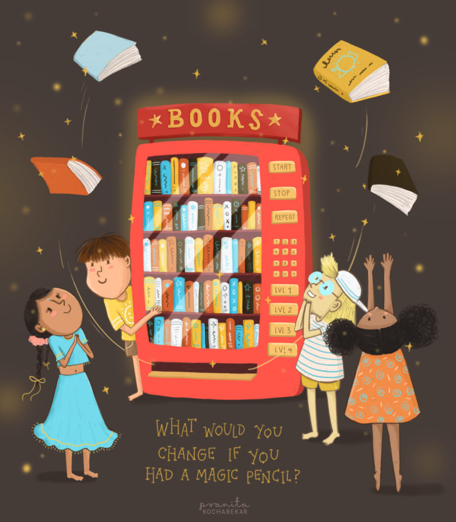
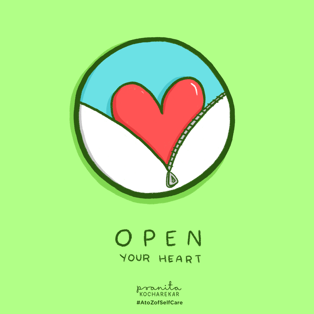
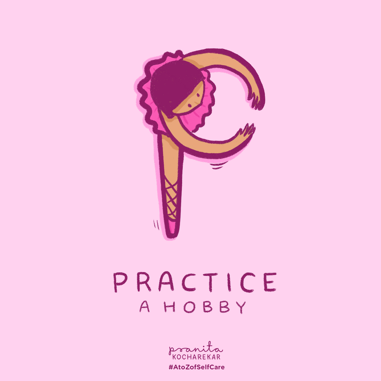
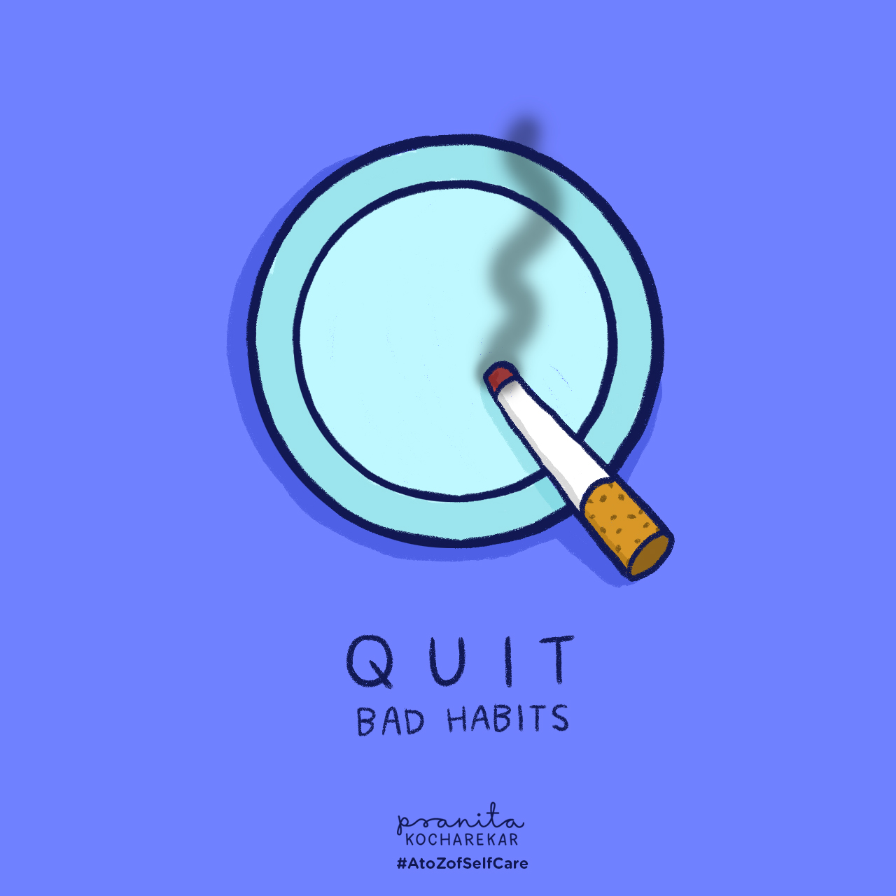
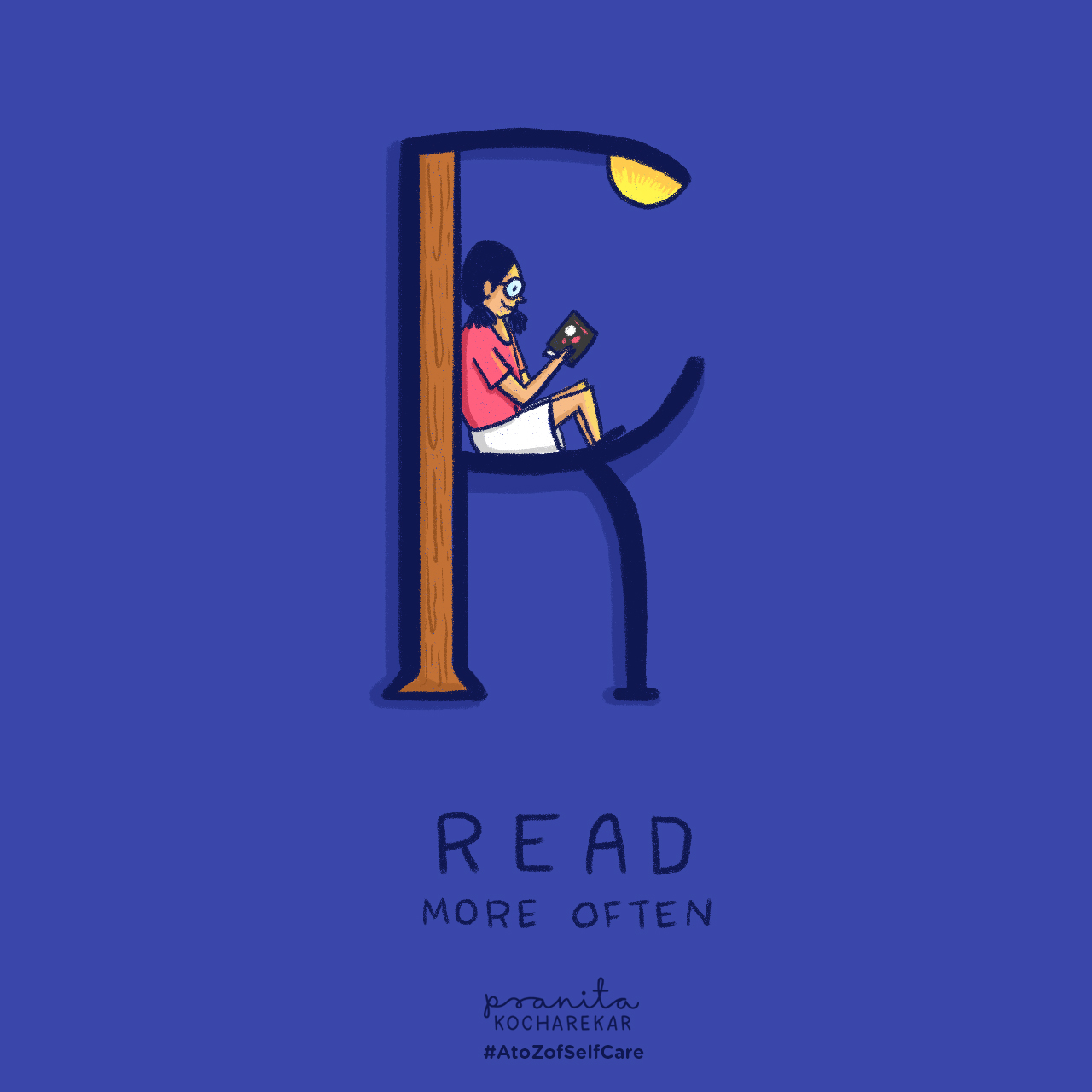
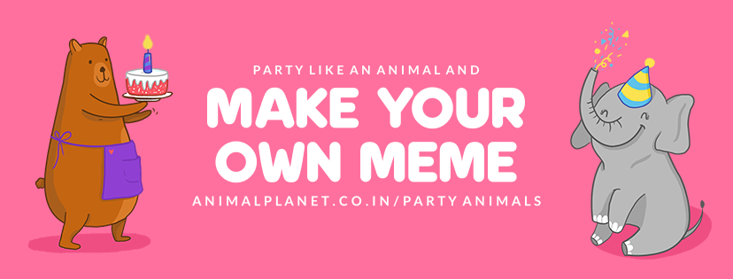
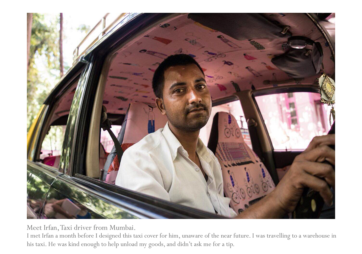
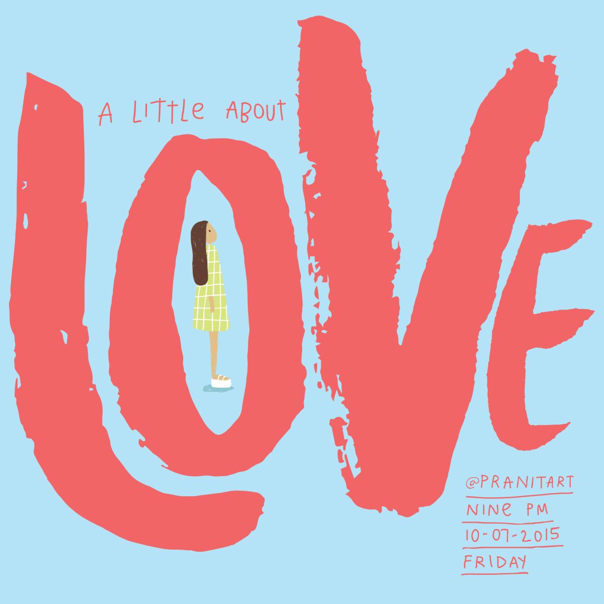
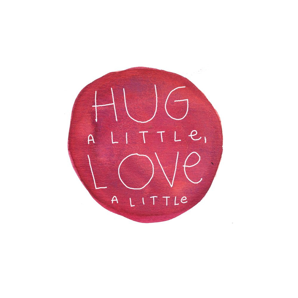
To coincide with Mental Health Awareness Week, BBC asked me to share my thoughts on getting through the past year.
You can read the entire article here: https://www.bbc.co.uk/programmes/articles/56kW7S2dWkWSQjsTzrBywfH/10-simple-pleasures-to-keep-you-going
This was also featured on BBC’s Instagram page.
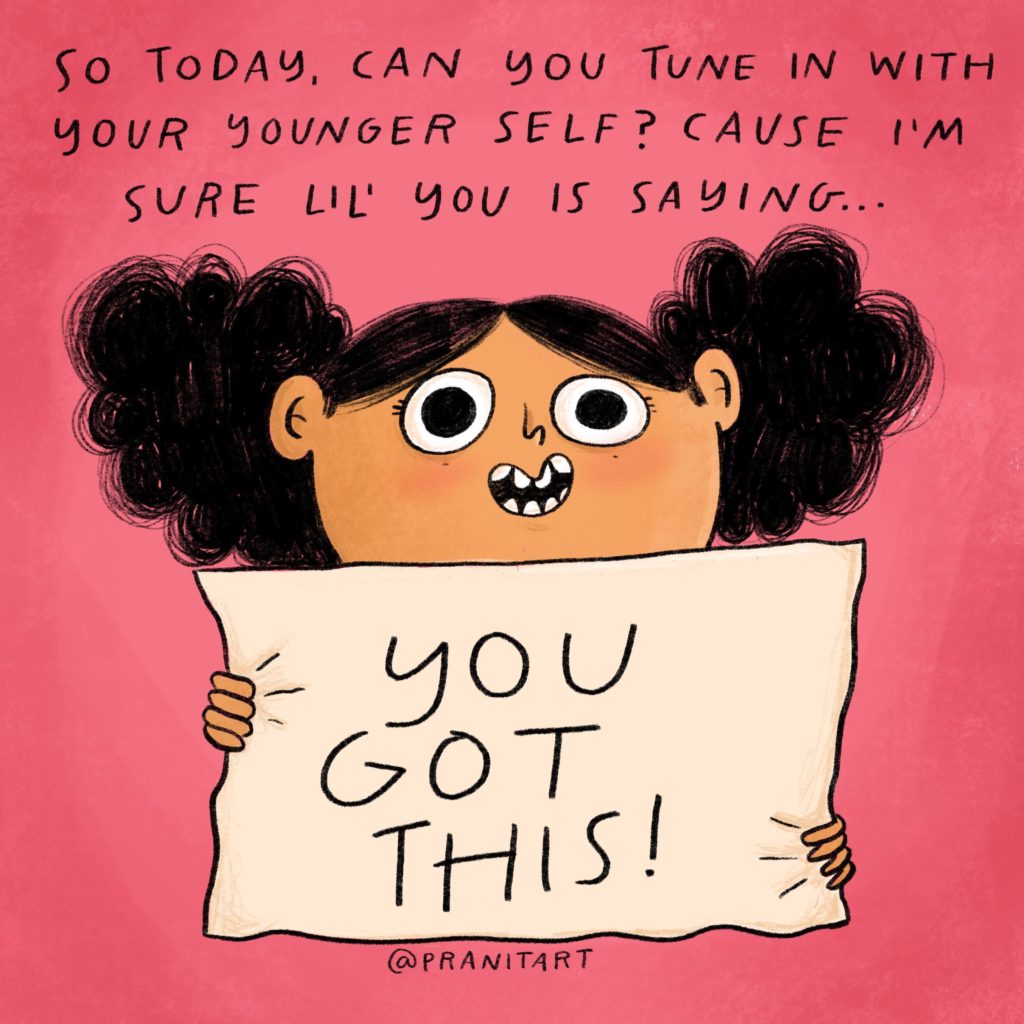
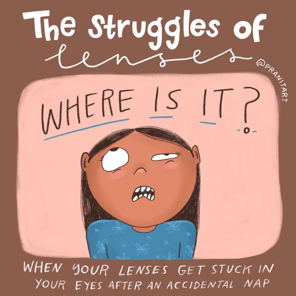
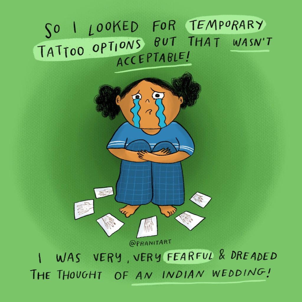
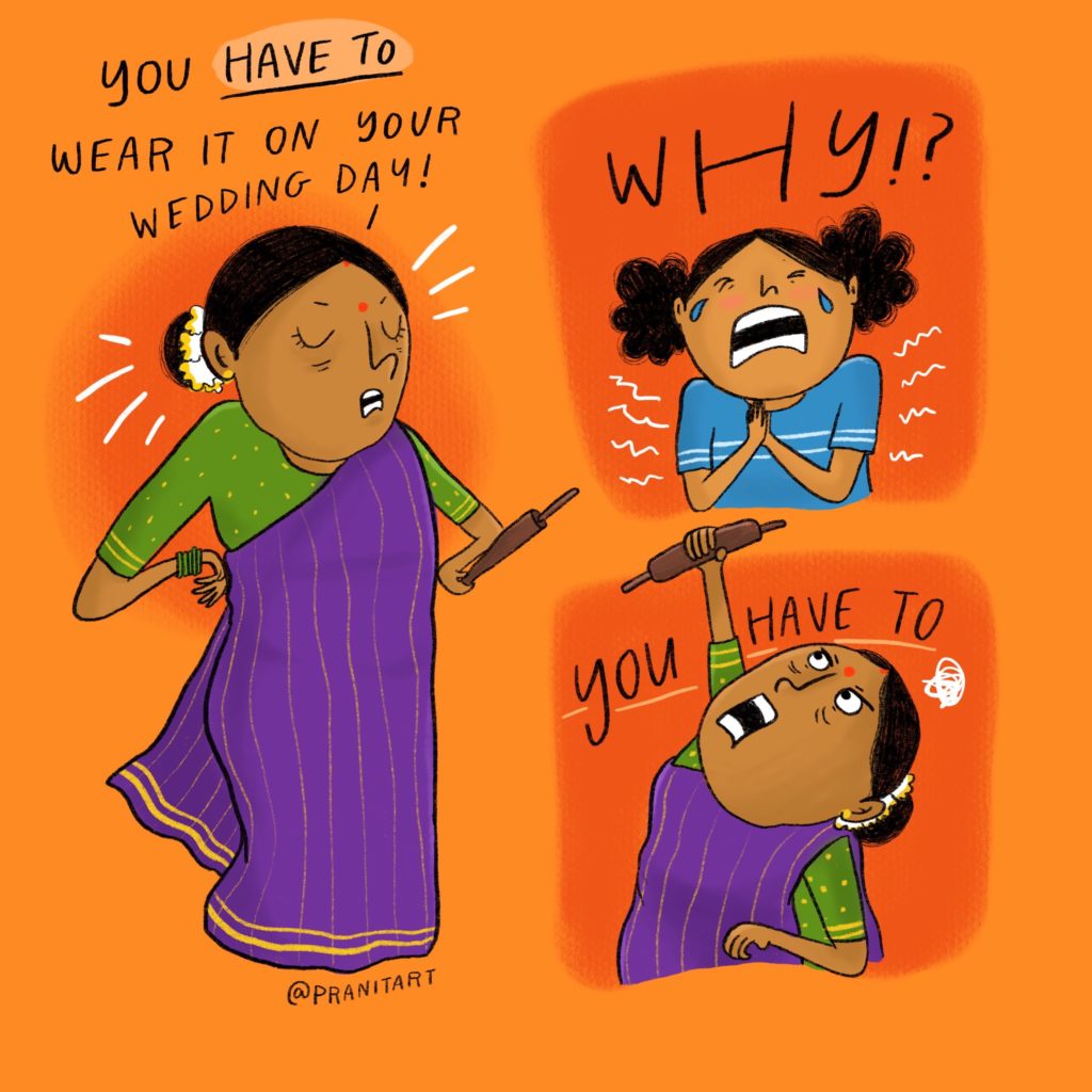
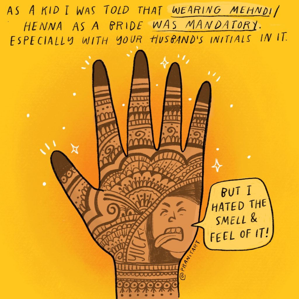
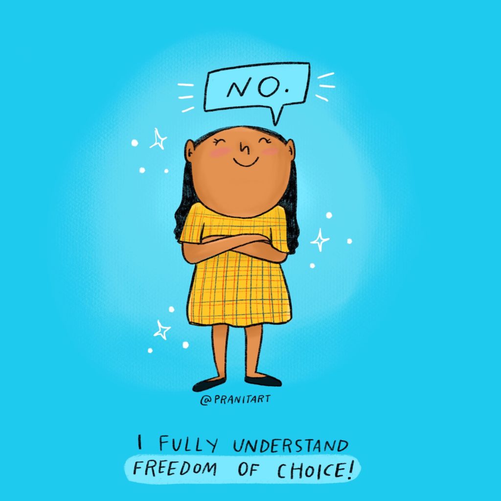
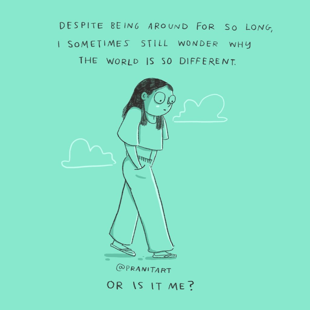
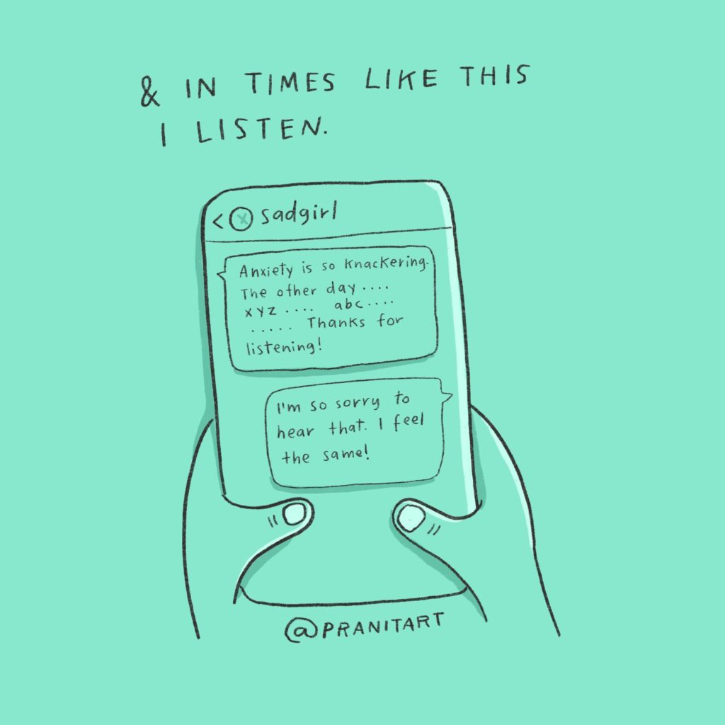
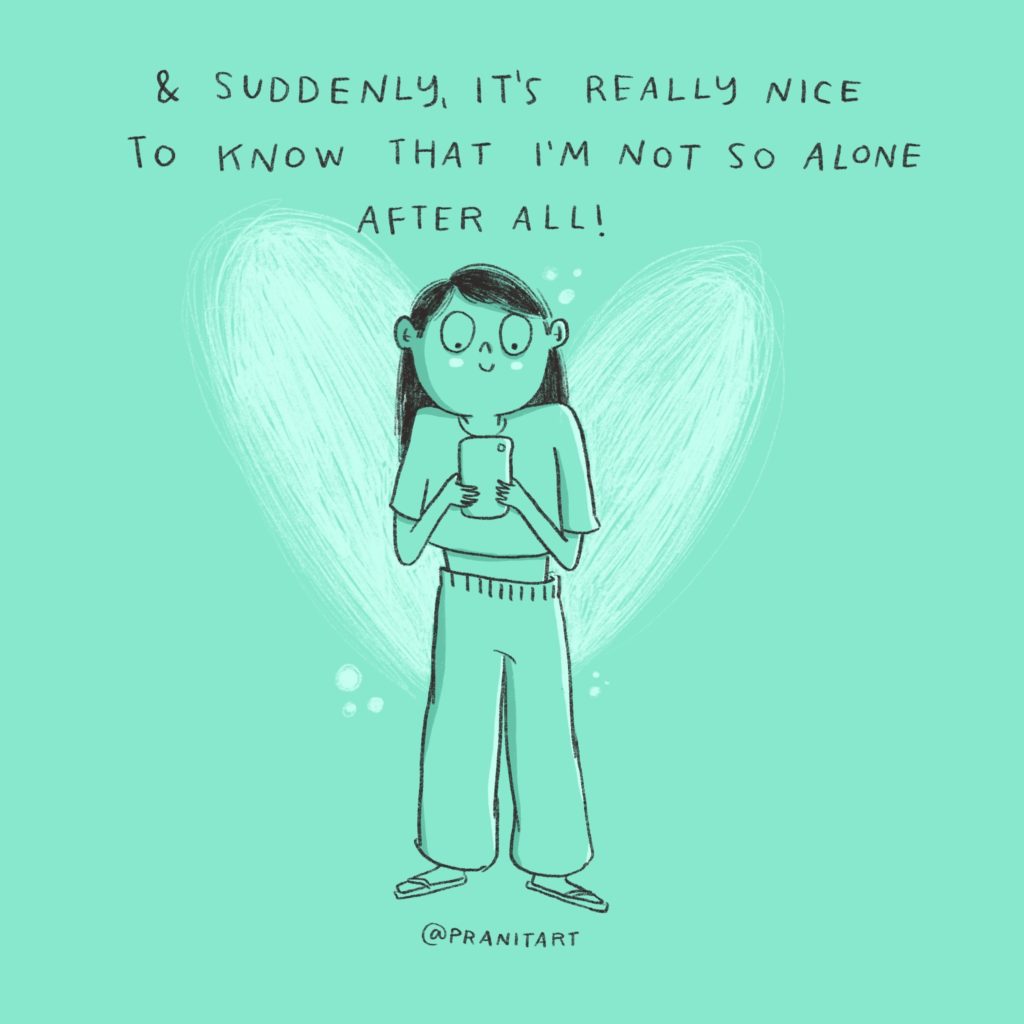
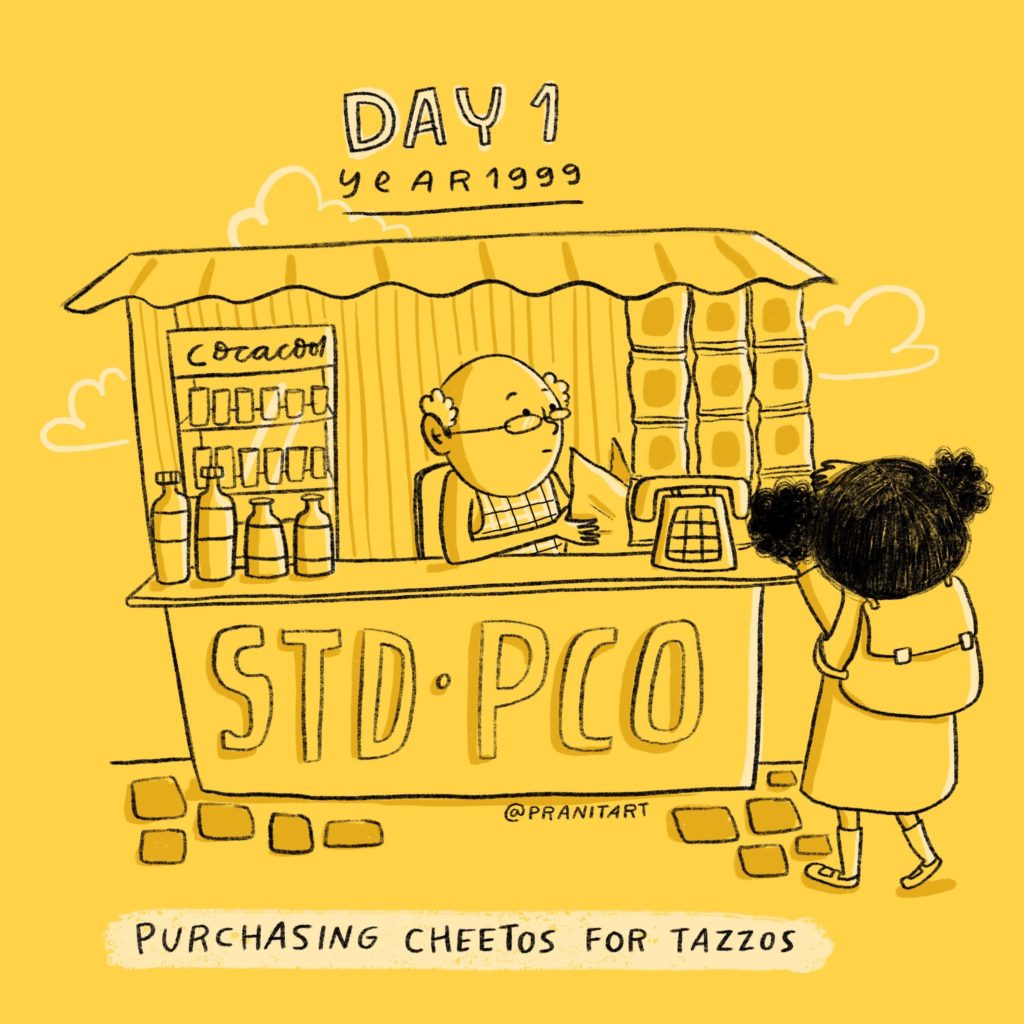
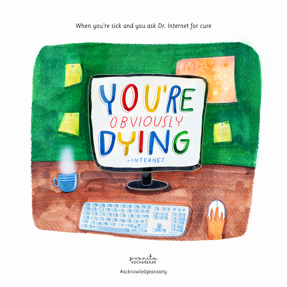
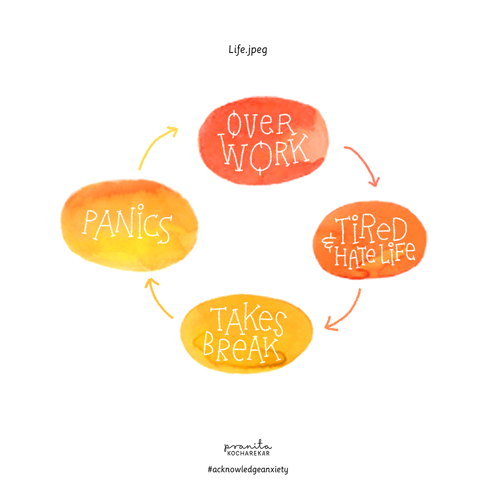
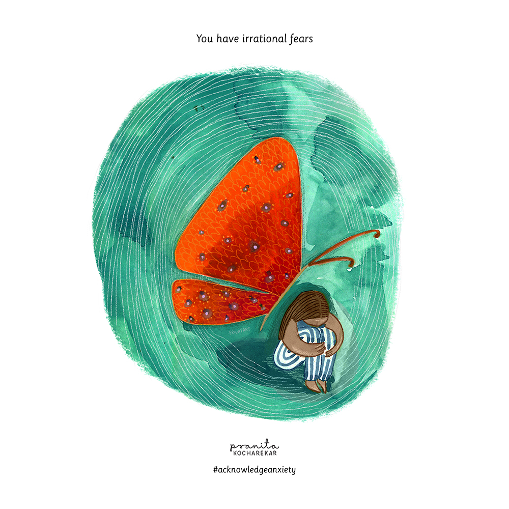
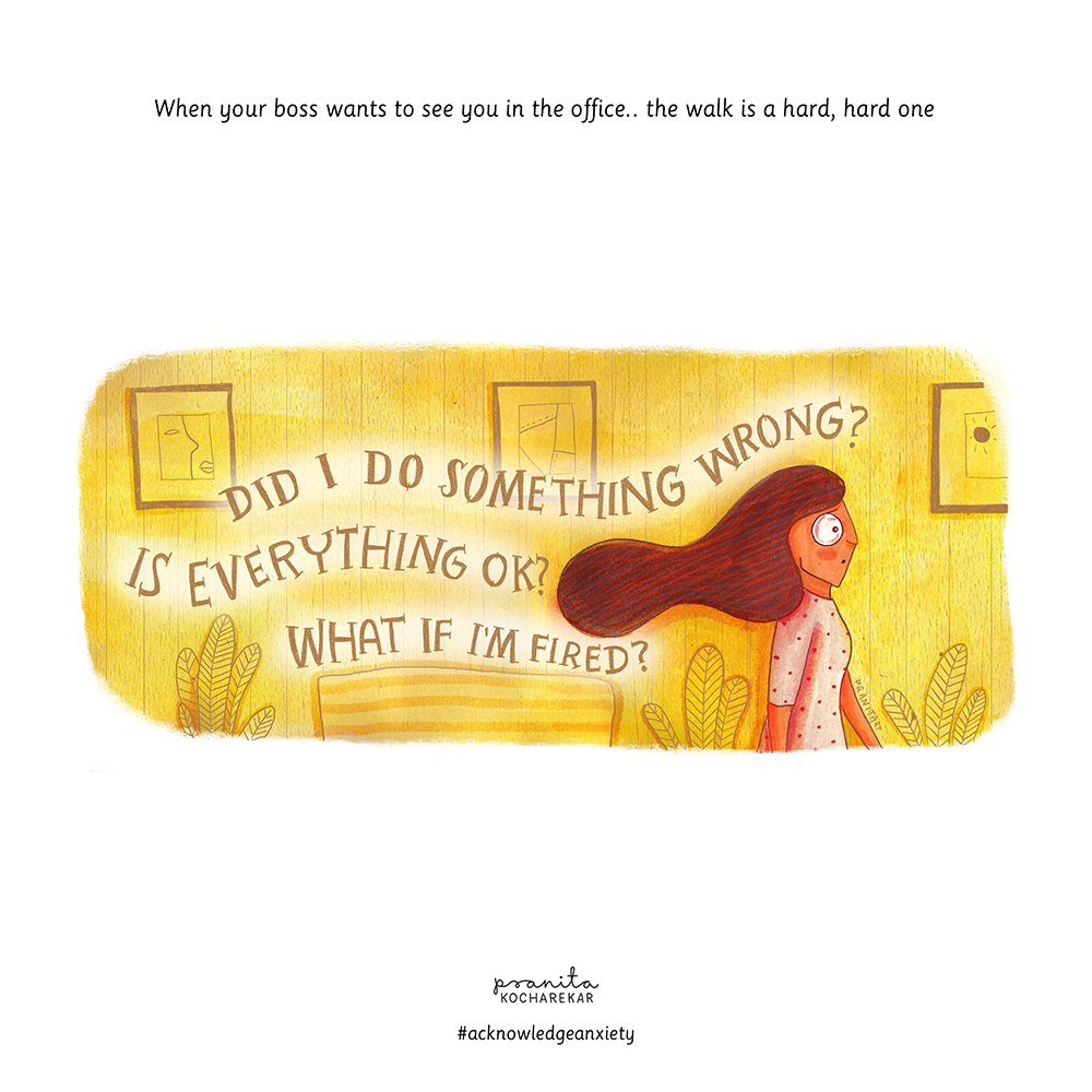
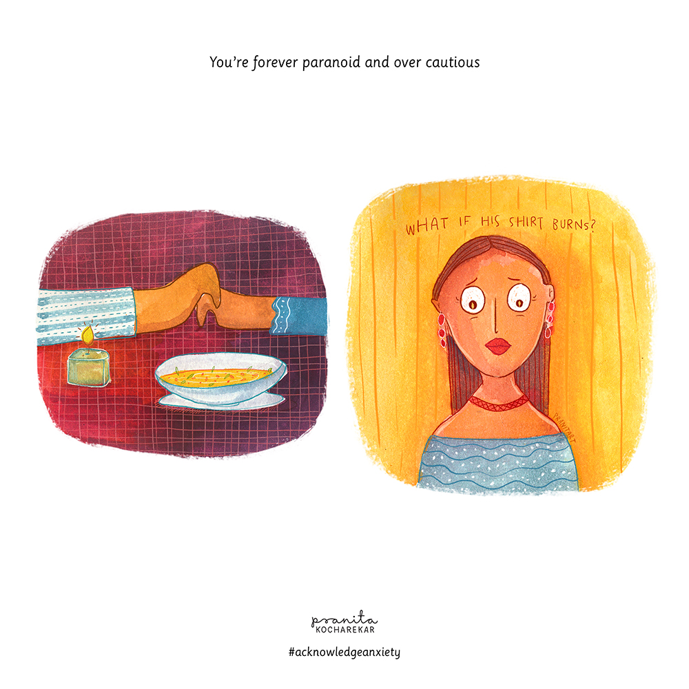
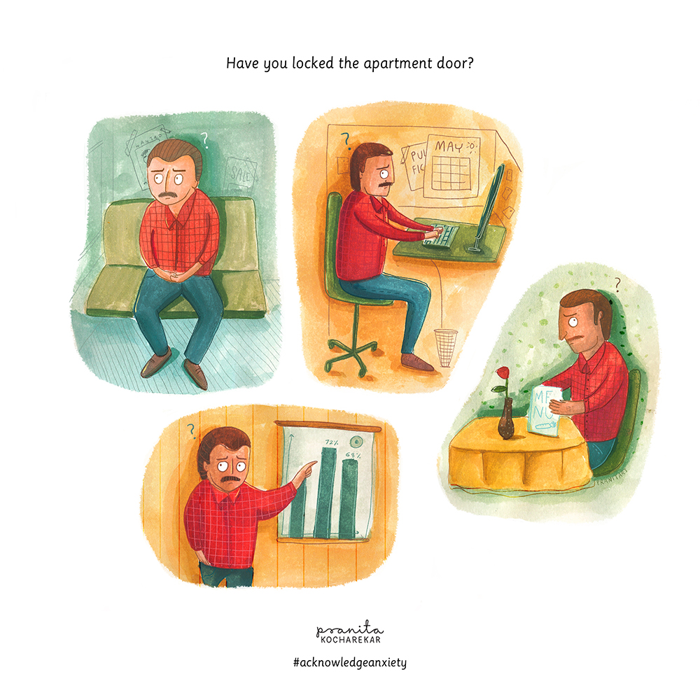
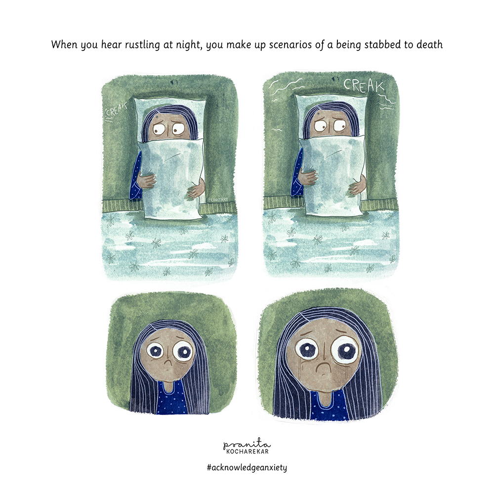
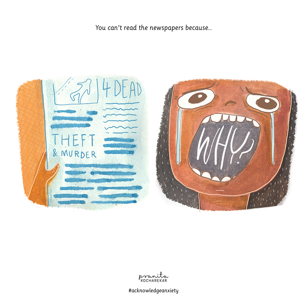
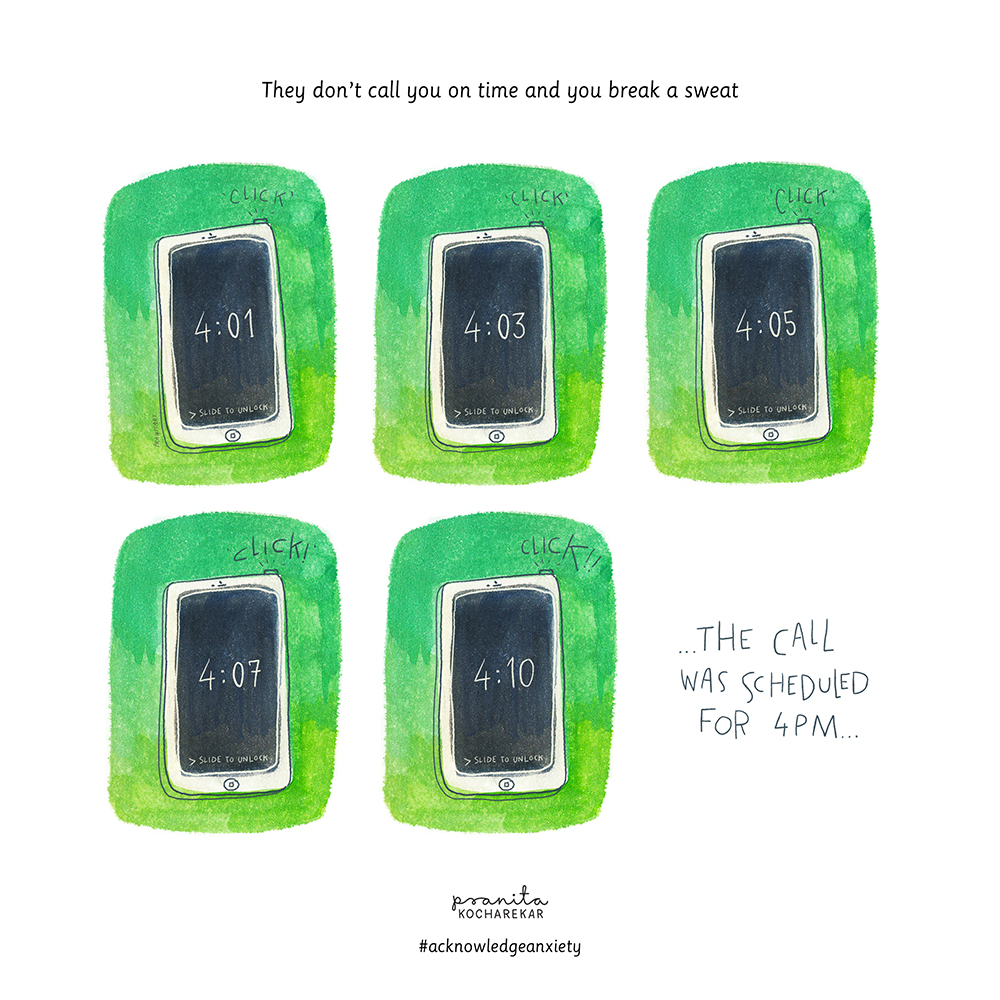
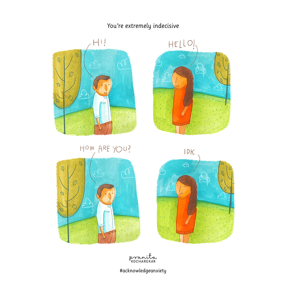
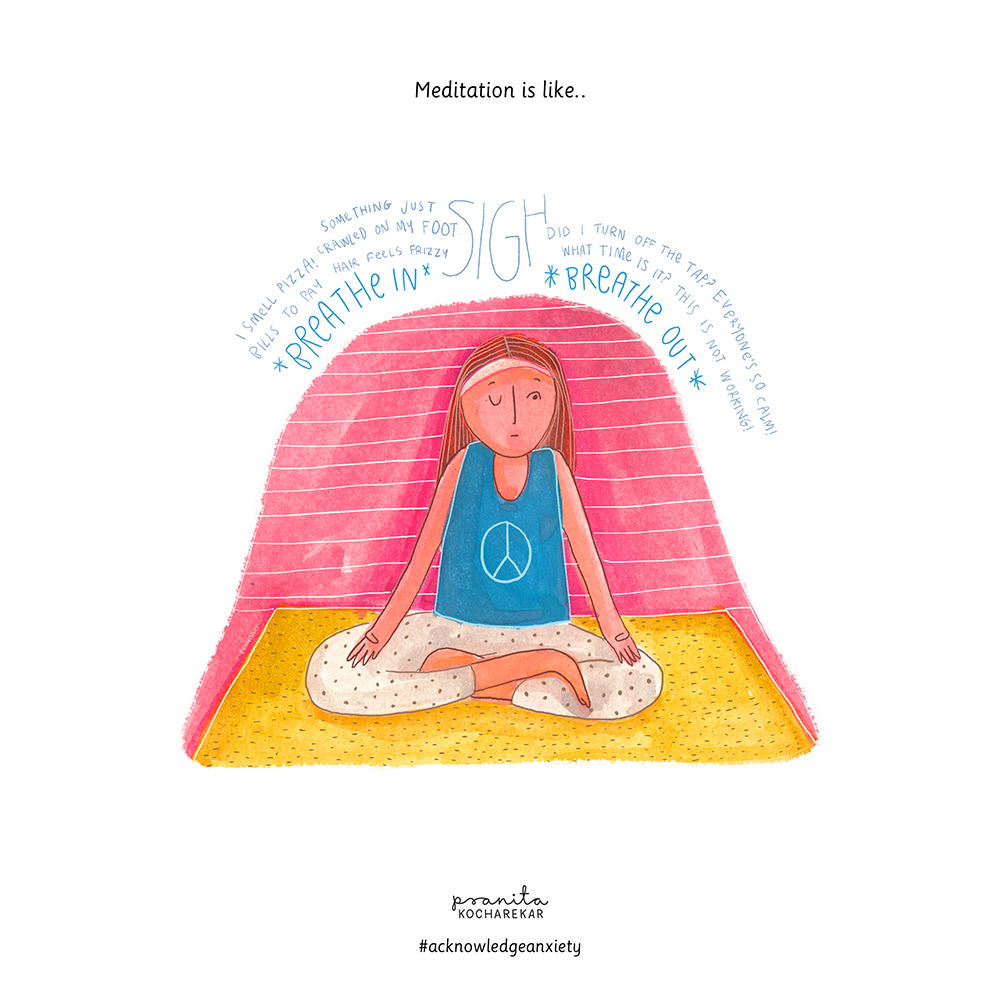
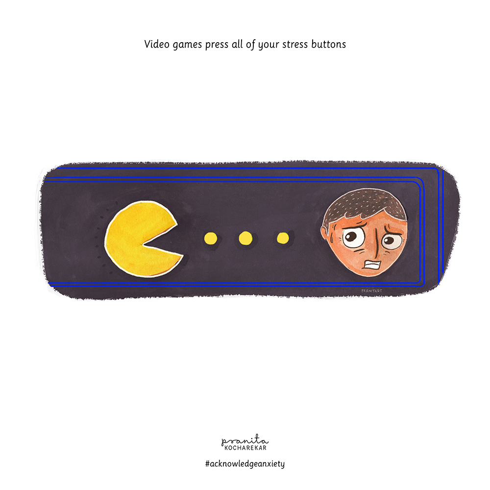
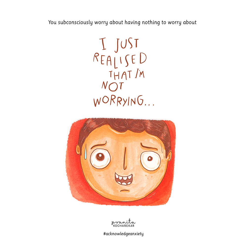
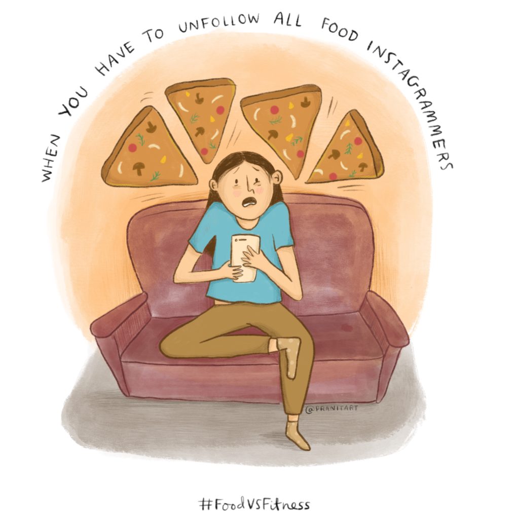
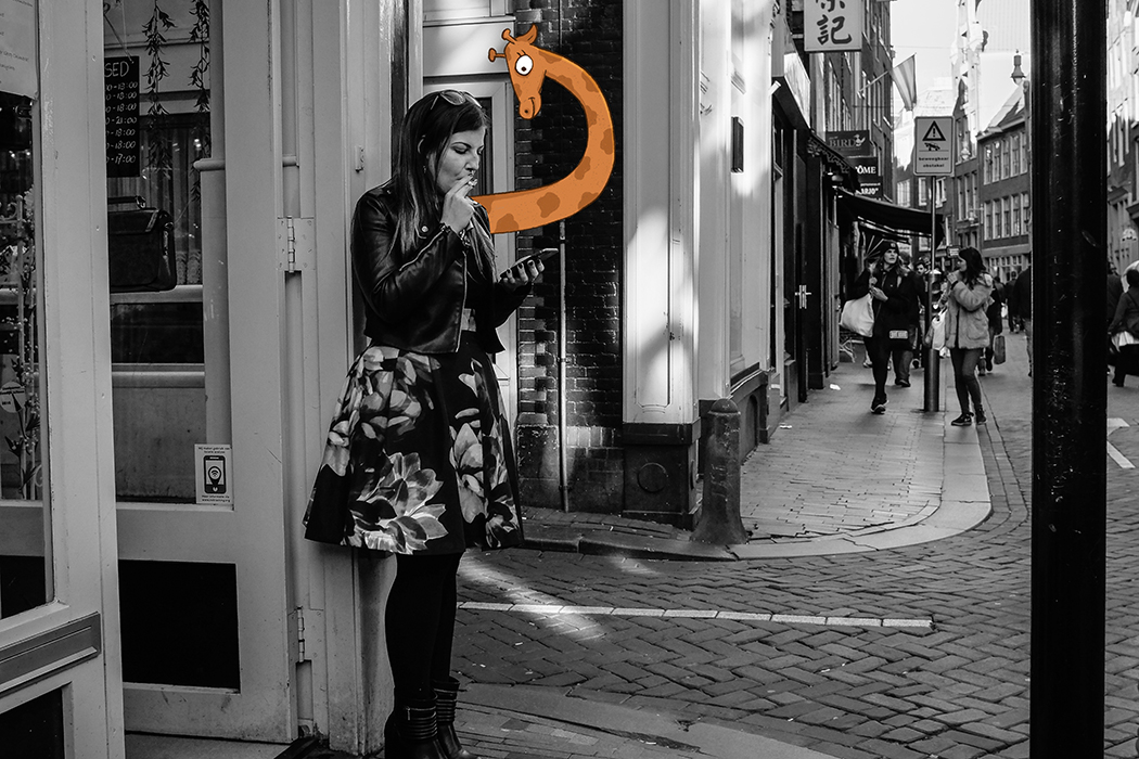
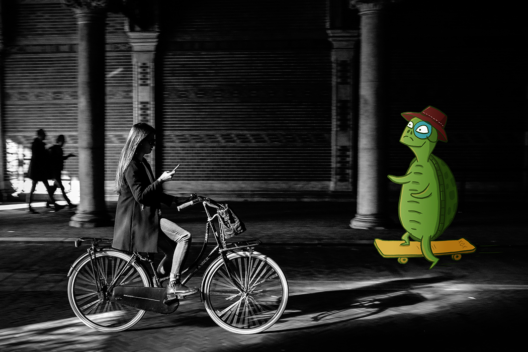
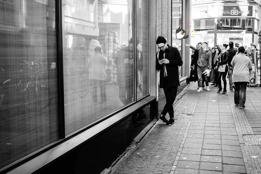
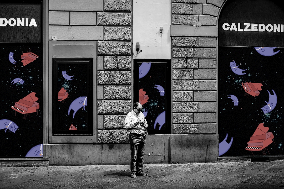
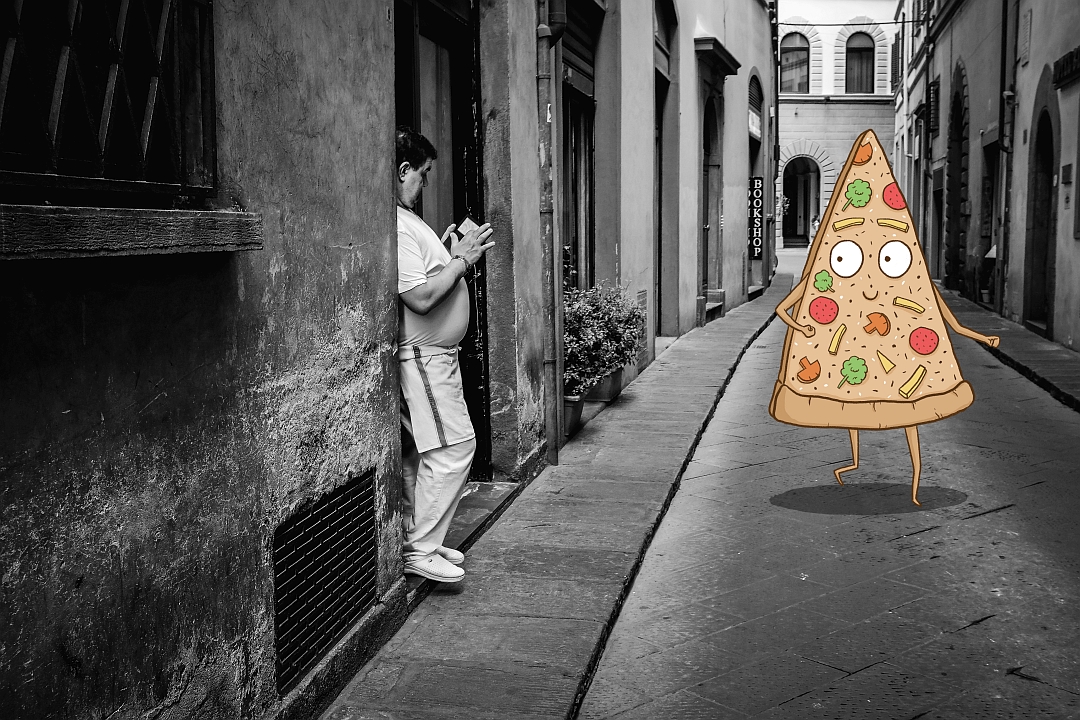
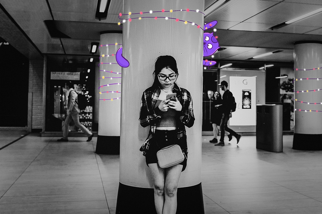
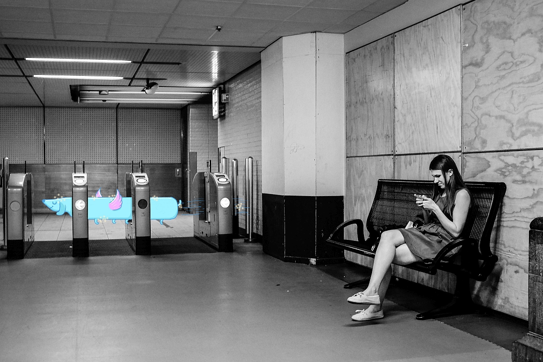
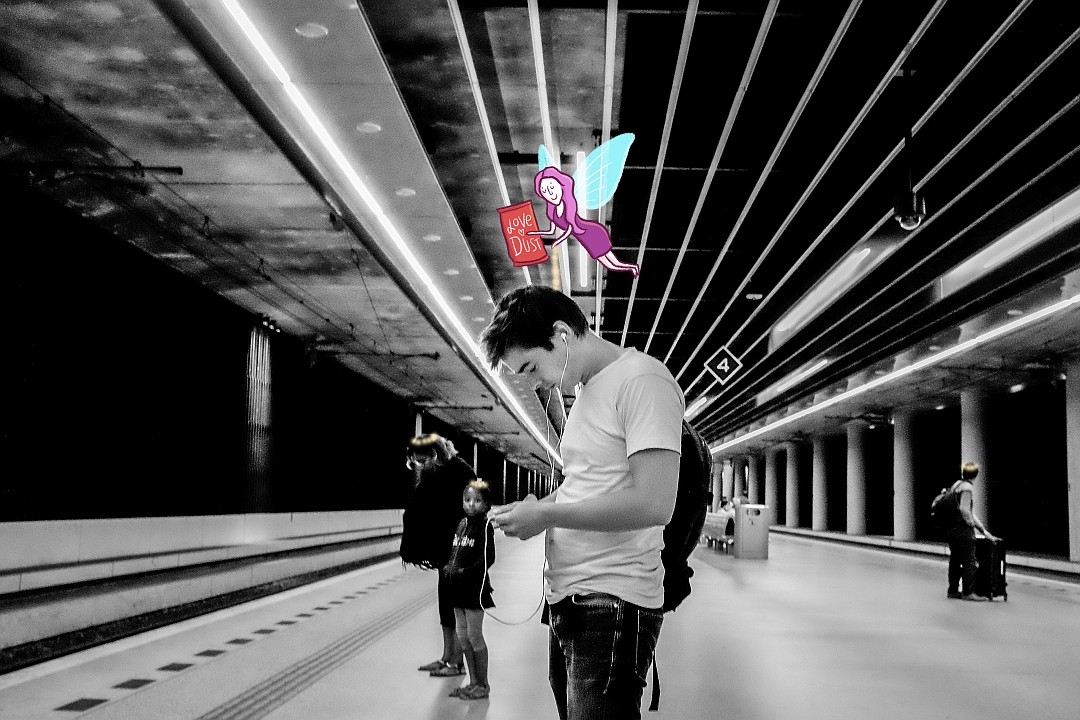
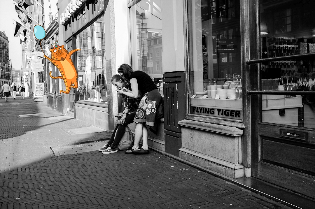
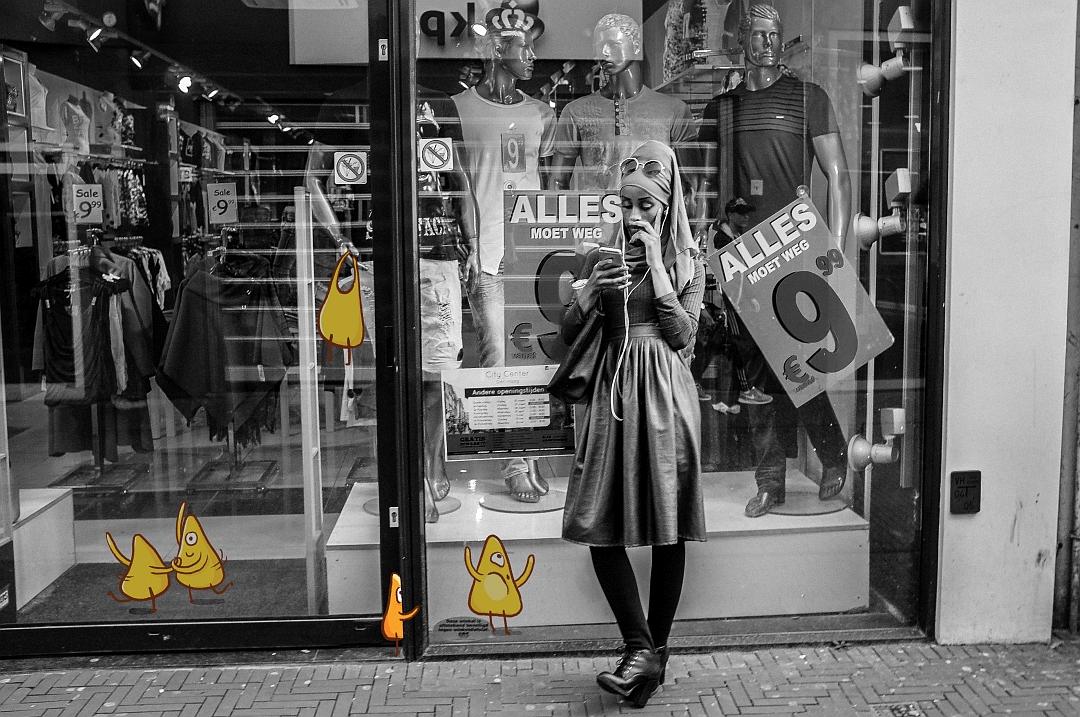
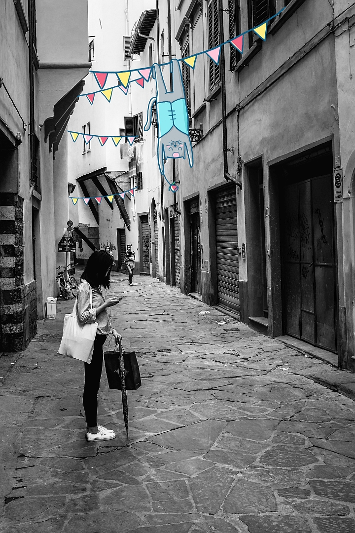
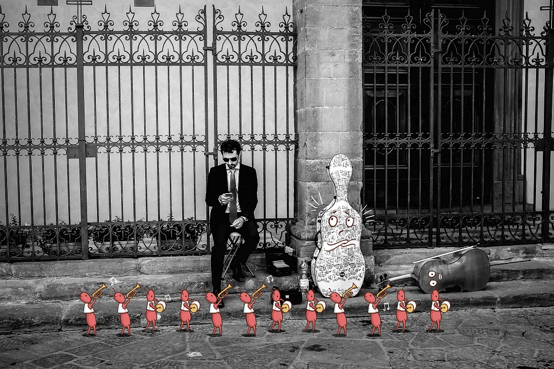
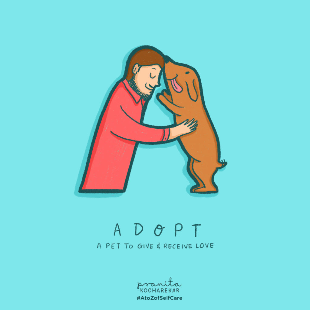
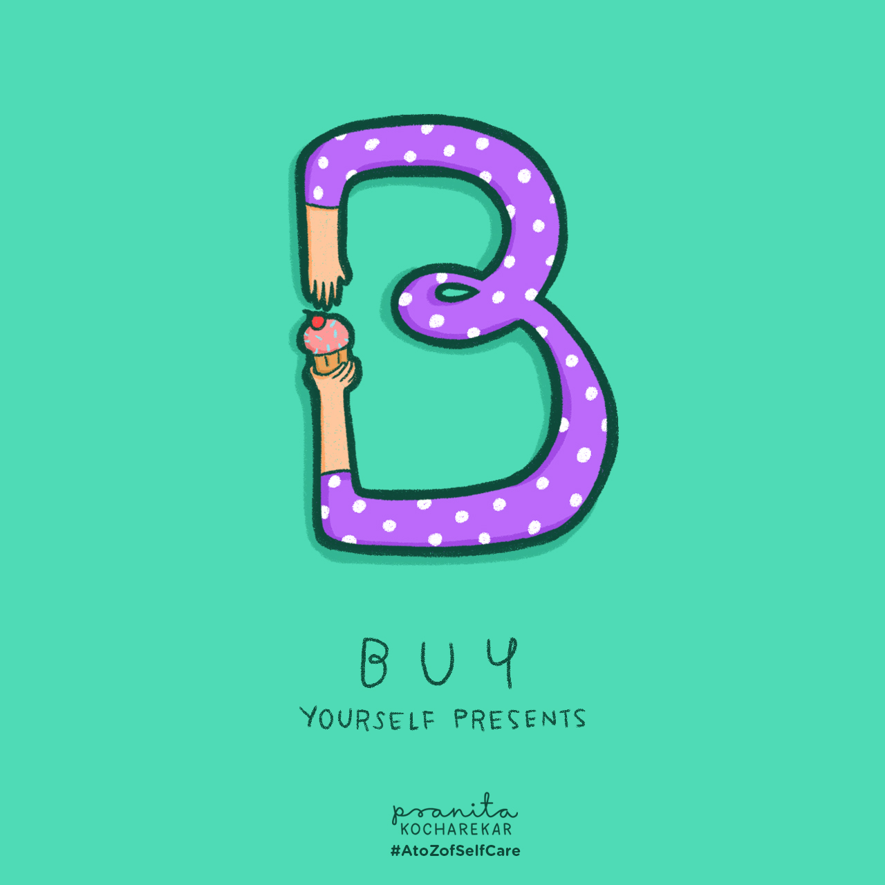
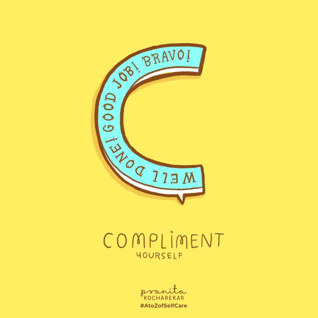
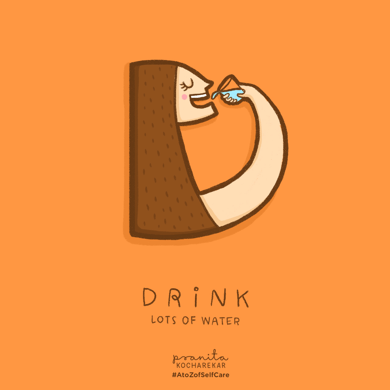
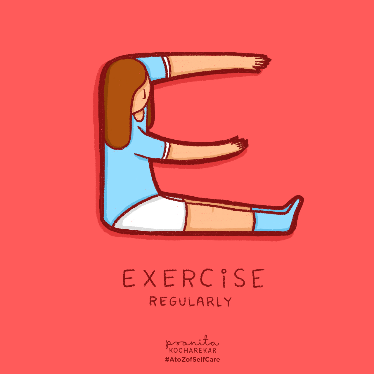
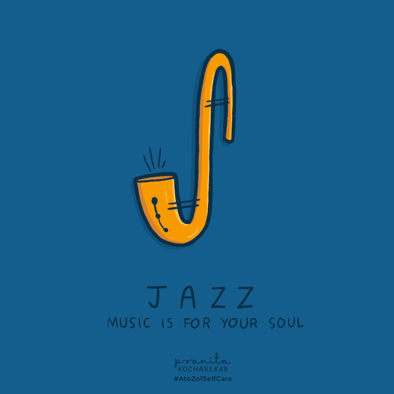
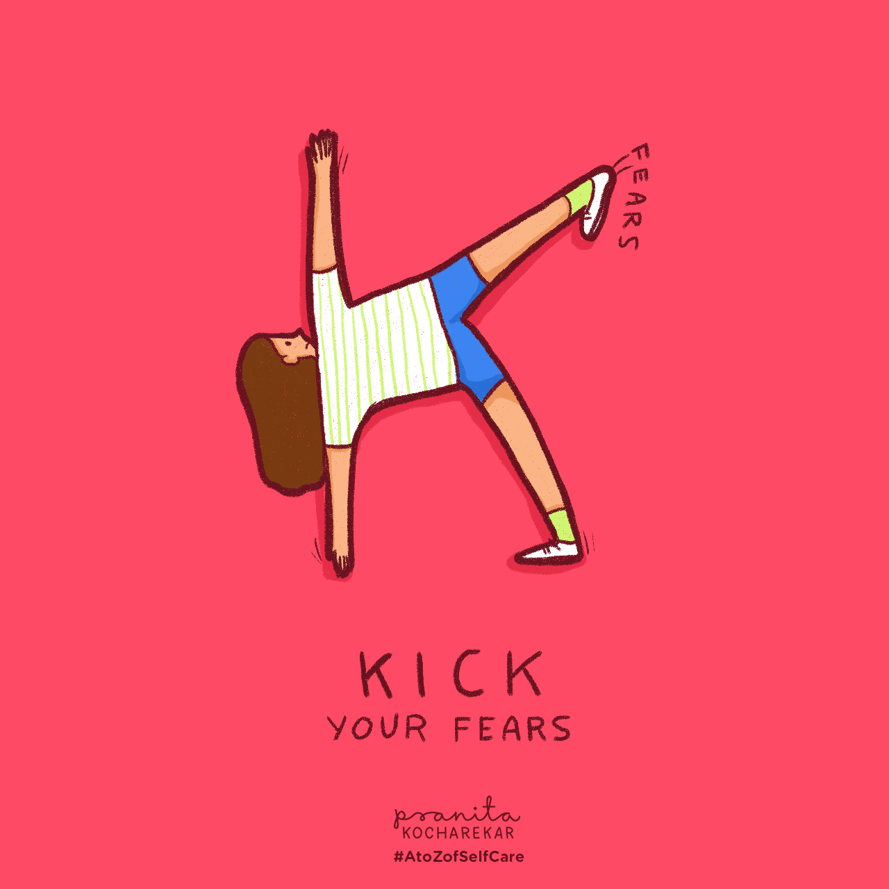
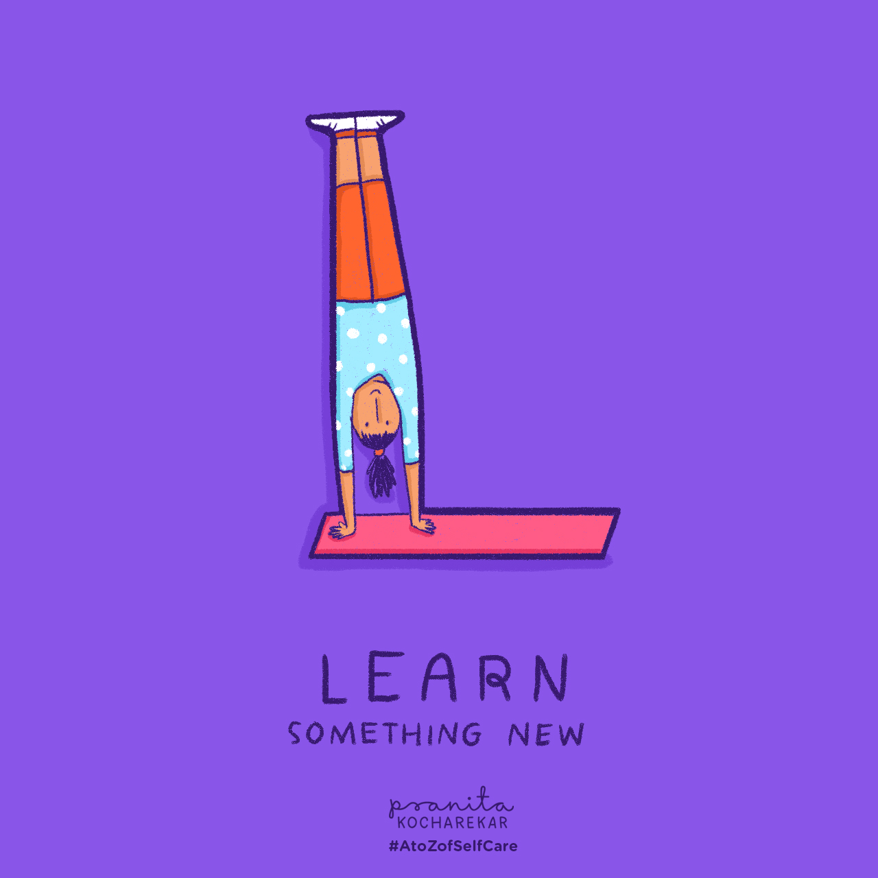
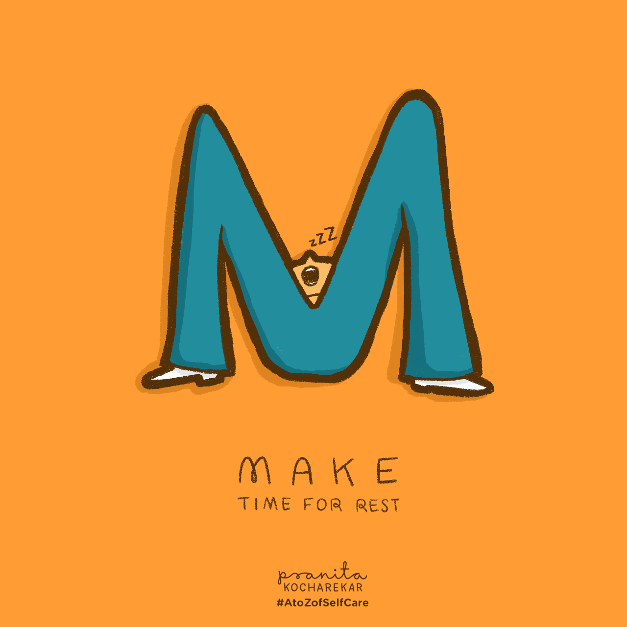
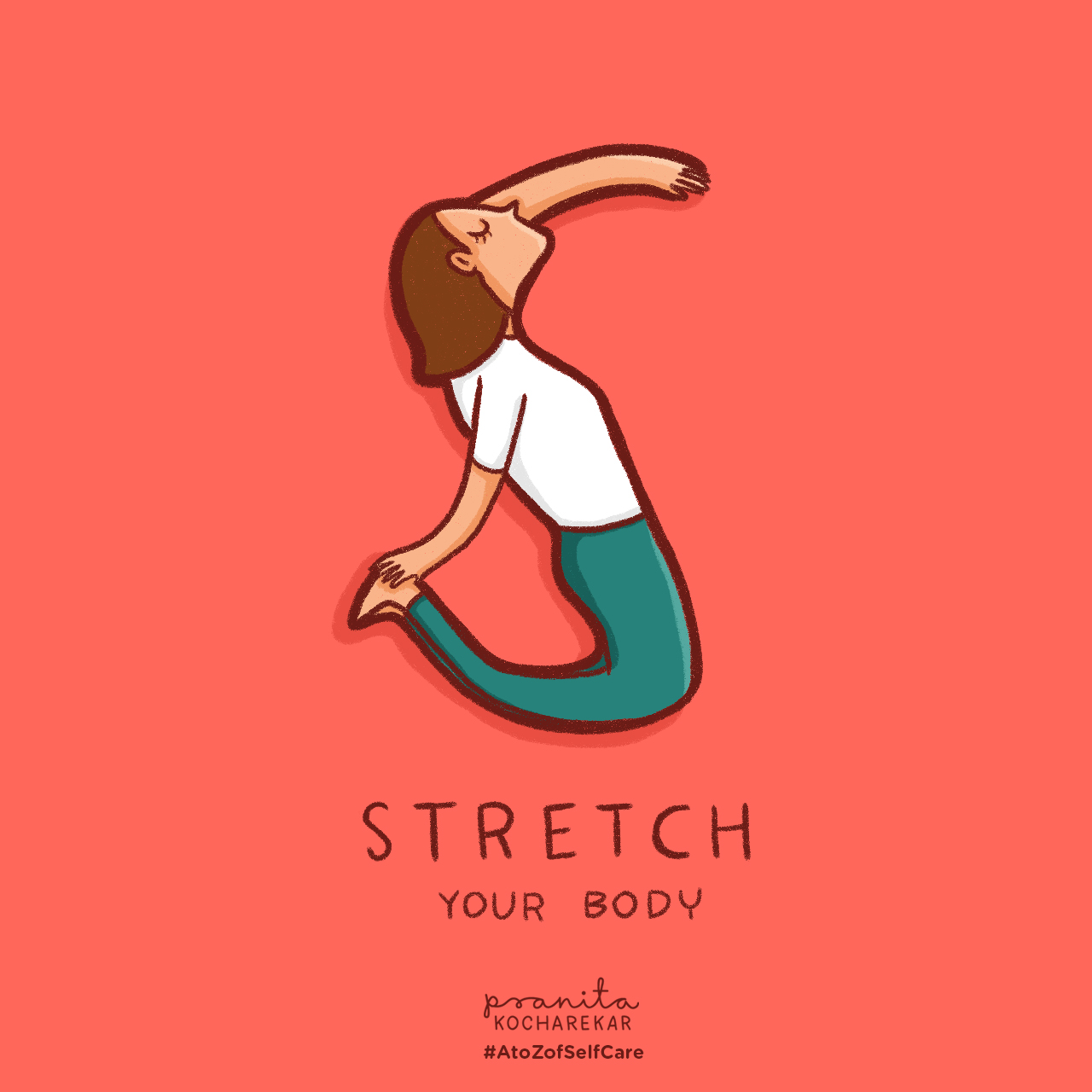
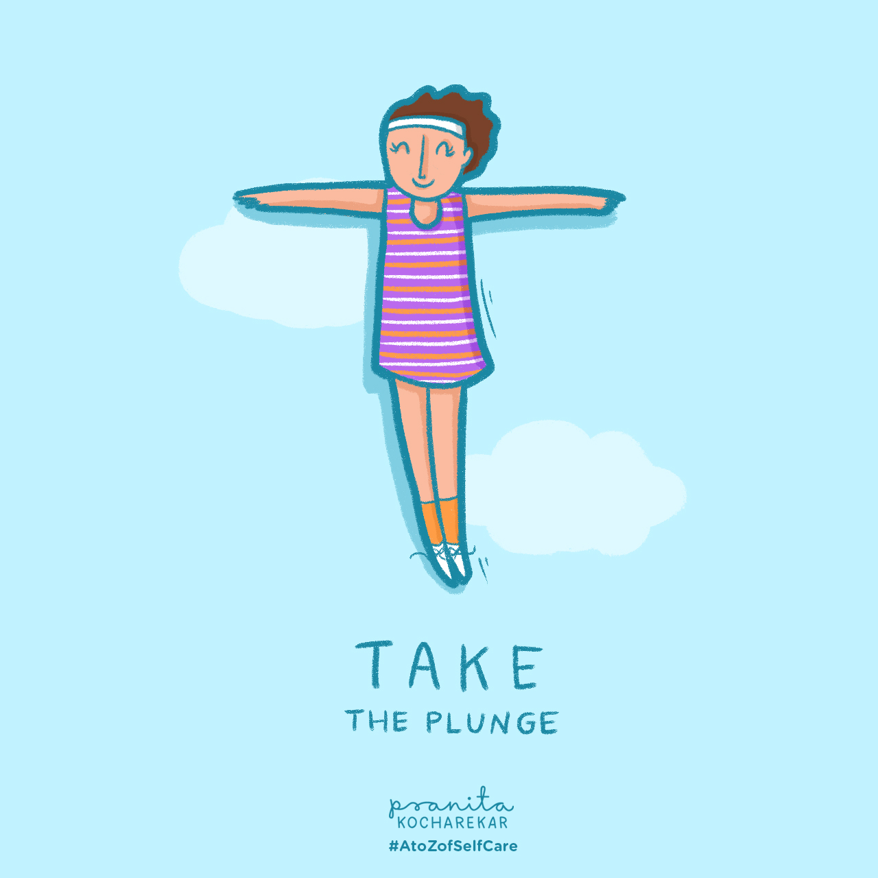
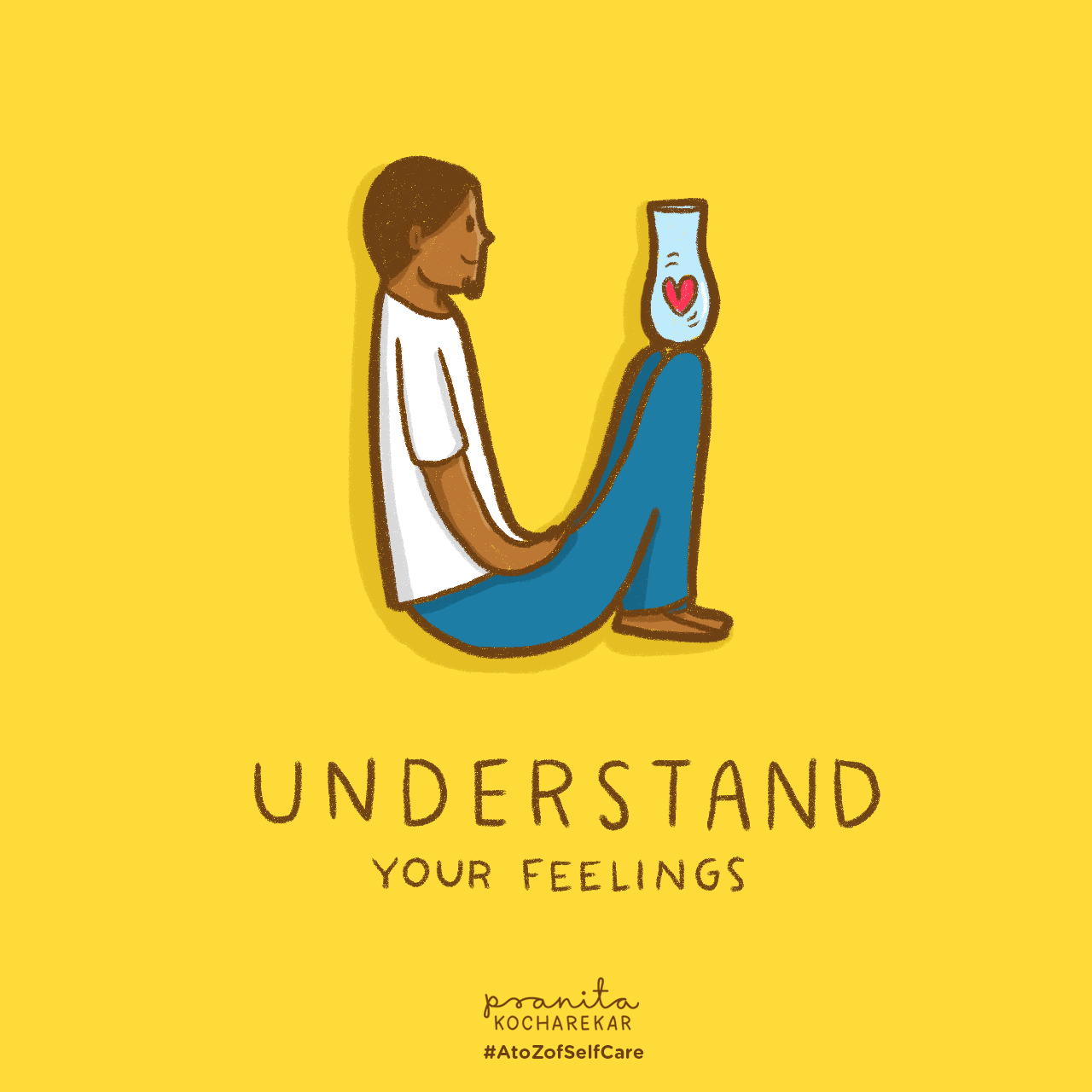
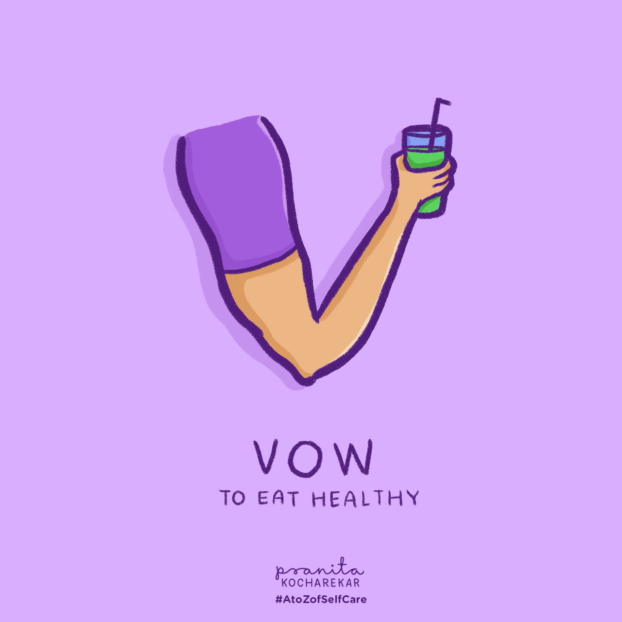
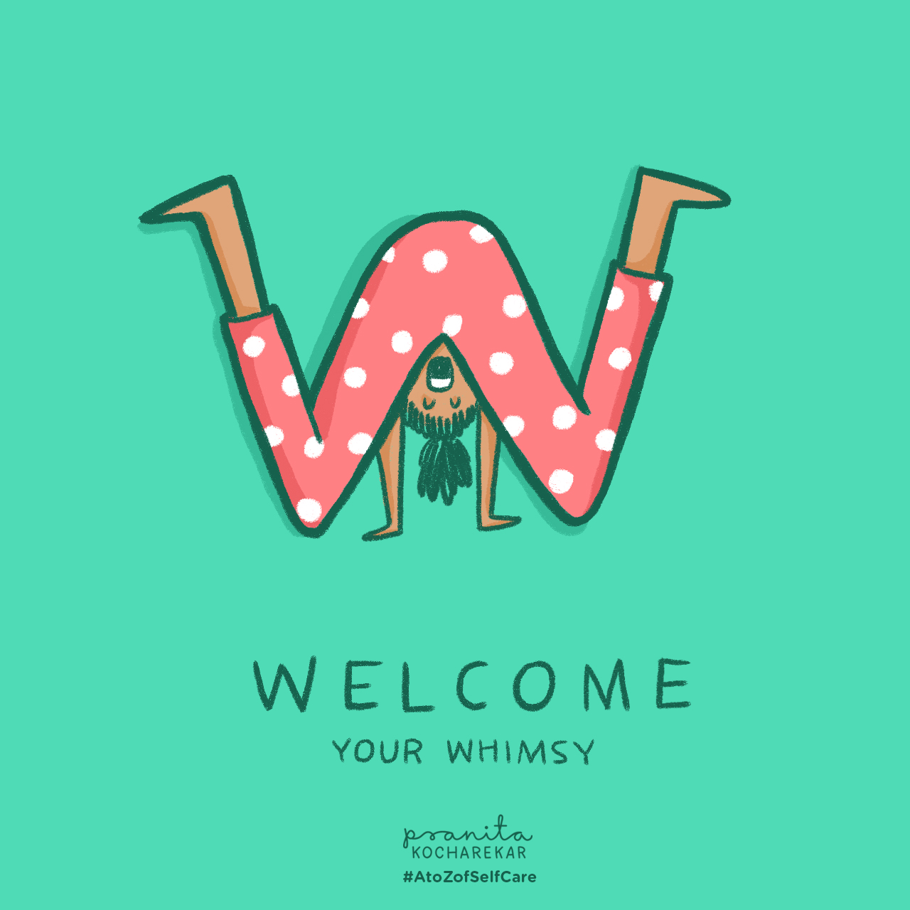
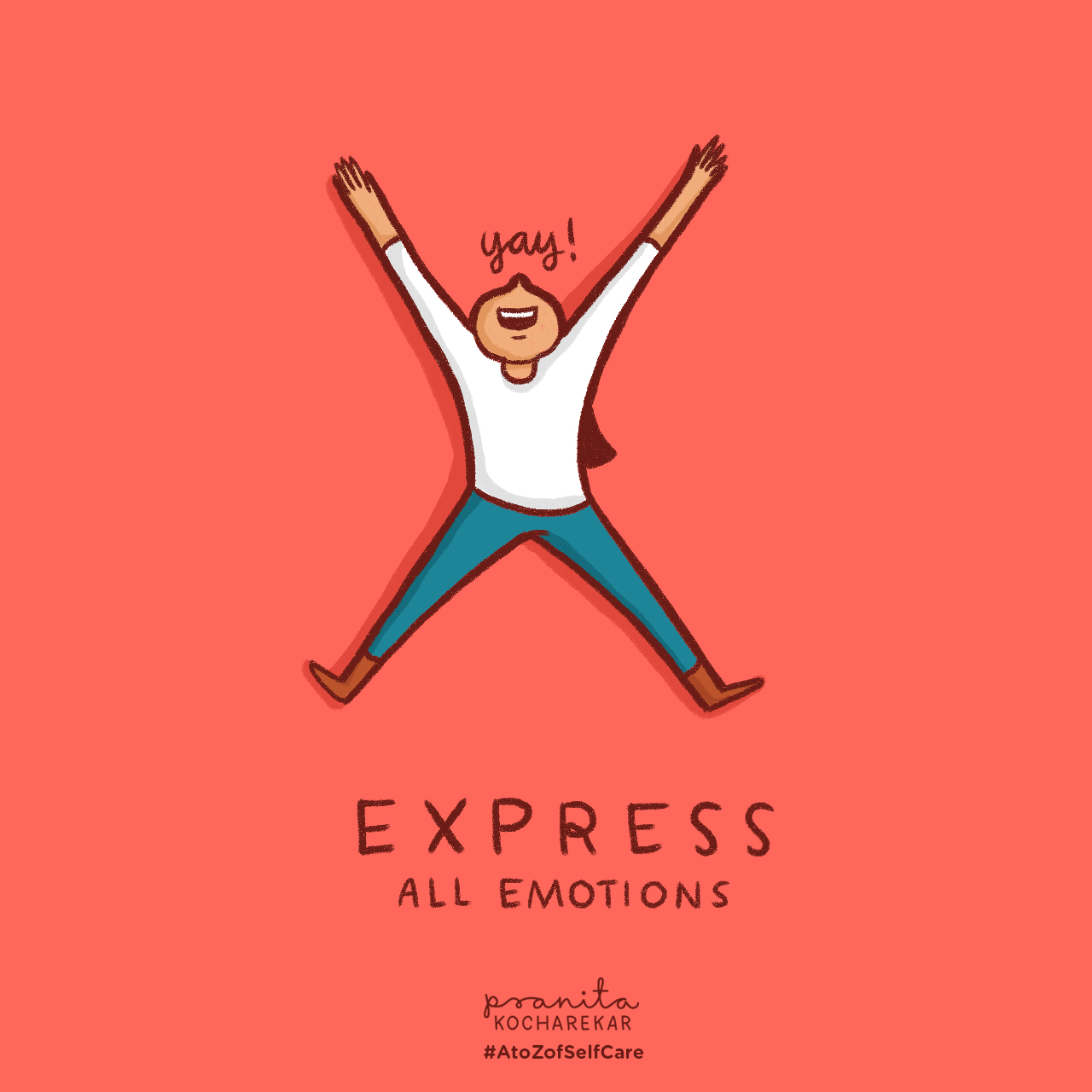
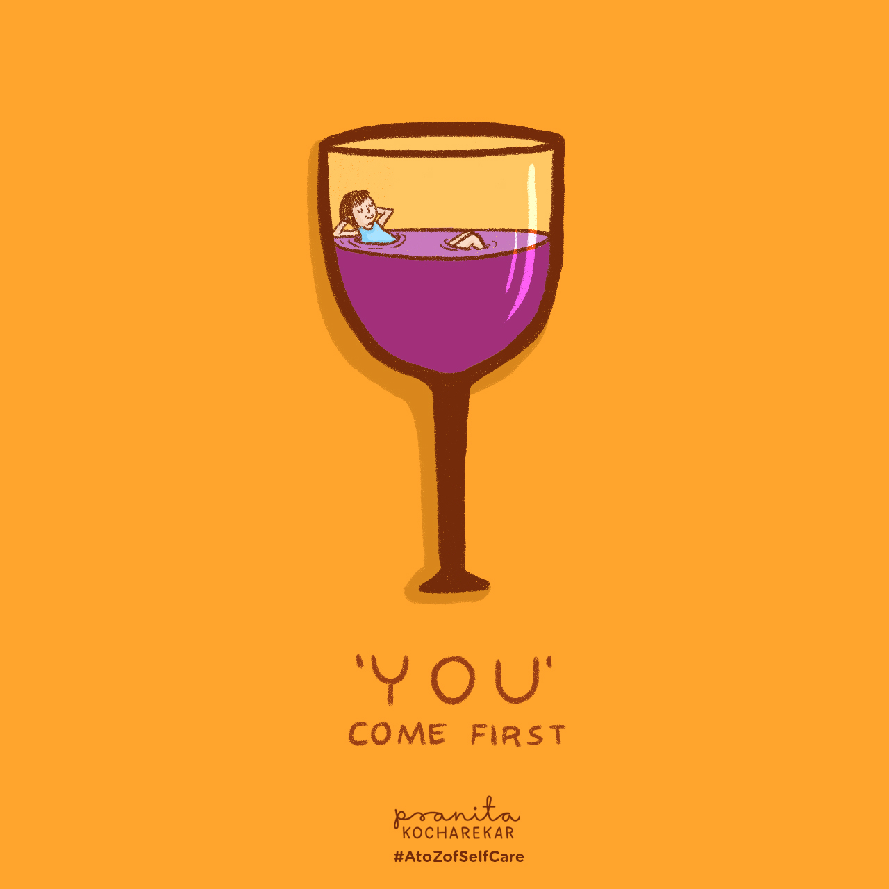
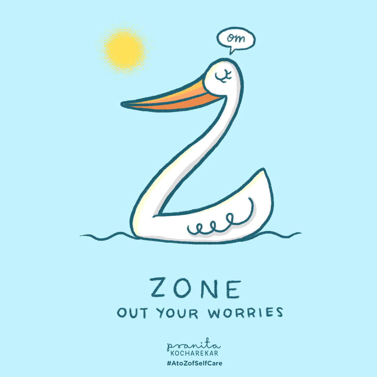
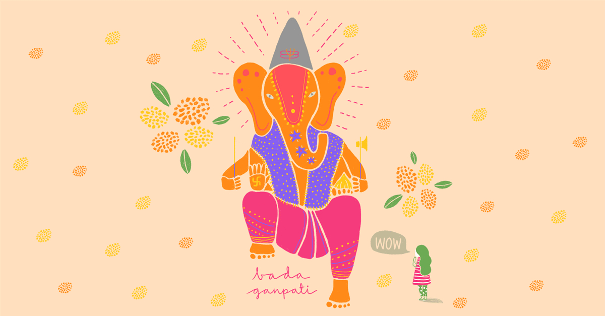
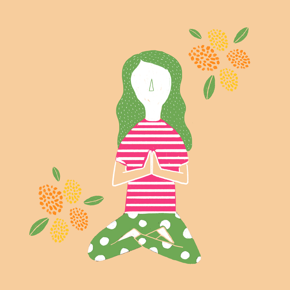
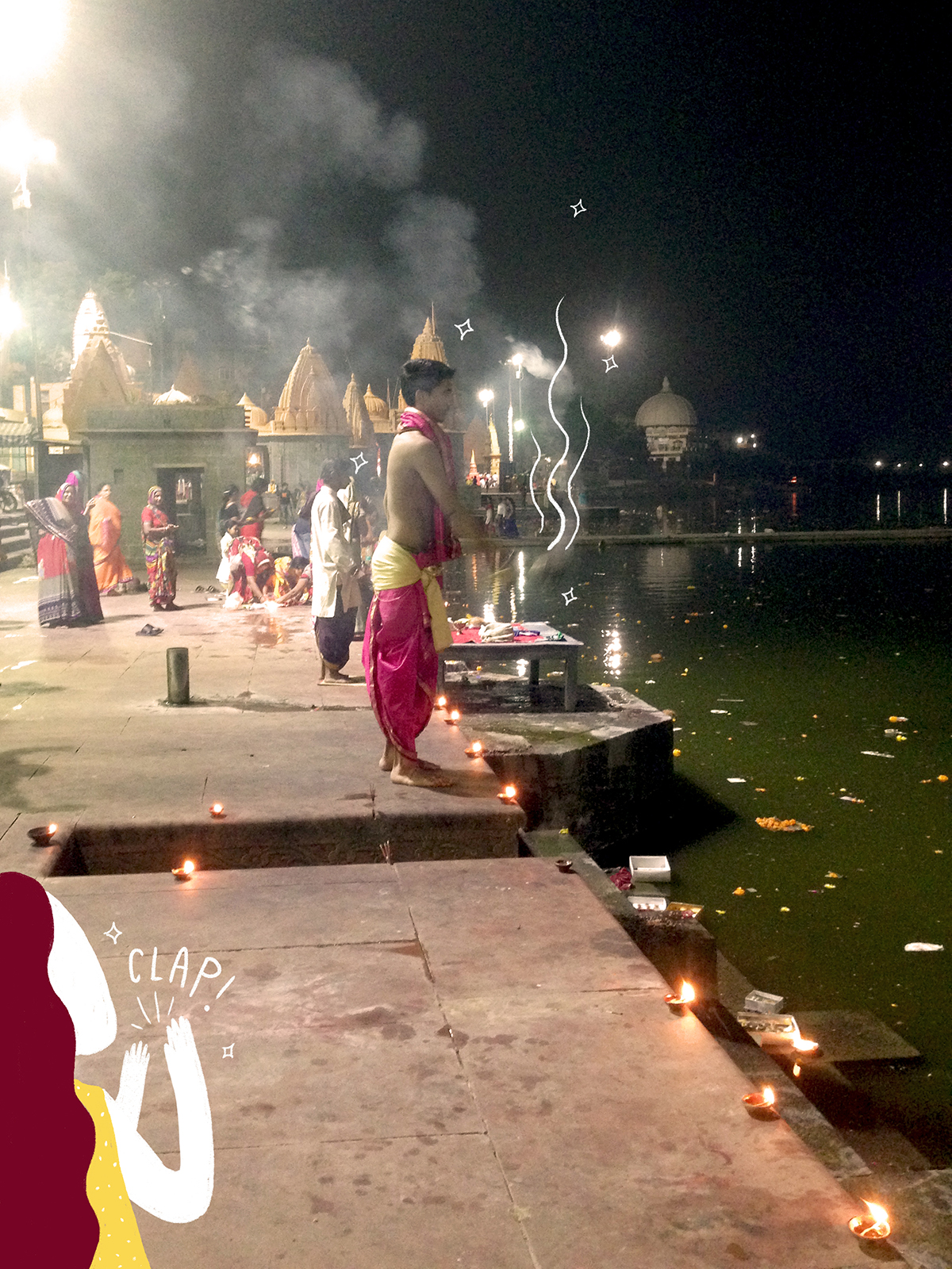
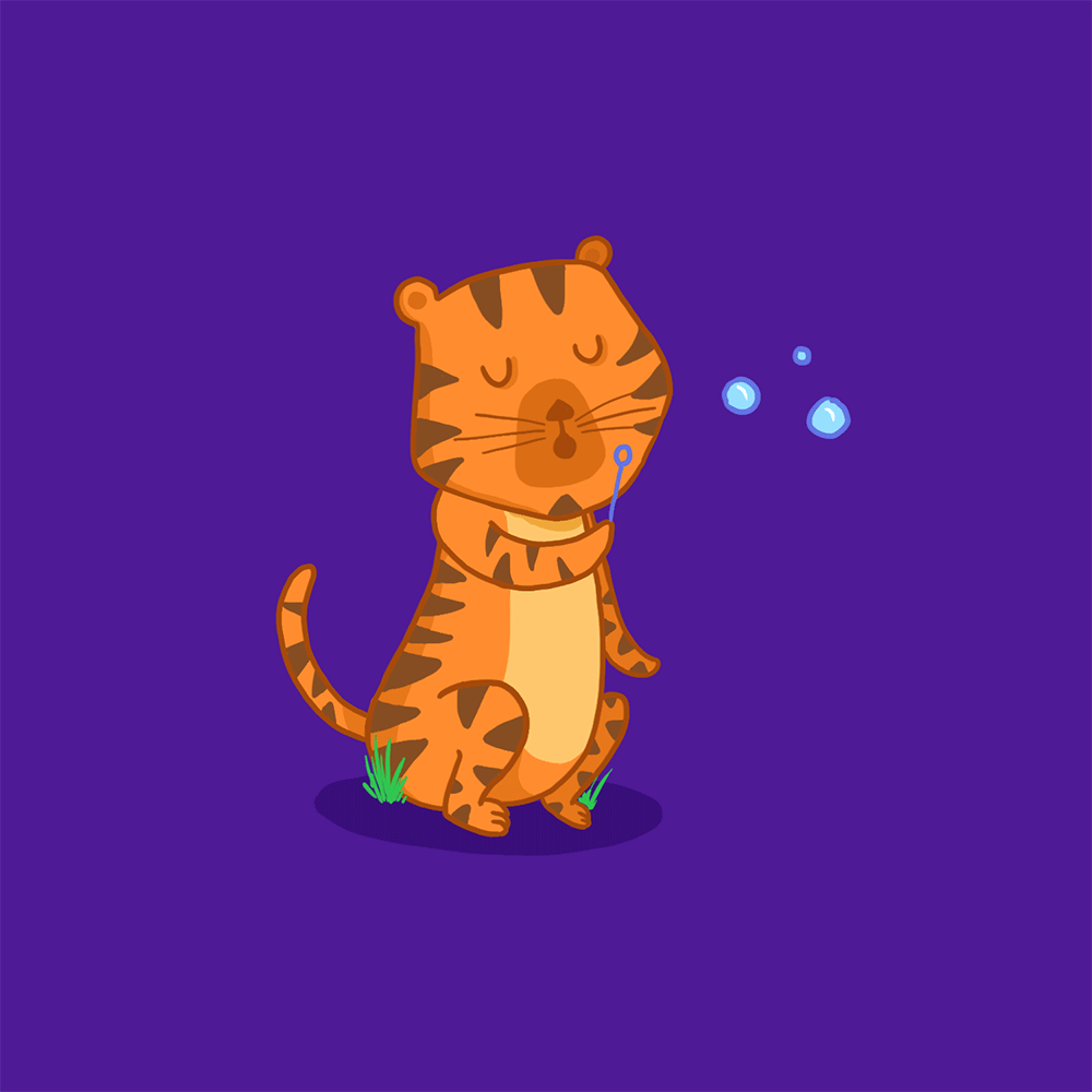
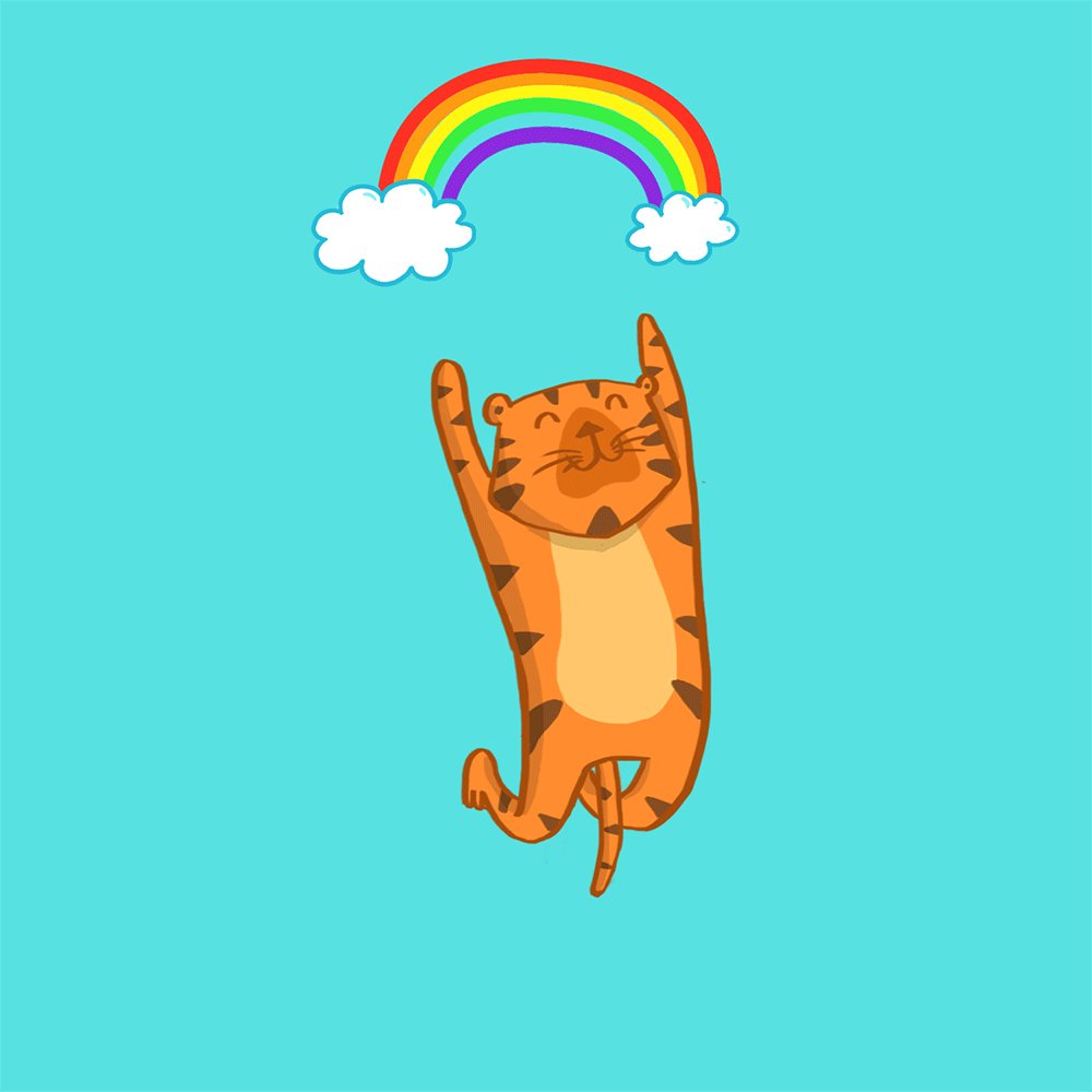
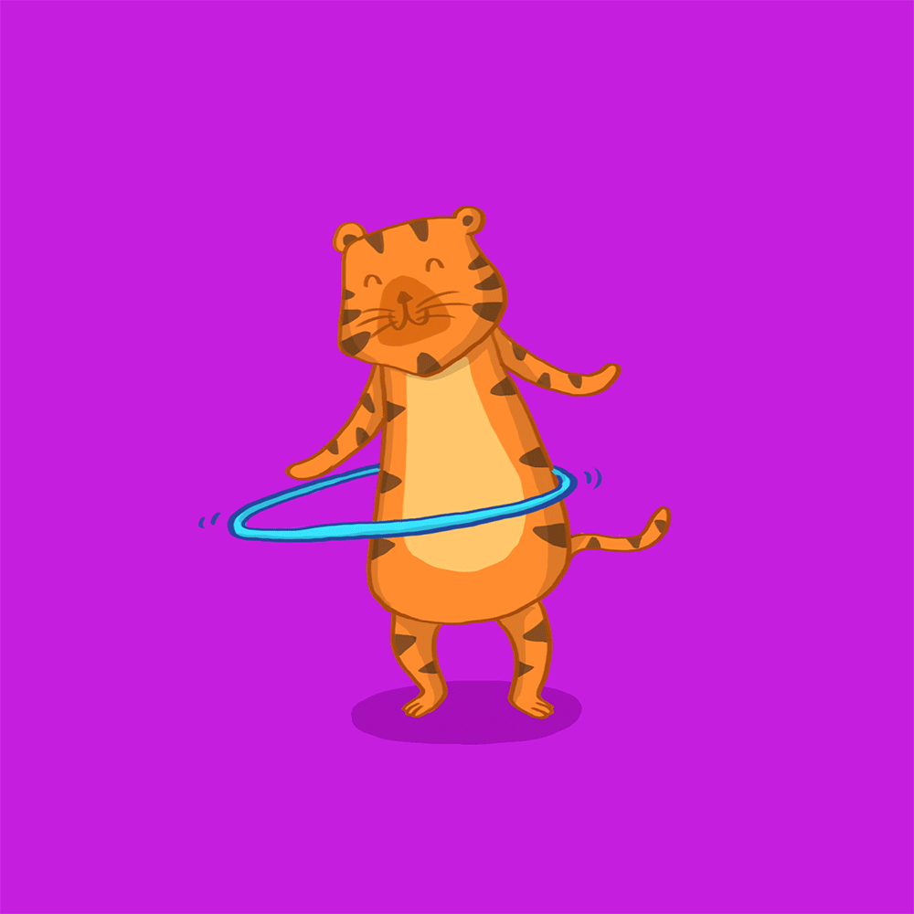
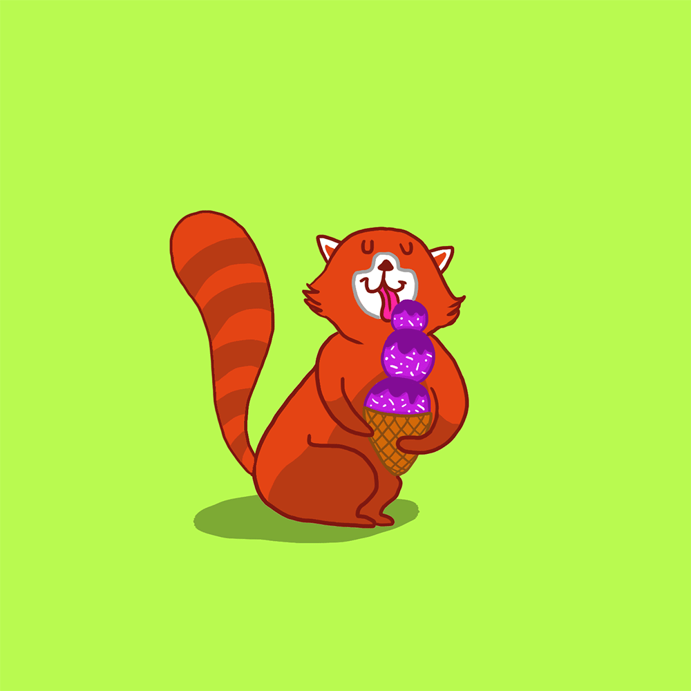
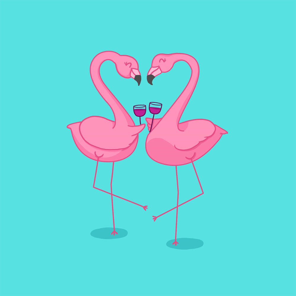
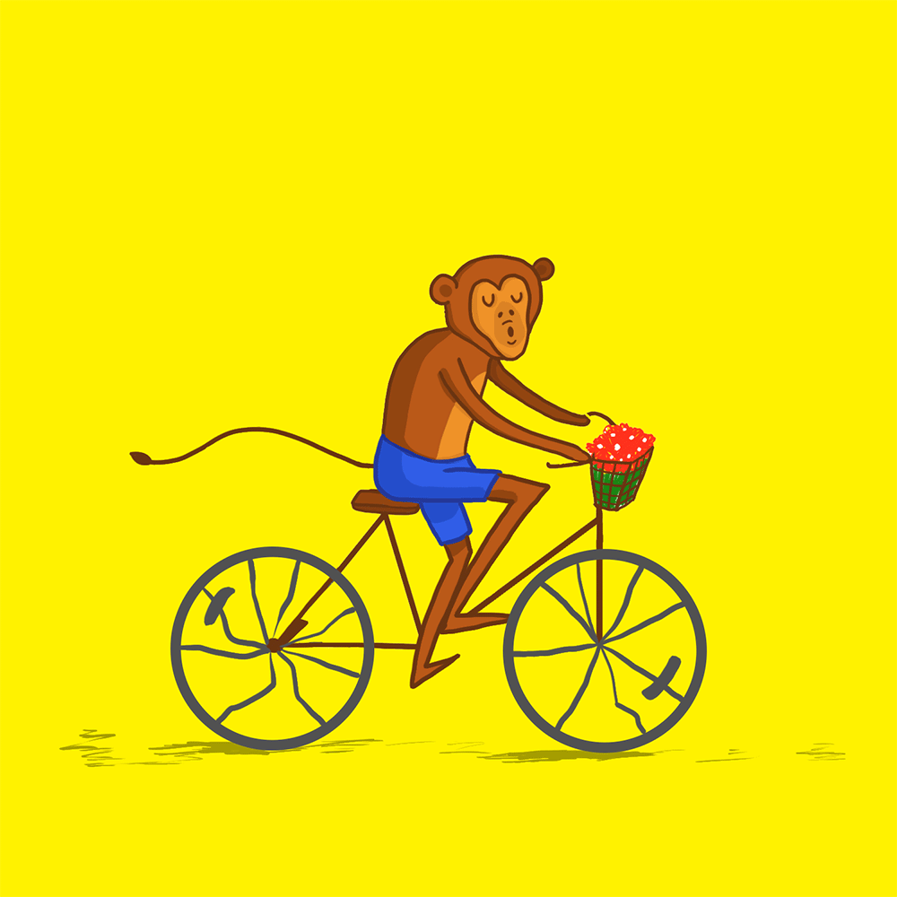
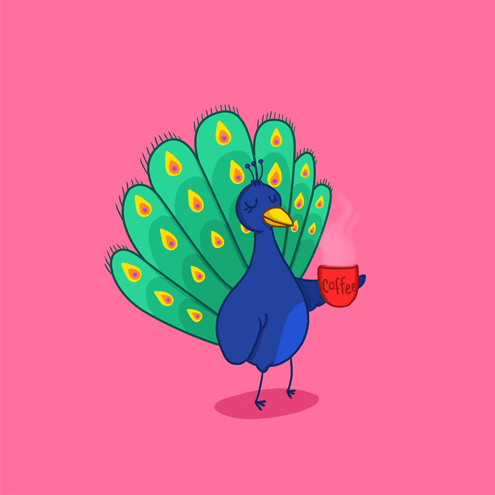
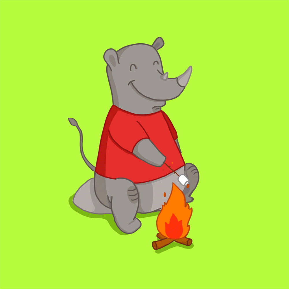
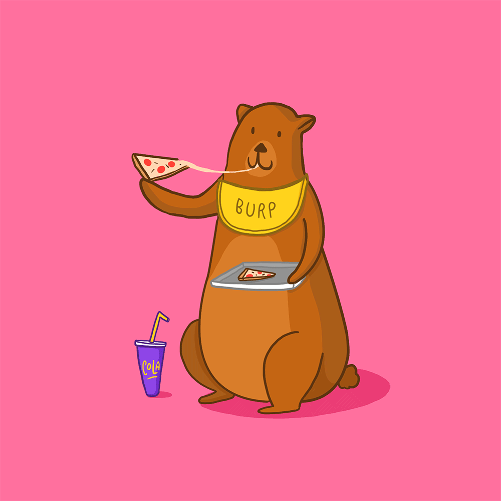
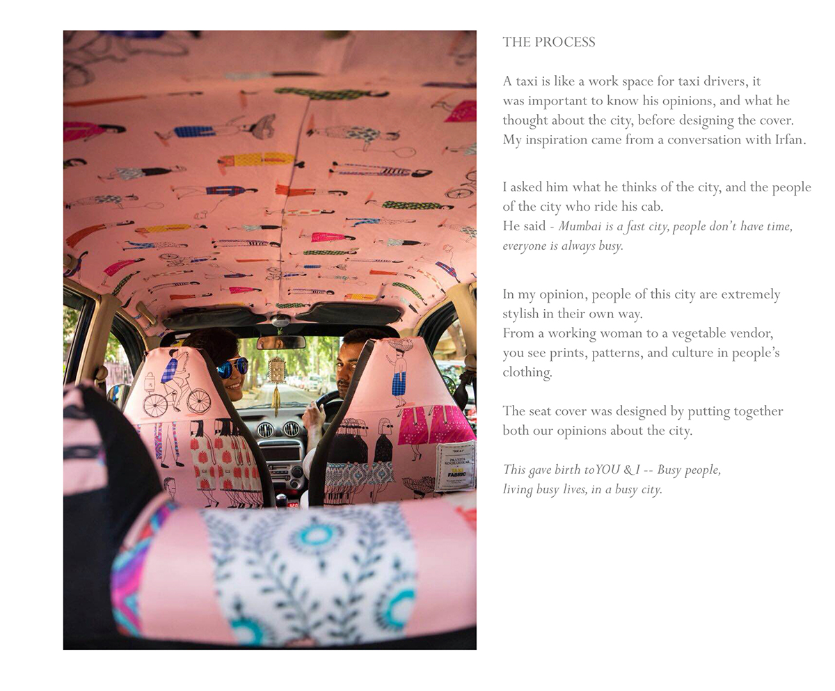
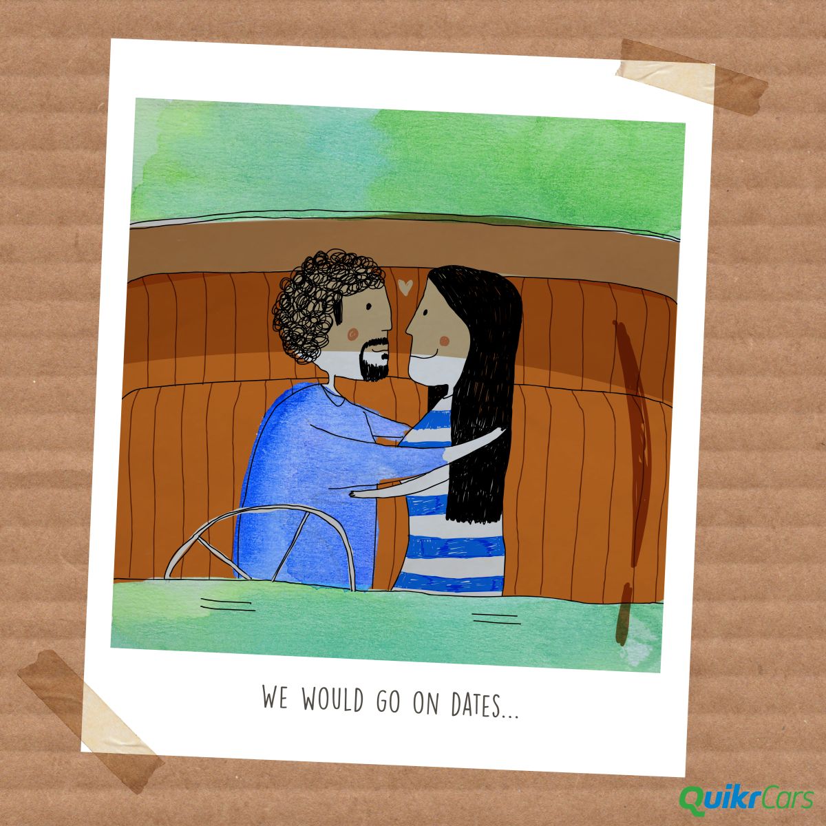
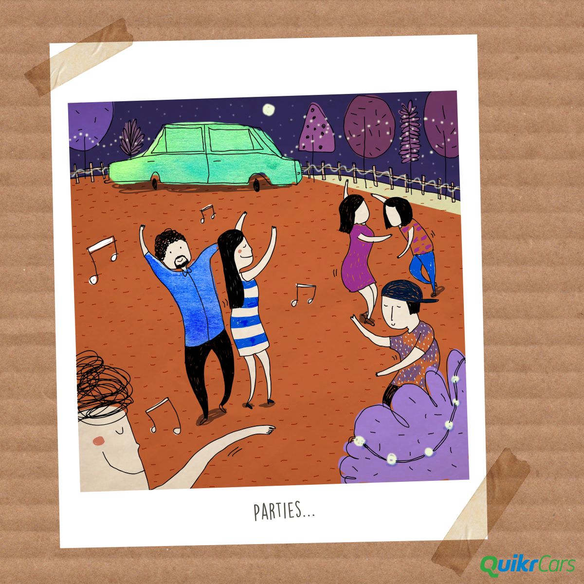
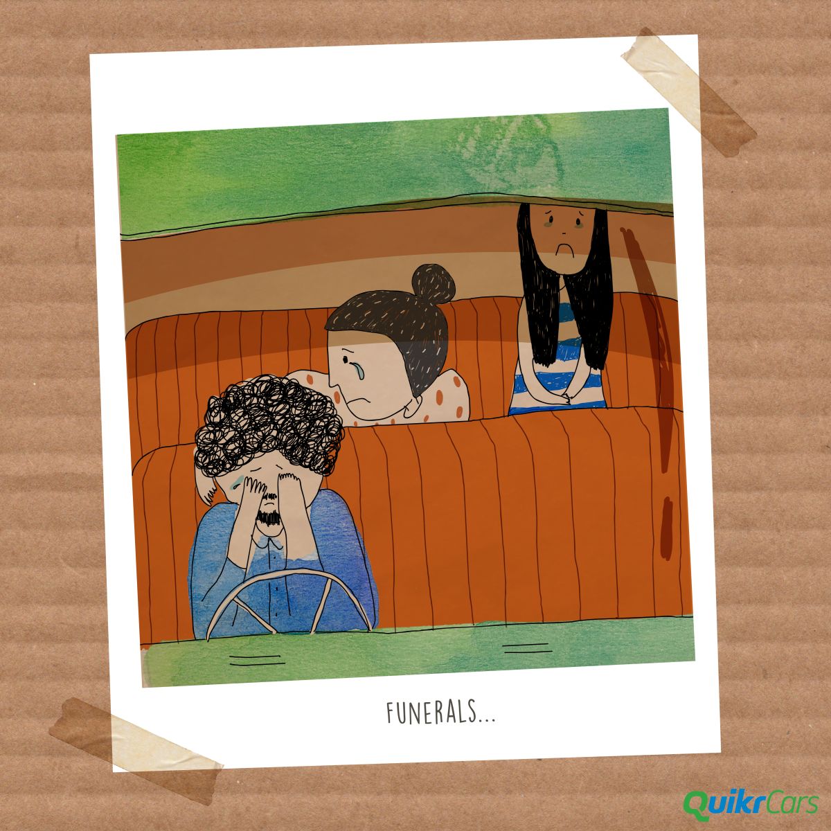
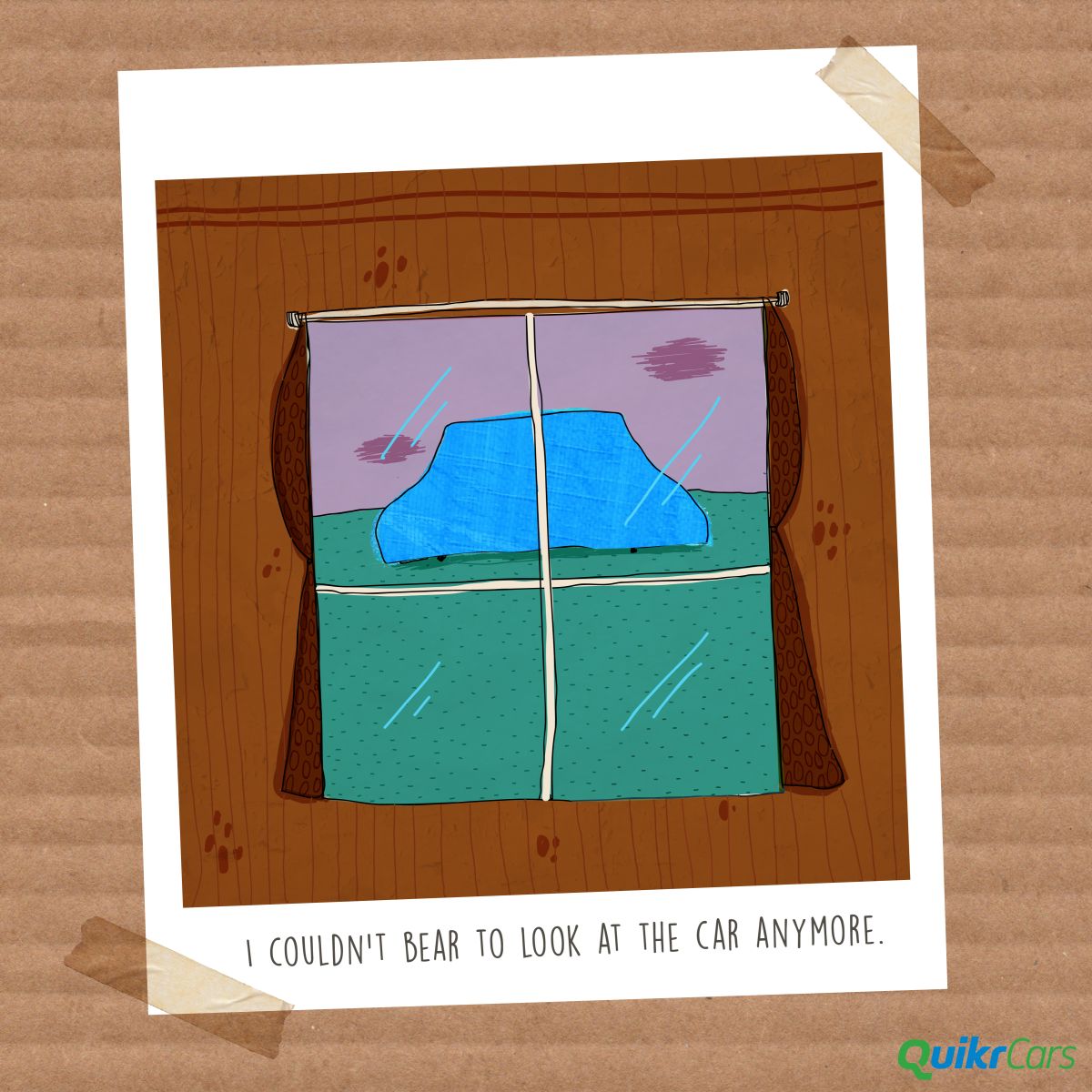
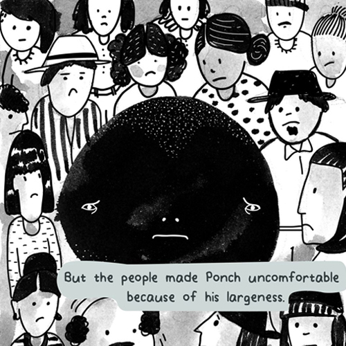
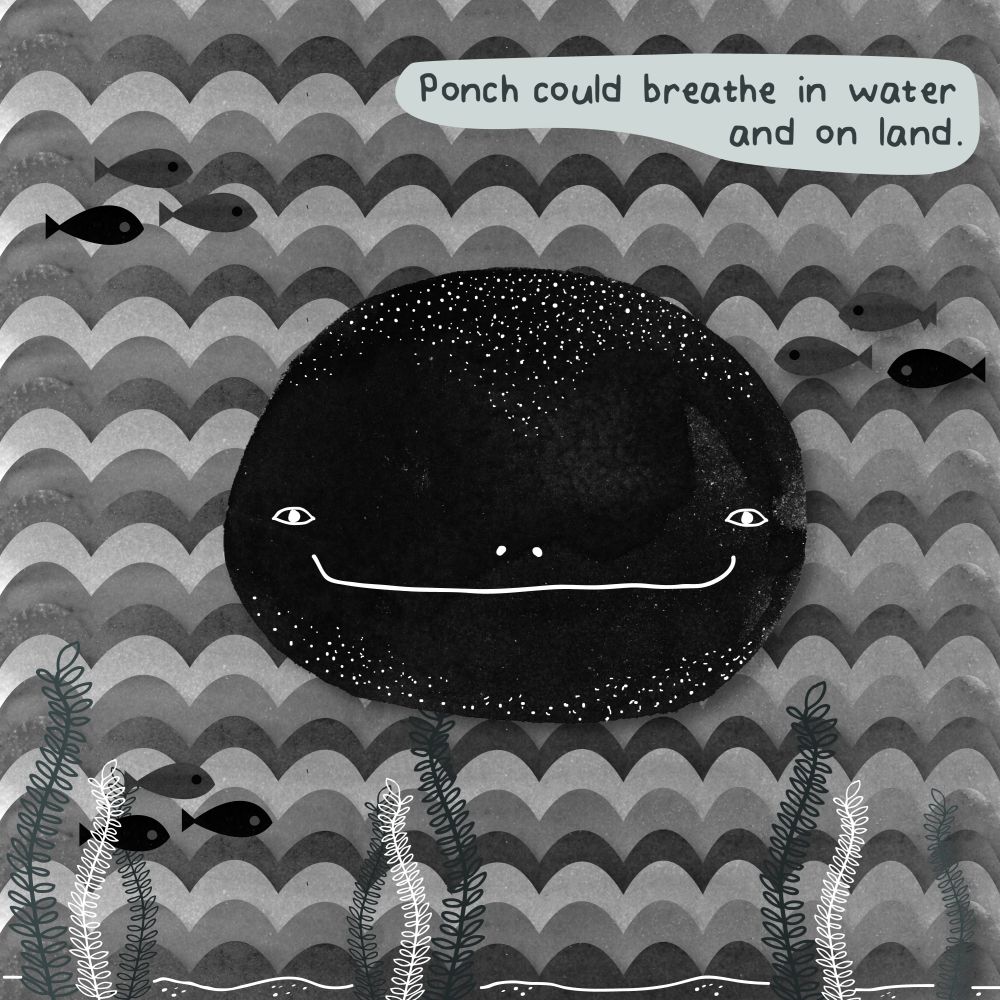
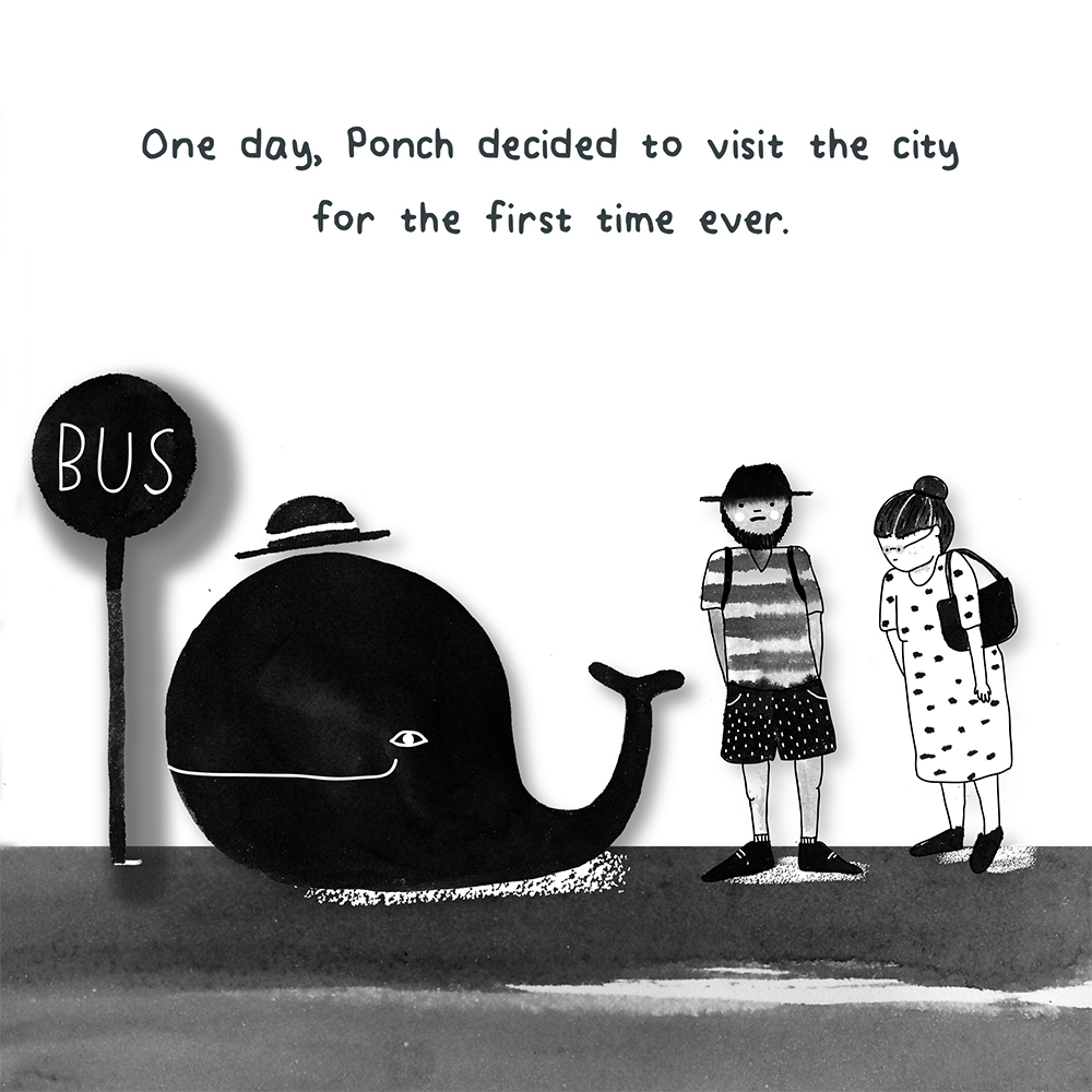
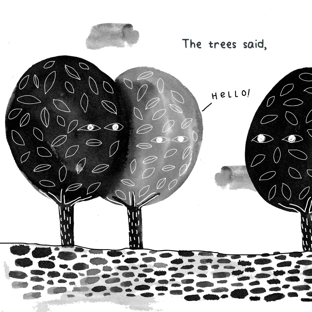
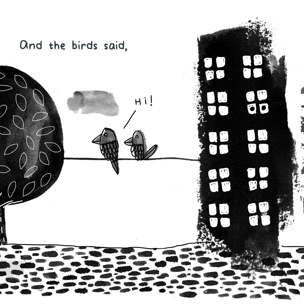
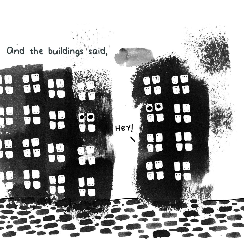
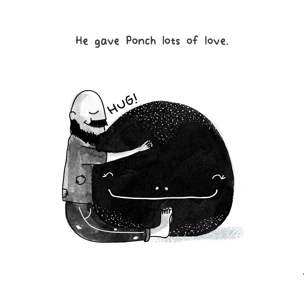
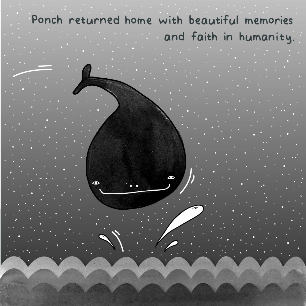
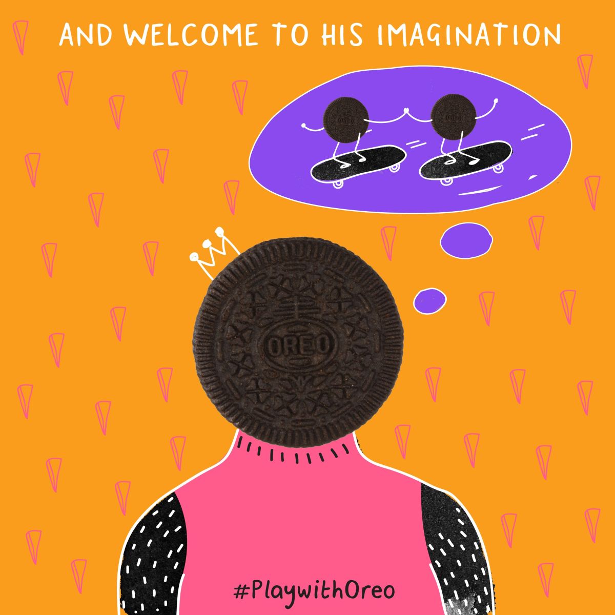
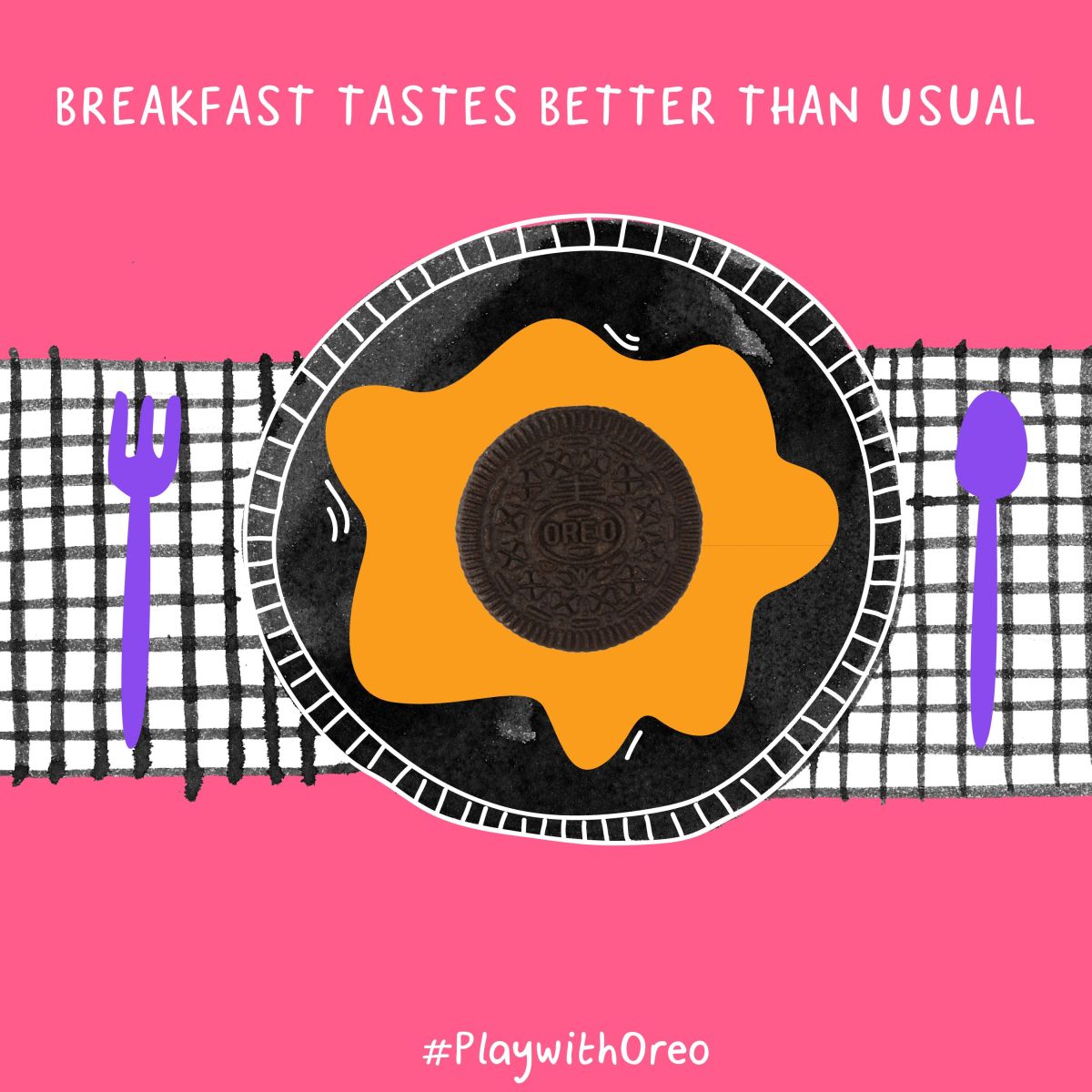
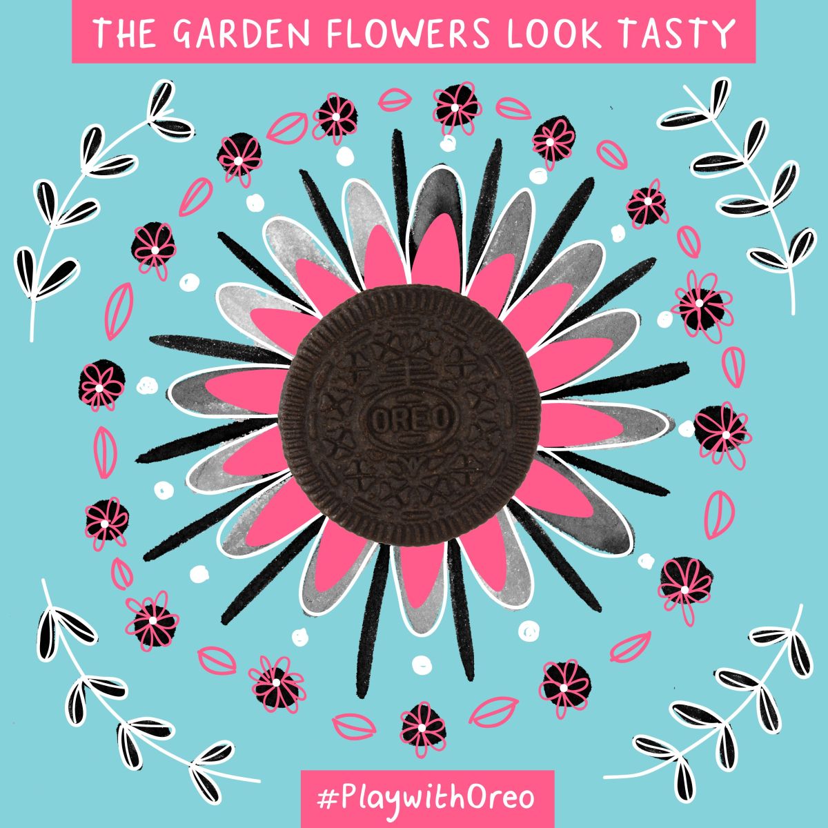
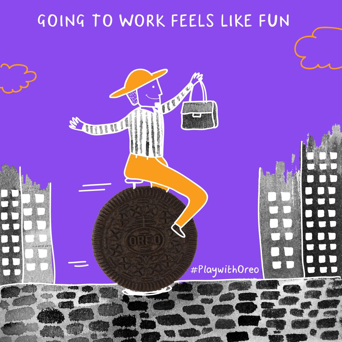
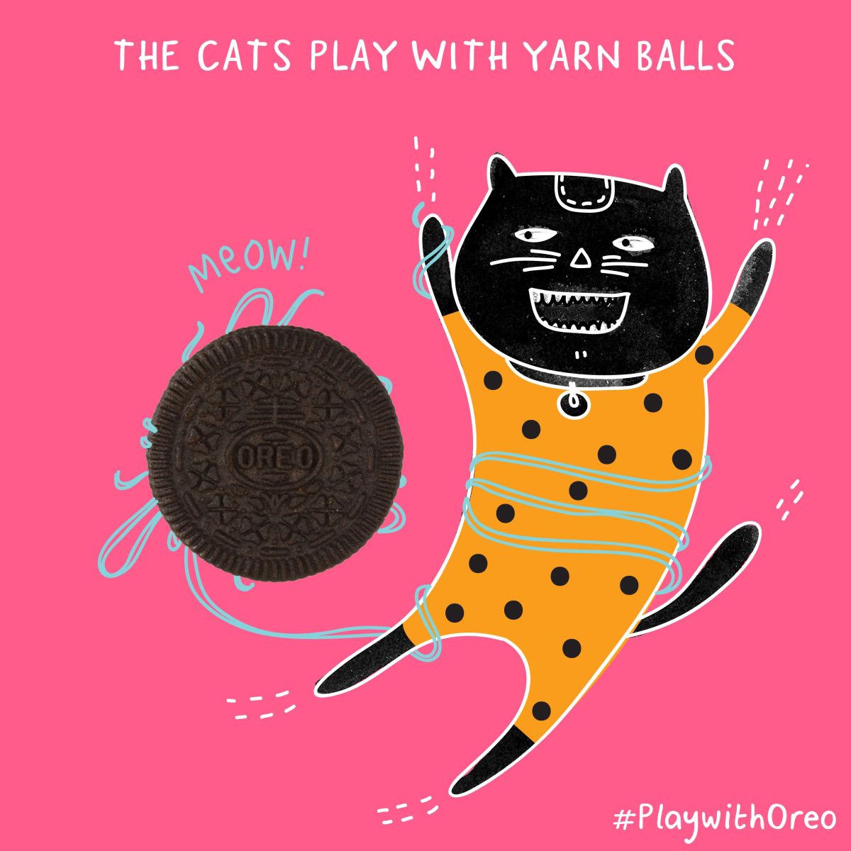
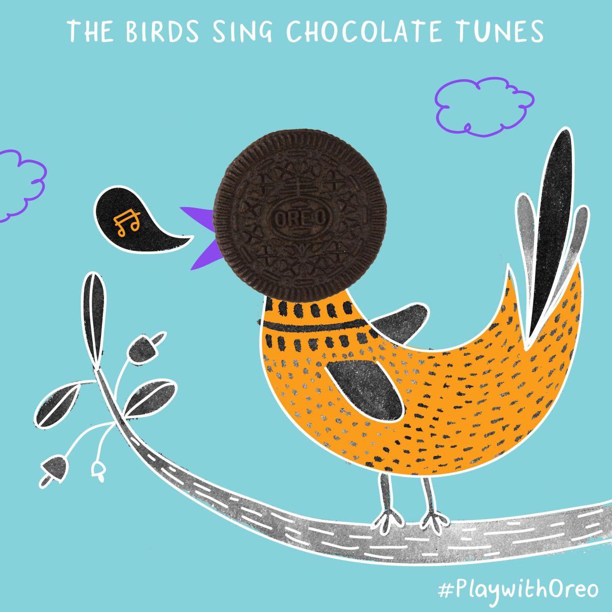
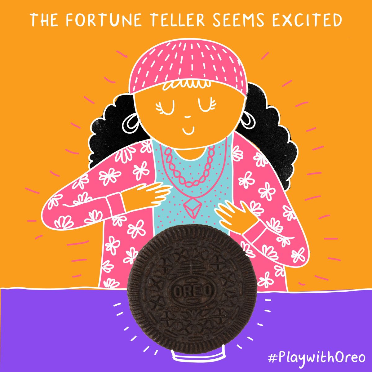
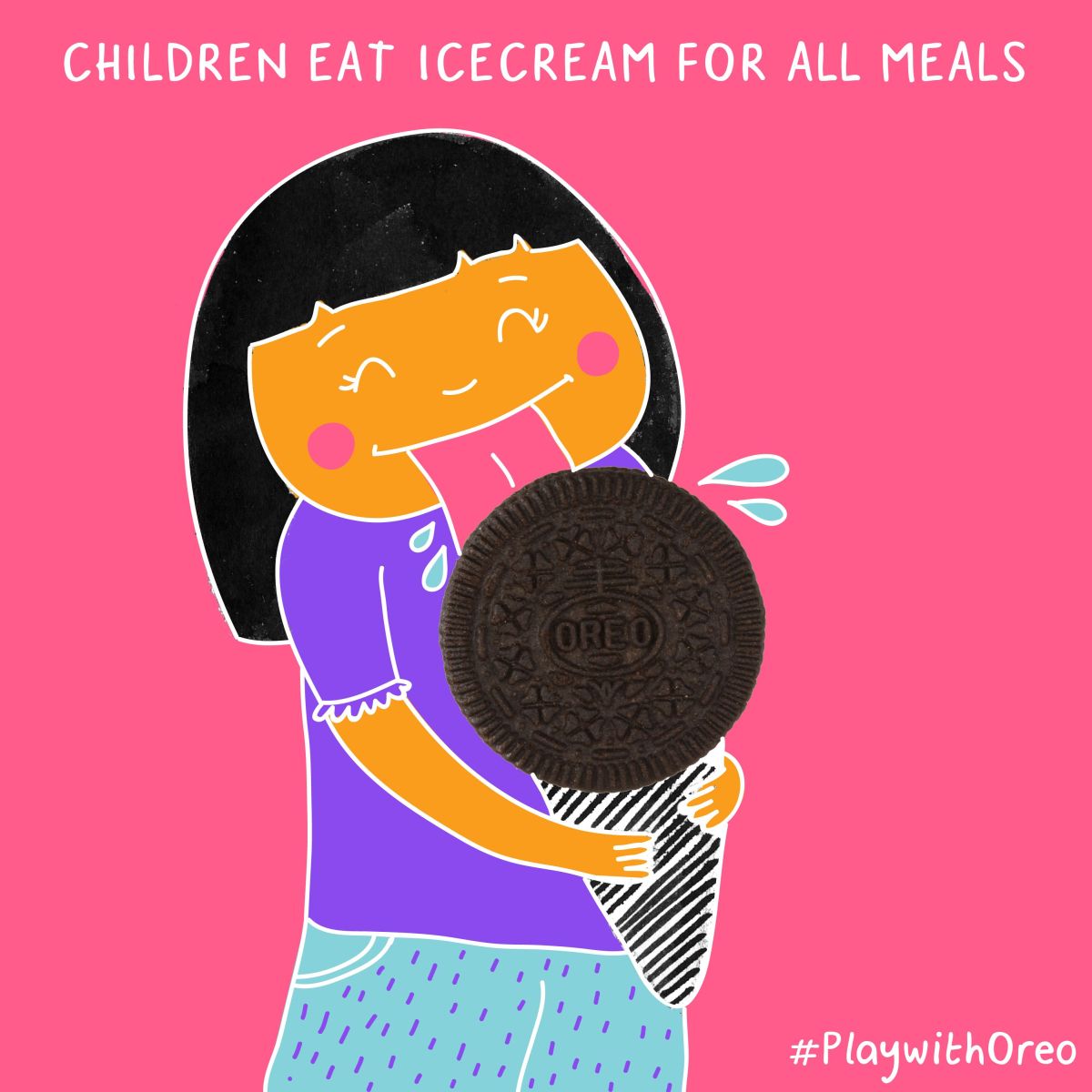
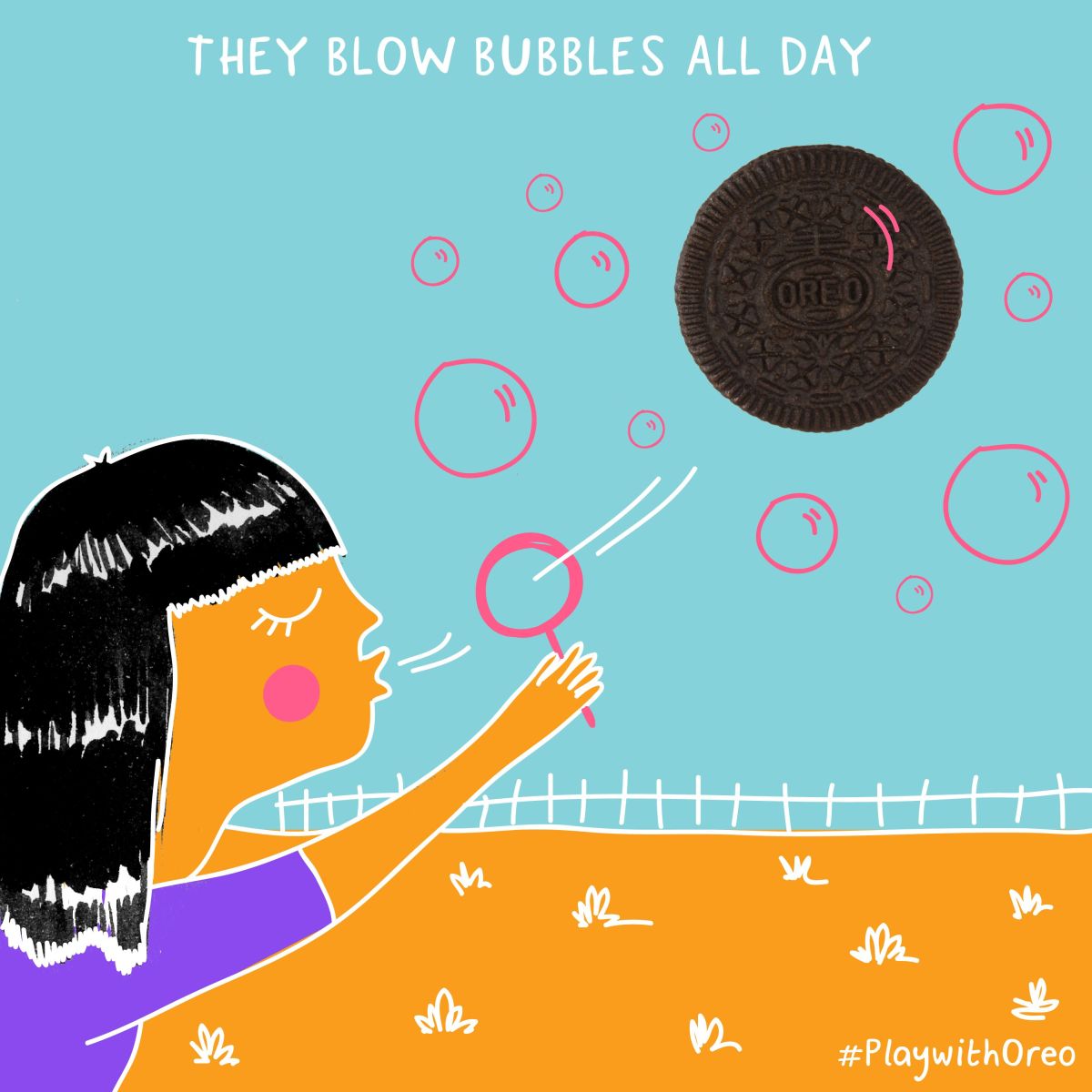
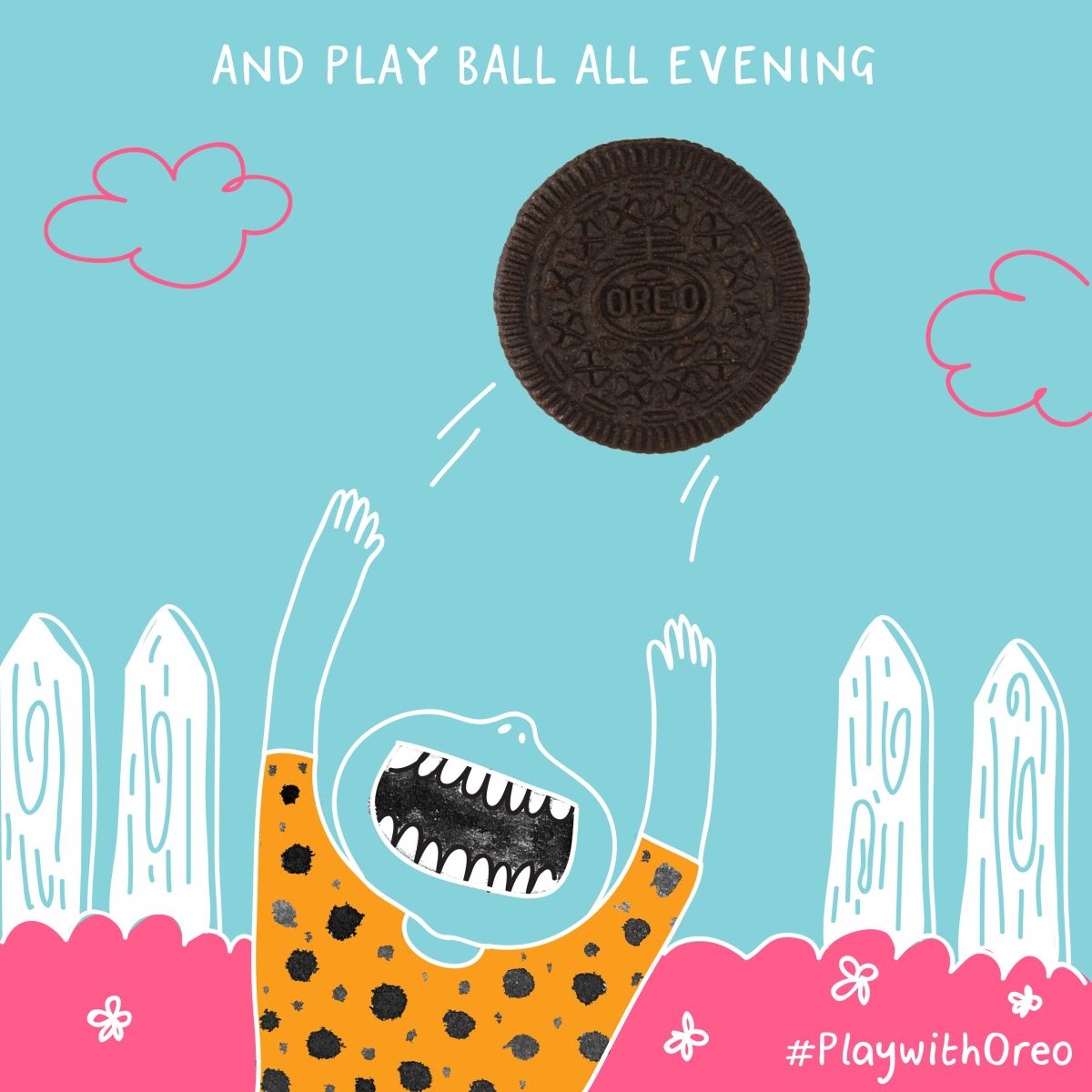
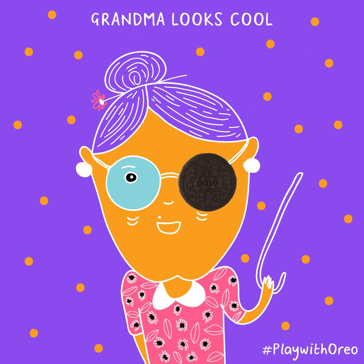
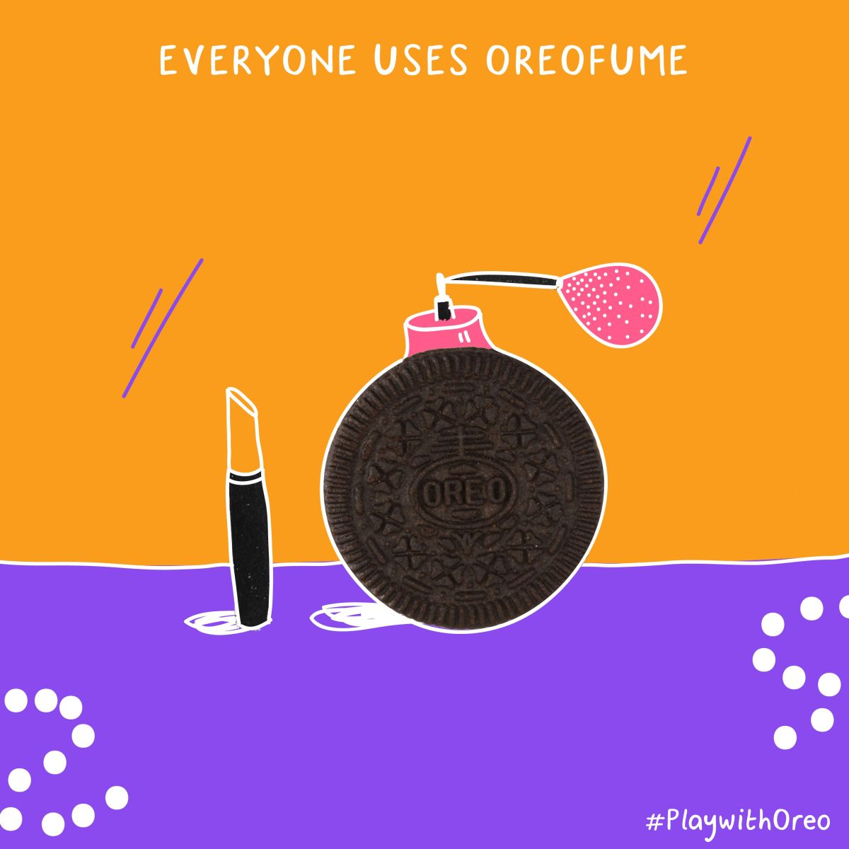
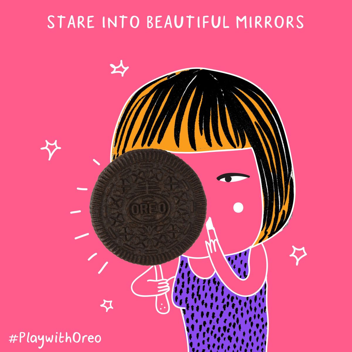
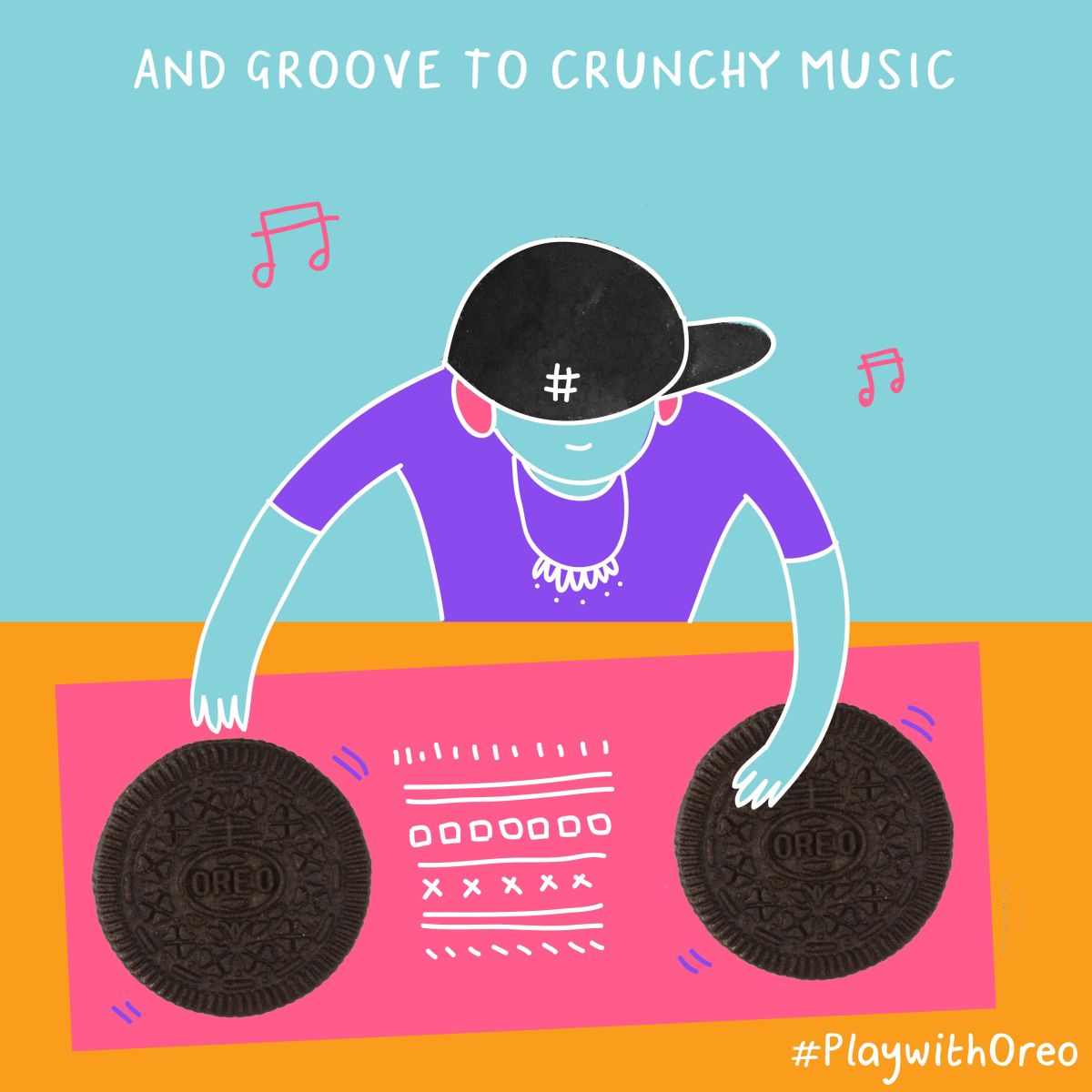
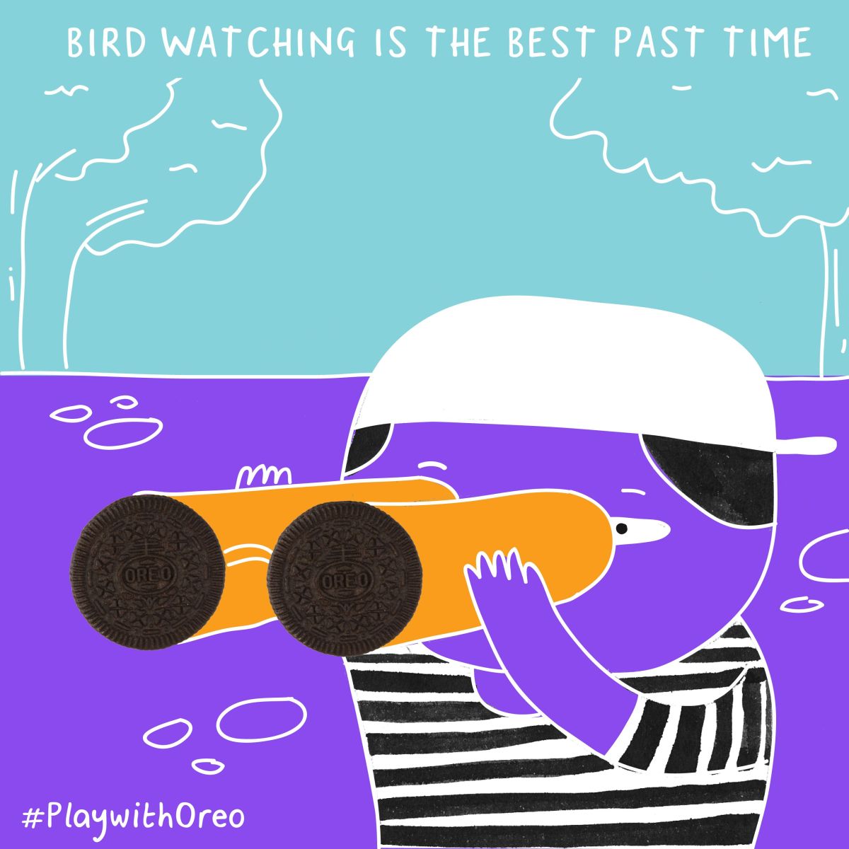
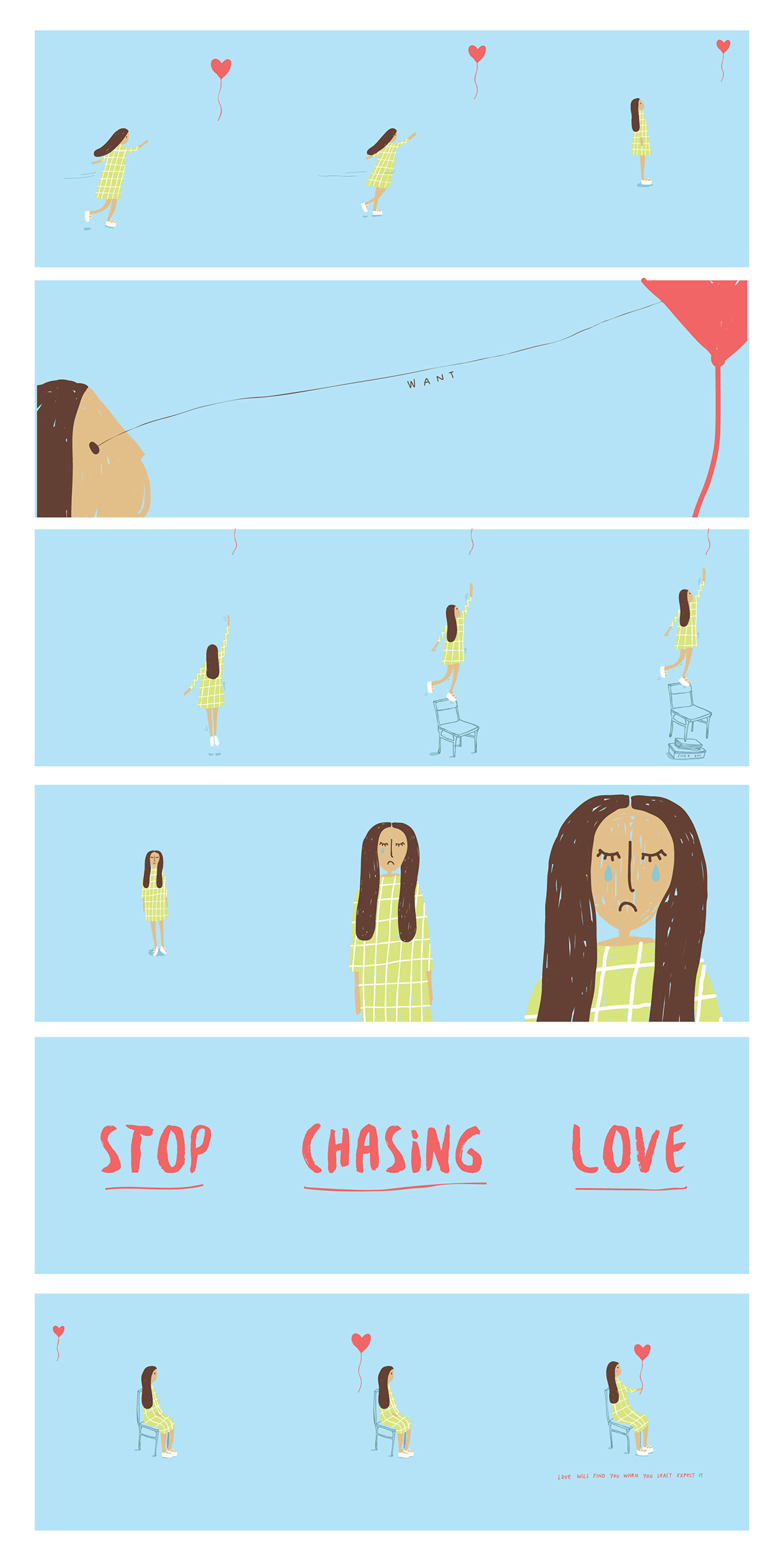
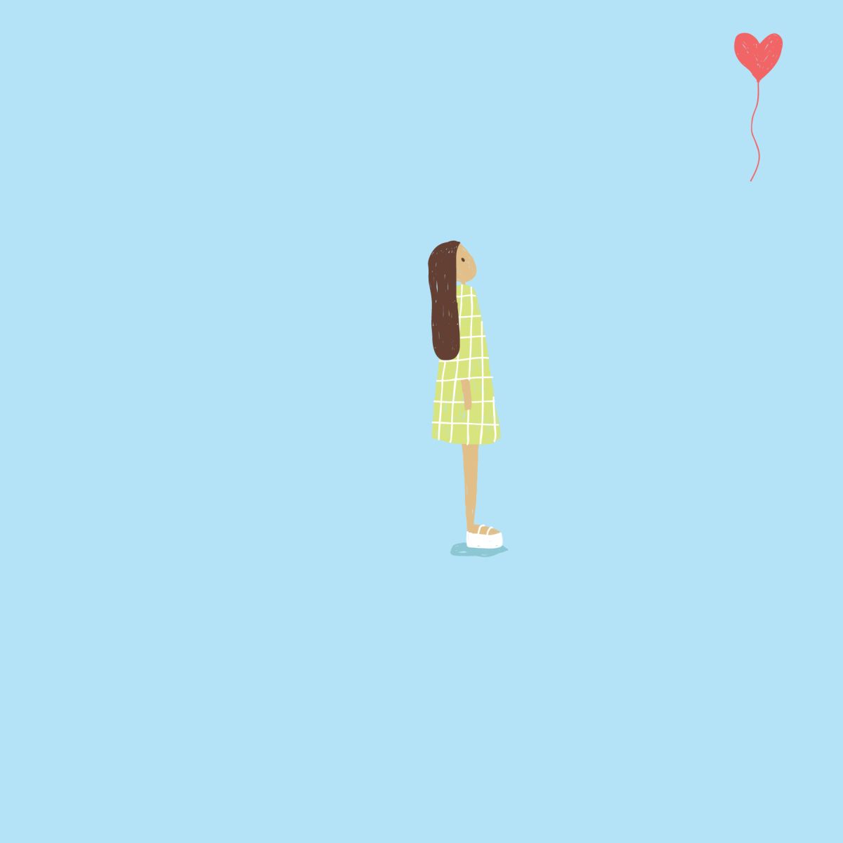
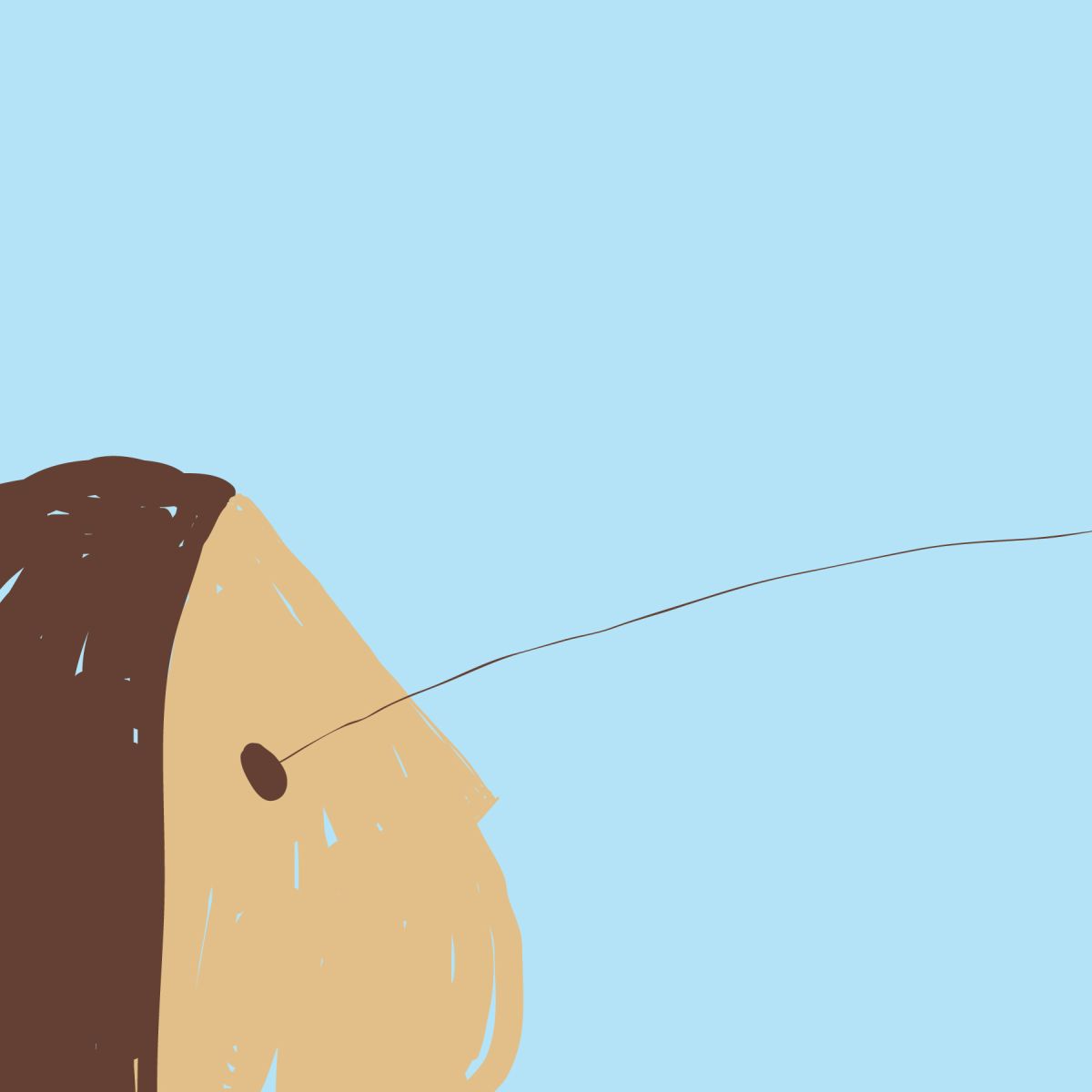
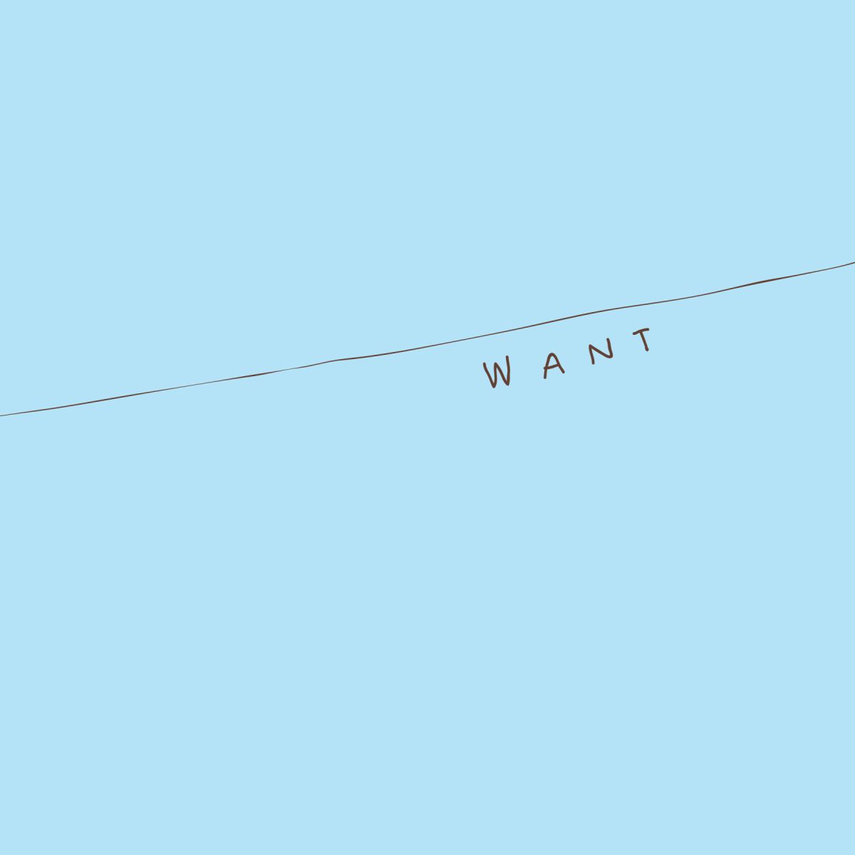
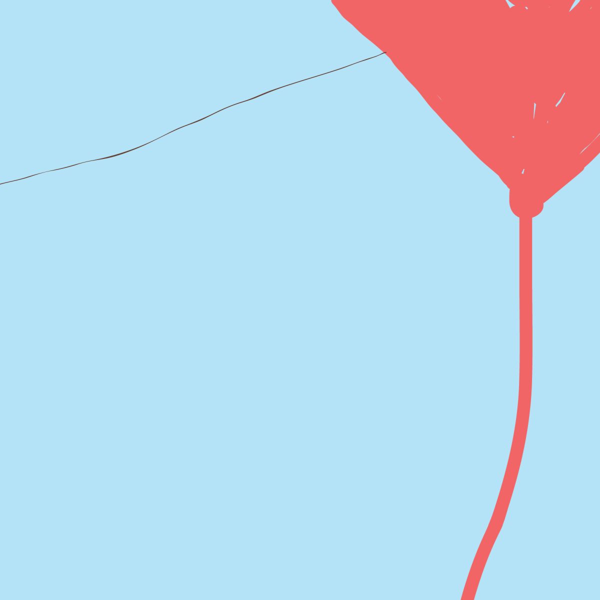
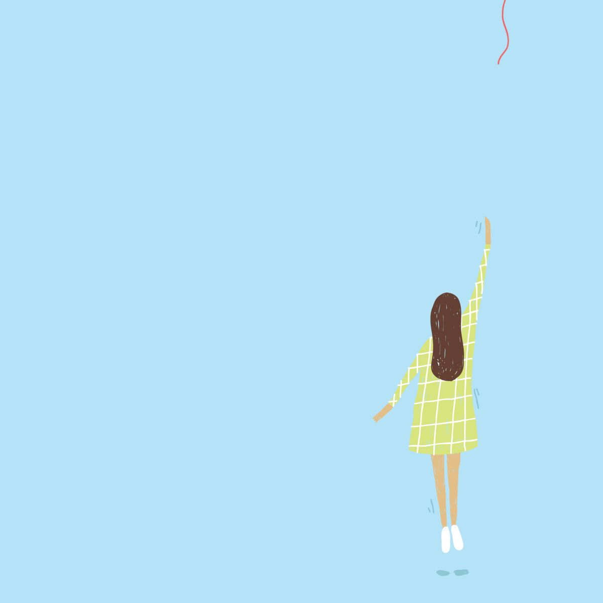
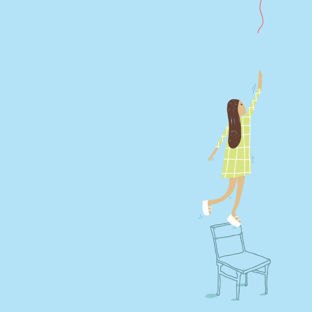
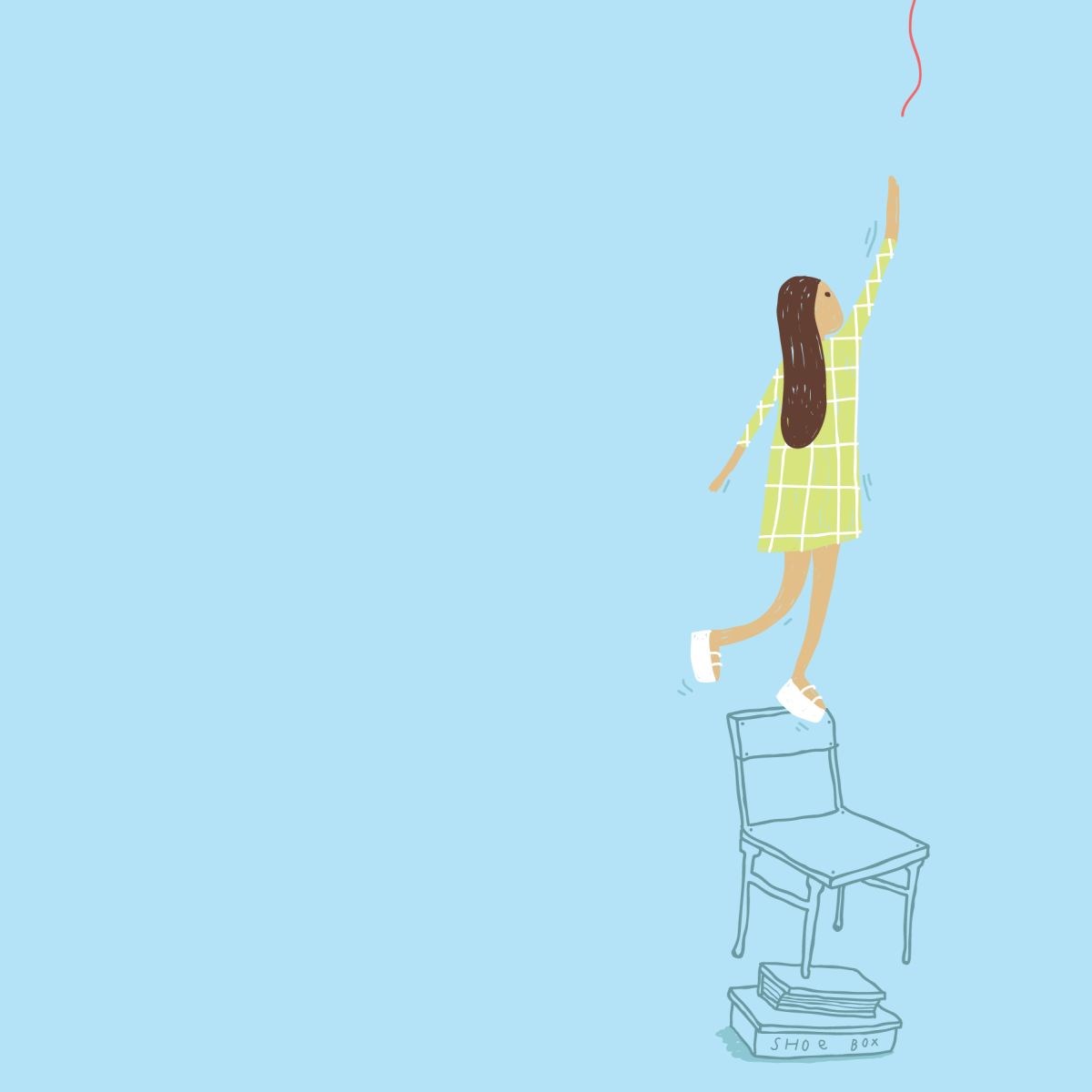
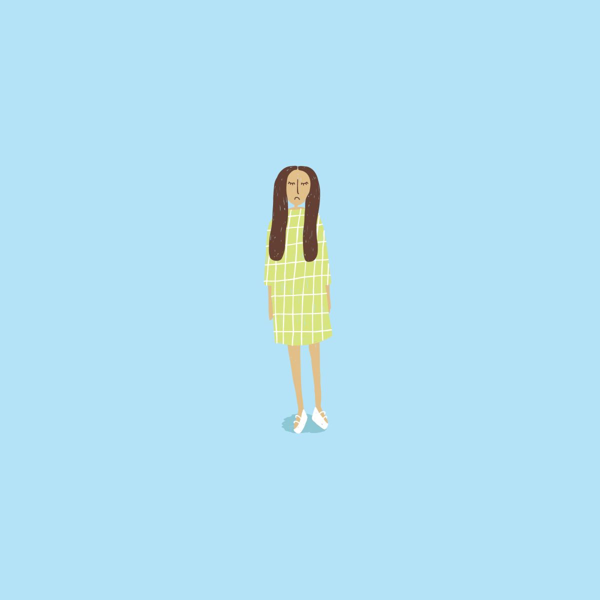
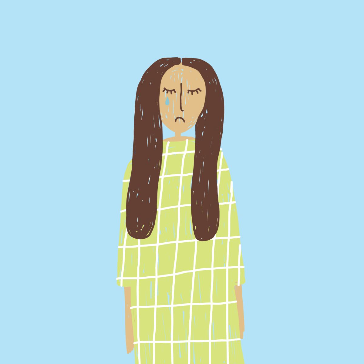
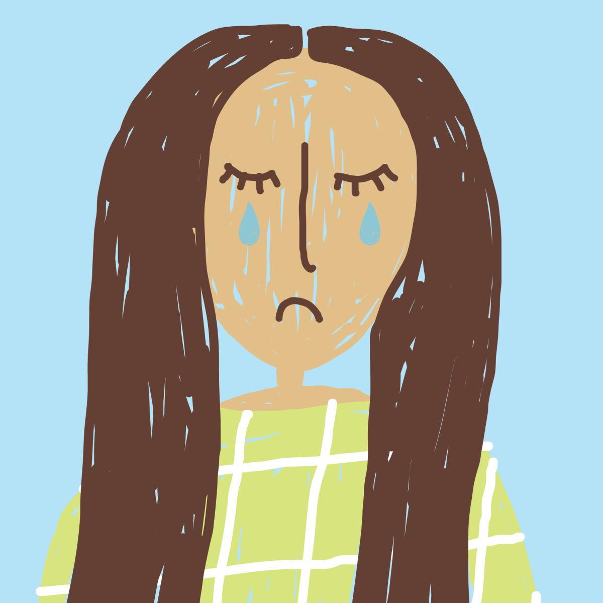
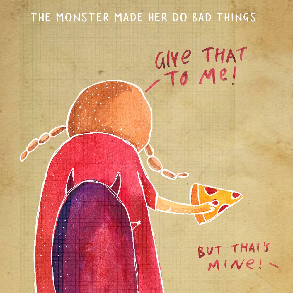
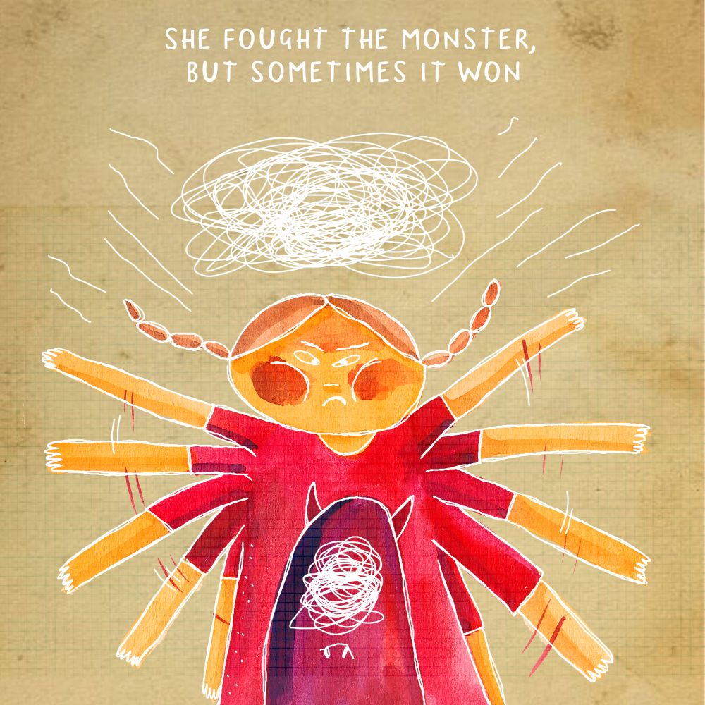
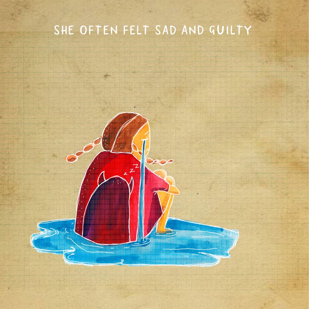
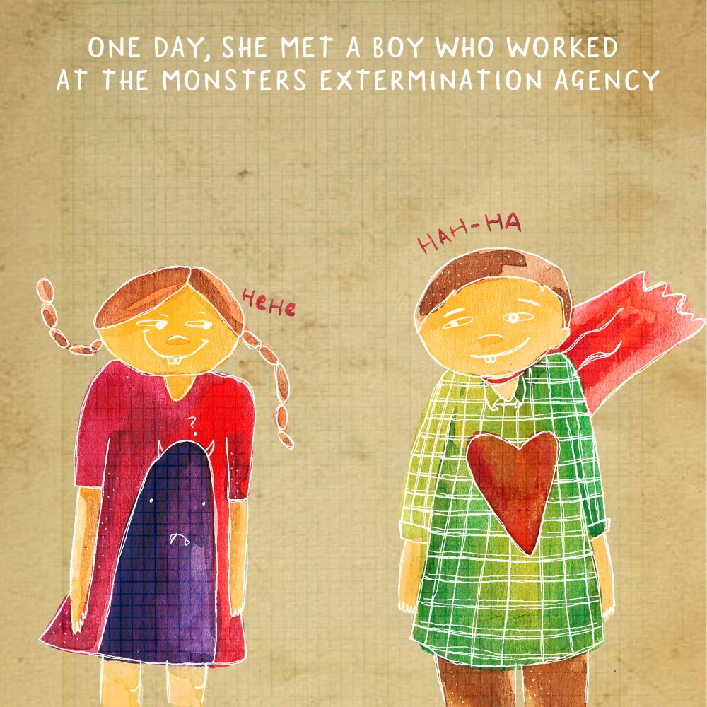
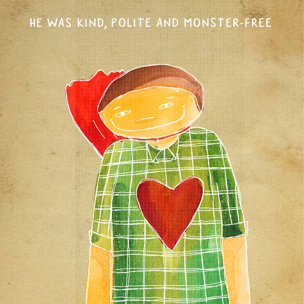
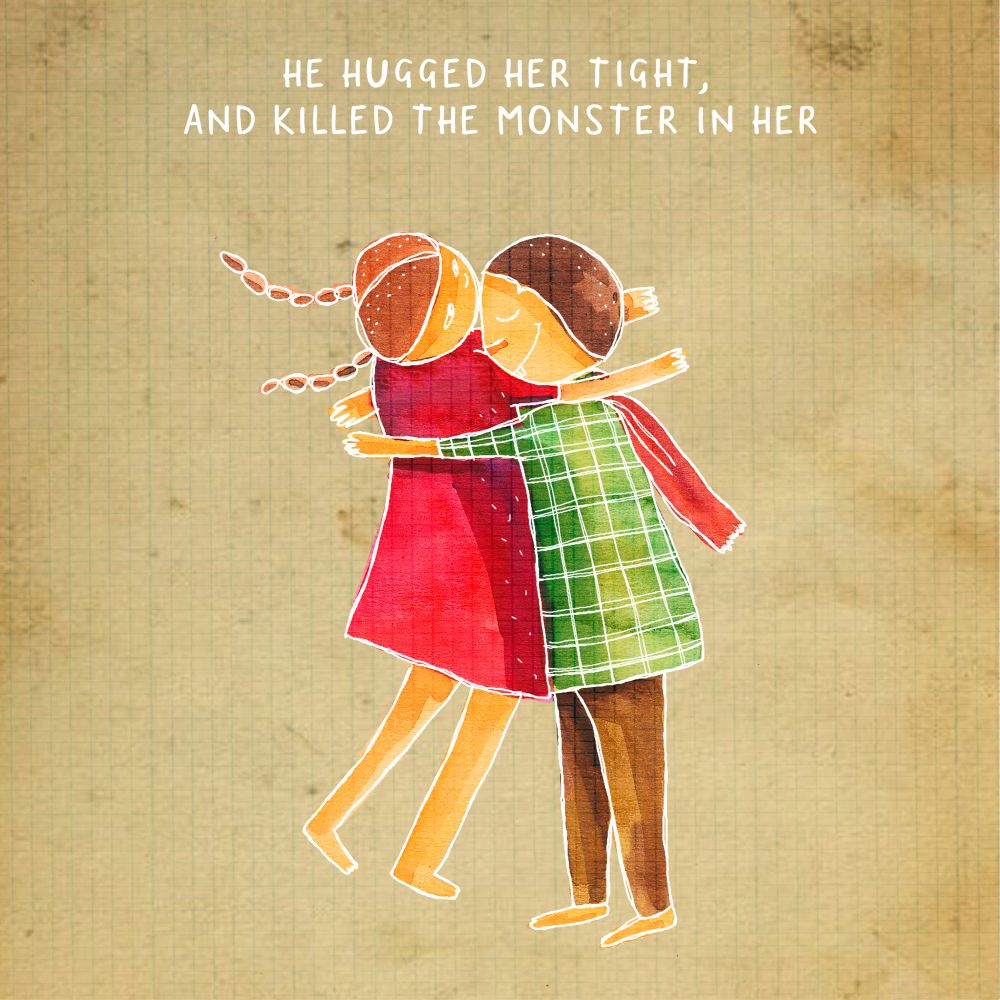
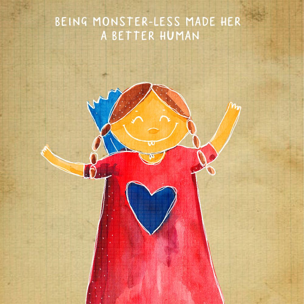
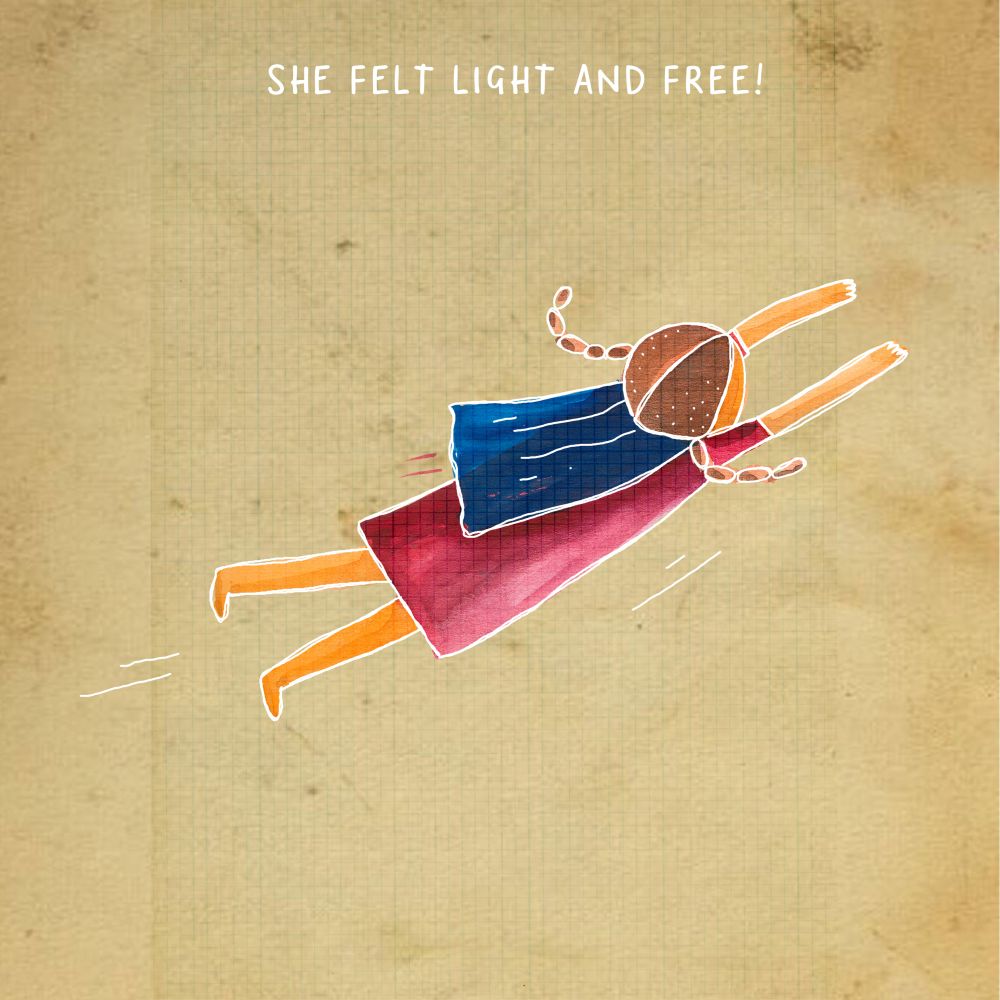
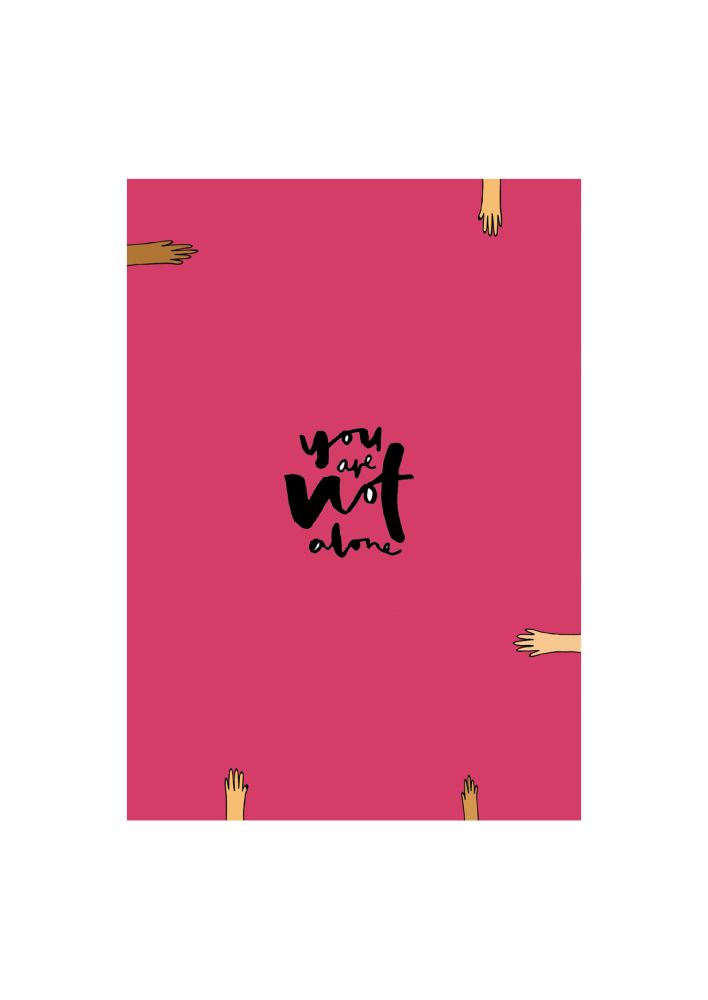
The helplessness and uncertainty of Covid-19 was terrifying for my already existing high functioning anxiety. After a long, tiring year, what helped me the most was to slow down and observe the simple pleasures of everyday life. Amidst the everyday hustle, the little things kept me going. I noticed that:
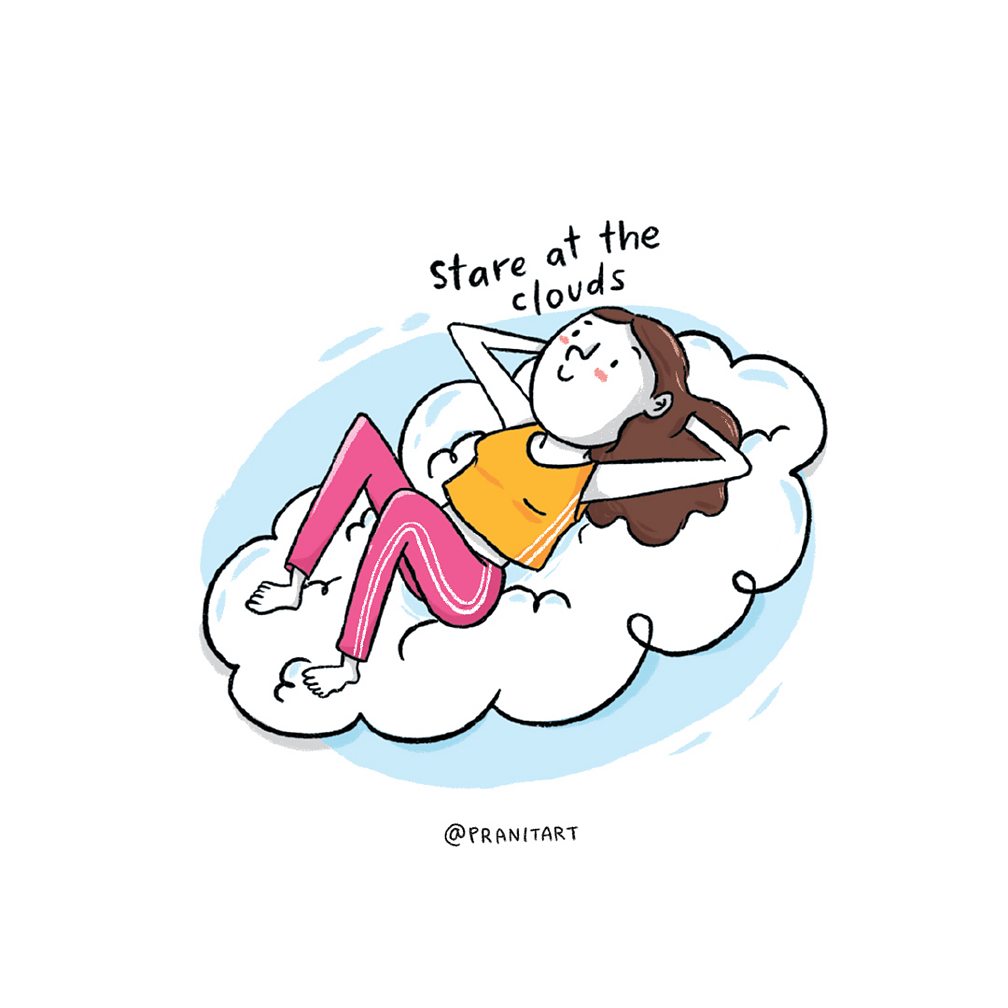
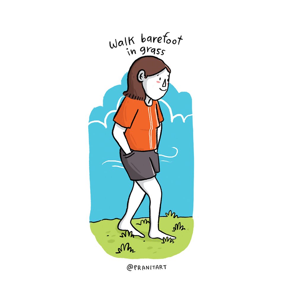
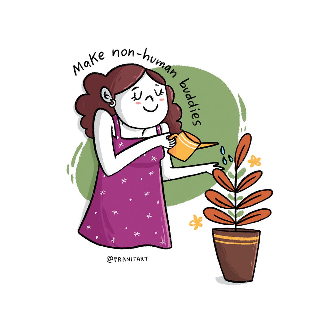
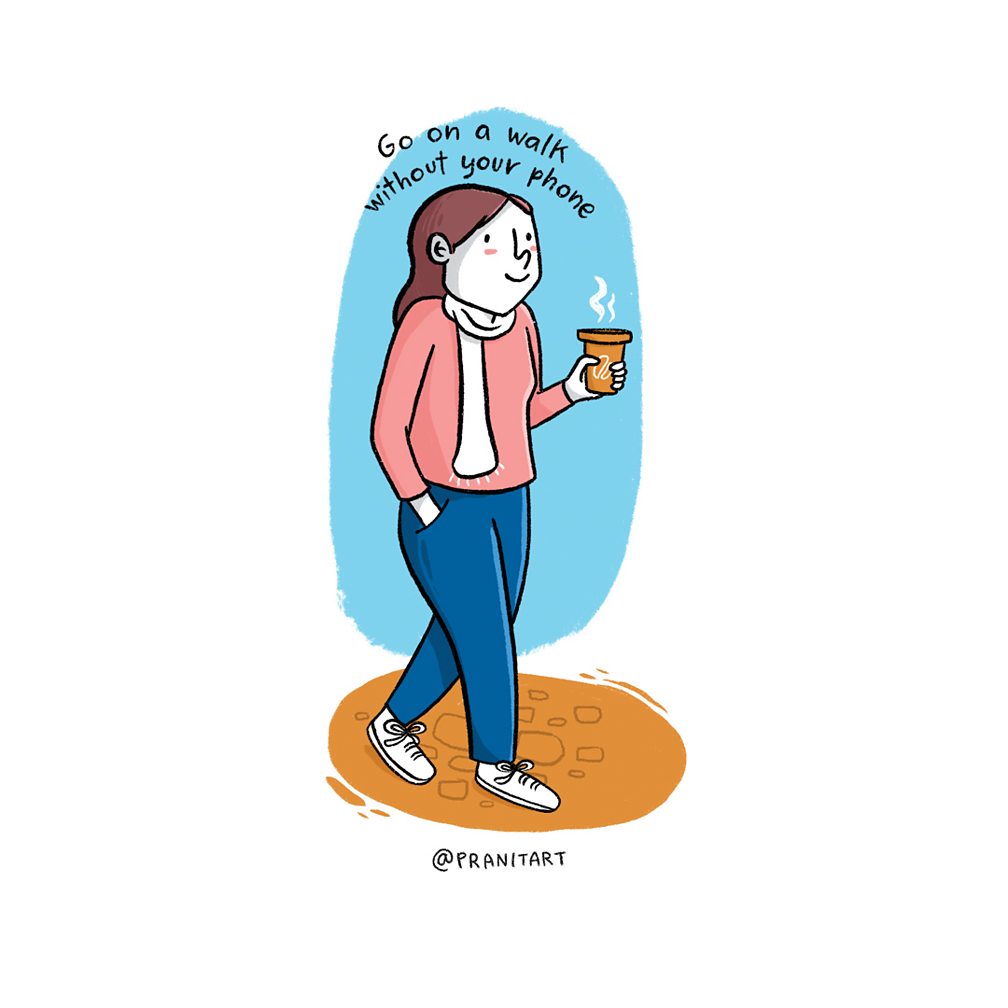
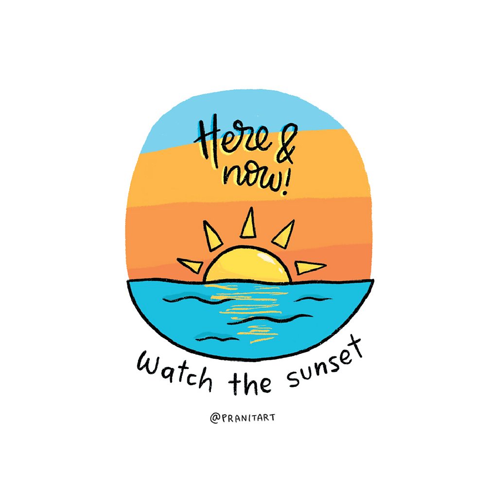
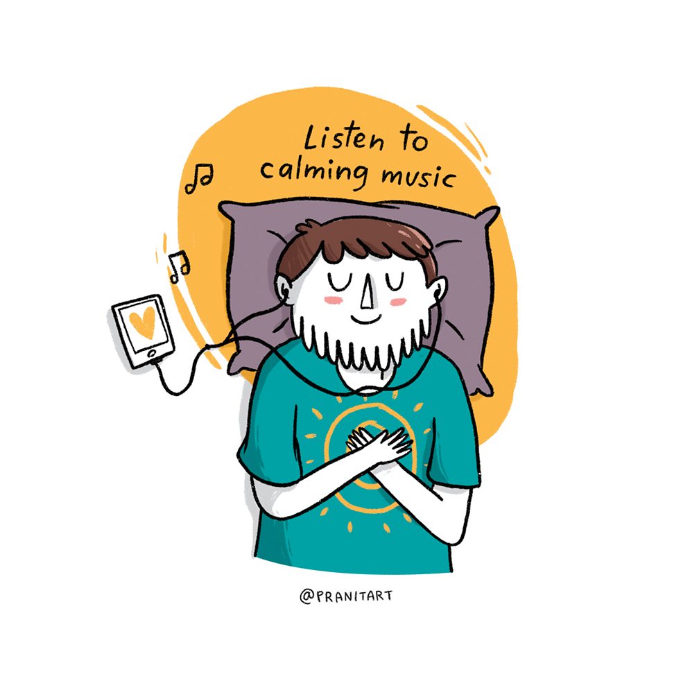
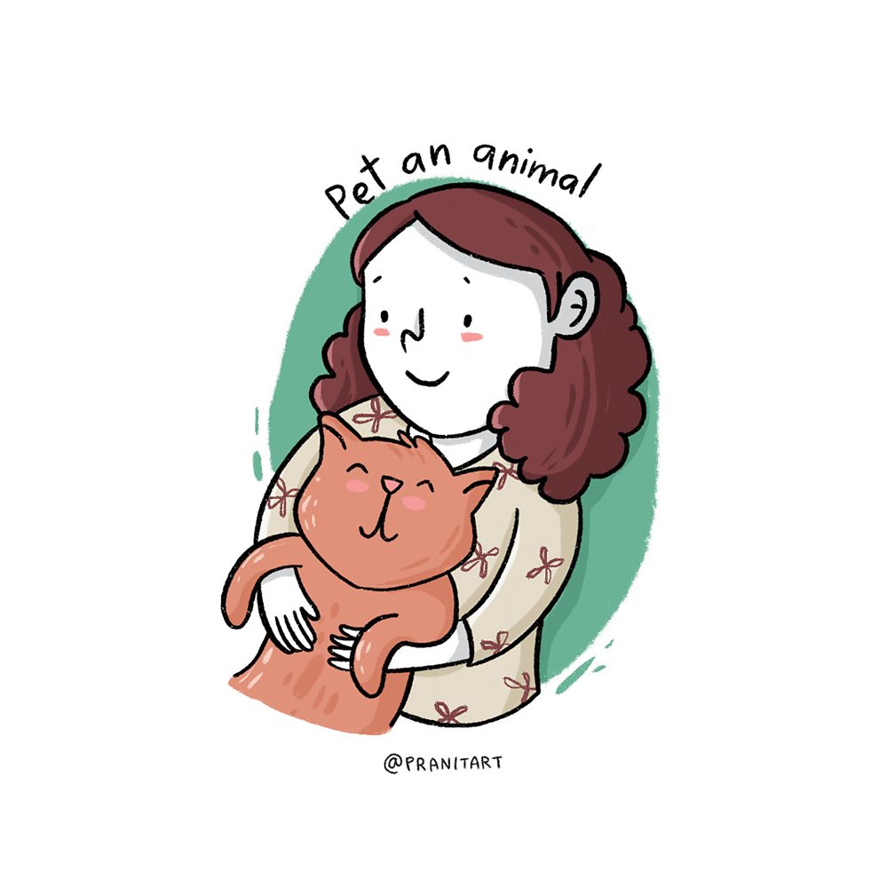
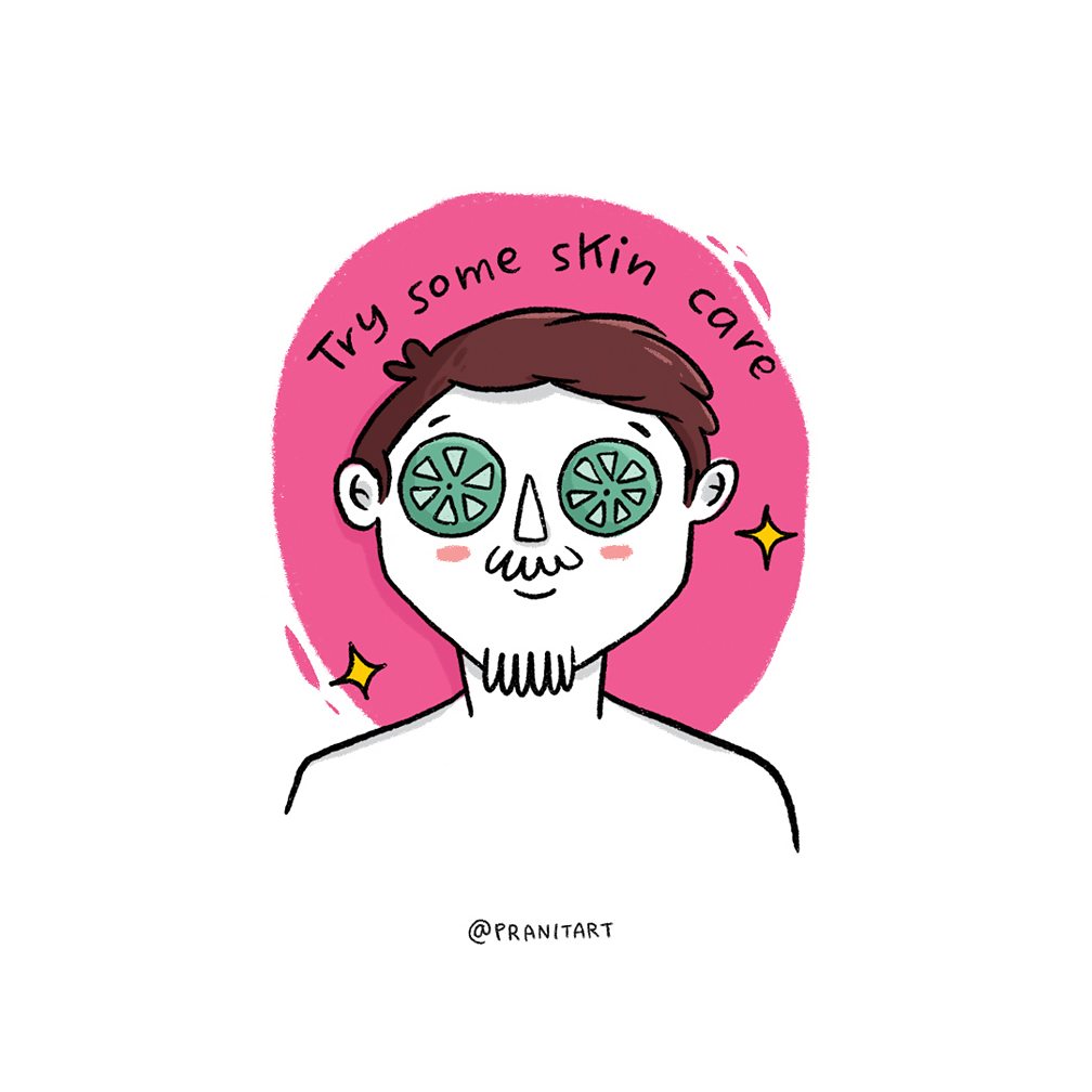
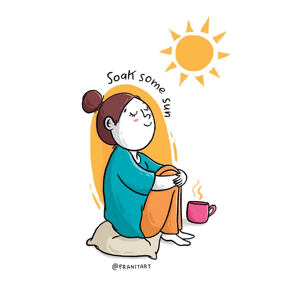
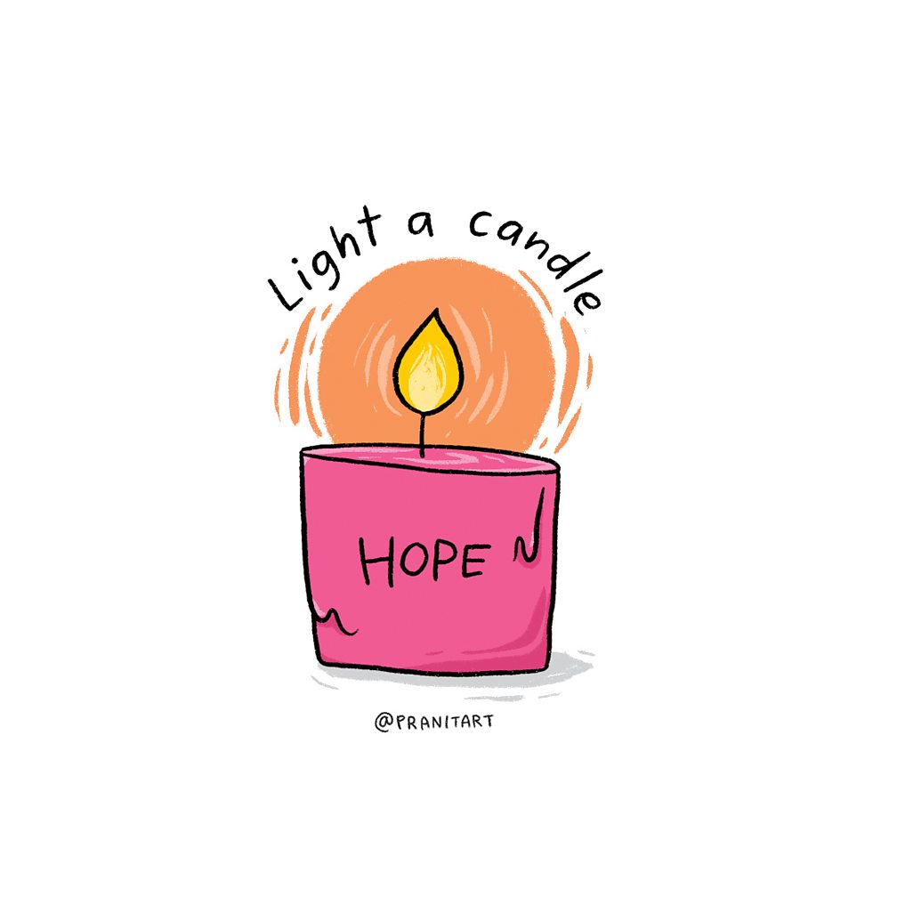
It made me realise that no matter how hard or bad life gets, it is living and experiencing these moments that helps me get through the tough days 🙂
————————————————————————————————————————-
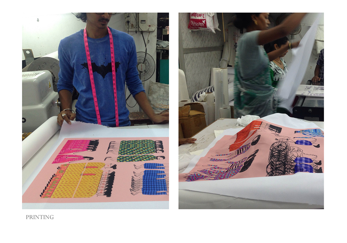
This was commissioned by BCC for my thoughts, writing and illustration.
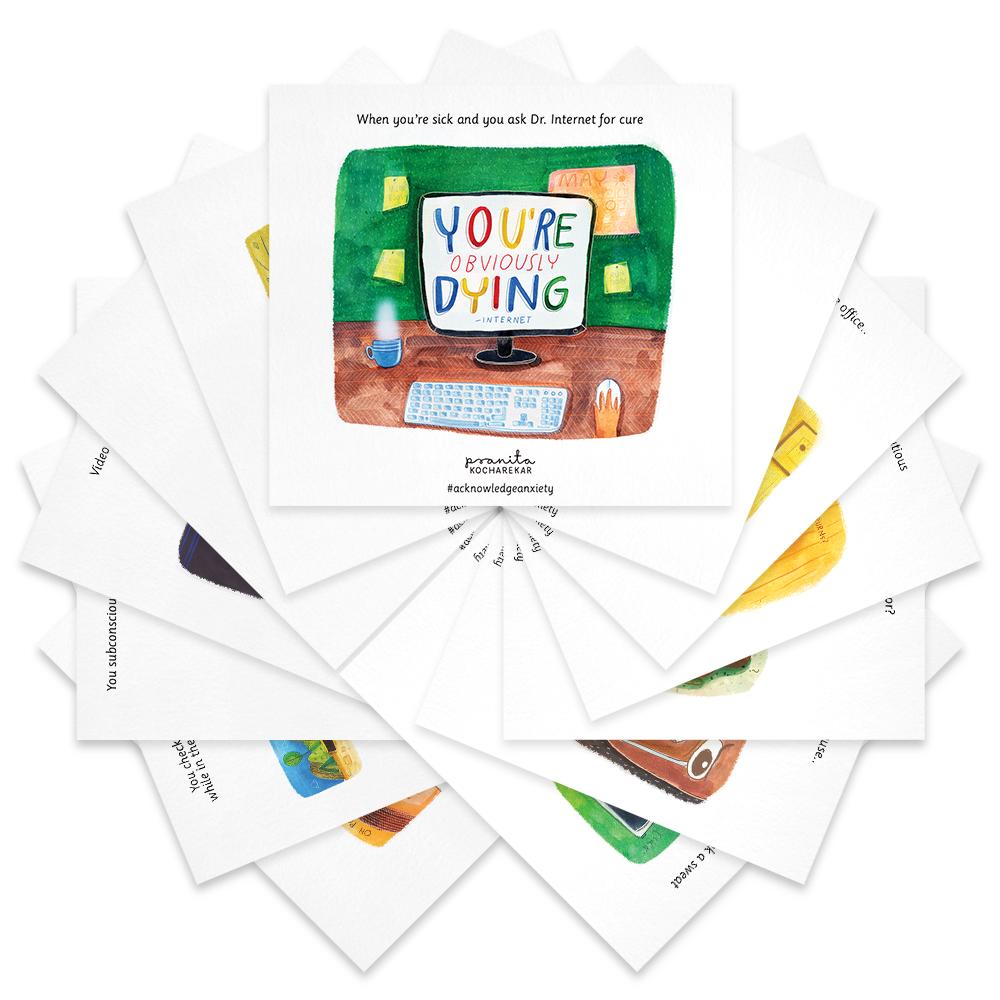
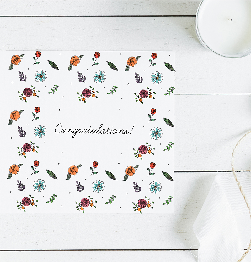
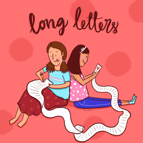
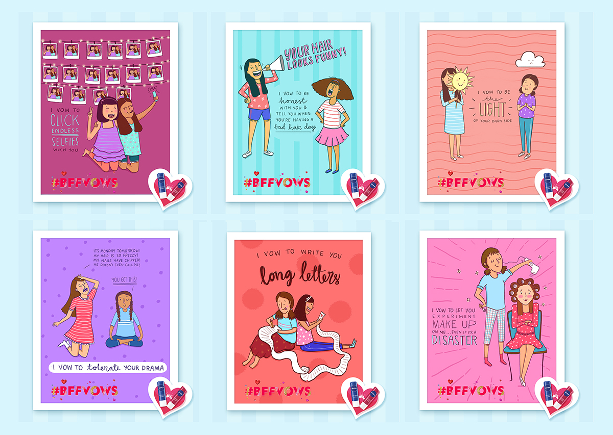
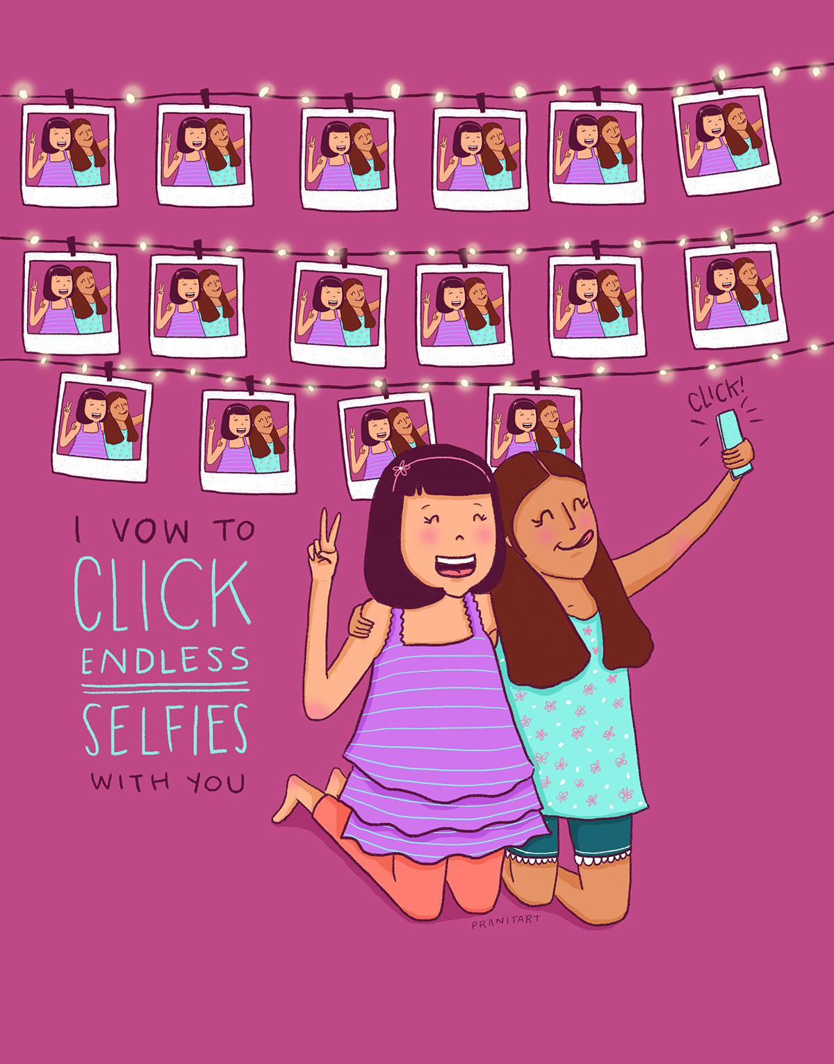
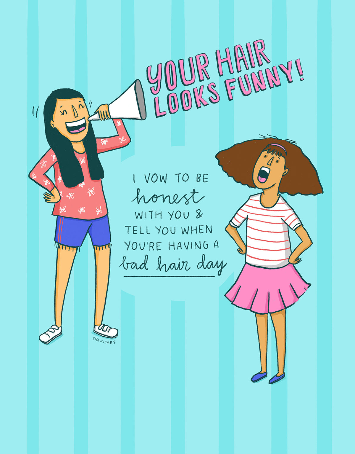
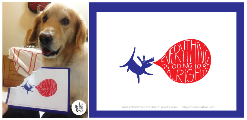
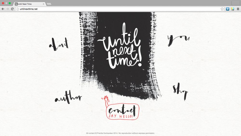
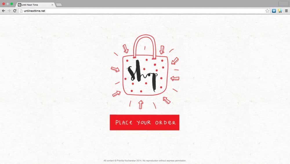
A version of these reminders are available as laptop stickers on my online store.


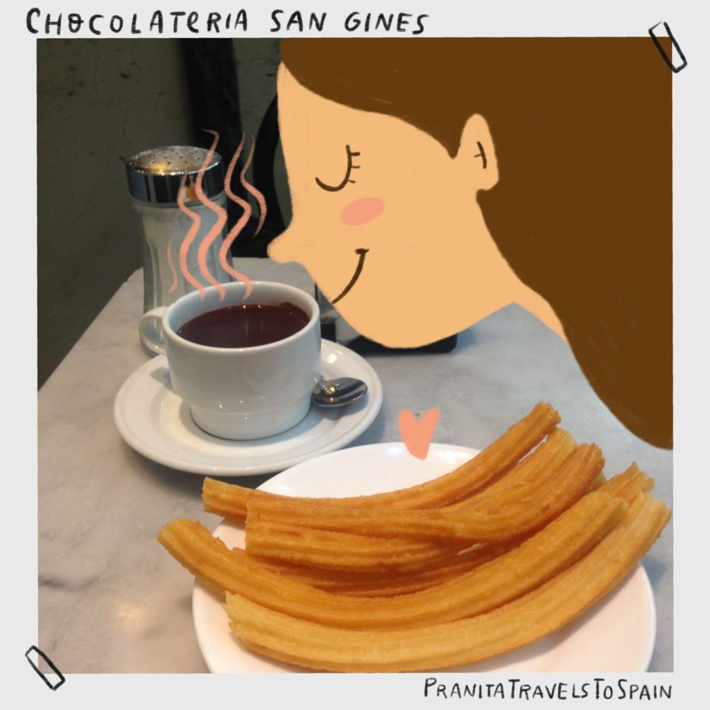

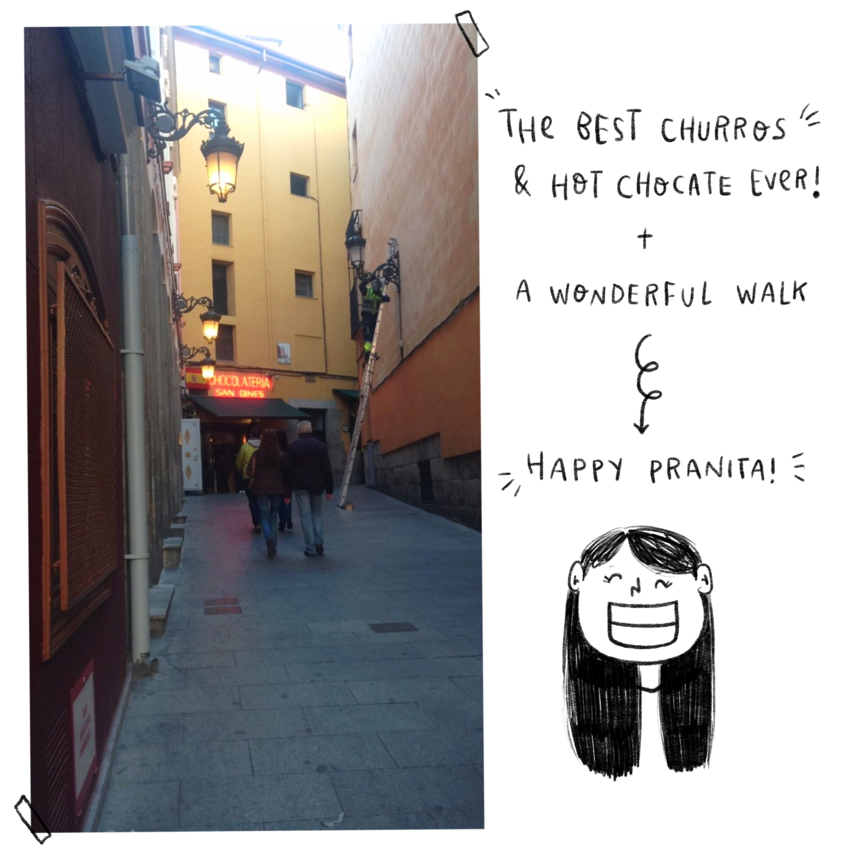
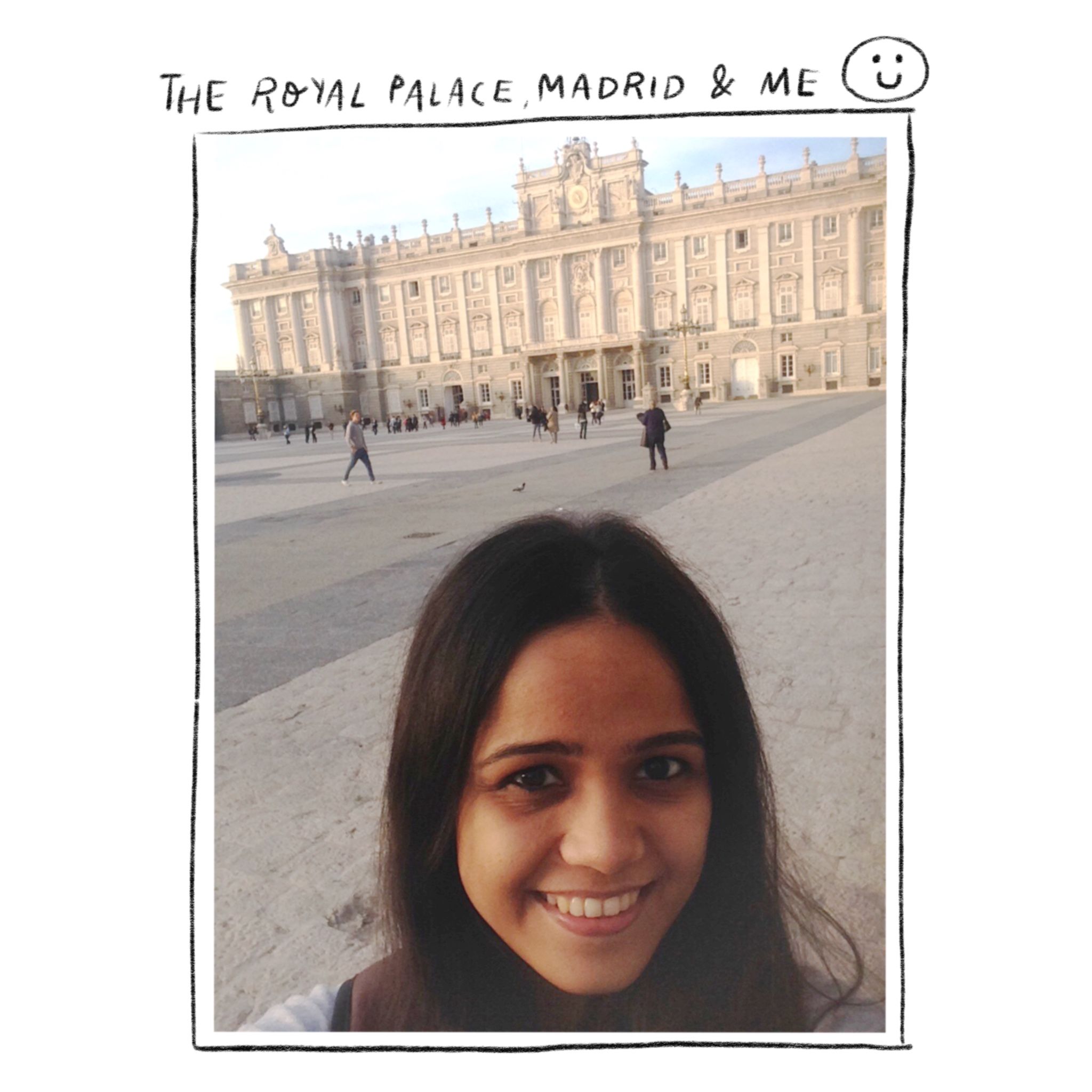
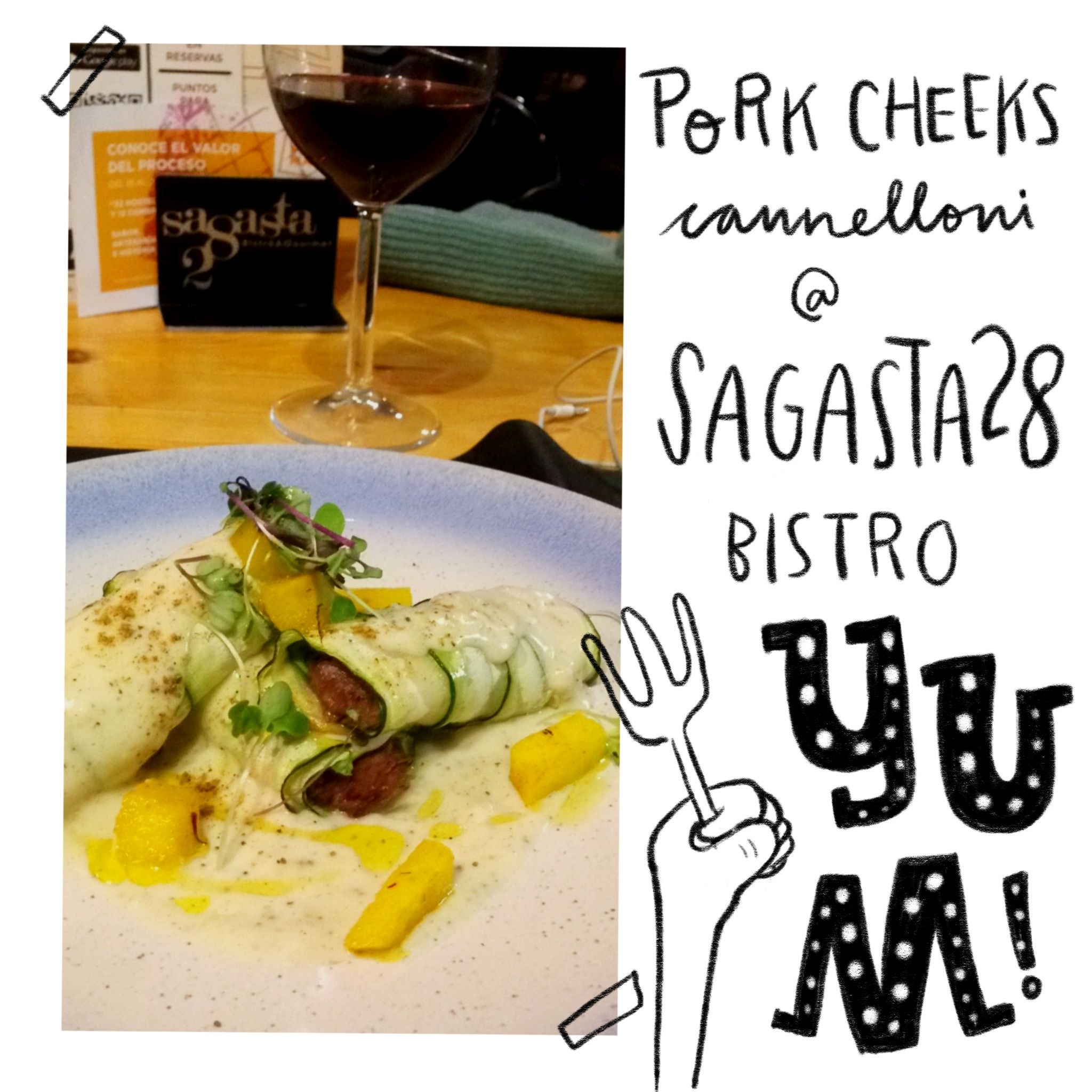
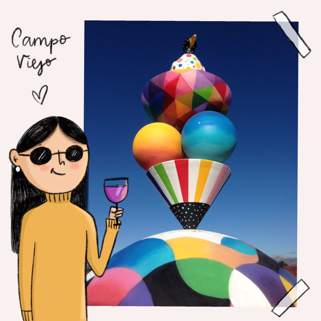
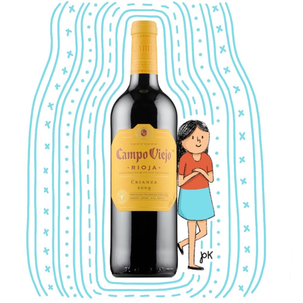
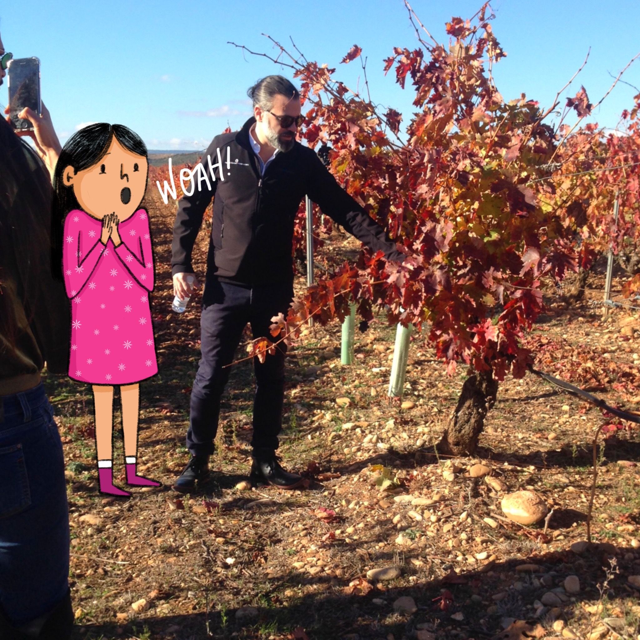

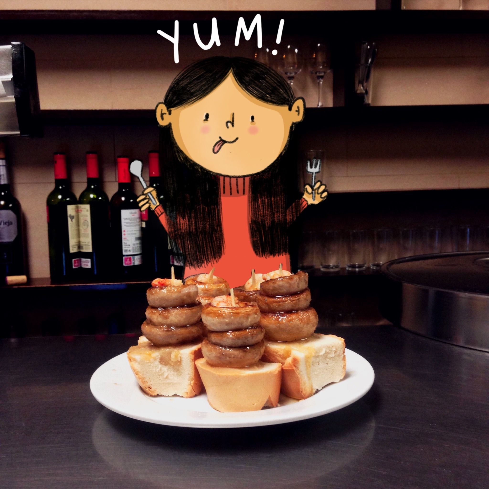 Went tapas hopping with the Campo Viejo crew & found these delicious mushroom tapas at Bar Soriano. Spain has my heart! ❤️
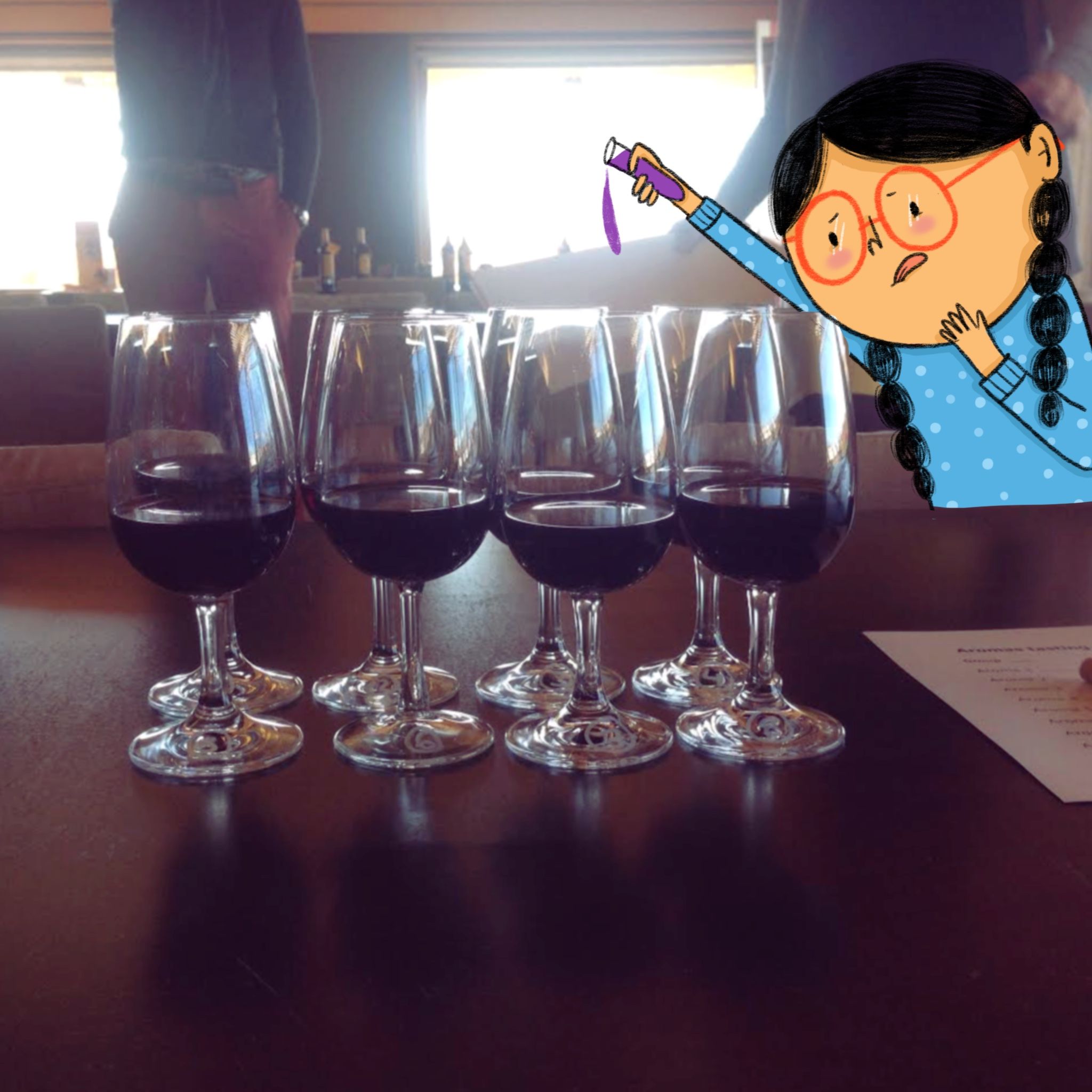
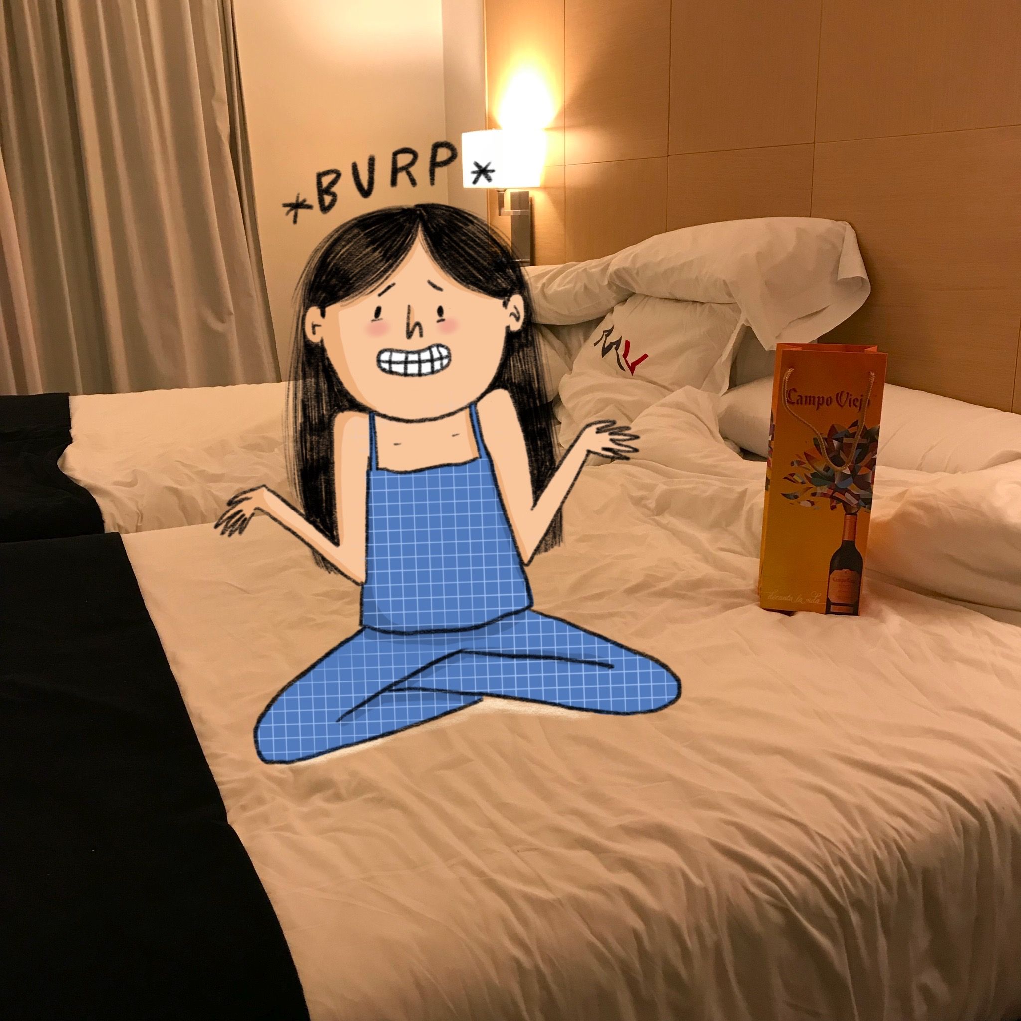 Woke up with a food & wine coma.
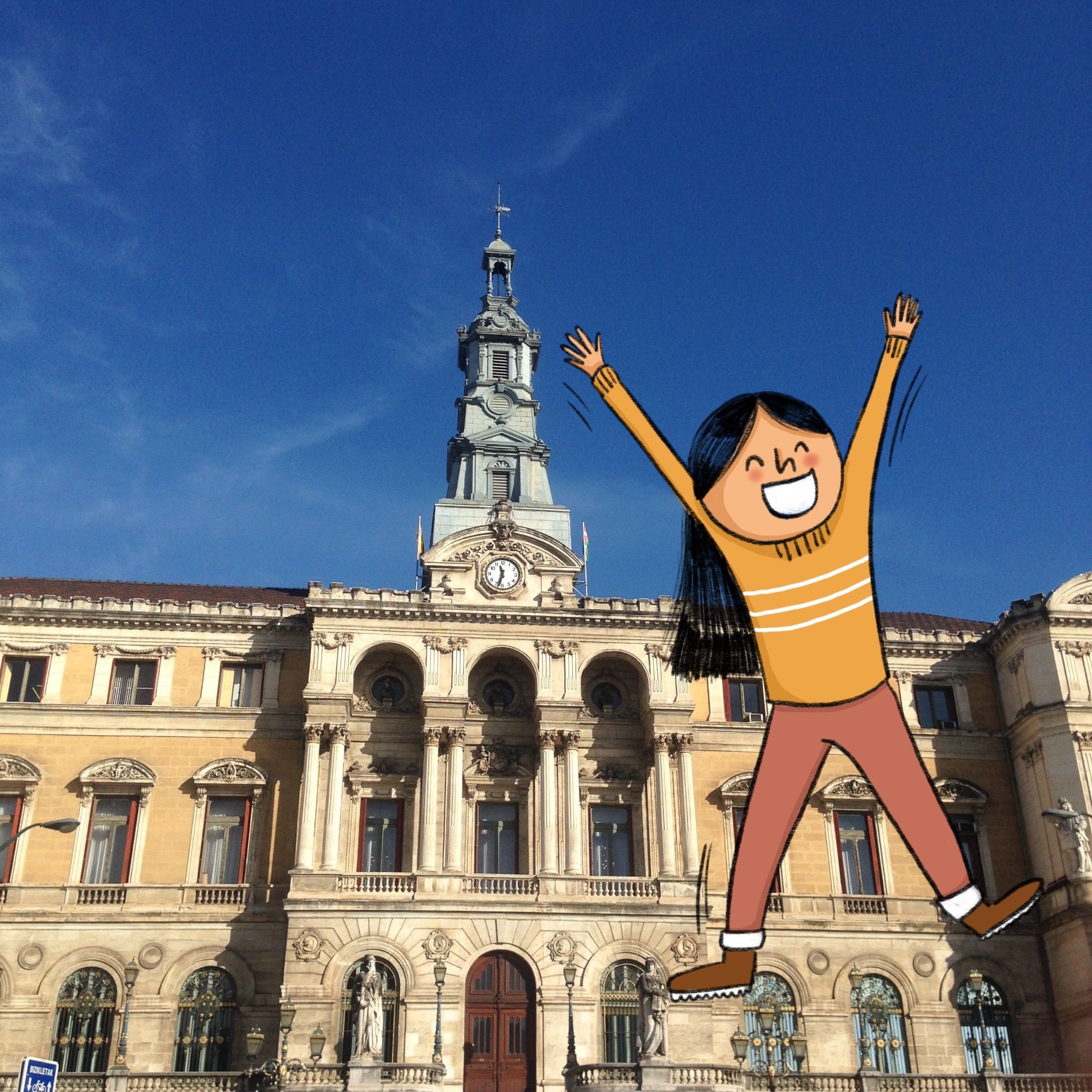
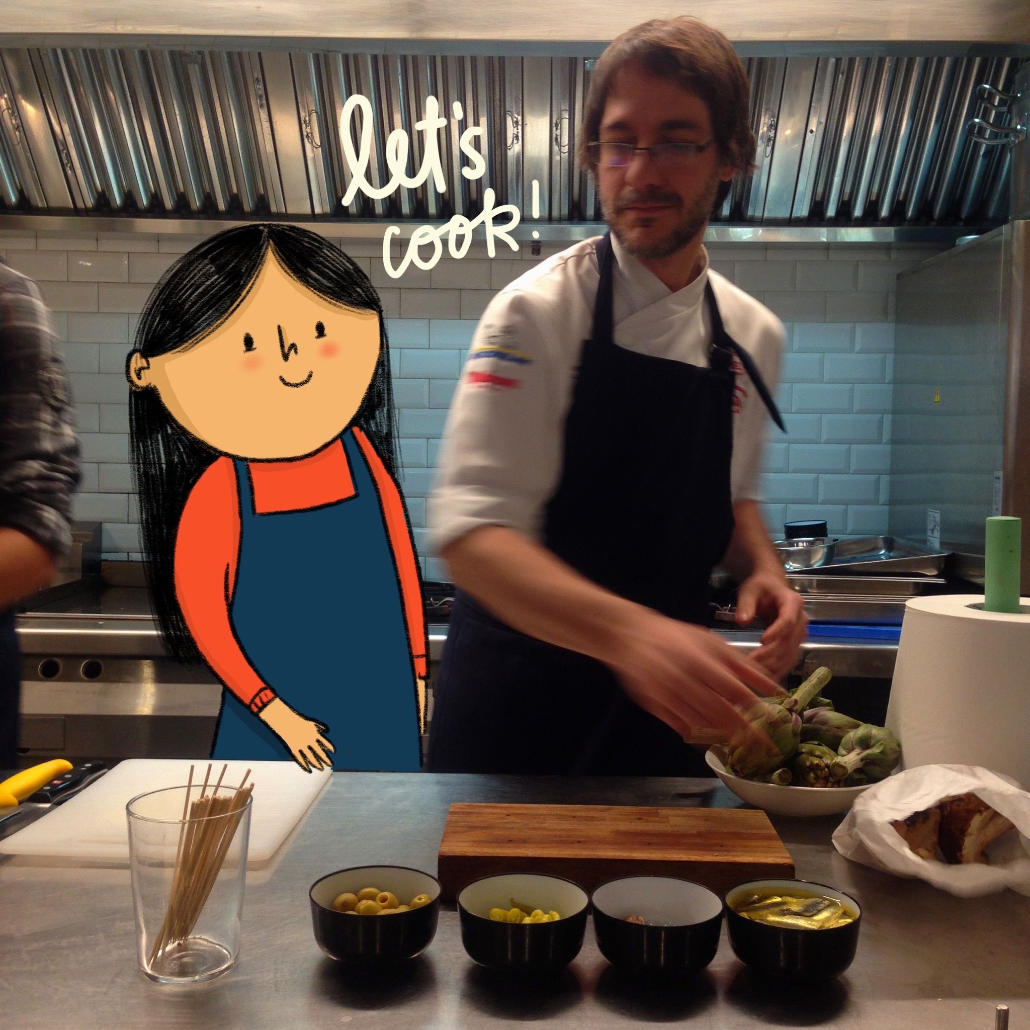
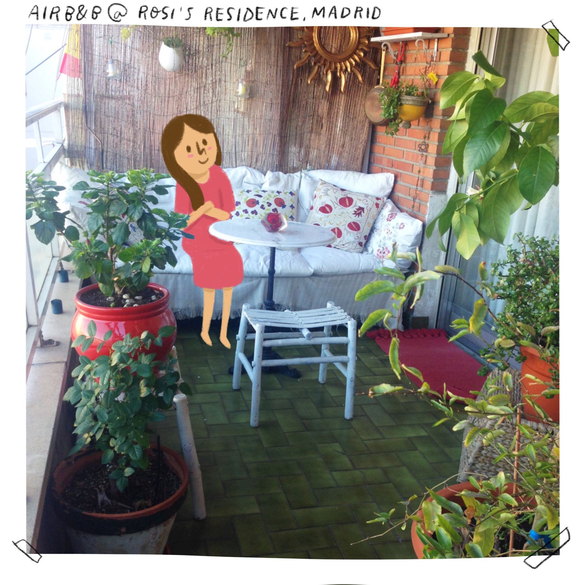
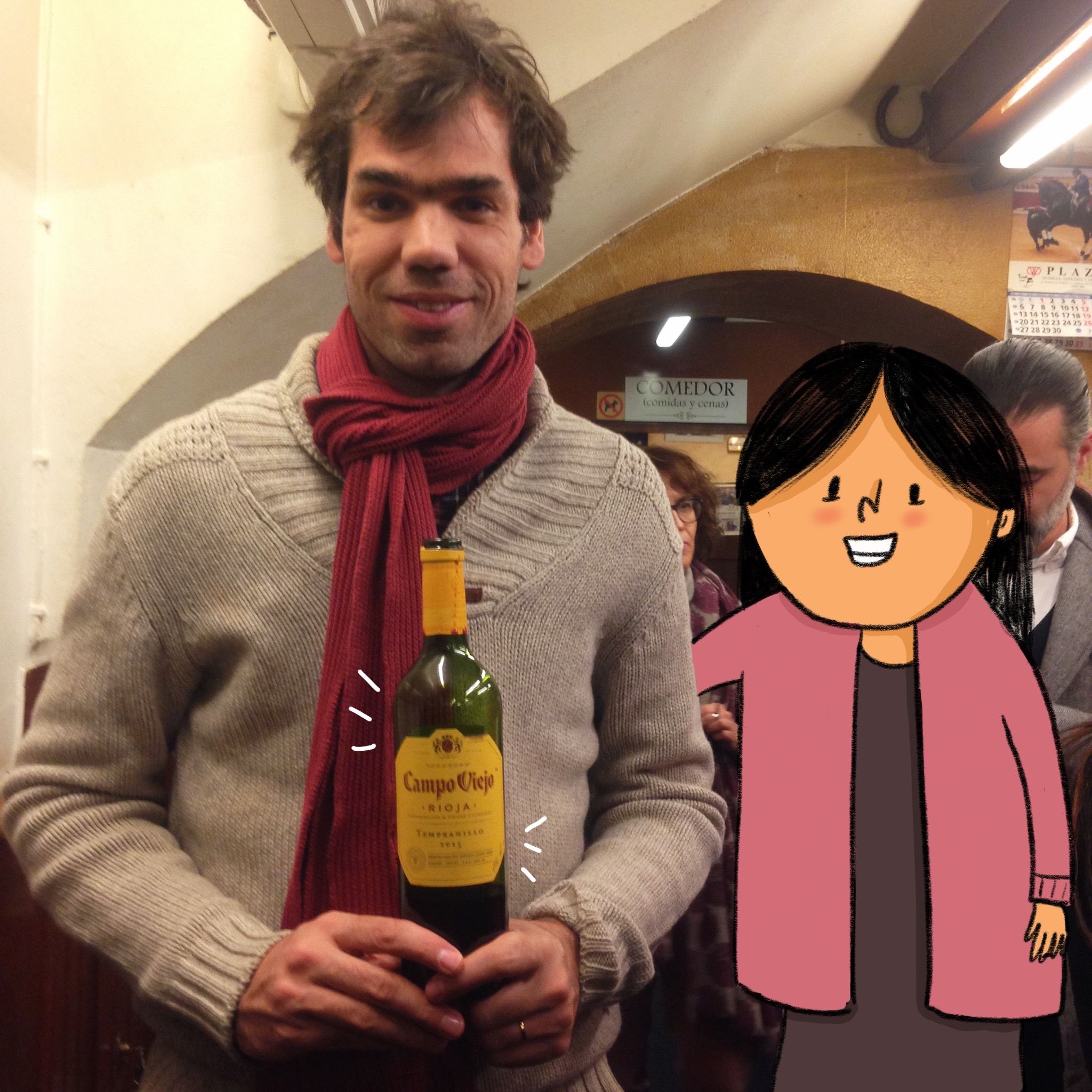
 Right before our cooking session,
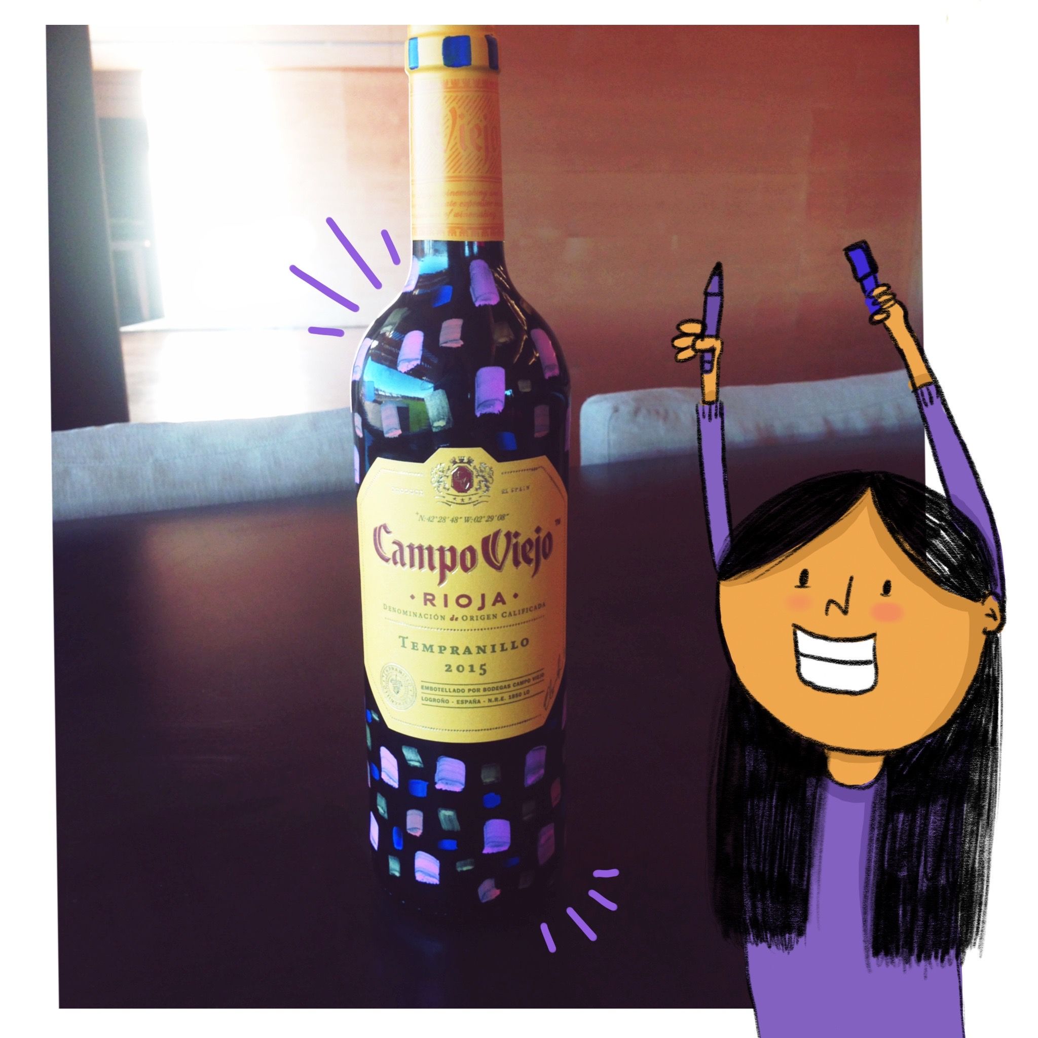

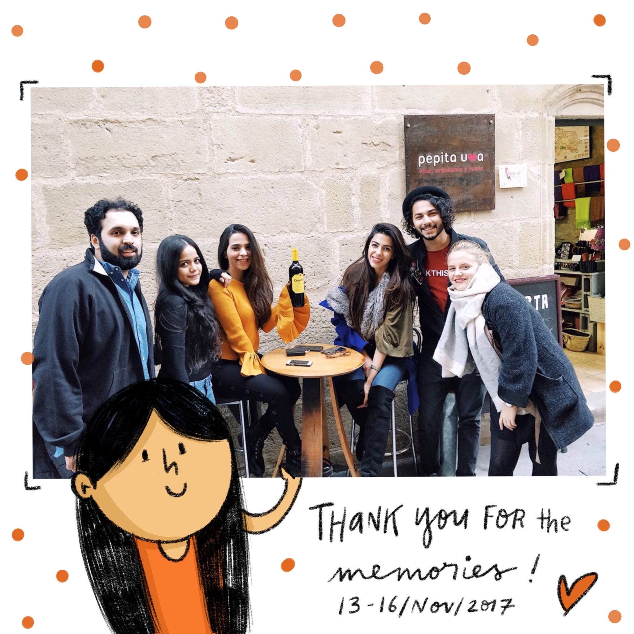


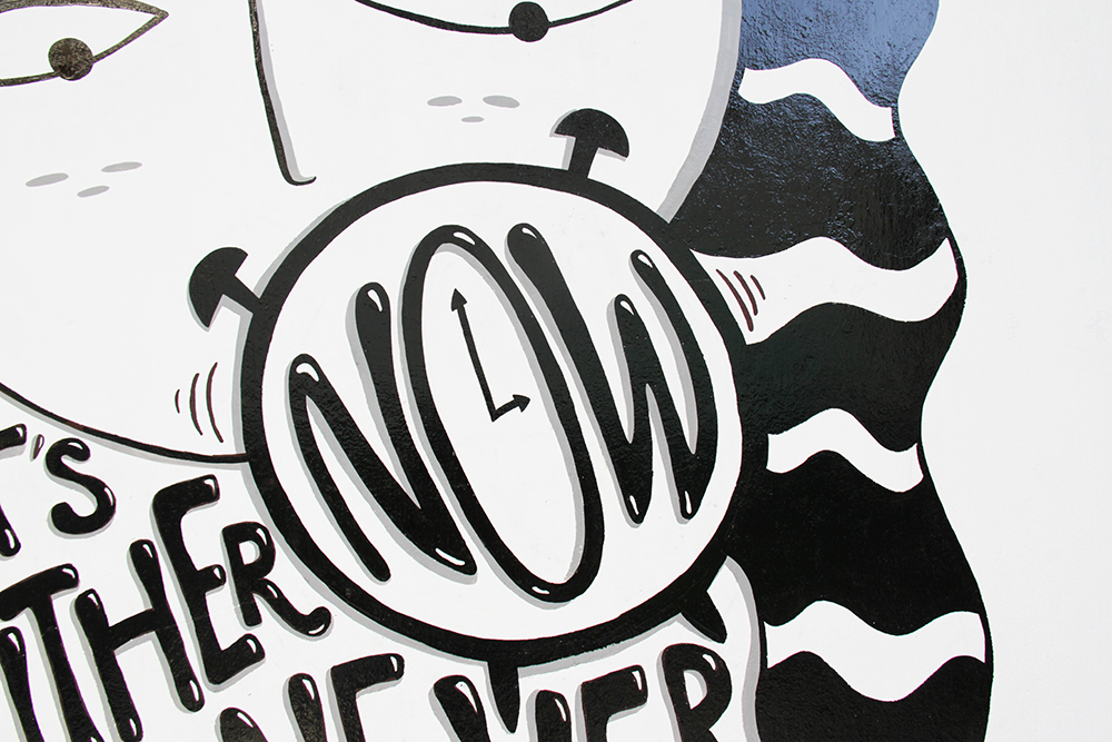
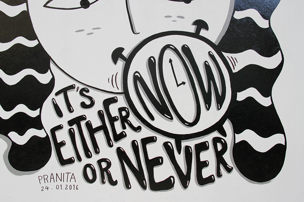
 close up
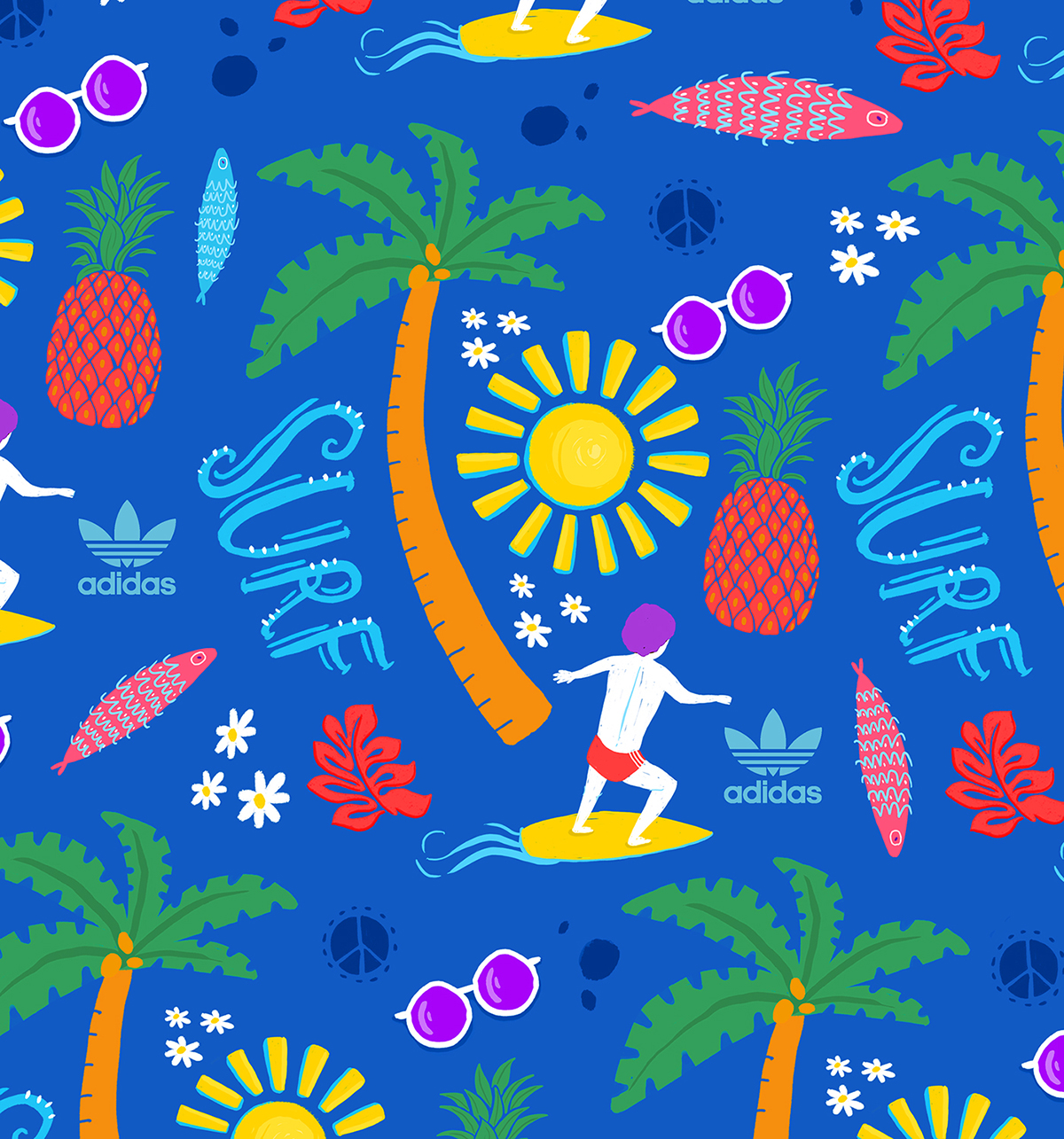 close up
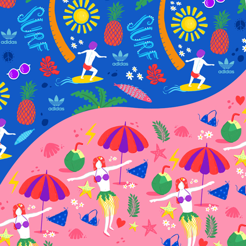
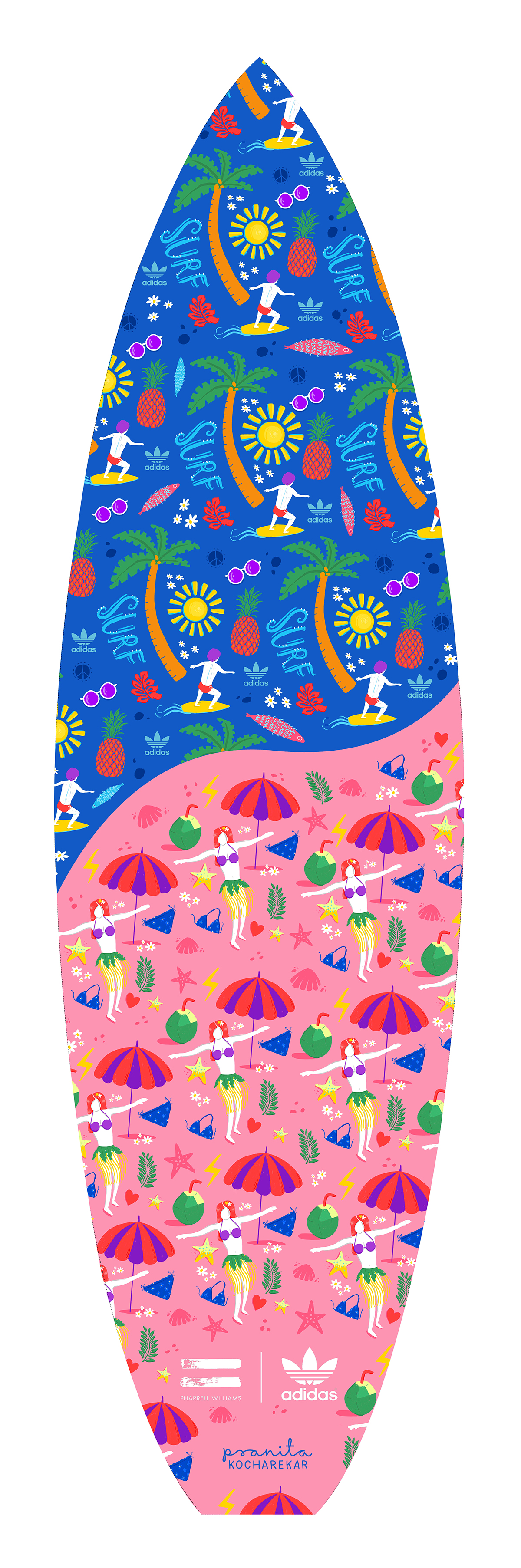
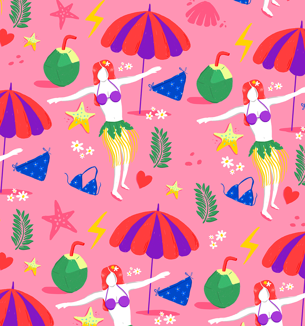
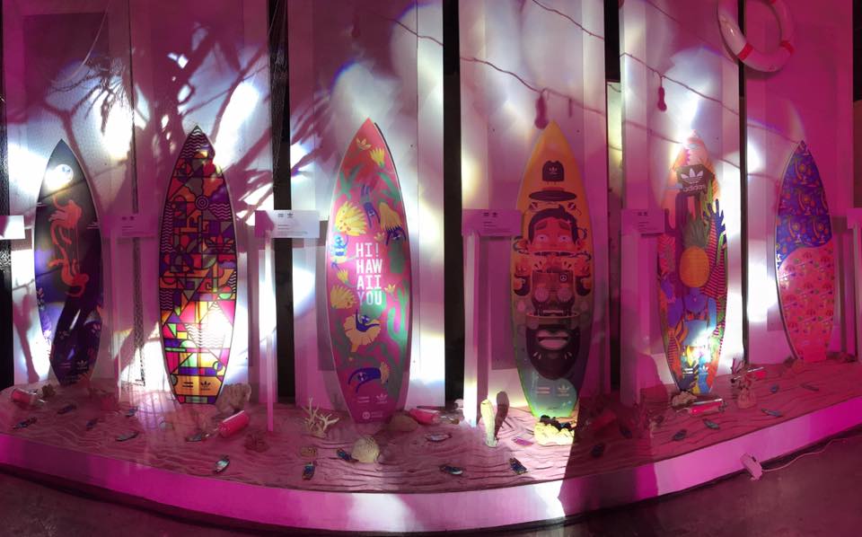 Surfboards designed by 6 artists at the launch party [photo credits: animal]
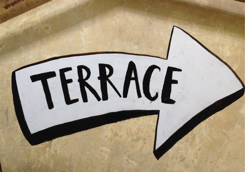
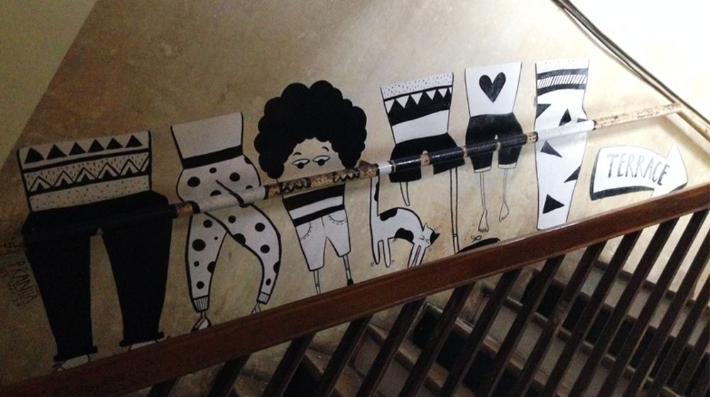
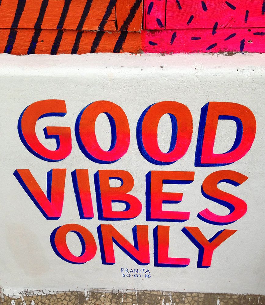
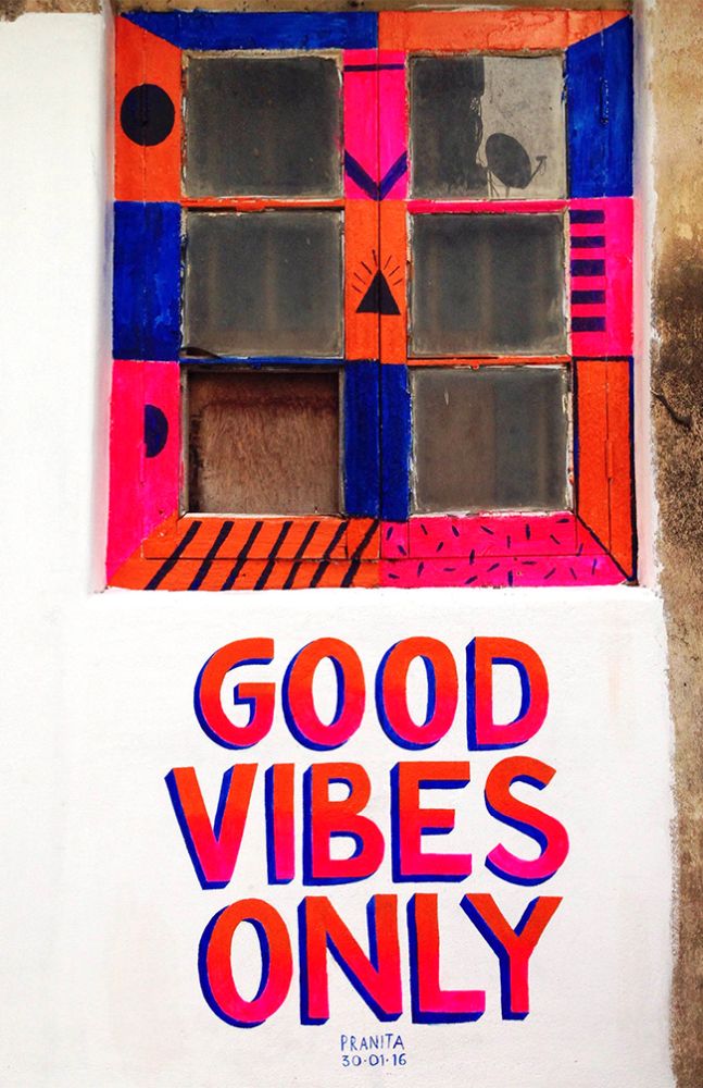
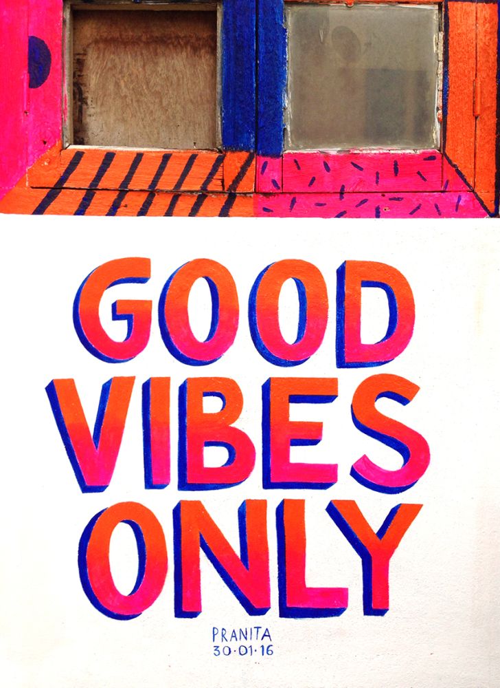
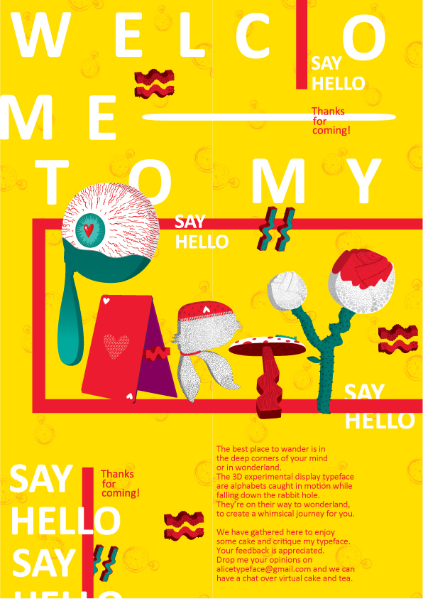
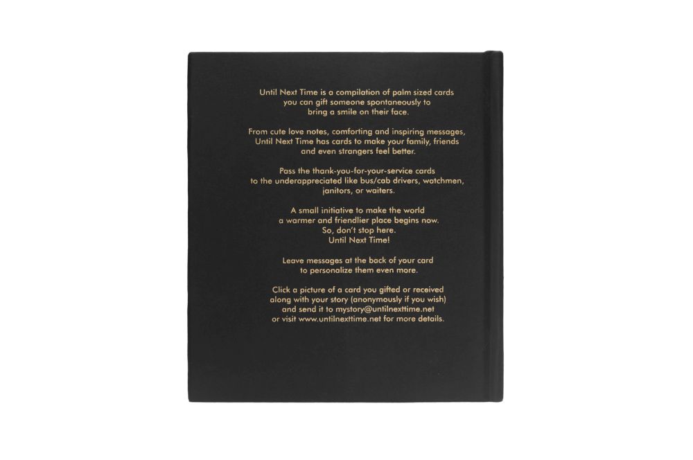
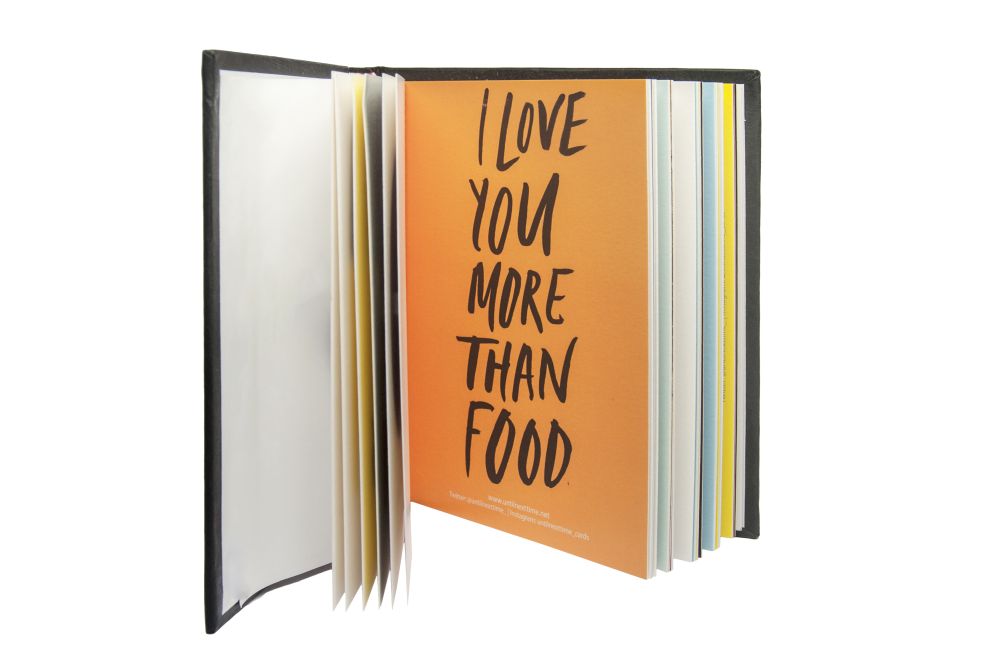
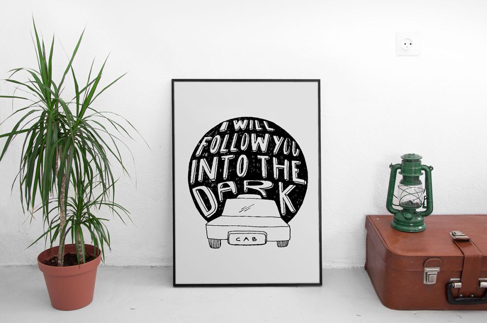
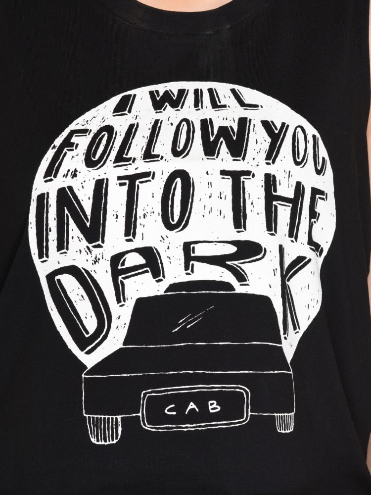
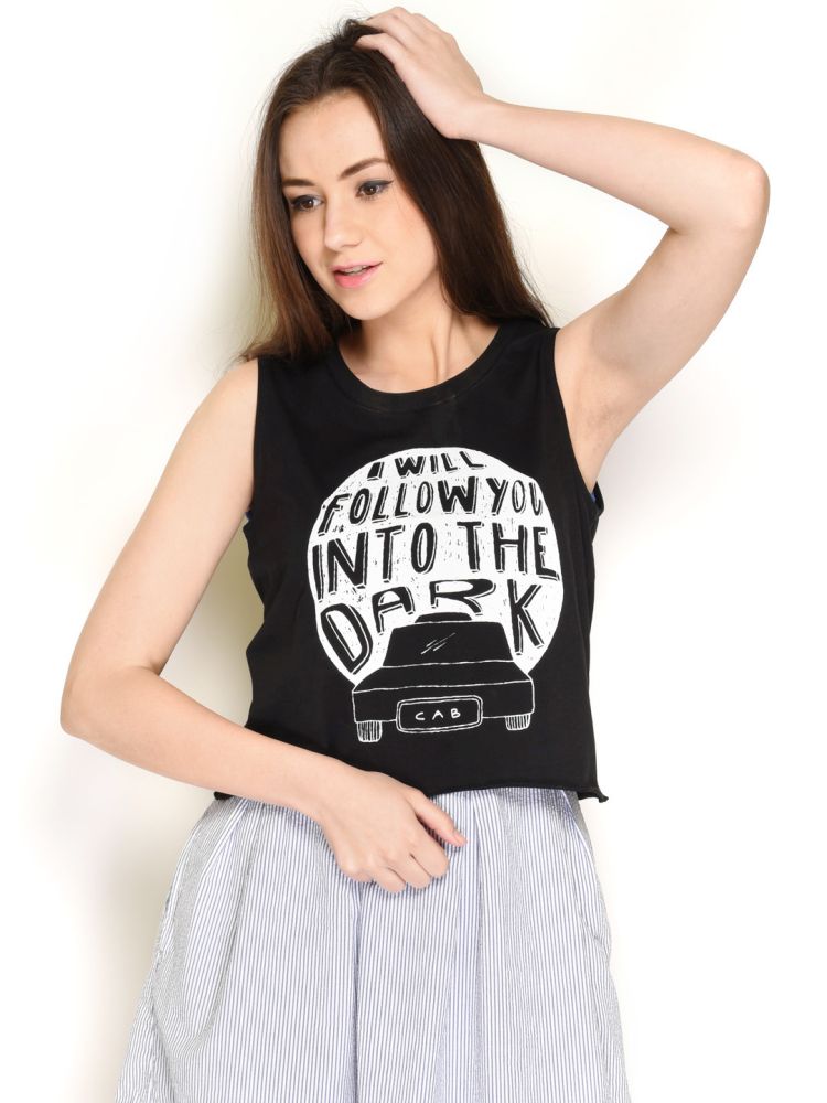
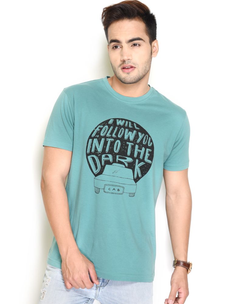
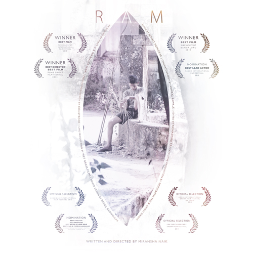
 Poster


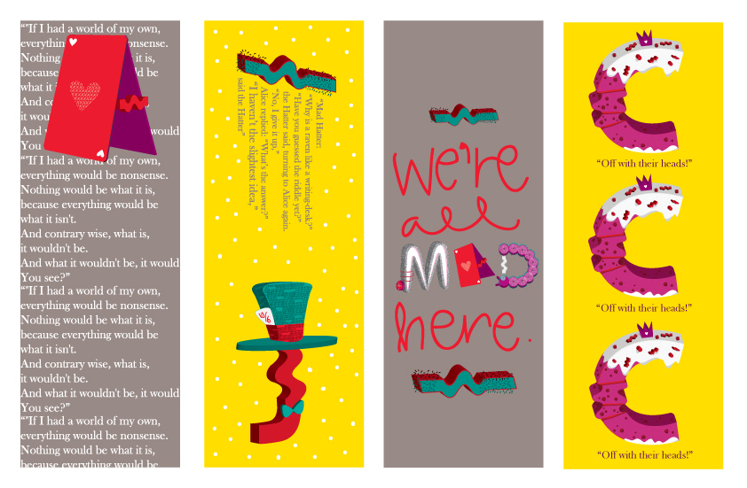
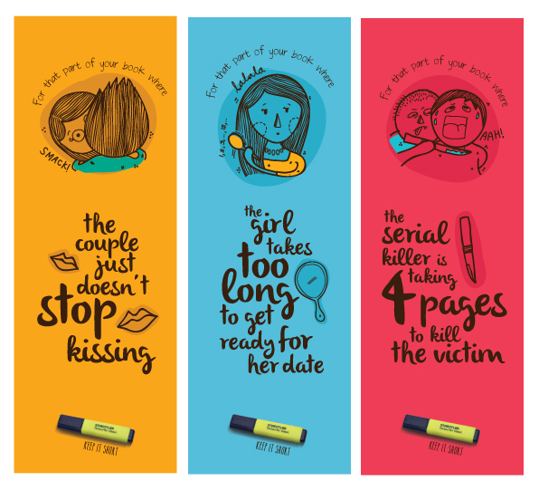 Bookmarks


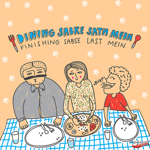
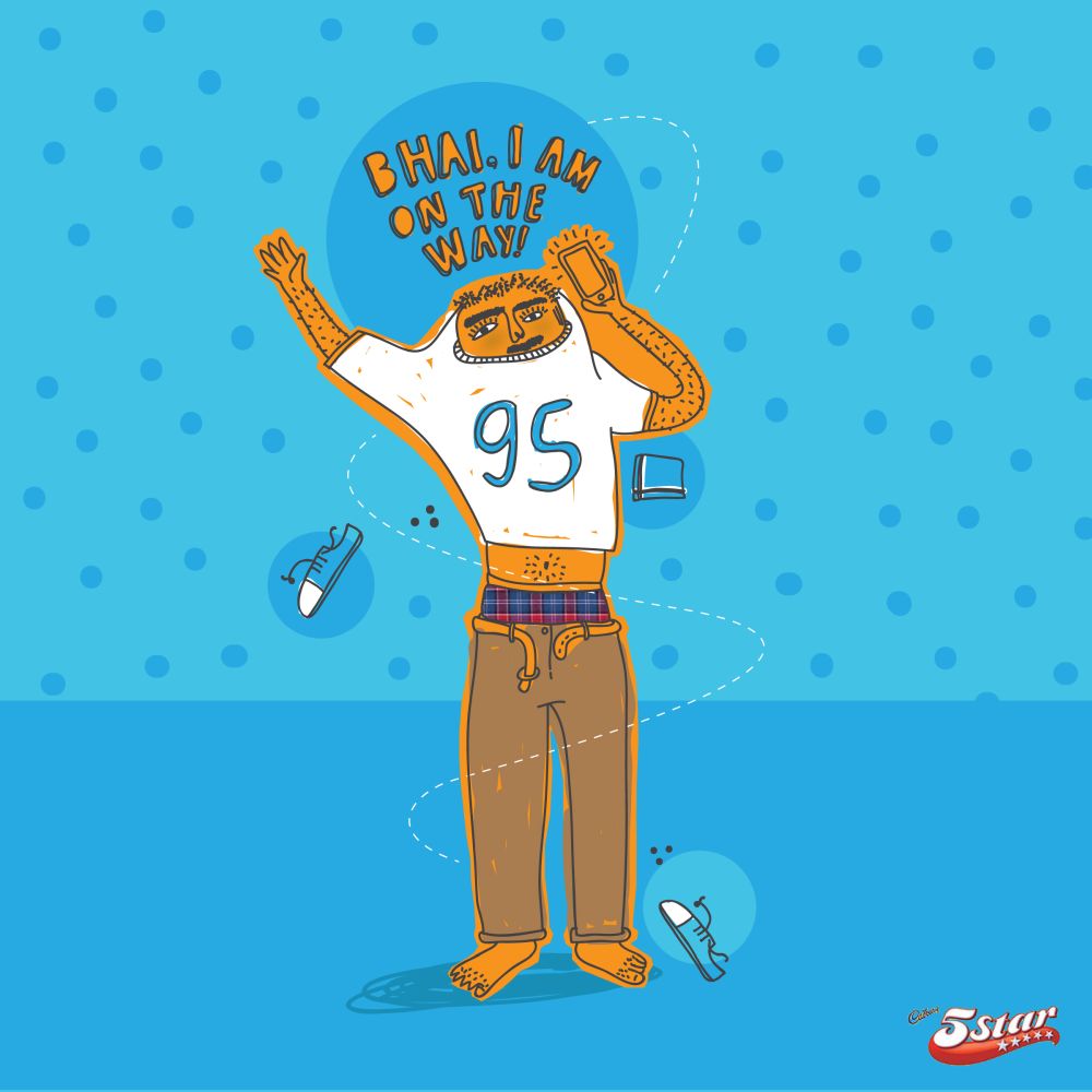
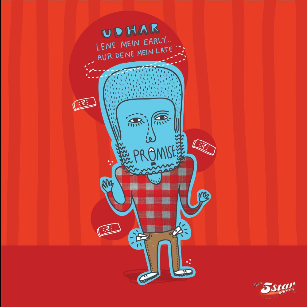
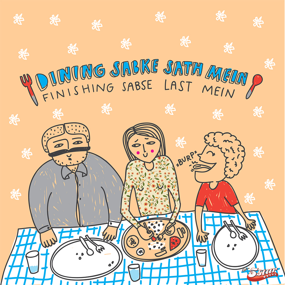
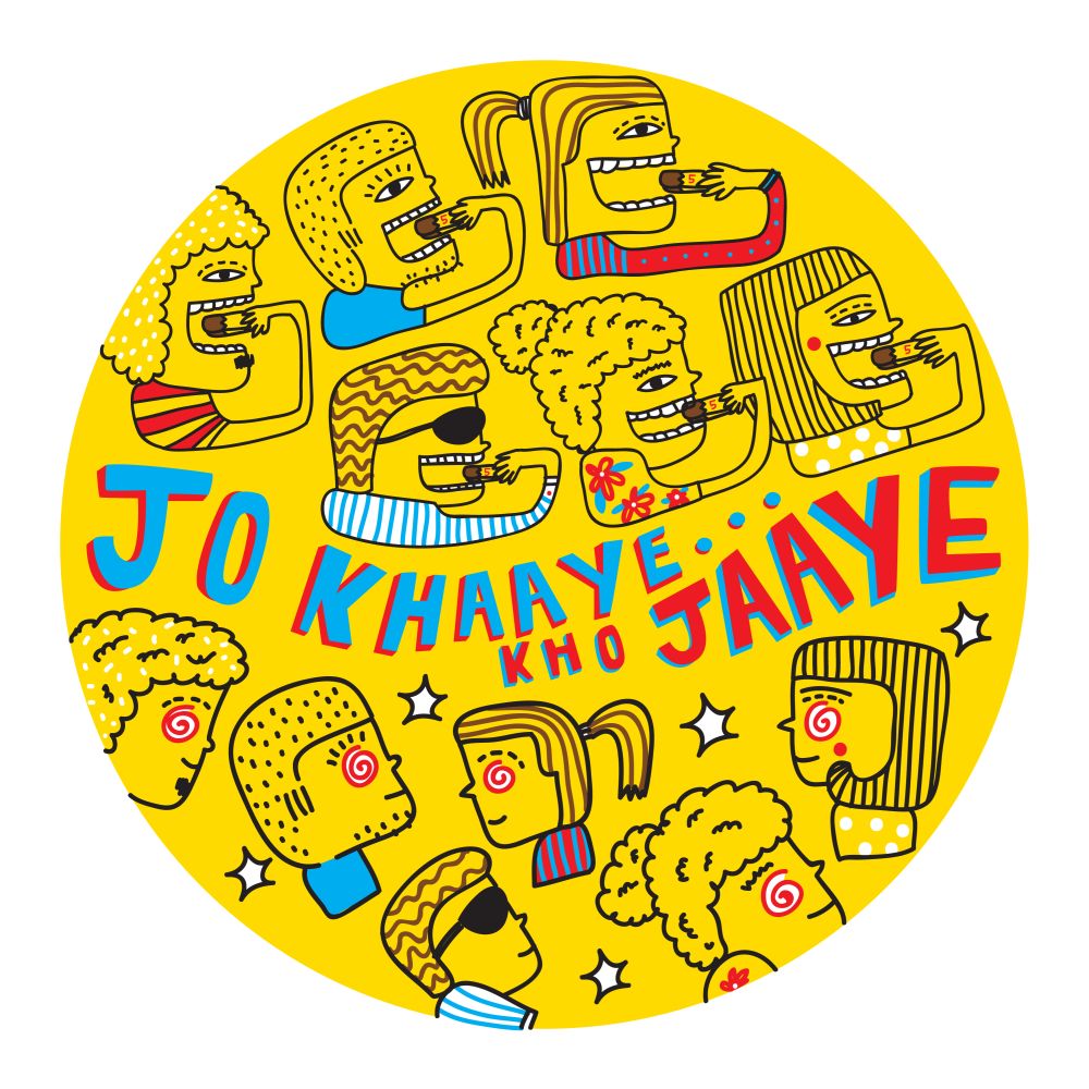
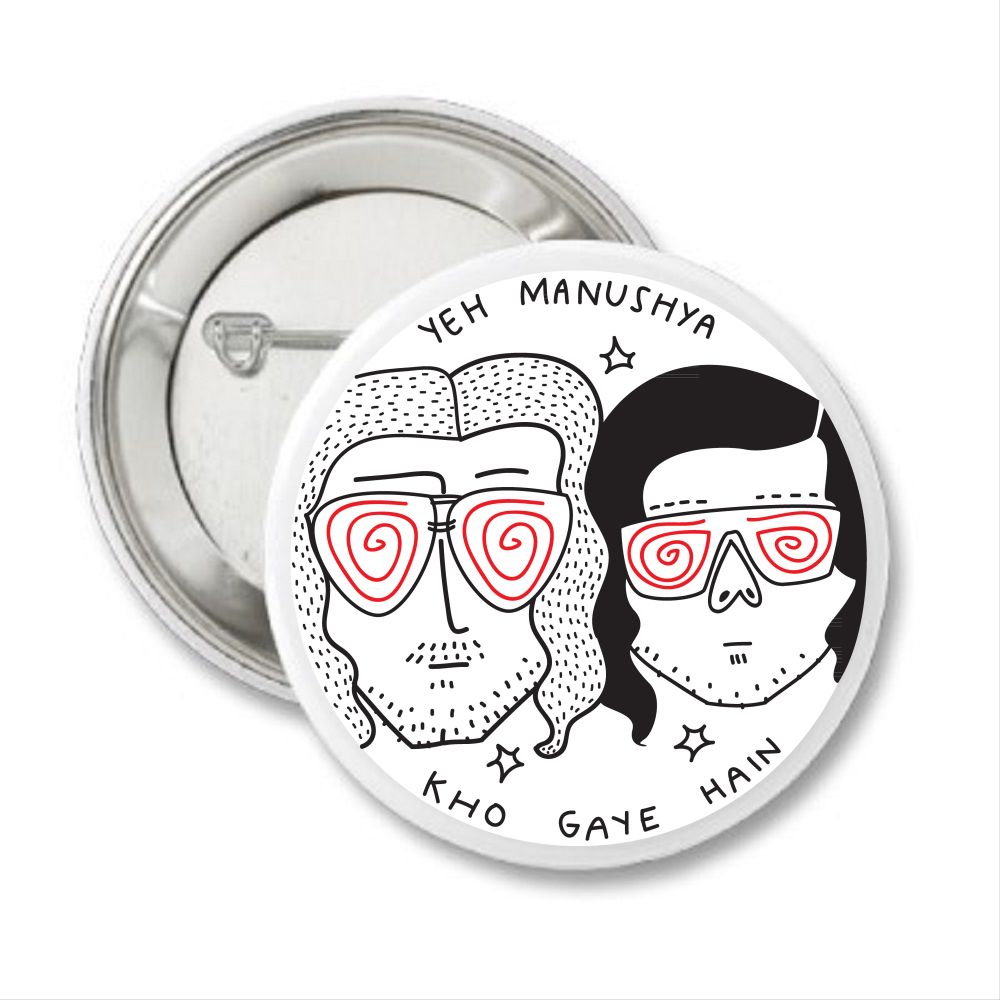
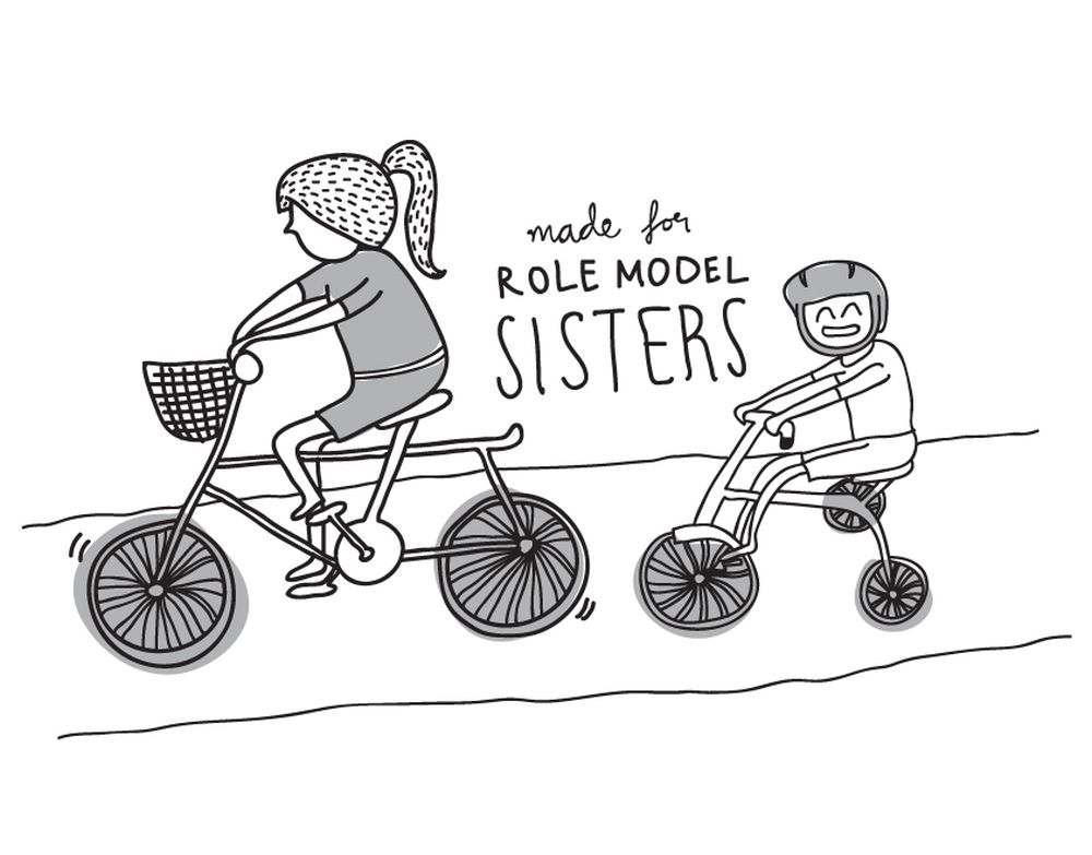
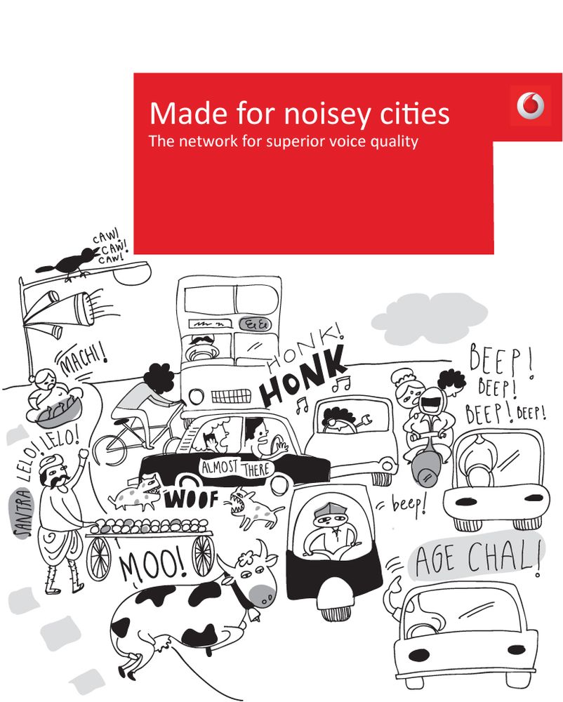
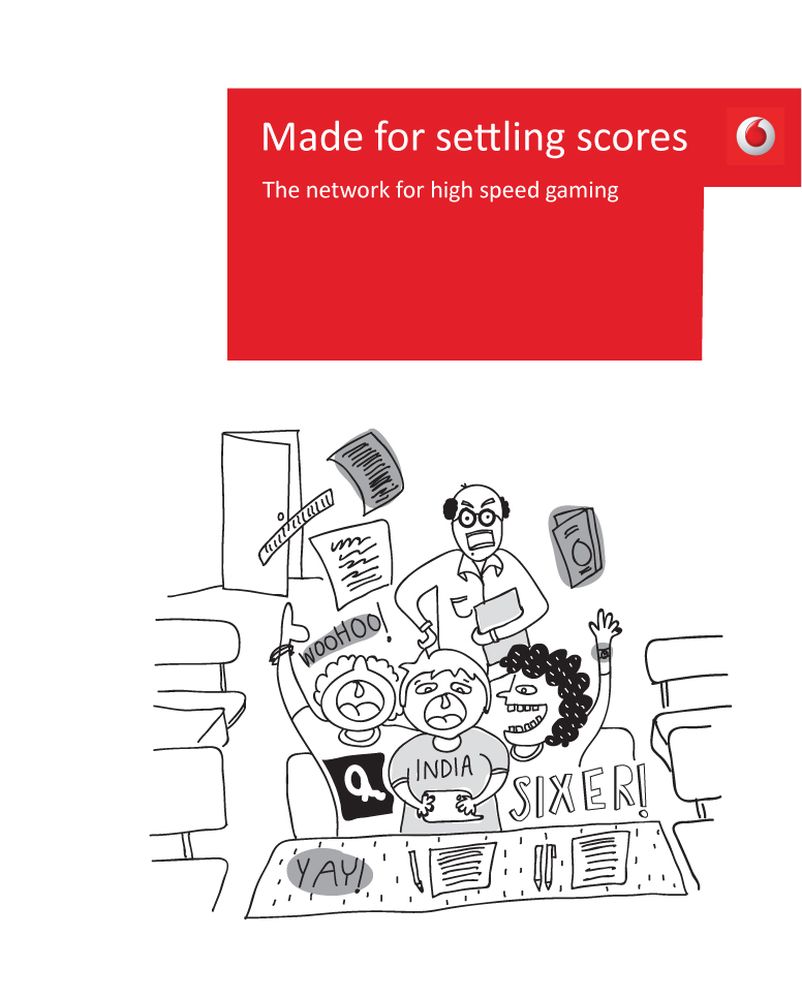
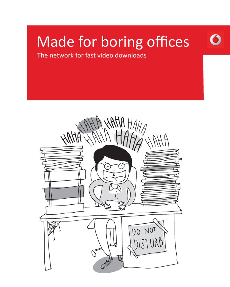
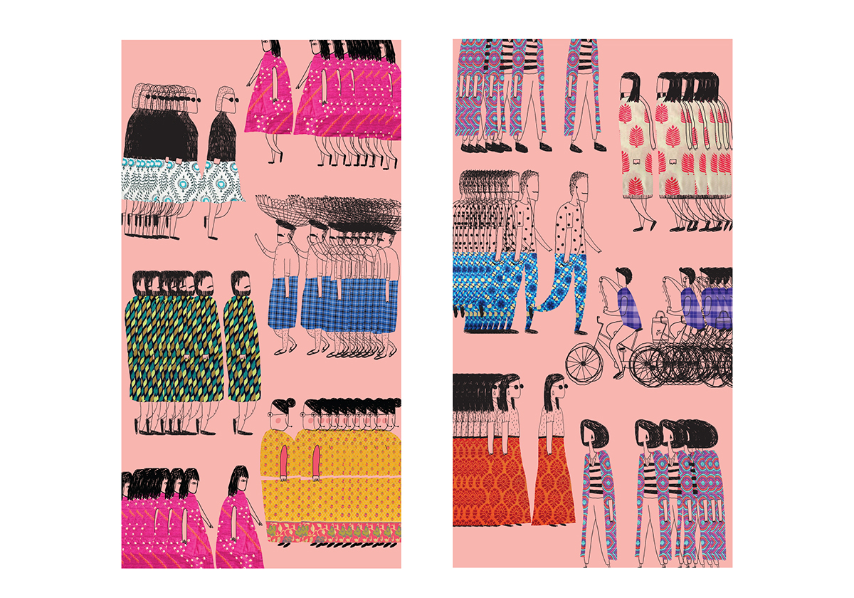
 Unpublished | Rakhi ads