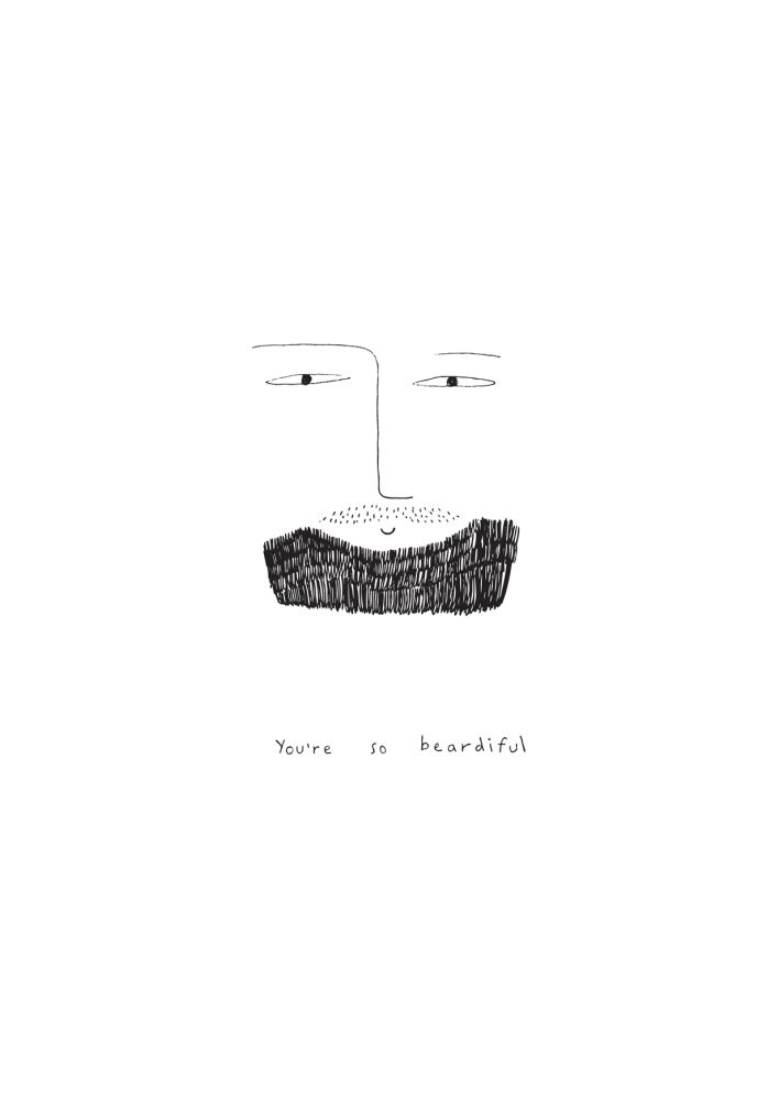
Shut Up & Stop Stereotyping 2019 Calendar, killing gender roles!
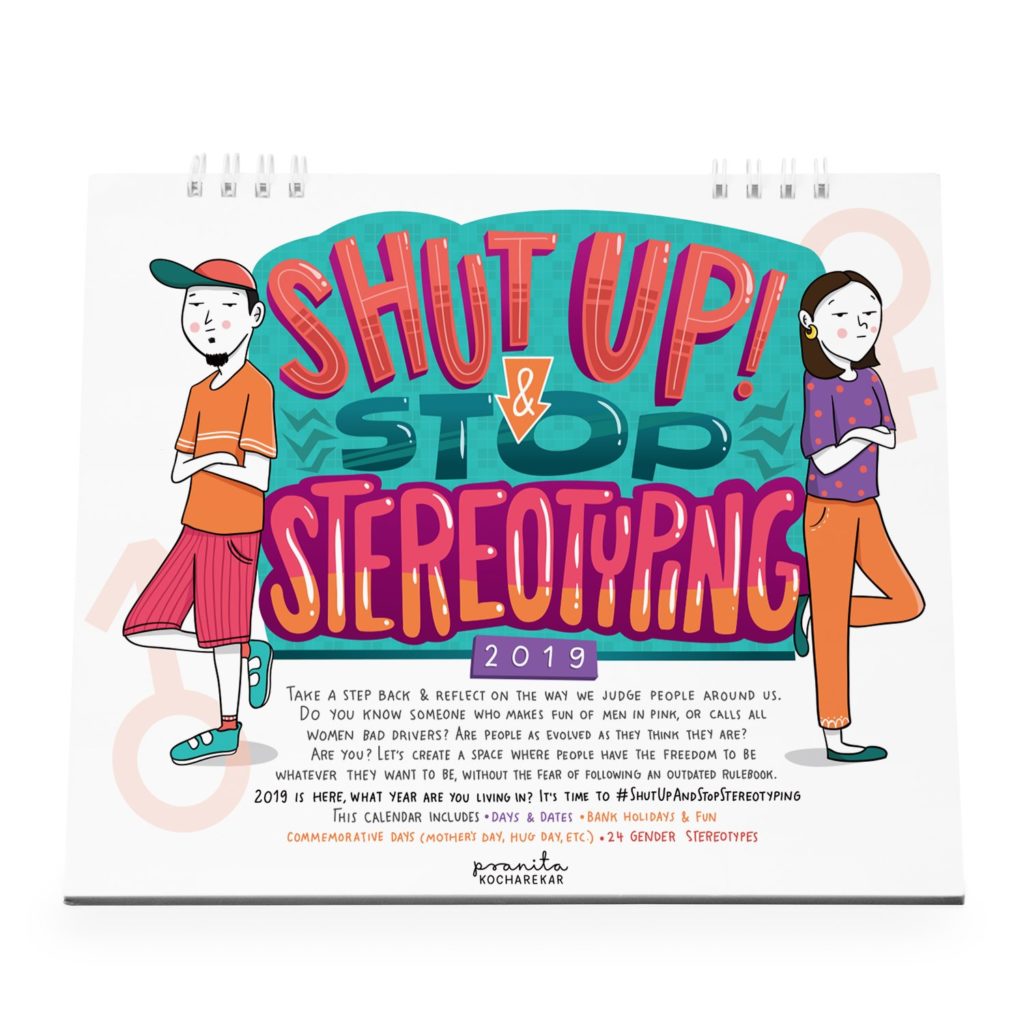

Shut Up & Stop Stereotyping 2019 Calendar, killing gender roles!
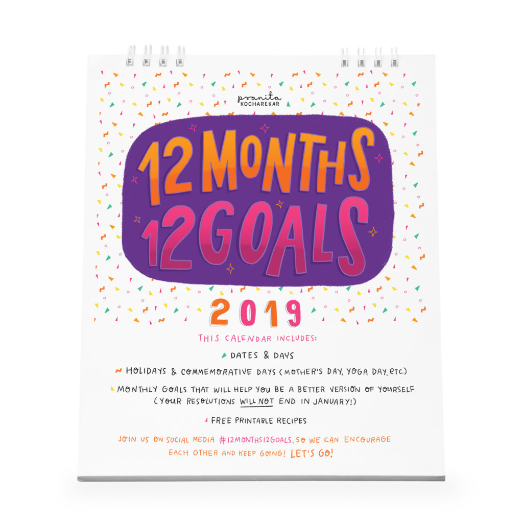
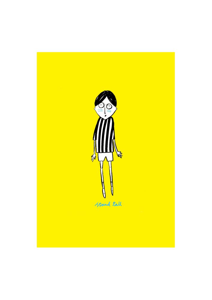
12 Months 12 Goals 2019 Calendar
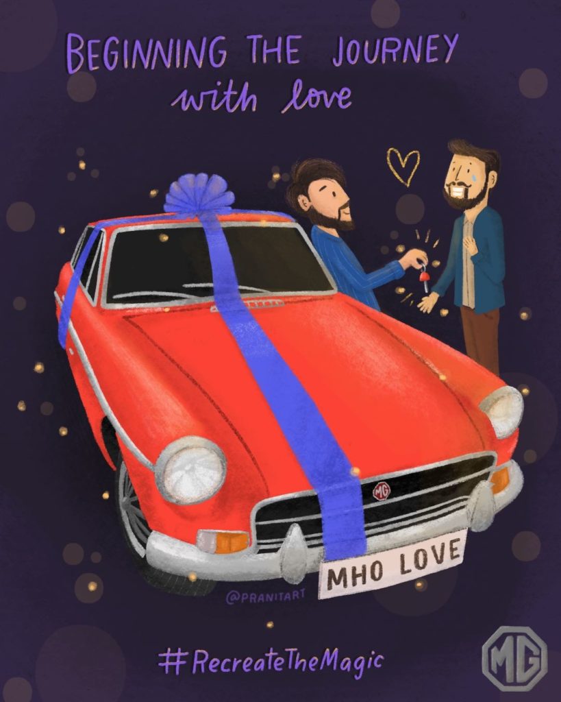
Mg Motors launch in India. #RecreateTheMagic recreating vintage ads with an illustrative twist
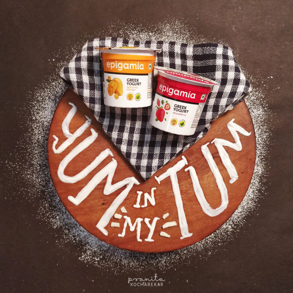
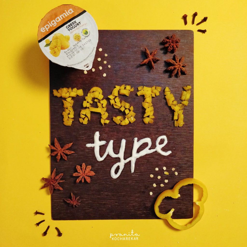
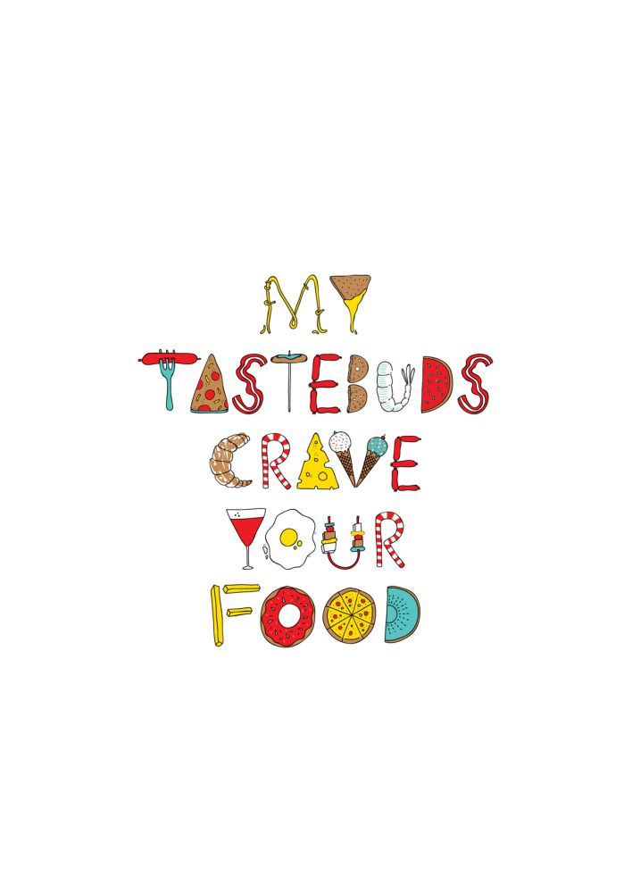
Epigamia Yogurt connected with food stylists and lettering artists for this project. The aim to create inspiring crowd sourced typography art with Epigamia Greek Yogurt and only natural/edible ingredients with no added artificial coloring, that tastes as good as it looks.
Creative Direction, Art Direction, Styling, Photography – Pranita Kocharekar
Agency – Rasta
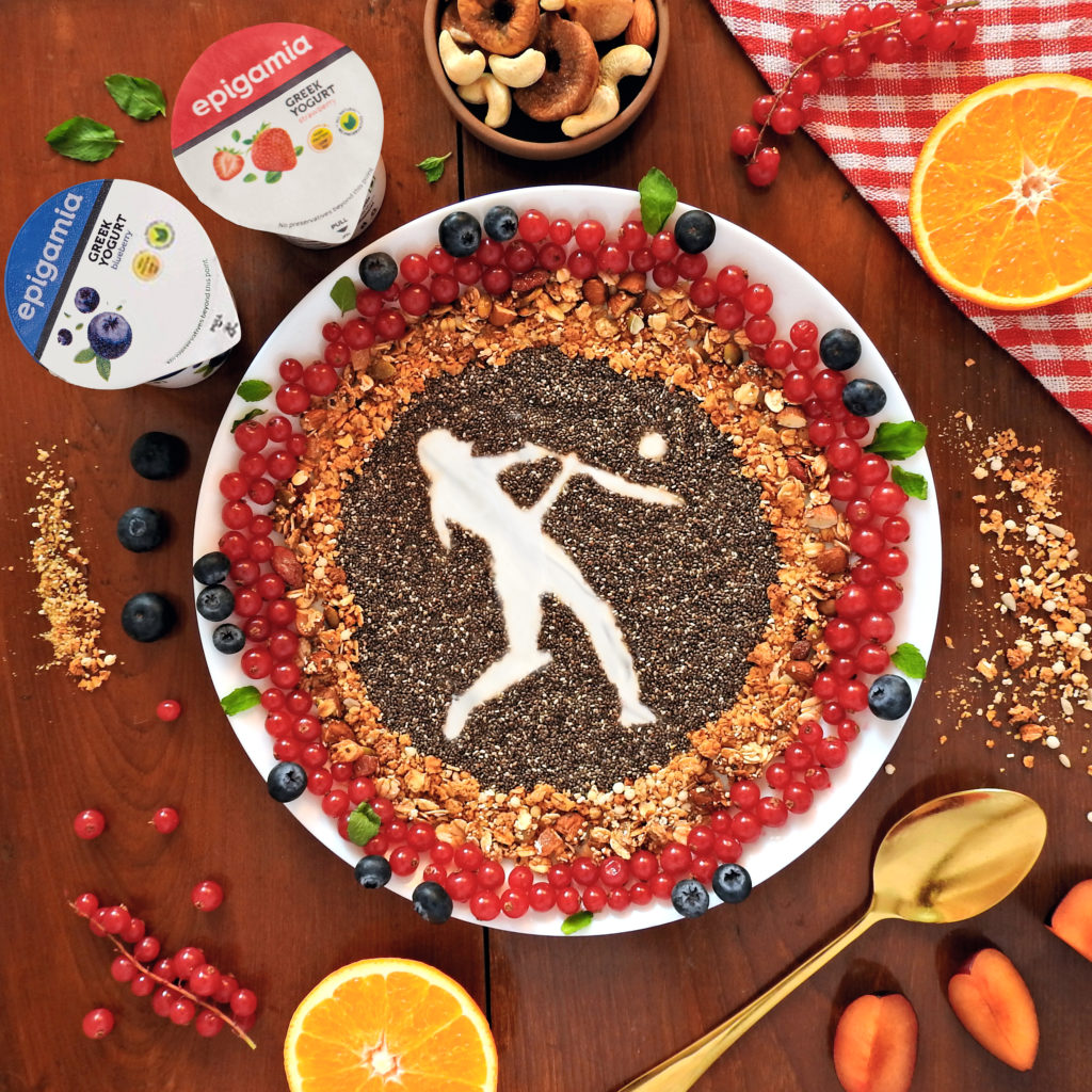
Epigamia Yogurt is celebrating the women’s T20 Cricket matches & wanted to create an appreciation post.
Concept by the team at Rasta.
Art Direction & Execution by Pranita Kocharekar
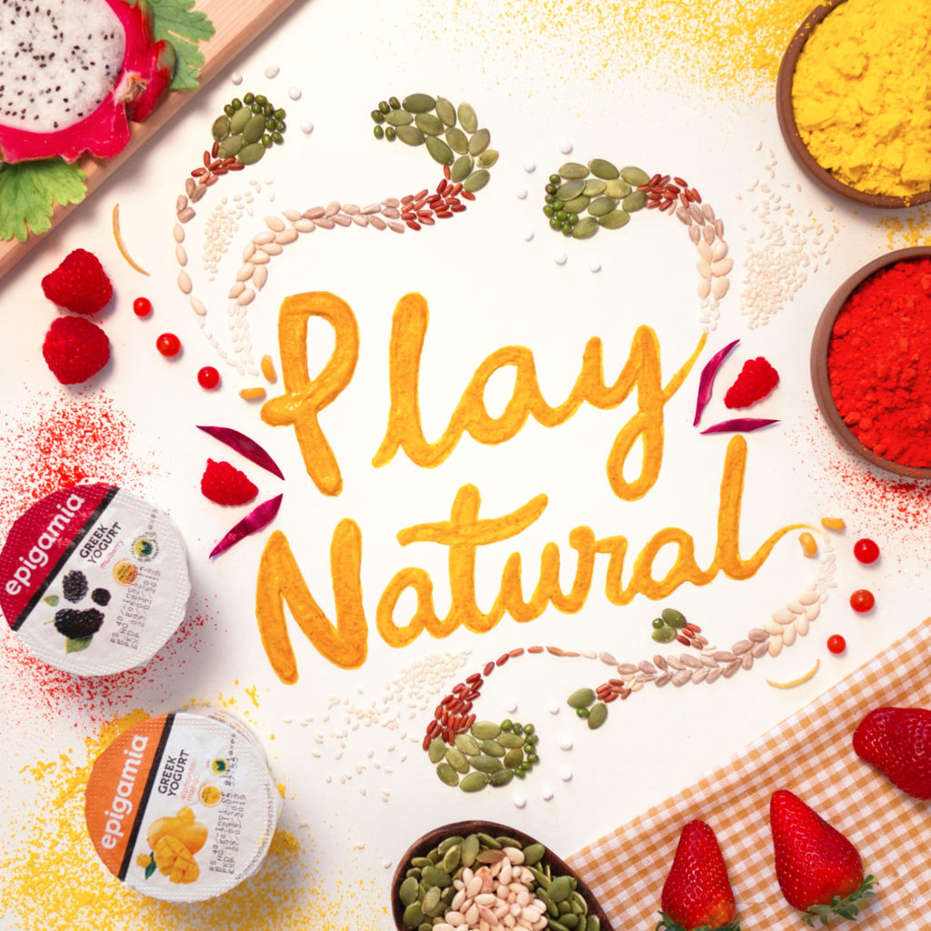
Epigamia Yogurt is celebrating Indian festival of colours, Holi. Concept by the team at Rasta. Art Direction, Type Design & Execution by Pranita Kocharekar.
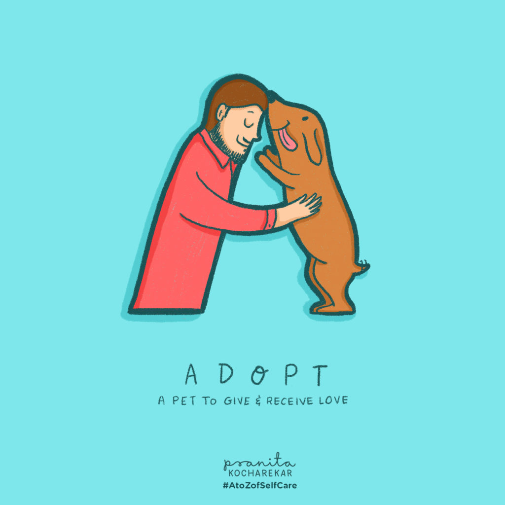
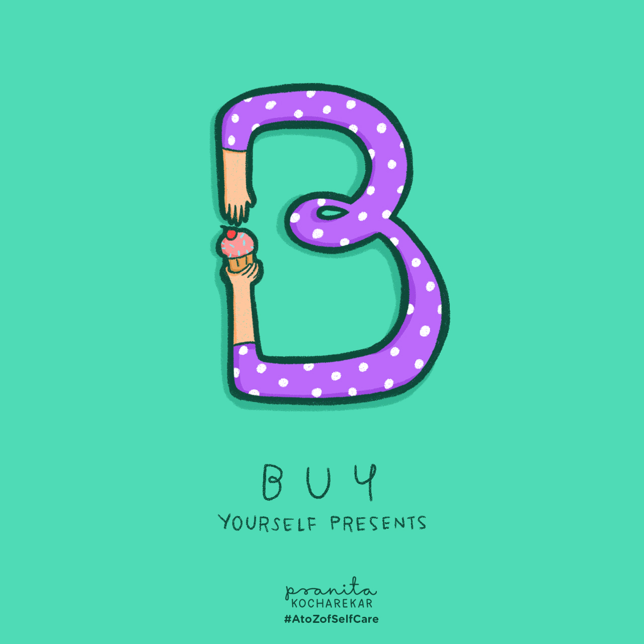
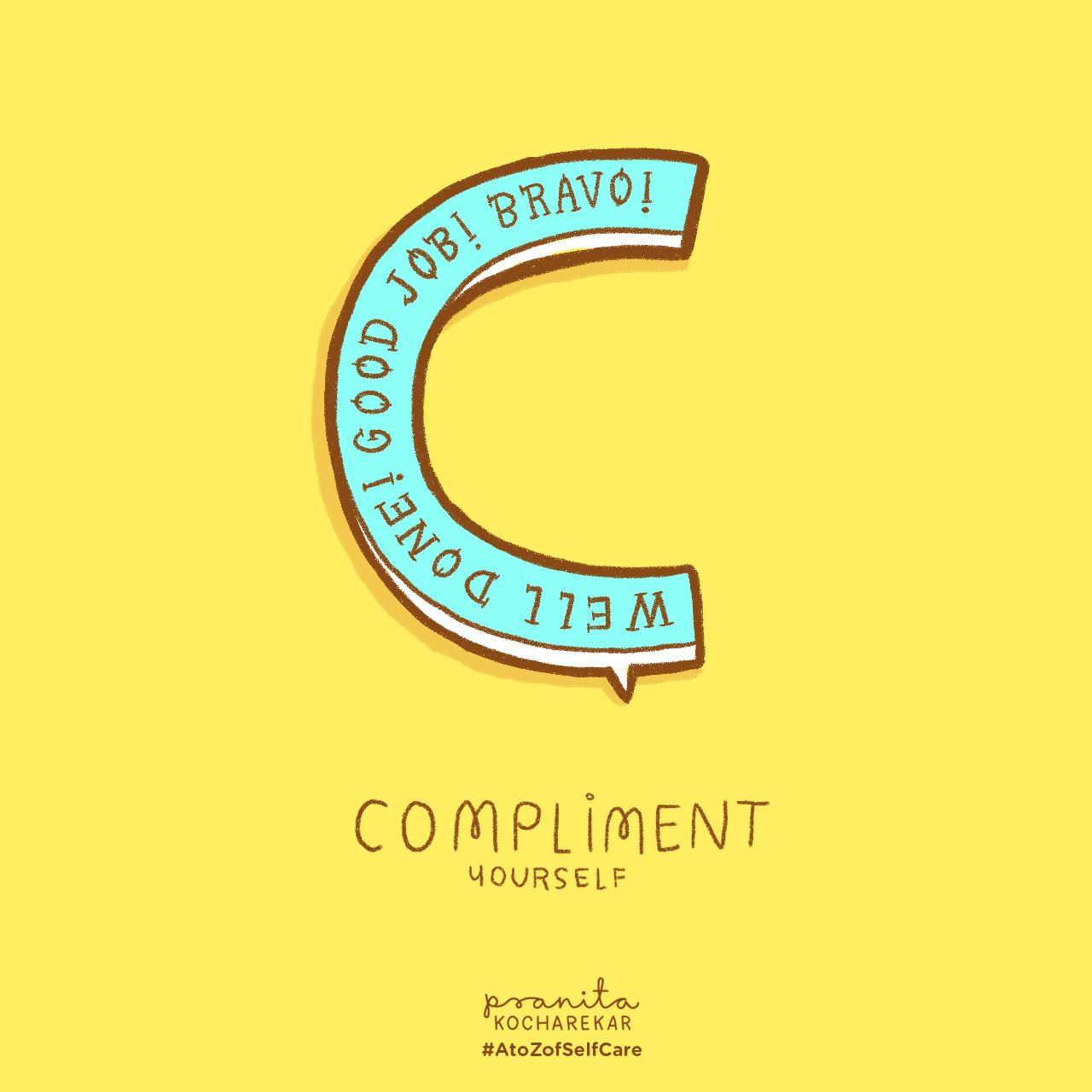
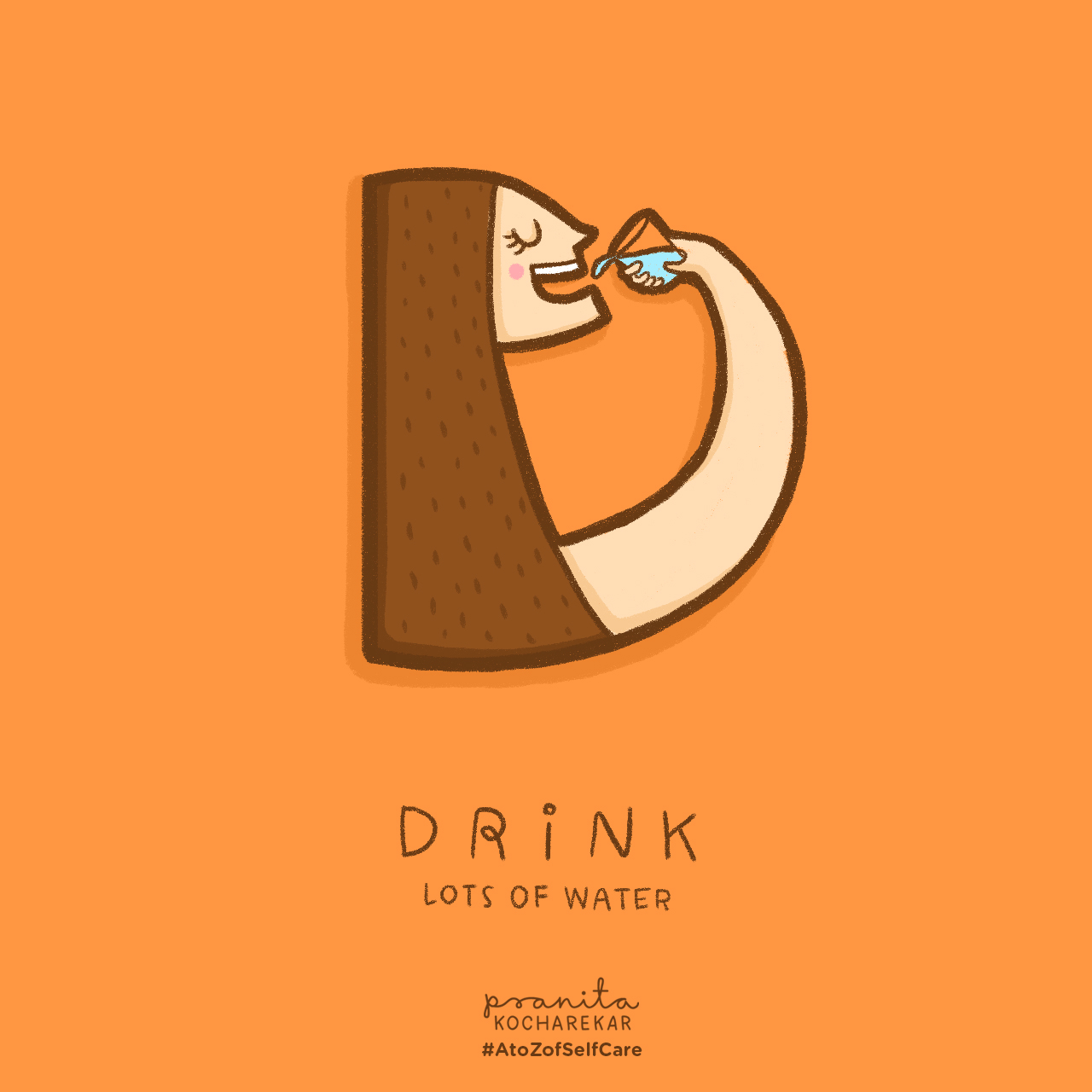
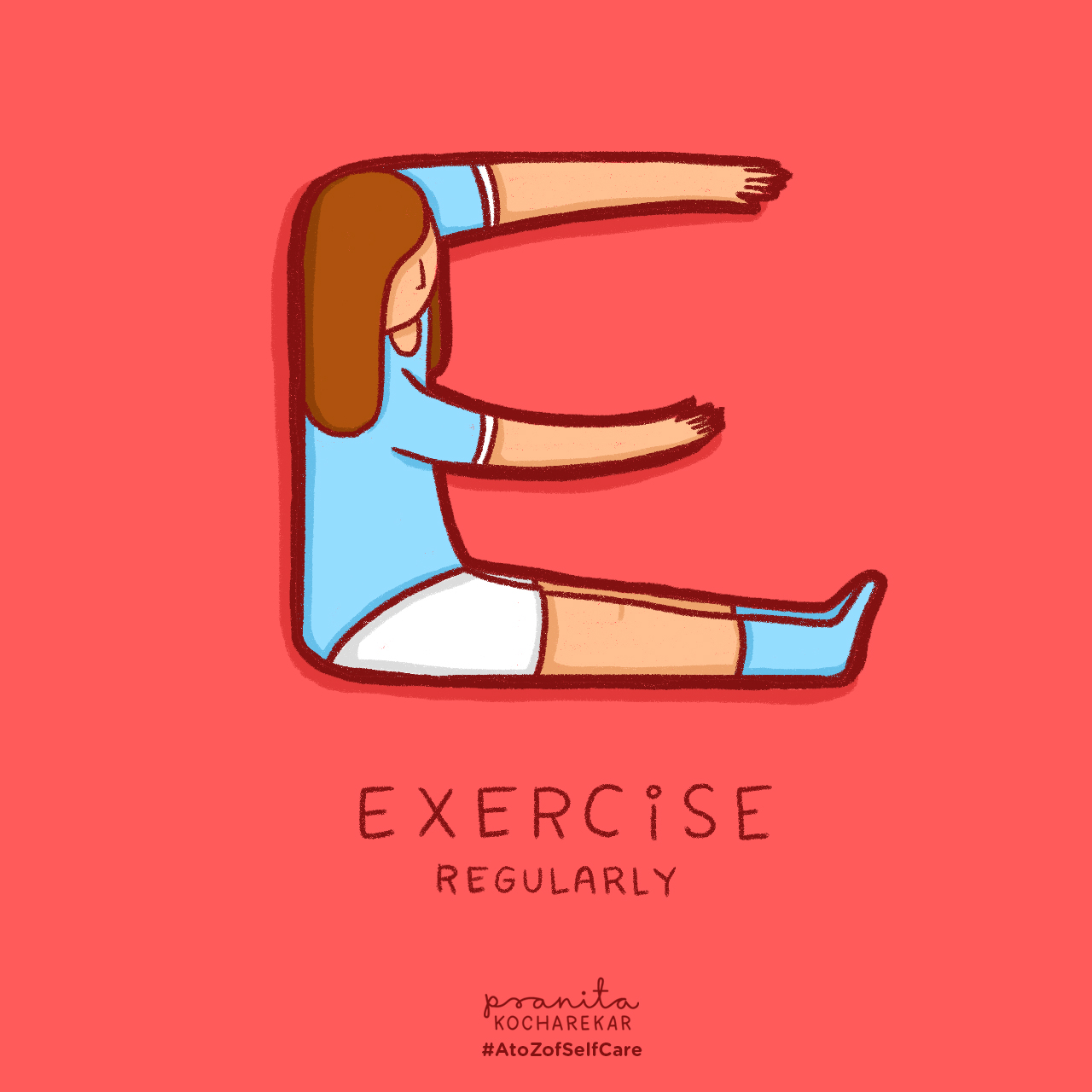
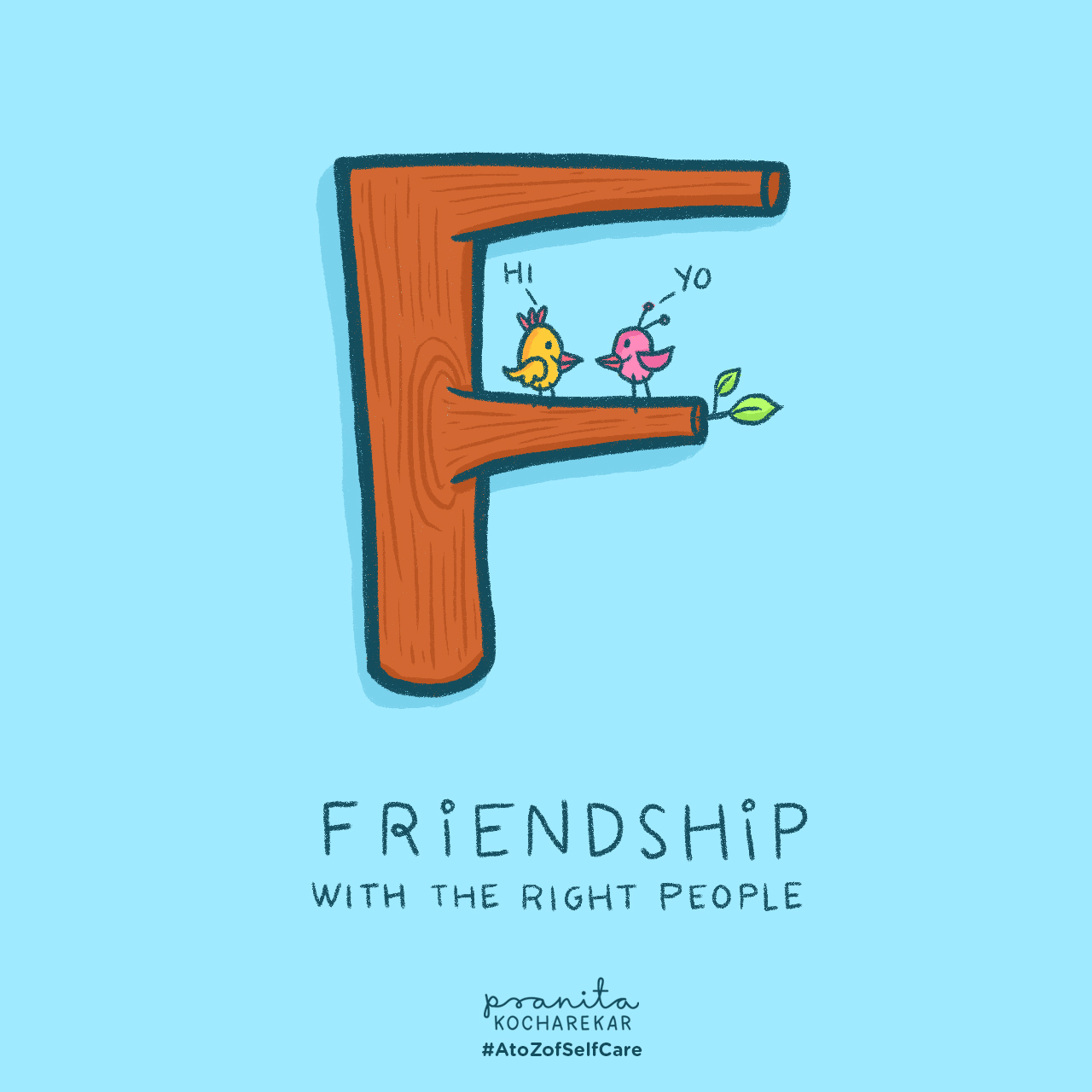
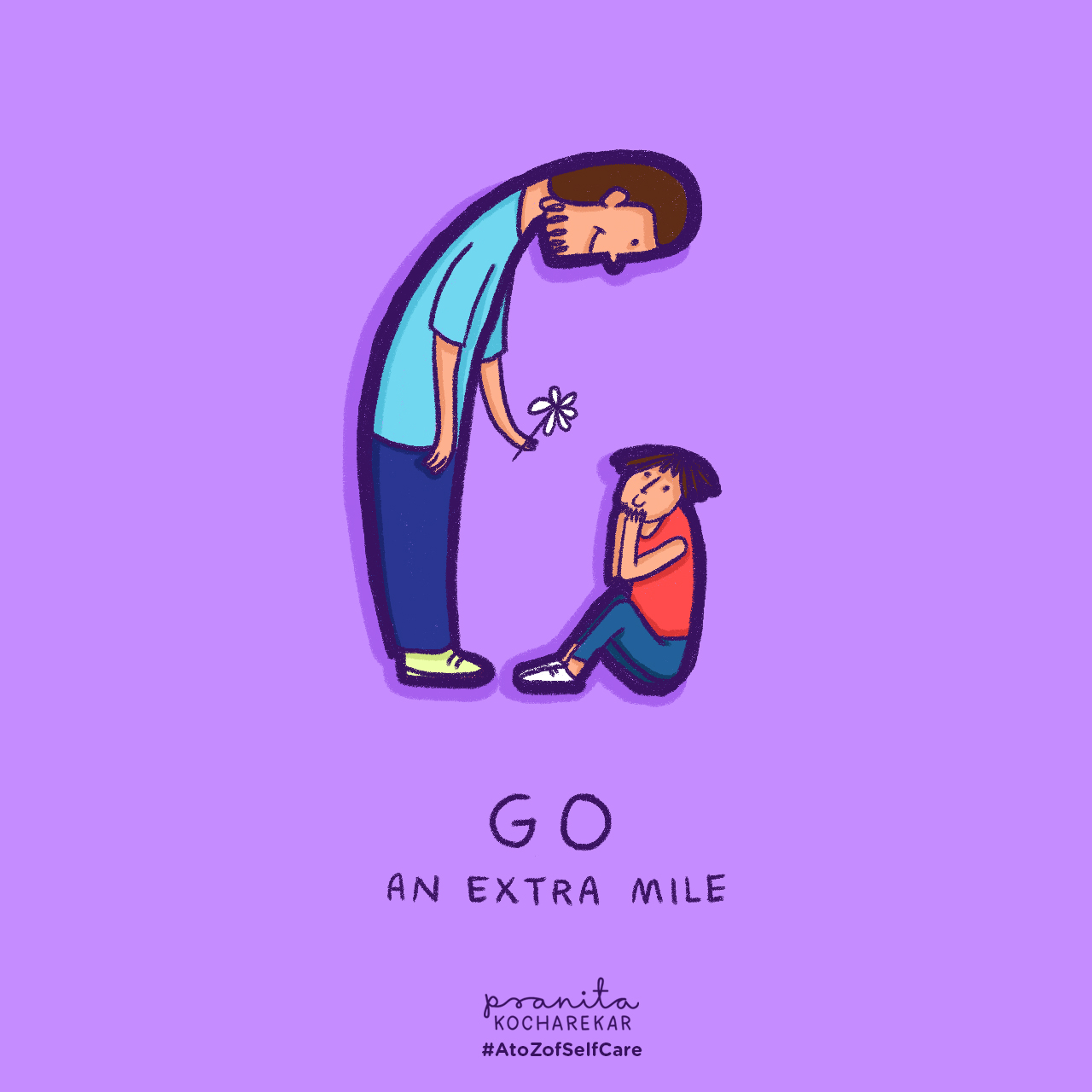
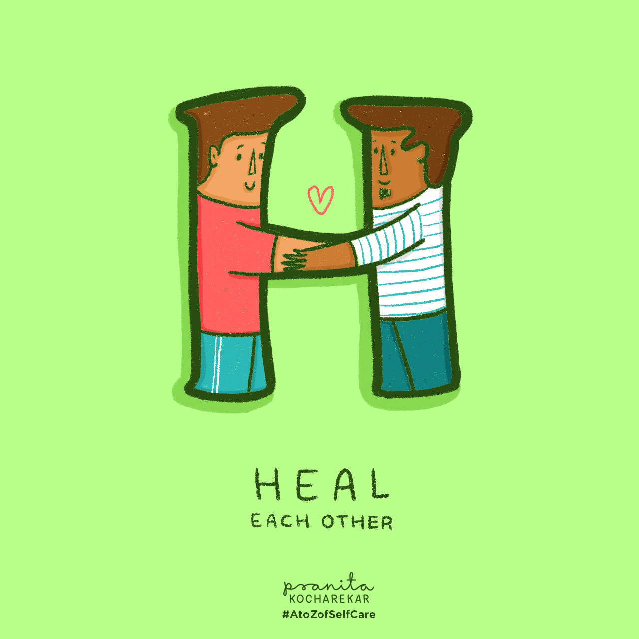
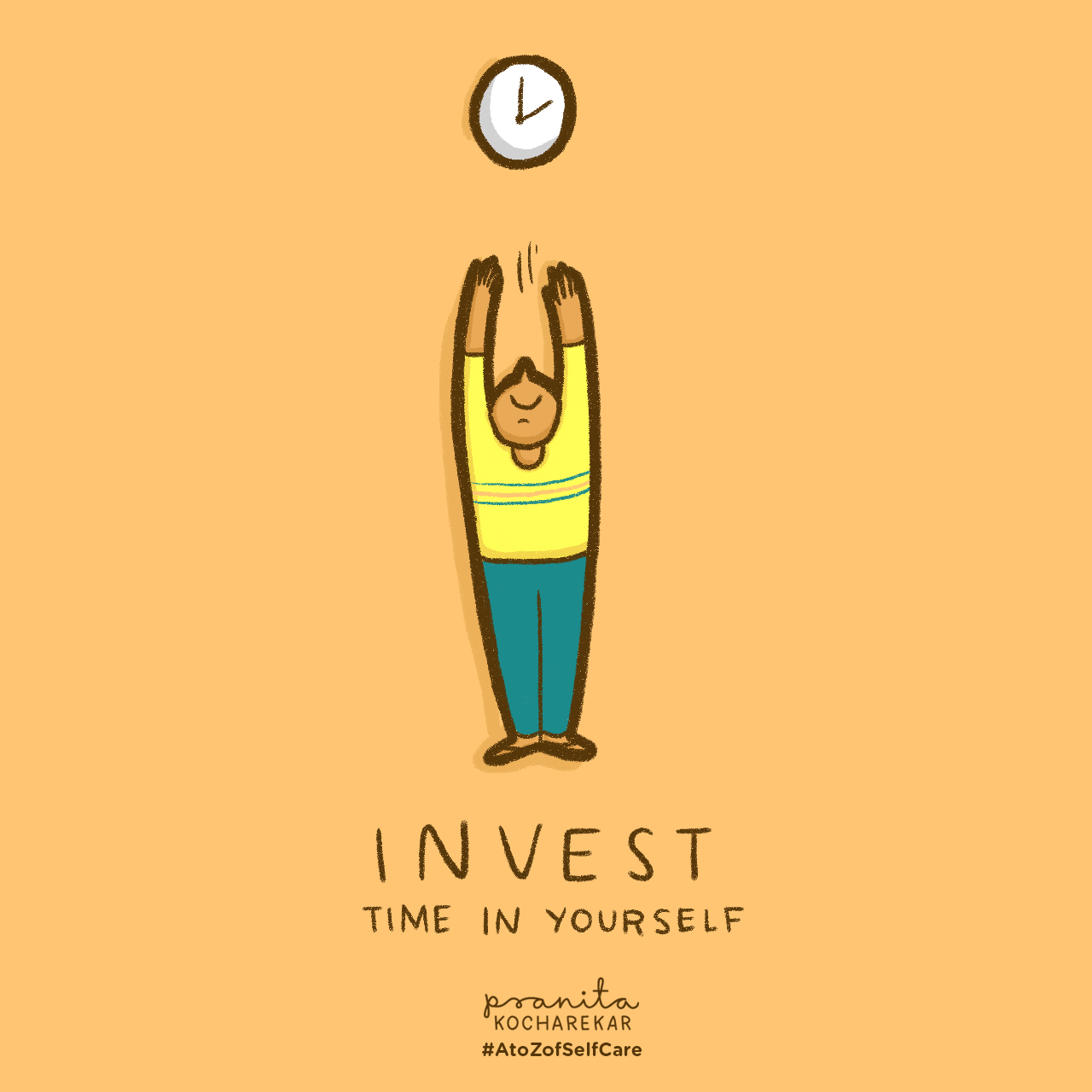
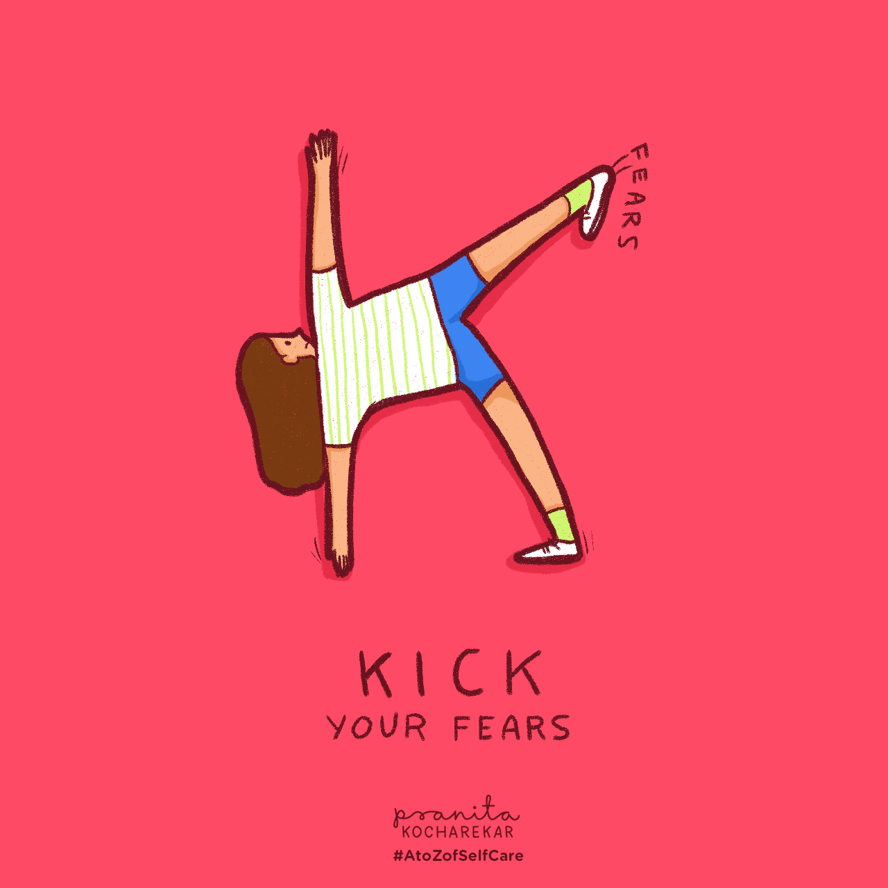
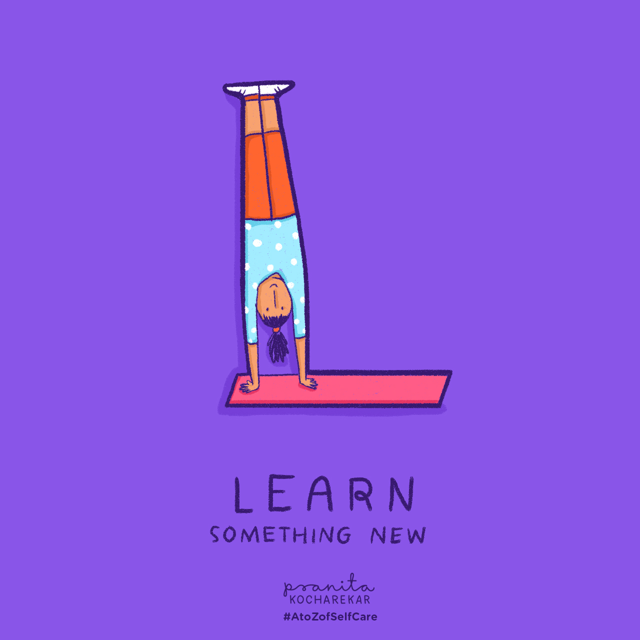
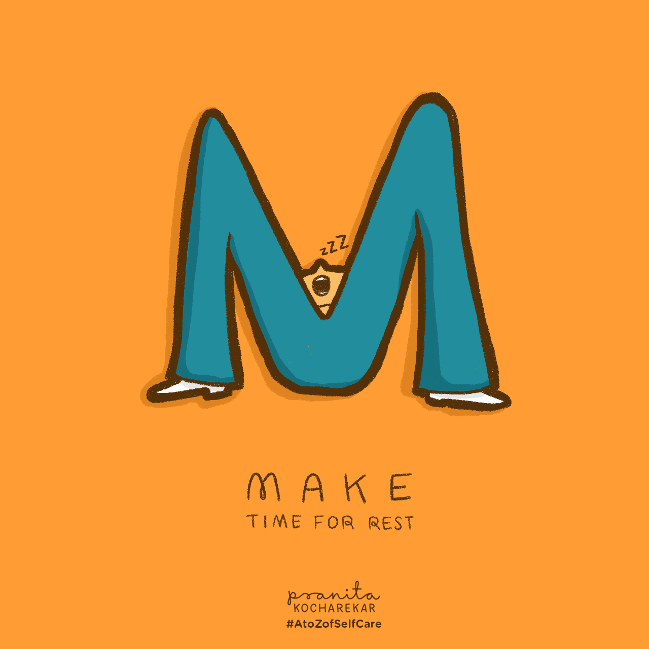
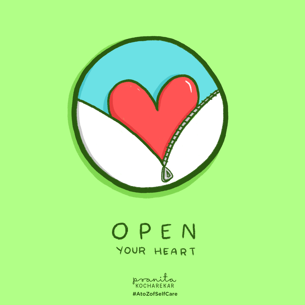
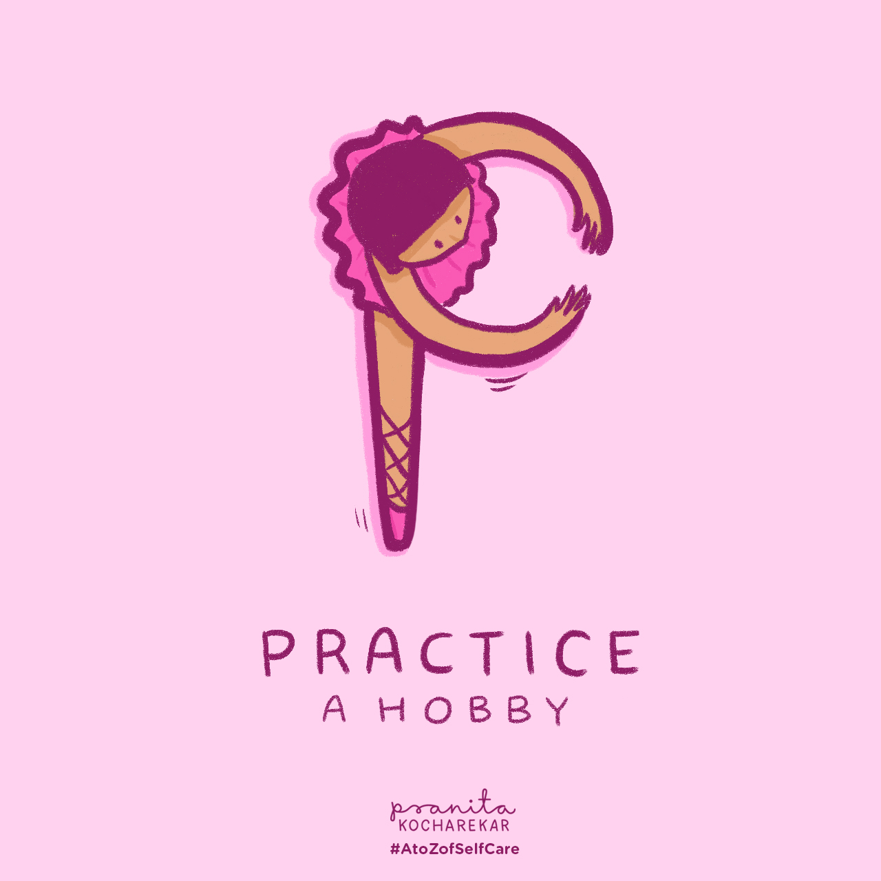
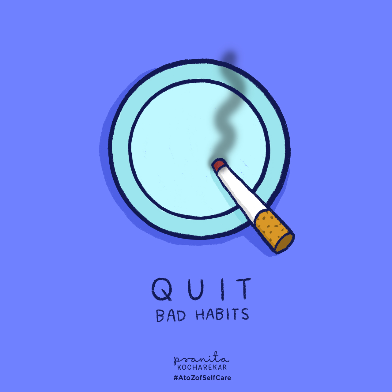
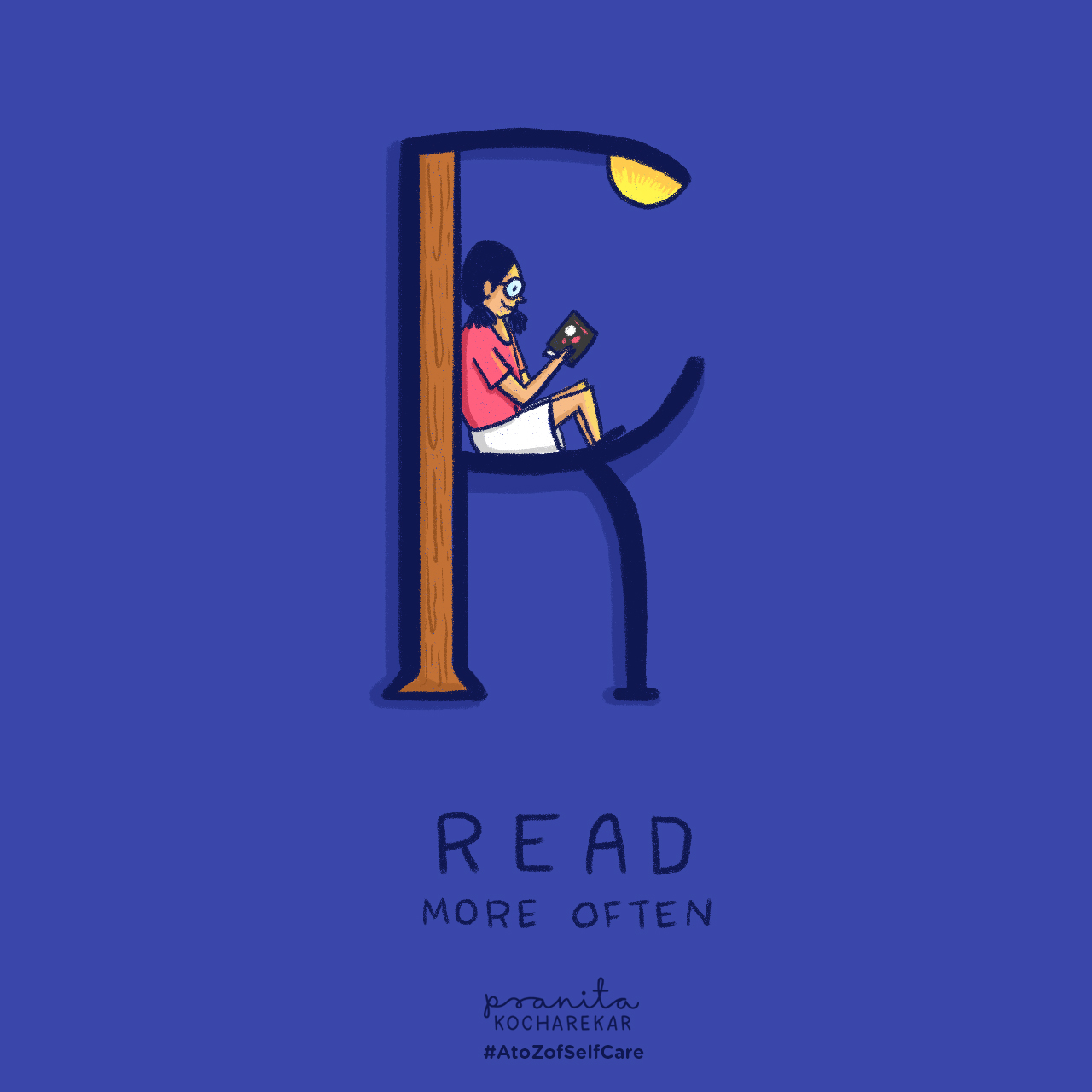
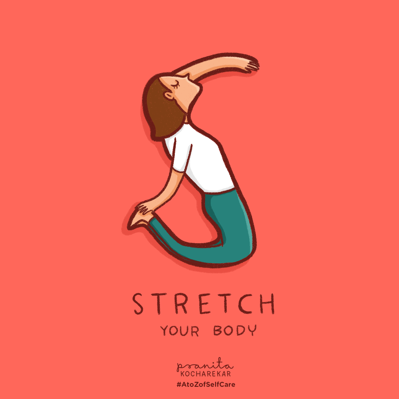
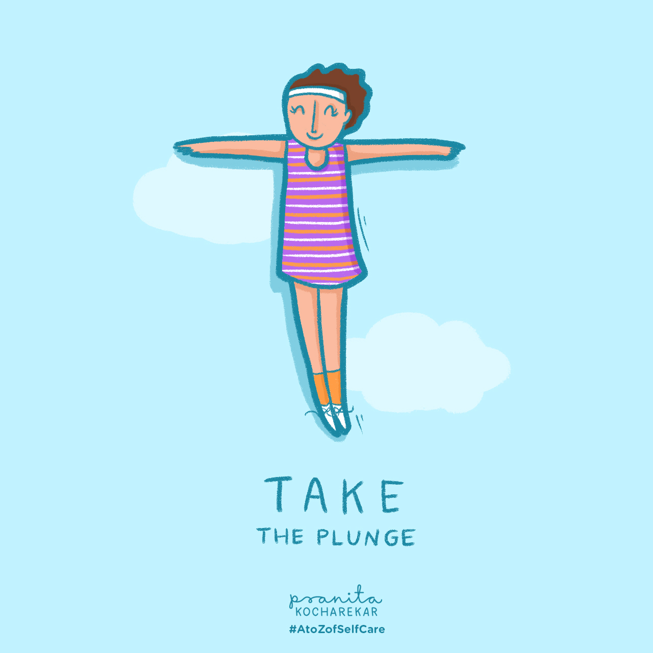
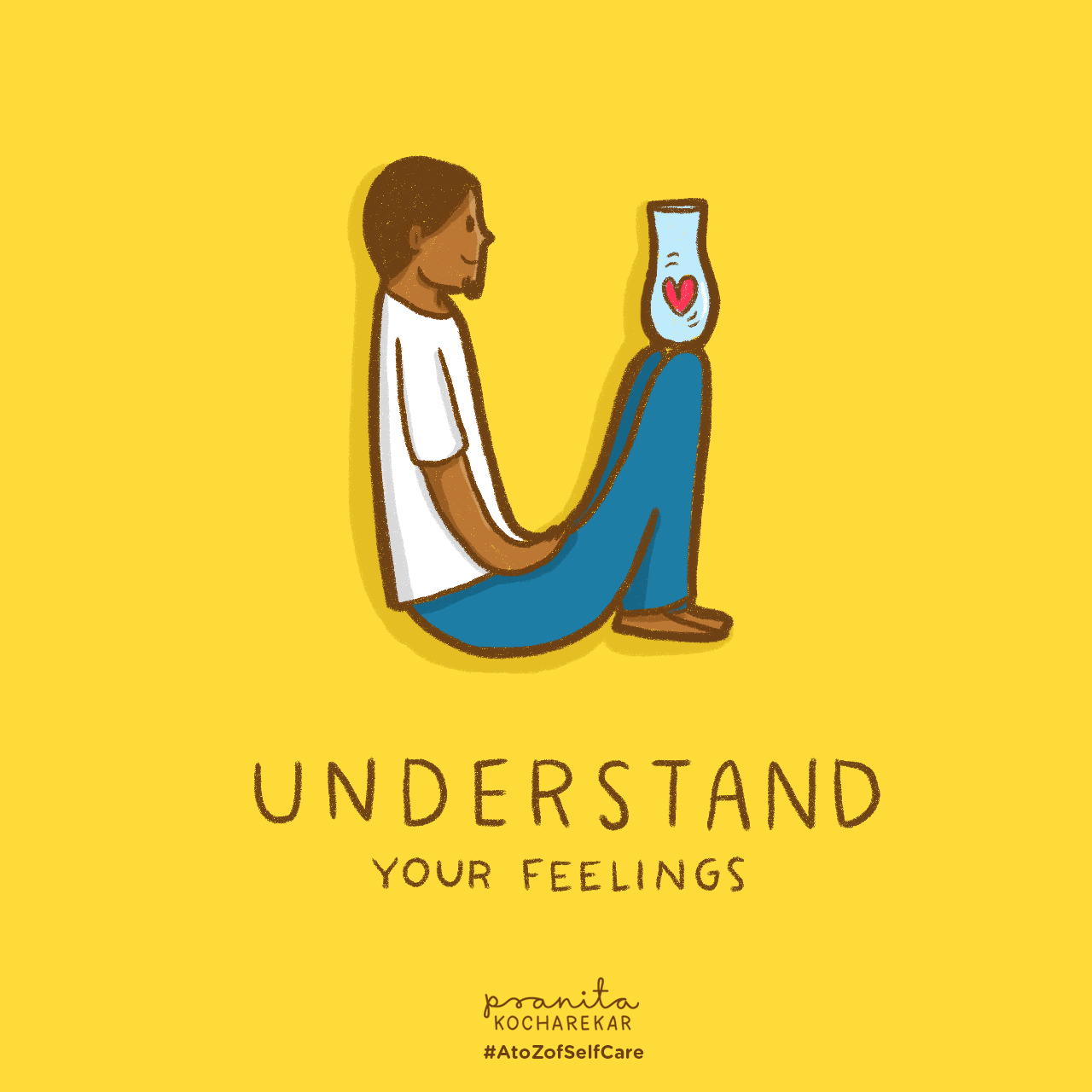
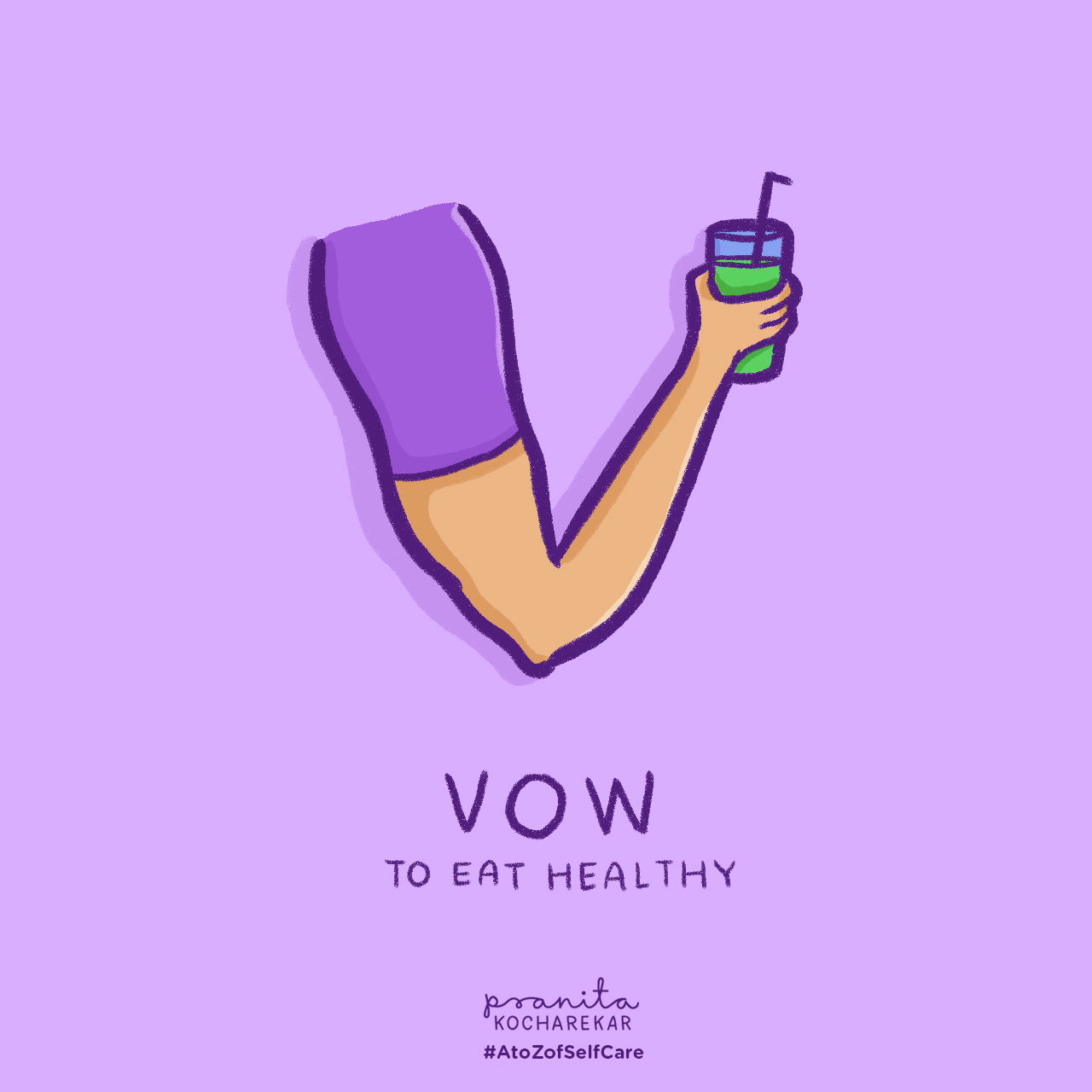
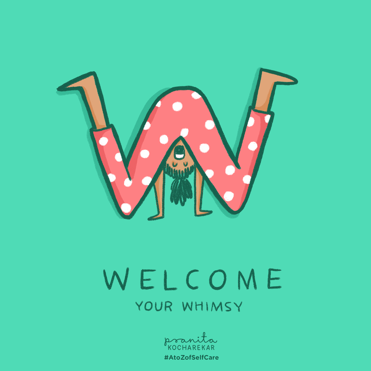
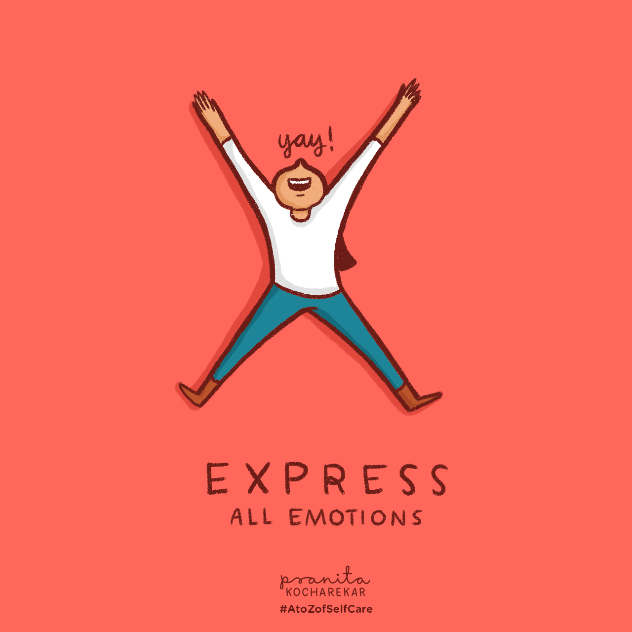
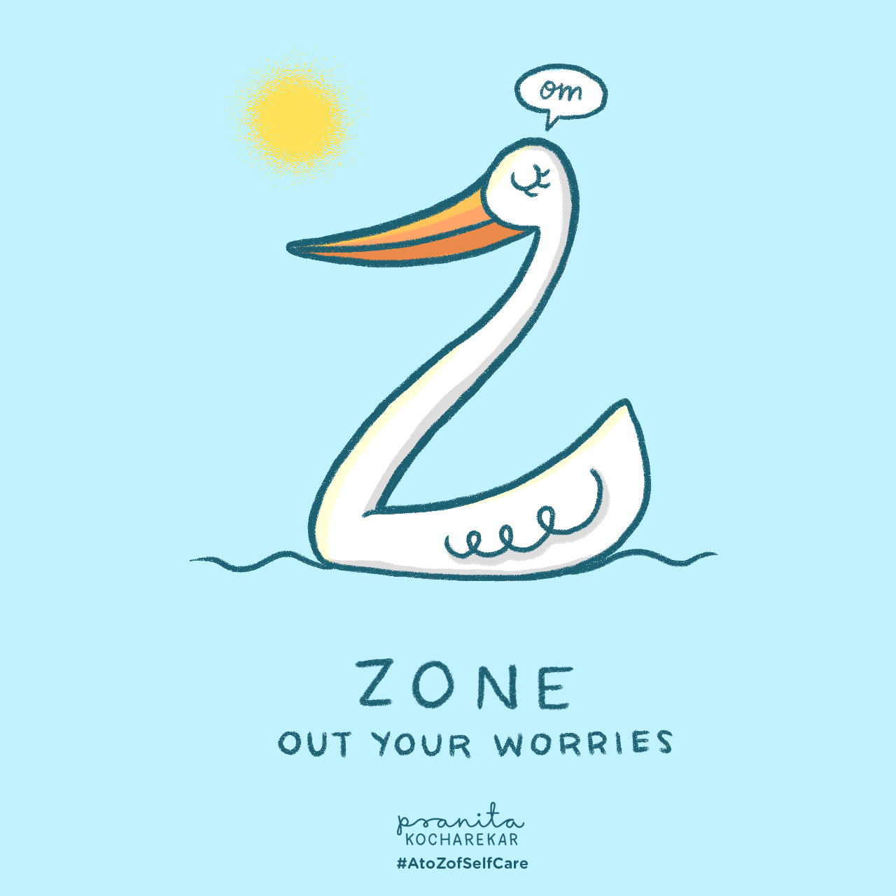
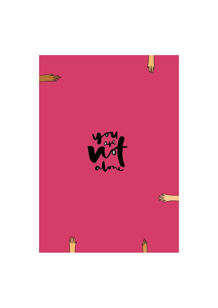
#AToZOfSelfCare is an Instagram series. The idea of this series is to encourage people to spend some extra time taking care of themselves.


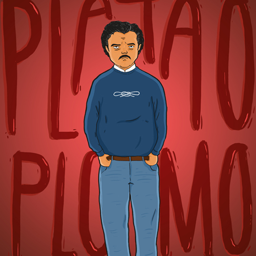
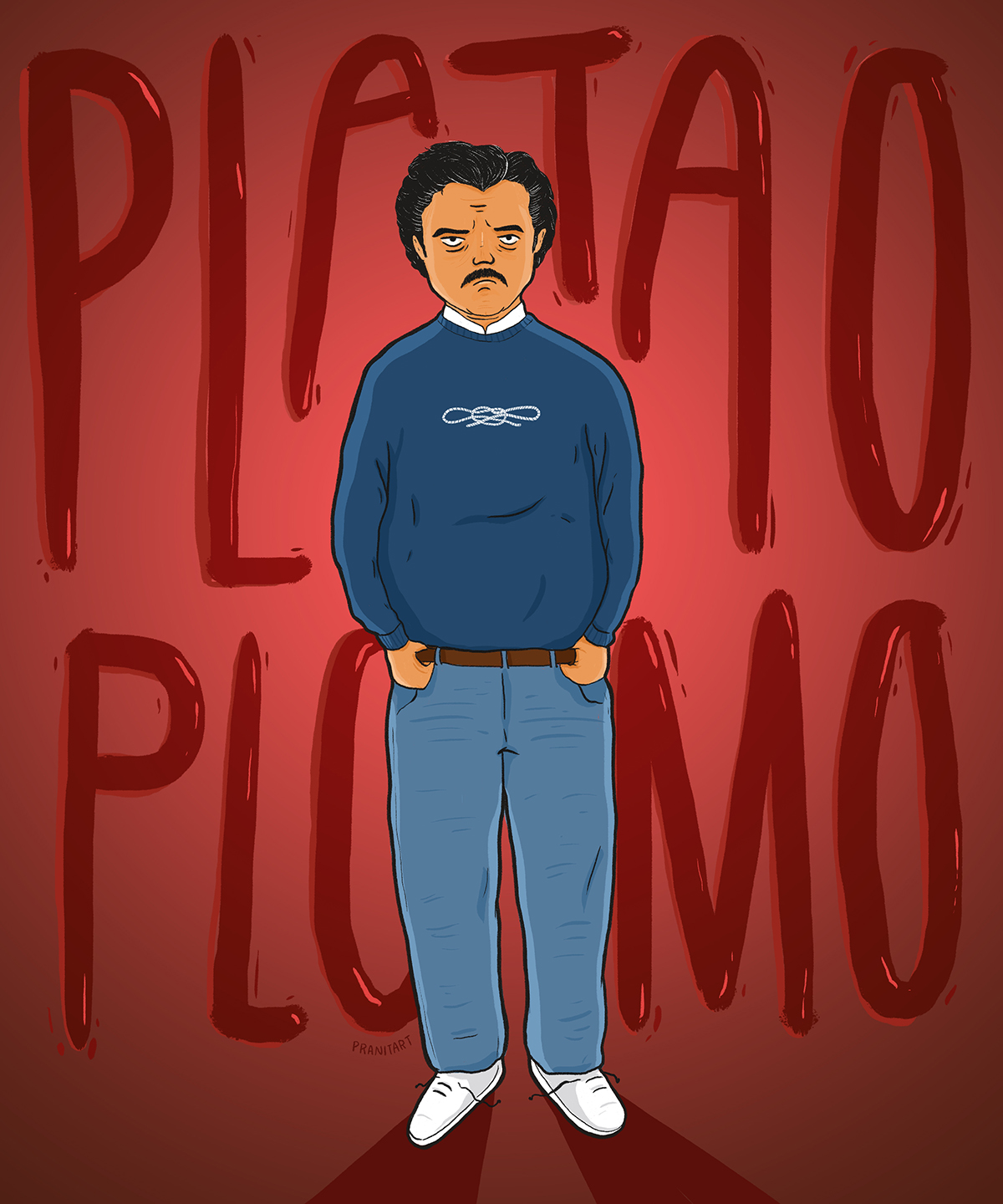
PLATA O PLOMO
Accept a bribe or face death
Commissioned fan art for Narcos Netflix’s social media campaign.

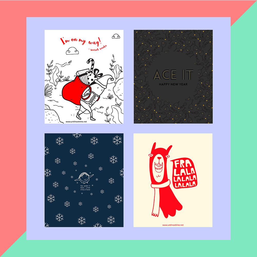
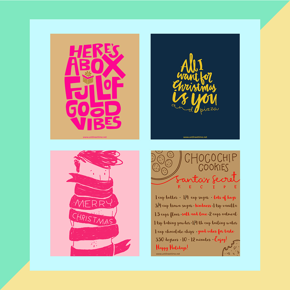
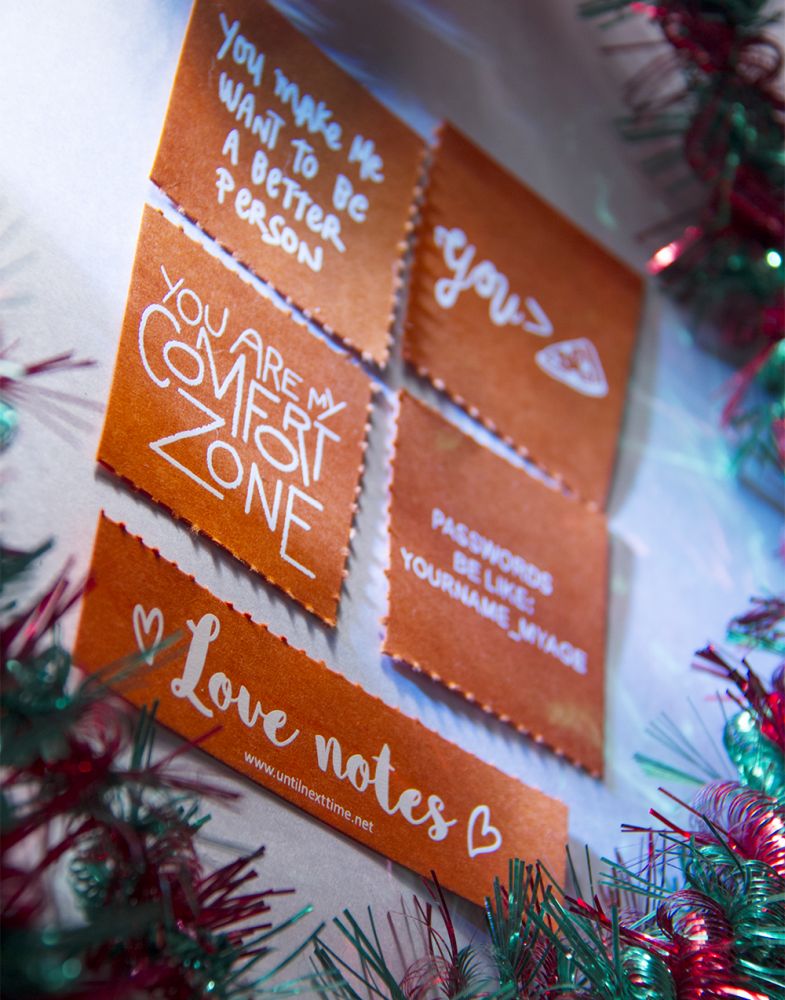
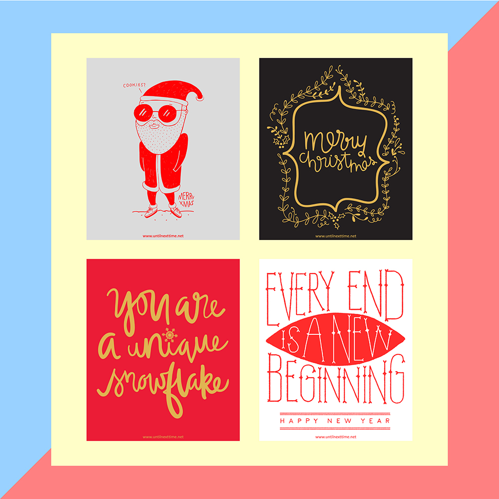
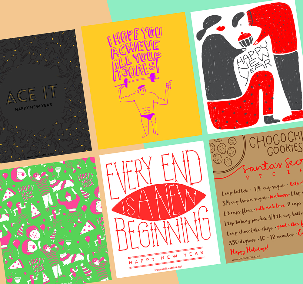
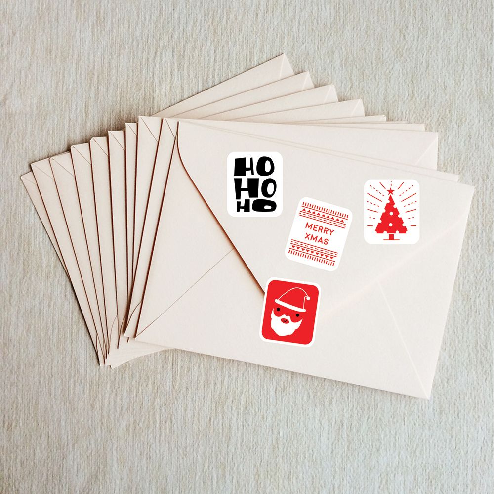
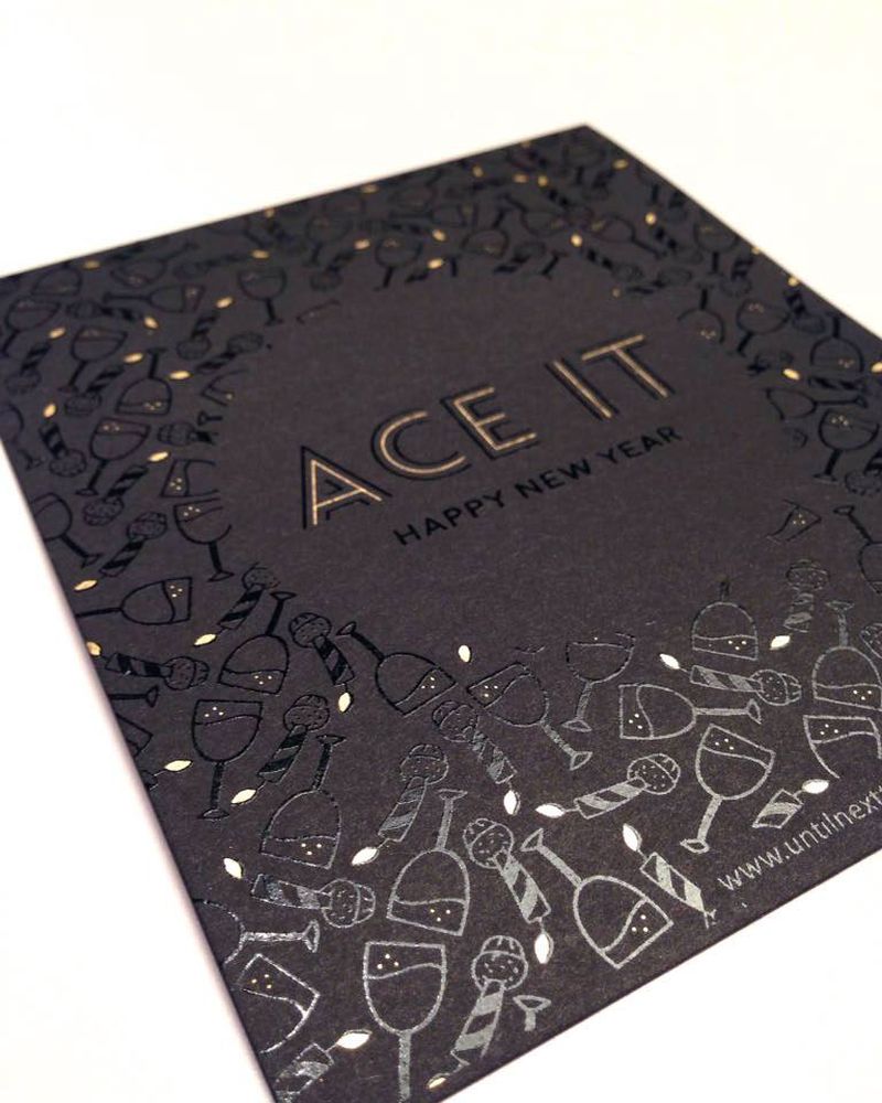
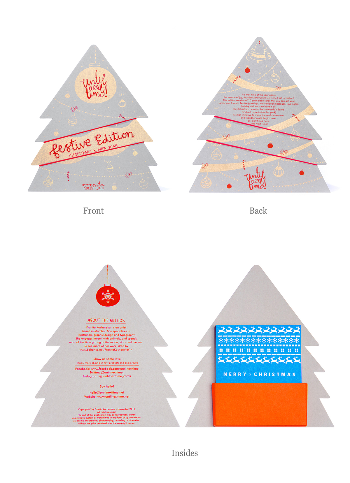
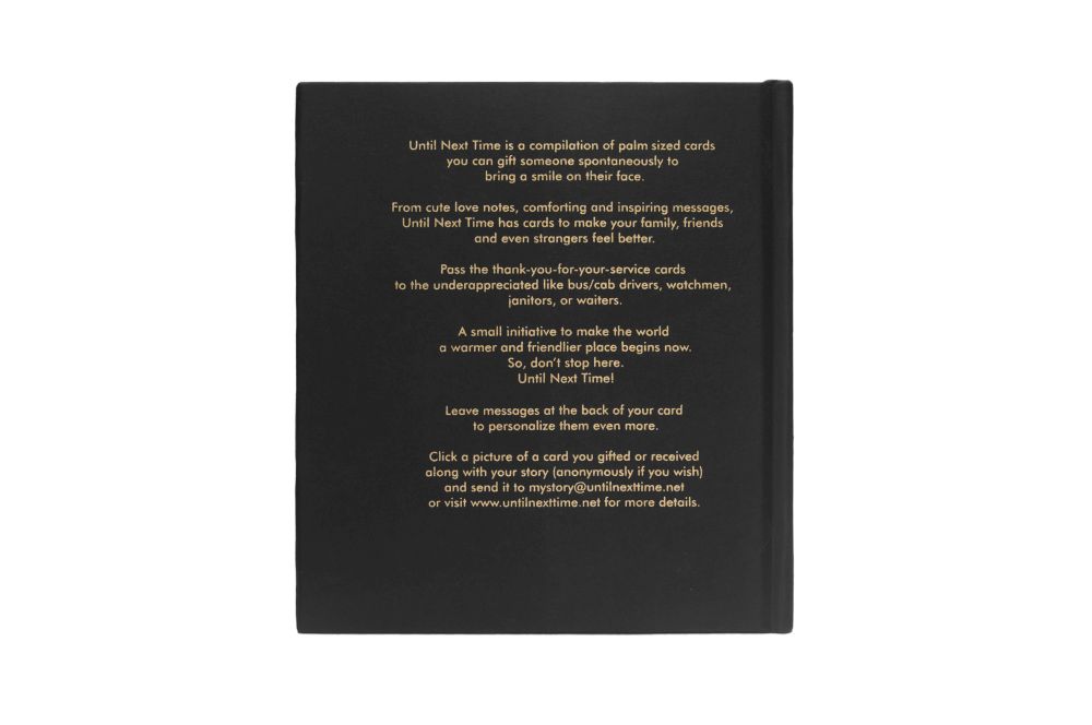
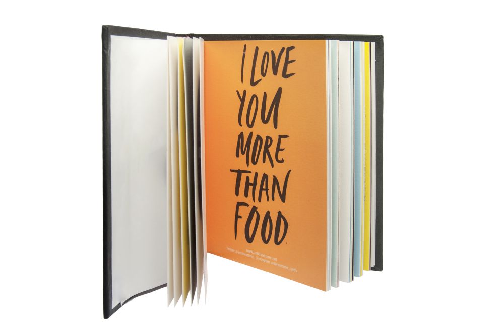
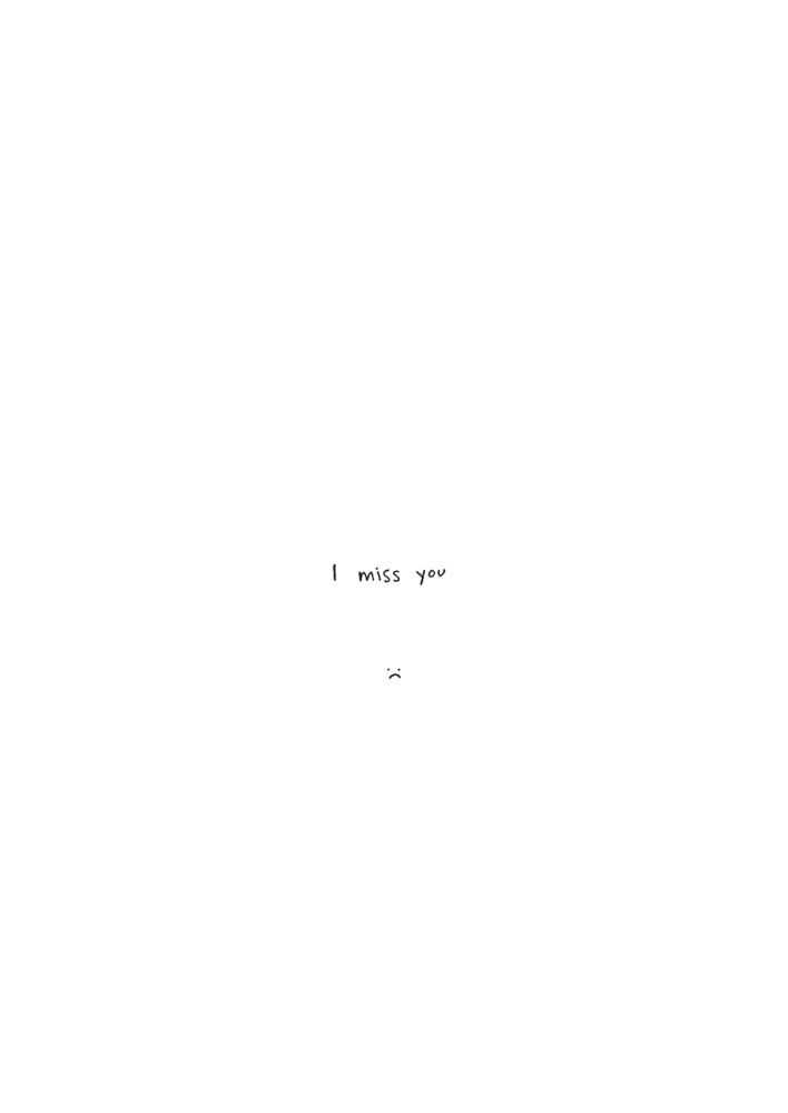
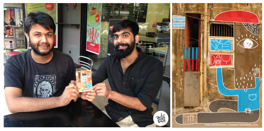
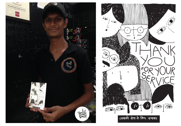
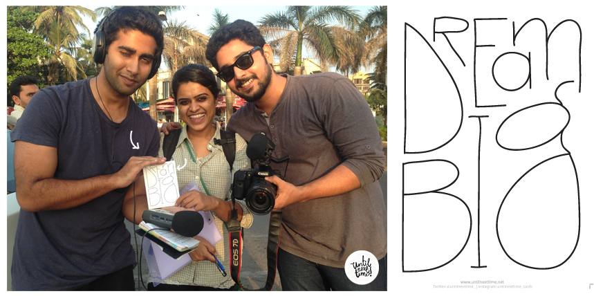
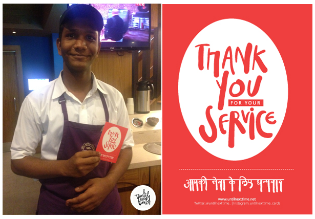
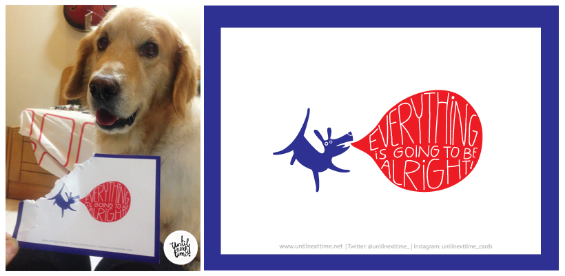
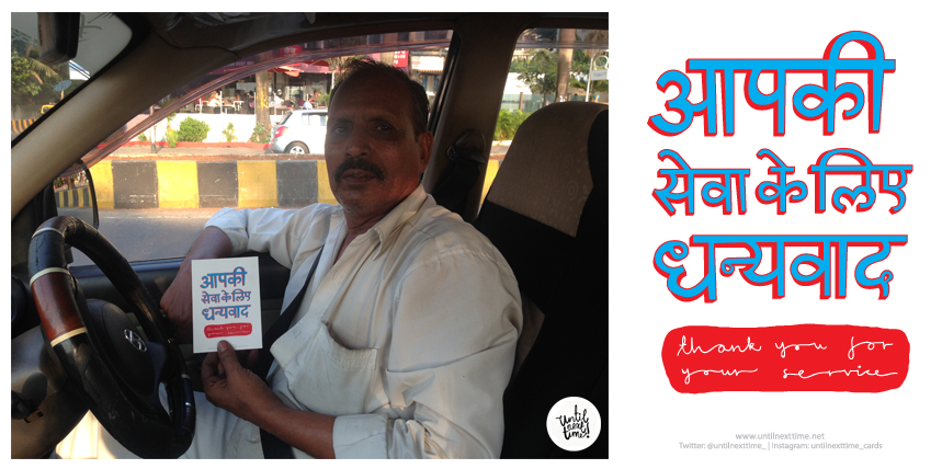
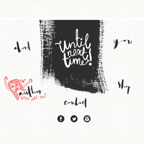
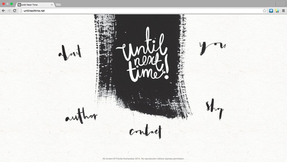
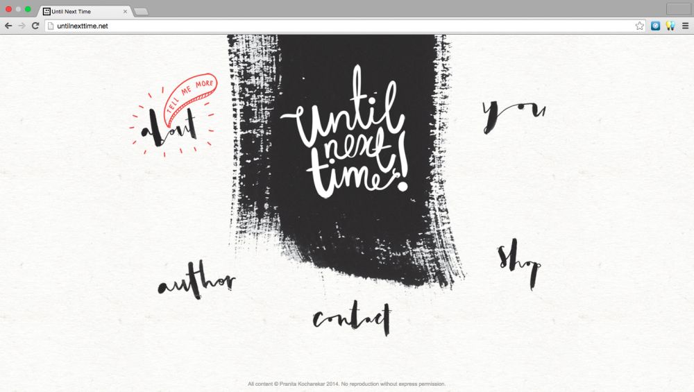
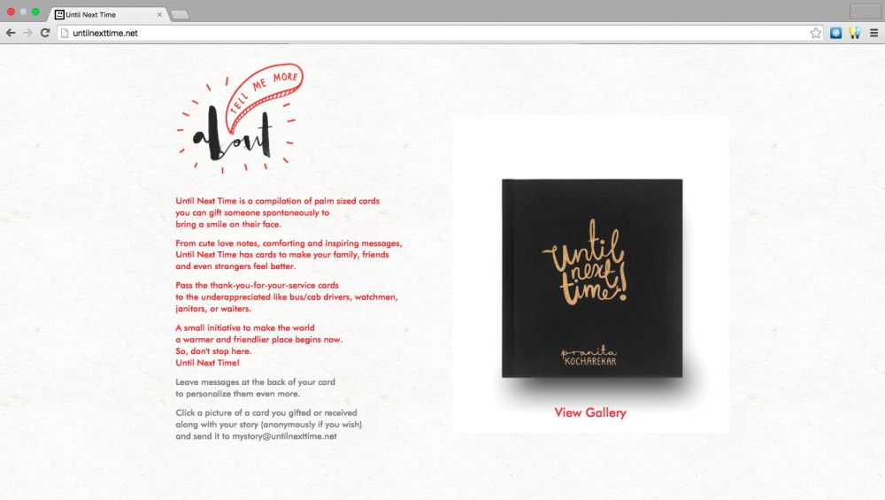
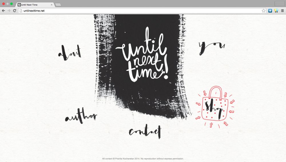
Until Next Time is a compilation of cards designed by me to help spread a smile. This is the second edition – the festive edition. This edition has palm sized Christmas and New Year cards with a unqiue Christmas tree packaging.
Every card was manually screen printed with gold, silver, and fluorescent inks.
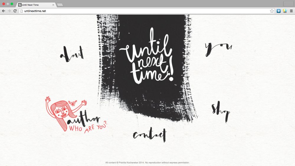
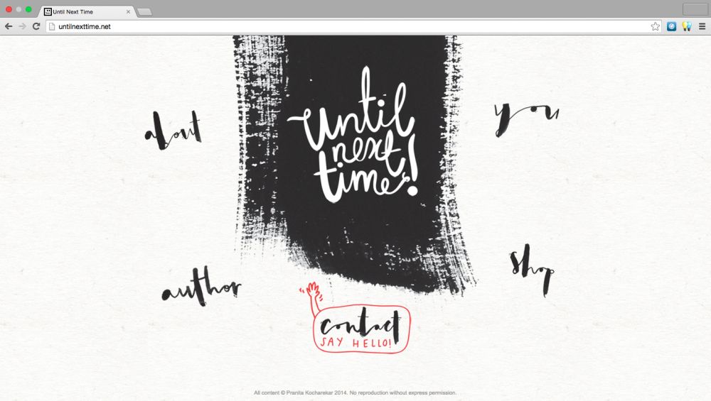
Website: www.untilnexttime.net
Instagram: @untilnexttime_cards
Twitter: @untilnexttime_
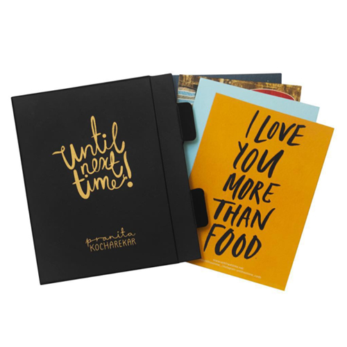
The book is now available on Amazon
Website: www.untilnexttime.net

Self Branding
E-commer Luxury Clothing

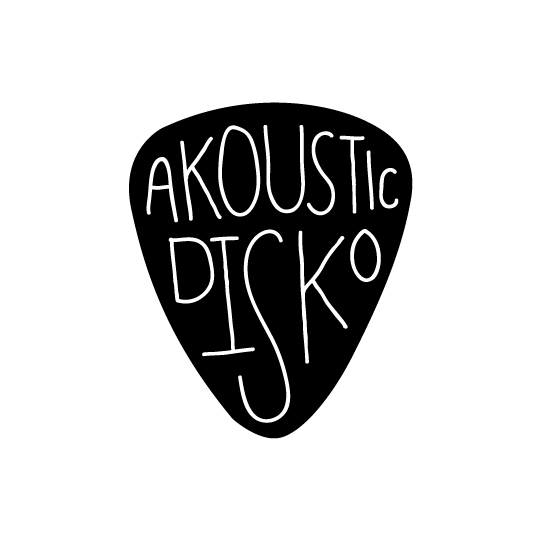
Band that plays disco music using acoustic instruments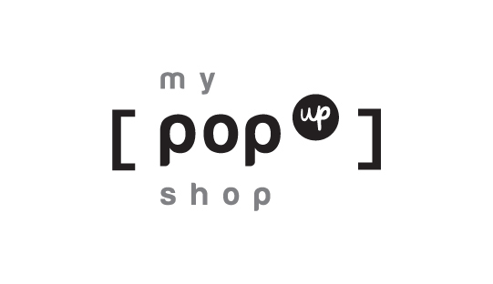
Pop up shops events company
E-commerce luxury clothing
E-commerce clothing
Shoes brand
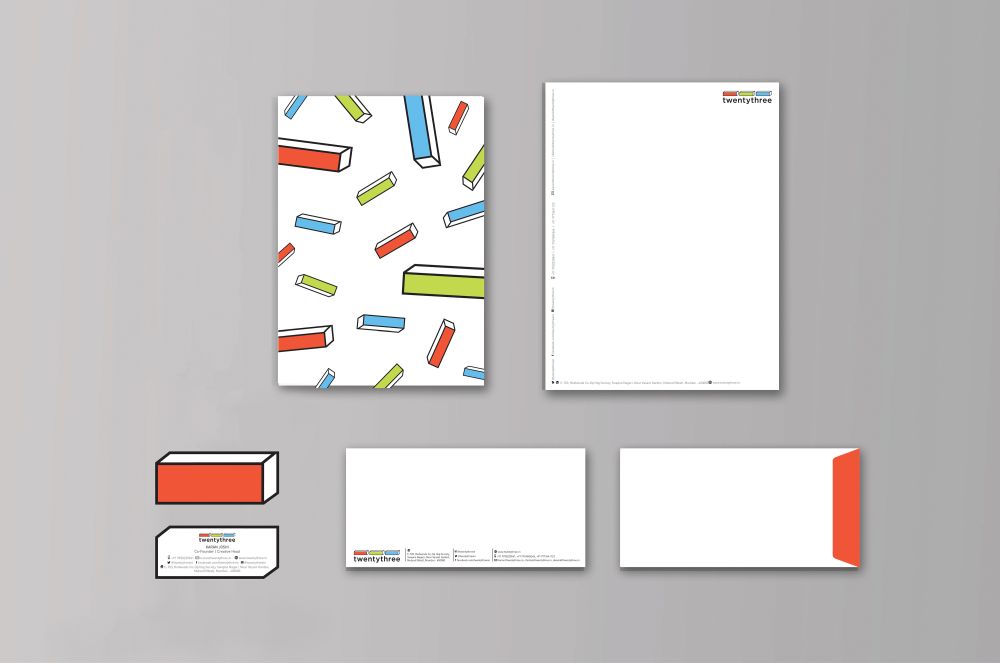
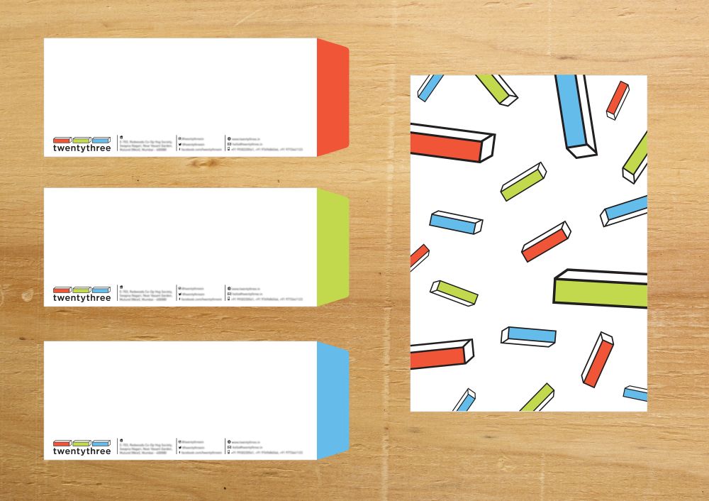
Digital agency
Food – Dessert
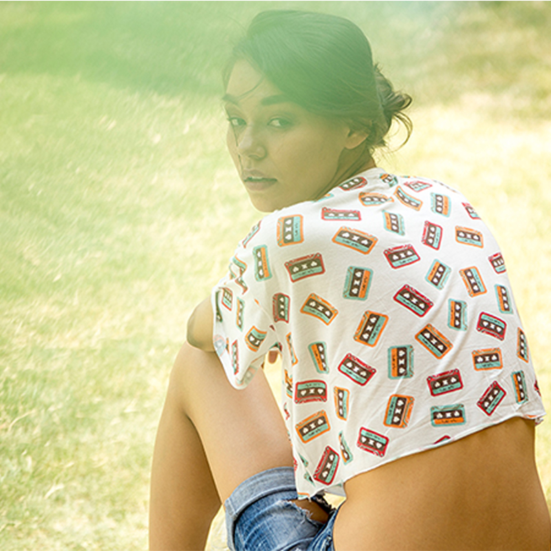
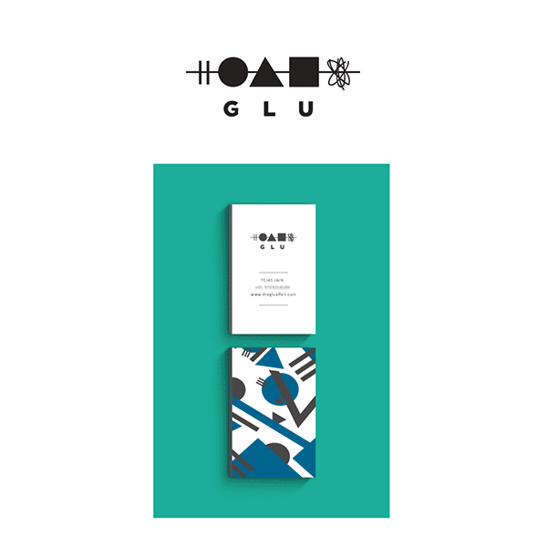
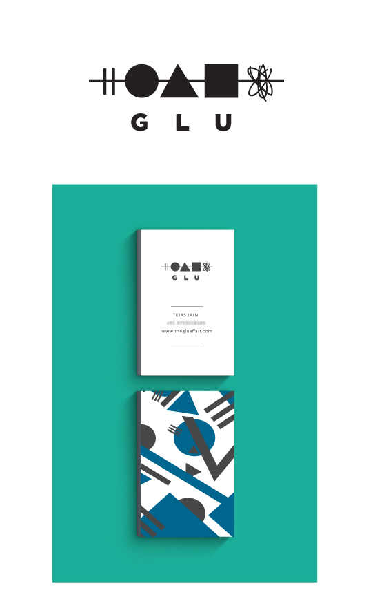
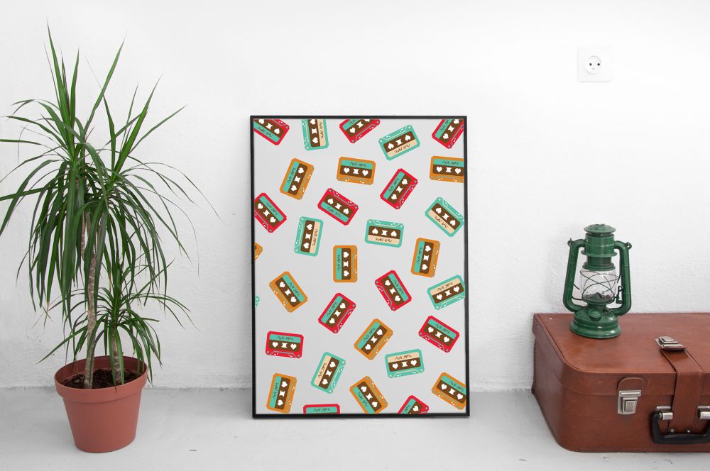
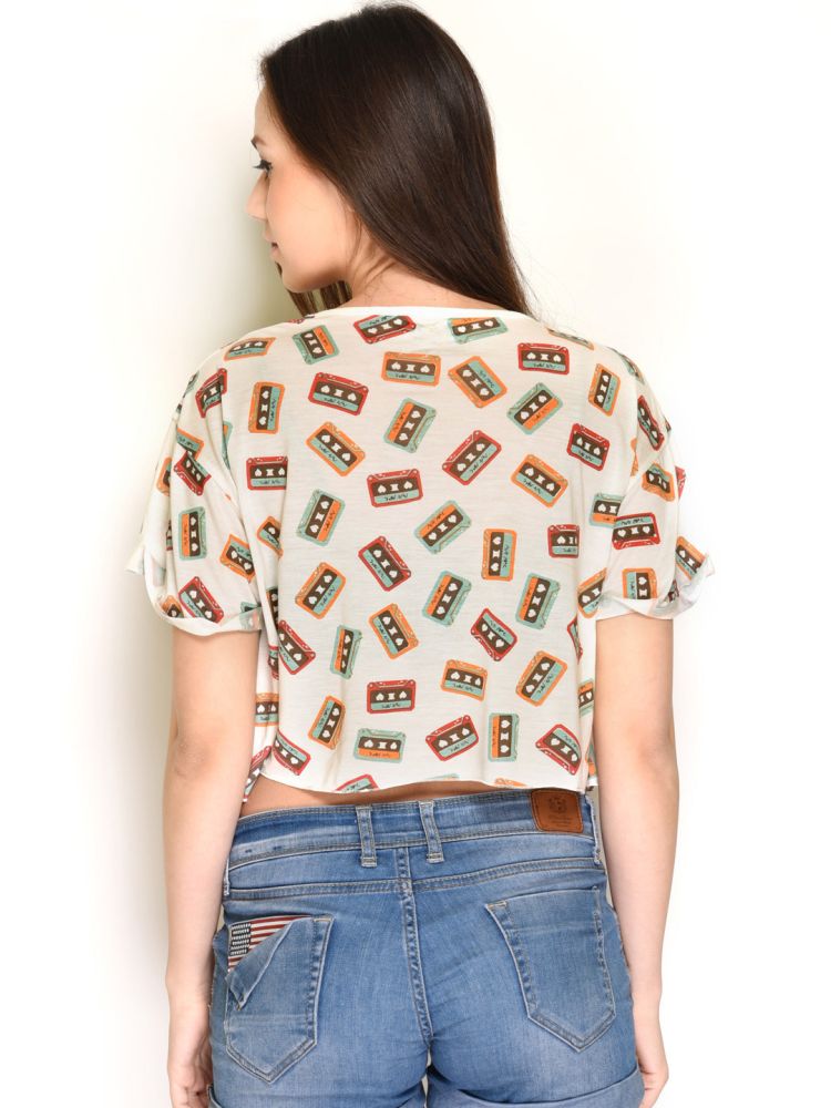
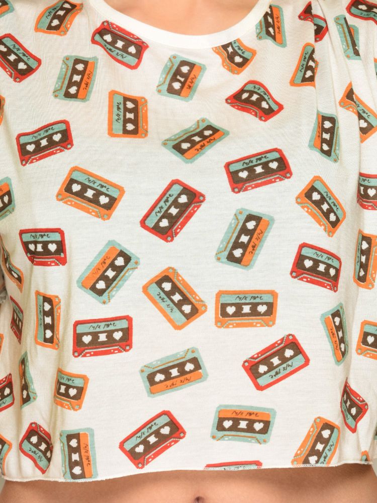
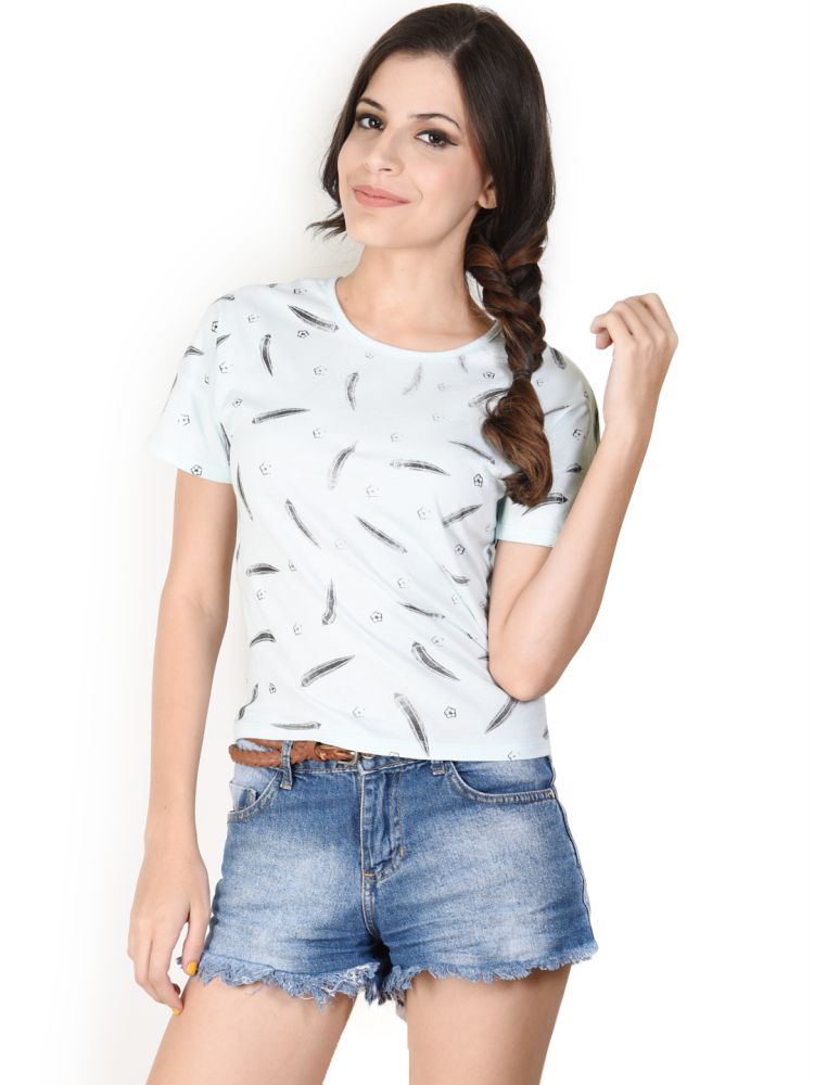
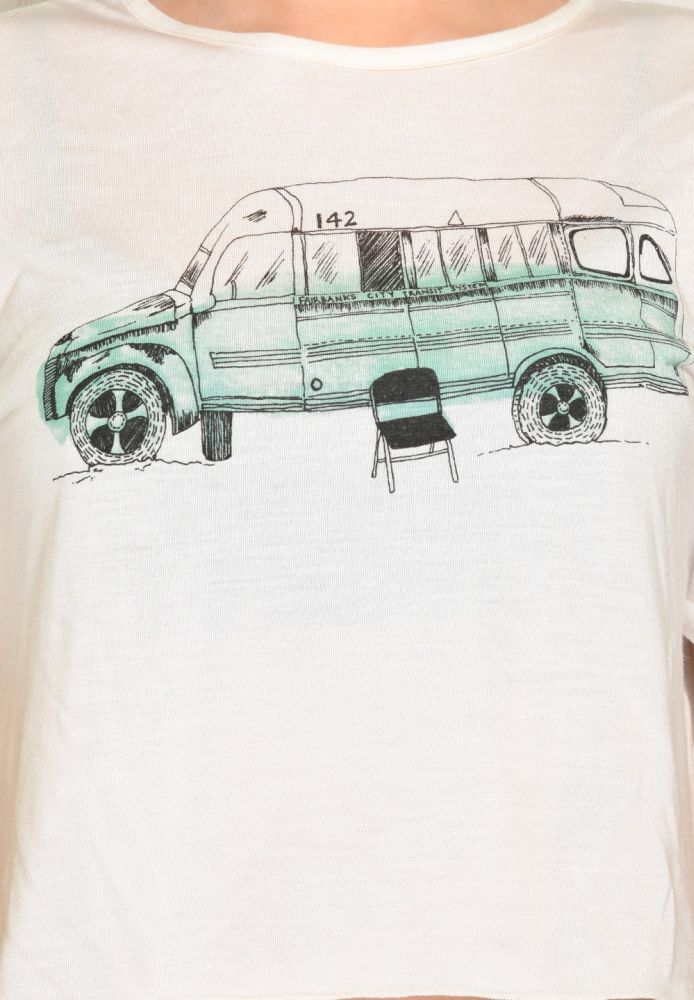
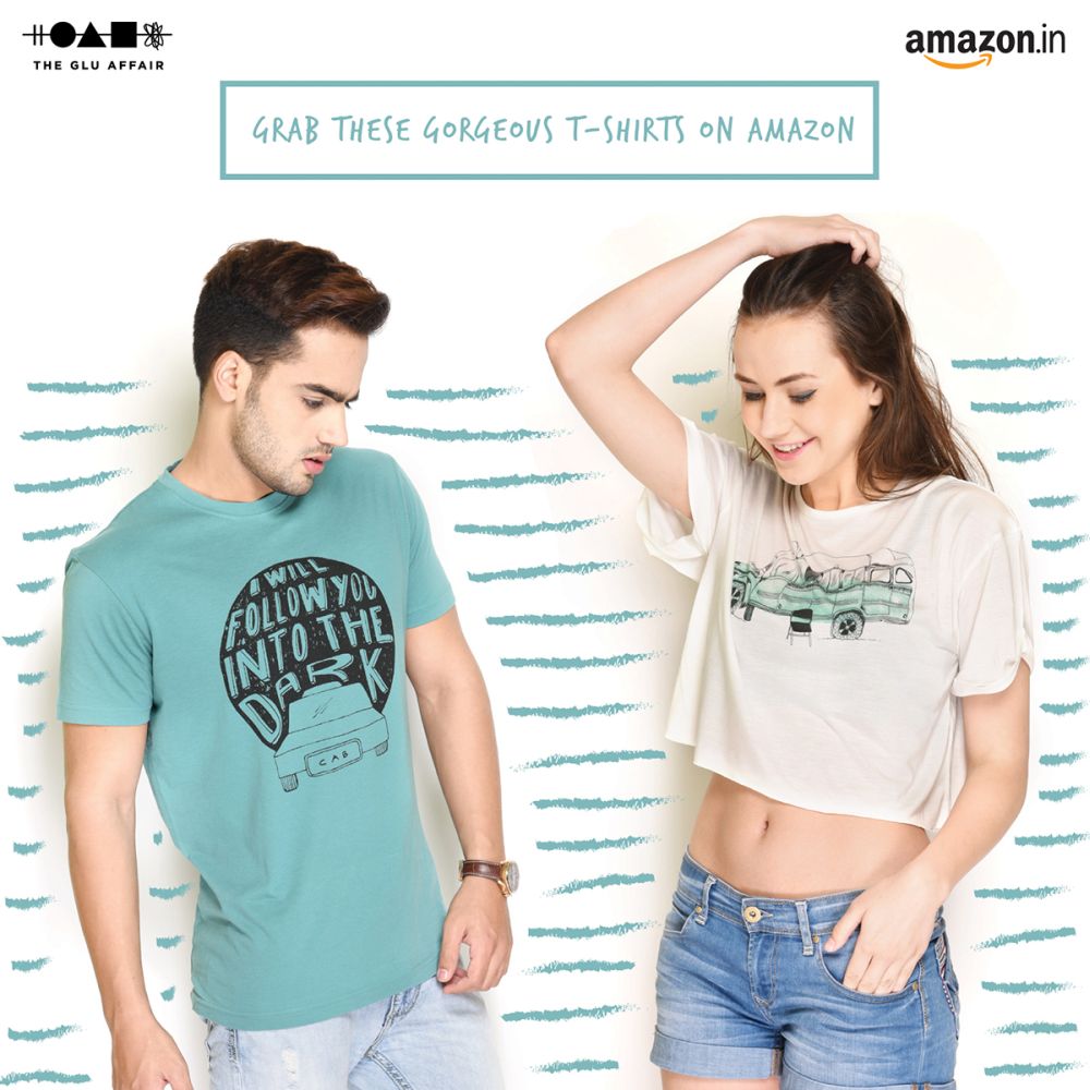
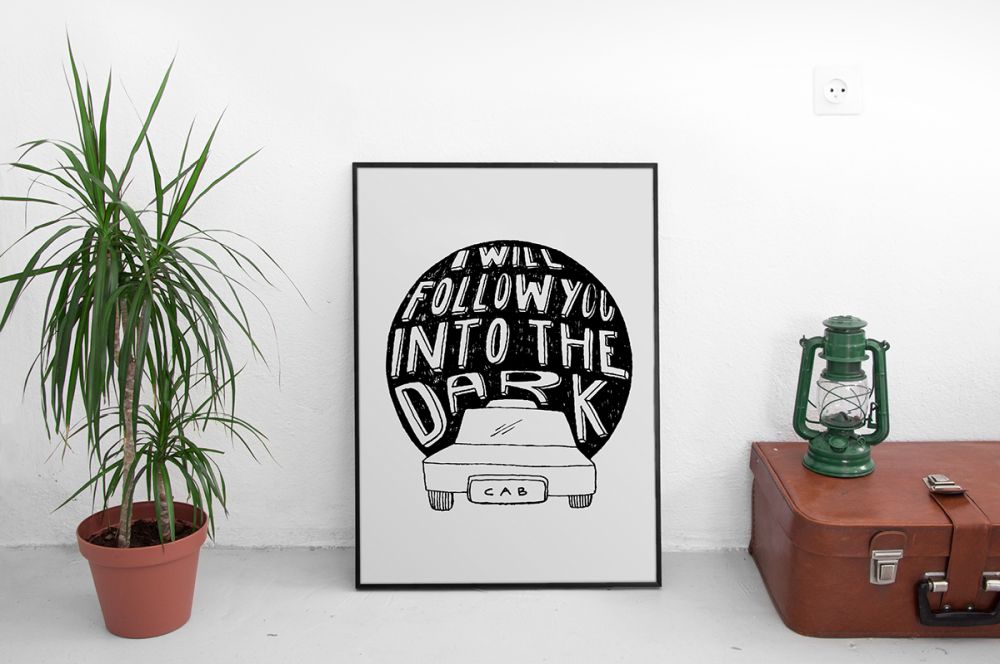
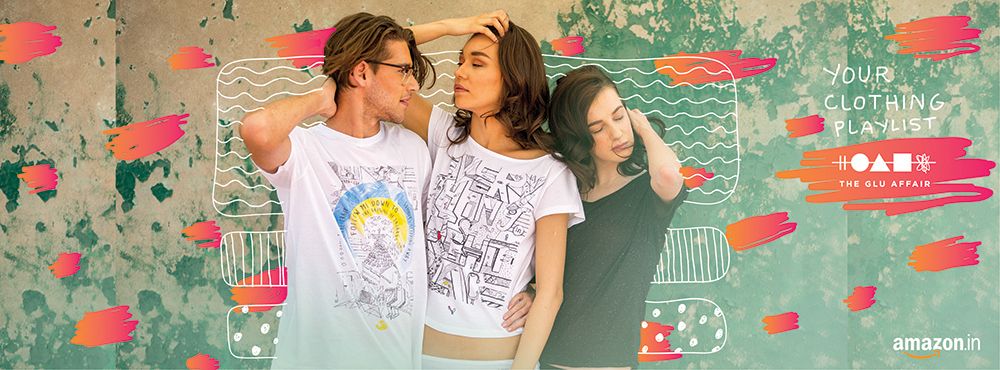
THE GLU AFFAIR is a clothing brand based in India. I’ve been working closely with the brand since a couple years. They’ve released collections inspired by music, art & food. Besides creating their branding, I’ve worked on varaious prints and clothing styles, and also been their artist manager for the first couple collections. We’ve collaborated with artists from all over the globe, like Tyler Spangler, Sophie Bahn, Shamika Kocharekar, Sameer Kulkani, Sanjay Ramachandran, Hikimi& so on.
You can purchase these designs here.
Follow them on Facebook, Twitter & Instagram for more!


Art for social media
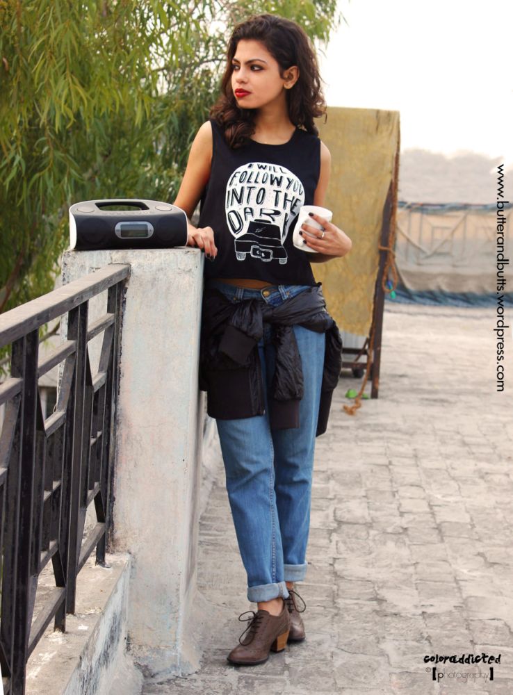
Style & fashion bloggers, DJs and actors donning the print


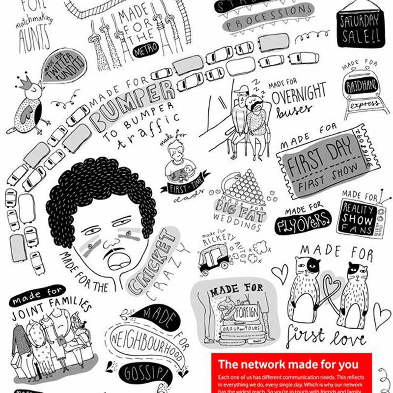
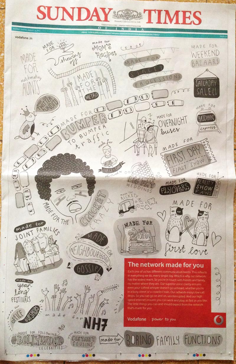
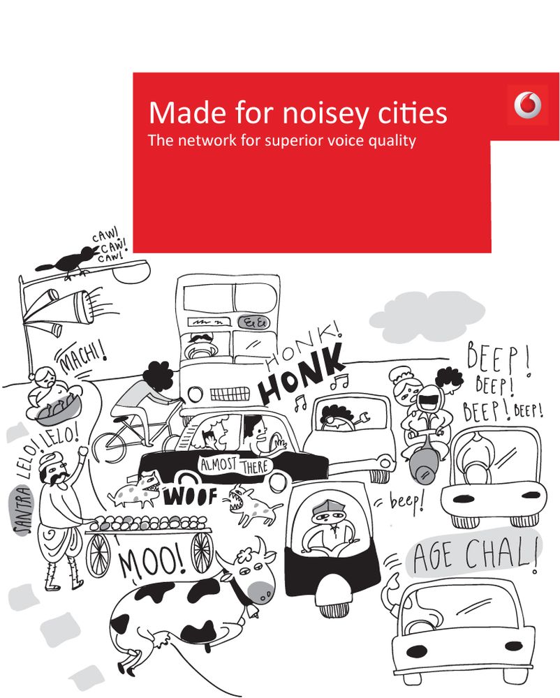
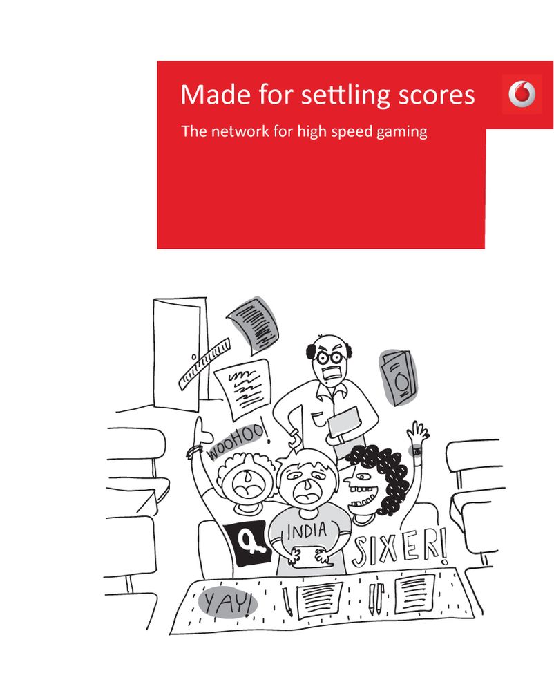
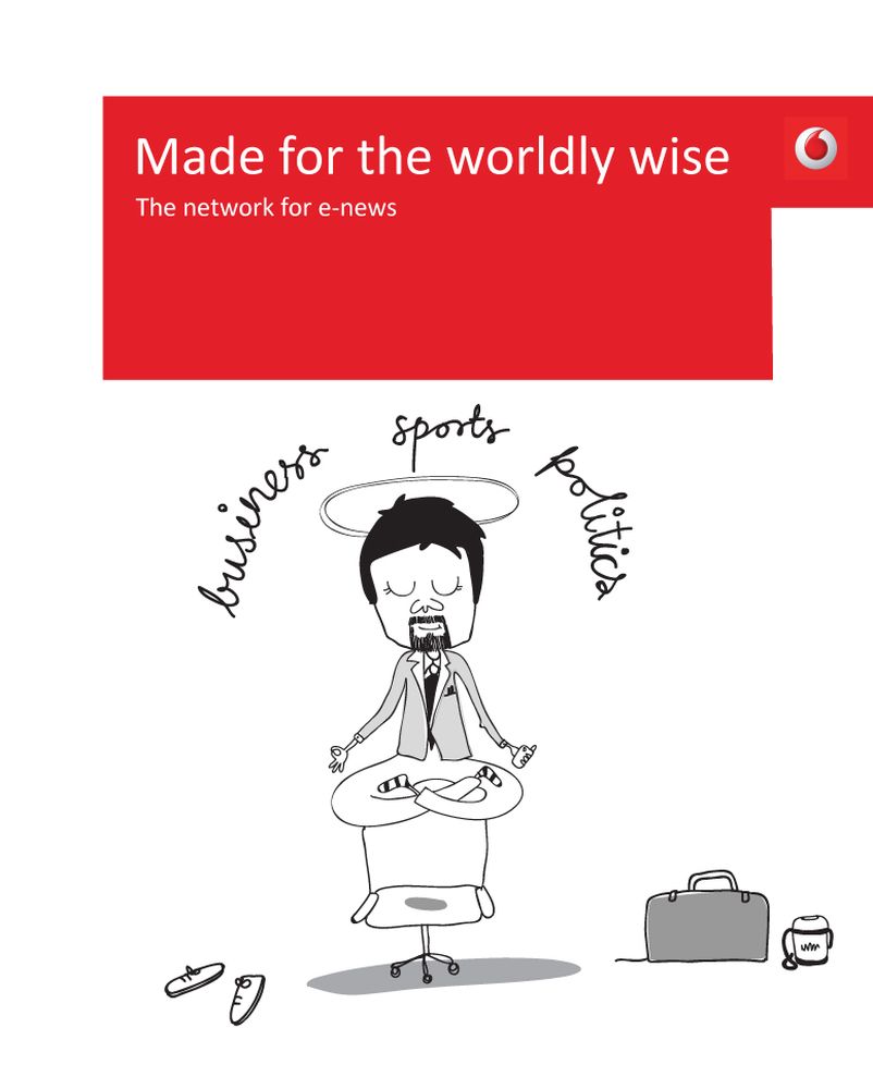
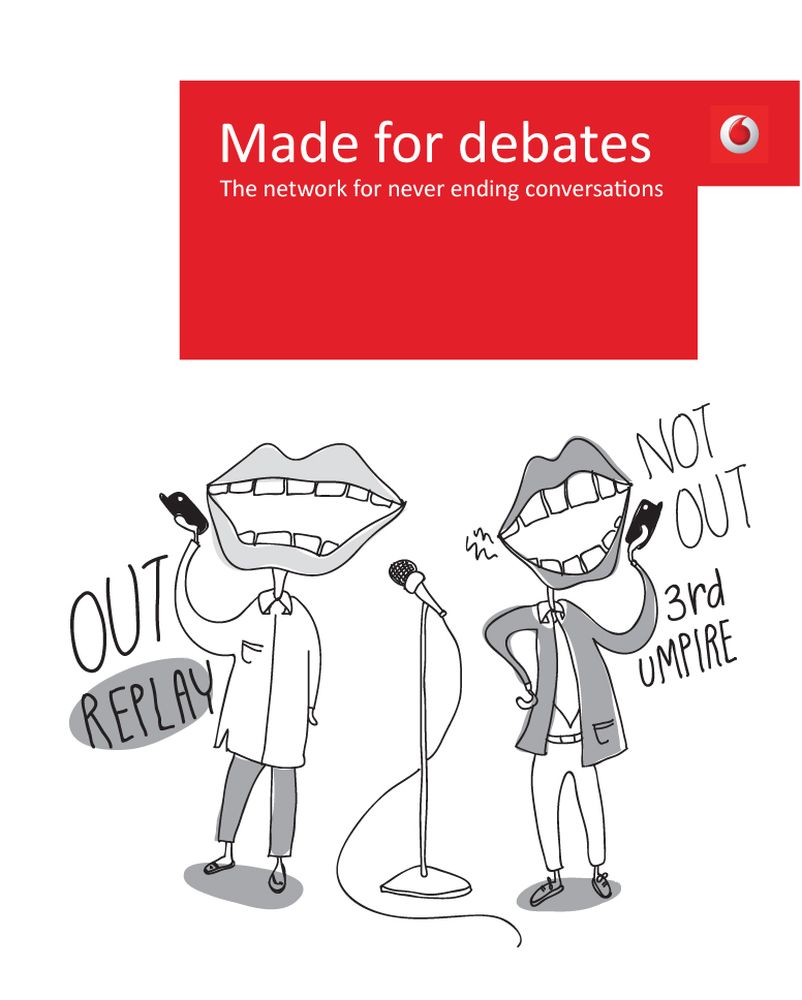
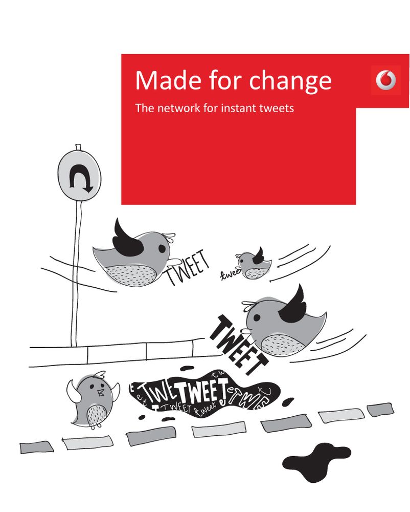
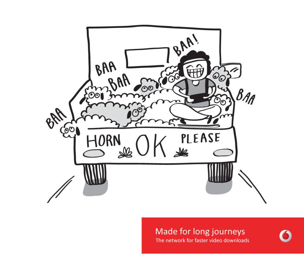
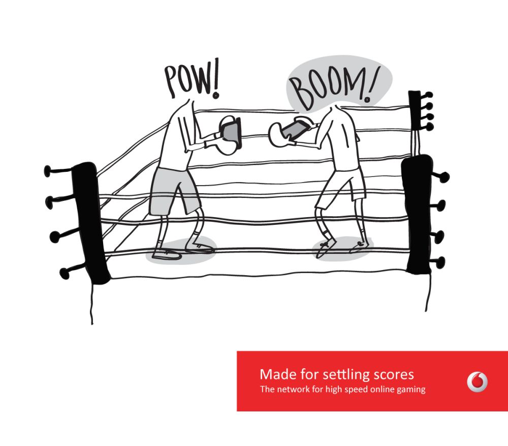
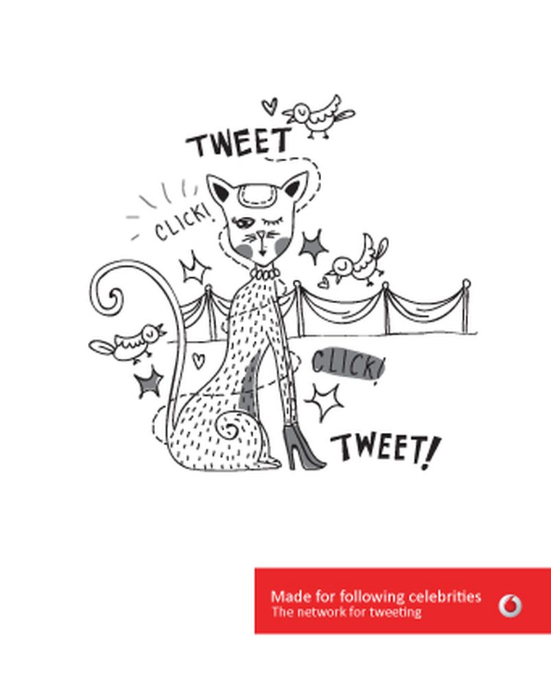
I worked with Ogilvy & Mather, India on their Vodafone campaign.
The unique selling proposition of this campaign is: This network is made for you.
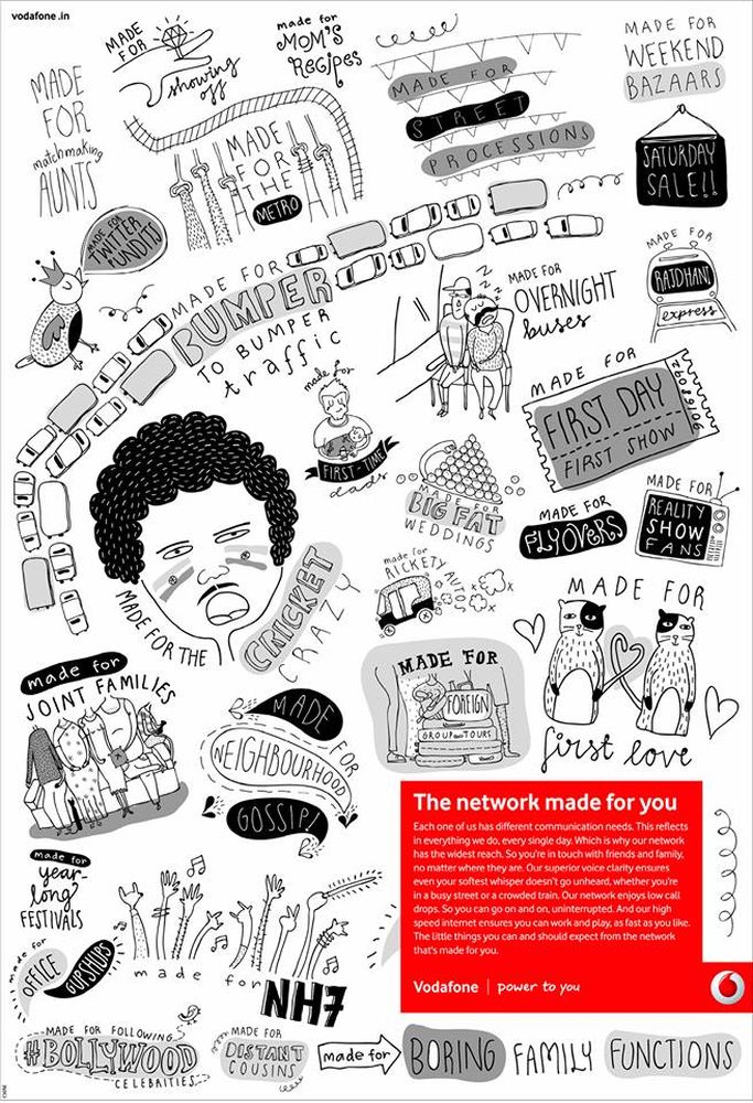
Published in The Times Of India, Sunday Times, front page & Hindustan Times
Press Release
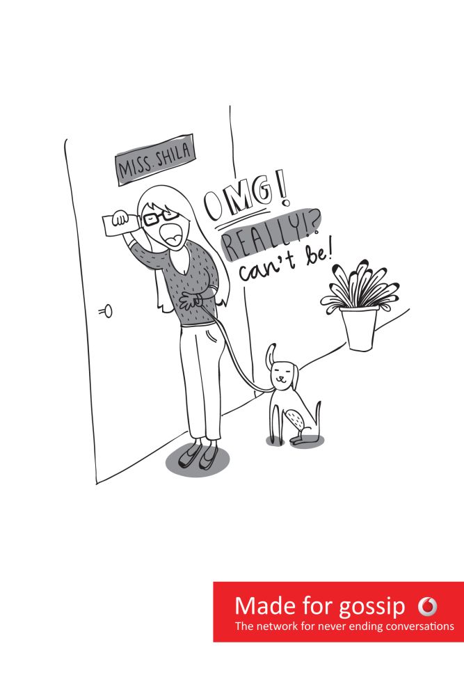
Further below is the unpublished work. I have used a different font and the logo for the purpose of displaying my work.
Unpublished | Bombay times Pg3 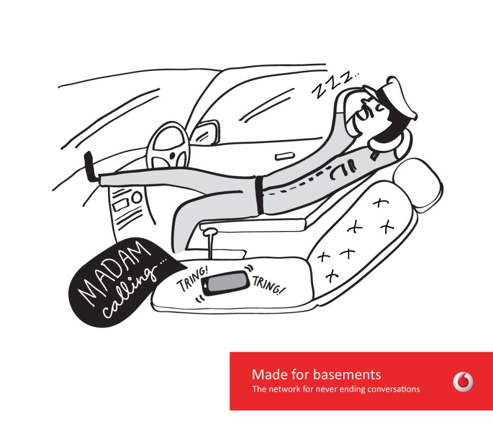
 Unpublished | Rakhi ads

Unpublished | Bombay Times, Games. 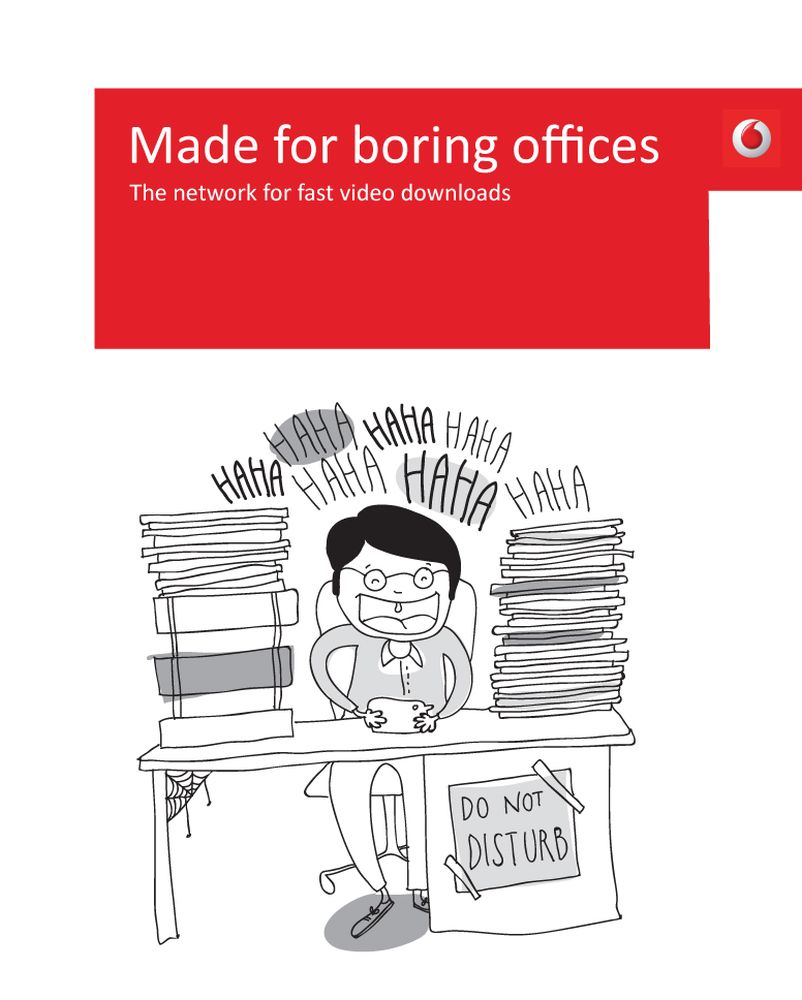
Unpublished | Times Of India, Nation
Unpublished Ambient Media | Bus Terminals 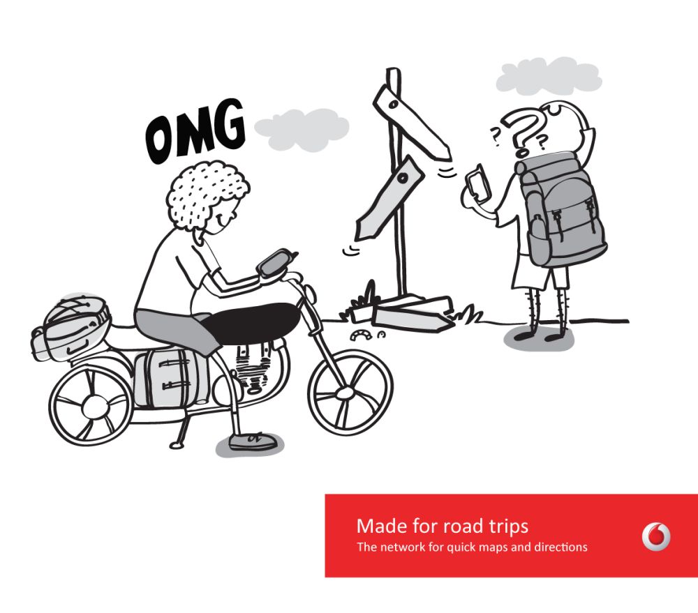
Unpublished Ambient Media | Highways 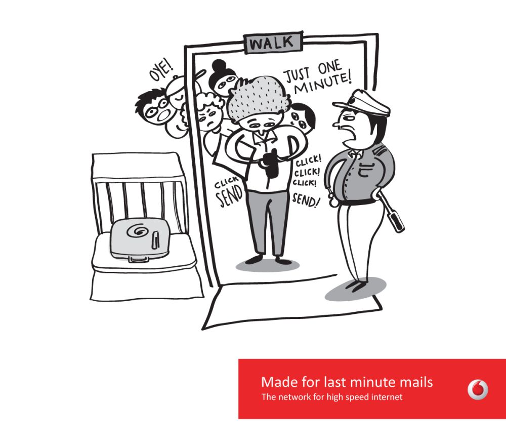
Unpublished Ambient Media | Airports
Unpublished | Bombay Times, Games section. 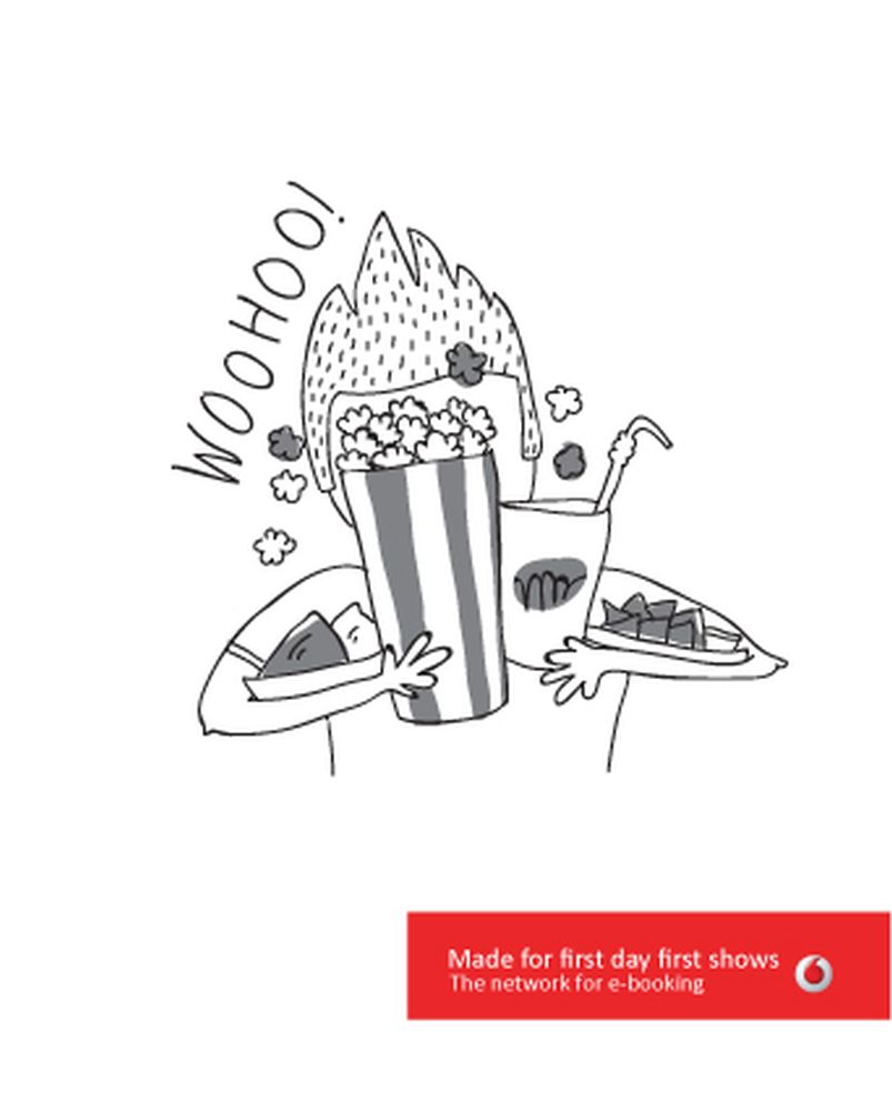
Unpublished | Bombay Times, Movies Section.
Unpublished Press Media

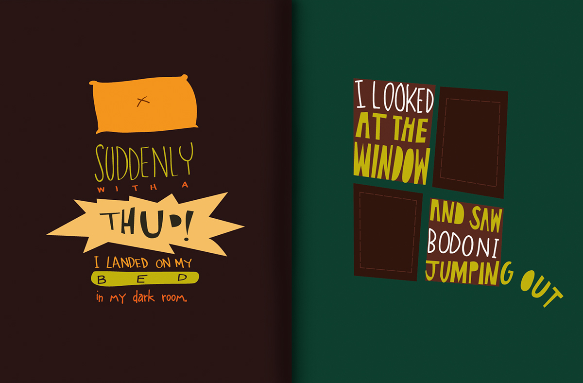
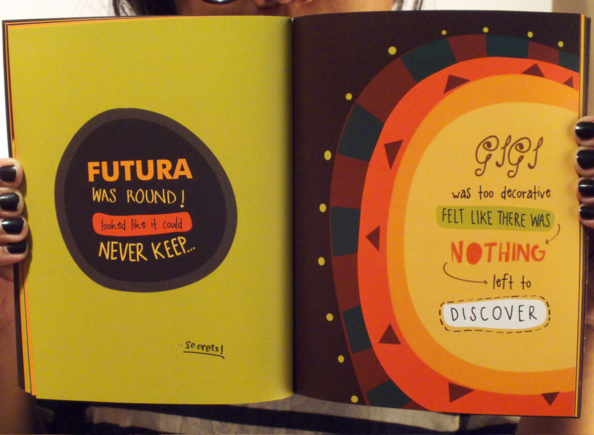
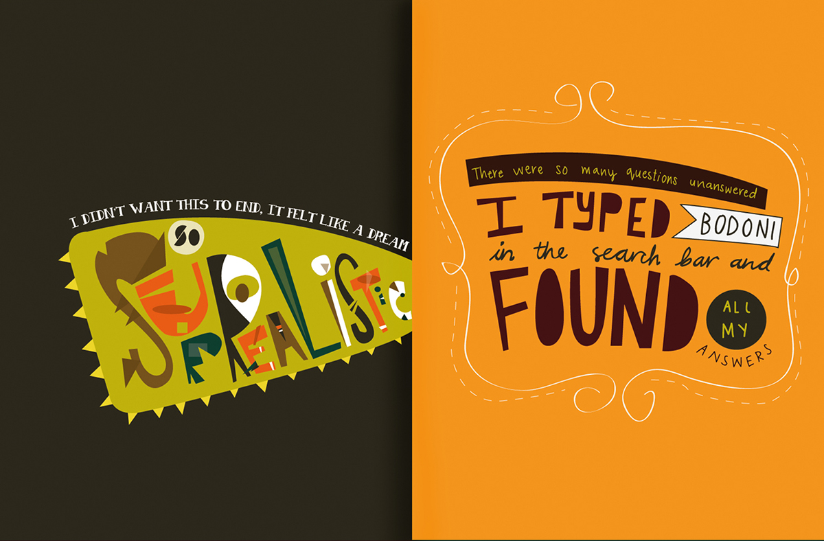
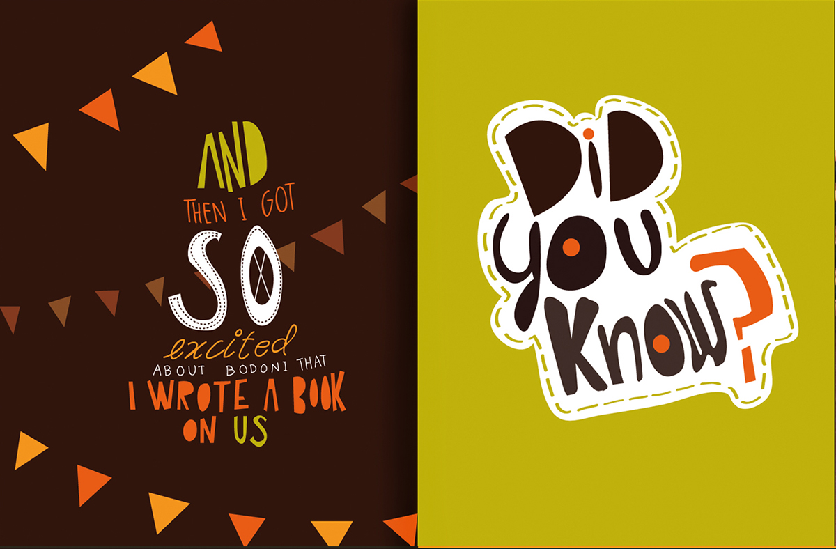
Below are the digital scans of the book for understanding the actual colours used.
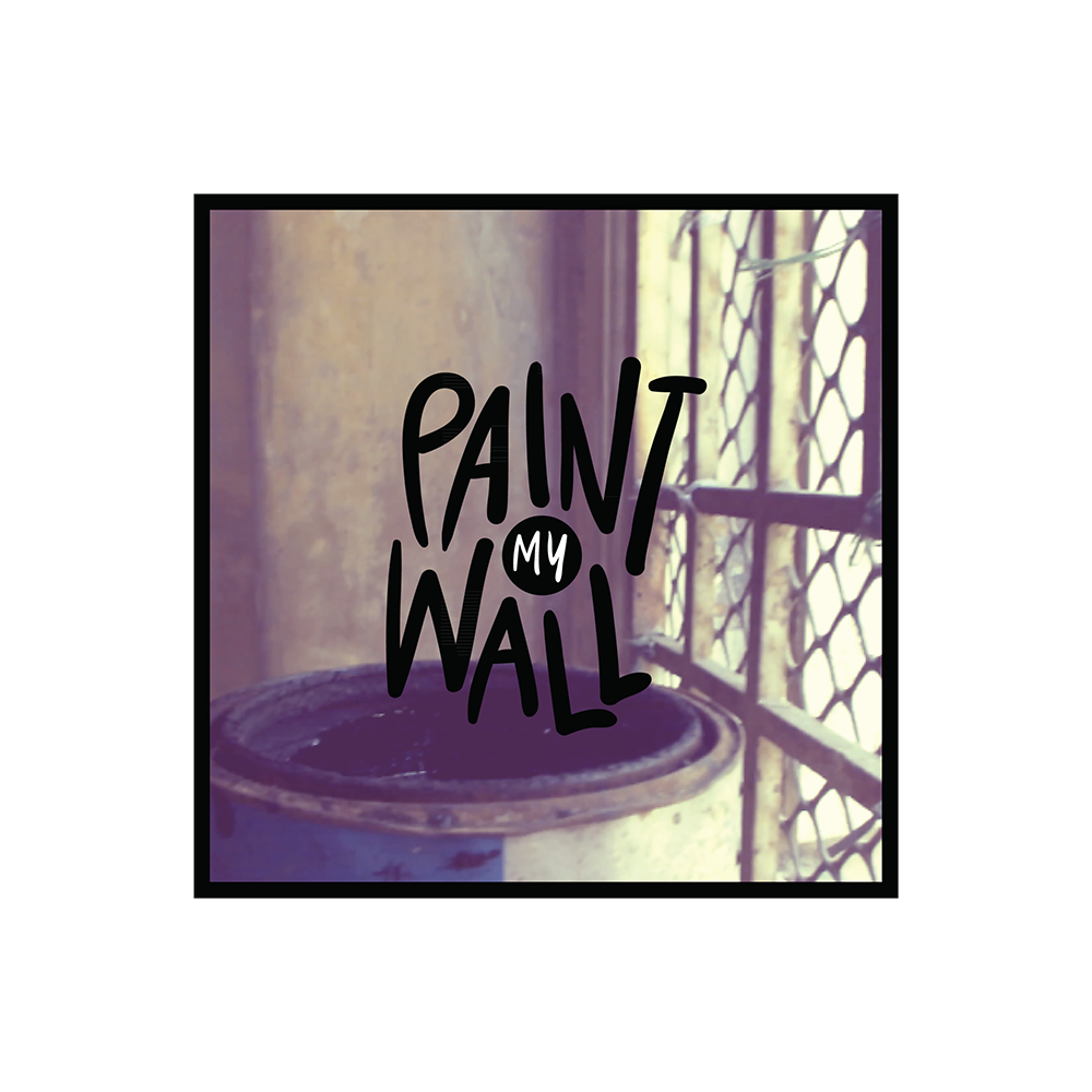
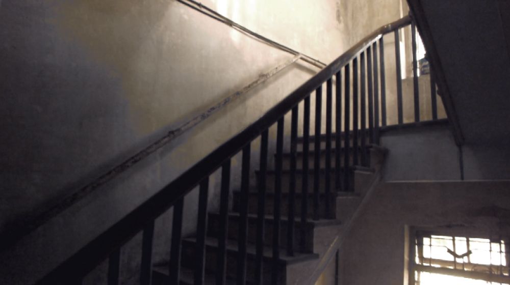
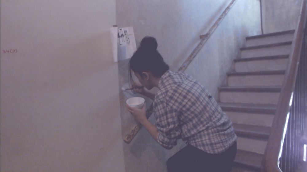
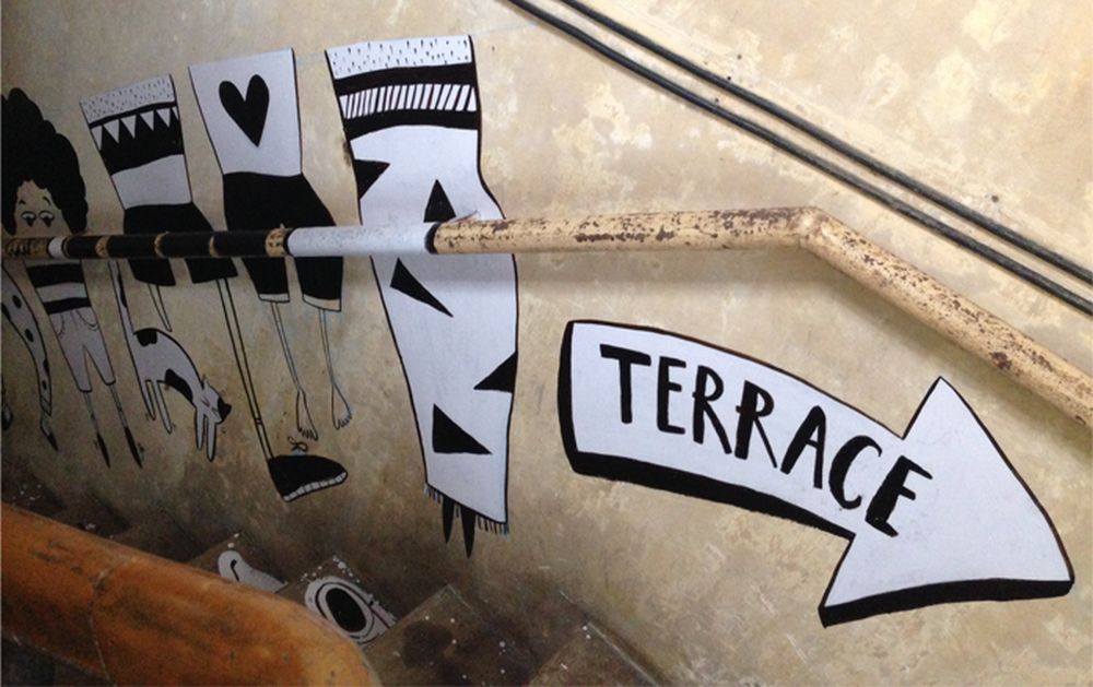
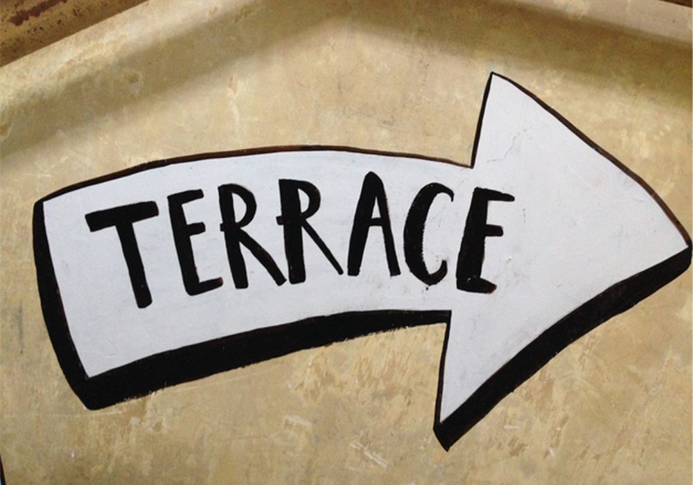
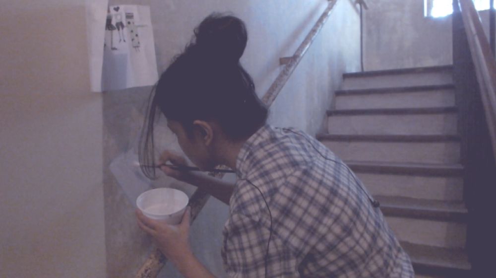
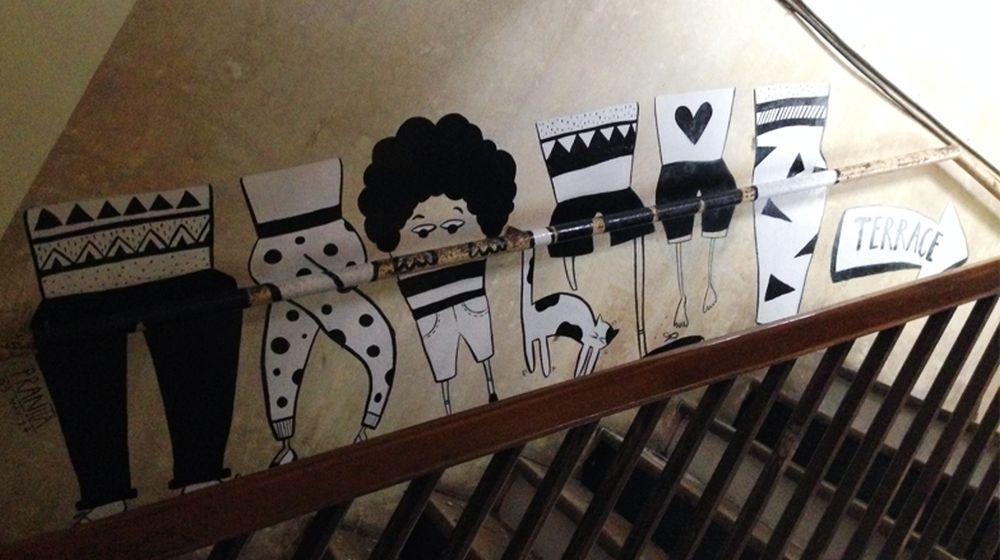
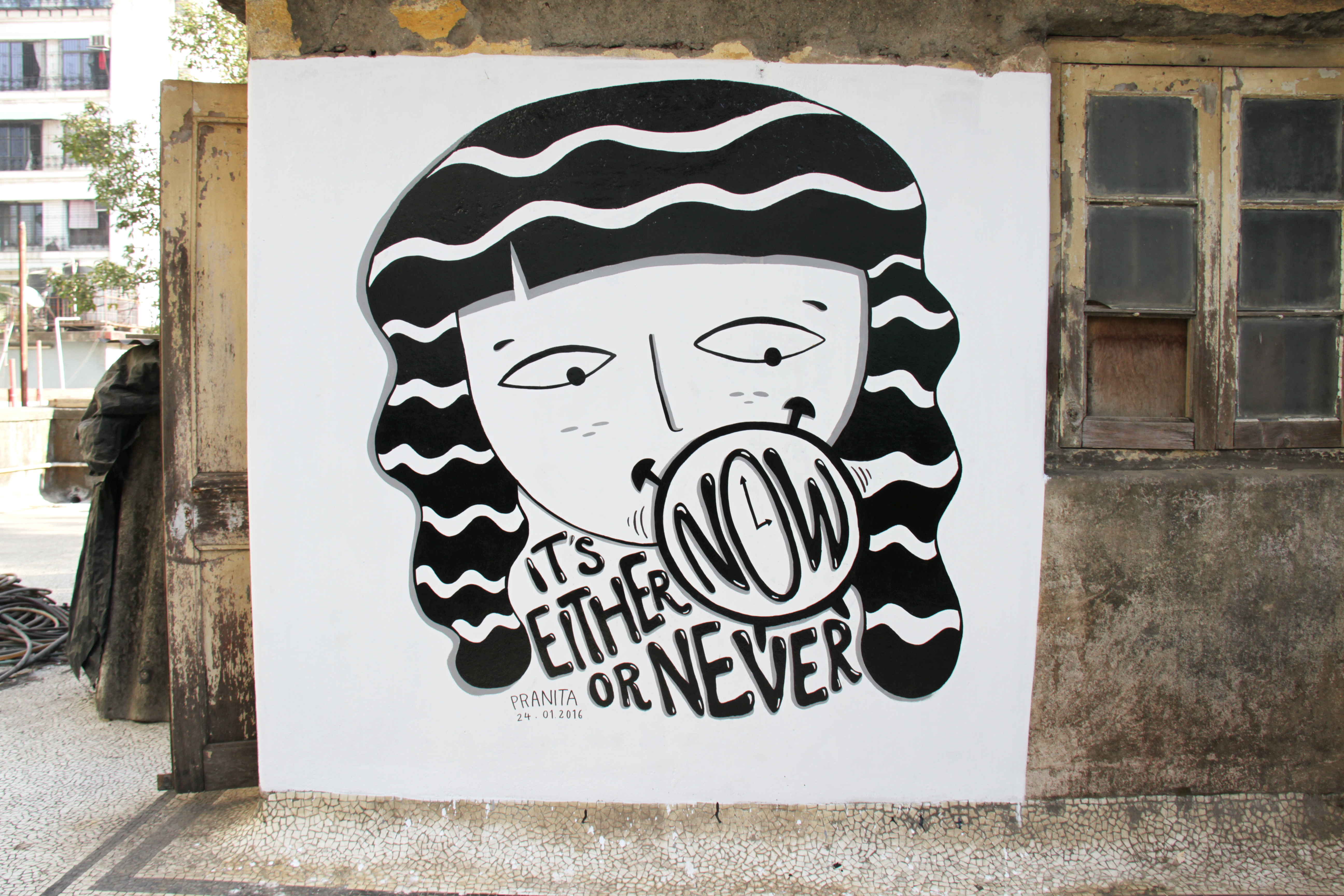
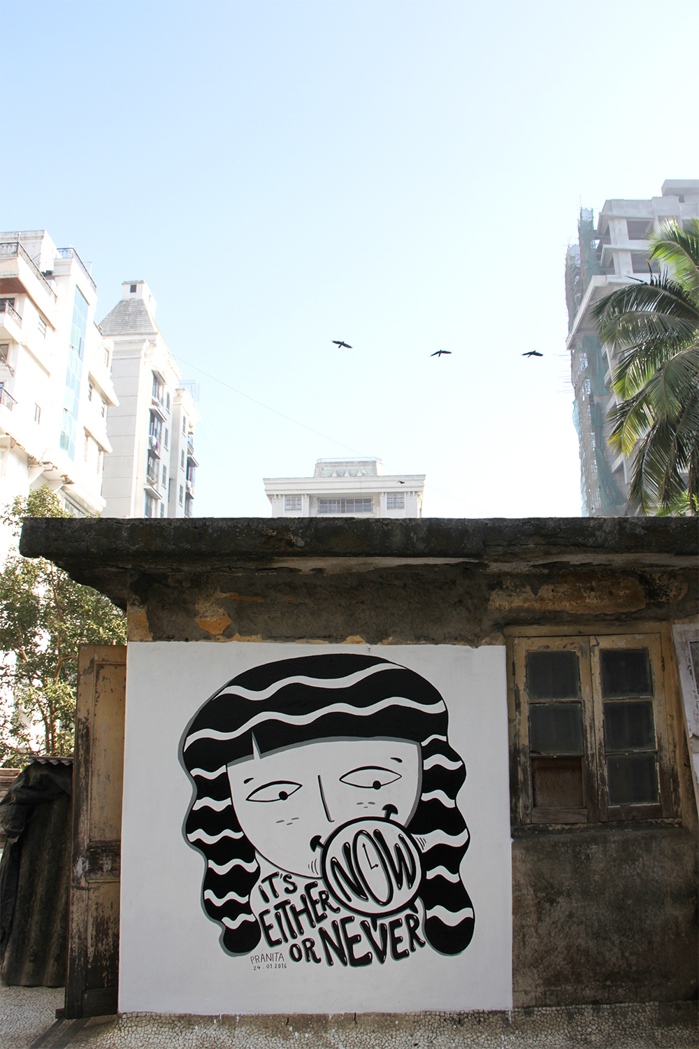
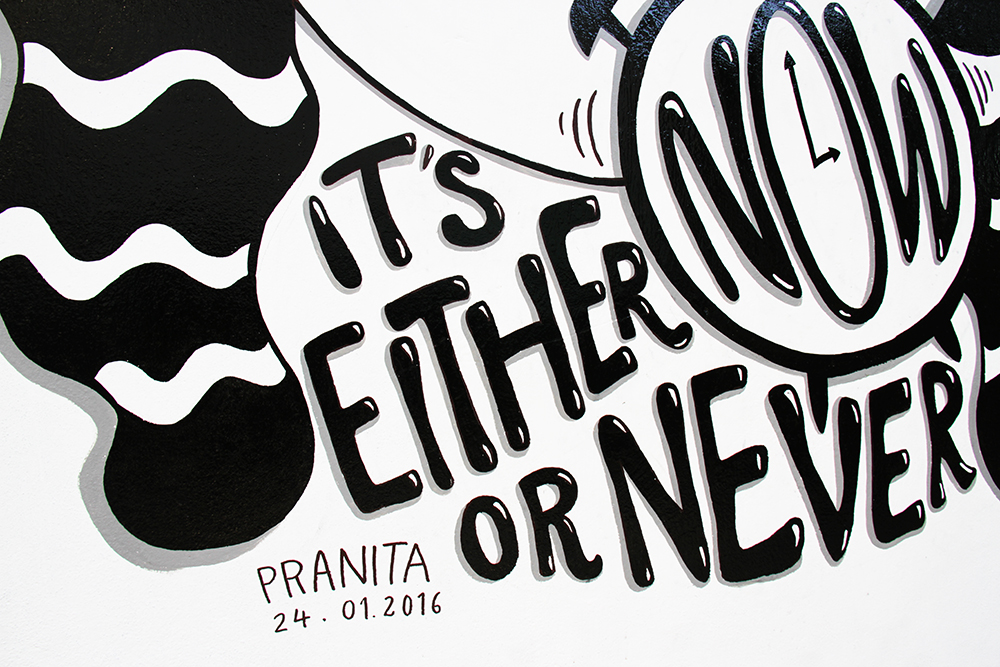
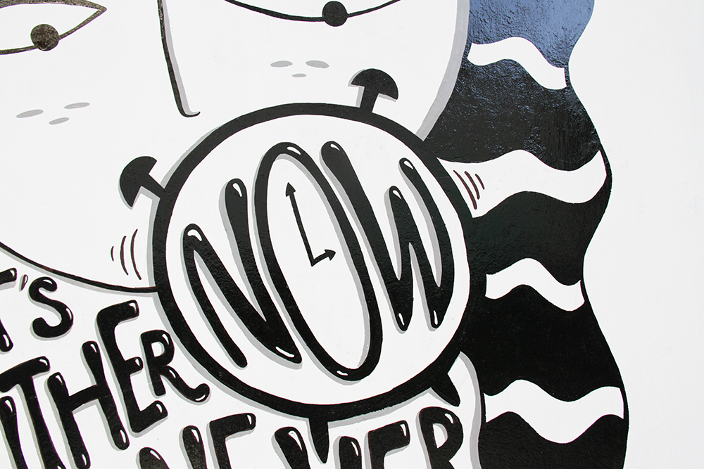
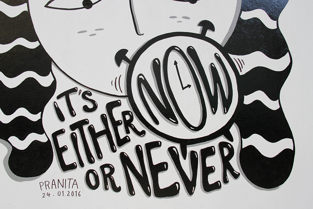
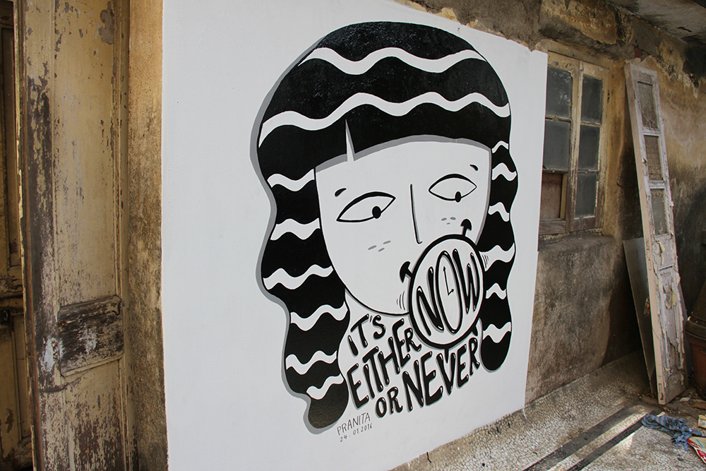
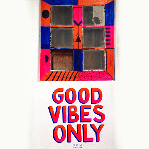
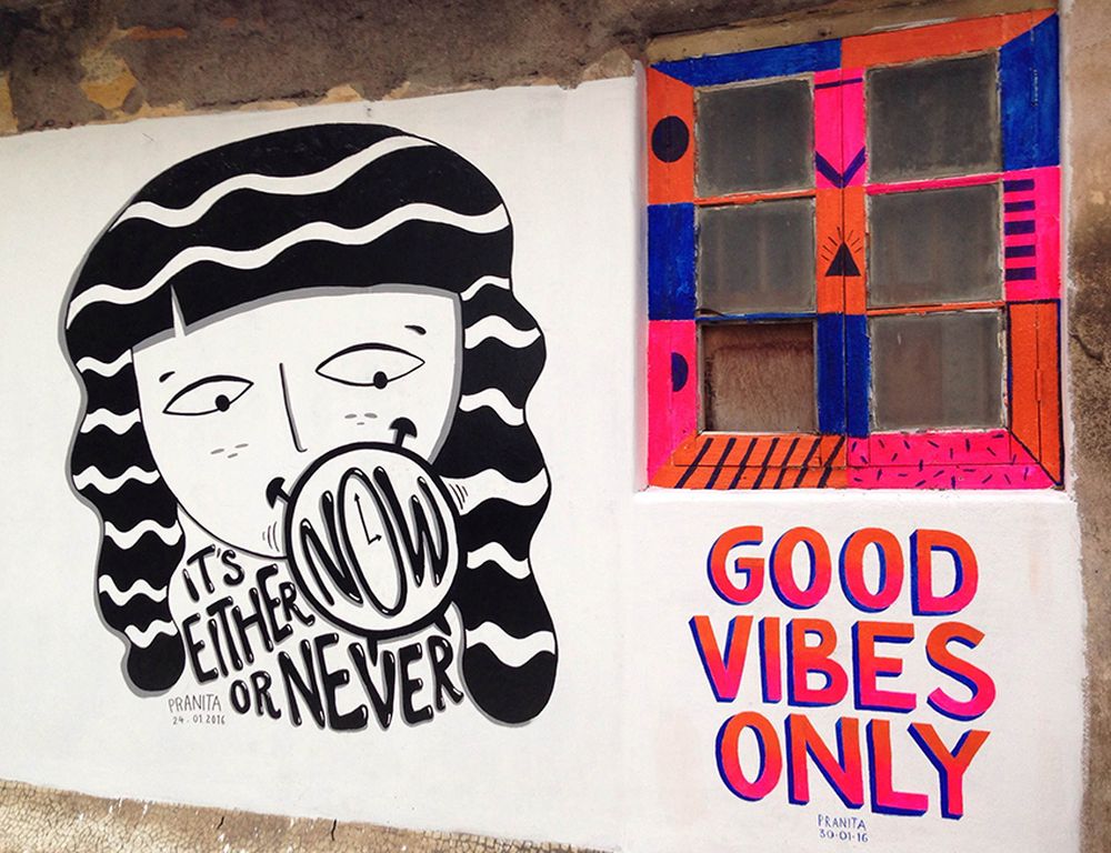
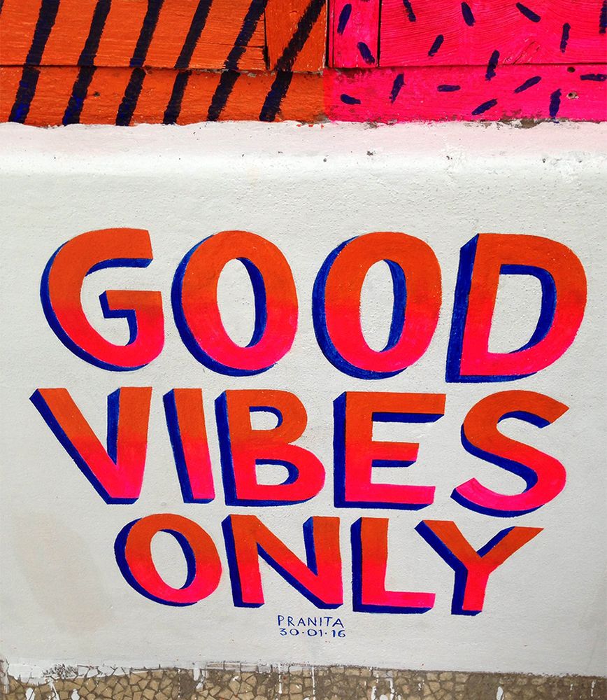
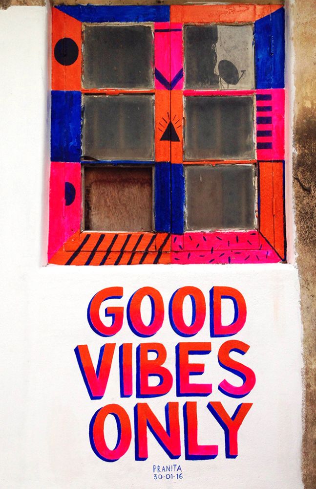
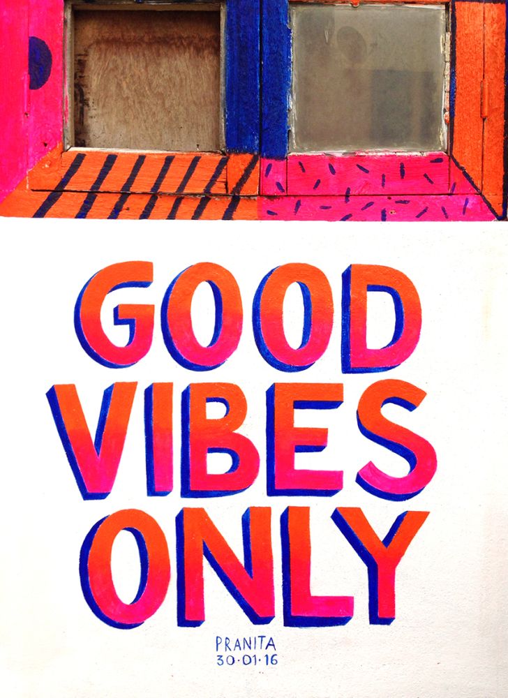
An unplanned, impromptu painting session. Spreading good vibes!
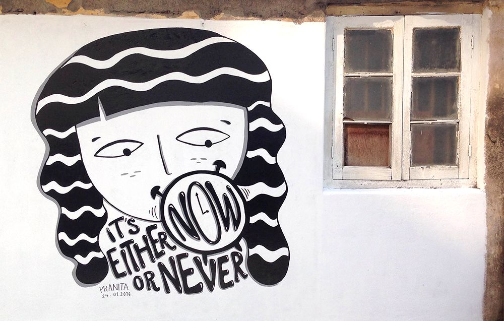
There was empty space next to the mural (before) 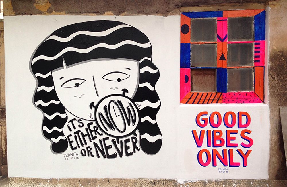

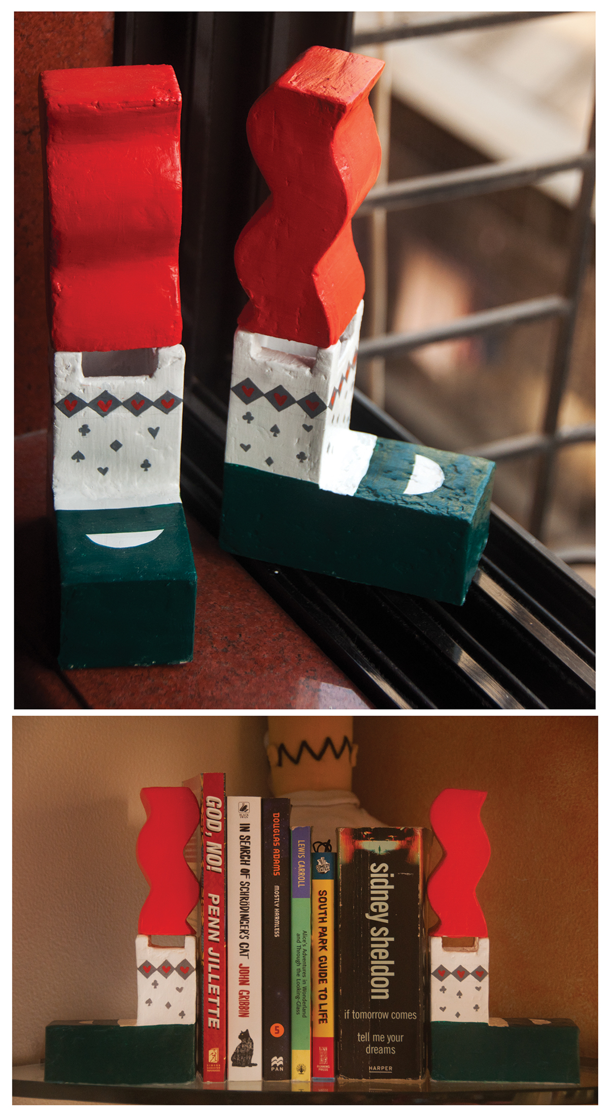
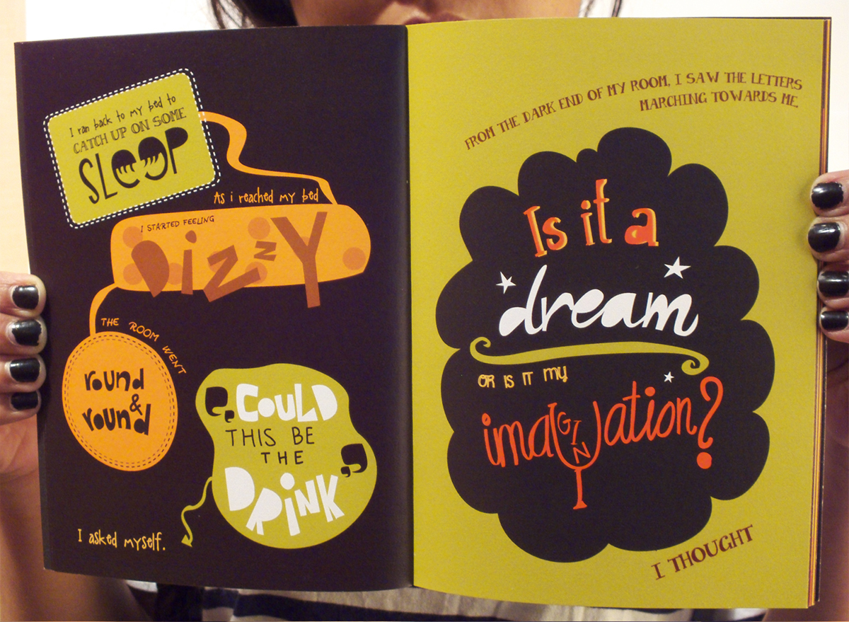
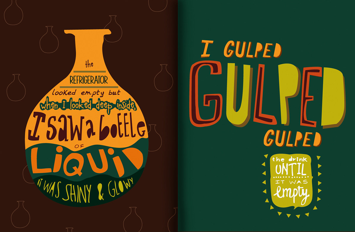
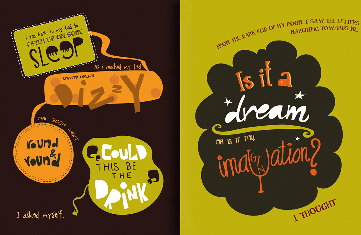
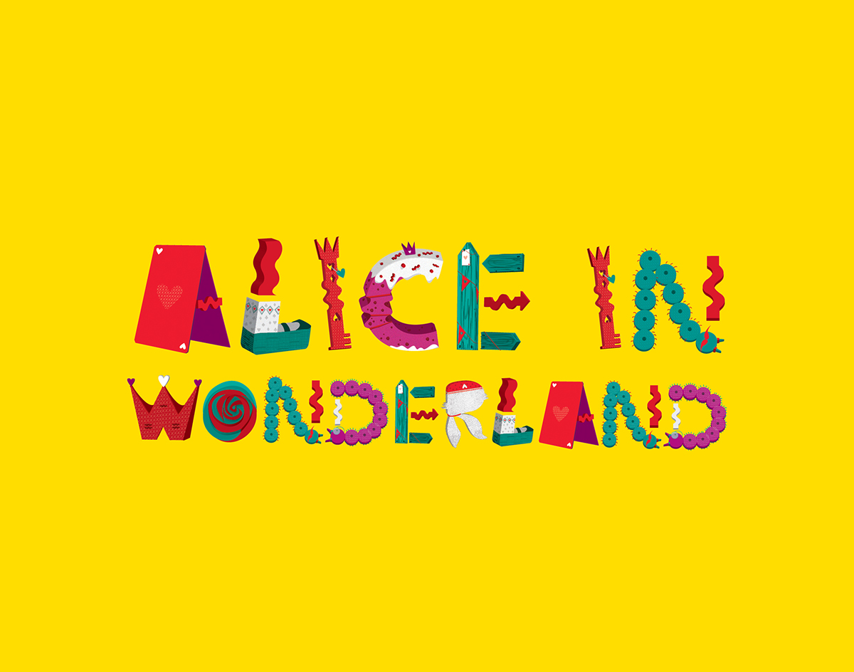
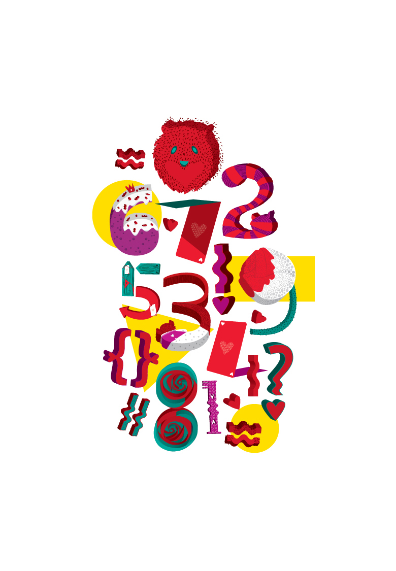
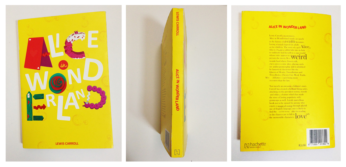
Alice In Wonderland is my favourite book since childhood and I chose to design a typeface to show my gratitude to Sir Lewis Carroll for giving me a whimsical book to get lost in when the world felt too mainstream. Imagination has no bounds. And that is something I wanted to portray through my typeface, targeting not only children but also adults.
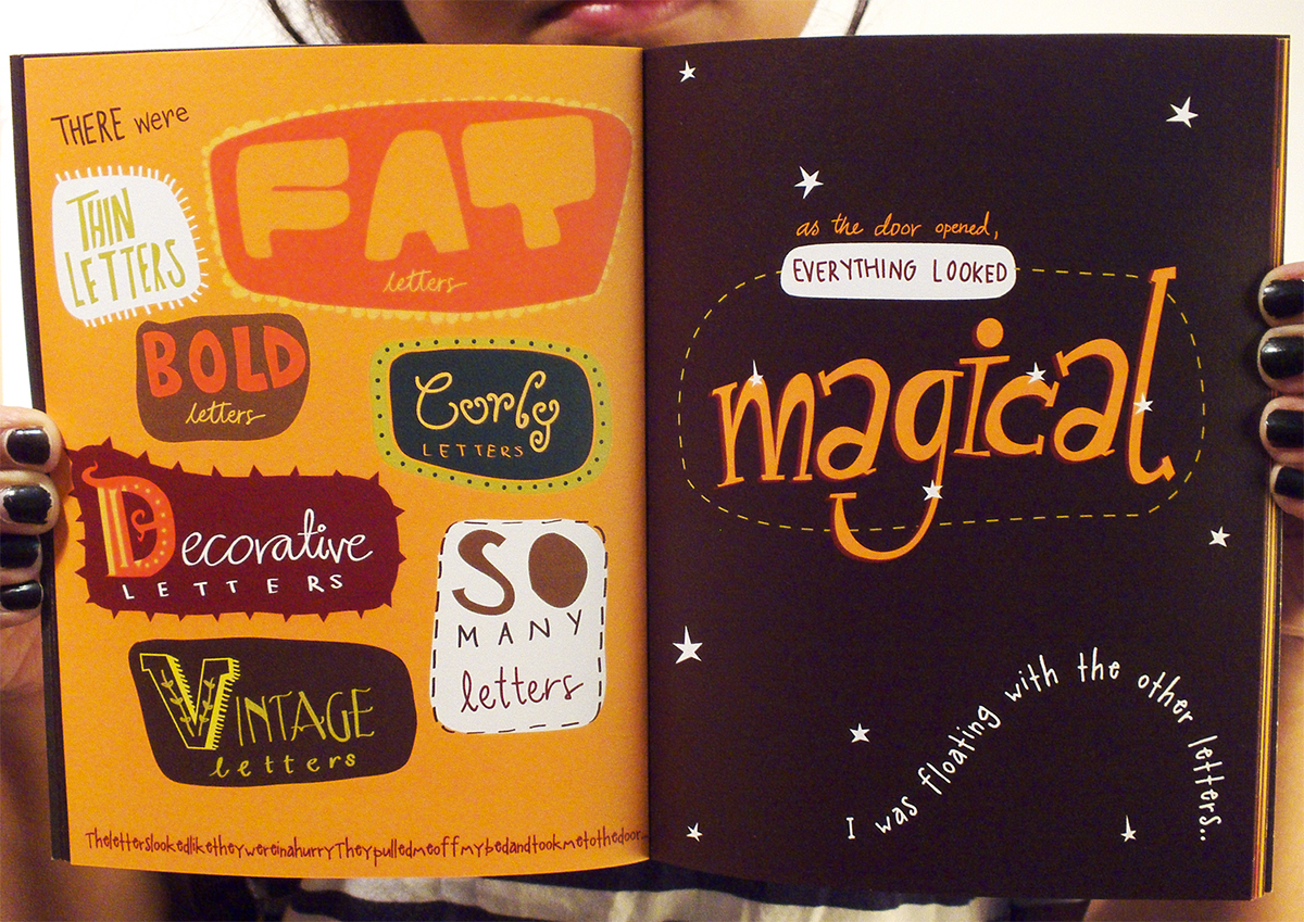
The typeface is a 3D experimental display typeface. There are times in the book, where Alice eats the cake or drinks the potion and her size increases and decreases. Here, the objects around Alice are viewed from different perspectives. Thus, I decided to use three perspectives but keep it as simple as possible so the typeface is readable.
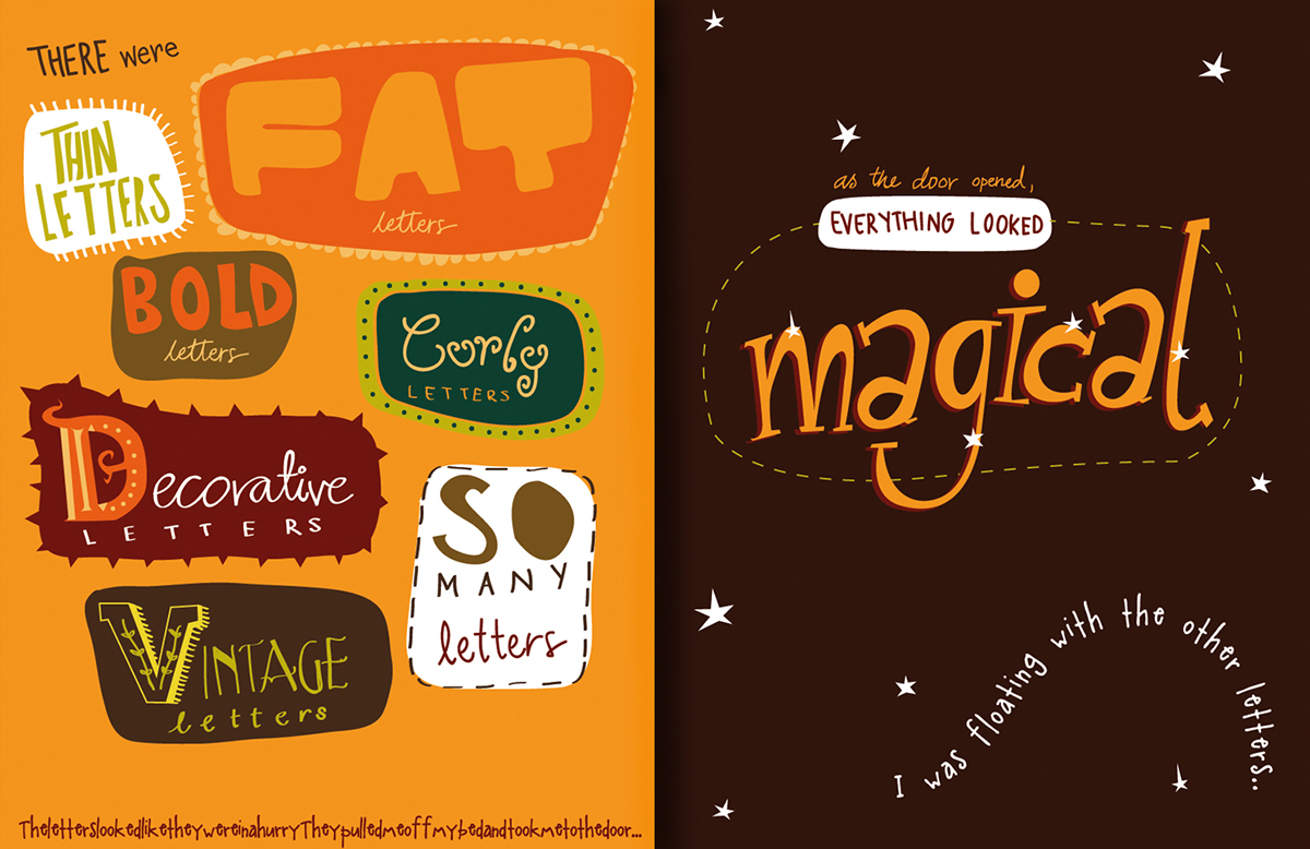
Each alphabet is either a character from the book, or a part of the story.
Following is the list of the concepts of the final alphabets:
A- Playing cards
B- Alice’s neck twisting (While she ate a piece of mushroom, her neck elongated and twisted in the fields)
C- Cake (the dessert that was stolen from the Queen of Heart’s kingdom)
D- Caterpillar
E- Direction signs (the cheshire cat confuses Alice about directions, after which she reaches the mad hatter’s party)
F- Flamingo (used by the Queen to play a game of croquet)
G- Tea cup (an upside down cup and saucer)
H- Tweedledum & Tweedledee
I- Key (used to open doors when she falls down the rabbit hole)
J- Mad Hatter
K- Key (used to open doors when she falls down the rabbit hole)
L- Alice
M- White Rabbit
N- Caterpillar
O- Rabbit Hole
P- Tear drop (when Alice is twice her size, she begins to cry and a pool of tears is created)
Q- White Rabbit’s watch
R- March Hare
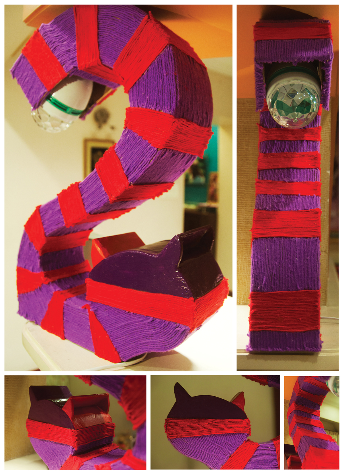
S- Cheshire Cat
T- Mushroom (on which the caterpillar was seen)
U- Cheshire Cat
V- Alice
W- Queen Of Hearts
X- Direction signs (the cheshire cat confuses alice about directions, after which she reaches the mad hatter’s party)
Y- White roses painted red
Z- Alice’s neck twisting (While she ate a bite of the mushroom, her neck elongated and twisted in the field)
I owe this to Manasi Keni, a wonderful mentor, designer and friend.
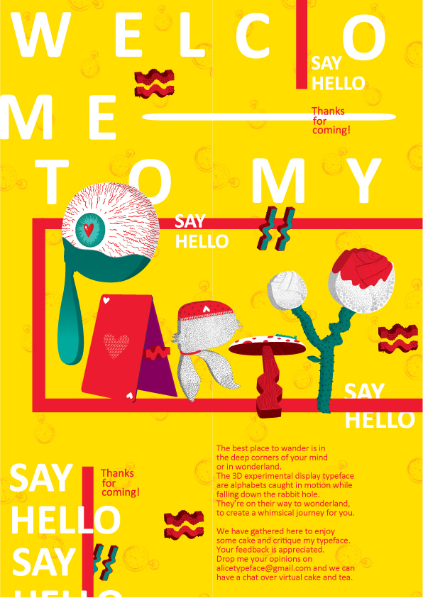
Font Poster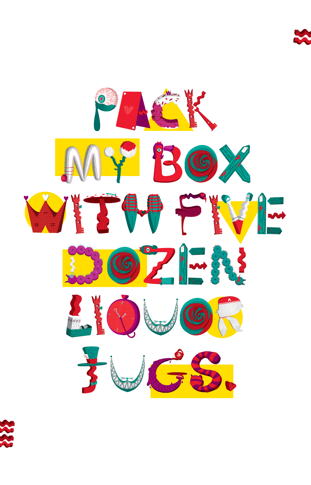
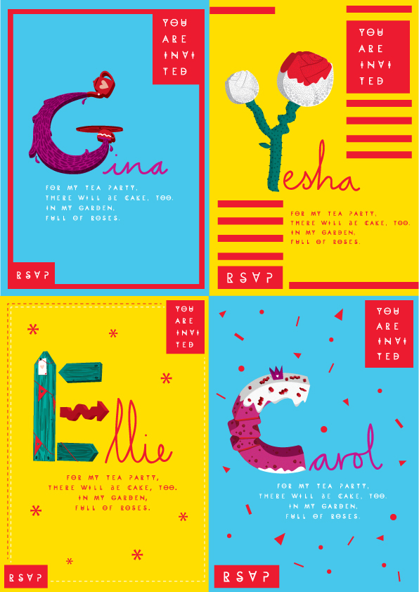
Party Invitation
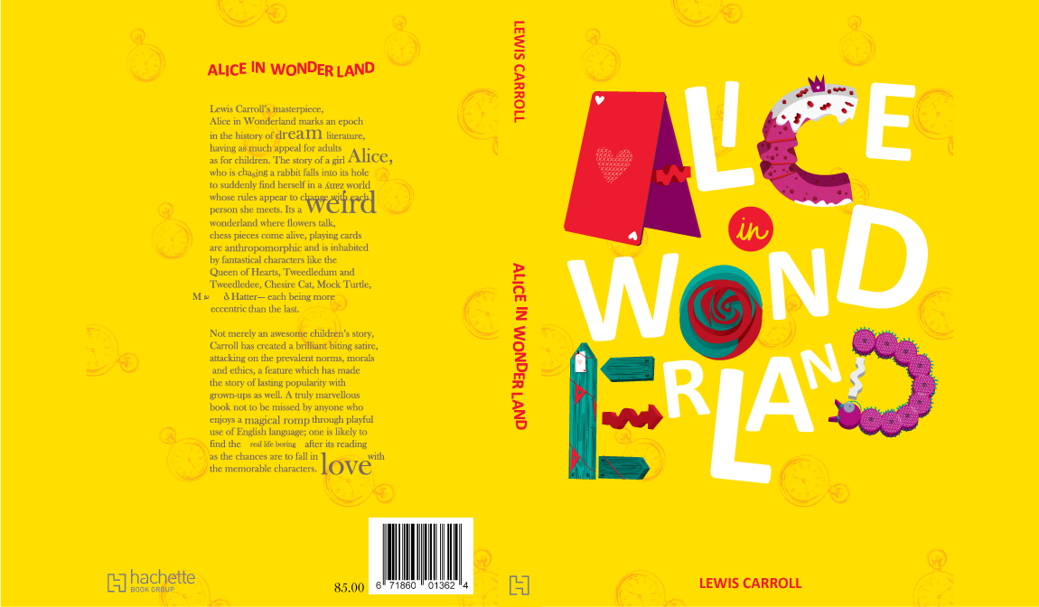
Book cover Design
Bookmarks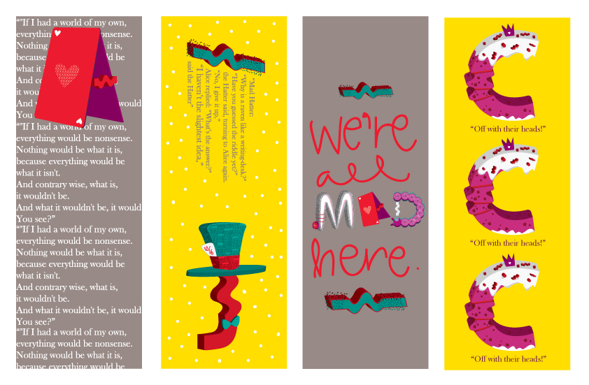
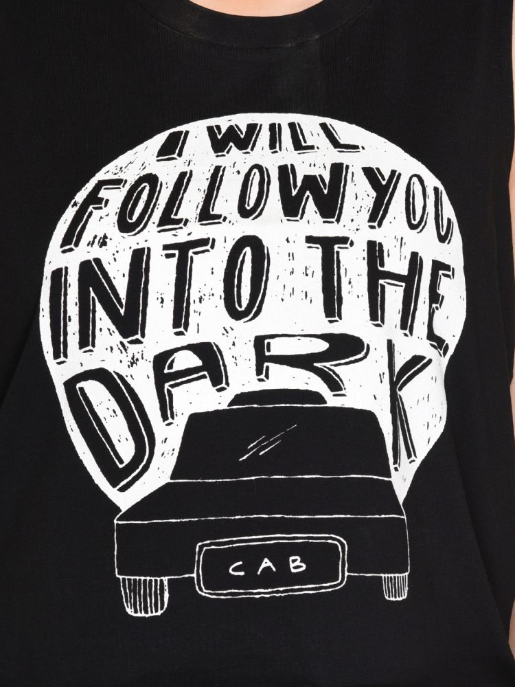
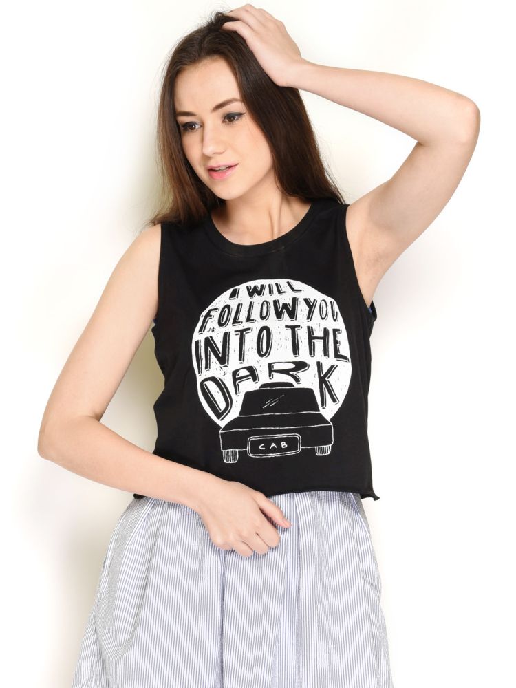
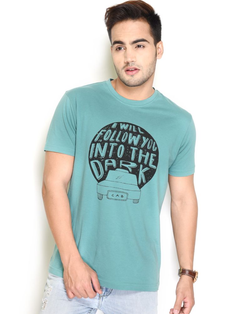
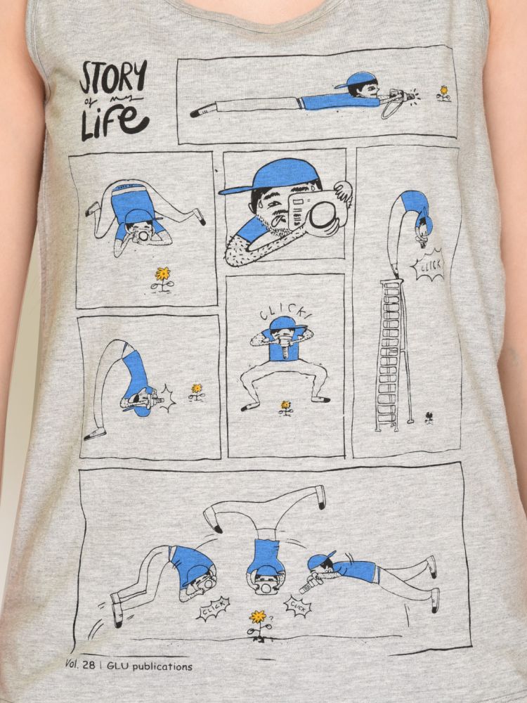
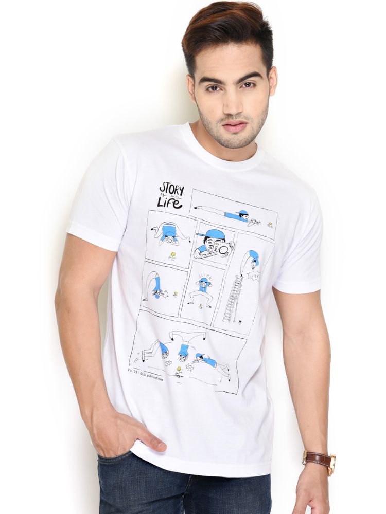
Tshirt Design
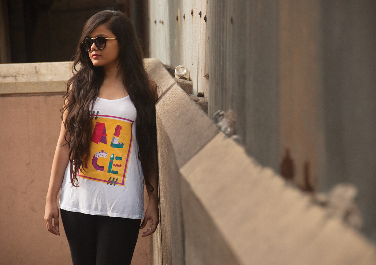
Table lamp as number 2
Book ends as letter L