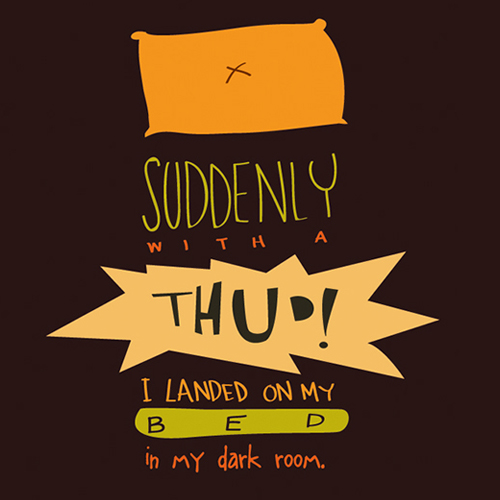
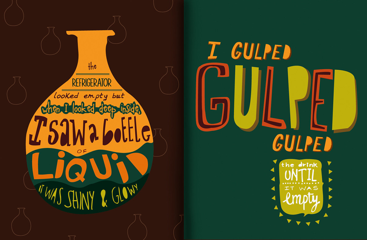
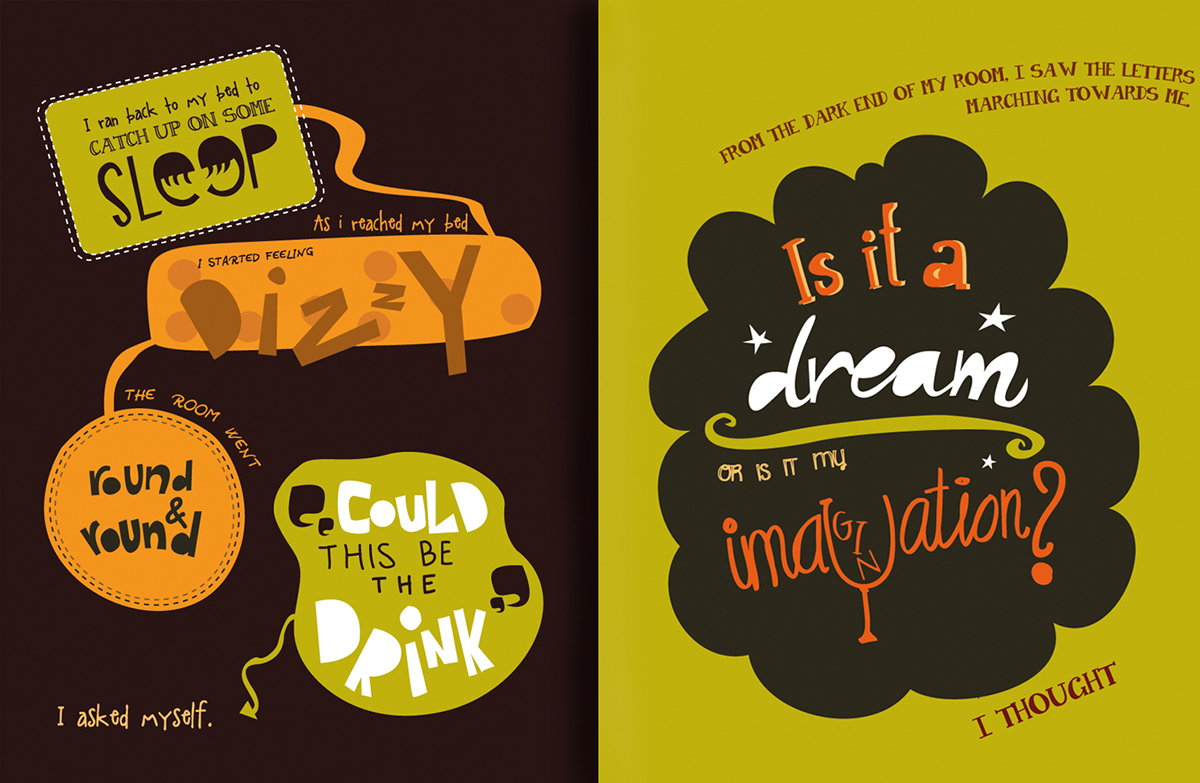
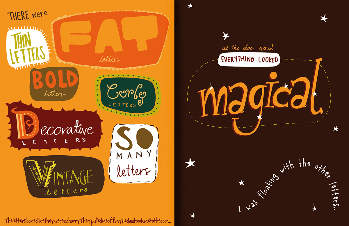
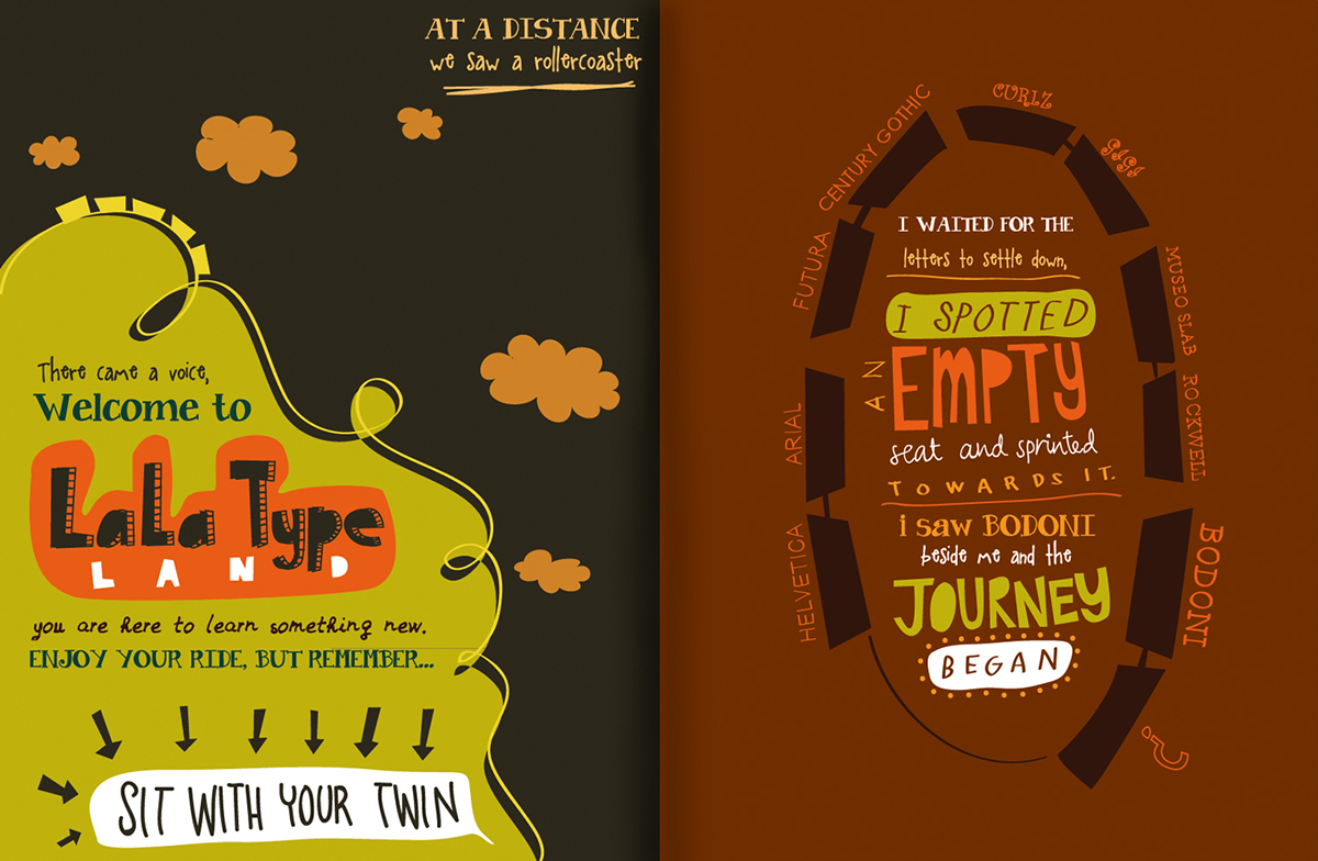
This children’s book is about a curious girl called Tabu.
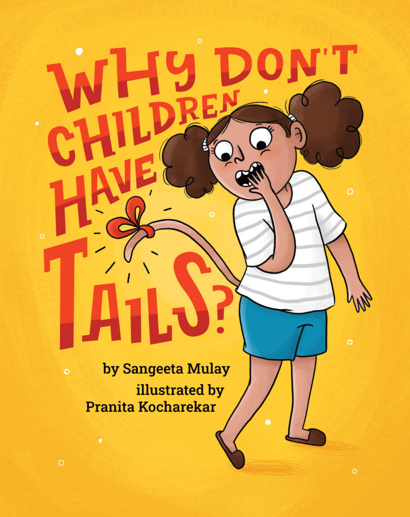

This children’s book is about a curious girl called Tabu.
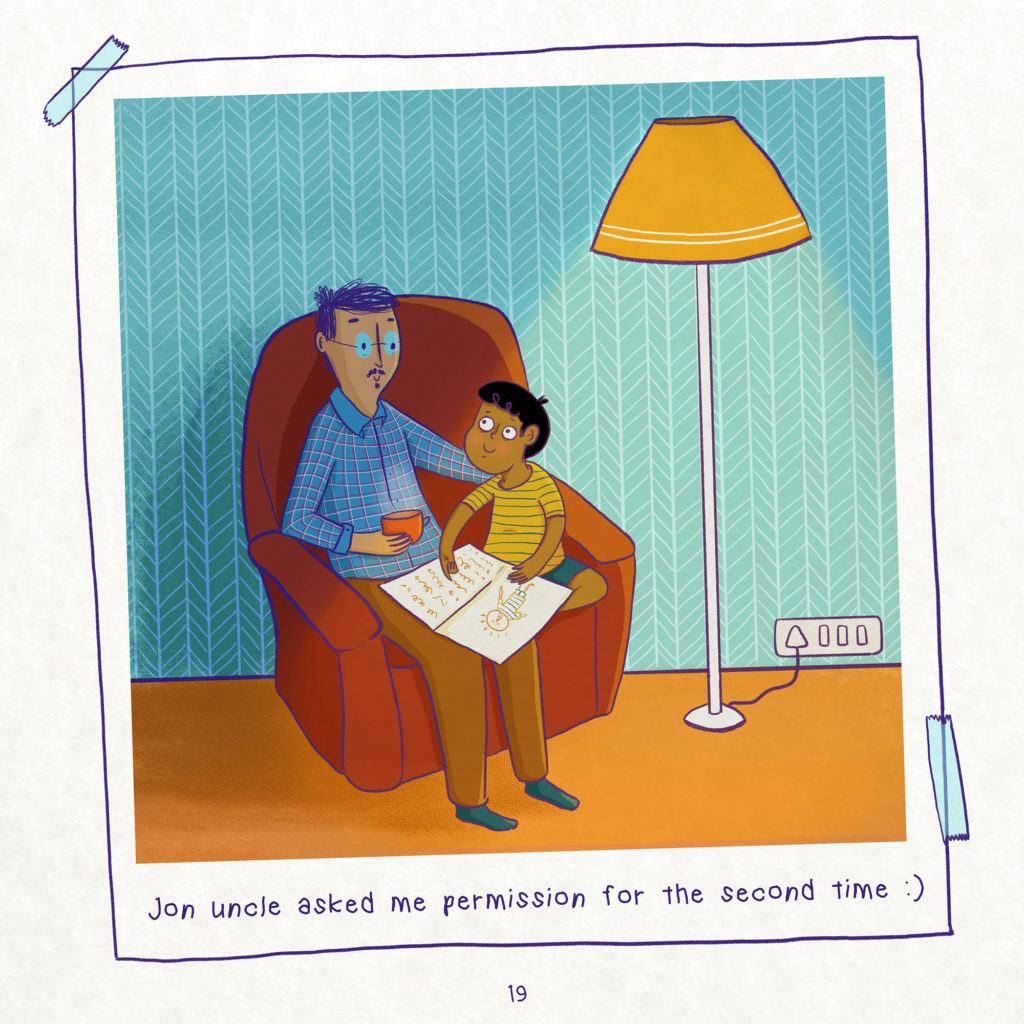
Picture book about a boy called Bibloo, the book talks about consent.
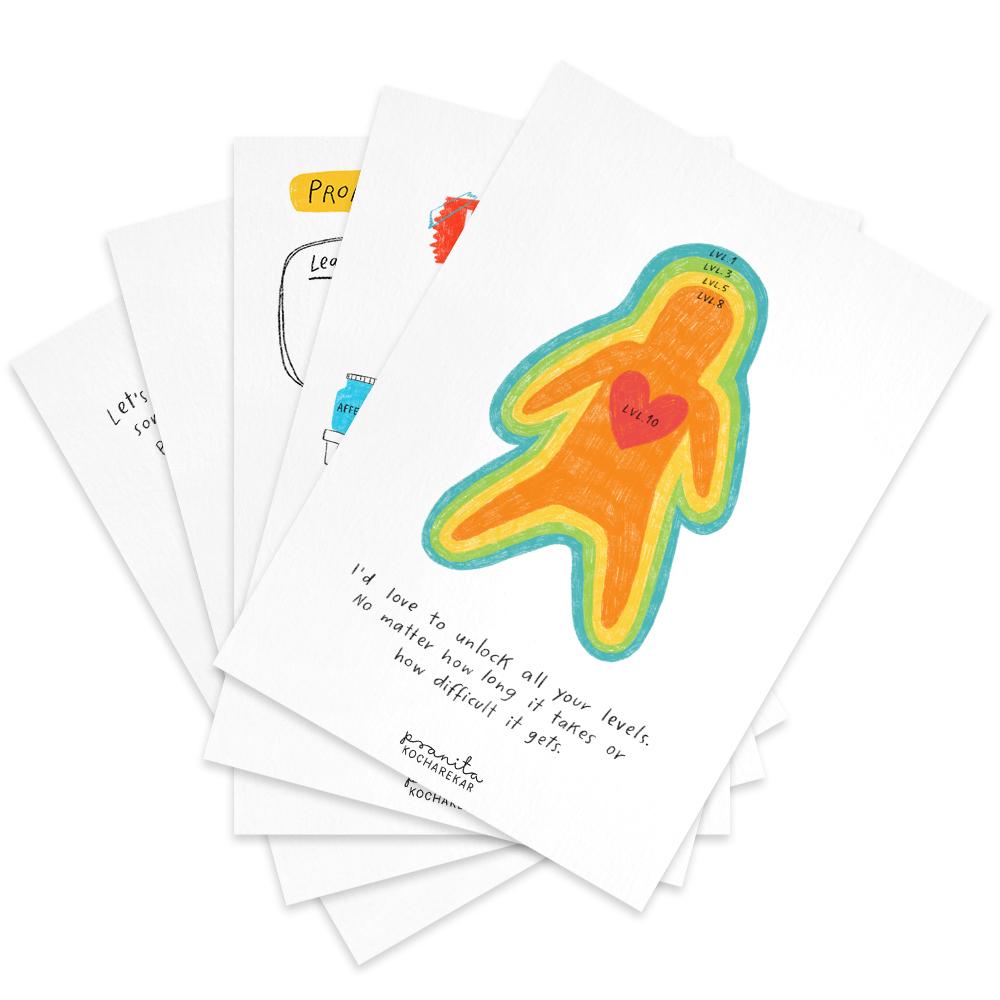
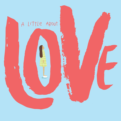
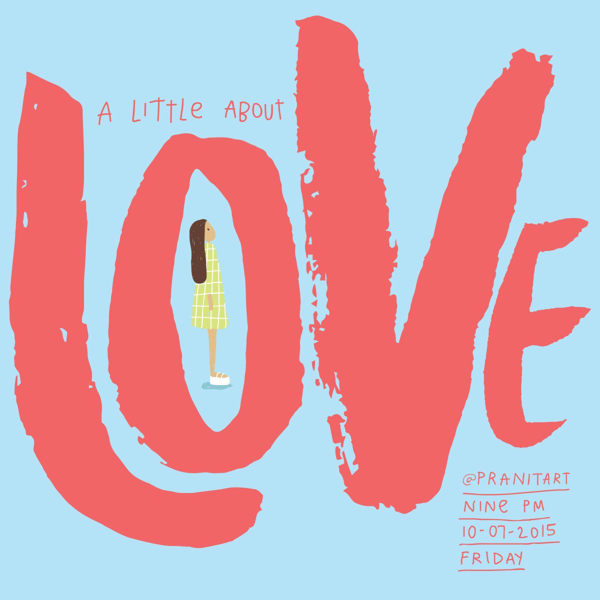
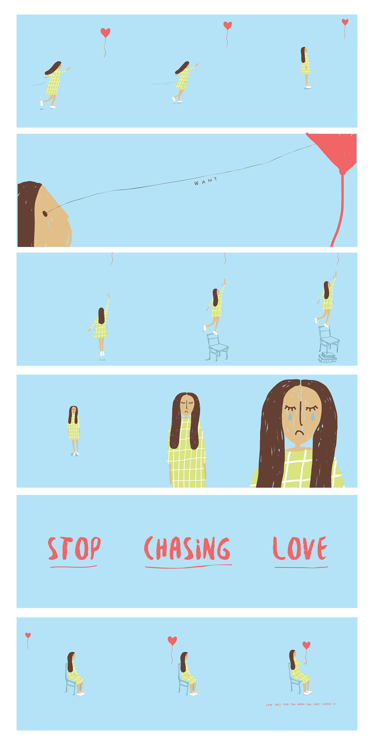
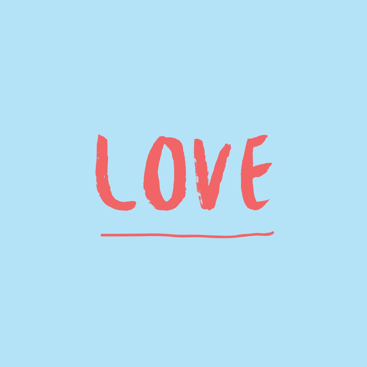
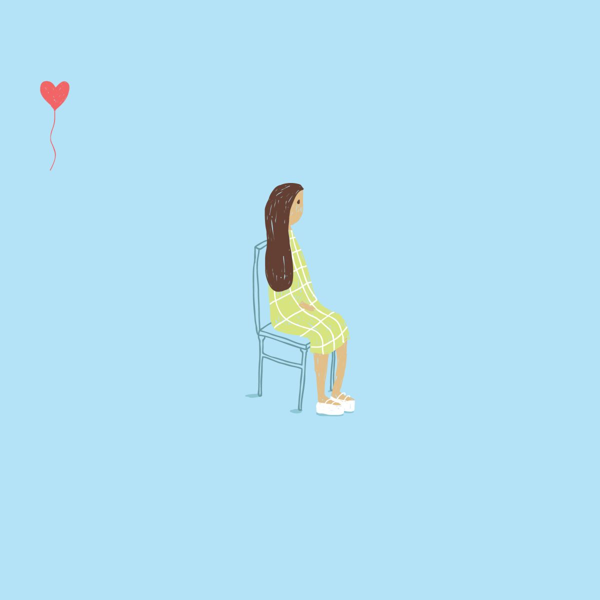
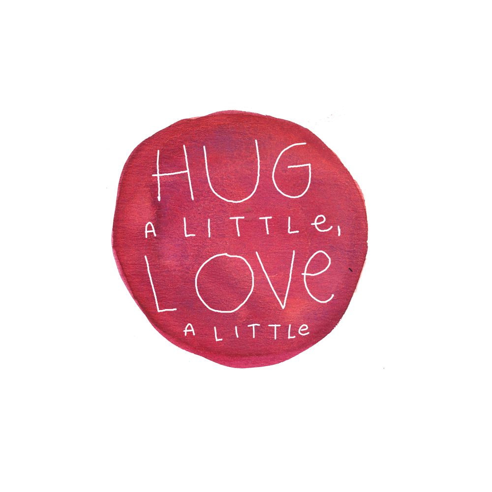
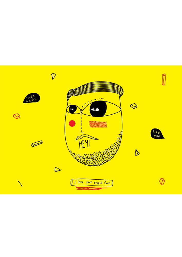
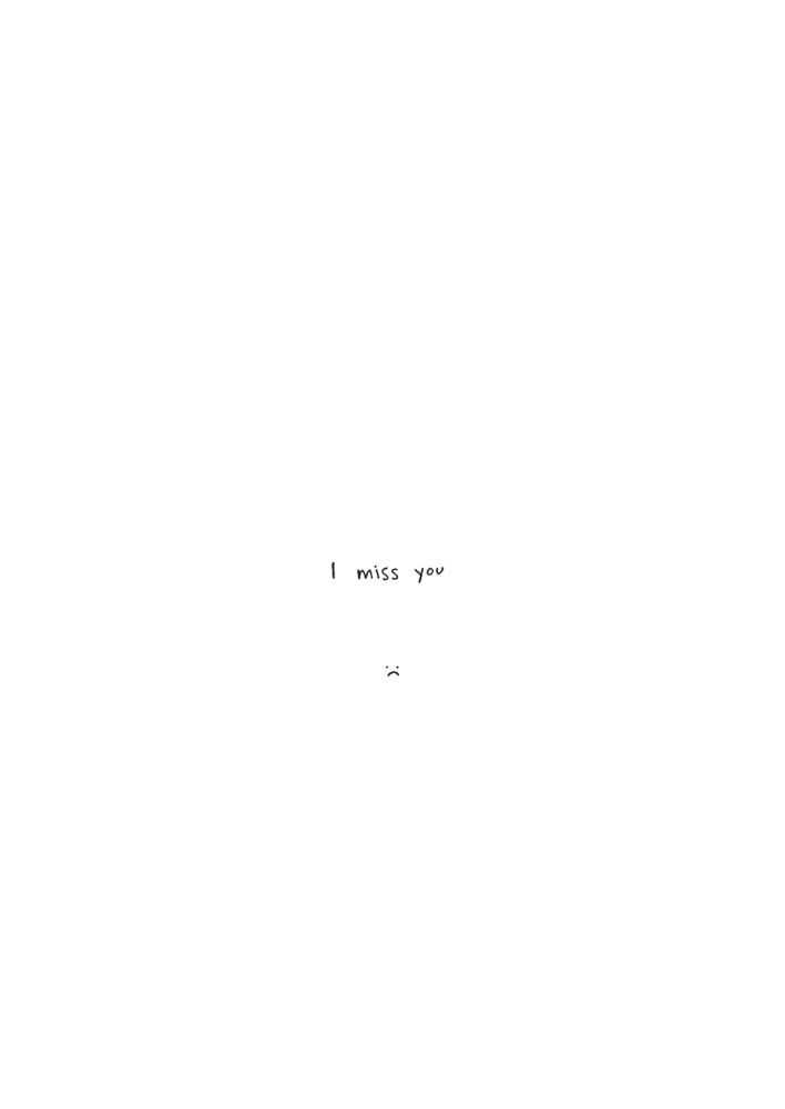
Unfiltered Love is a series of postcards expressing love in the purest, unfiltered manner
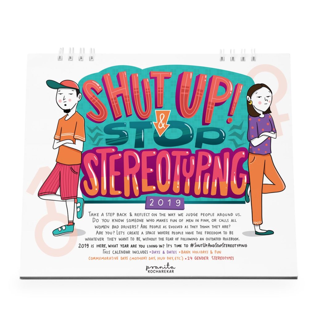
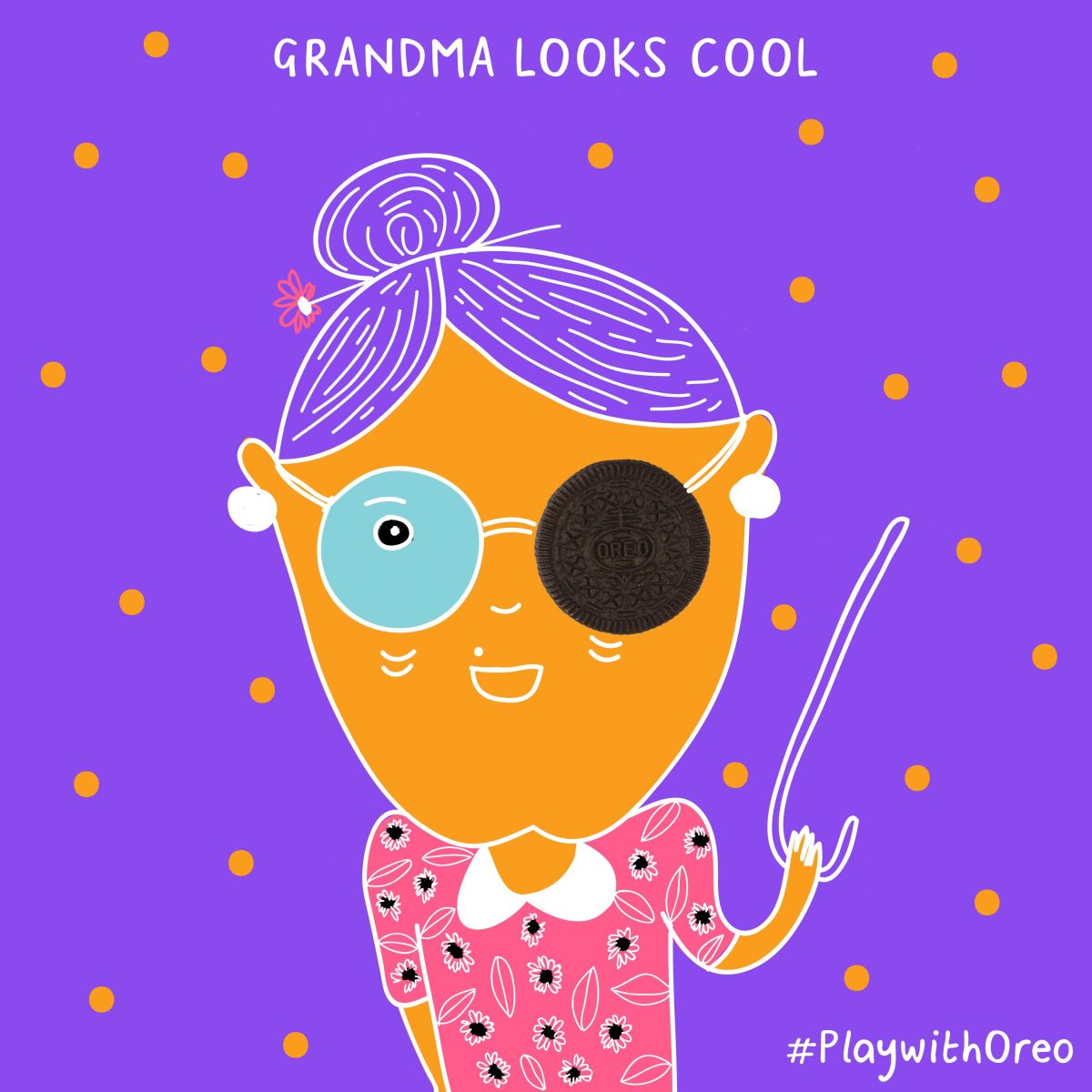
Shut Up & Stop Stereotyping 2019 Calendar, killing gender roles!
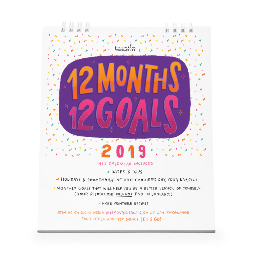
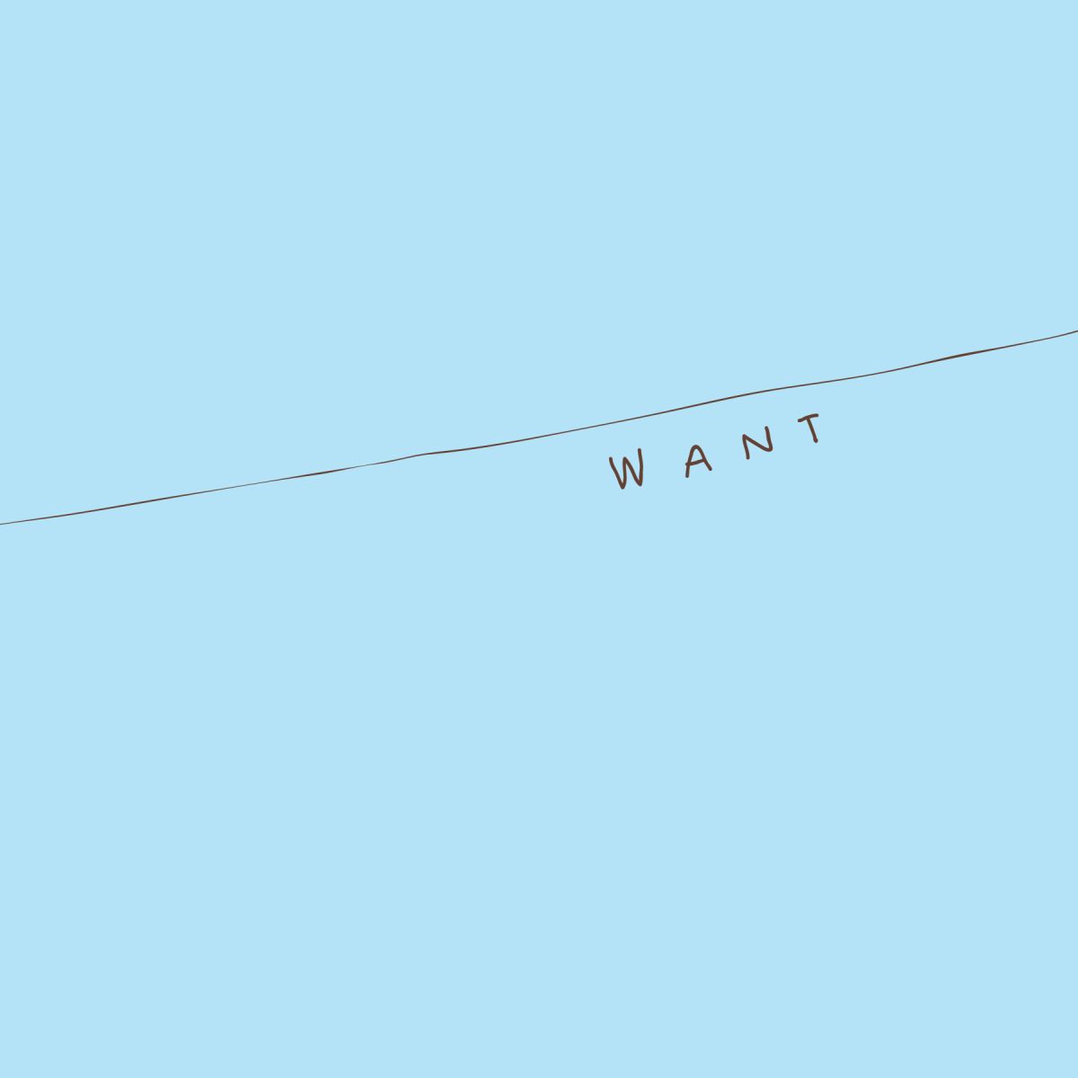
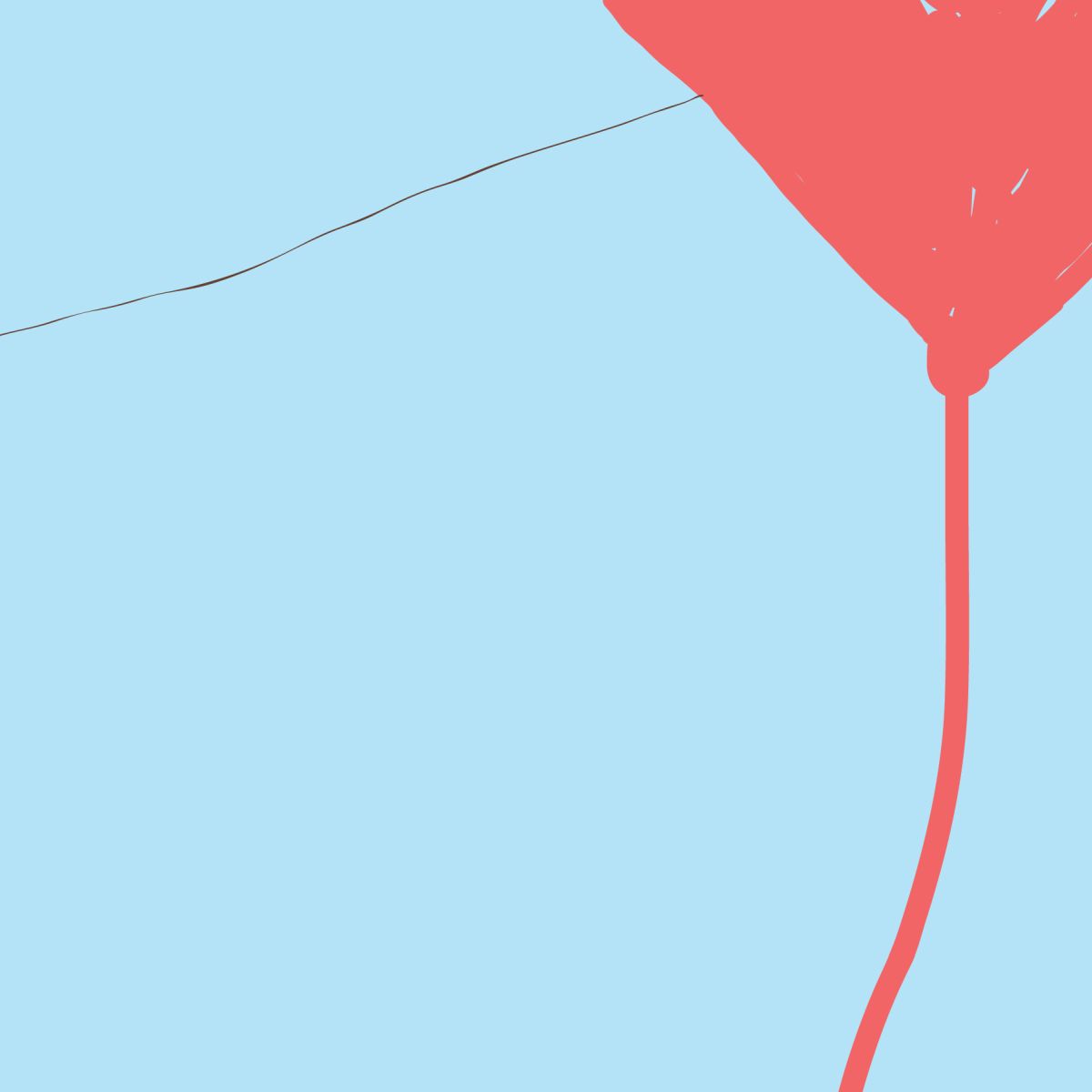
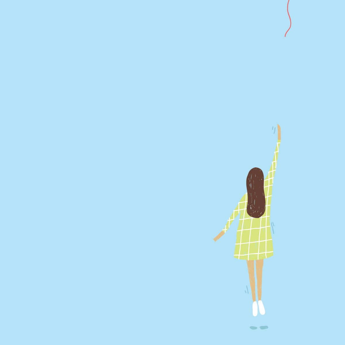
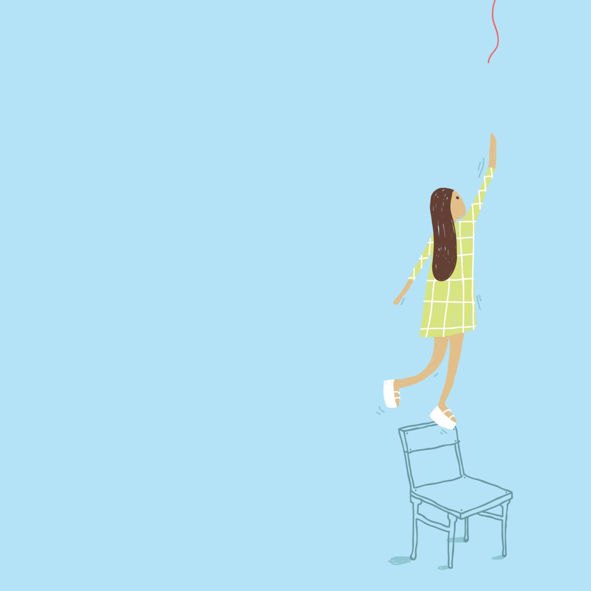
12 Months 12 Goals 2019 Calendar
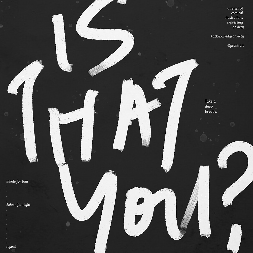
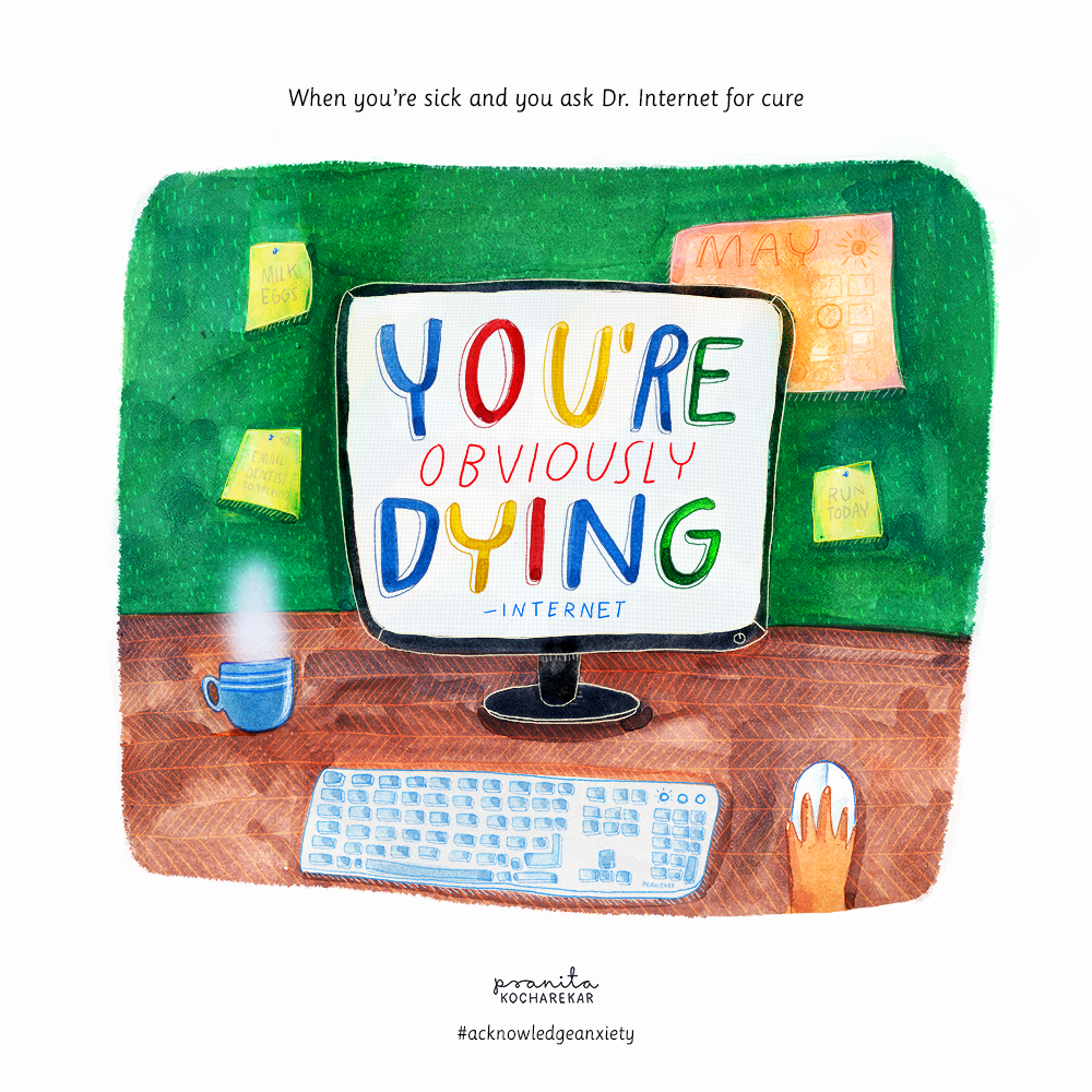
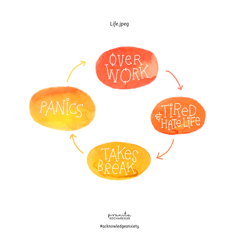
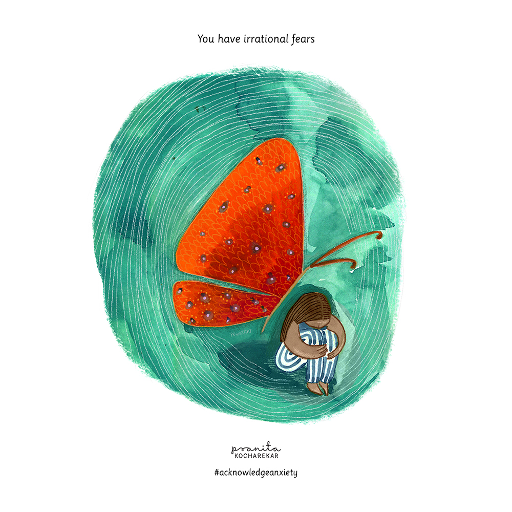
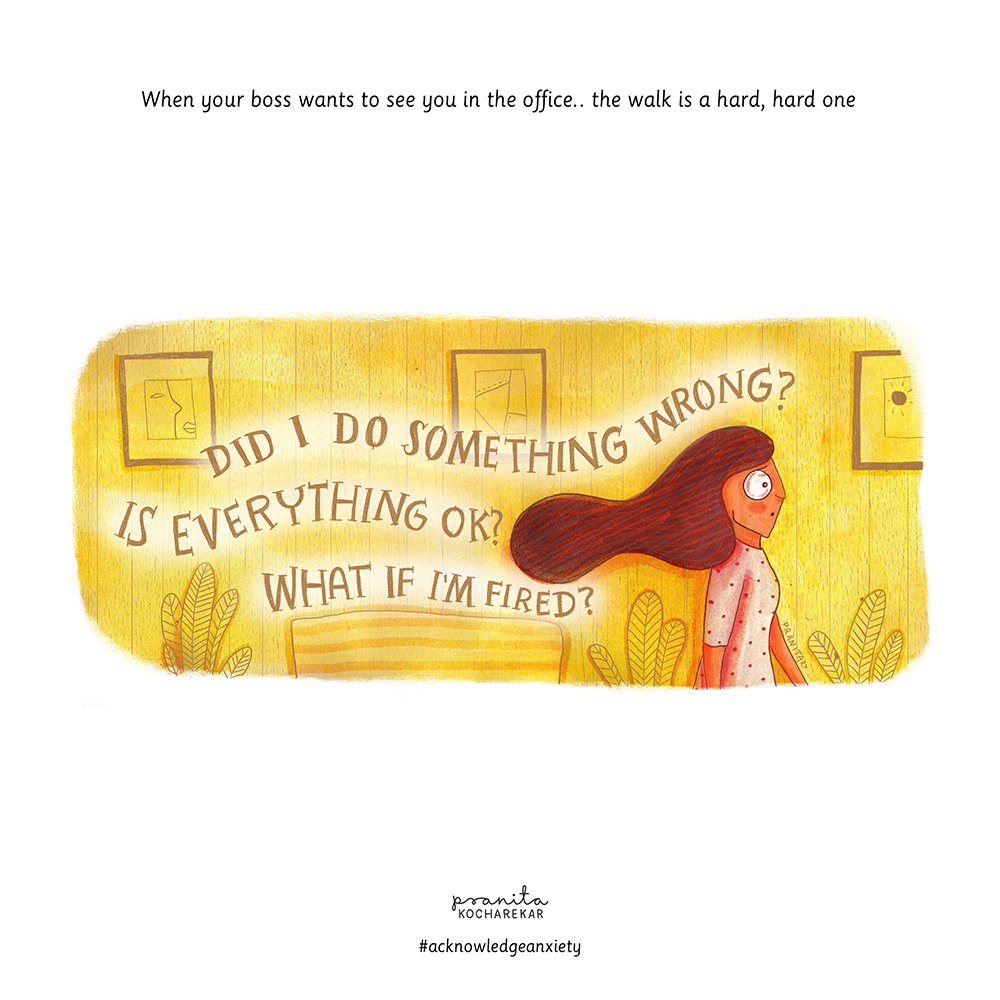
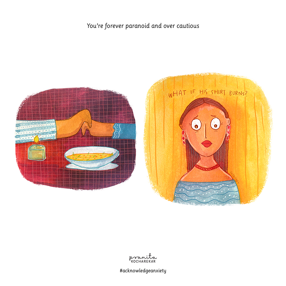
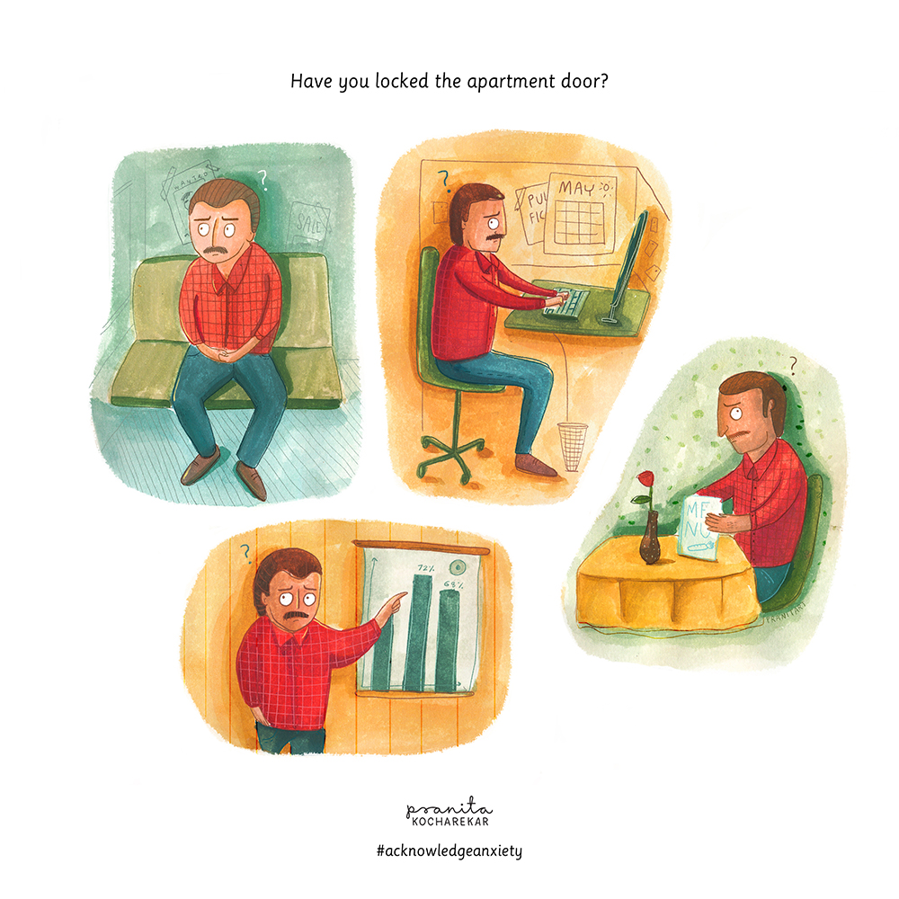
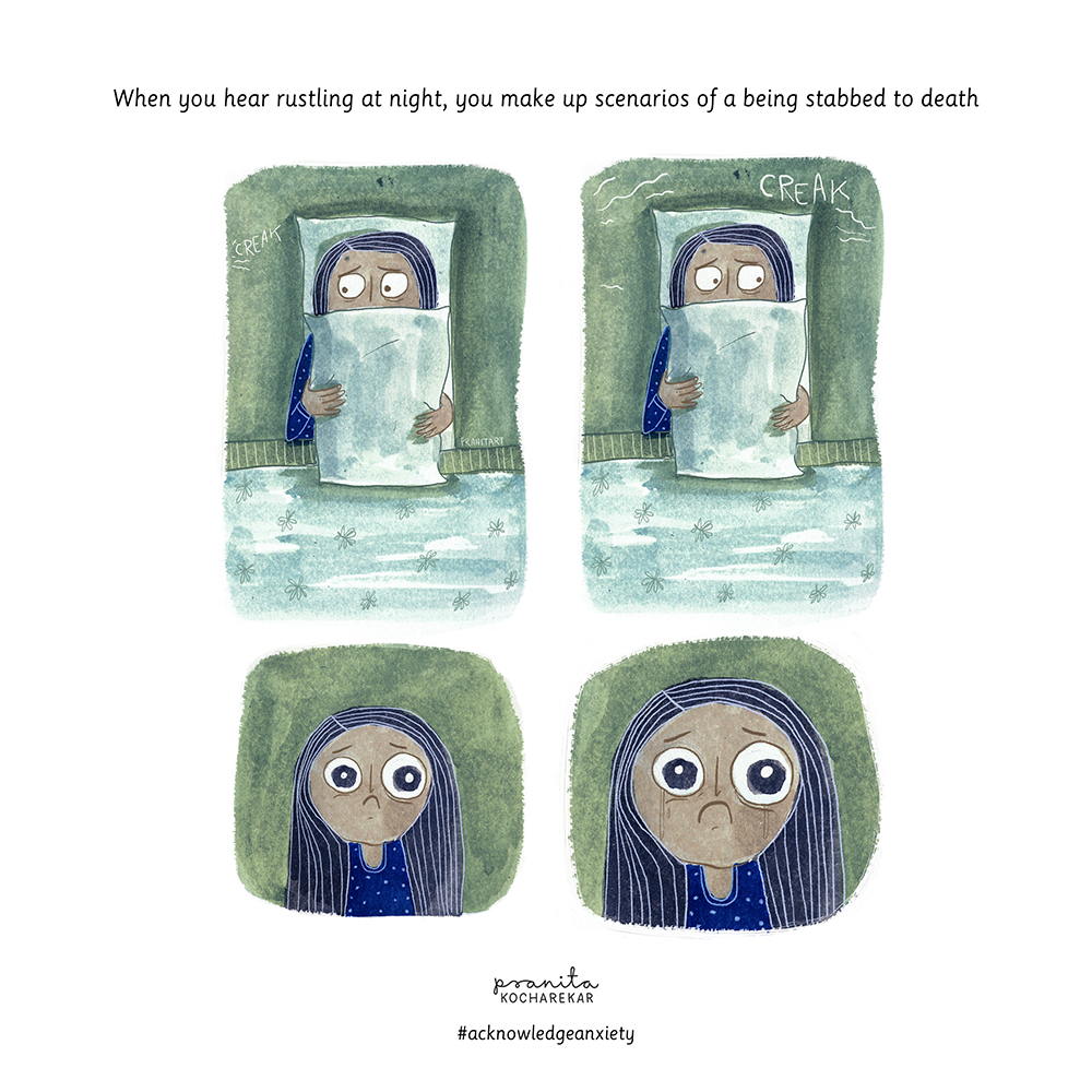
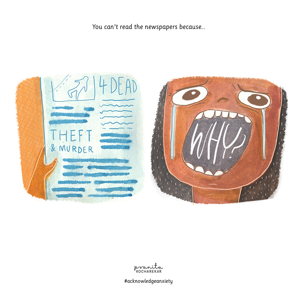
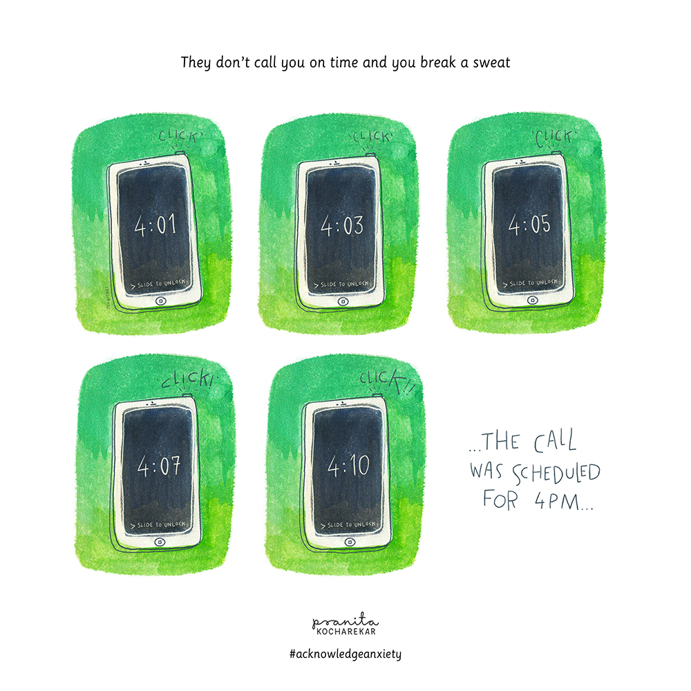
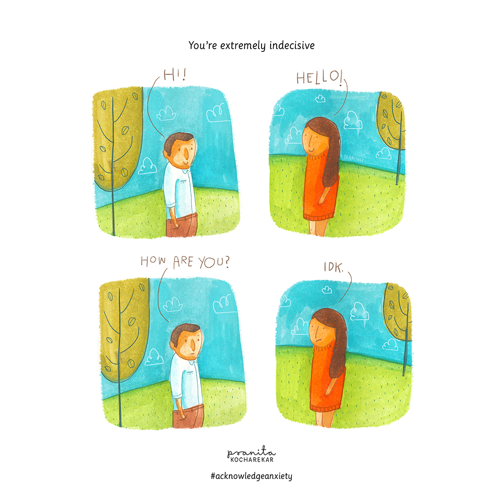
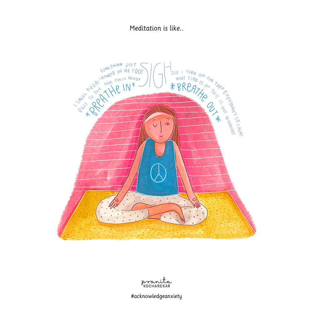
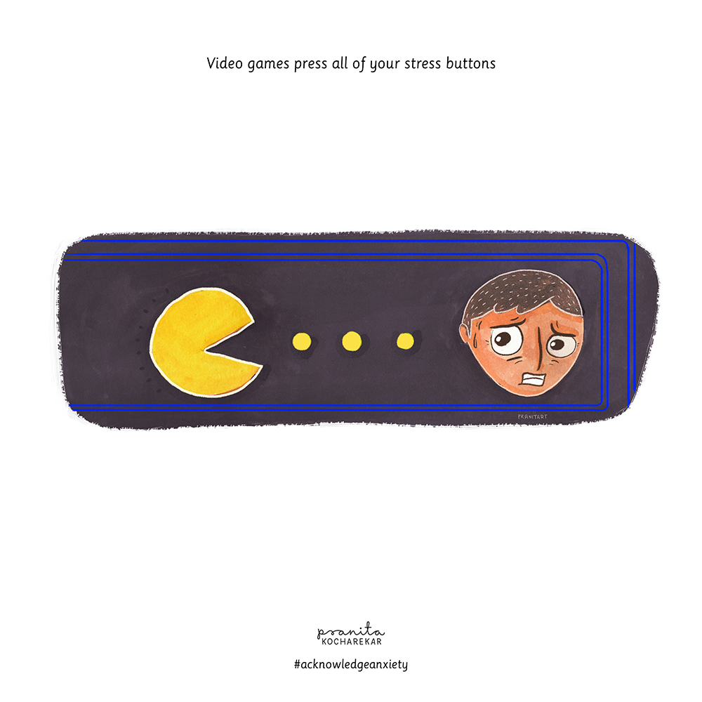
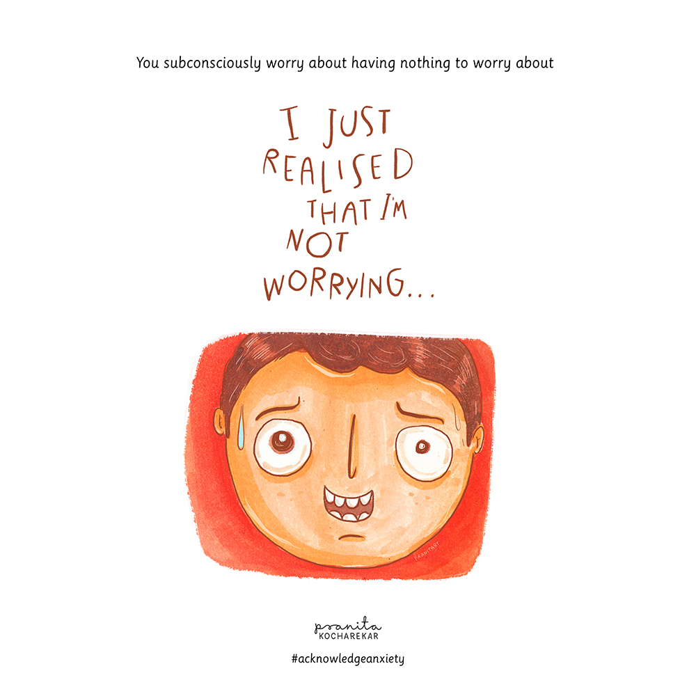
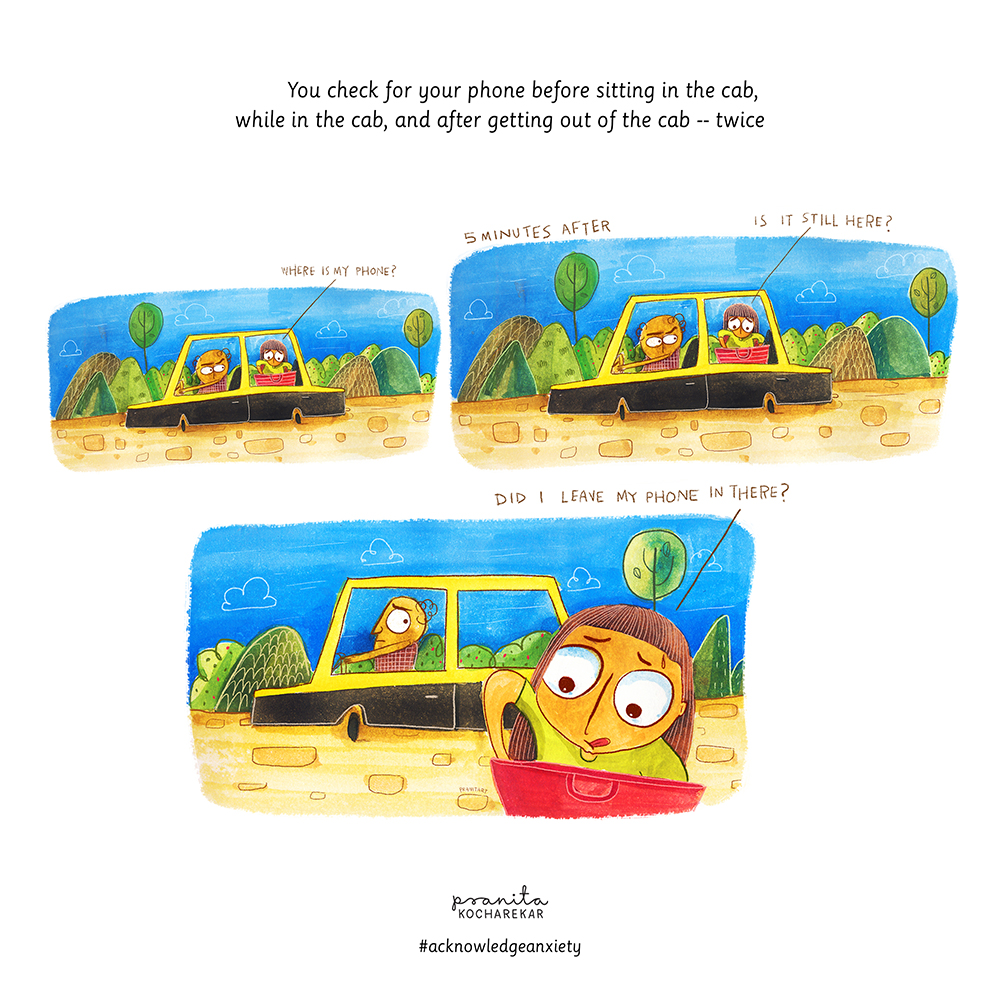
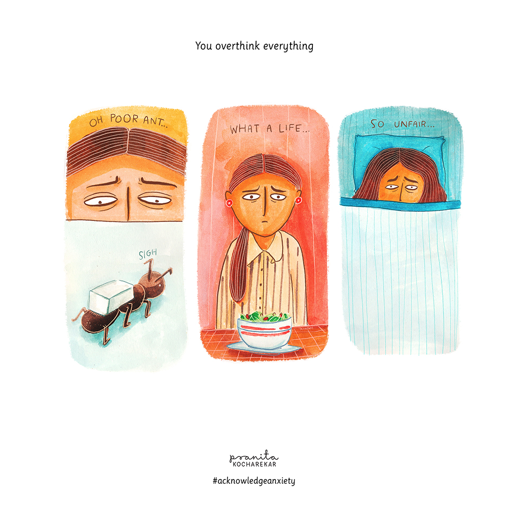
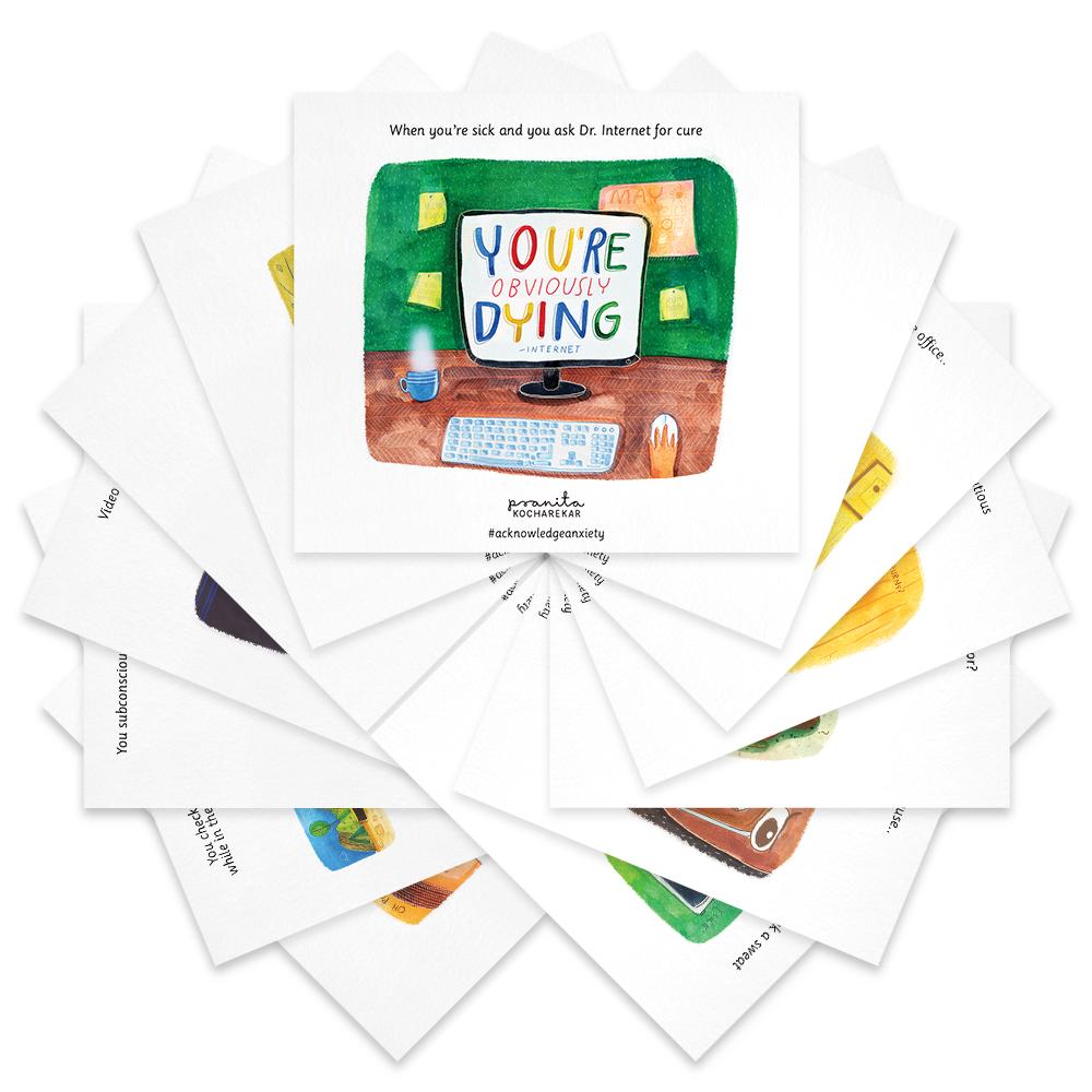
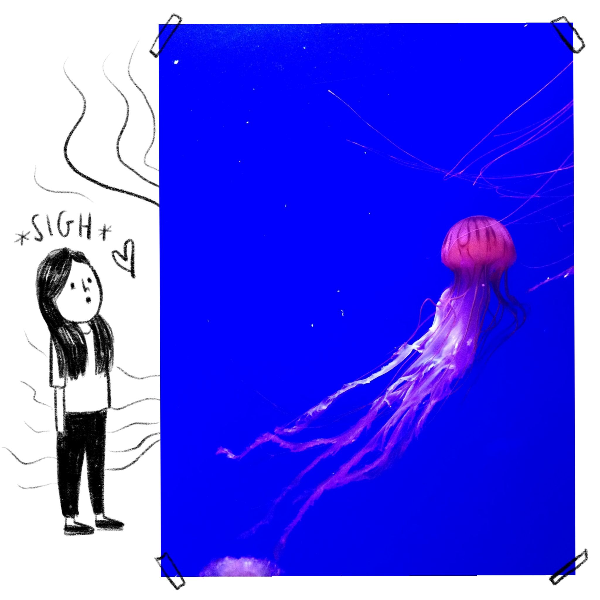
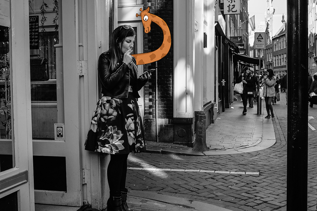
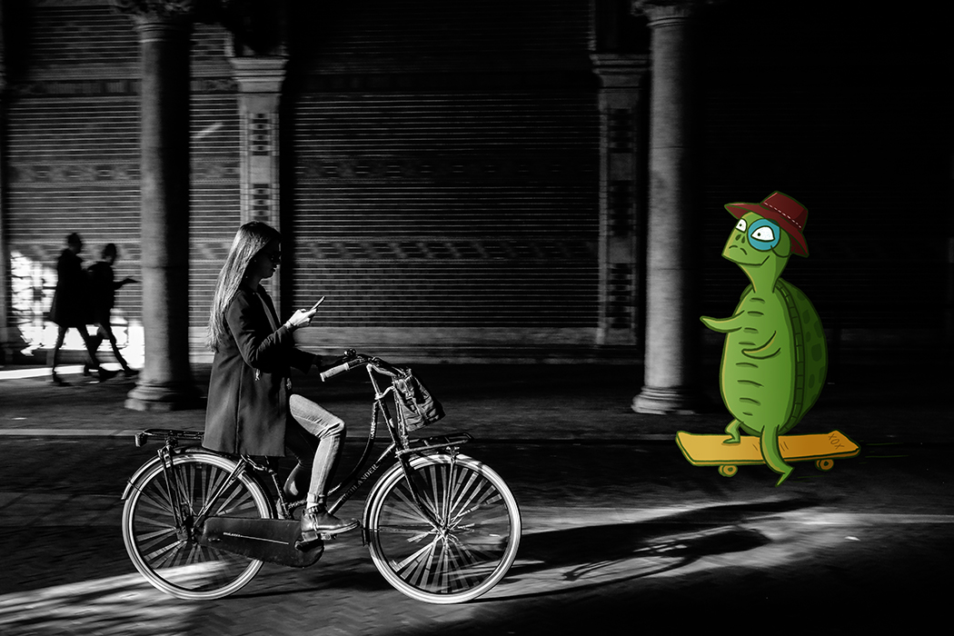
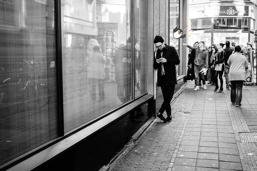
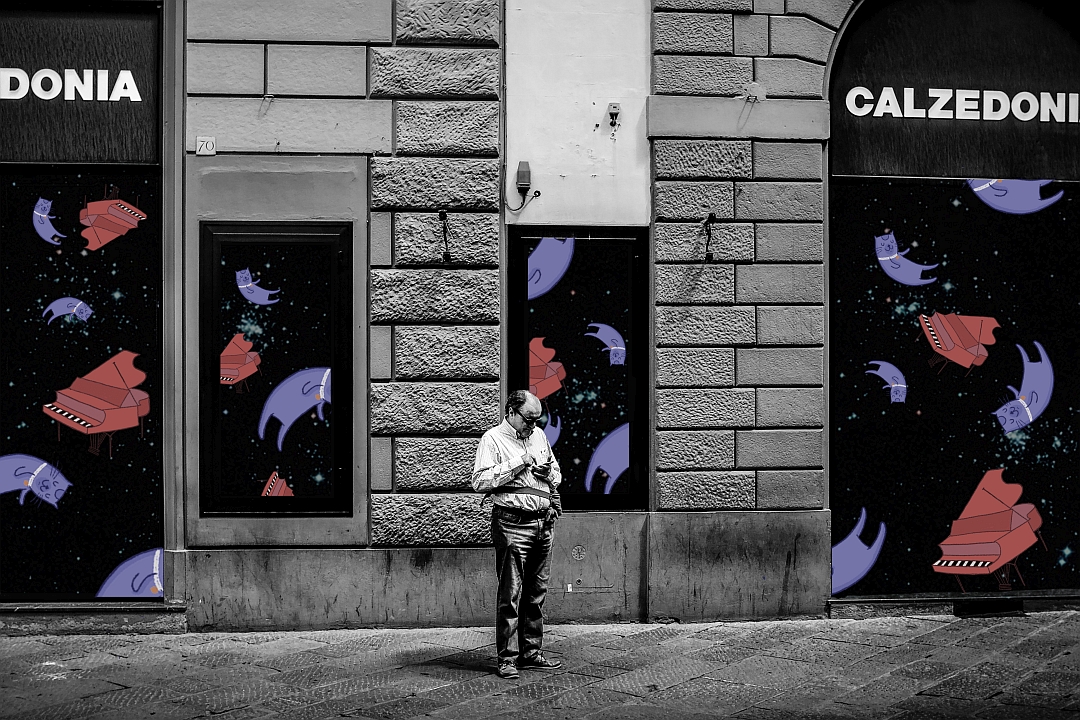
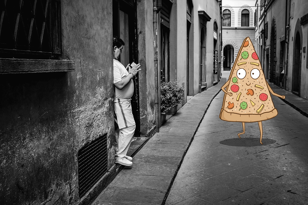
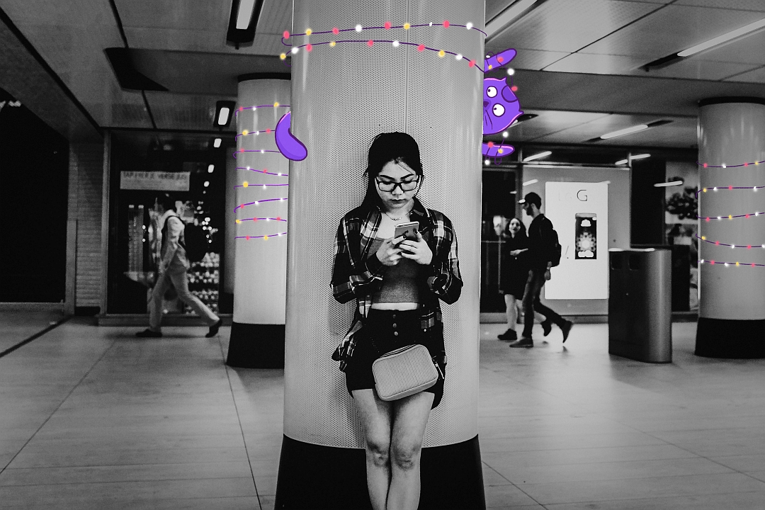
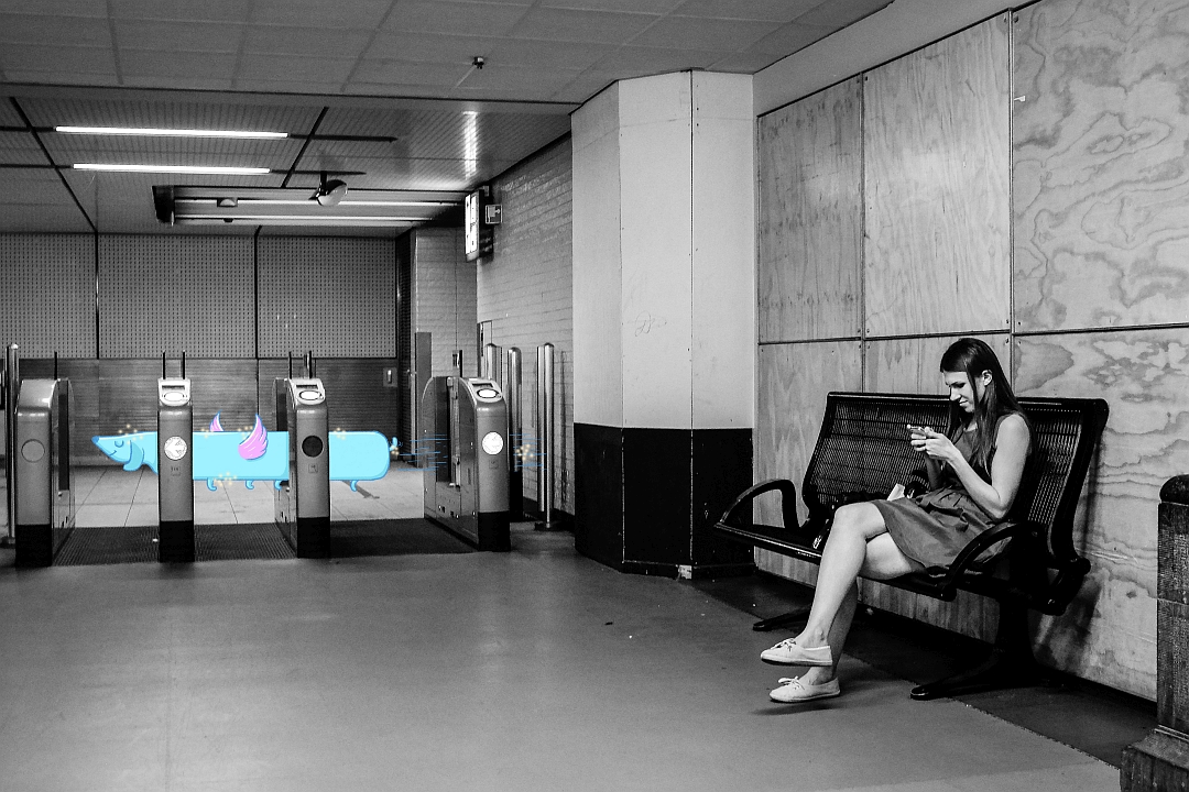
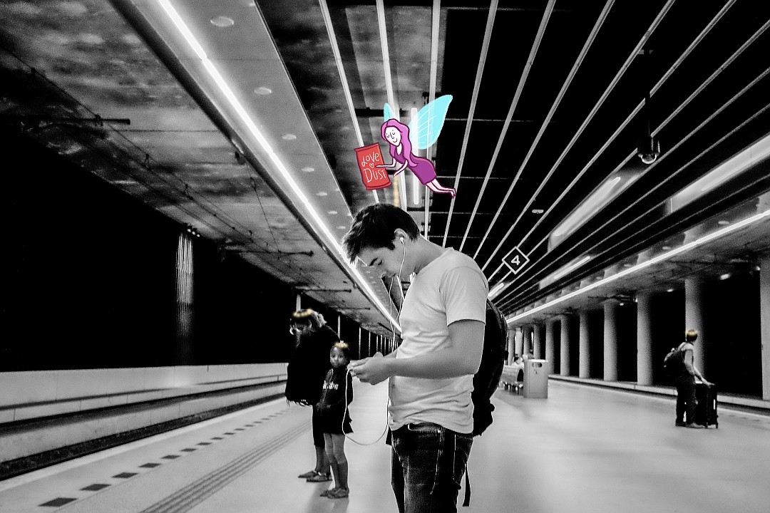
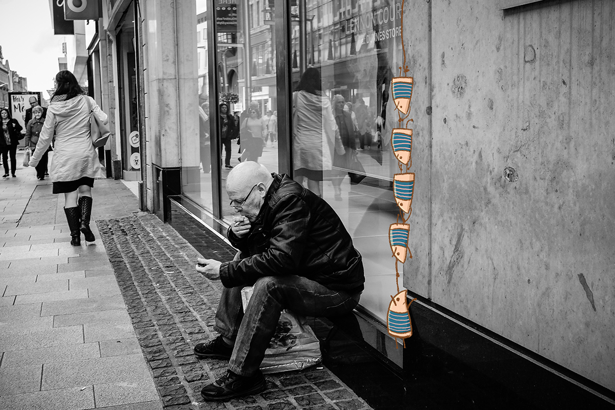
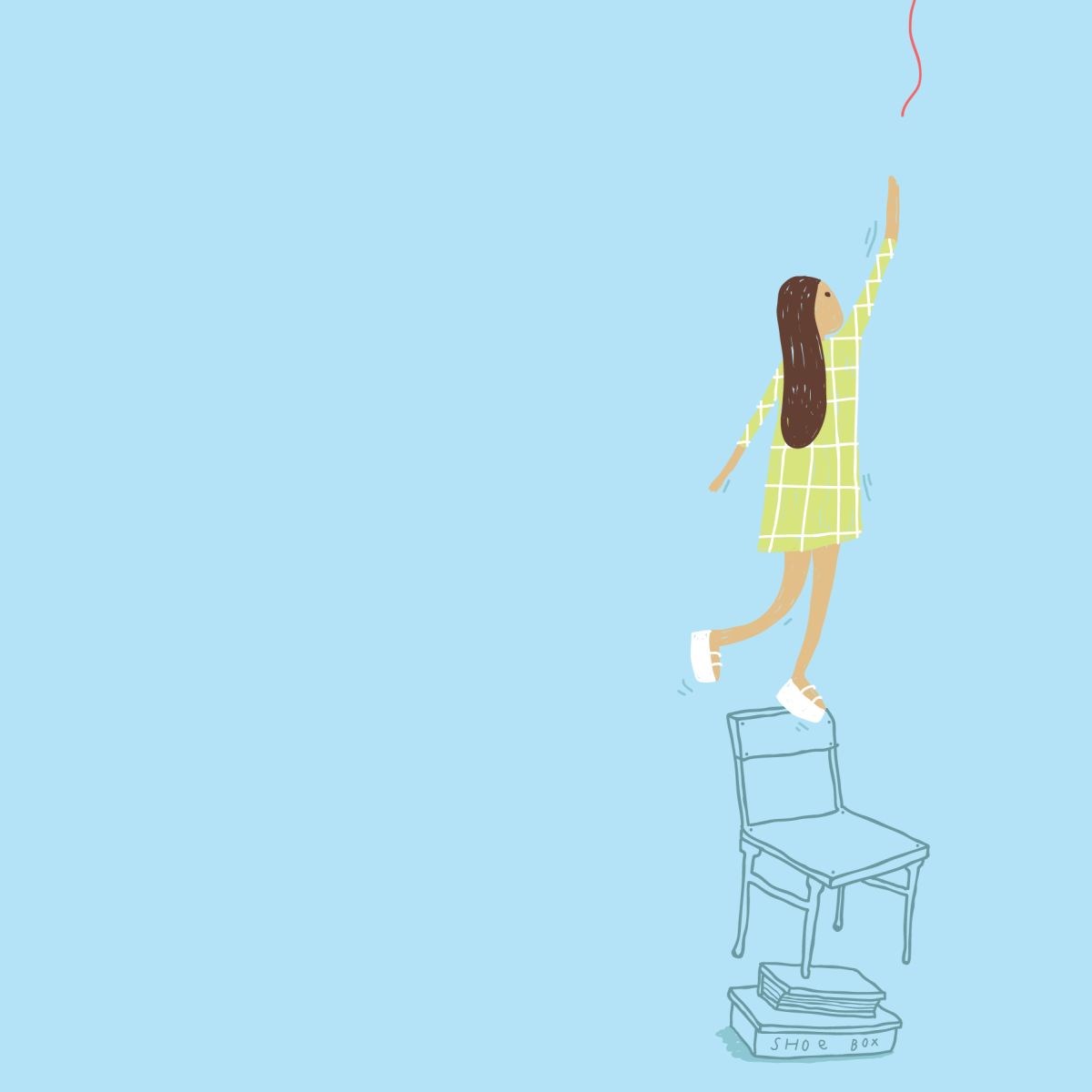
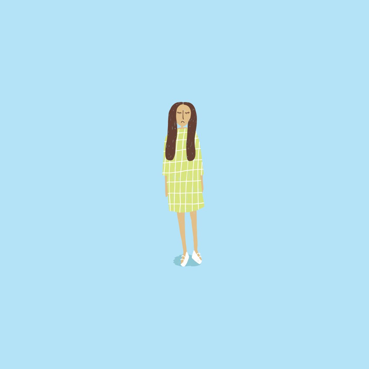
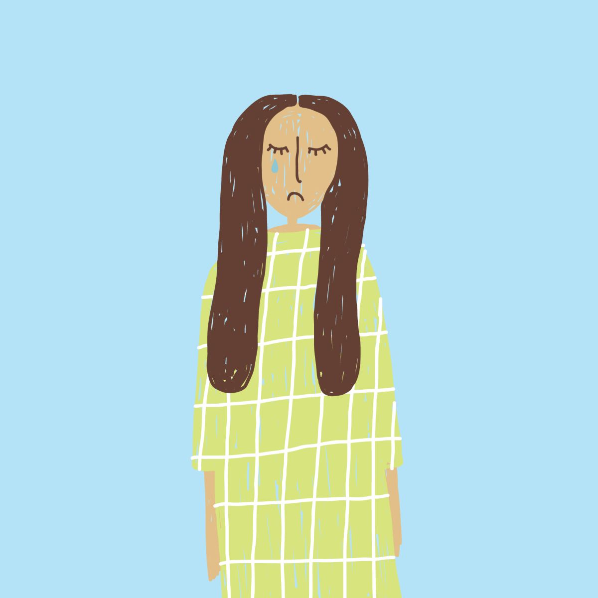
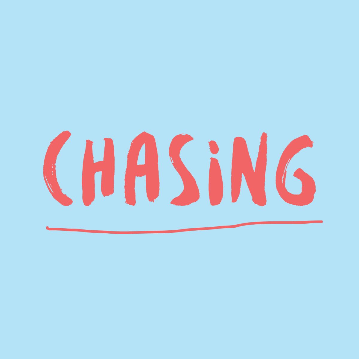
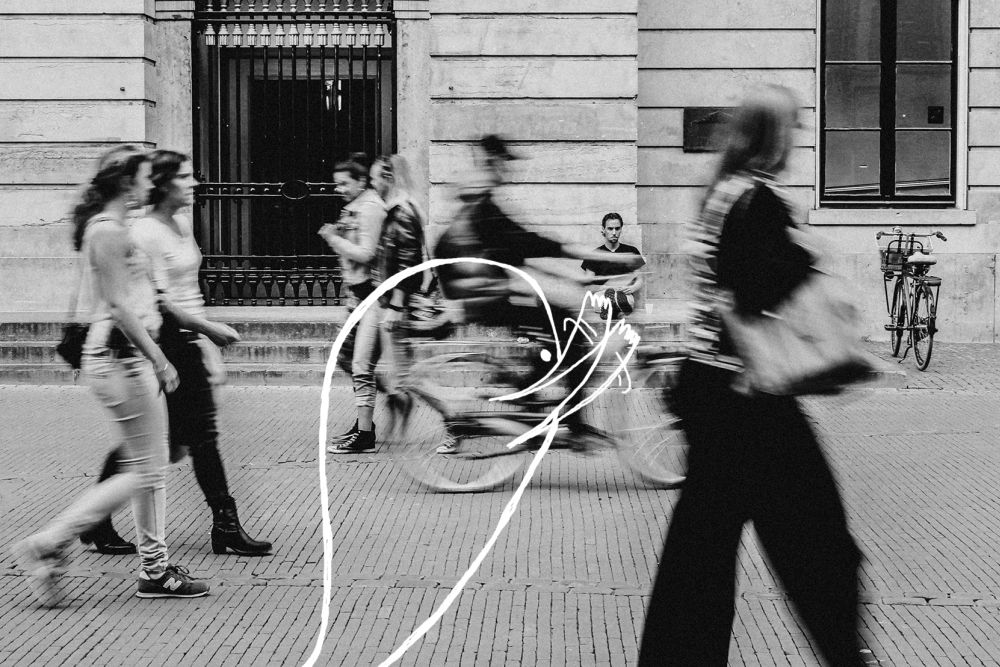
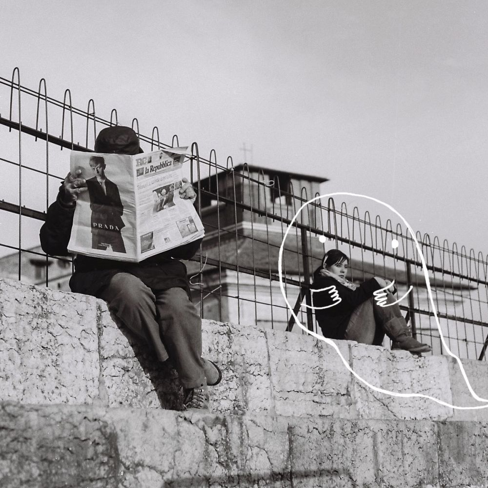
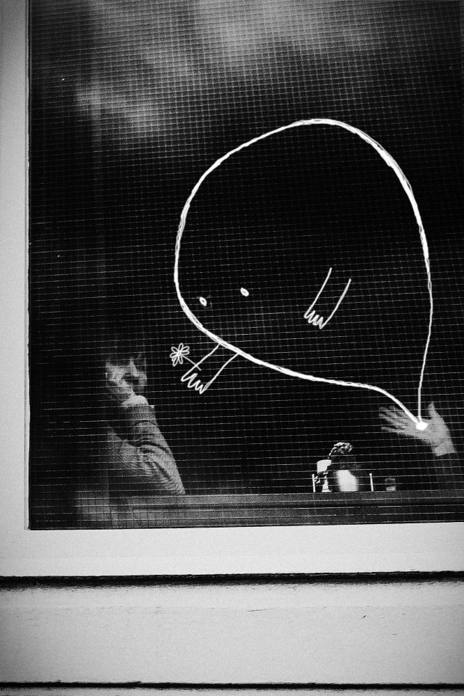
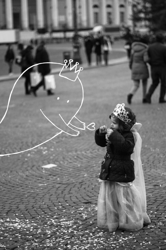
IS THAT YOU? is a comical series of illustrations on anxiety. The idea behind this was to make people aware that they’re not alone, anxiety on small levels exists in most of us, there are simple breathing techniques to control beginner level anxiety. Acknowledging anxiety and acting upon it is the first step to cure.Please note that these are not symptoms of anxiety but emotions of an anxious person. Kindly do not self diagnose, and visit a doctor for better guidance.
This project was featured in Elle India, India Today, Mashable, Huffpost Brazil, The Huff Post, Huff Post UK, Bored Panda, POPSUGAR, Buzzfeed India, DesignTaxi, 9GAG, Scoopwhoop, DNA news, Attn., theQuint.com, Metro.uk, Bustle.com (US), Takethis.org, The Debrief (UK), TechNinja, Recipe Land, Shout your site, Netro.in, Storypick, Scary mommy, JWB, Everyday Feminism, feminismindia.com to name a few.
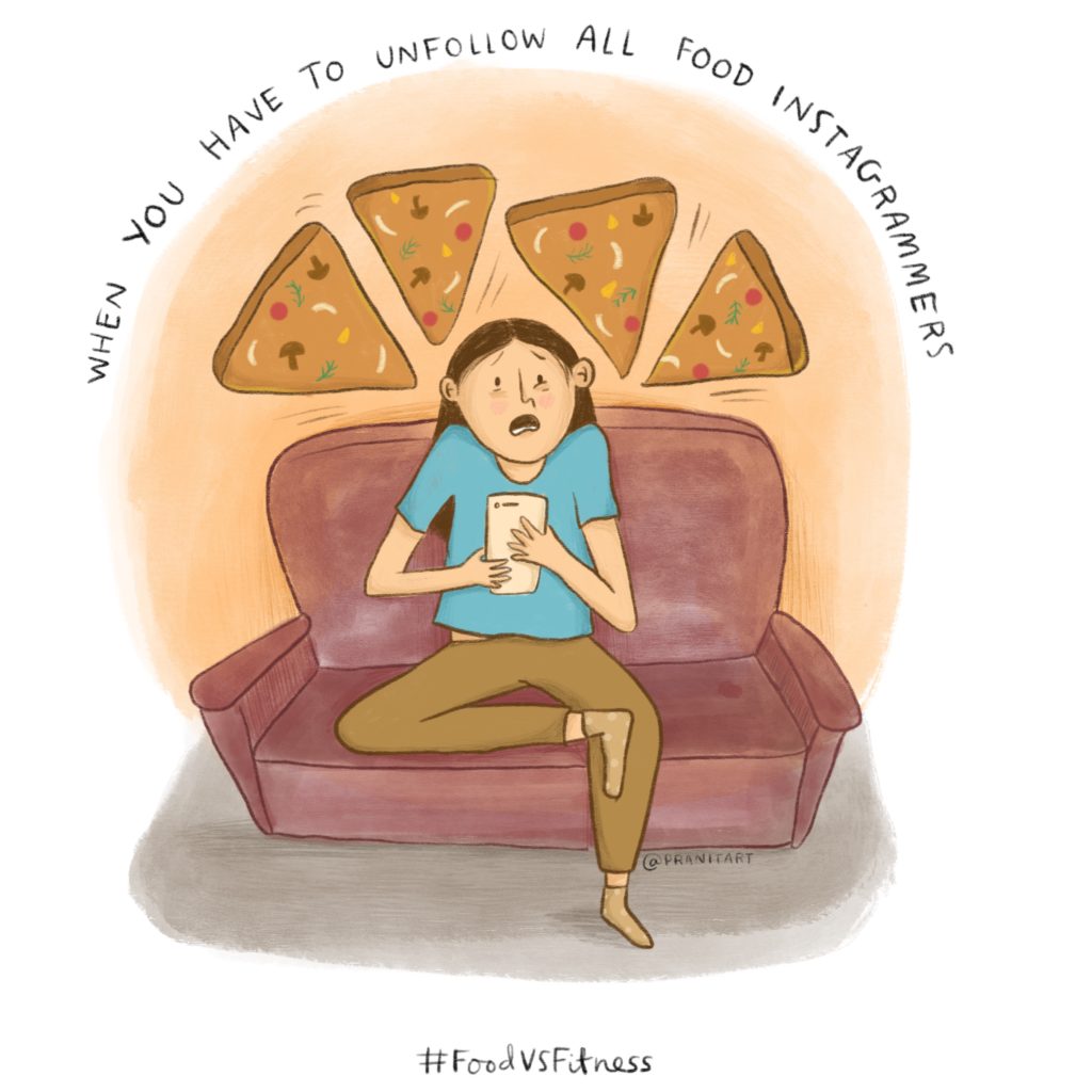
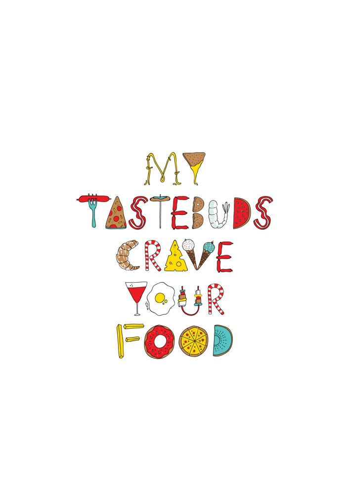
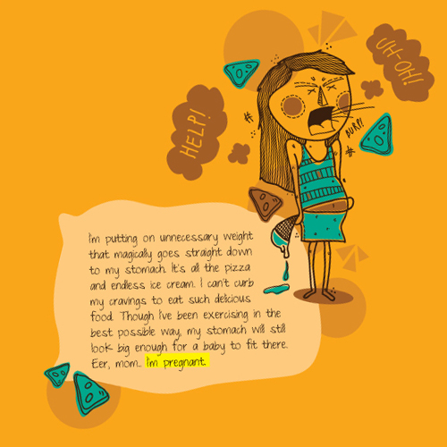
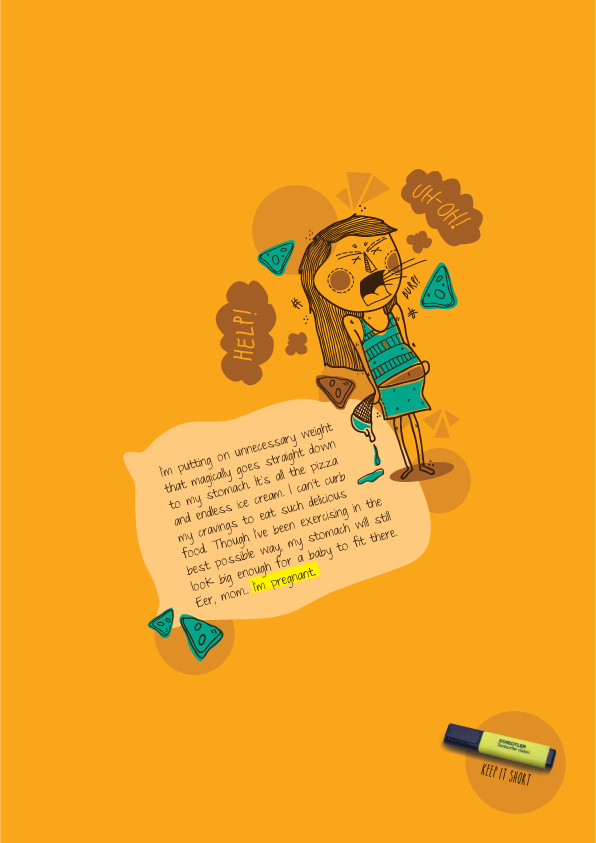
#FoodVSFitness is a series that elaborates the almost depressing worries of the food vs fitness dilemmas. The series consists of 10 illustrative scenarios describing the mental pressures one goes through. It talks about the lack of balance between extreme food eating habits or extreme fitness.
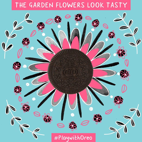
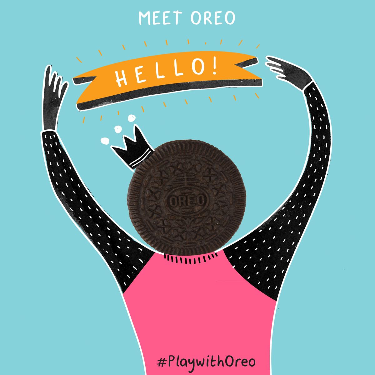
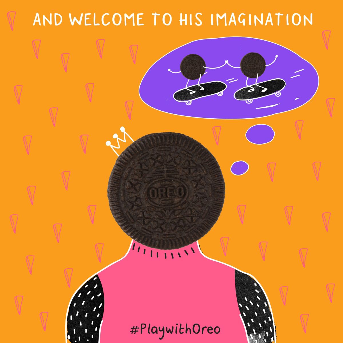
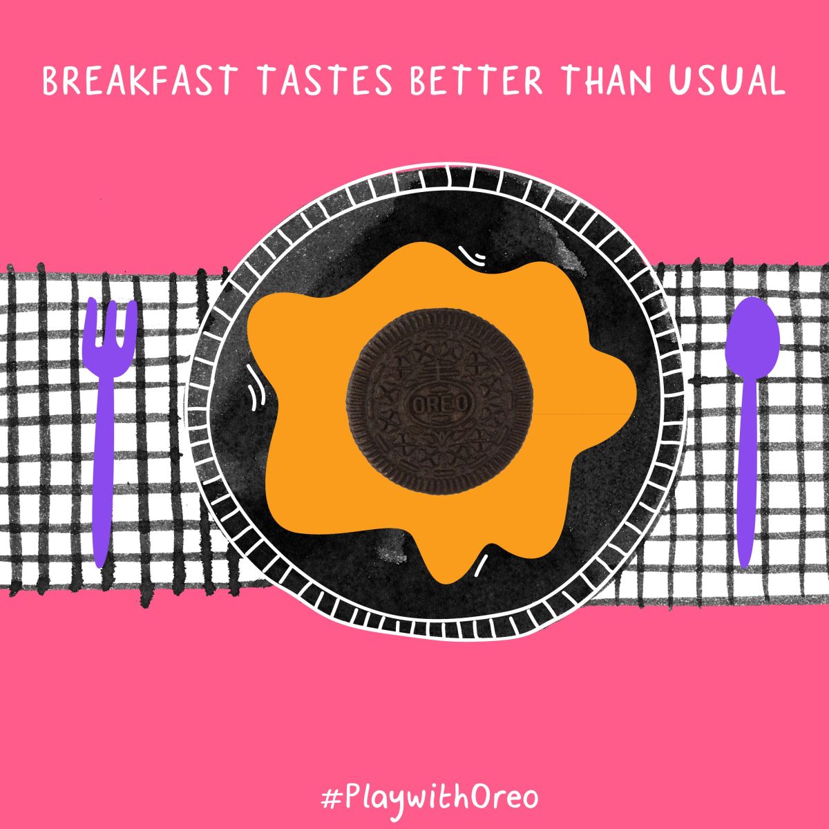
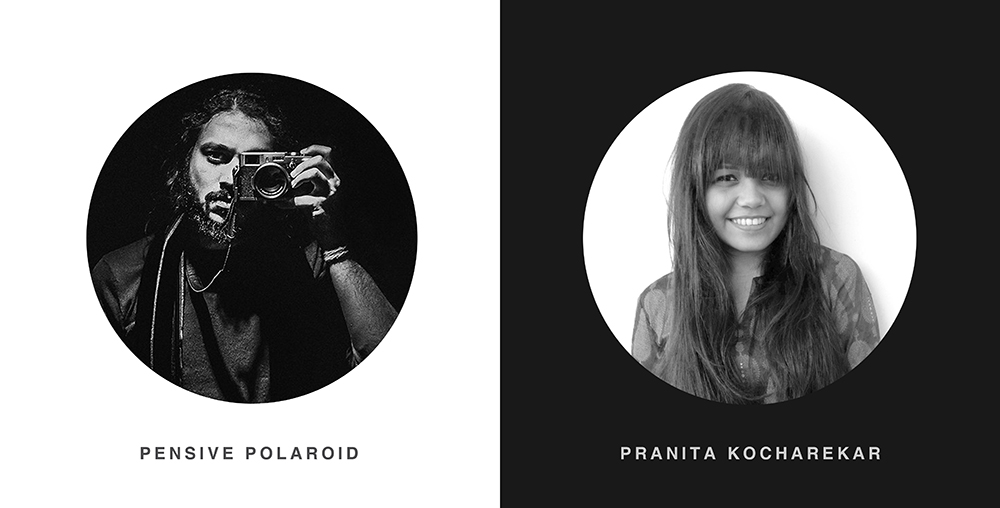
Creative Direction, Art Direction & Illustrations: Pranita Kocharekar
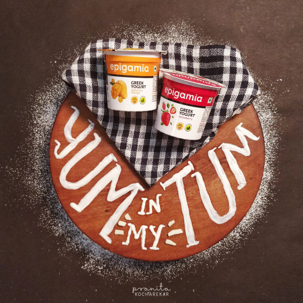
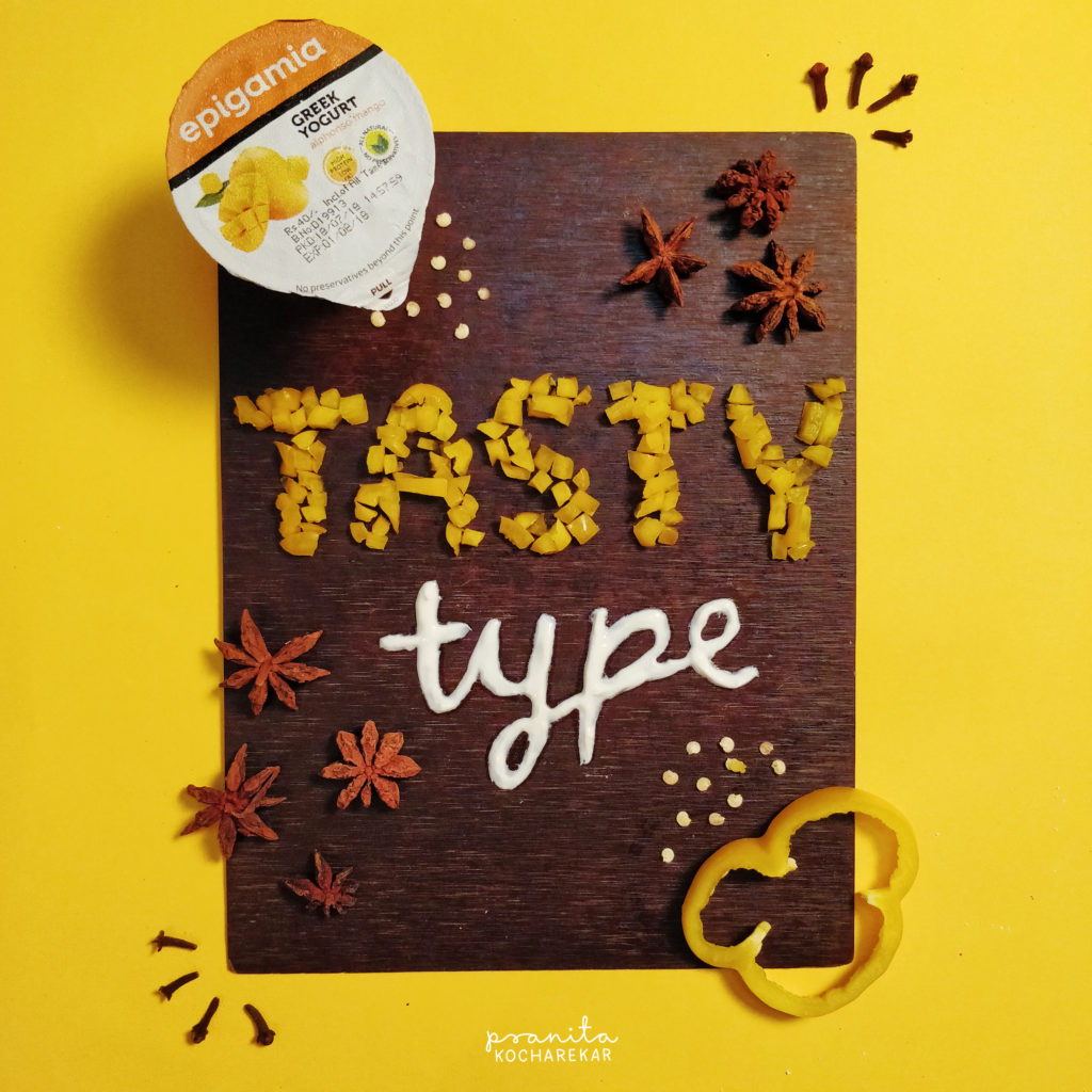
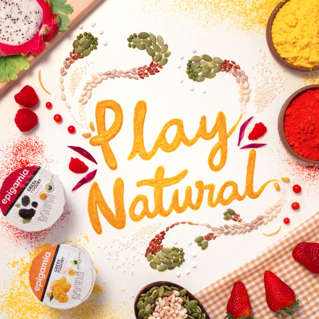
Epigamia Yogurt connected with food stylists and lettering artists for this project. The aim to create inspiring crowd sourced typography art with Epigamia Greek Yogurt and only natural/edible ingredients with no added artificial coloring, that tastes as good as it looks.
Creative Direction, Art Direction, Styling, Photography – Pranita Kocharekar
Agency – Rasta
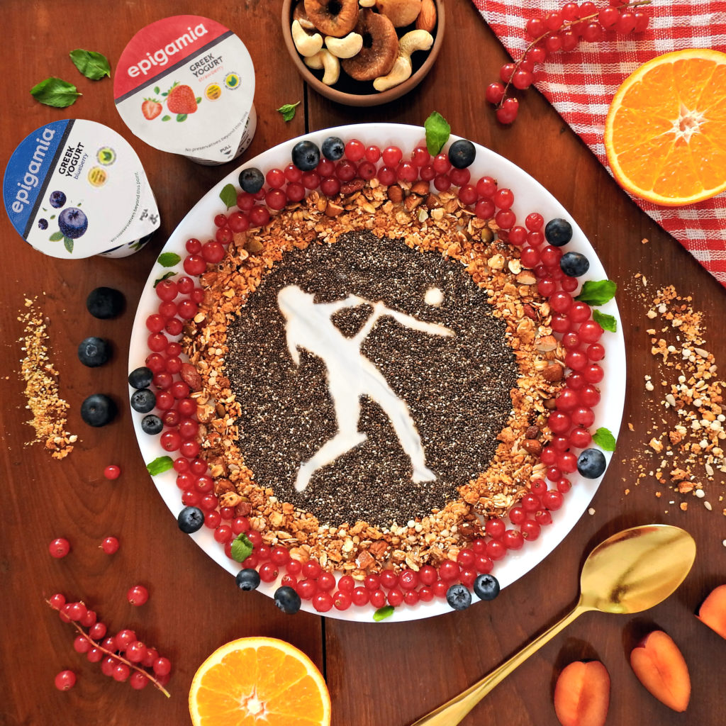
Epigamia Yogurt is celebrating the women’s T20 Cricket matches & wanted to create an appreciation post.
Concept by the team at Rasta.
Art Direction & Execution by Pranita Kocharekar
Epigamia Yogurt is celebrating Indian festival of colours, Holi. Concept by the team at Rasta. Art Direction, Type Design & Execution by Pranita Kocharekar.
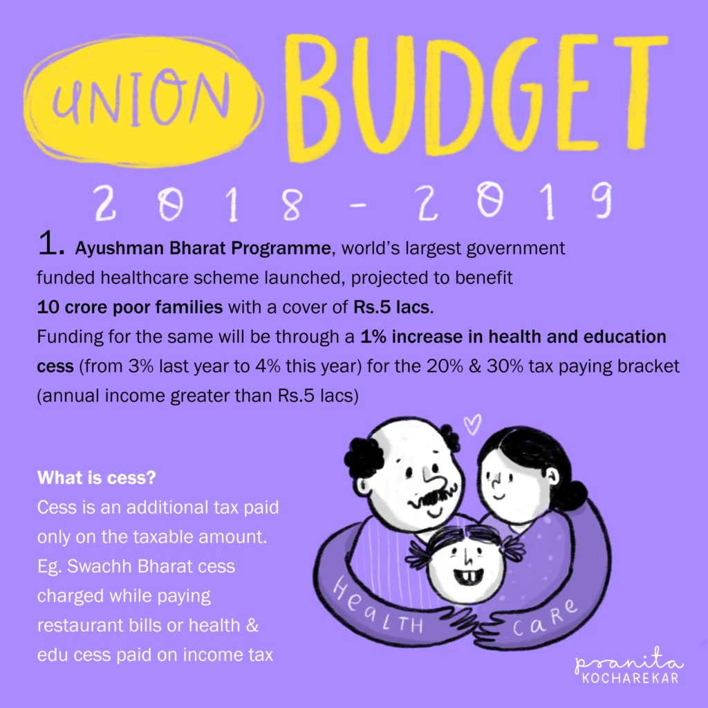
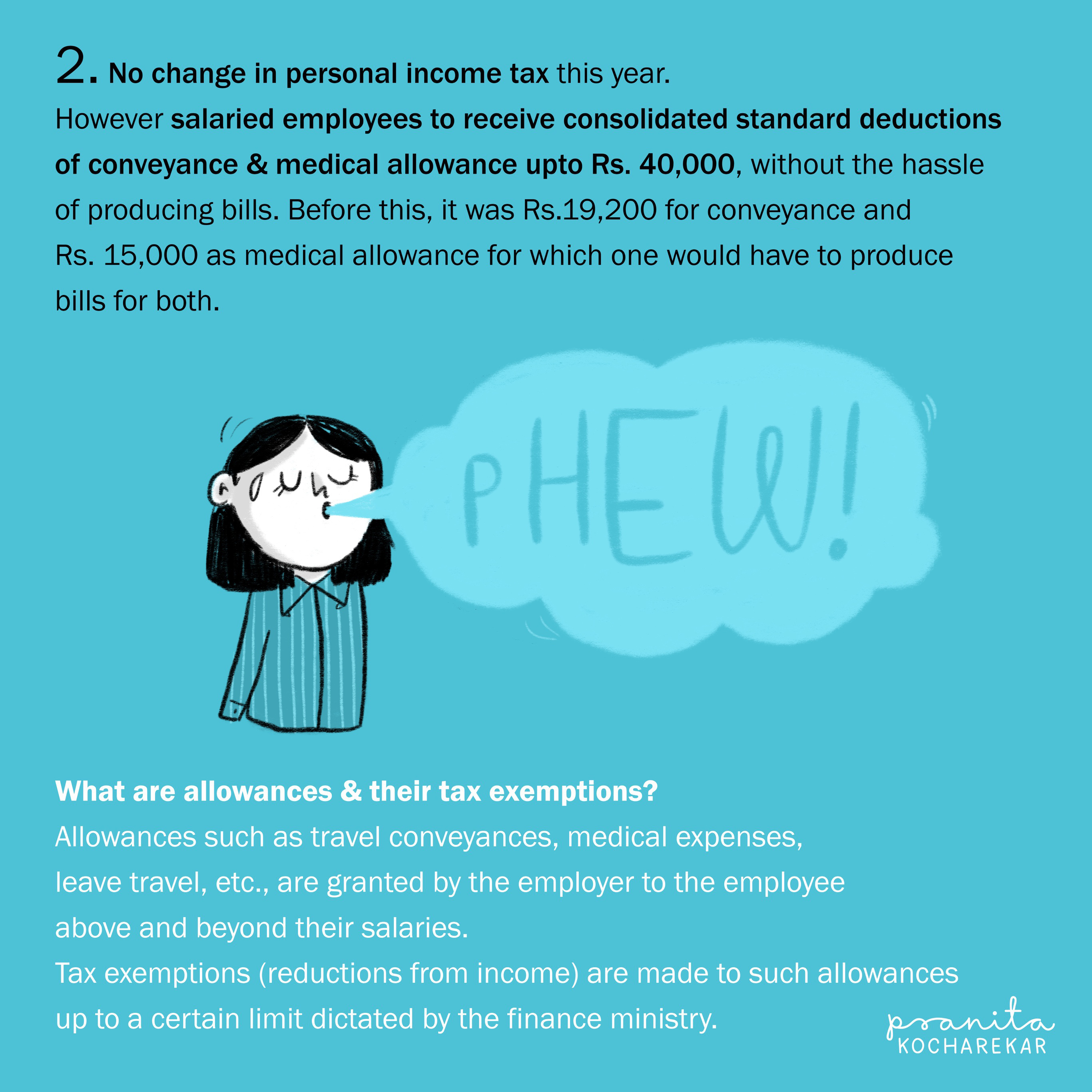
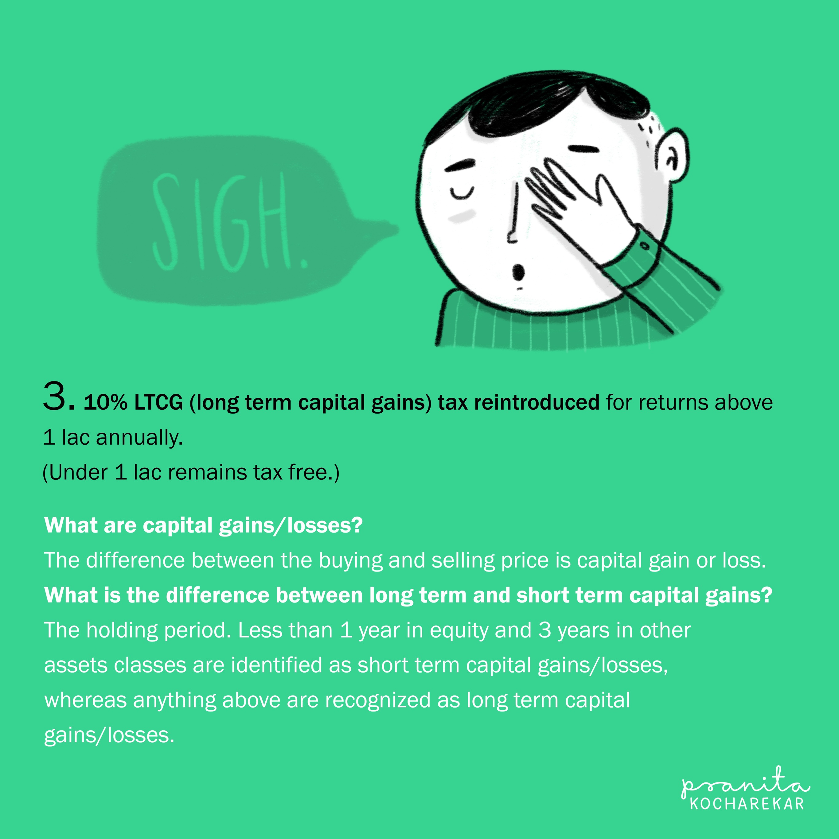
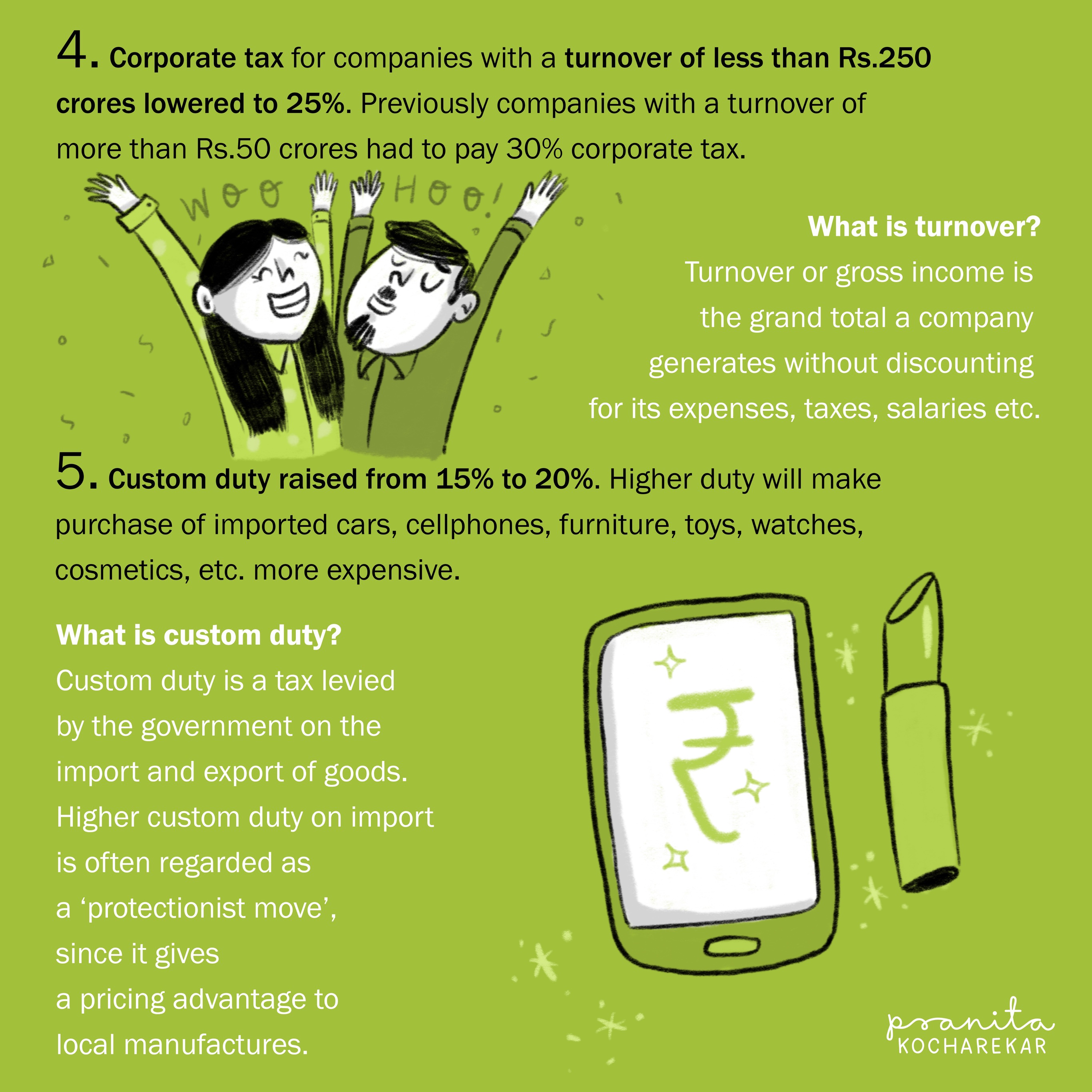
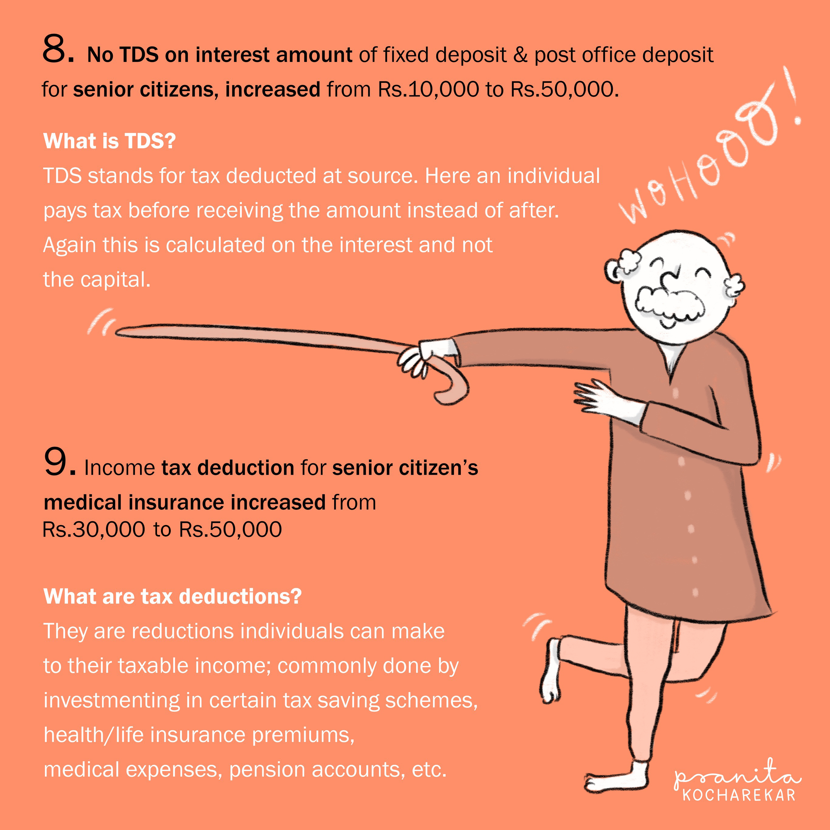
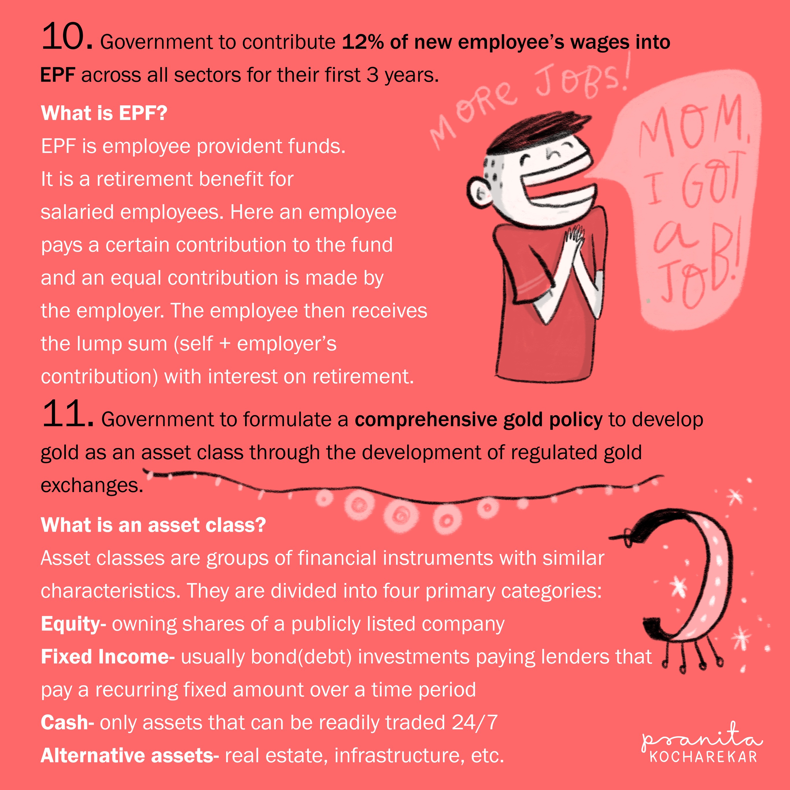
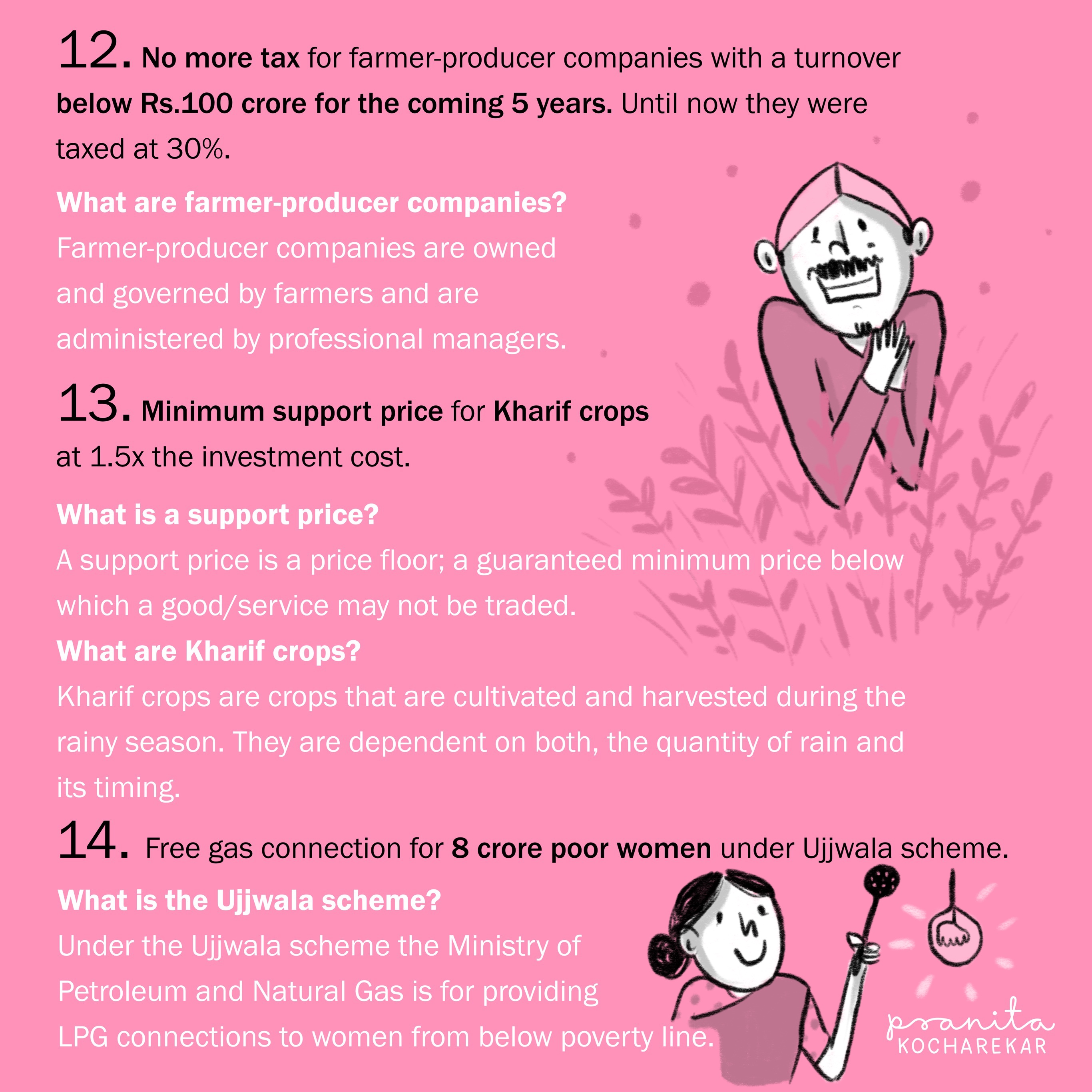
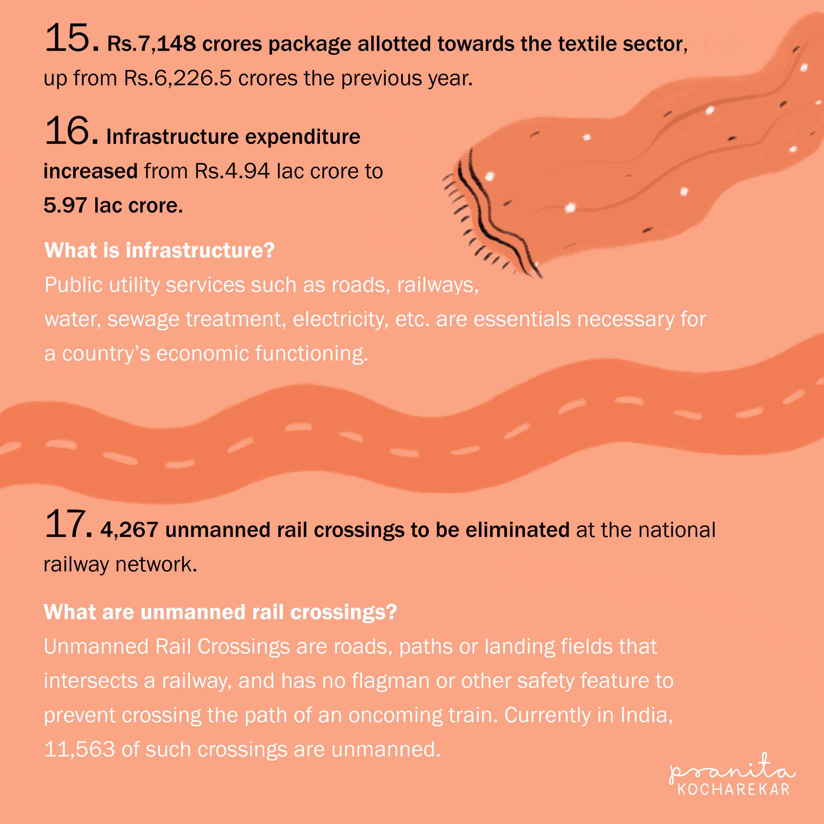
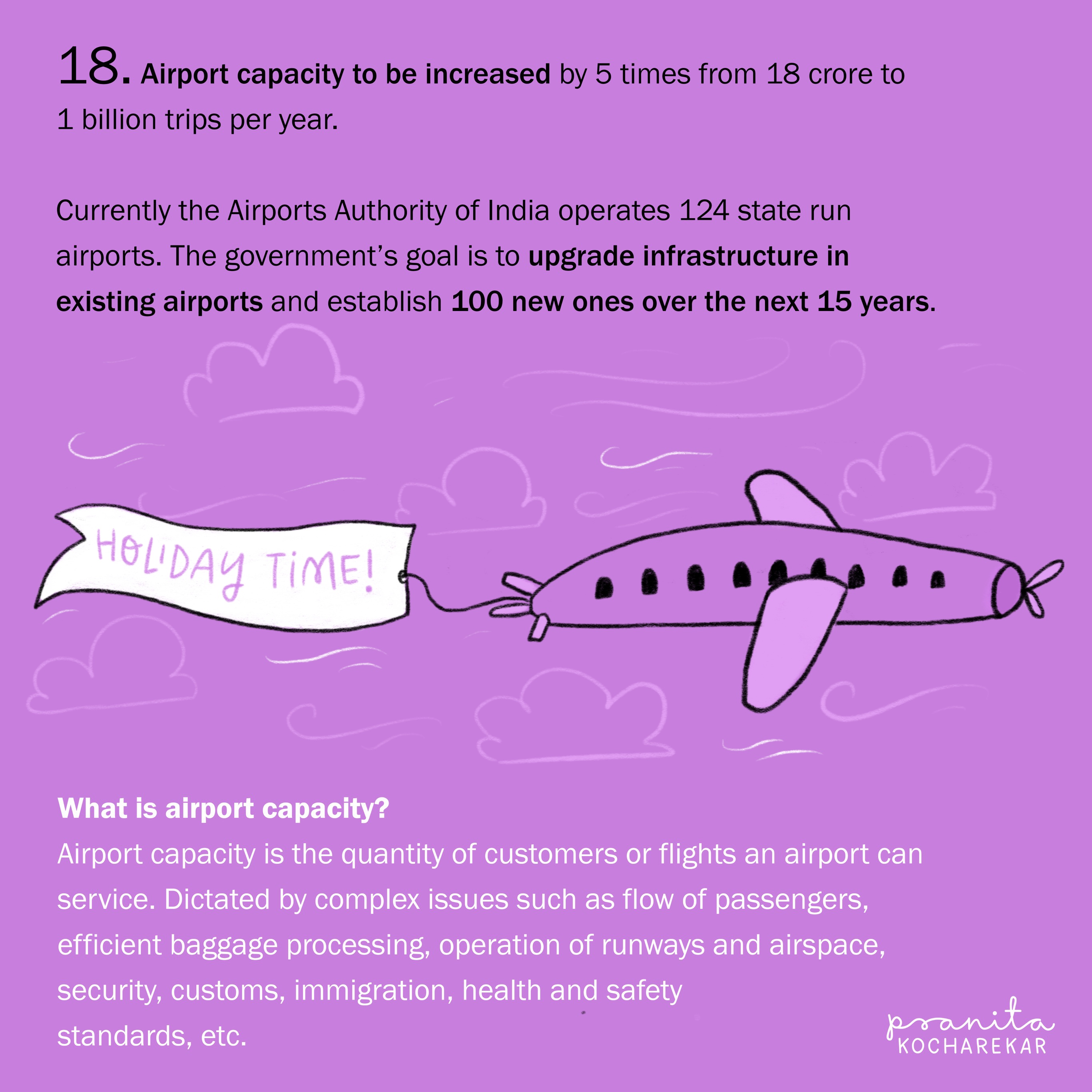
This project was an effort to understand the Indian Union Budget 2018 -2019. We created the content by picking highlights from the Budget and elaborating it further with simple explanations in order to help the general audience understand the Budget.
Content sourcing, writing & editing: Abhiraj Rawale
Art: Pranita Kocharekar


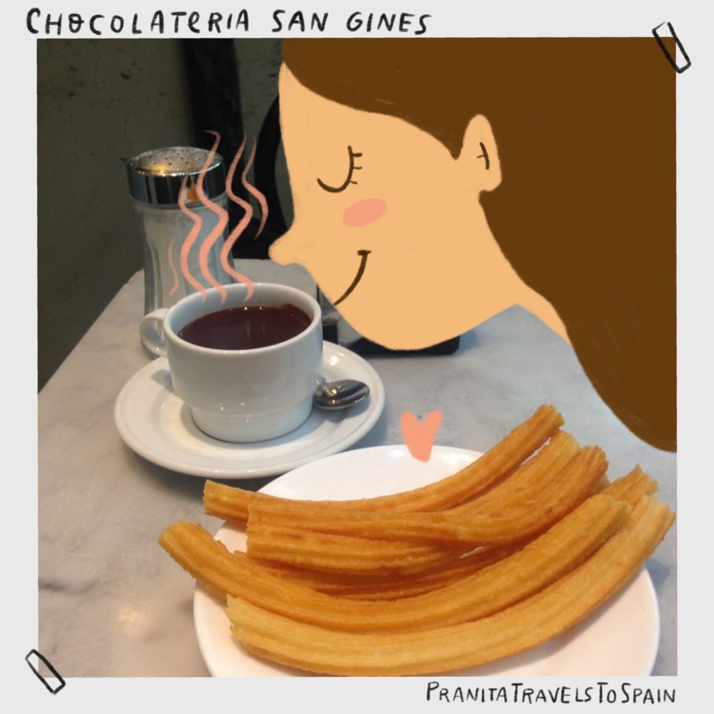
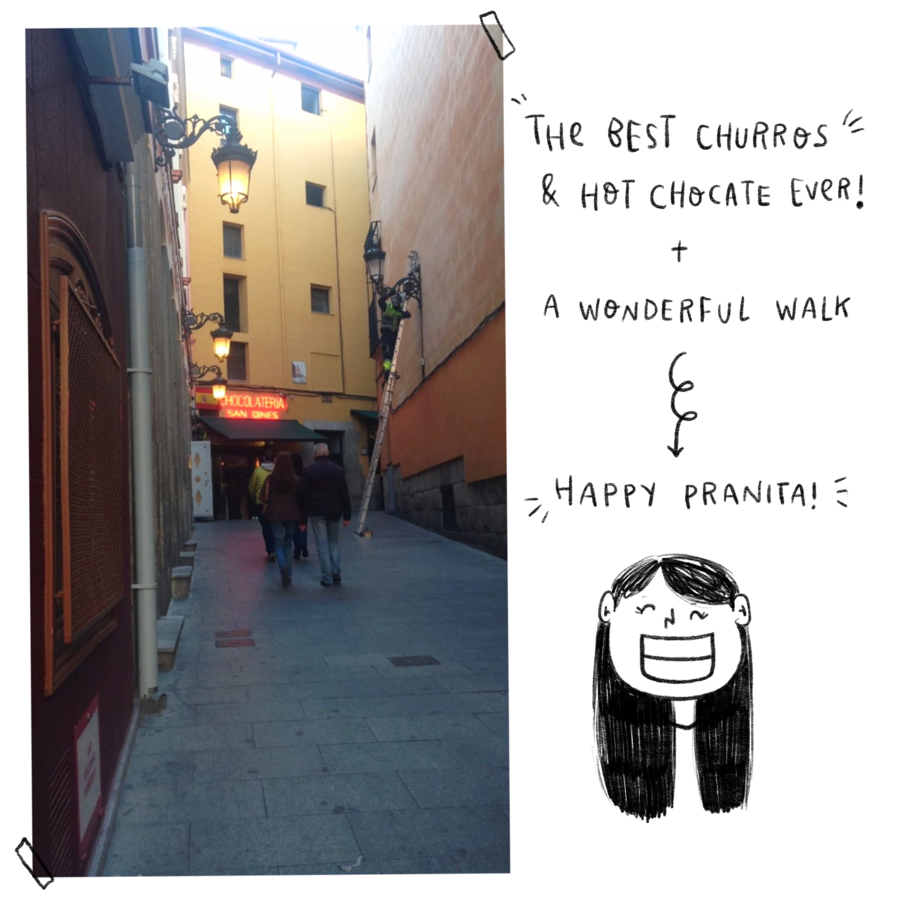
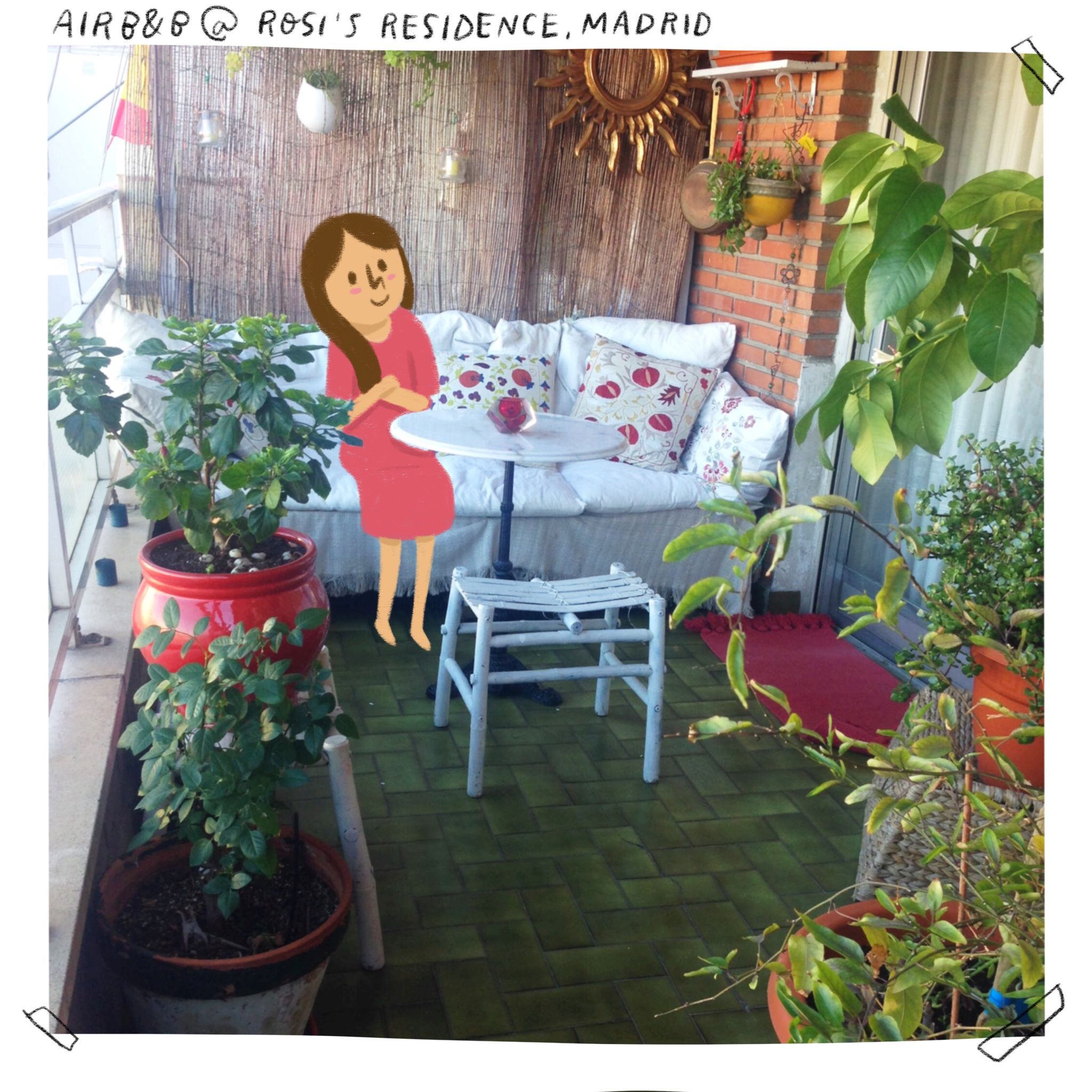
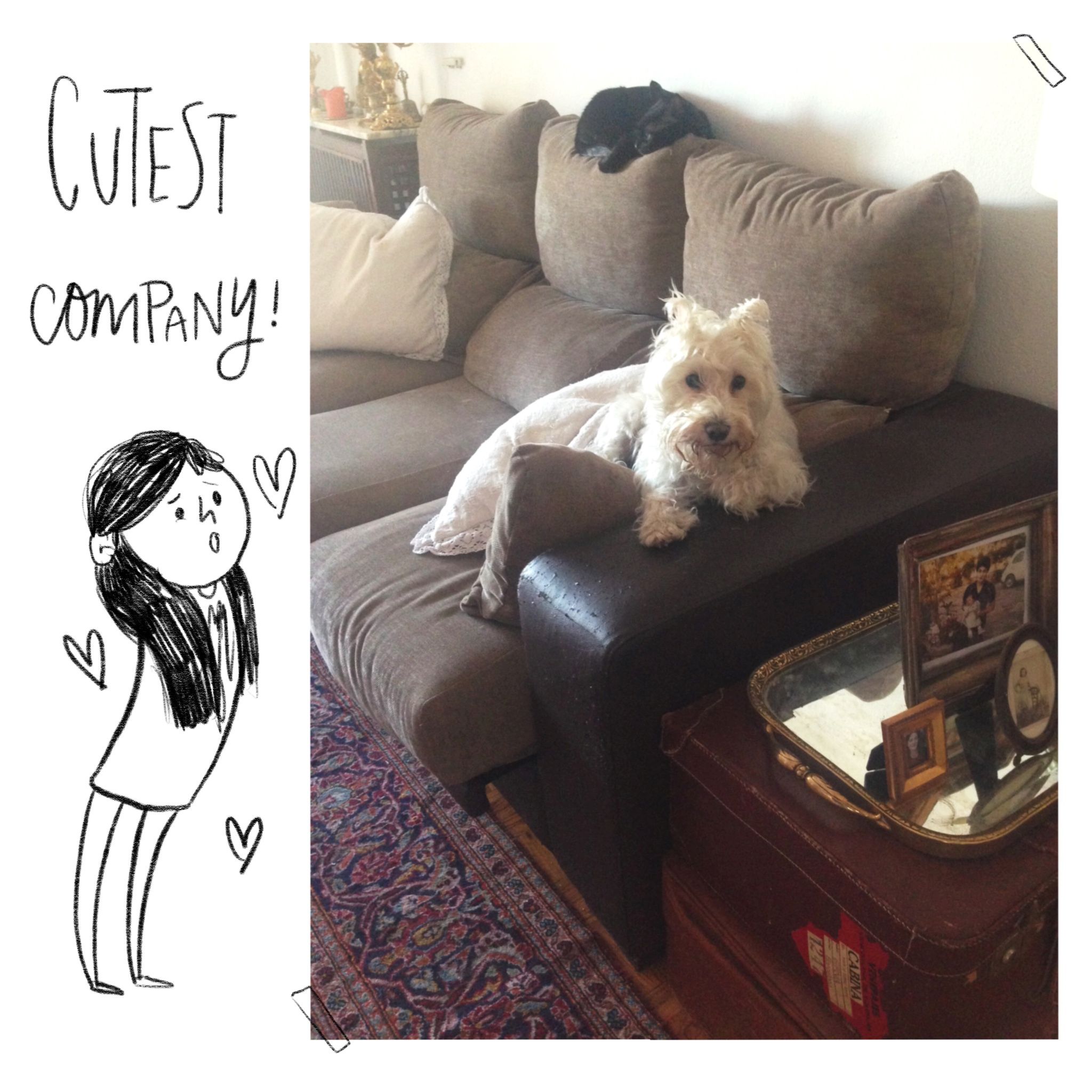
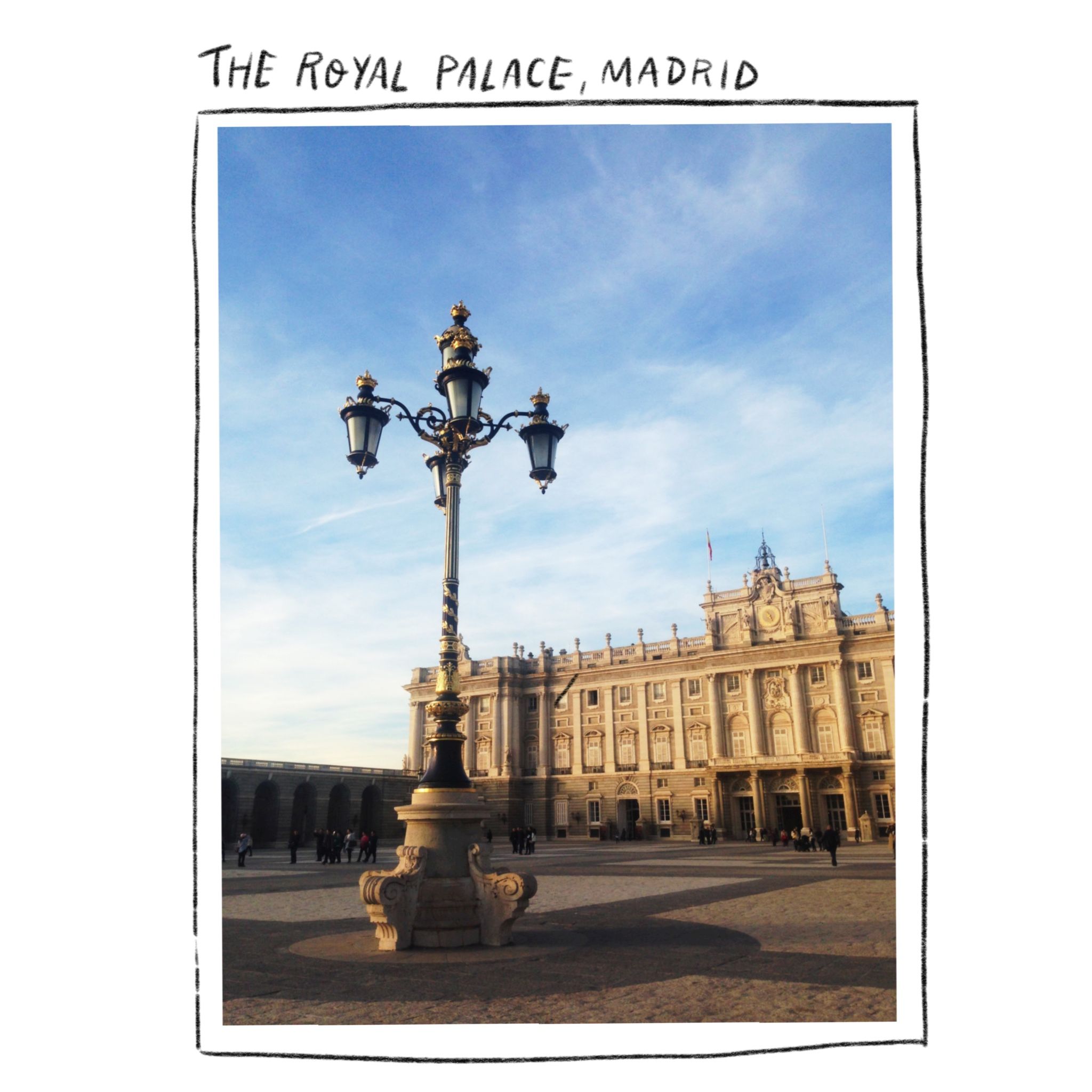
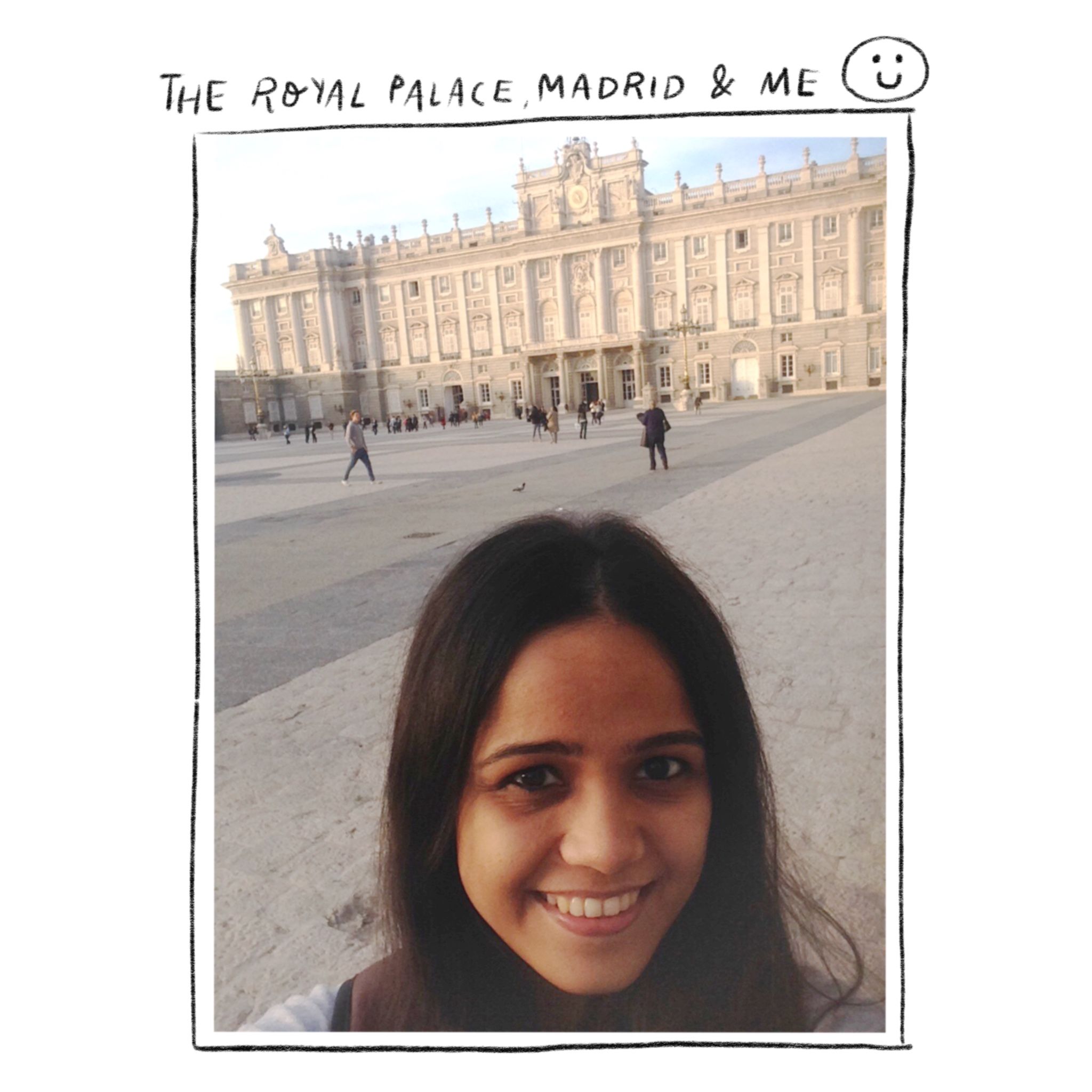
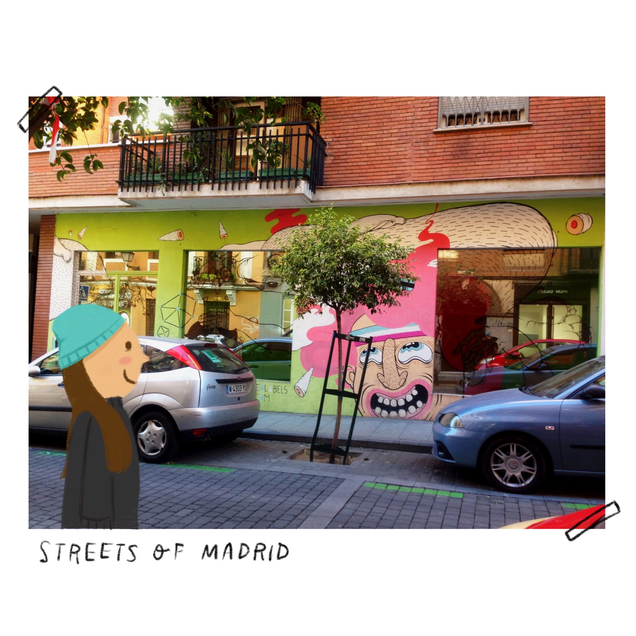
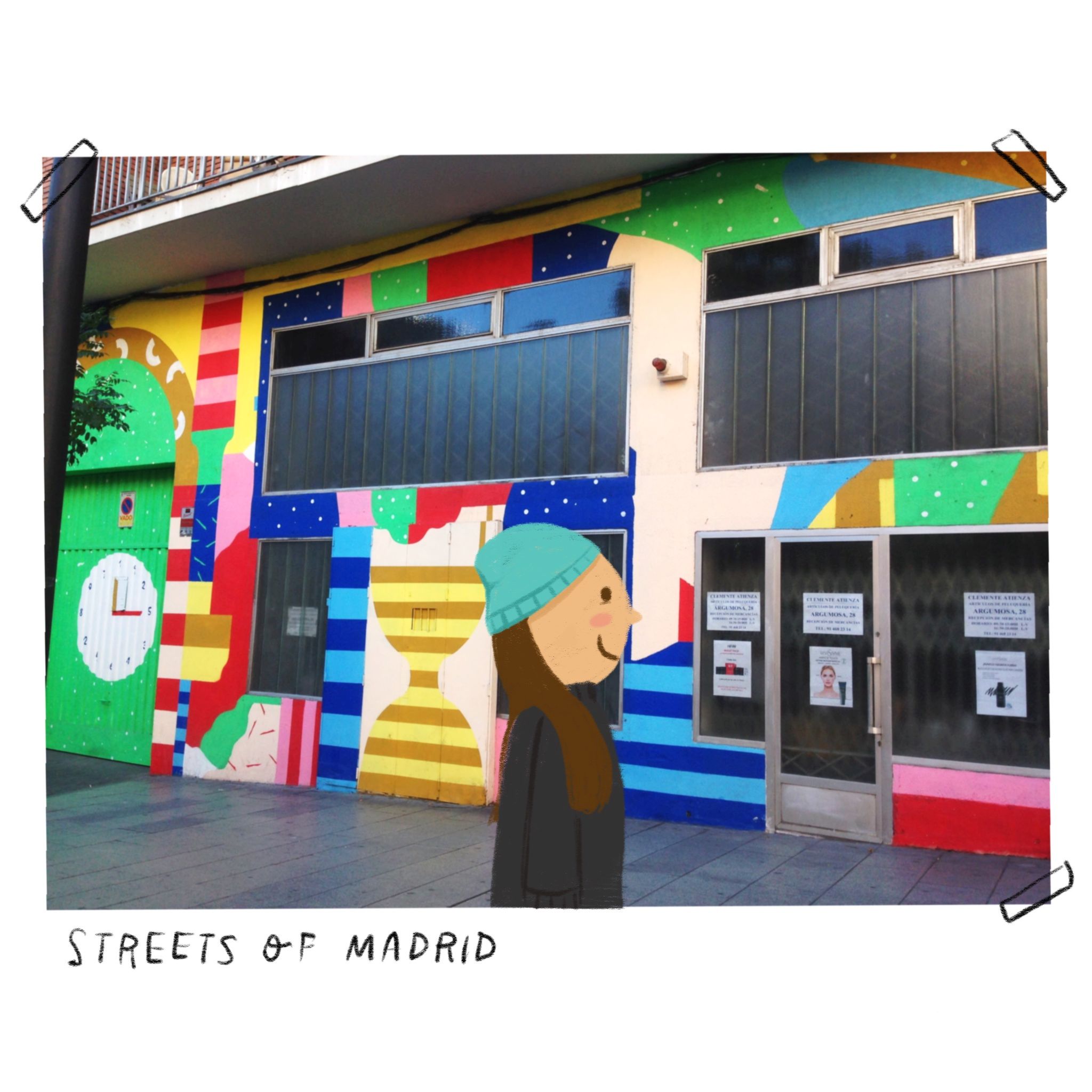
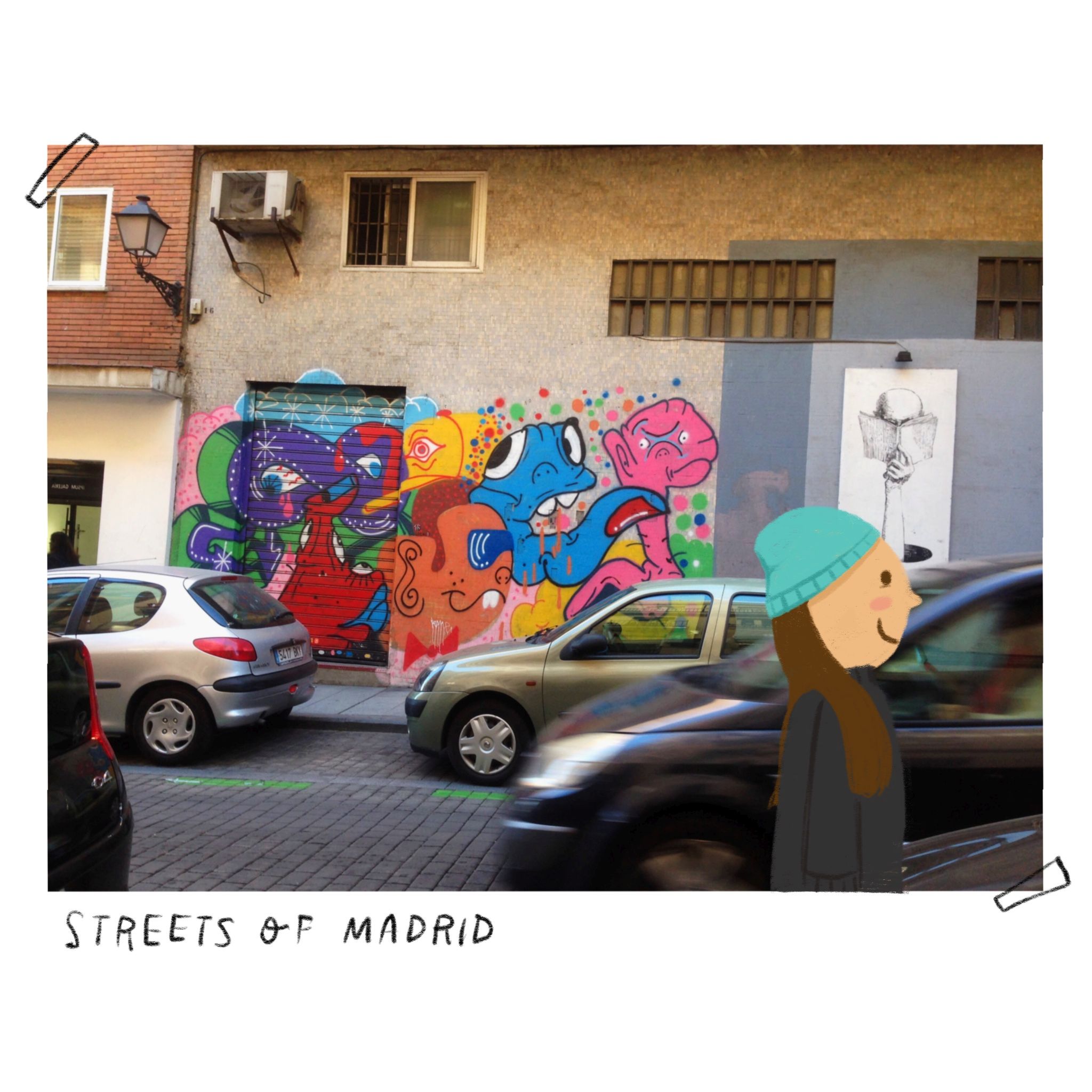
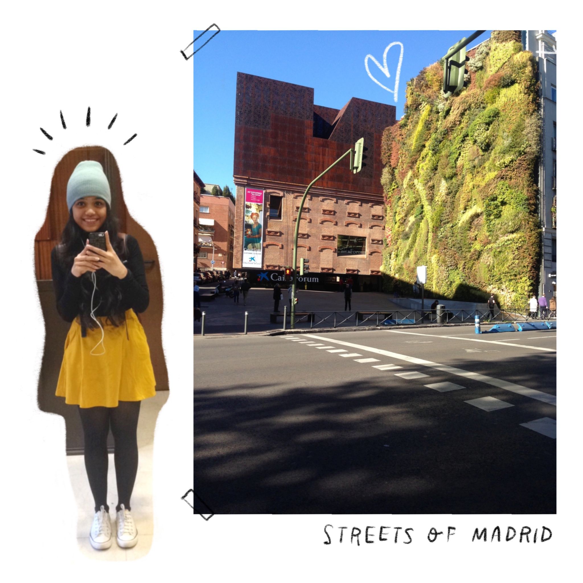
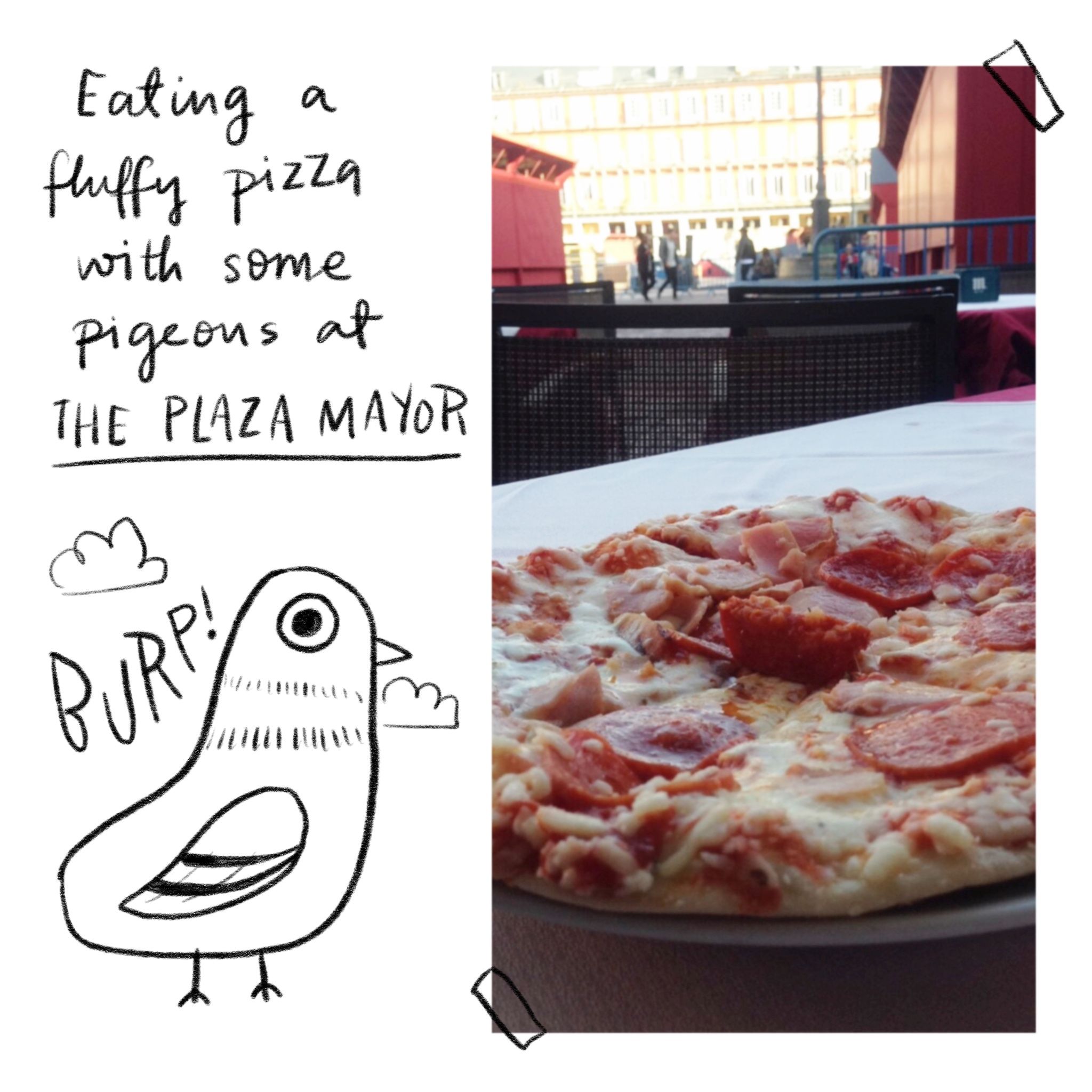
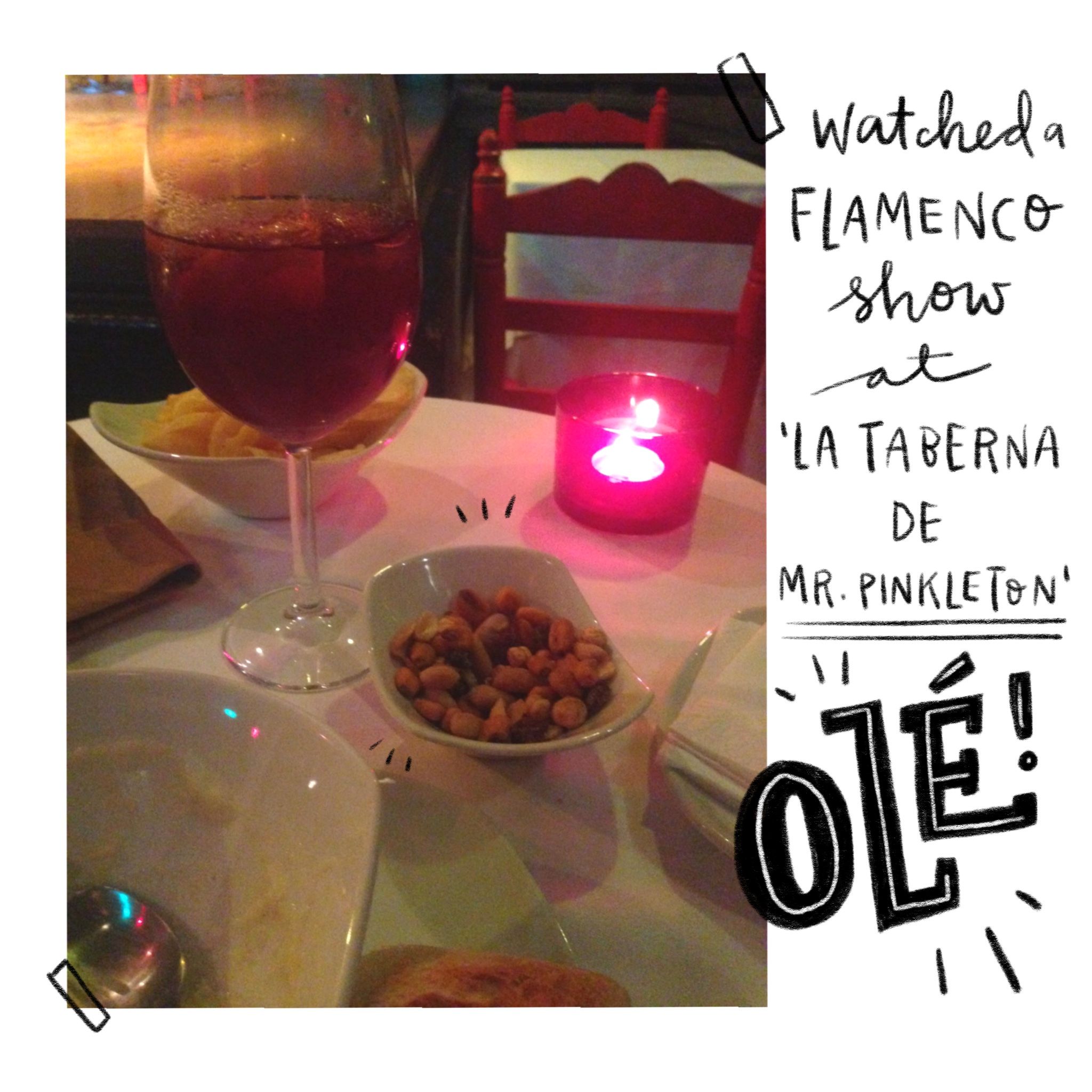
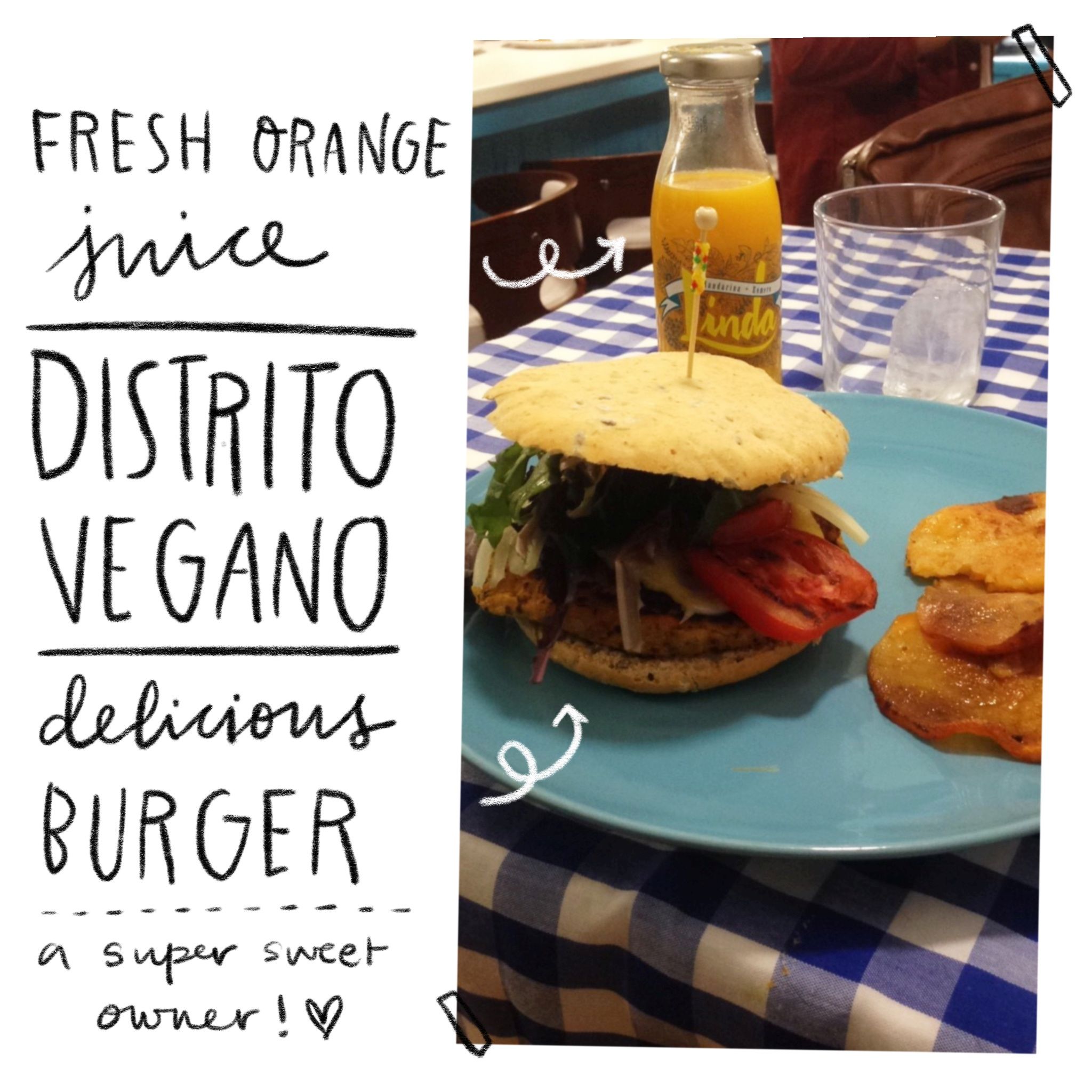
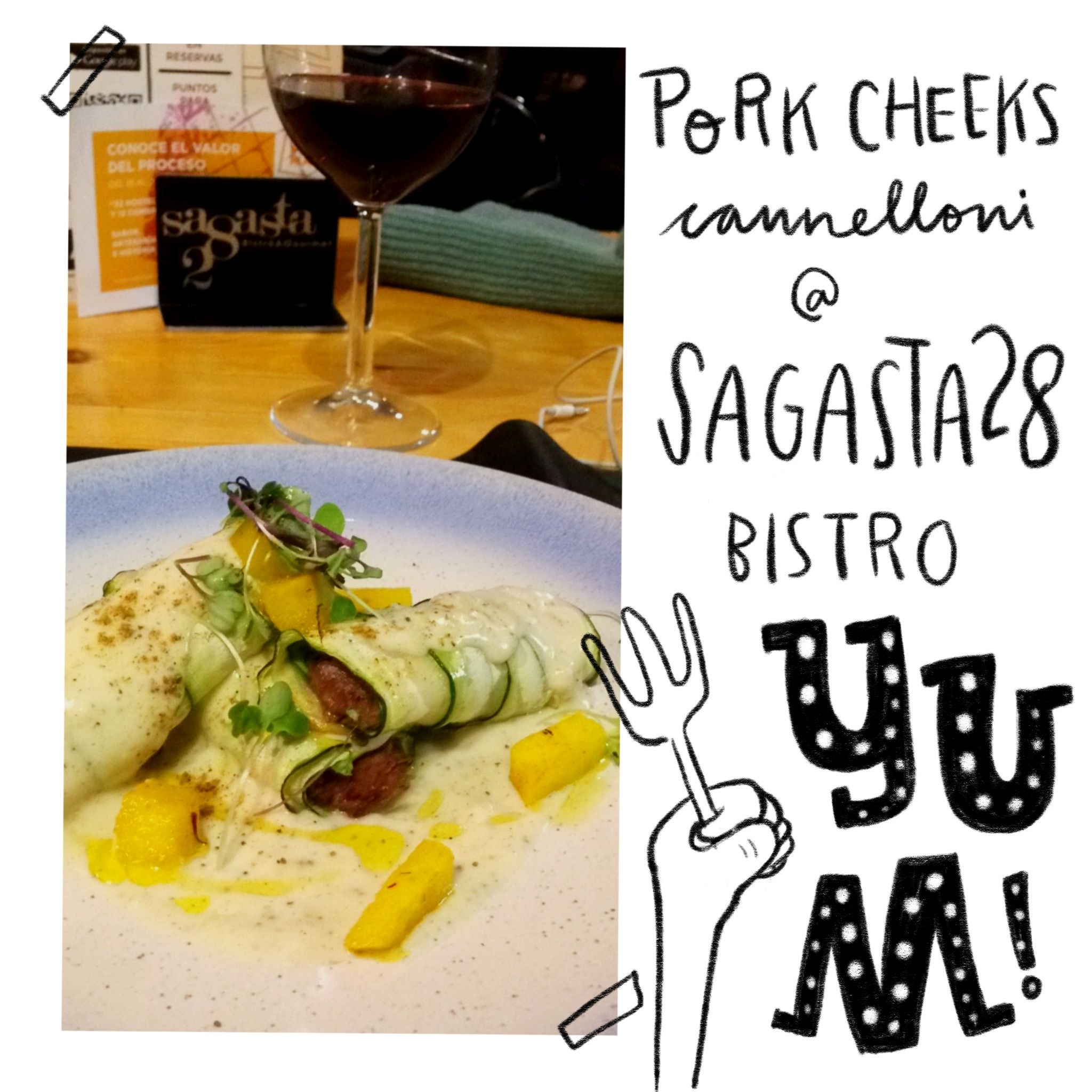
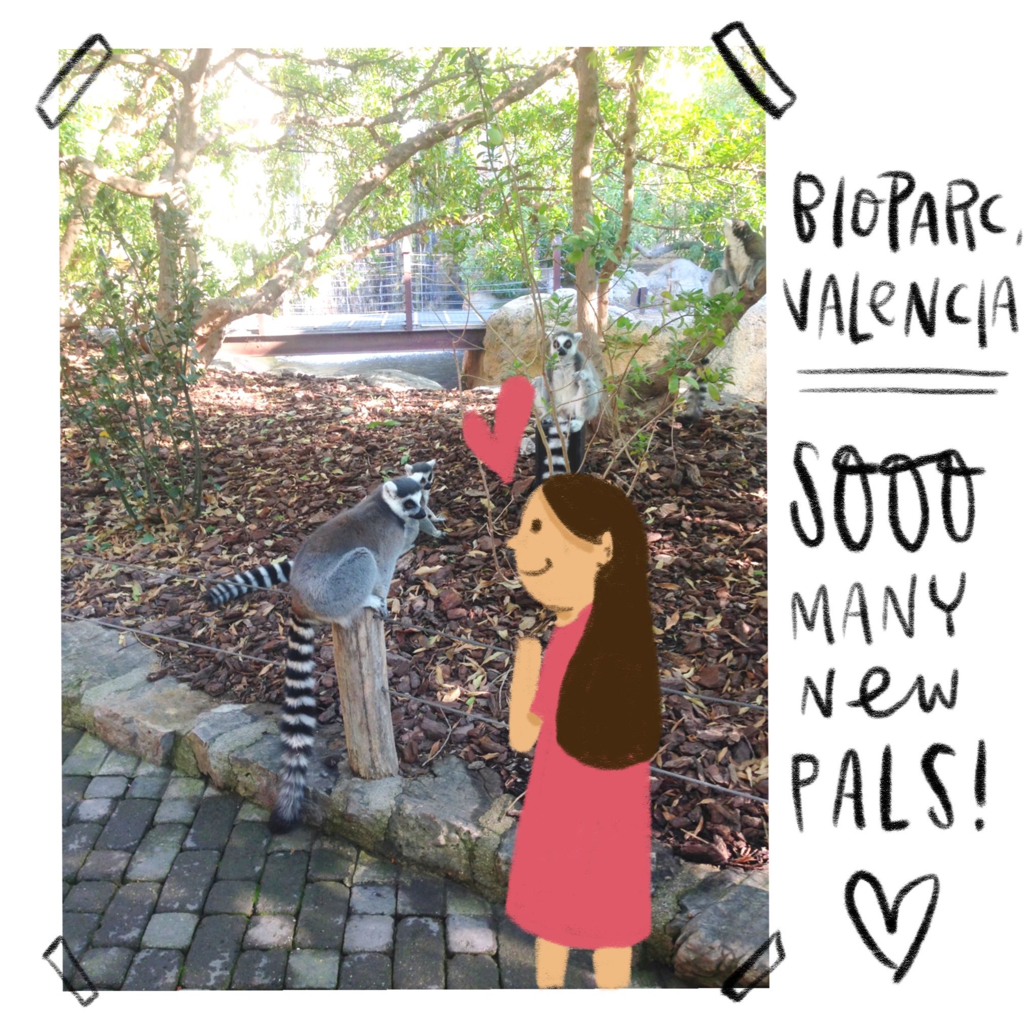
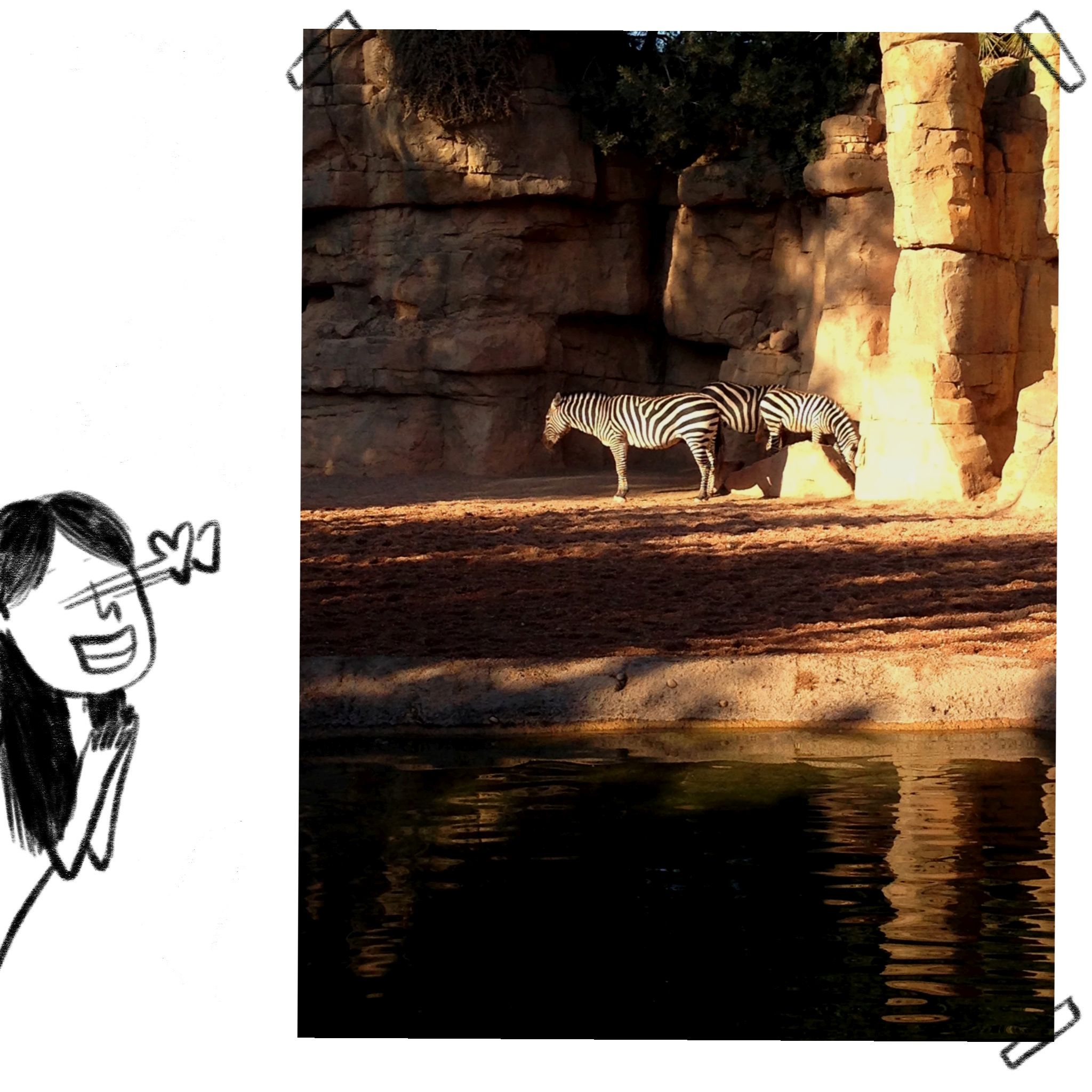
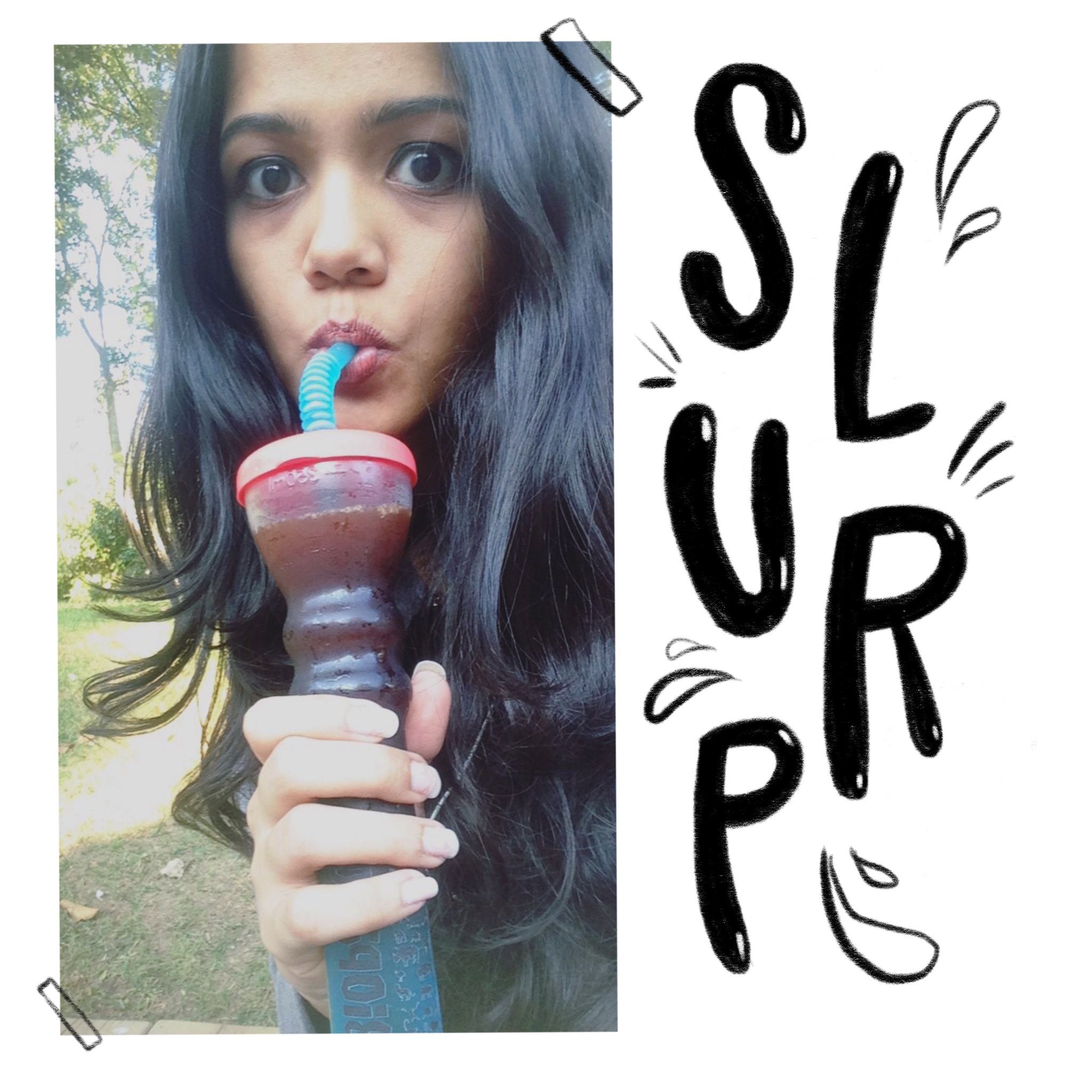
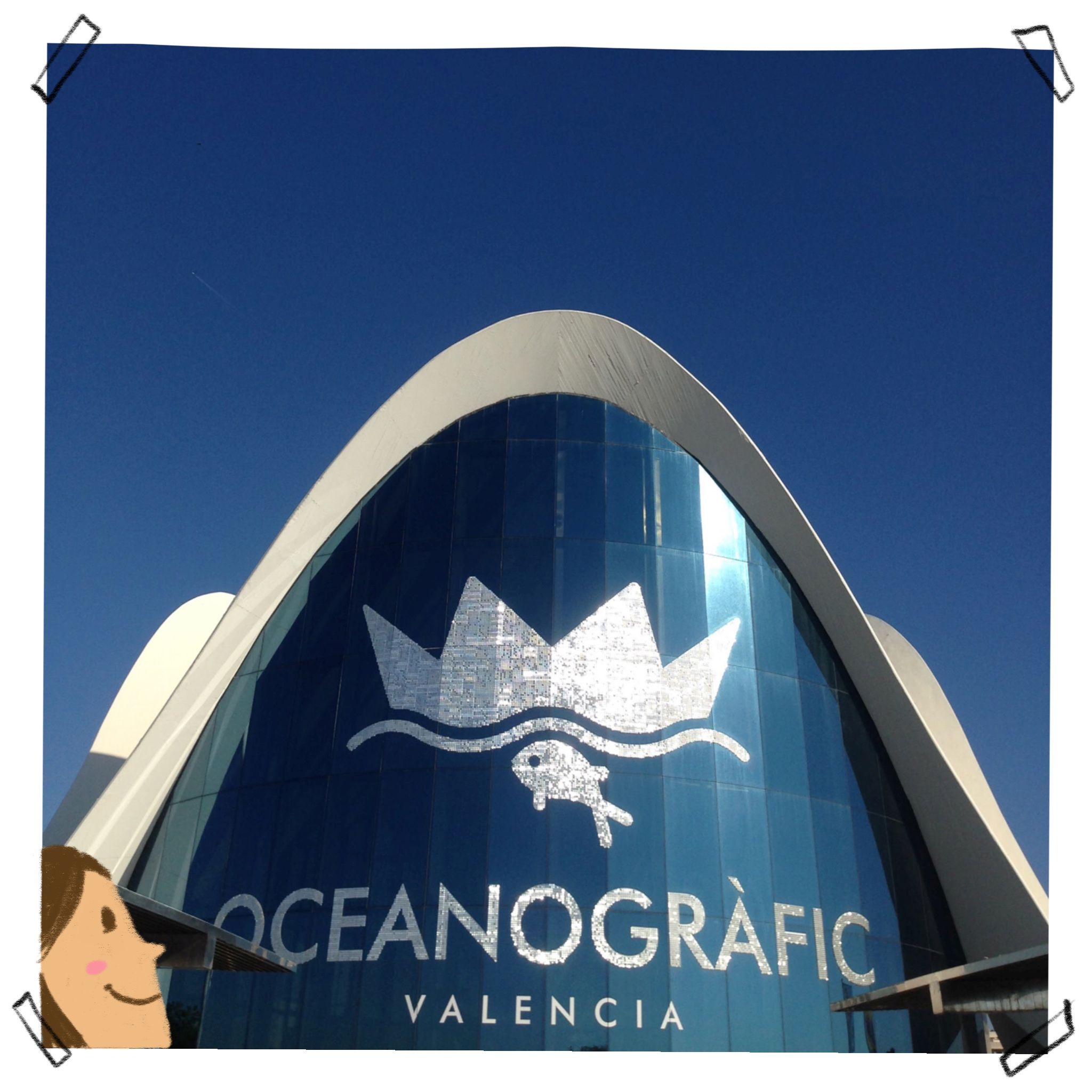
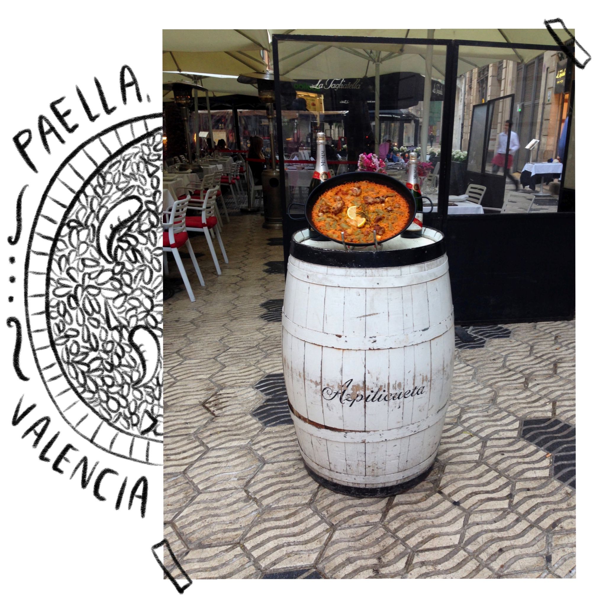
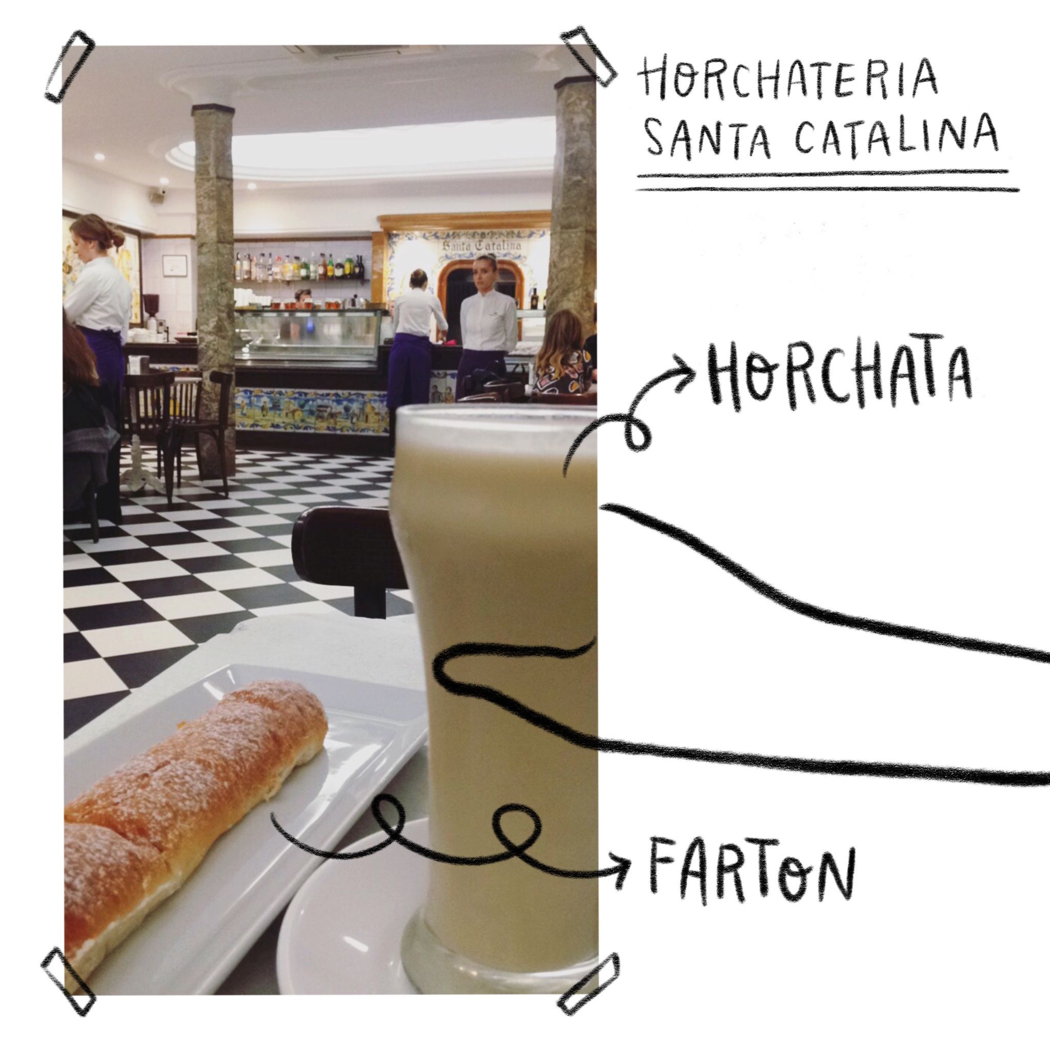
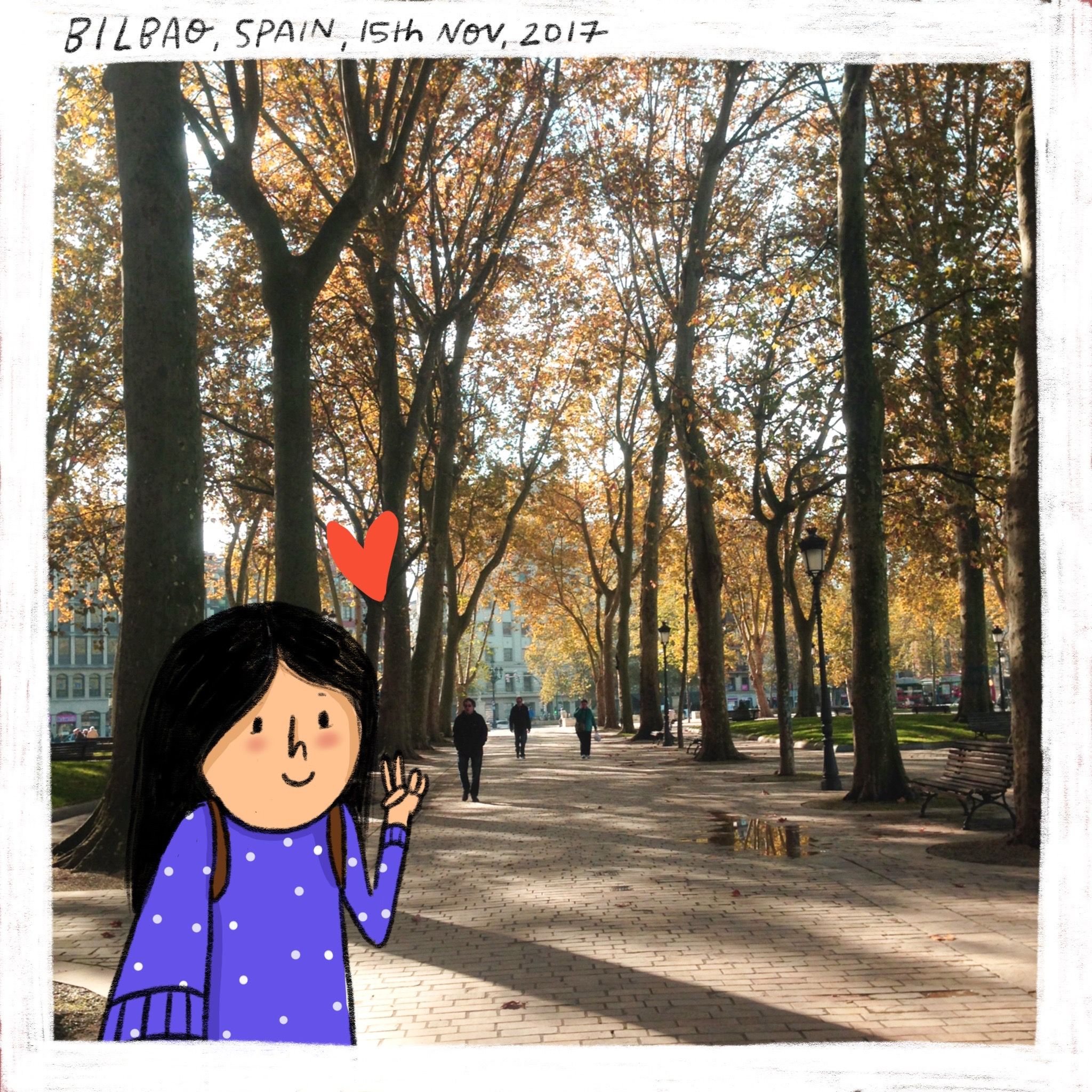
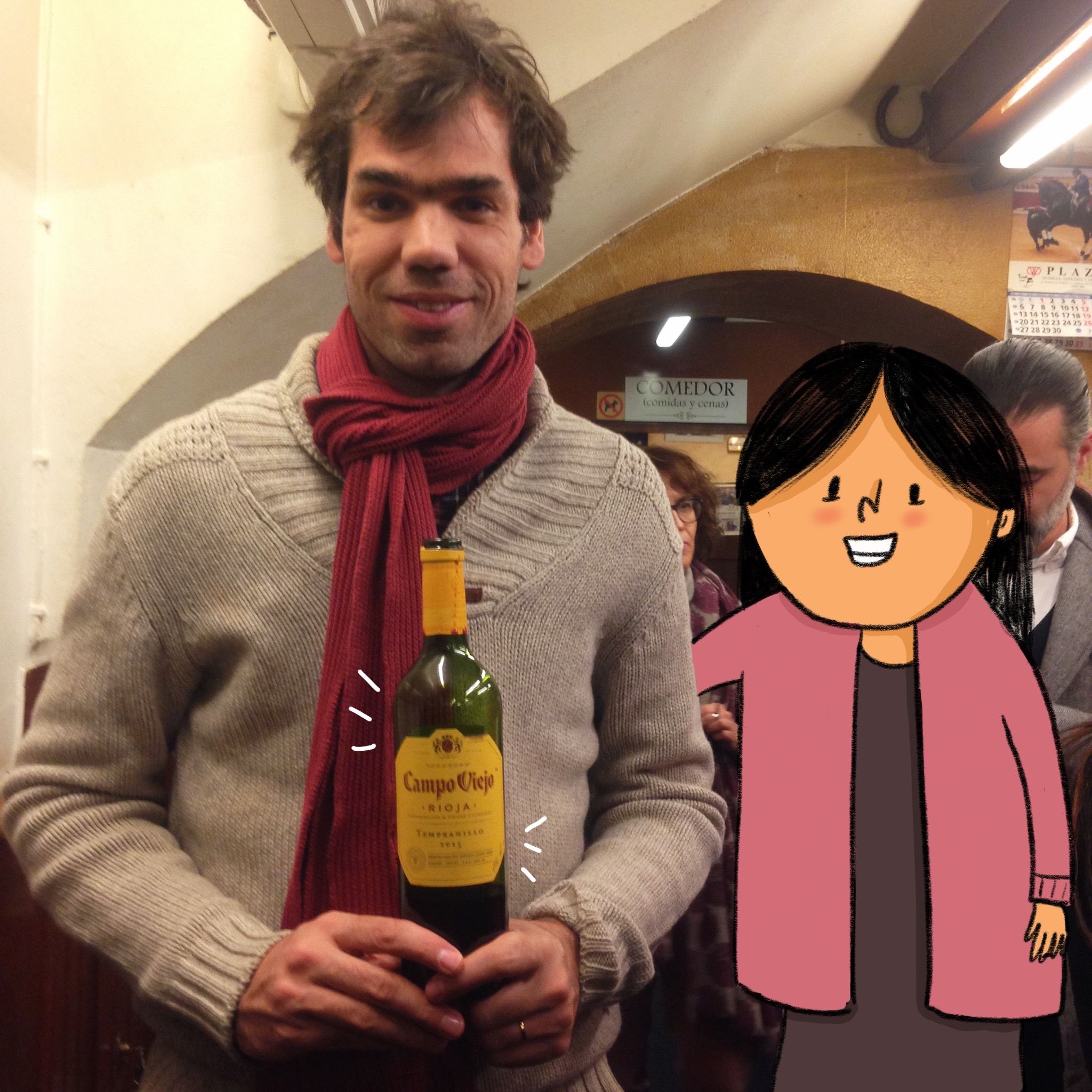
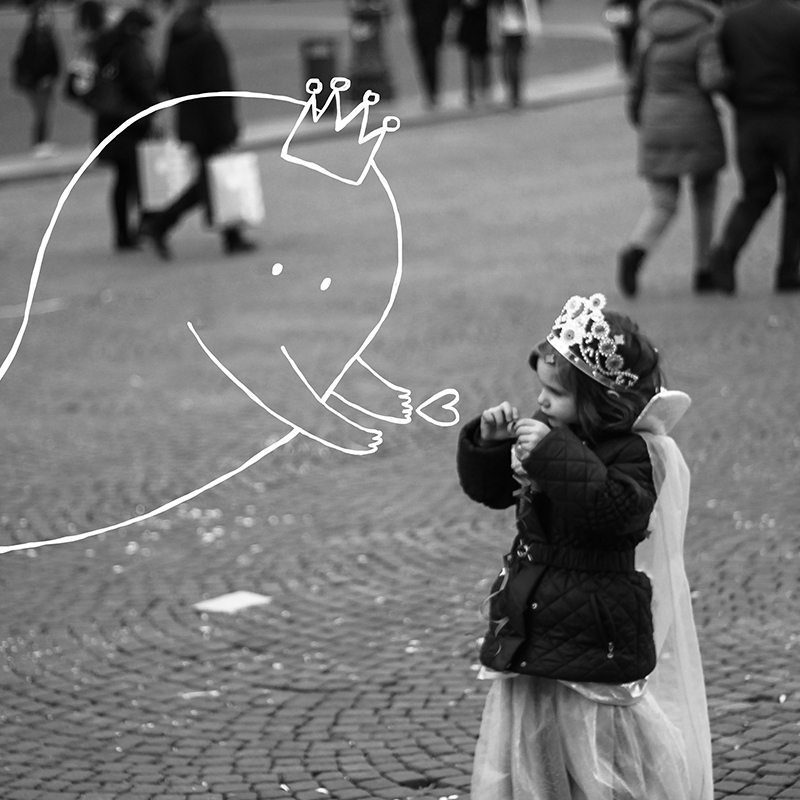
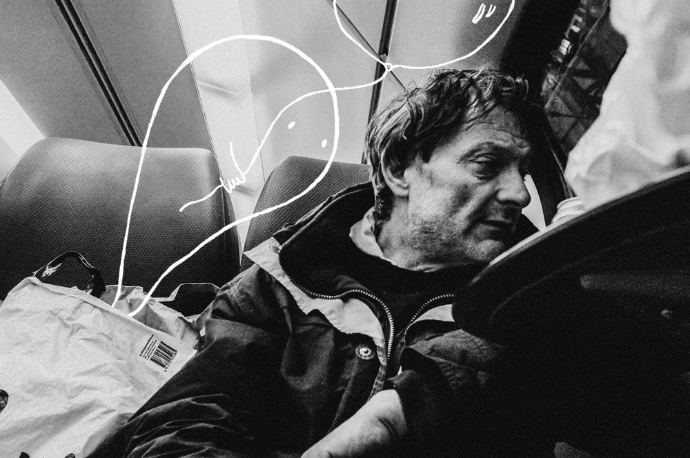
This is a travel journal from when I visited Madrid & Valencia, Spain. All the illustrations are created on an Apple iPad Pro using Procreate. These artworks are a part of my social media travel campaign.

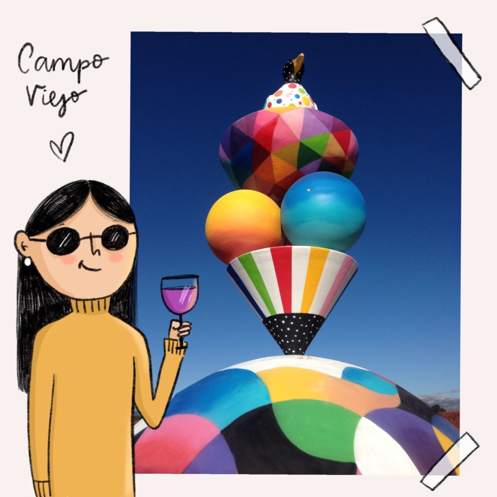
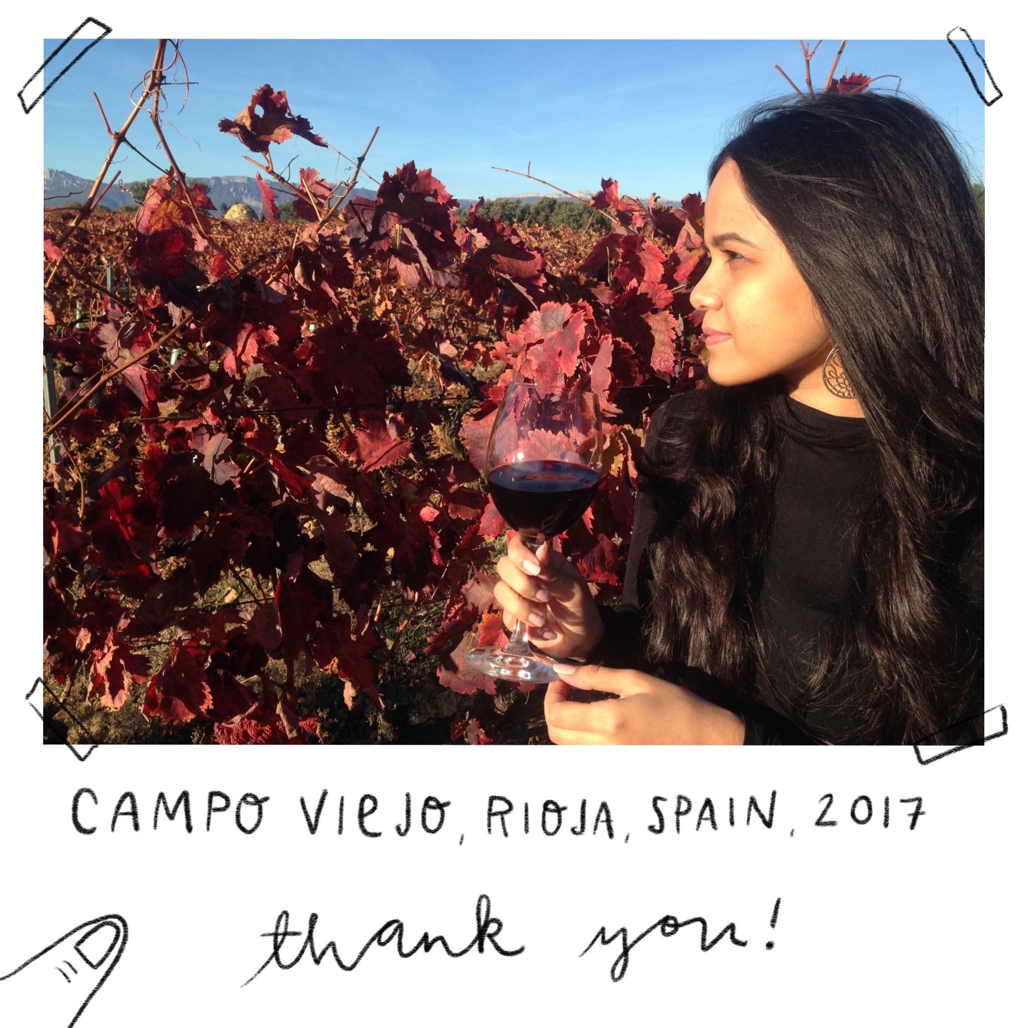
Campo Viejo owned by Pernod Ricard Winemarks sponsored my trip to Rioja, Spain to visit their vineyards. I illustrated my experience to their vineyards – this was an influencer social media campaign.
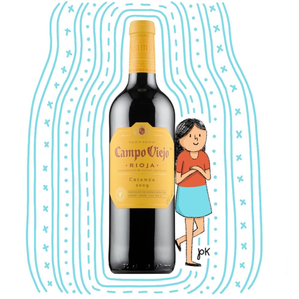
@campoviejoindia invited me to experience their vineyards in Spain! I’m sooooo excited to go!
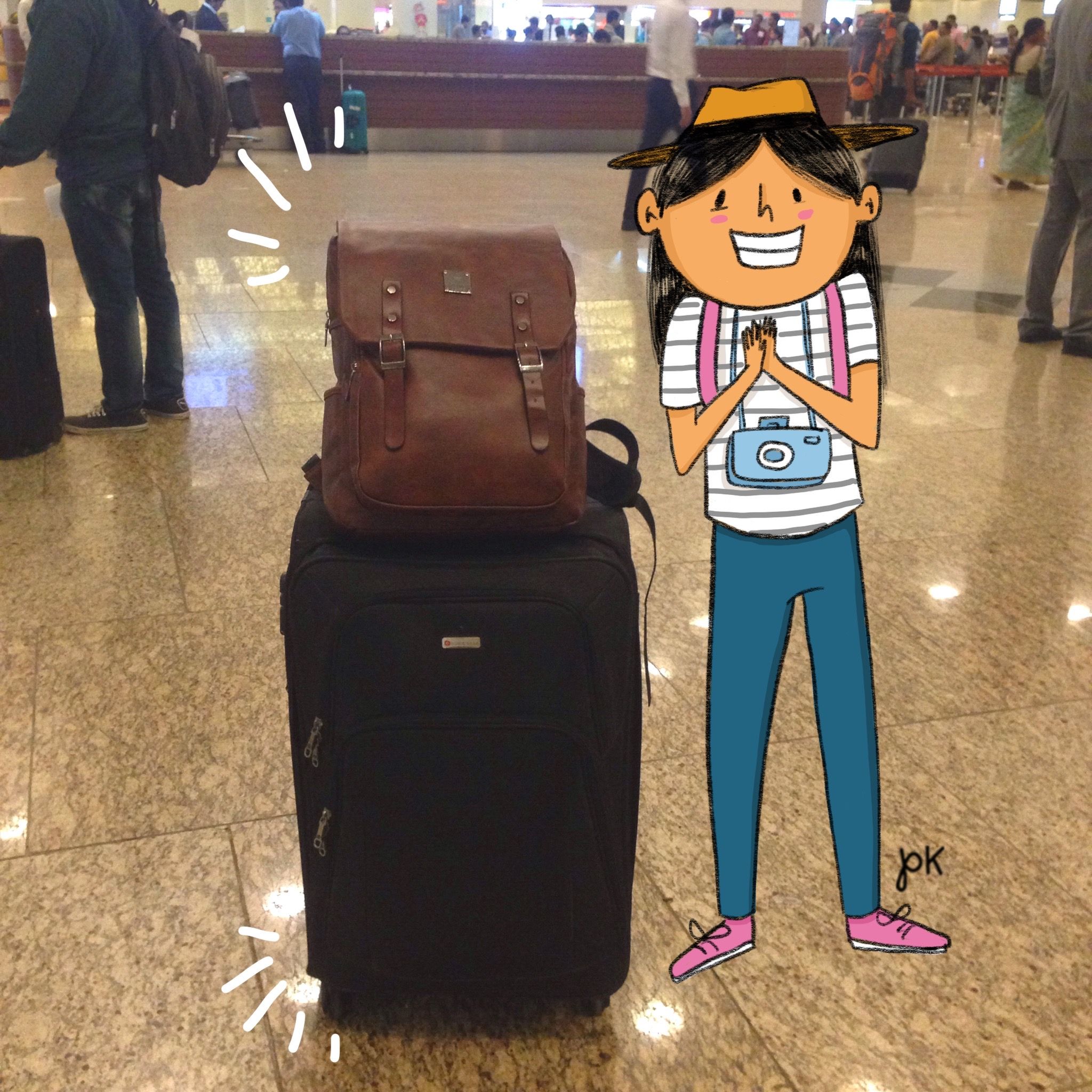
My taste buds are tinkling & I’m all packed and ready to go! ✈️🍷
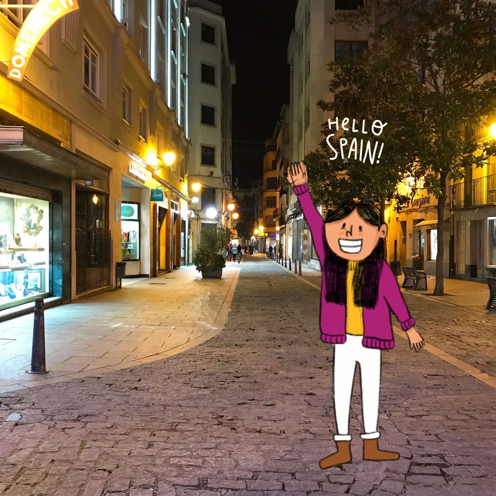
Hello, hello! 😀
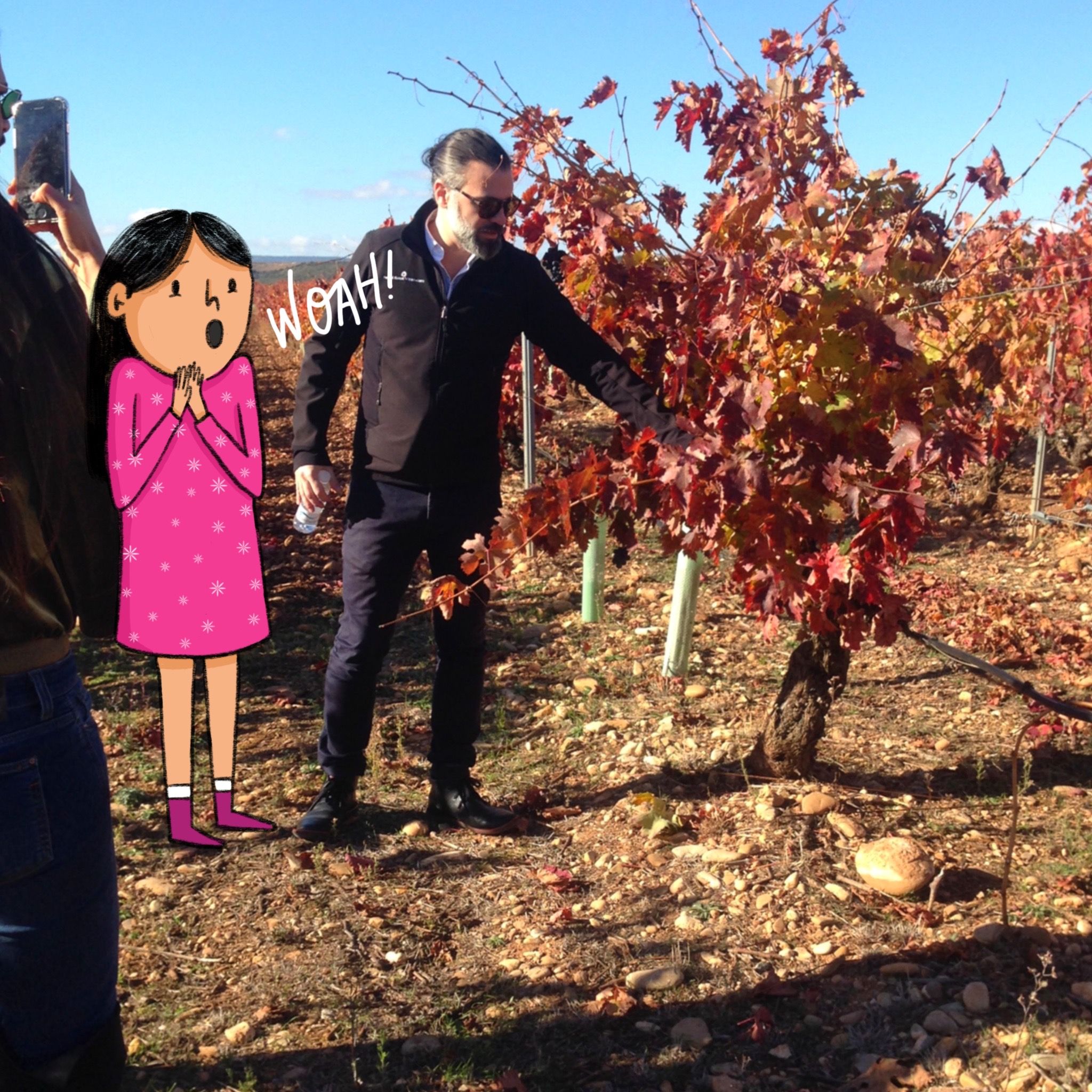
Learning so much about the wine making process! Fredrico, the global ambassador briefing us about the beautifully functional and sustainable methods of wine making!
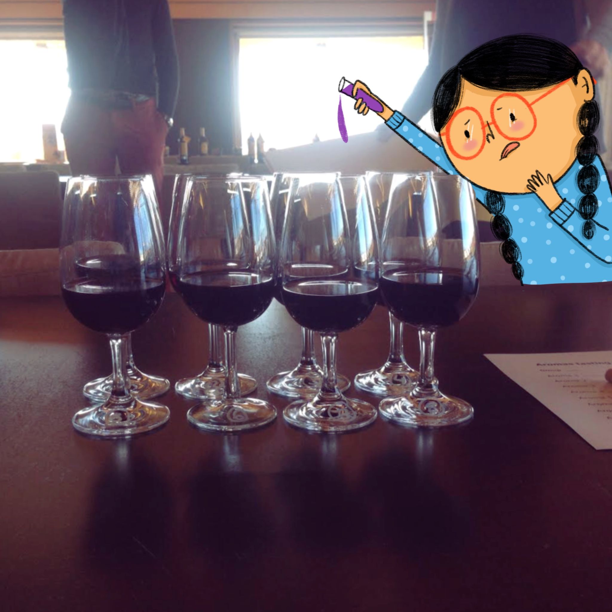
Played a ‘Guess the aroma’! These glasses of wines had various flavours- fruity, spicey, sweet!

Spotted this colourful installation at the Campo Viejo vineyard. That’s a bird that’s seen frequently around the vineyard on top, under which are grapes and a wine glass. I was so awestruck by how vibrant this brand’s vibe is even WITHIN their workspace!
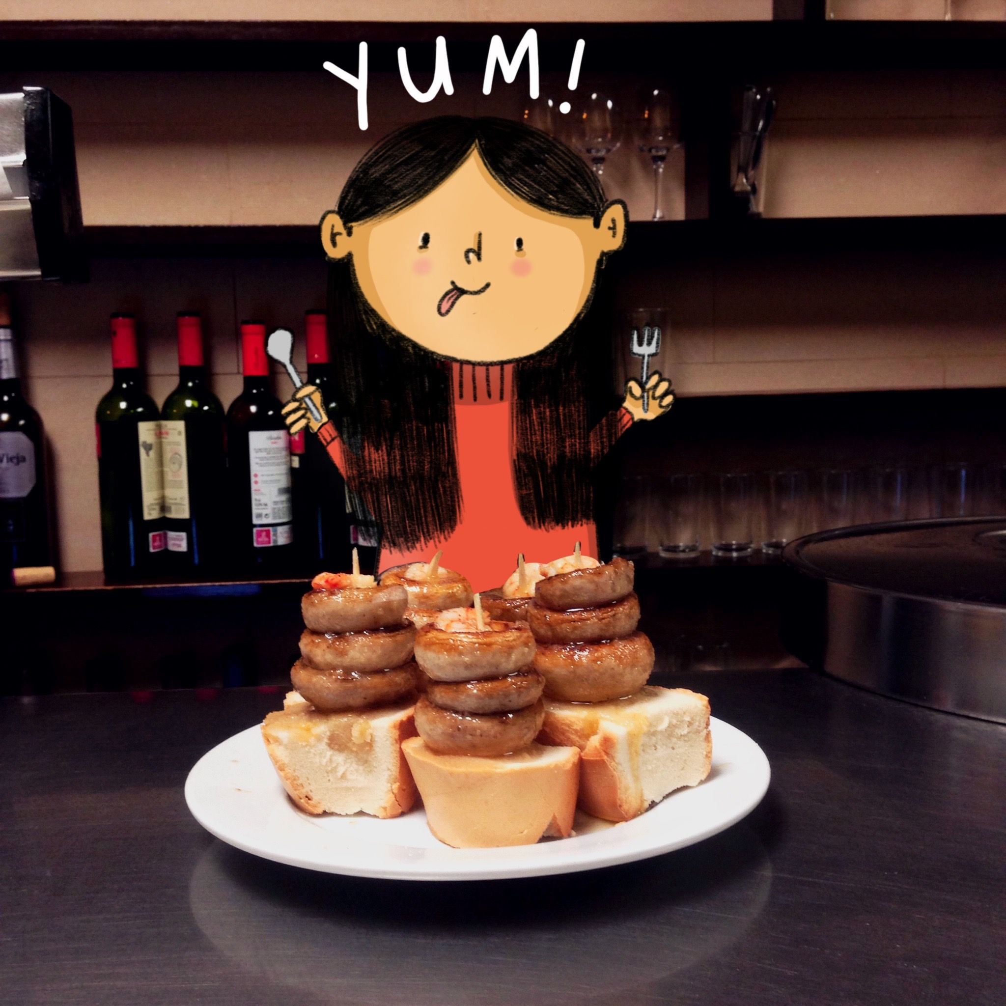 Went tapas hopping with the Campo Viejo crew & found these delicious mushroom tapas at Bar Soriano. Spain has my heart! ❤️
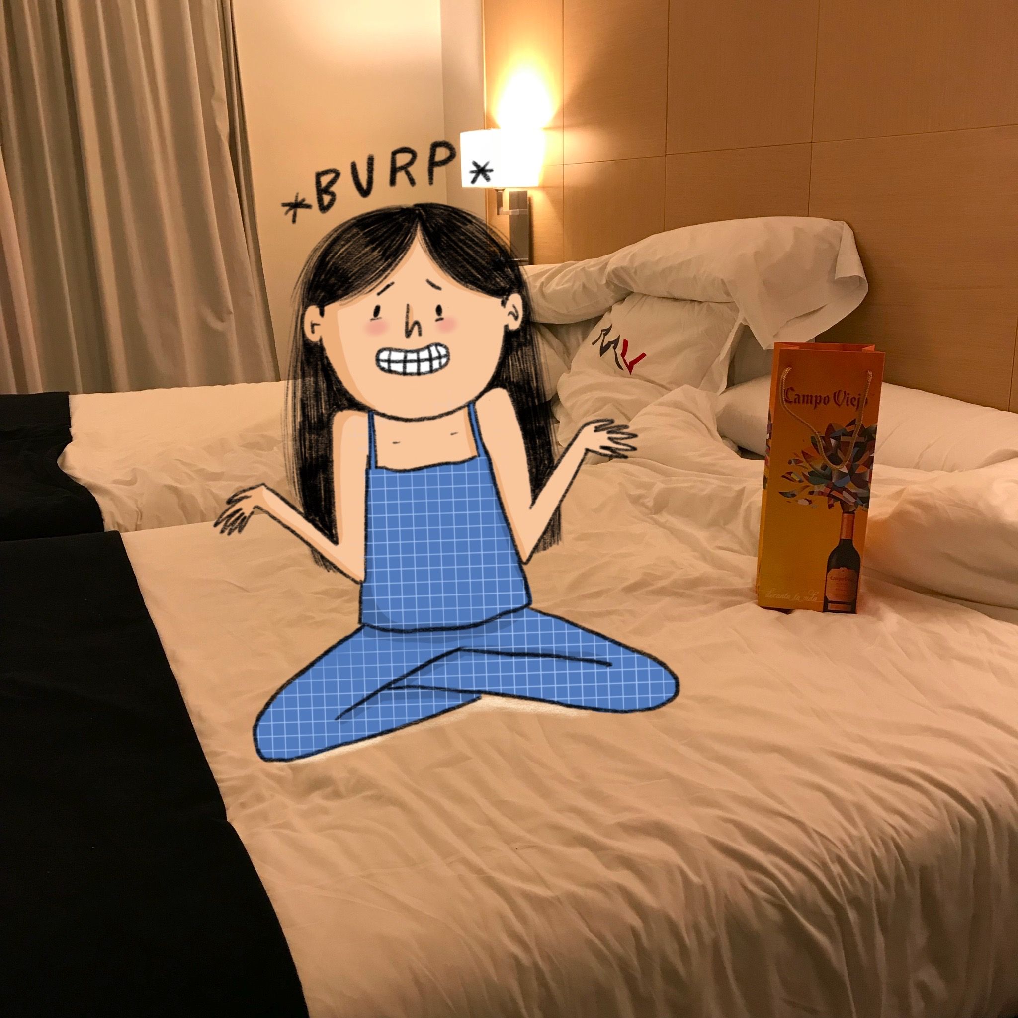 Woke up with a food & wine coma.
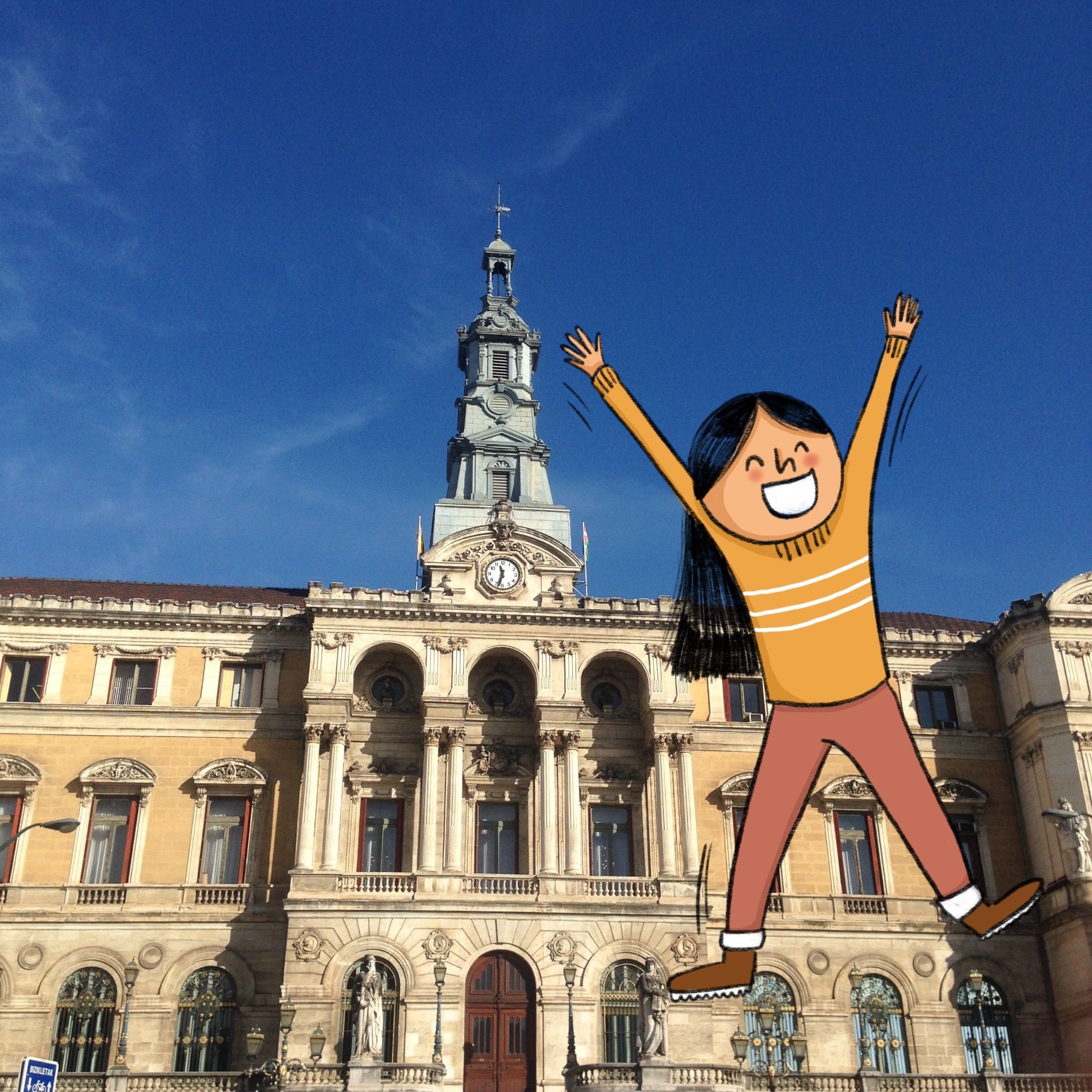
Wandering around the quaint Bilbao roads. Look at how beautiful their Town Hall looks!
Bye bye beautiful city, hope to see you soon!
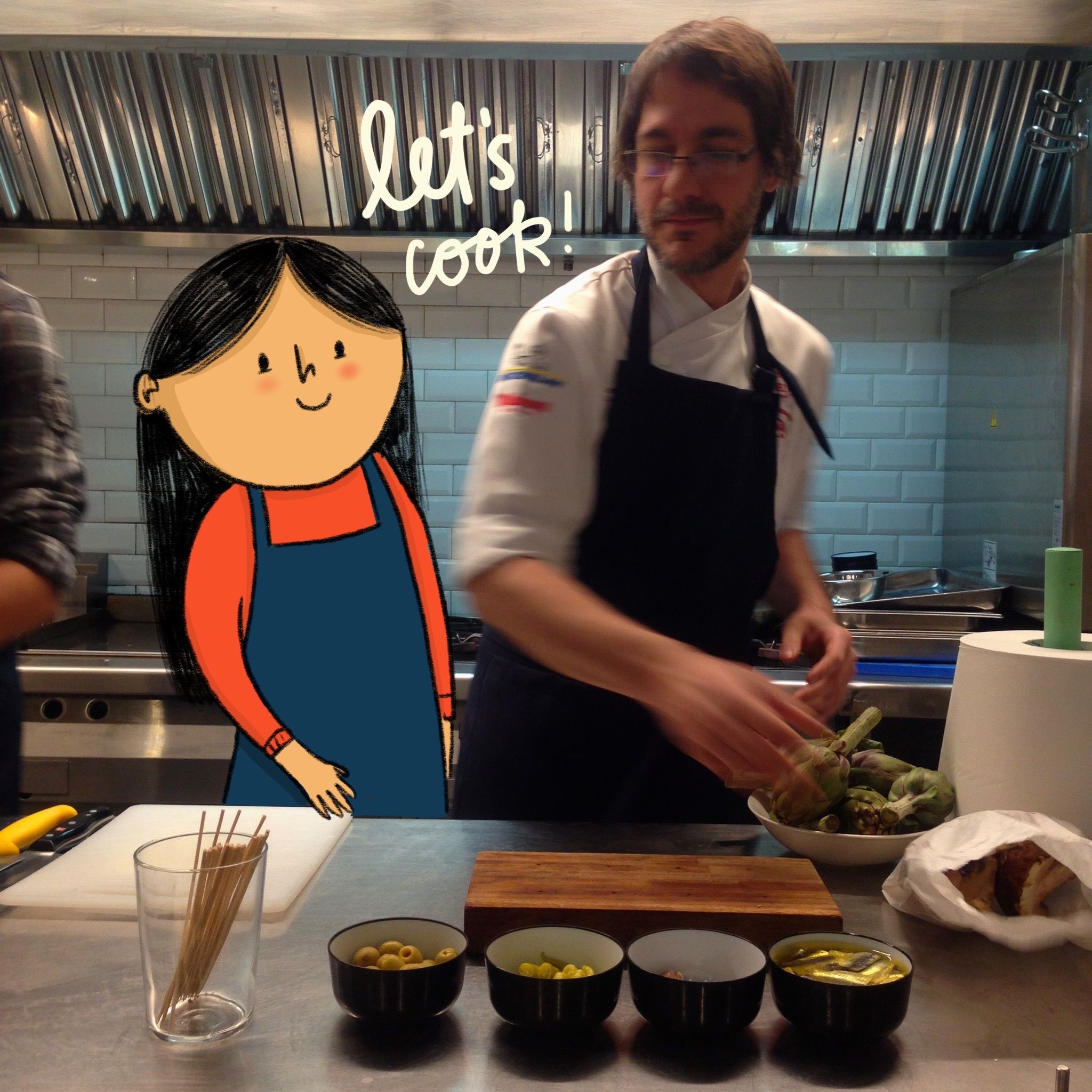
I cooked in Spain!!
@campoviejoindia took us to Los Fueros, an experimental restaurant in Bilbao, Spain. Chef Paul taught us to cook beef pinchos (Spanish bar snacks), quail eggs & caviar on toast! ❤️ swipe to watch me cook!
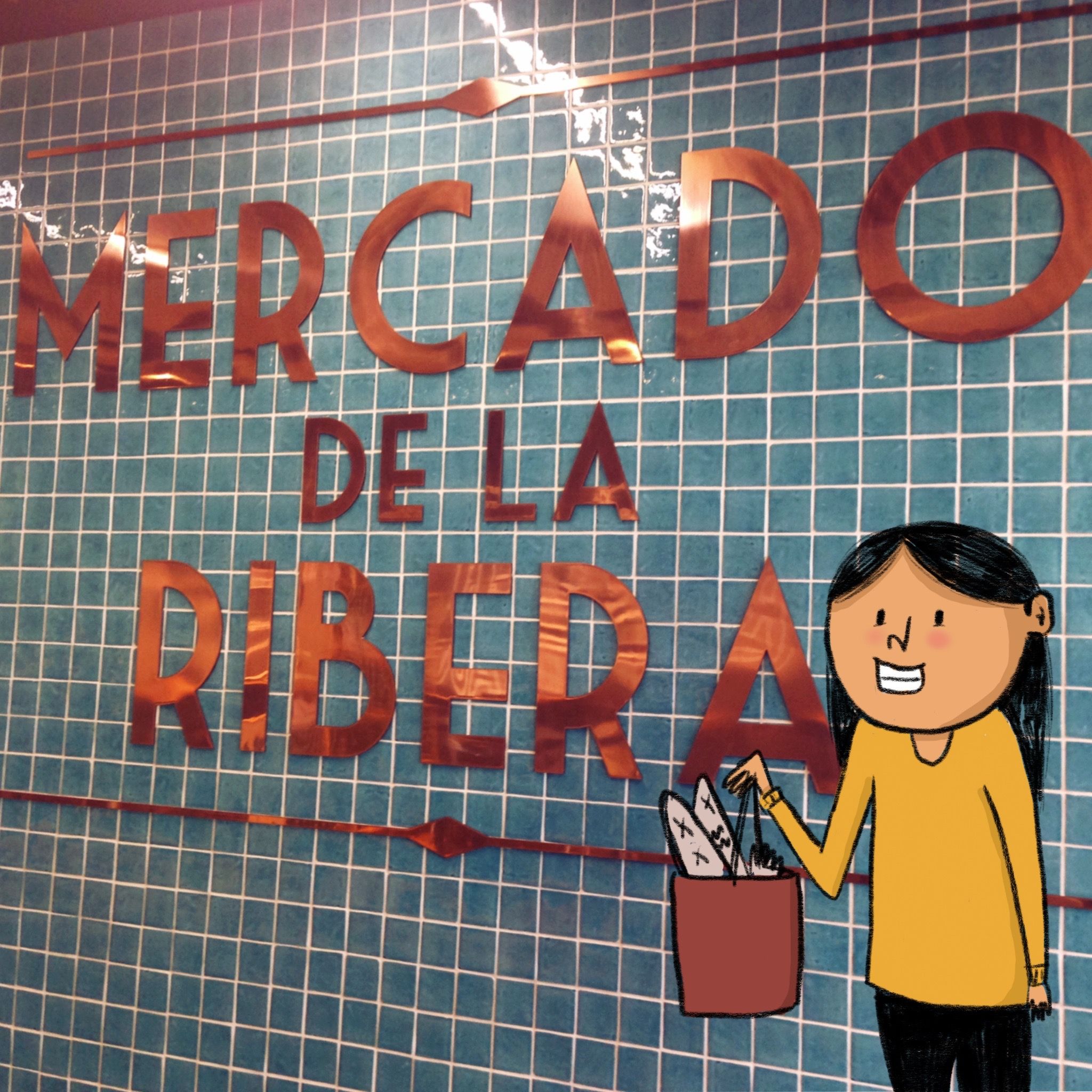 Right before our cooking session, #previouspost @campoviejoindia team took us to the Ribera market which is one of the biggest and fanciest supermarket I’ve seen! We purchased some beef, tuna and delicious artichokes.. and bumped into a few photo bombers (swipe to see!) This was fun!
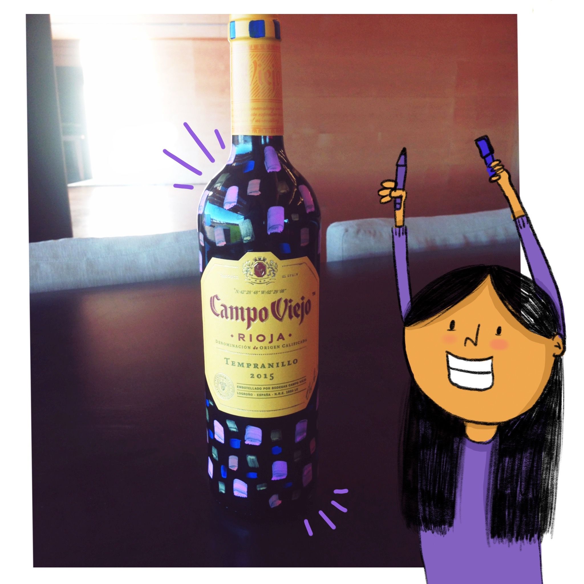
Pranita Kocharekar x @campoviejoindia — there’s only one of these and it stays with me! We painted our own Campo Viejo bottles and then obviously drank all of it, it was so much fun!
What makes a brand wonderful is it’s people! Meet Dael from @campoviejoindiawho was a wonderful host, warmed us up to local food & delicious wines! 🍷🍾 (p.s: he’s actually French!)
Sipping wine in the middle of vineyards! @campoviejoindia you have my heart
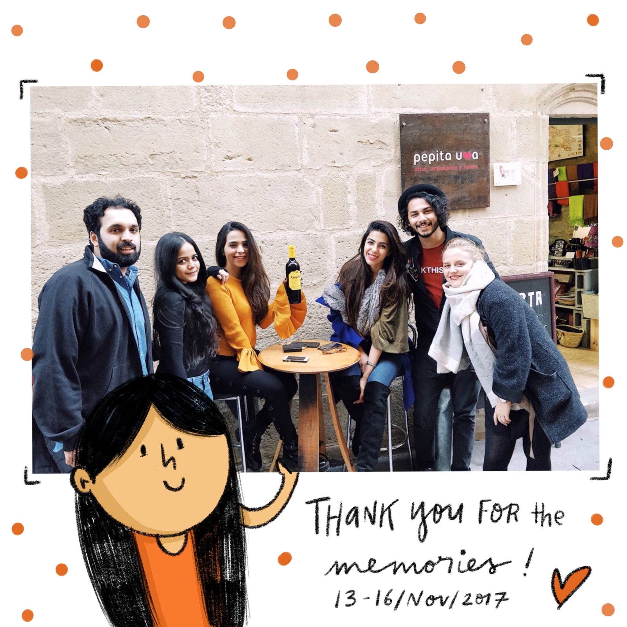
@campoviejoindia invited us to their vineyards in Rioja earlier last week. I met a bunch of wonderful influencers and together we explored the massive lands of Spain. We walked around the quaint streets, enjoyed the rich culture & consumed the yummiest food. Though the highlight of my stay was the trip to the vineyards. The team taught us everything— how to maintain the soil, sustain the environment, store the wines; everything! They produced two wine varieties specially for our climate (swipe to view). I’m definite going back and drowning myself in some Campo memories 🍷
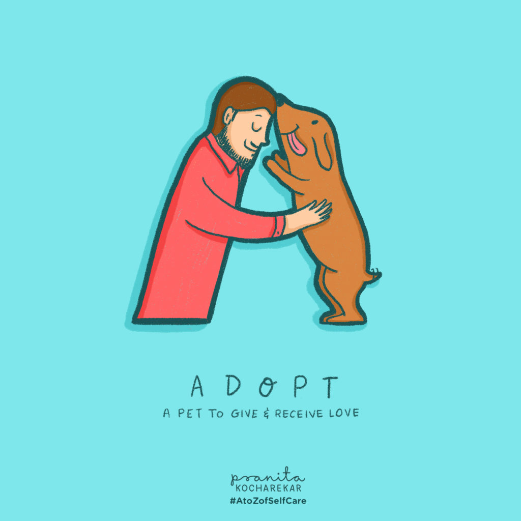
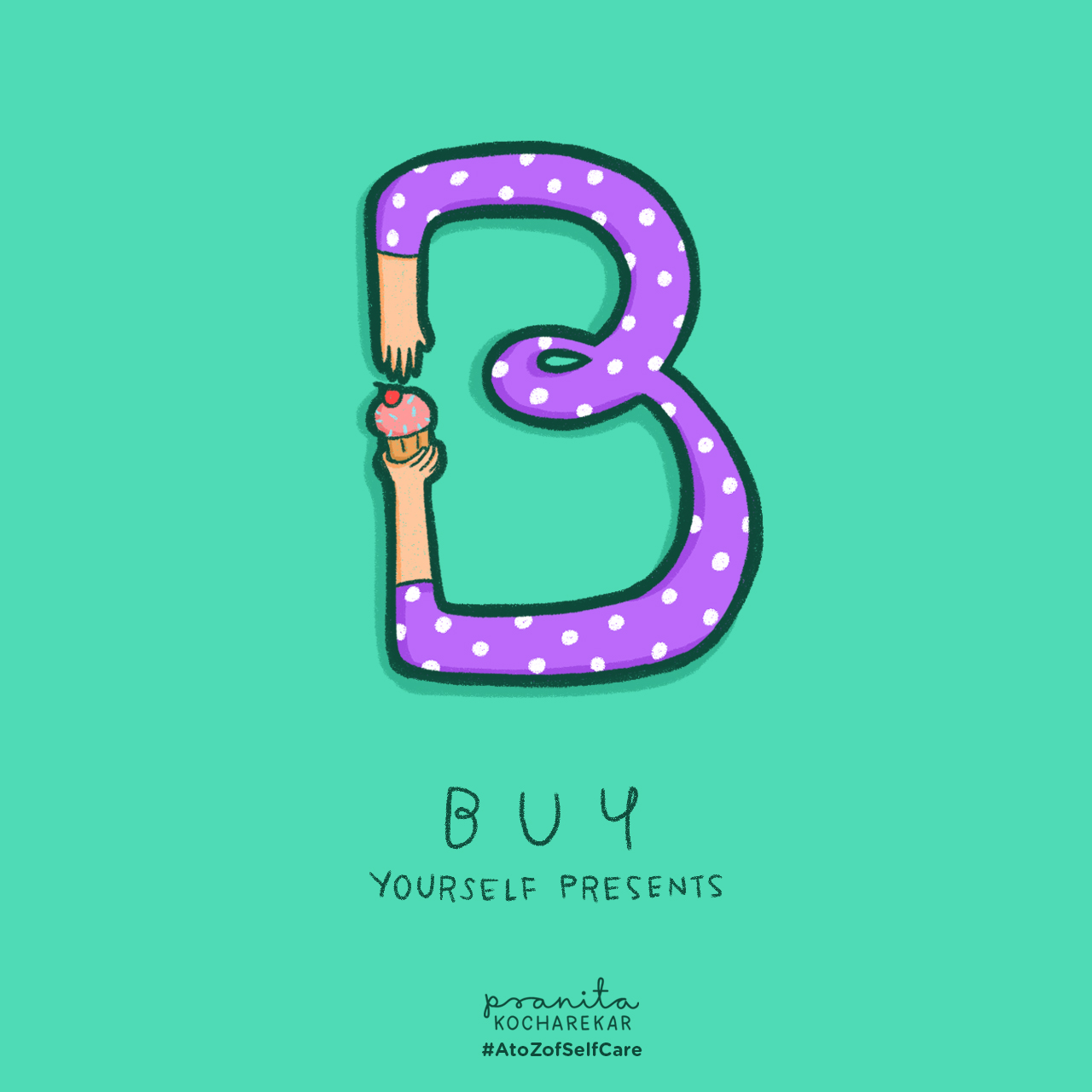
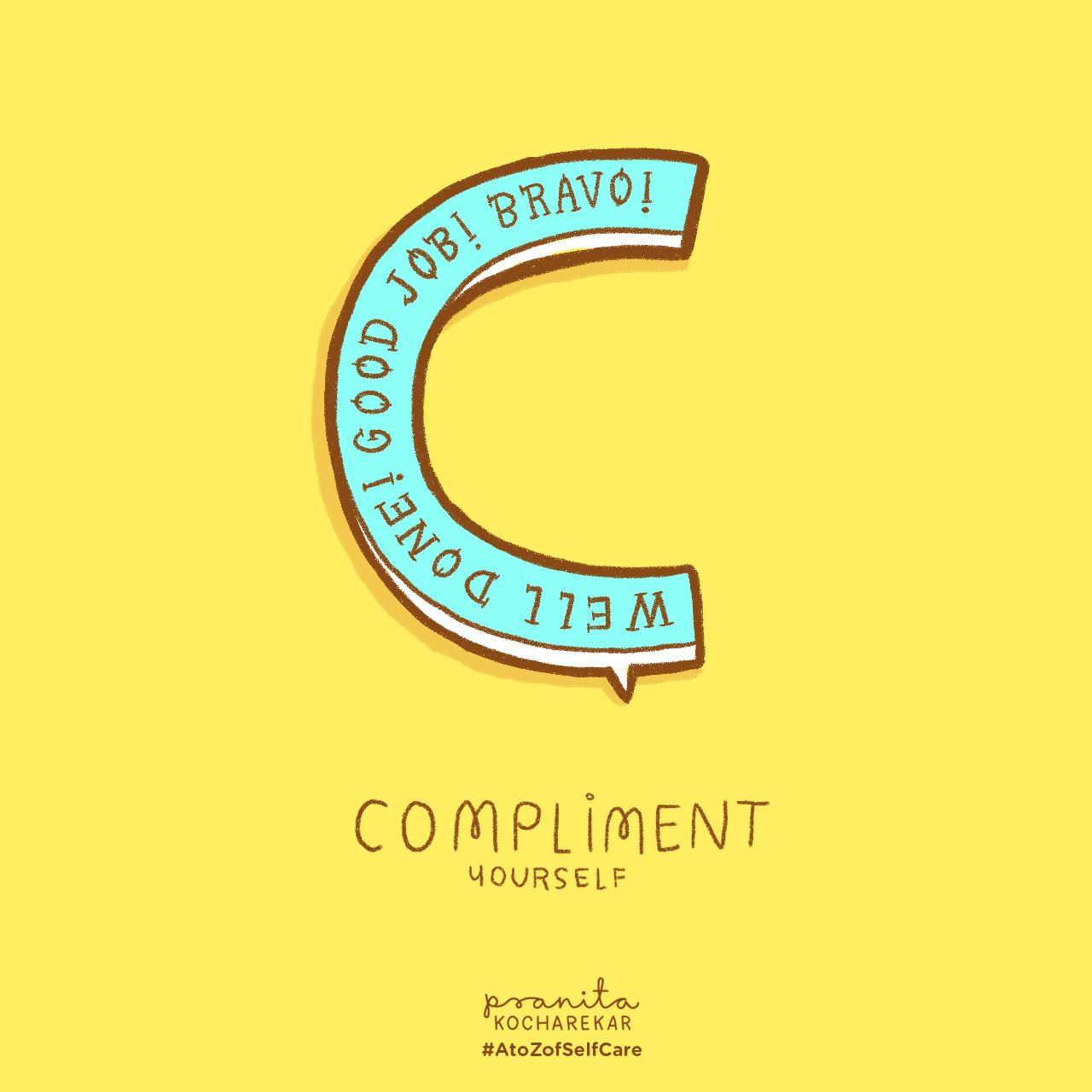
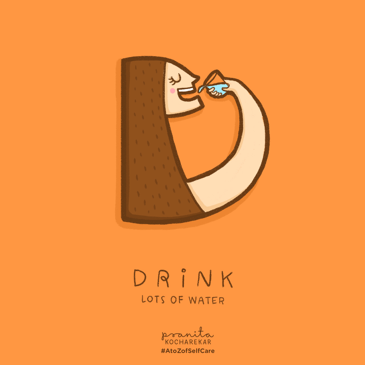
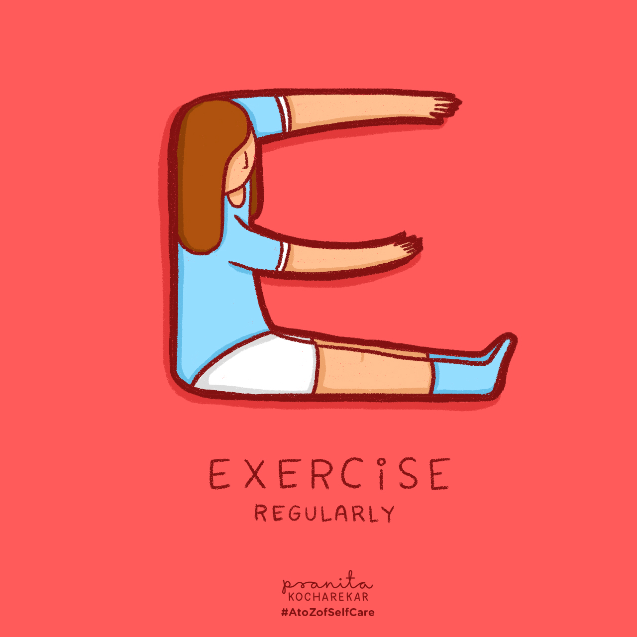
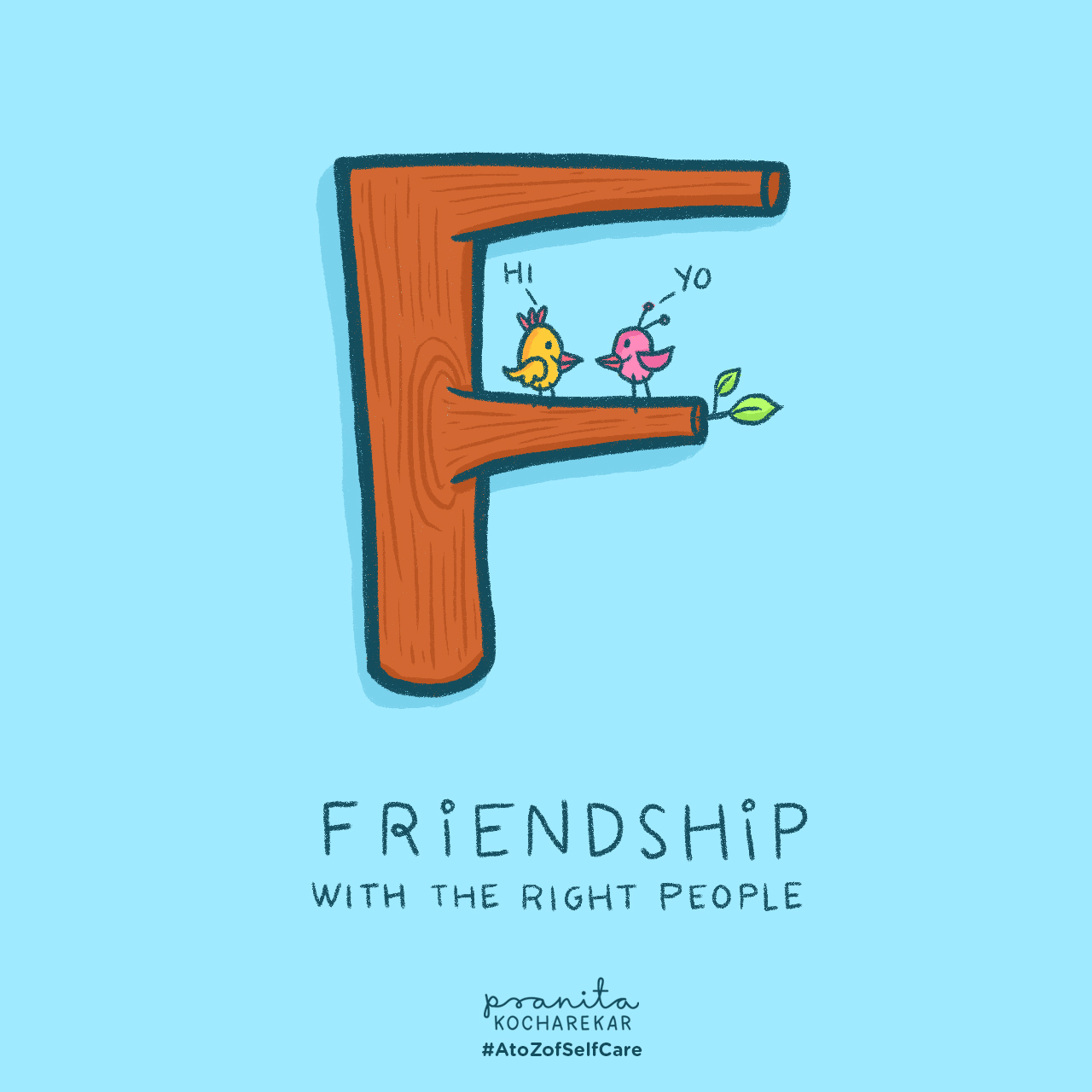
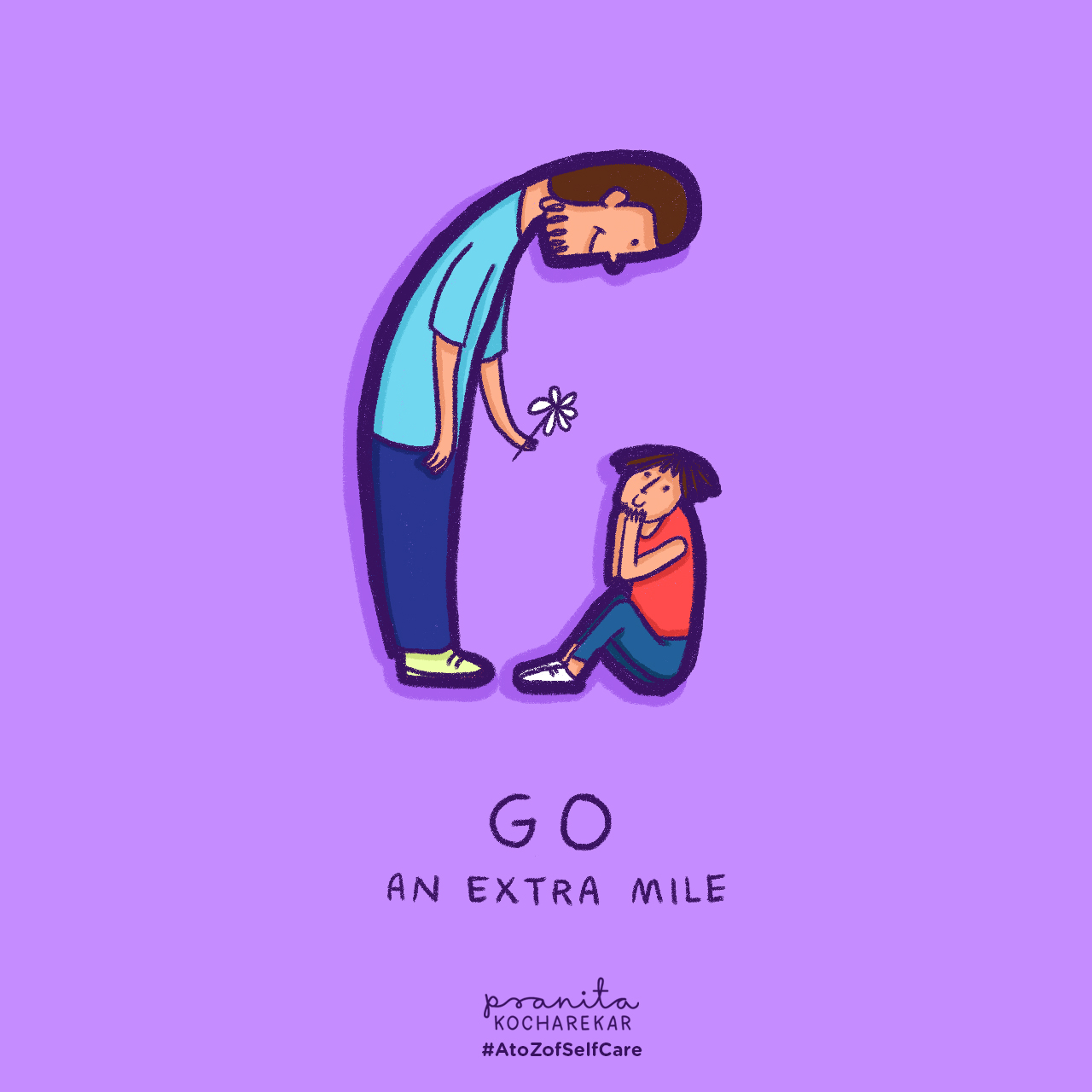
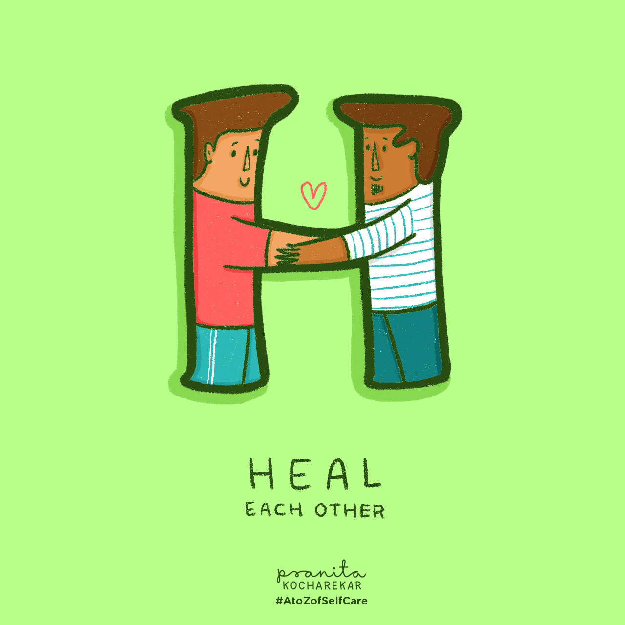
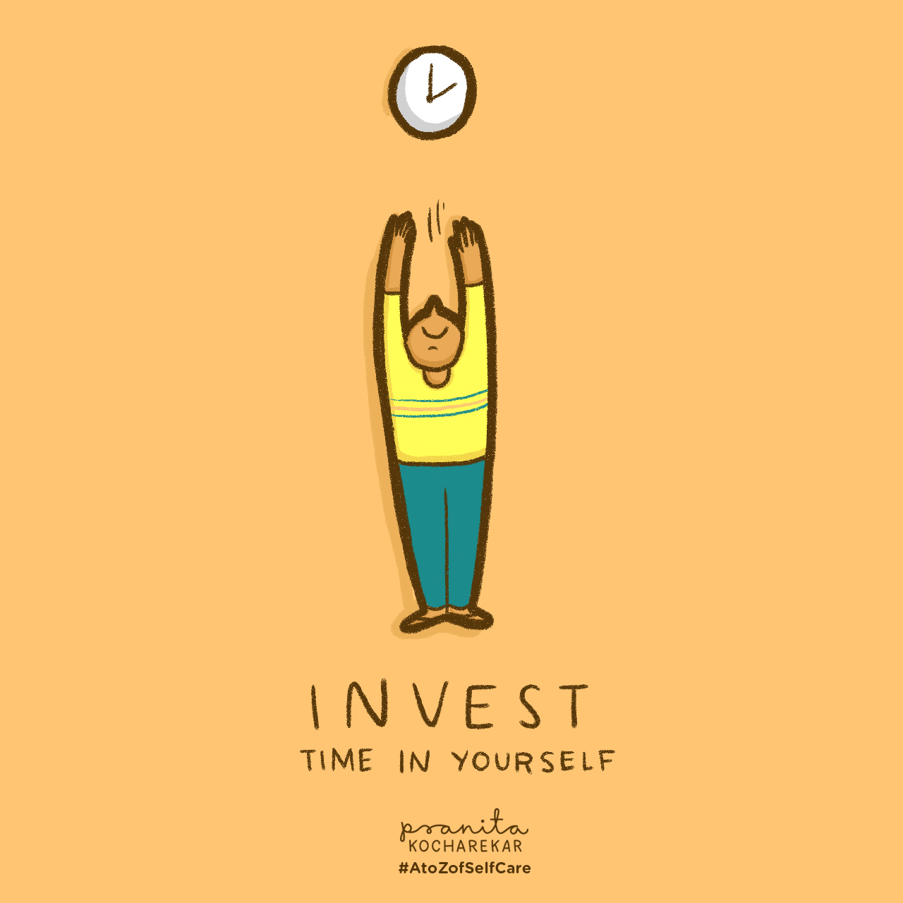
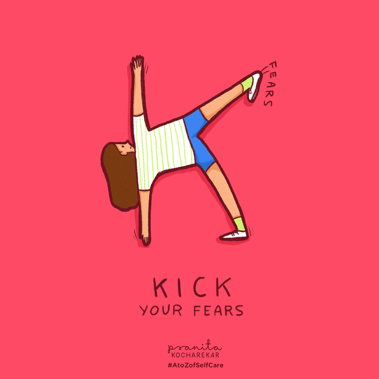
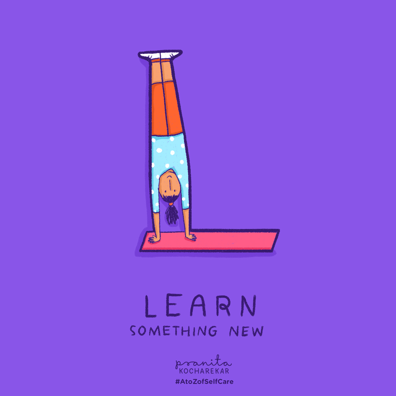
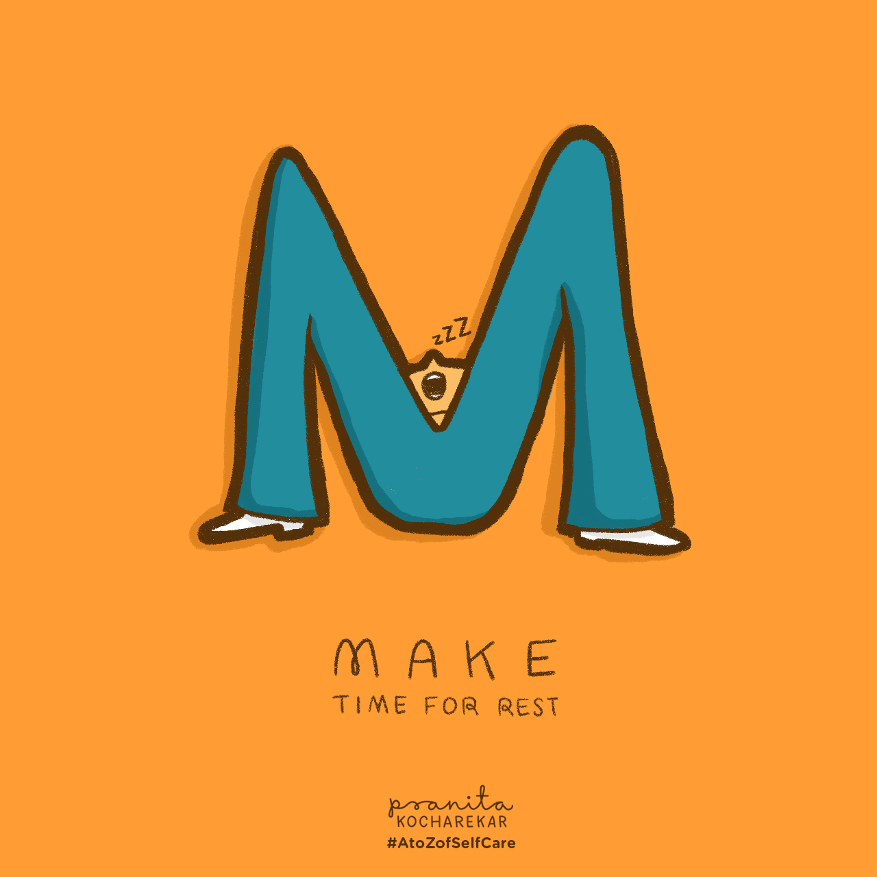
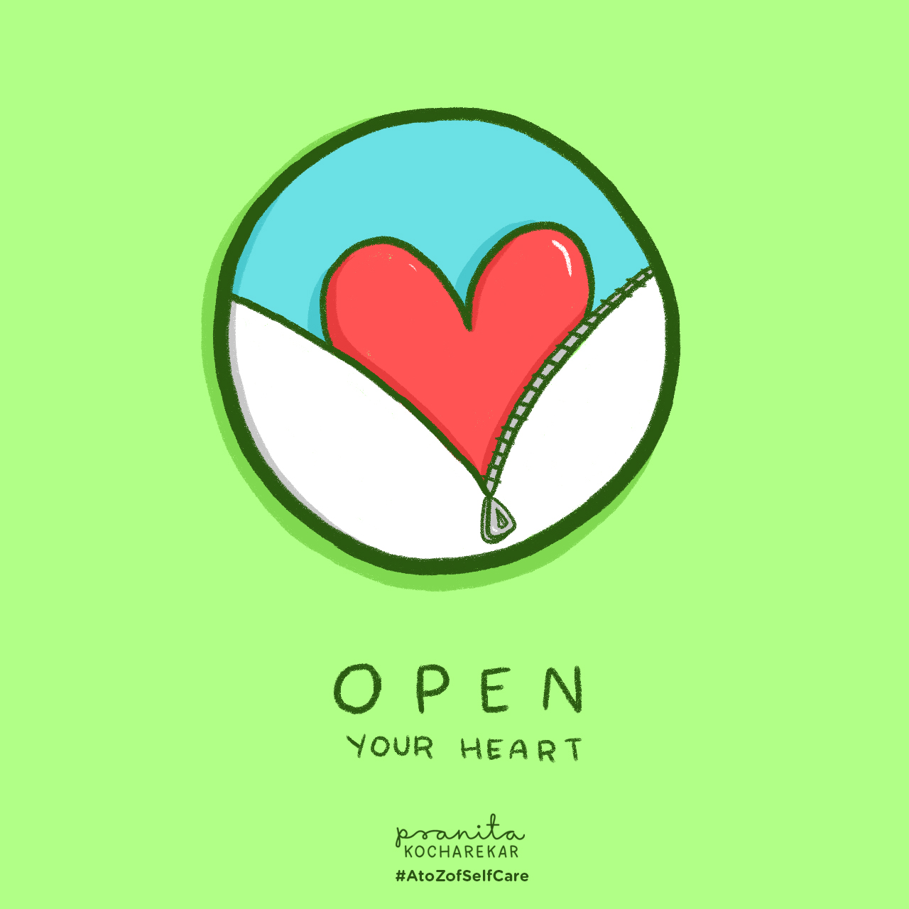
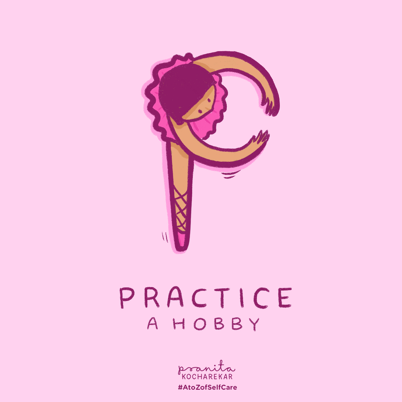
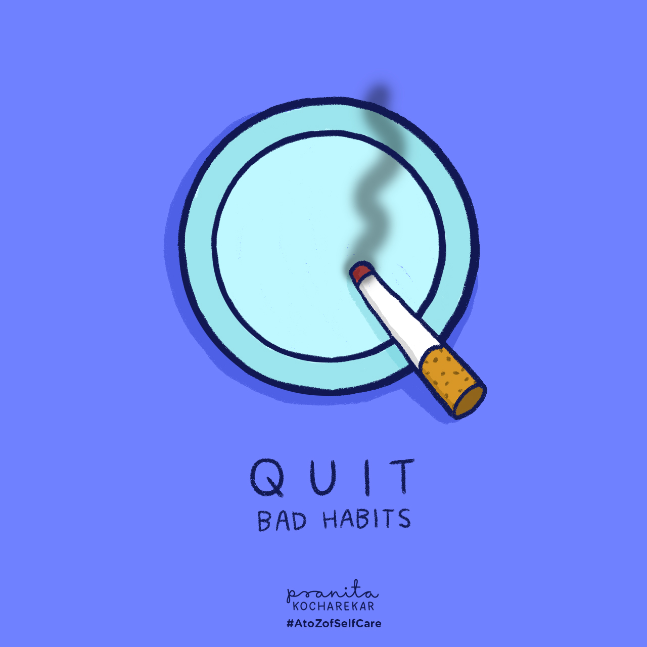
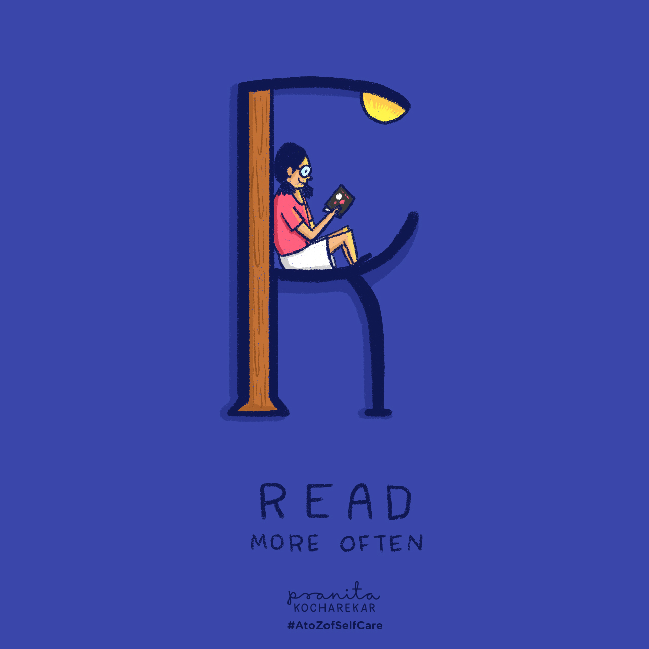
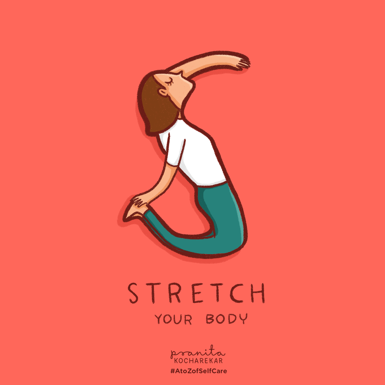
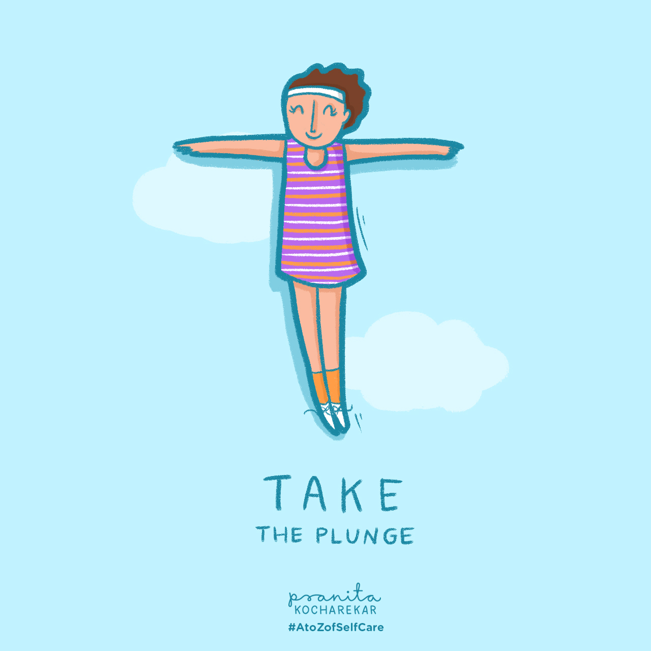
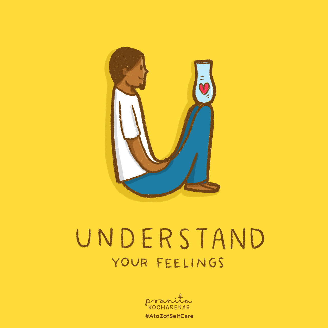
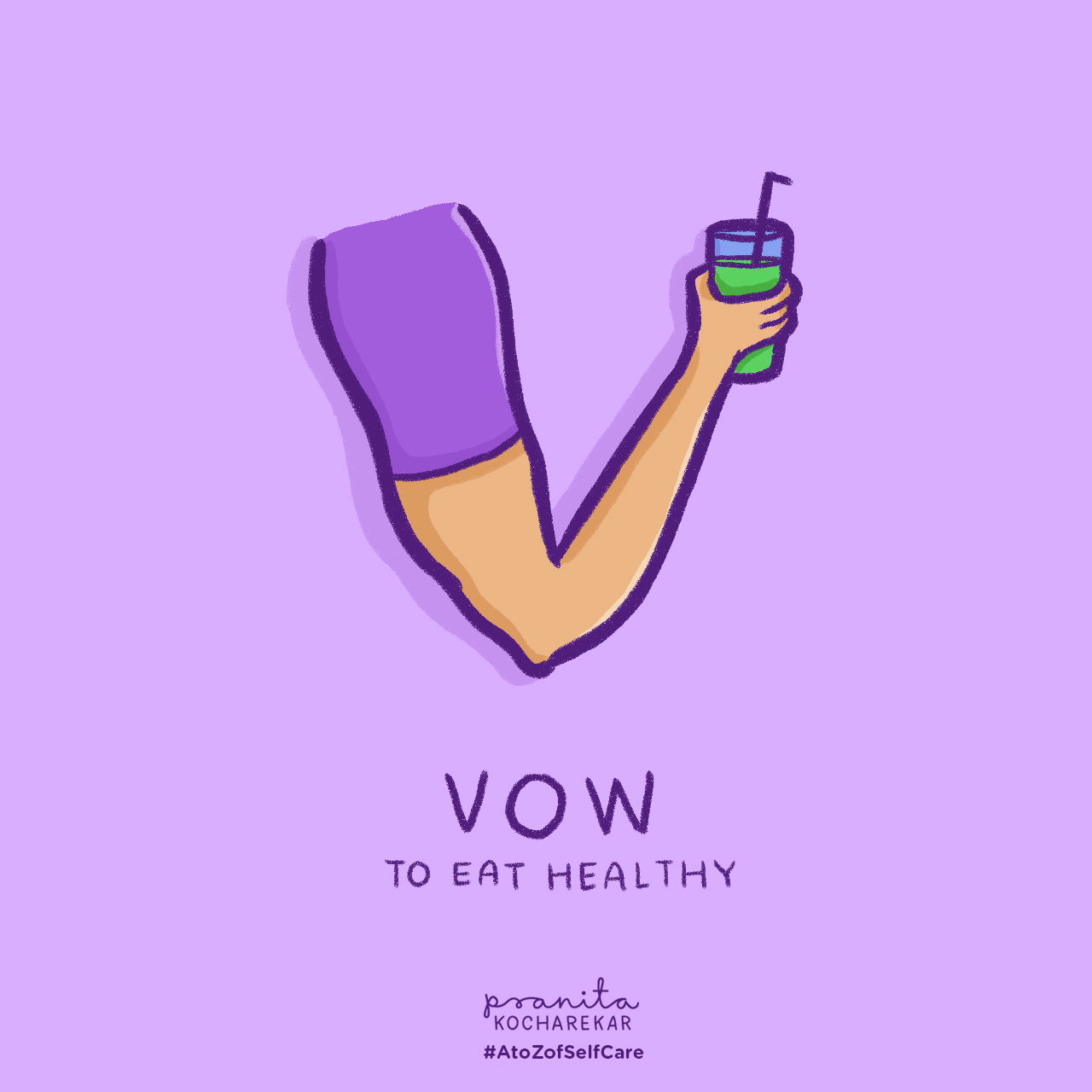
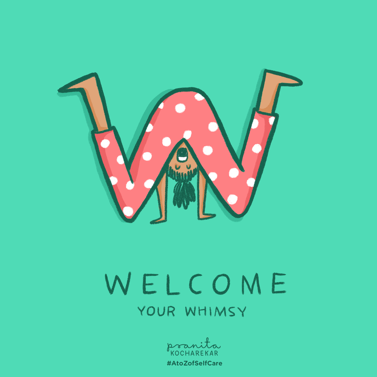
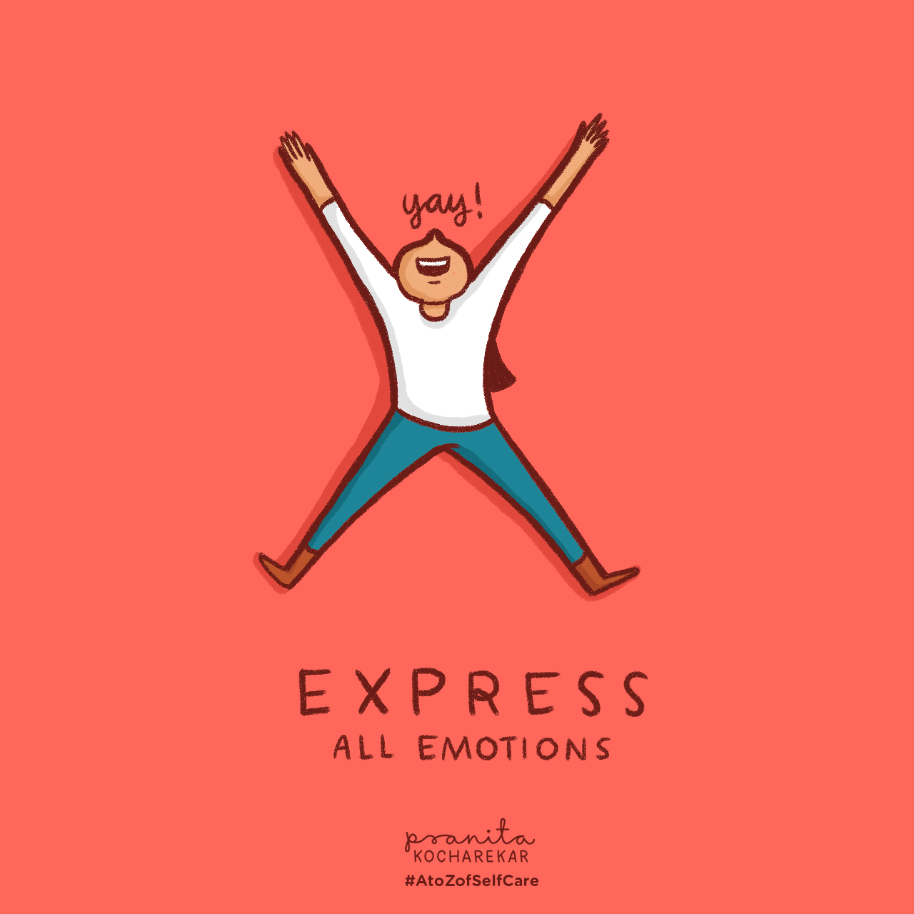
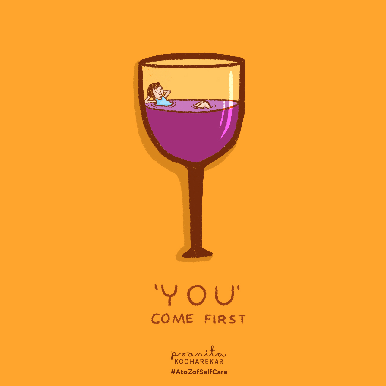
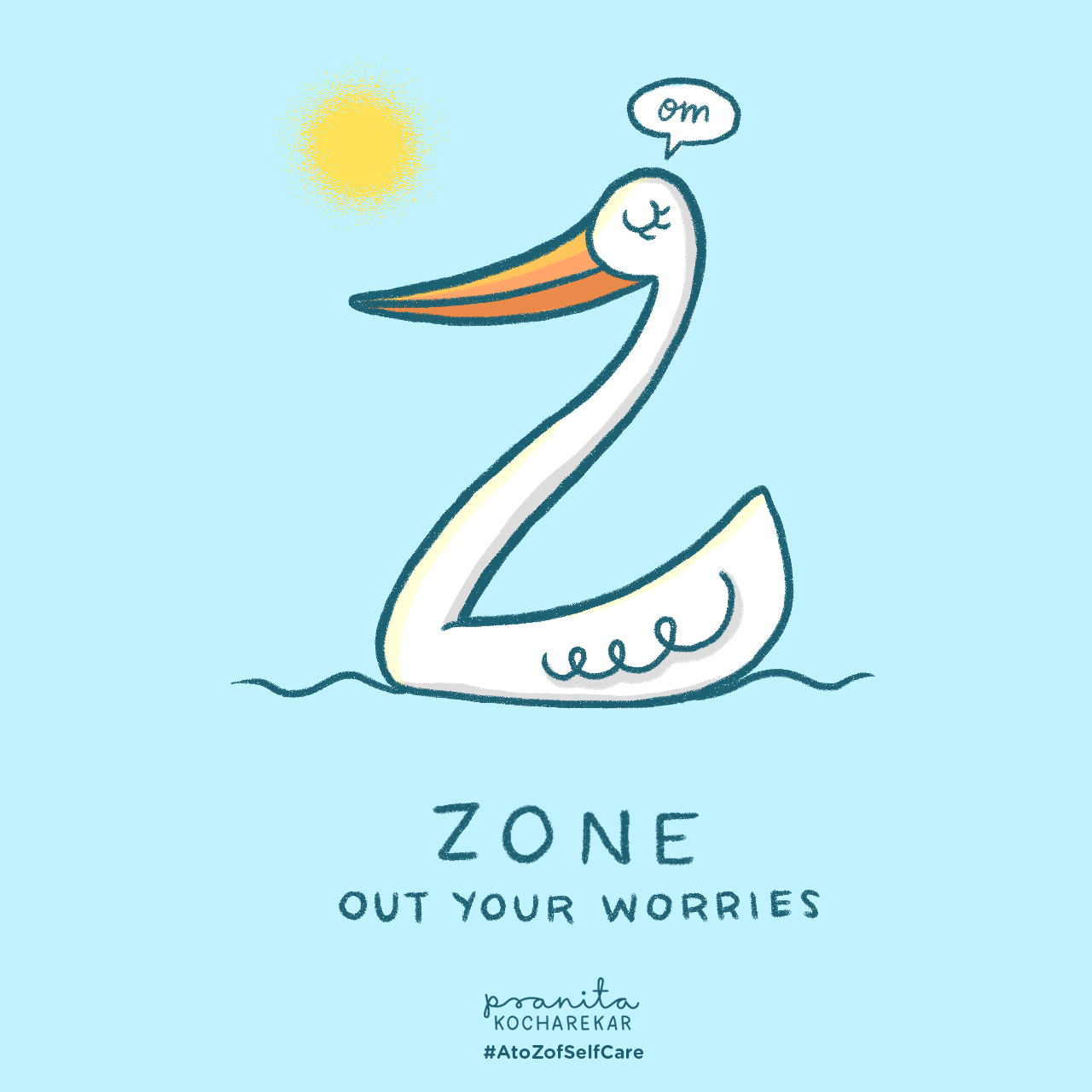
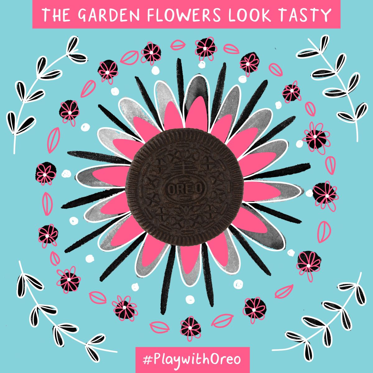
#AToZOfSelfCare is an Instagram series. The idea of this series is to encourage people to spend some extra time taking care of themselves.


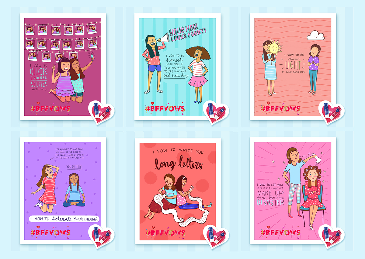
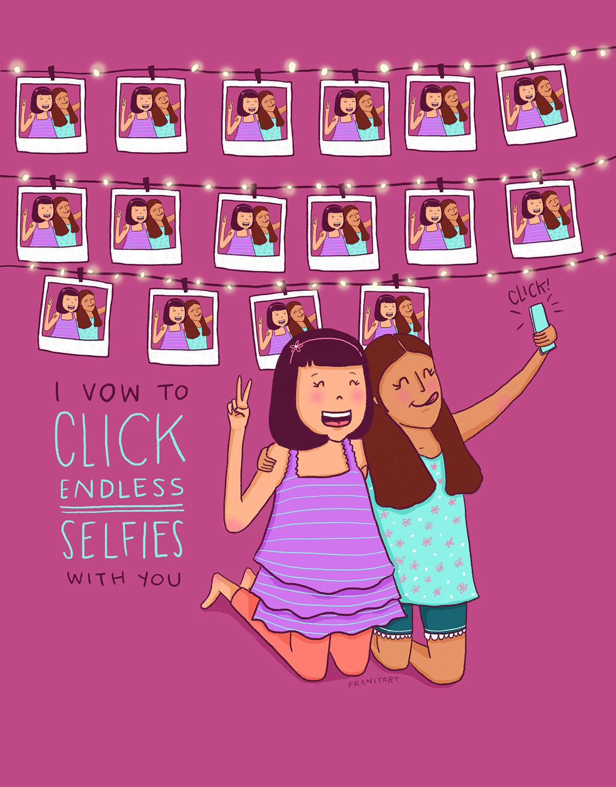
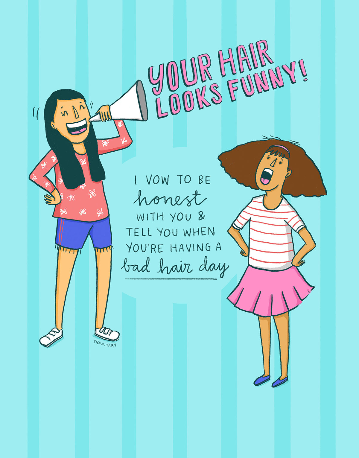
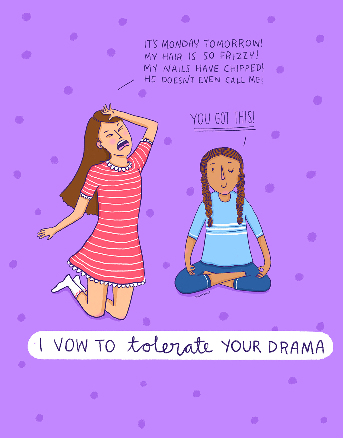
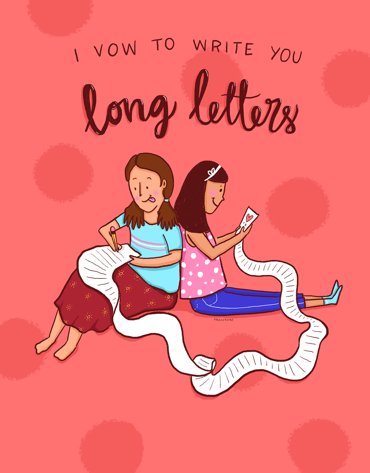
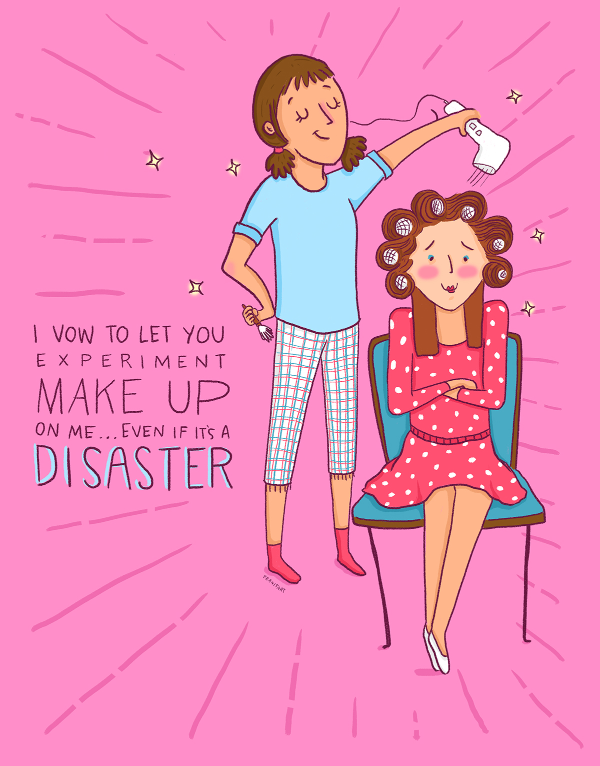
Nivea launched a digital campaign for their lip balms during Valentine’s Day week.
The idea of the campaign was to source vows from their followers, illustrate them and send them back to them. The campaign focuses on how Valentine’s Day is also about friendships!
In collaboration with: Digitas Lbi India
Campaign idea & direction: Digitas Lbi India
Creative direction, art direction, illustration: Pranita Kocharekar
Pranita Kocharekar x MP Tourism x Tumblr
This has definitely been one of my most exciting projects of 2016.
I visited a few cities in Madhya Pradesh and blogged about my travel experience.
You can read each blog post here
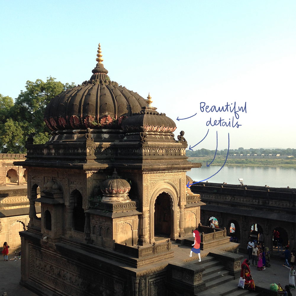
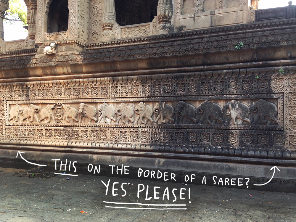
I met many interesting people, learnt about the rich Indian history and saw beautiful architecture in Madhya Pradesh.
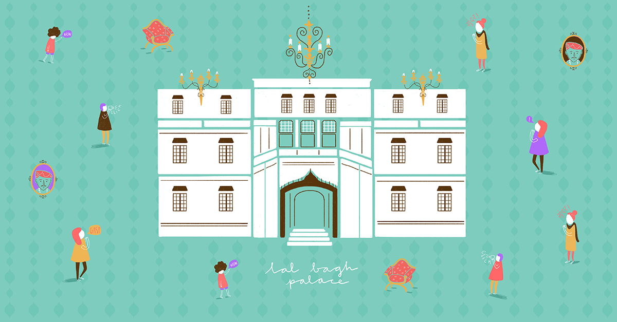
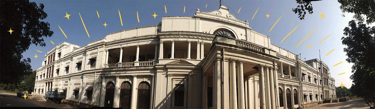
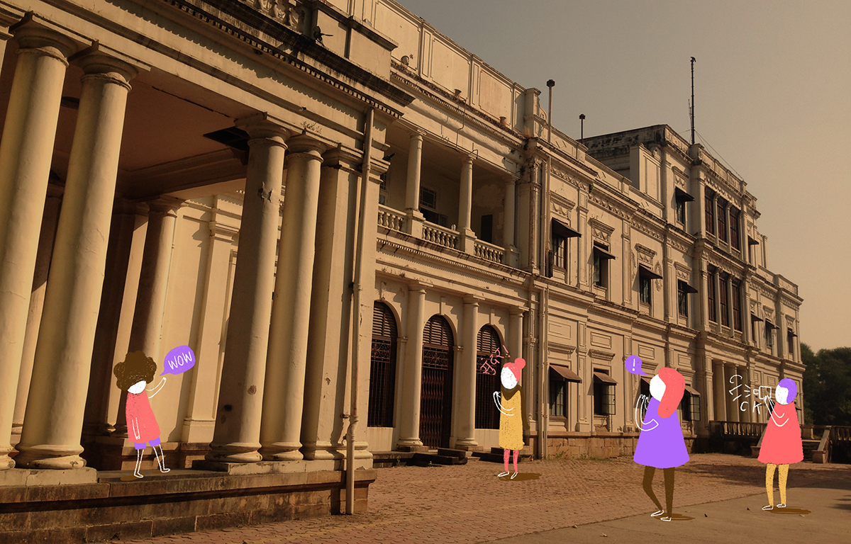
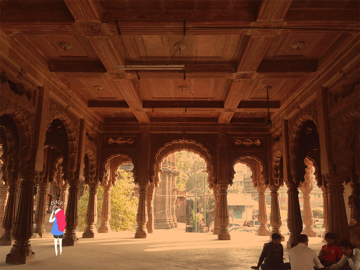
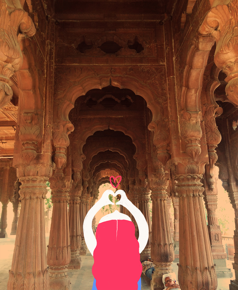
Lal Bagh Palace, Indore, Madhya Pradesh
You can read more about my experience here
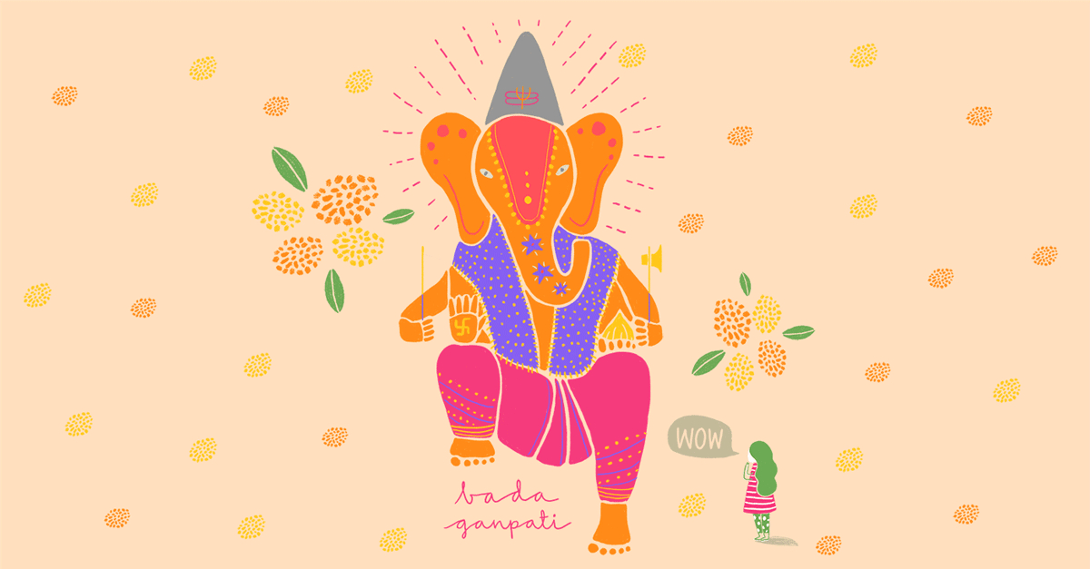
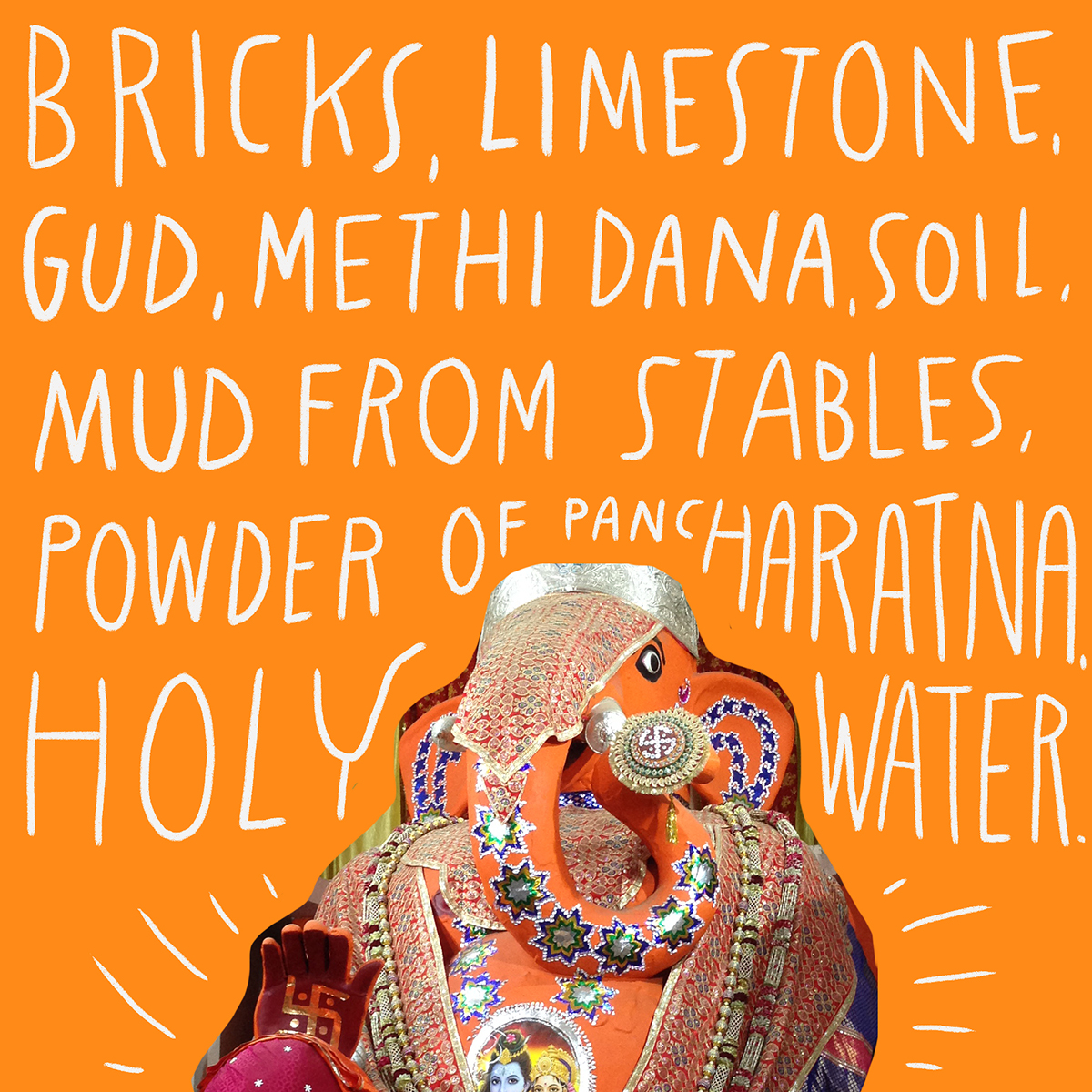
Bada Ganpati, Indore, Madhya Pradesh
You can read more about my experience here
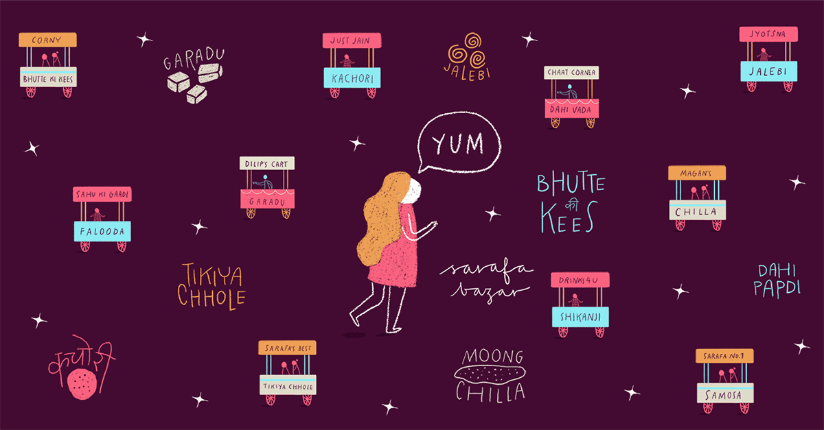
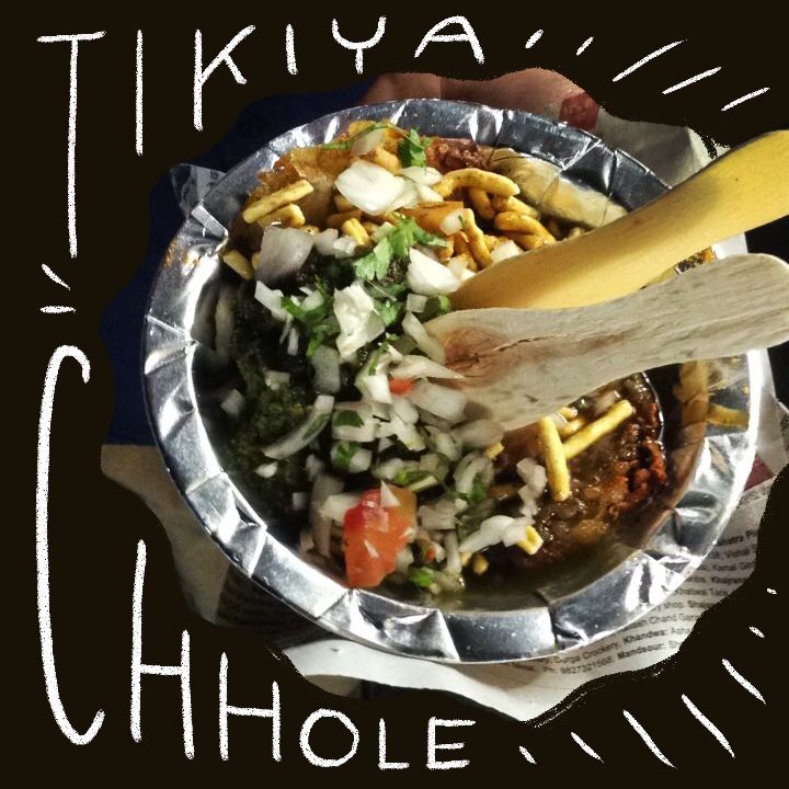
Sarafa Bazaar, Indore, Madhya Pradesh
You can read more about my experience here
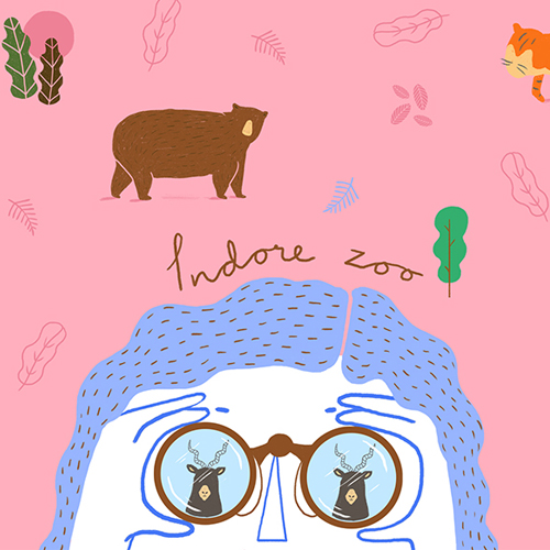
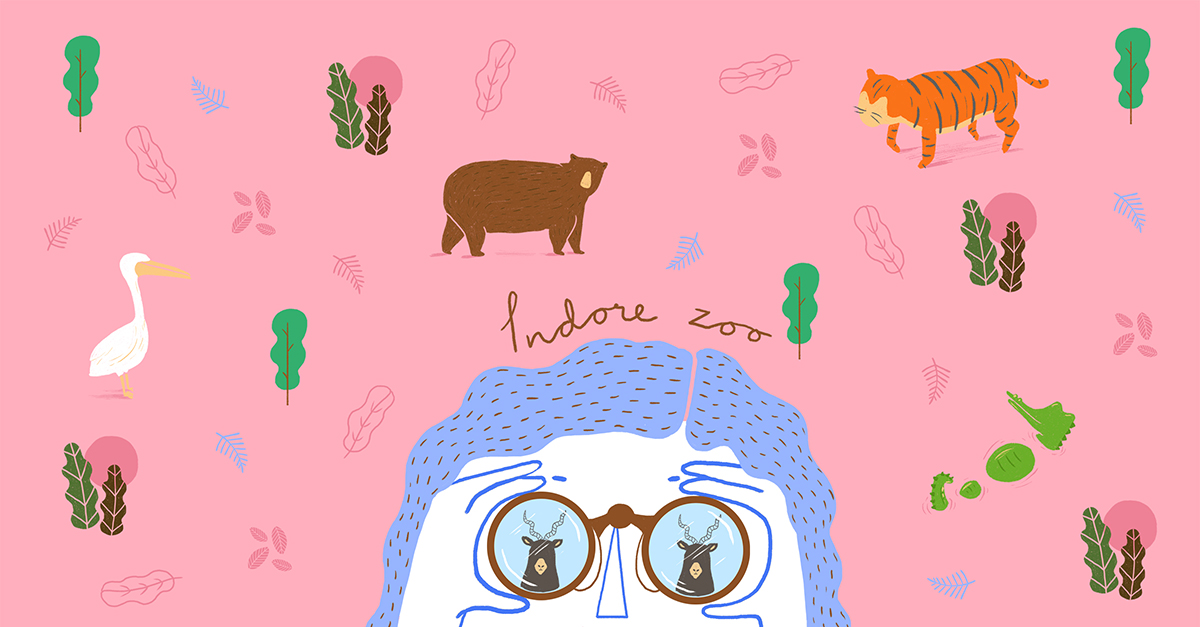
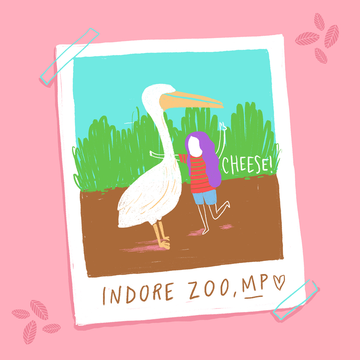
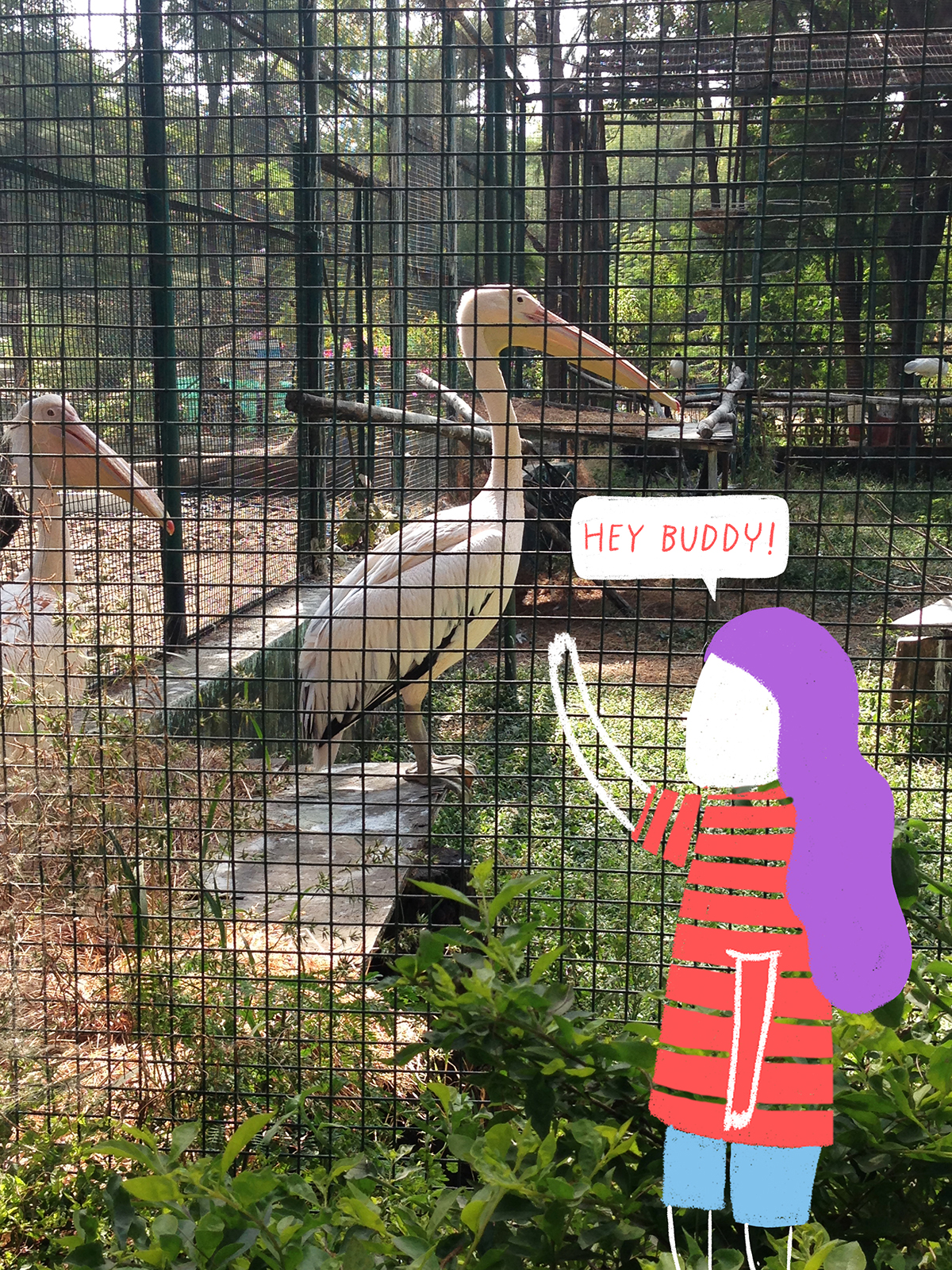
Zoo, Indore, Madhya Pradesh
You can read more about my experience here
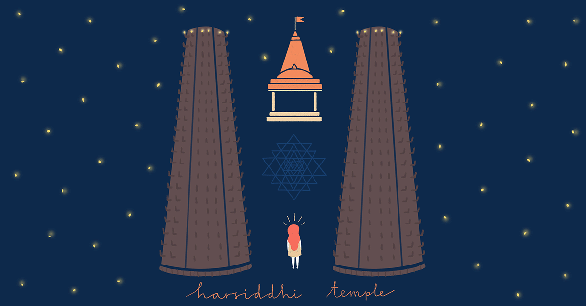
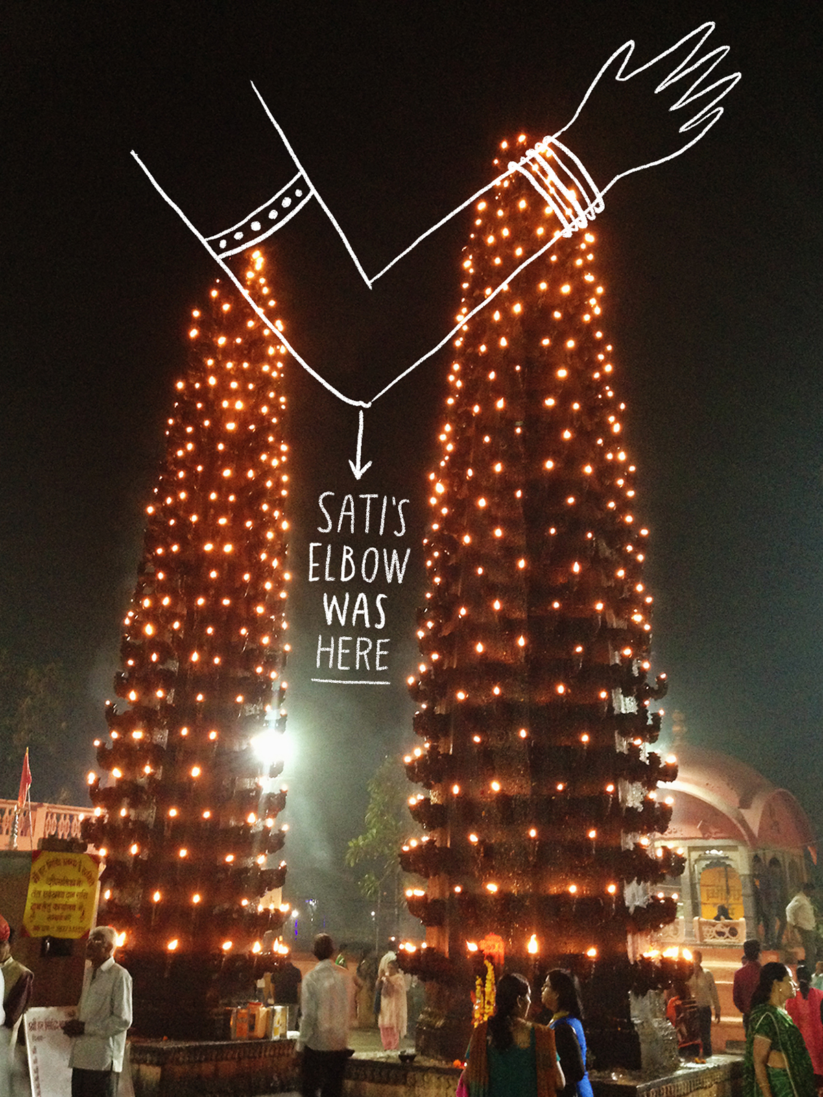
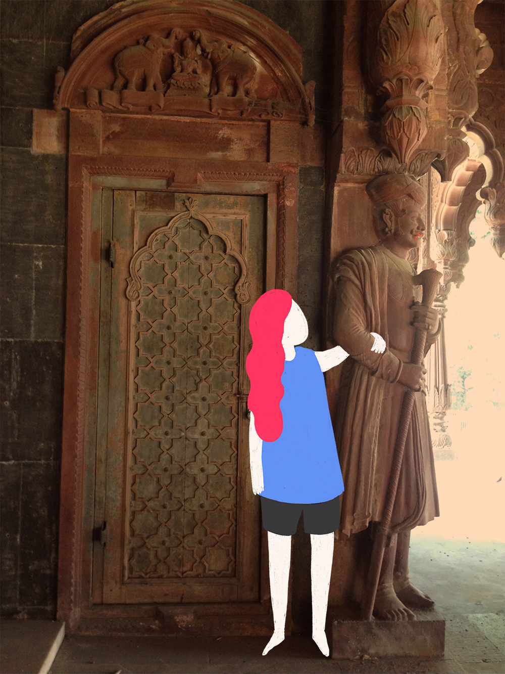
Harsiddhi Temple, Ujjain, Madhya Pradesh
You can read more about my experience here
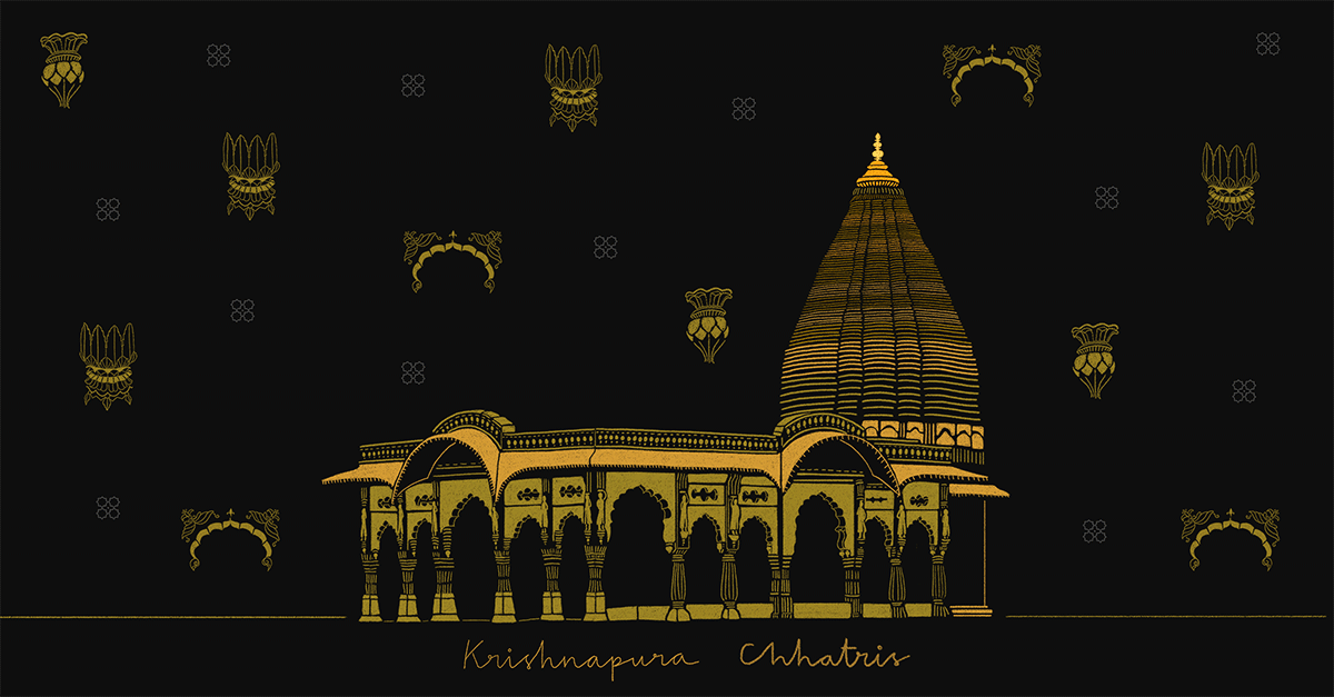
Krishnapura Chhatris, Indore, Madhya Pradesh
You can read more about my experience here
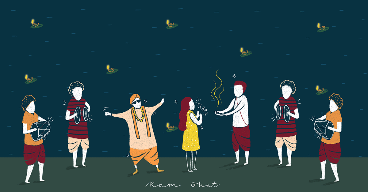
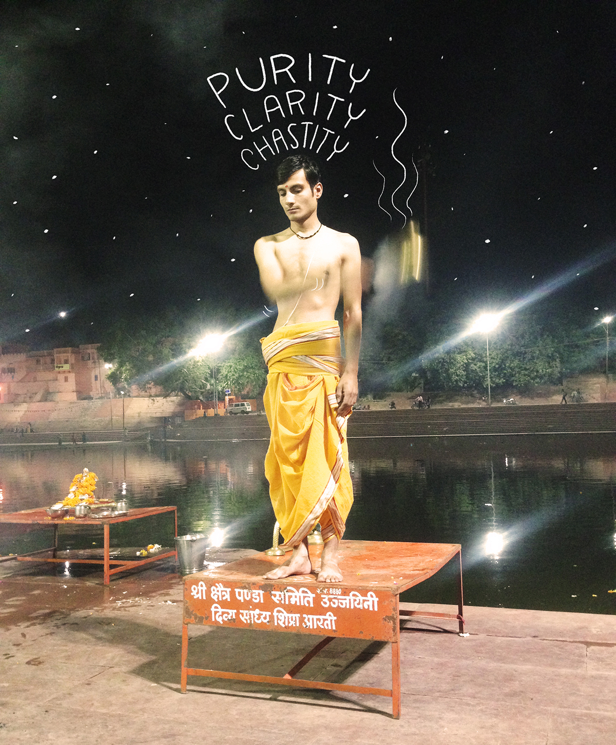
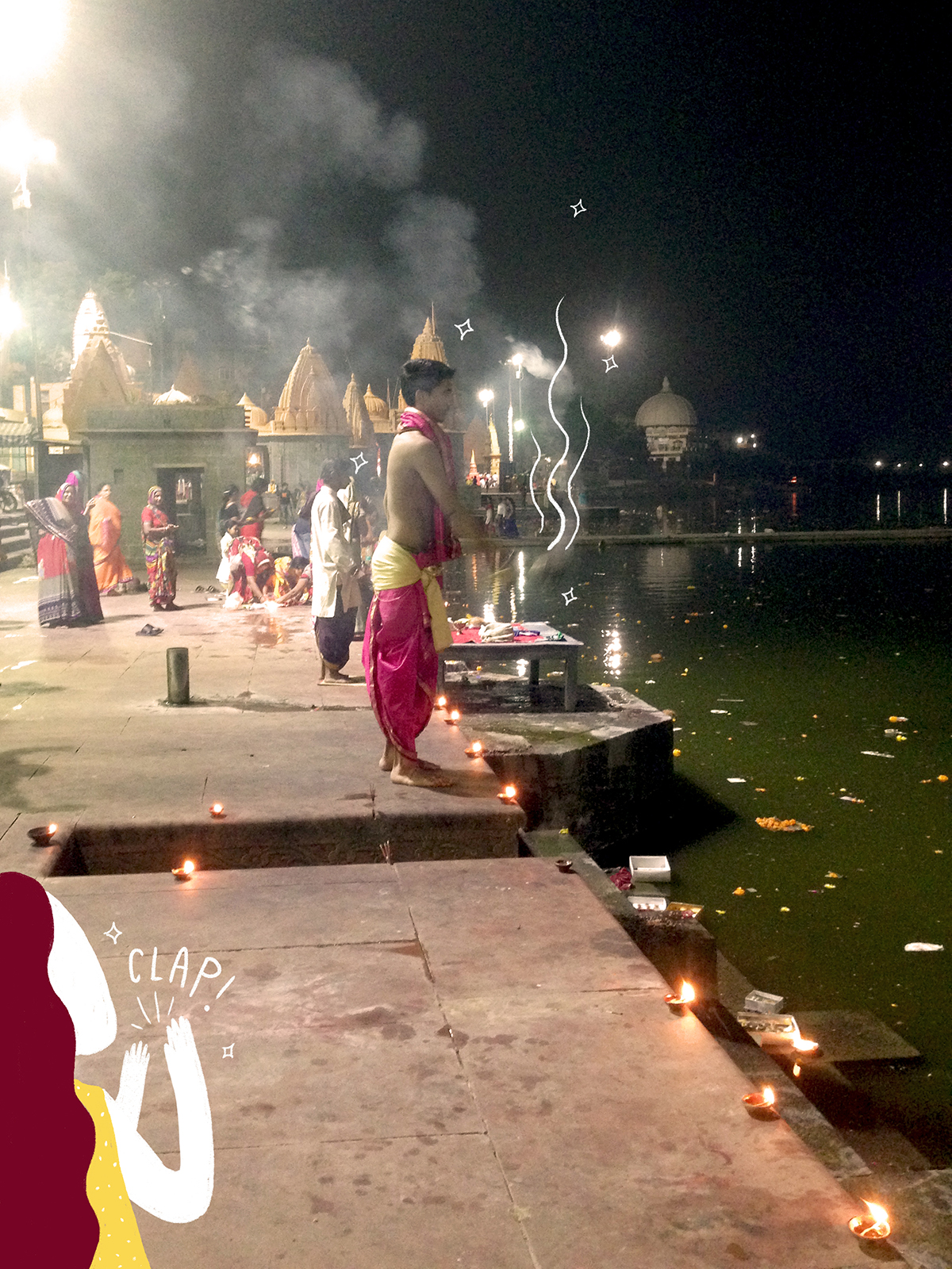
Ram Ghat, Ujjain, Madhya Pradesh
You can read more about my experience here
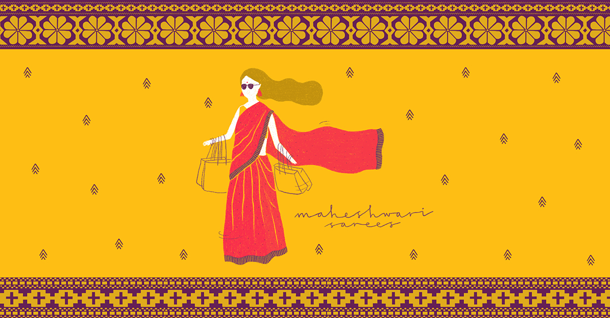
Maheshwari Sarees, Maheshwar, Madhya Pradesh
You can read more about my experience here

I’m really happy to have engaged an audience on the blog! 
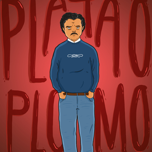
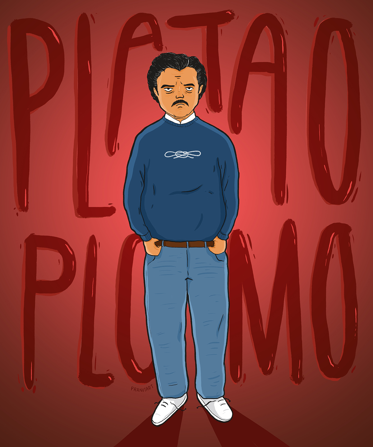
PLATA O PLOMO
Accept a bribe or face death
Commissioned fan art for Narcos Netflix’s social media campaign.
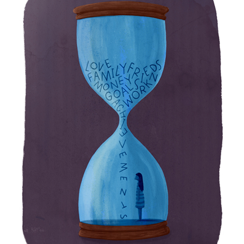
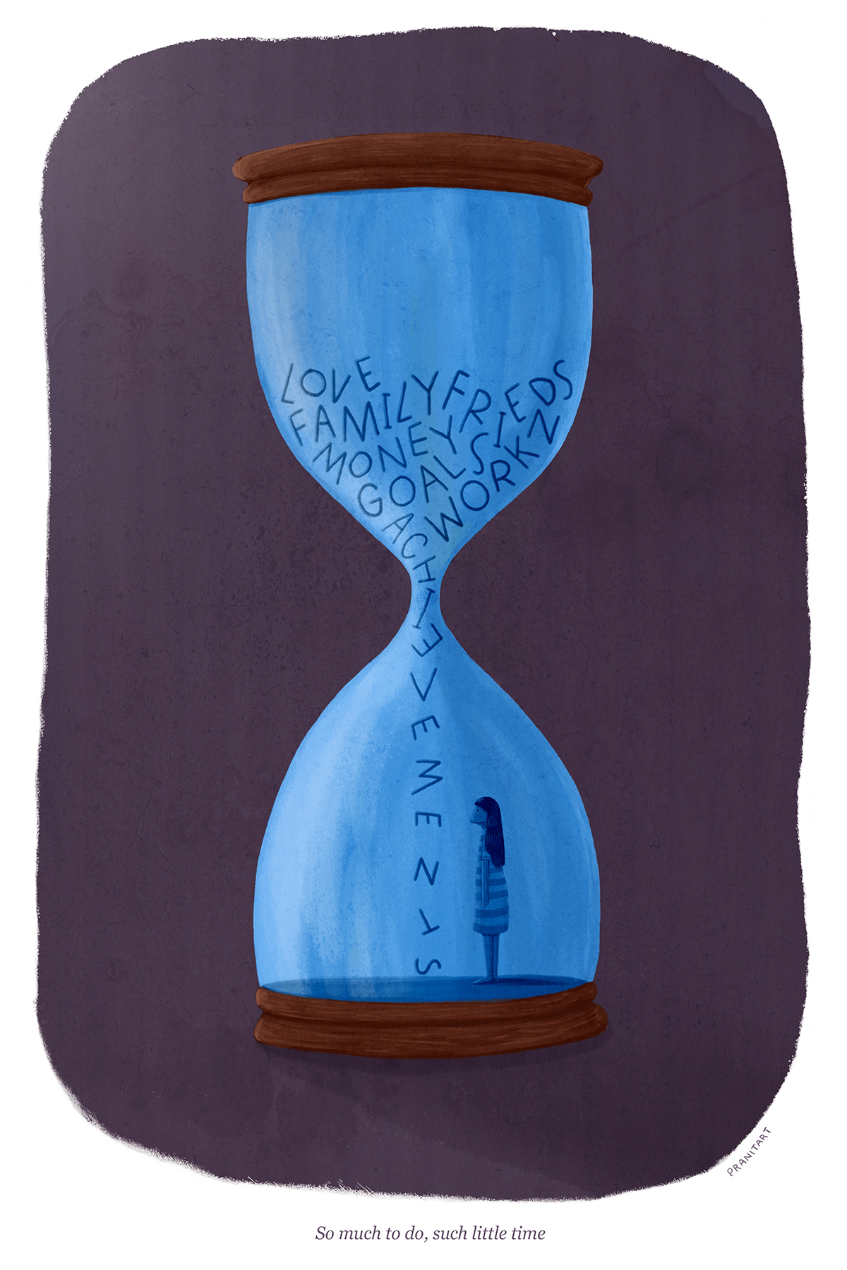
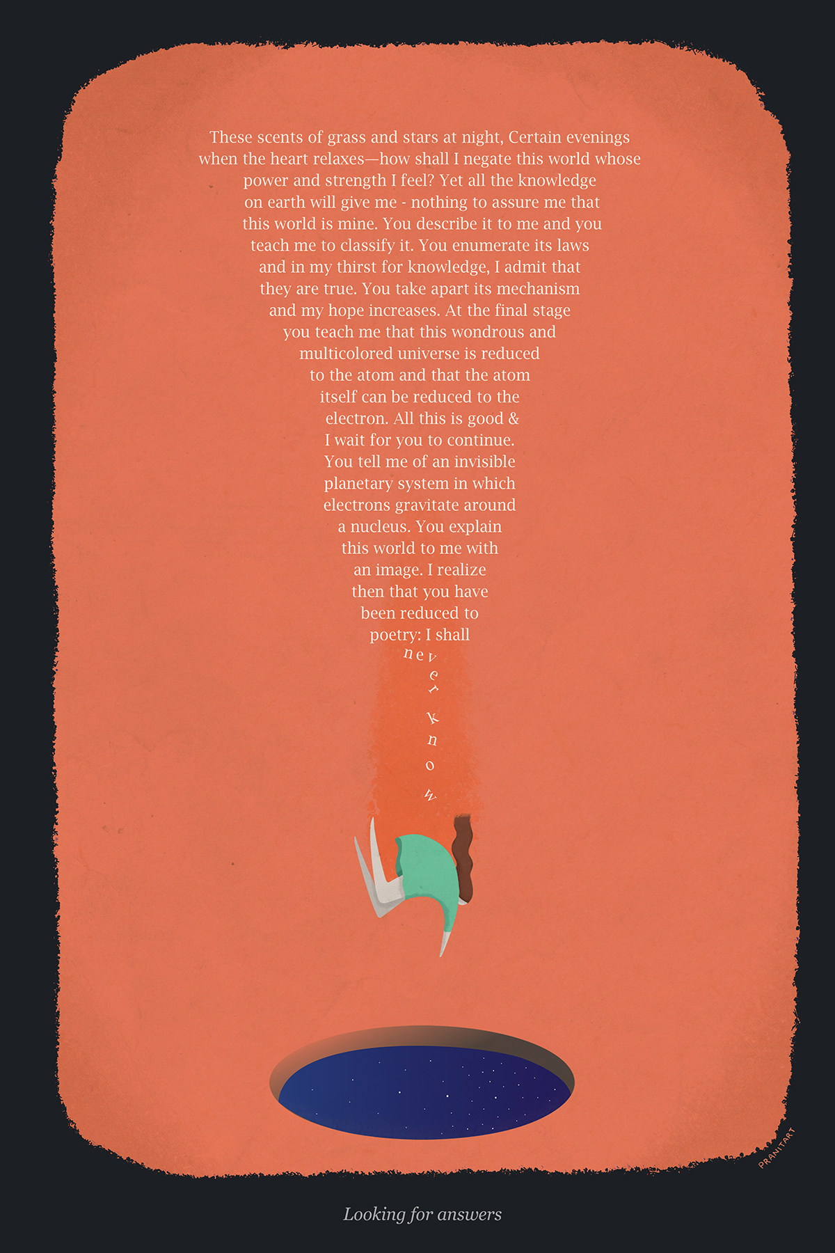
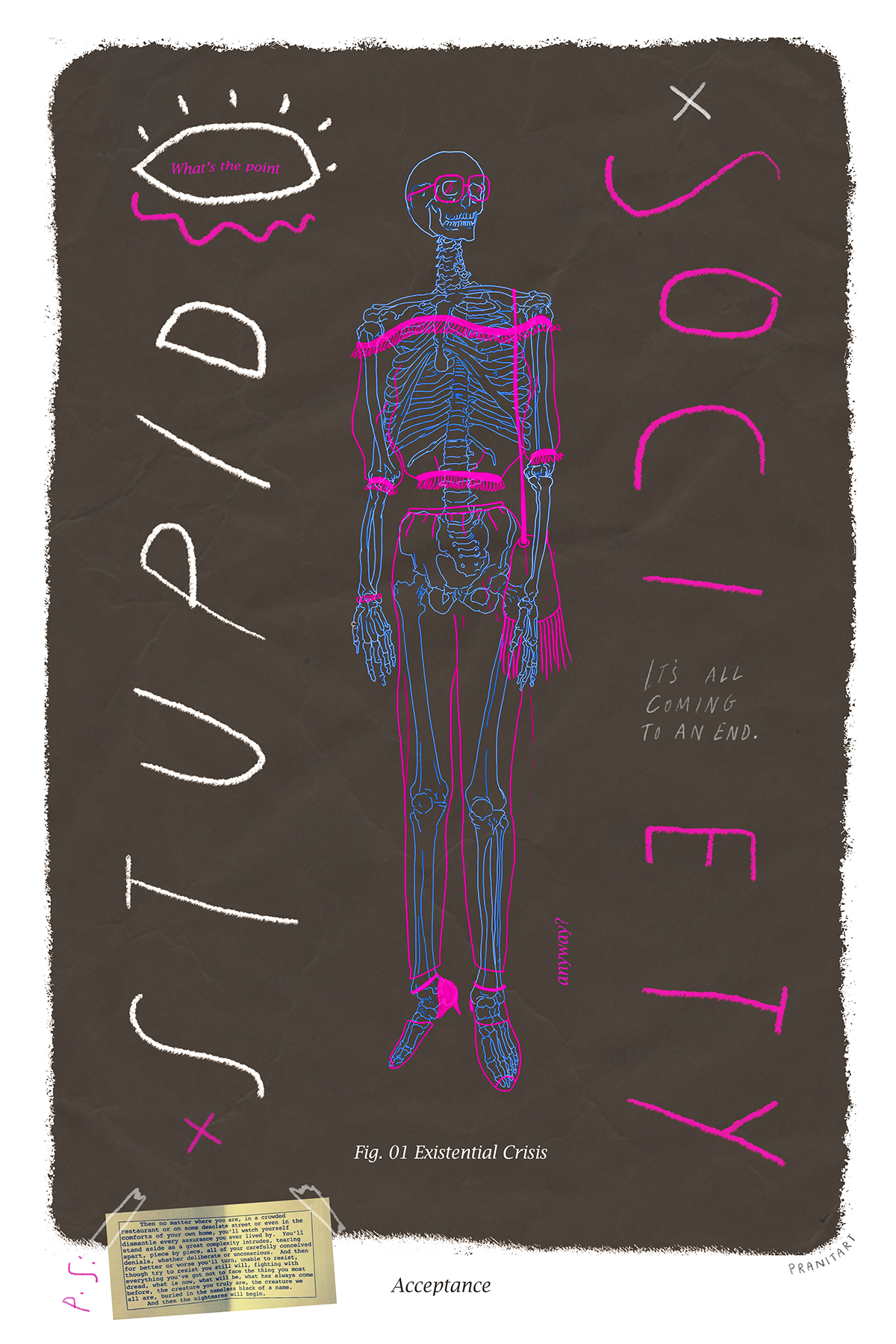
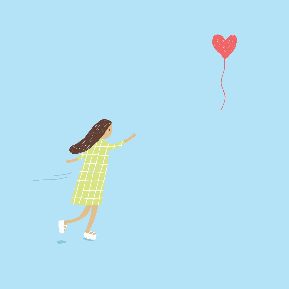
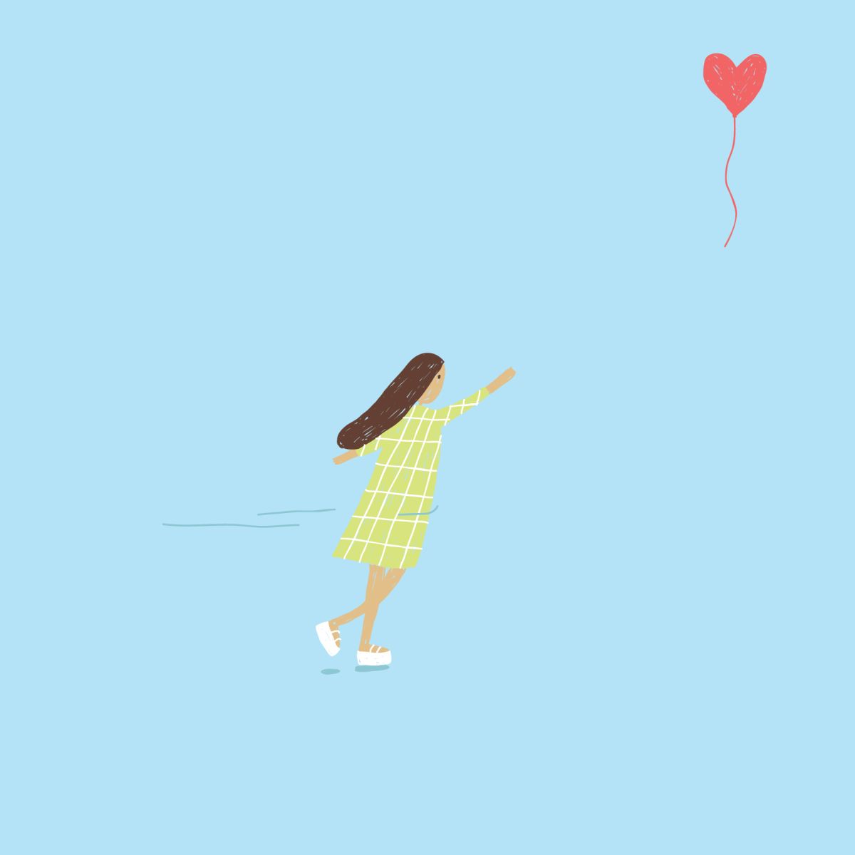
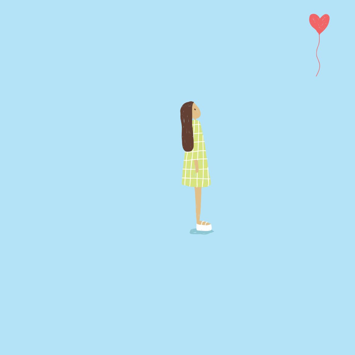
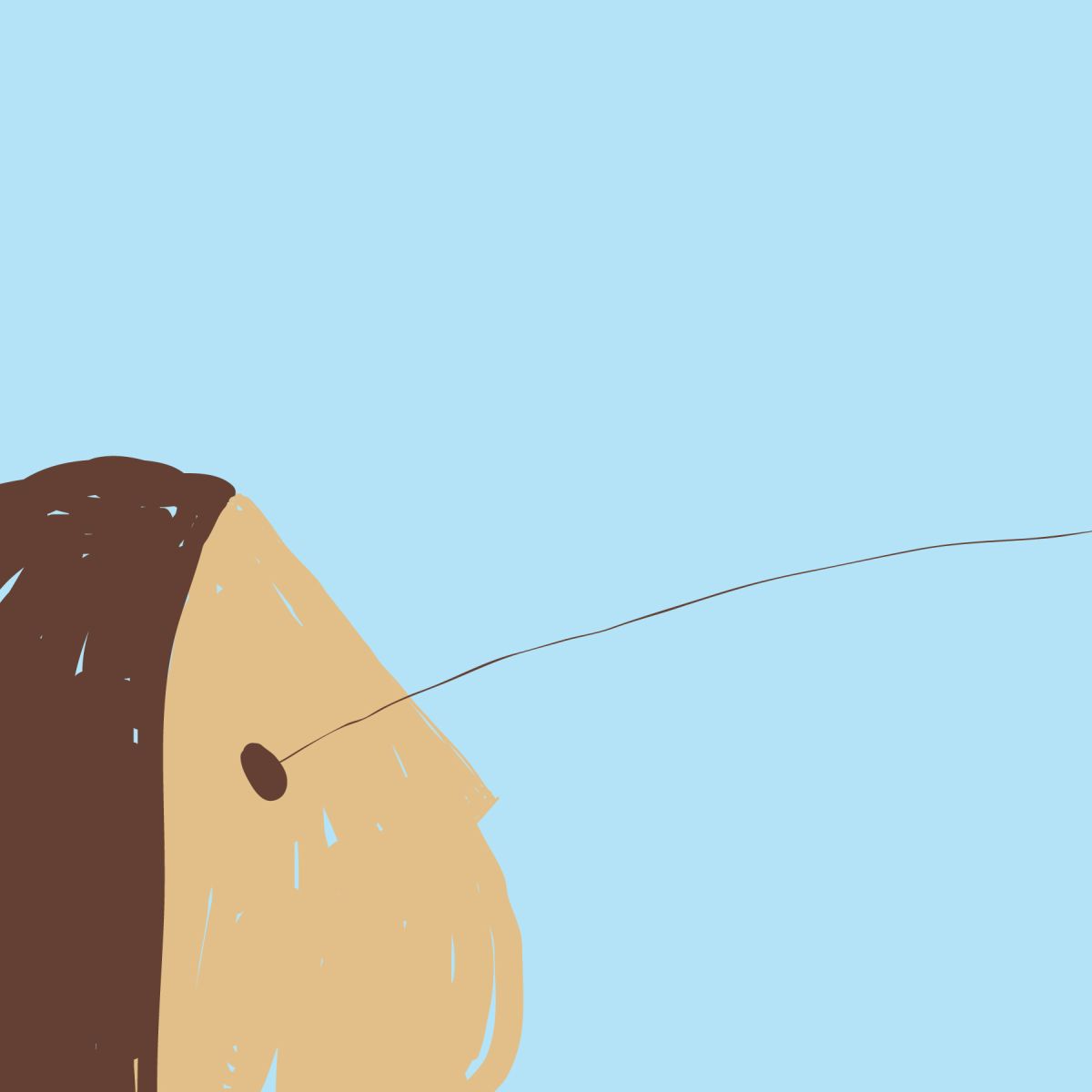
This is a personal project, an experiment to express and channelize my feelings in one direction.
It is a series of three illustrations executed in different styles.
Looking for answers
I havnt fully understood the meaning of life and death, hence in my search for some meaning I stumbled upon a piece written by Albert Camus. Camus expresses my thoughts in words so perfectly. This piece is about my genuine process of looking for answers.
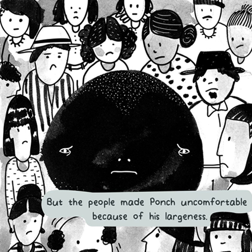
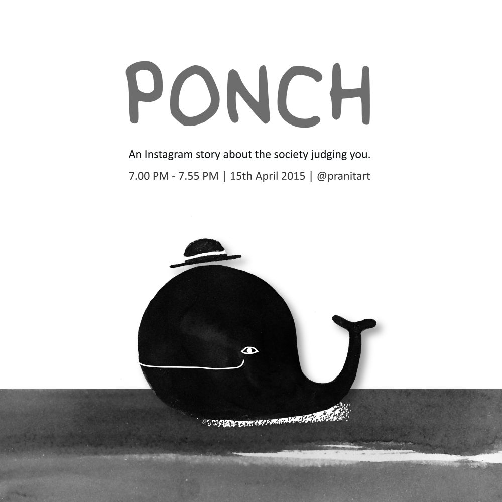
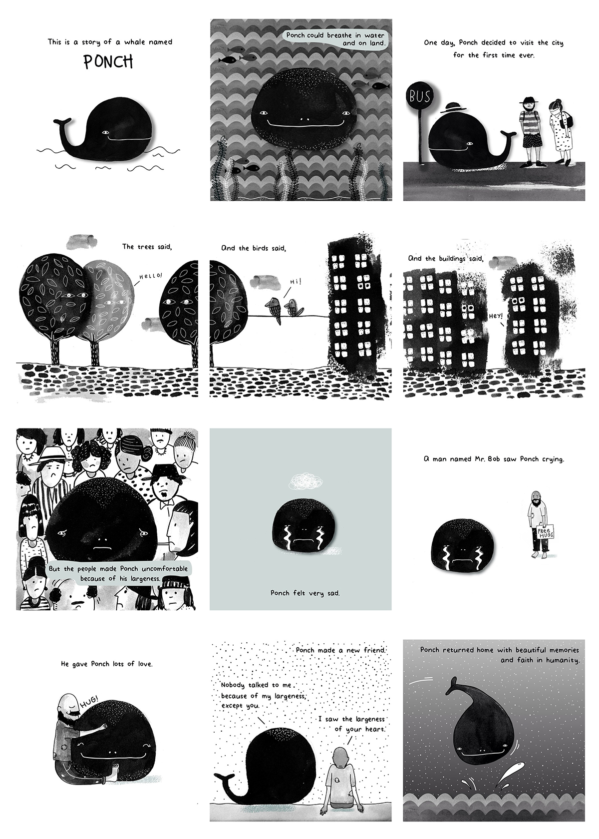
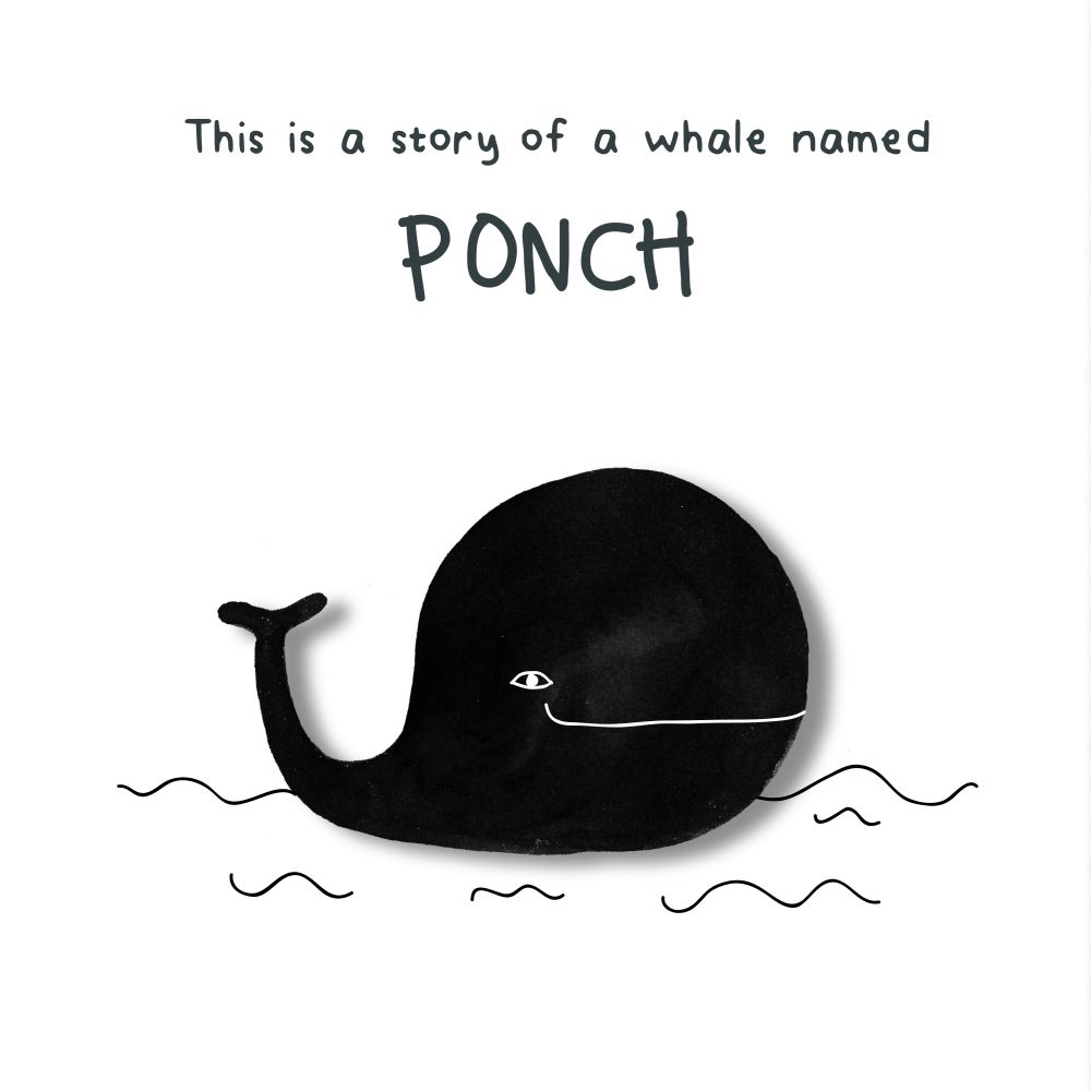
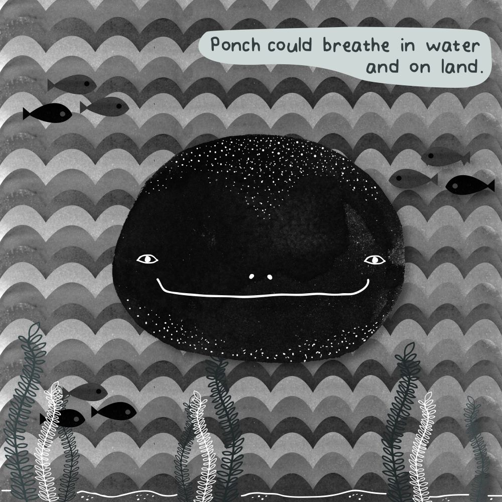
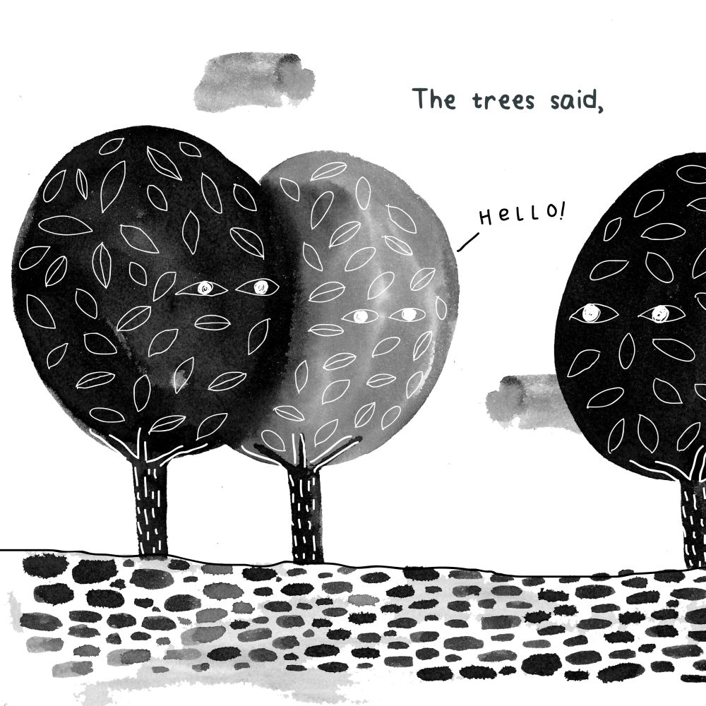
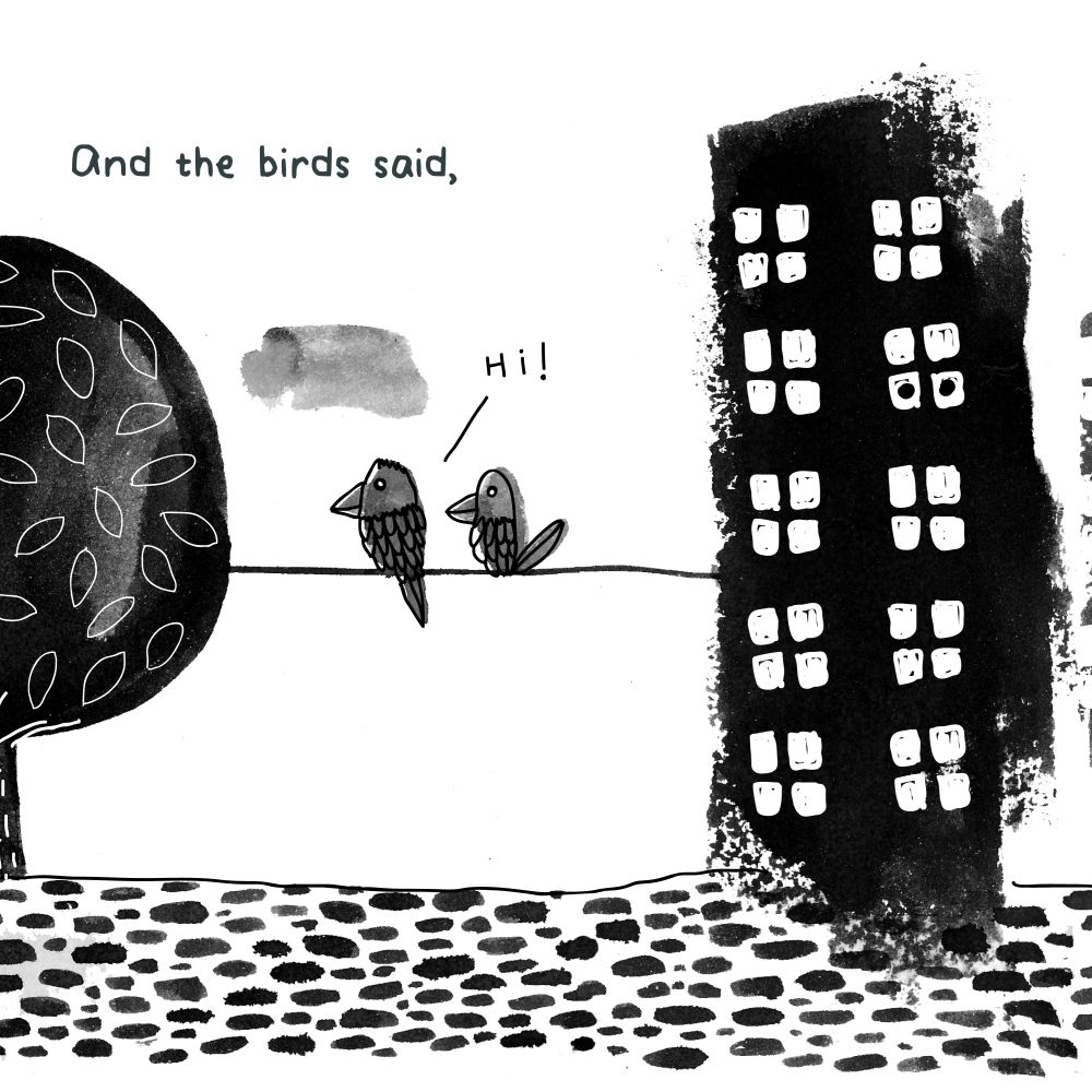
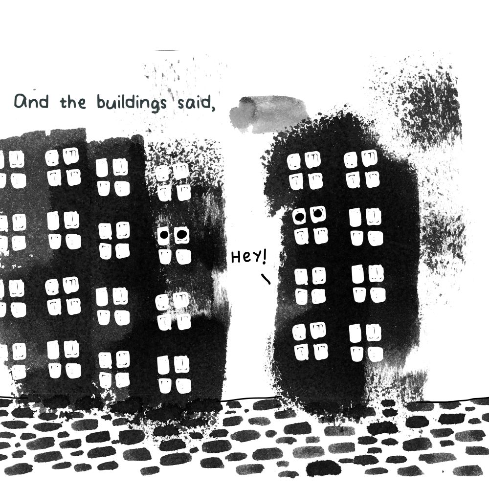
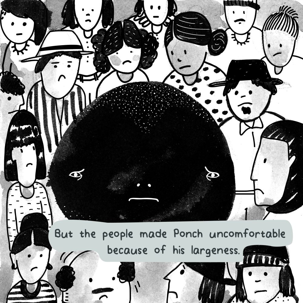
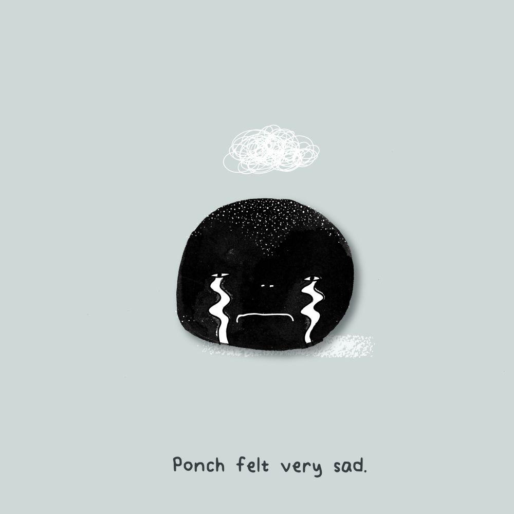
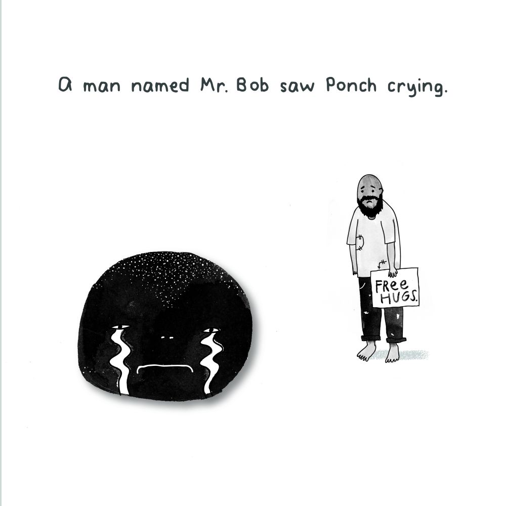
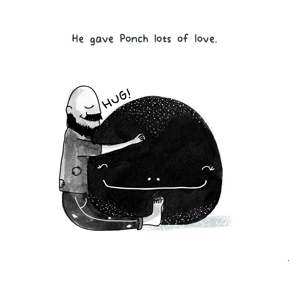
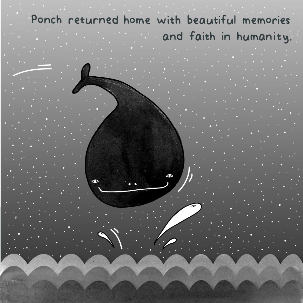
PONCH is a short children’s story that was exhibited over the period of 55mins on instagram (@pranitart).
The idea of the instagram-exhibition was to involve the audience in the story of Ponch, a whale who visits the city and witnesses the cruelity of society but also finds a true friend and regains faith in humanity.
This project received press coverage in Hindustan Times
 Poster
As seen on Instagram
—
Individual frames


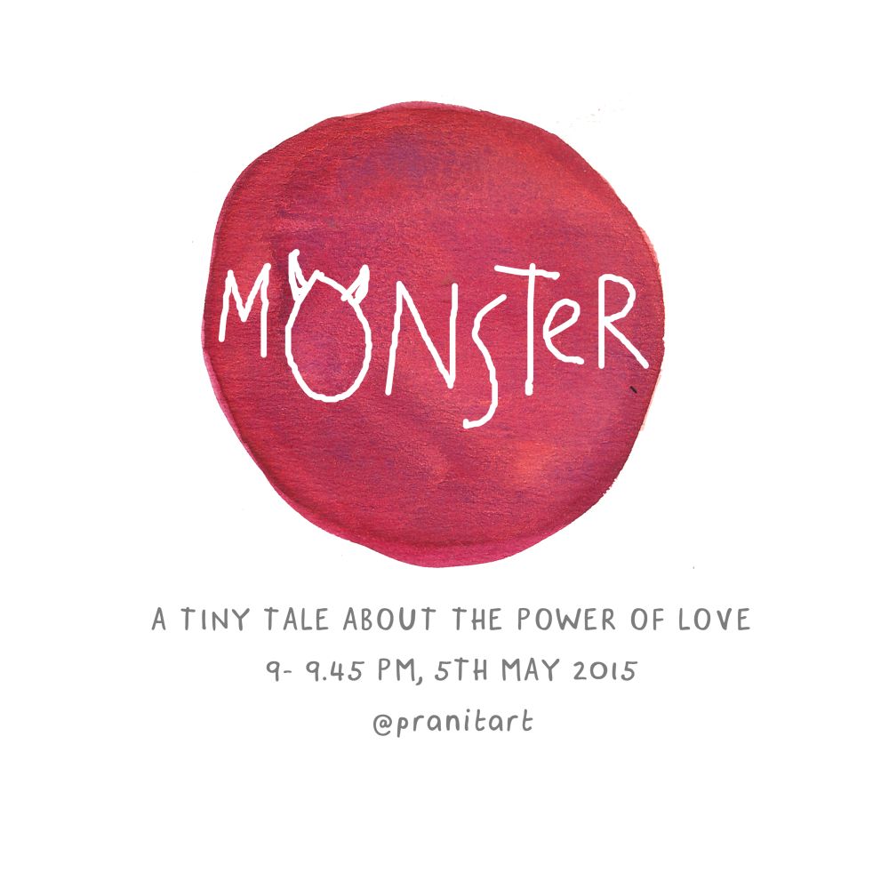
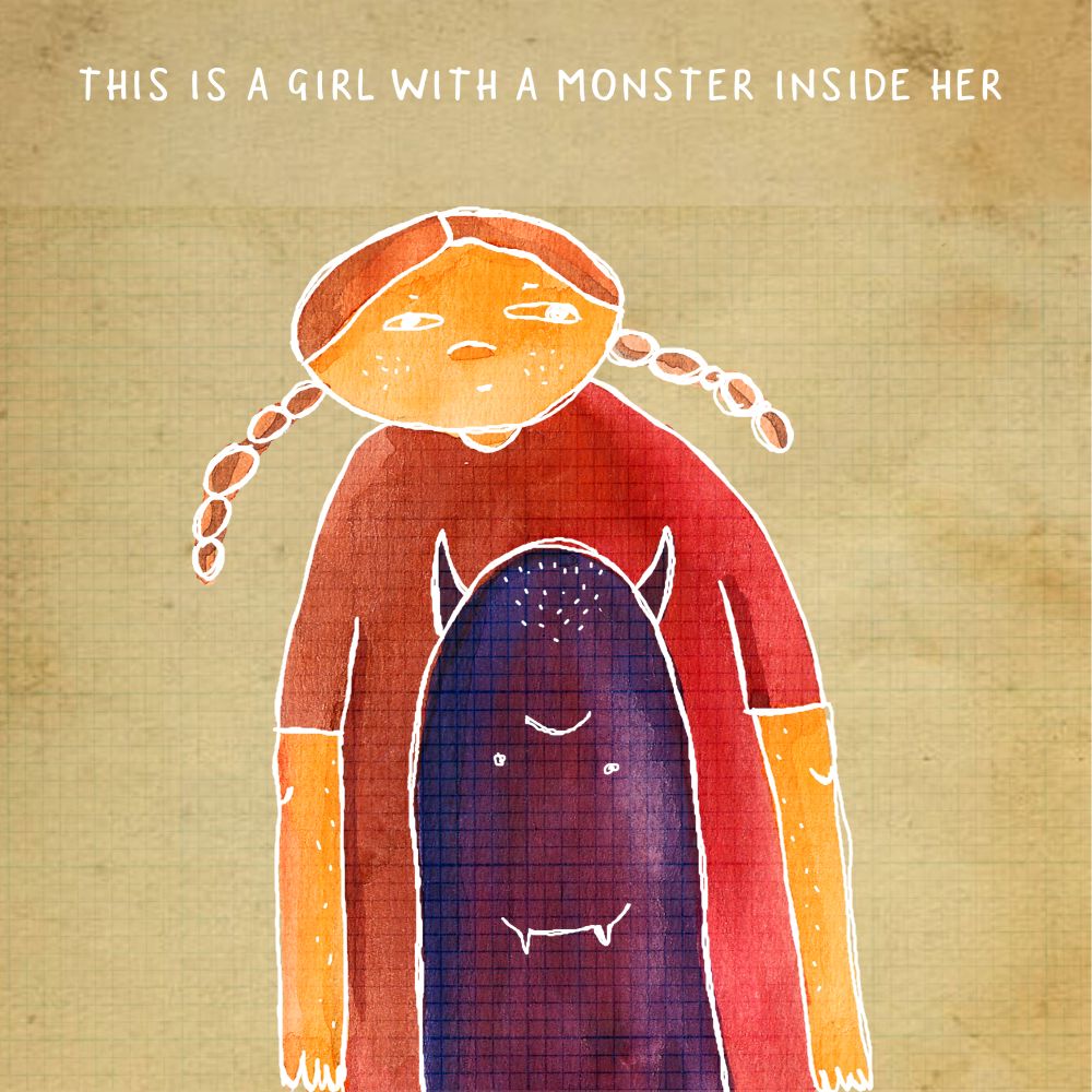
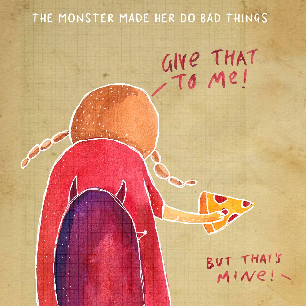
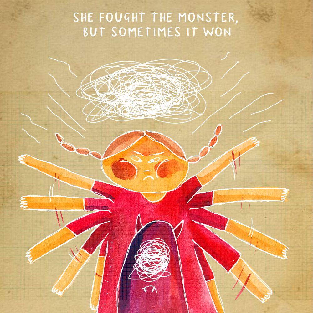
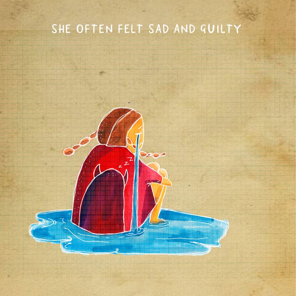
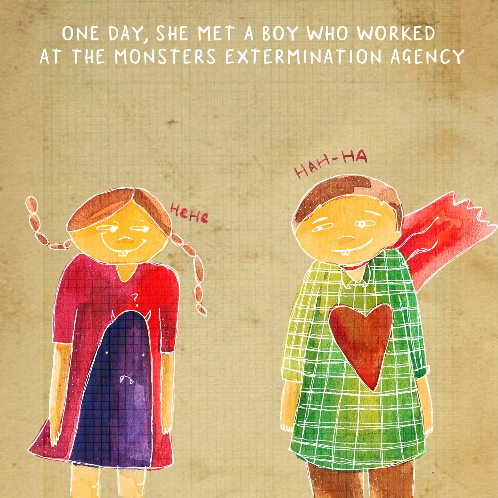
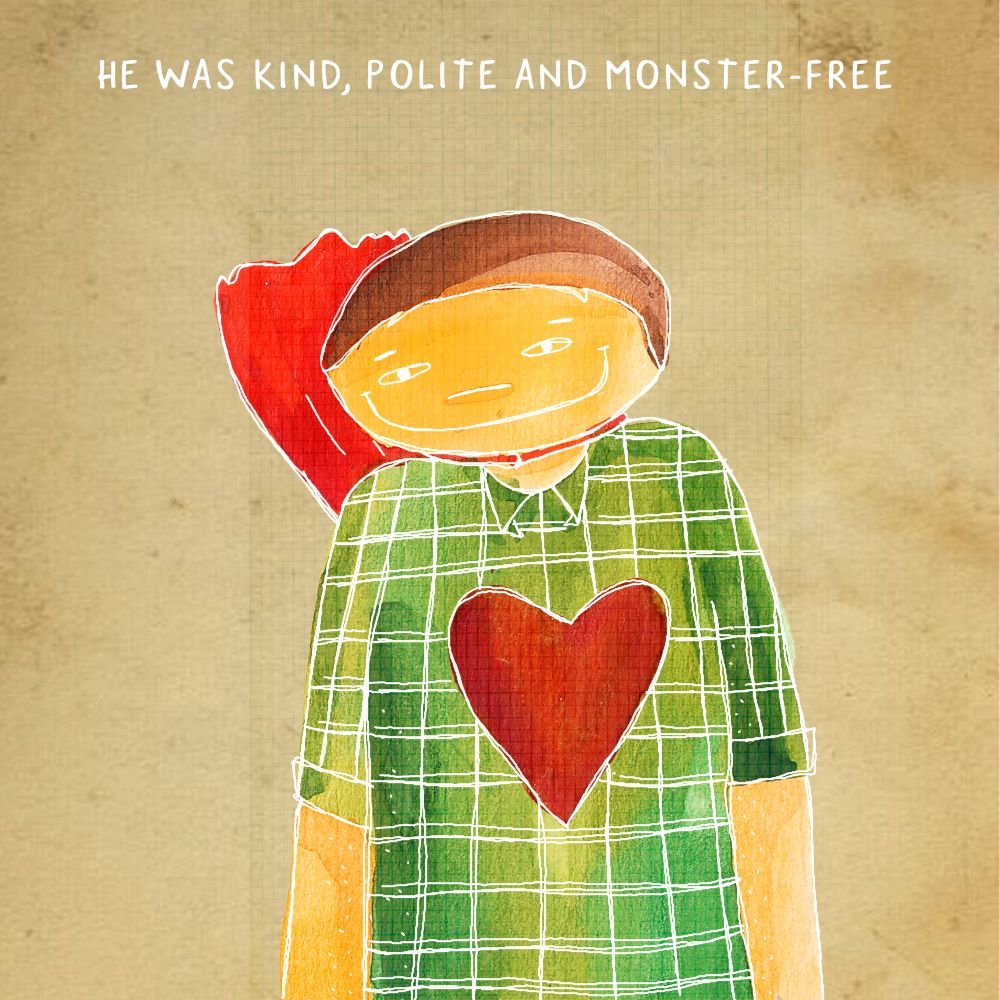
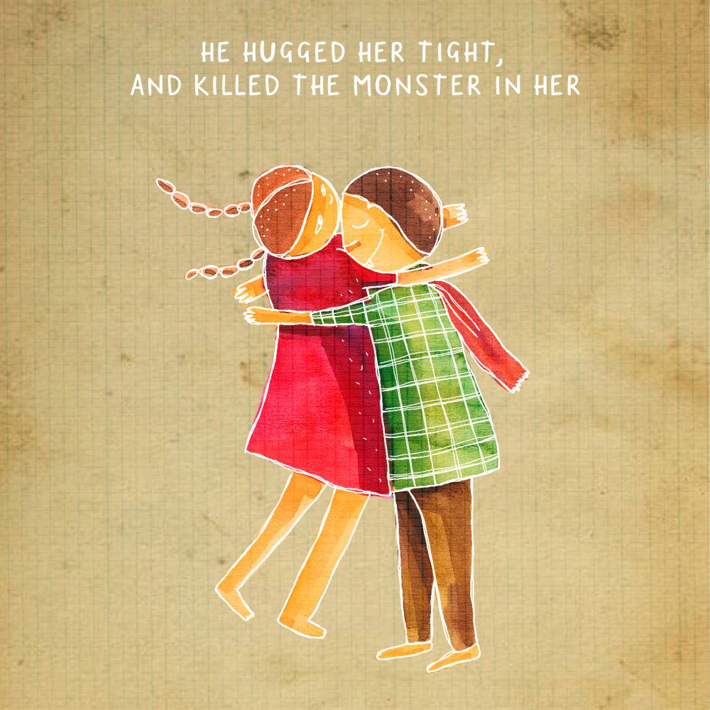
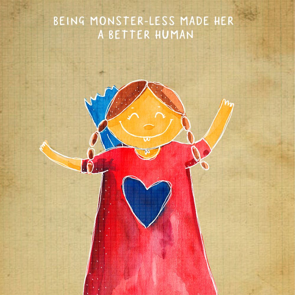
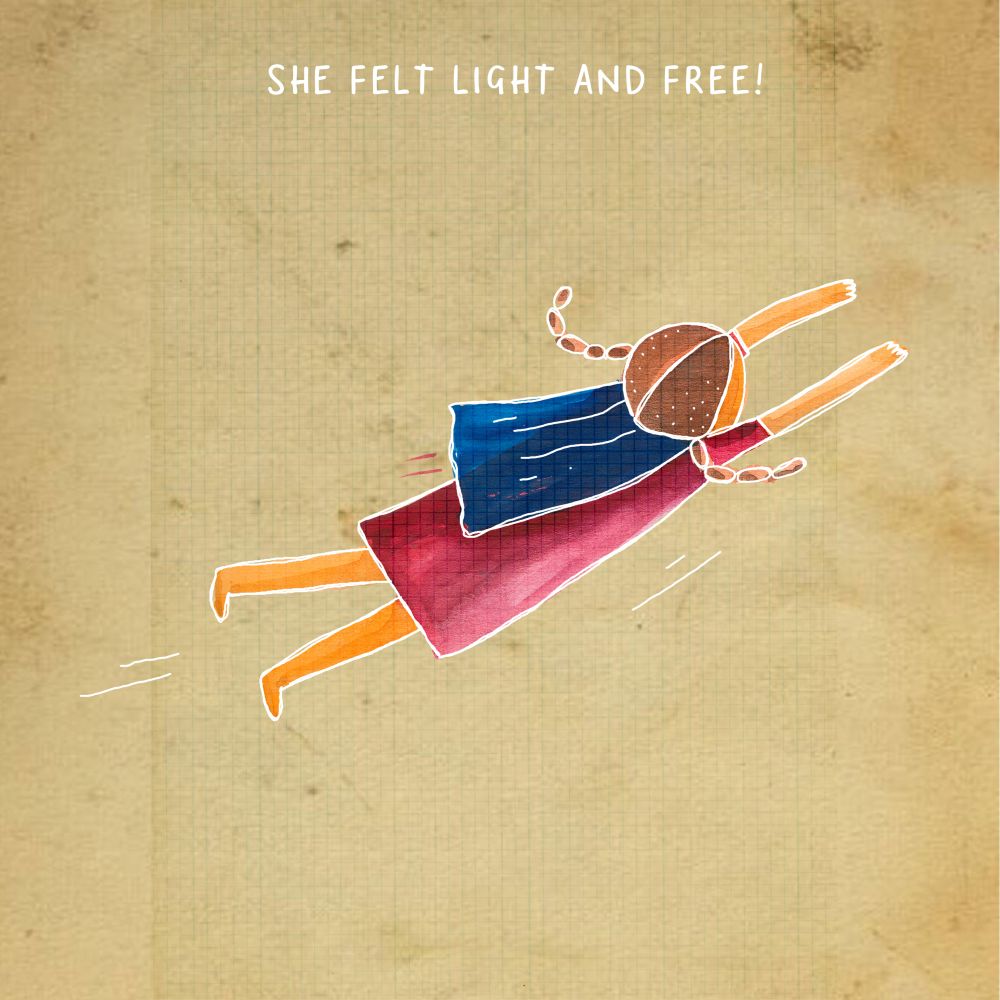
MONSTER is the second short children’s story that was exhibited over the period of 45mins on instagram (@pranitart).
The idea of the instagram-exhibition was to involve the audience in the story of a girl who had a monster in her.
We often attract vices easily and grow a monster in us. One must kill the monster, before it kills us. This story talks about the power of love, and how it heals everything.
Poster

As seen on Instagram
—-
A Touch Of Happiness
Siddhartha and I decided to spread happiness through this little character, bringing hope in each beautifully captured frame.
This project was featured in Highterate

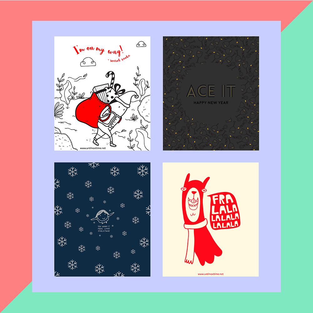
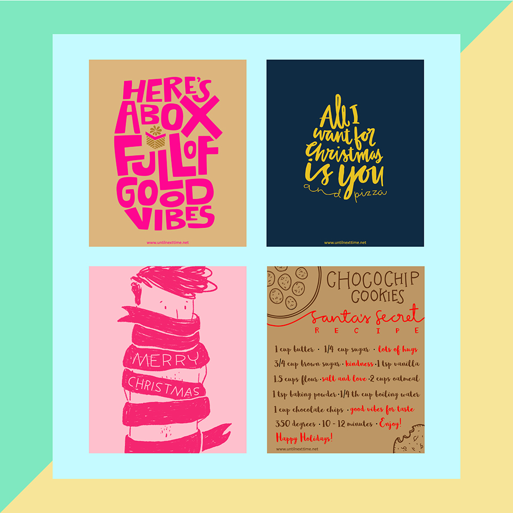
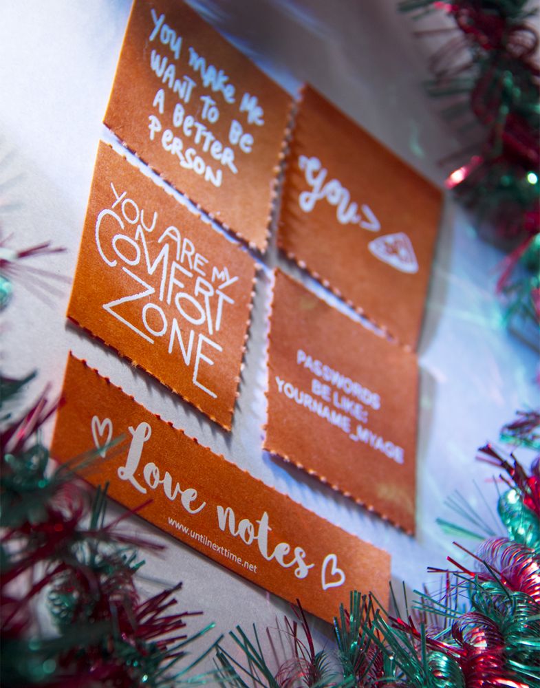
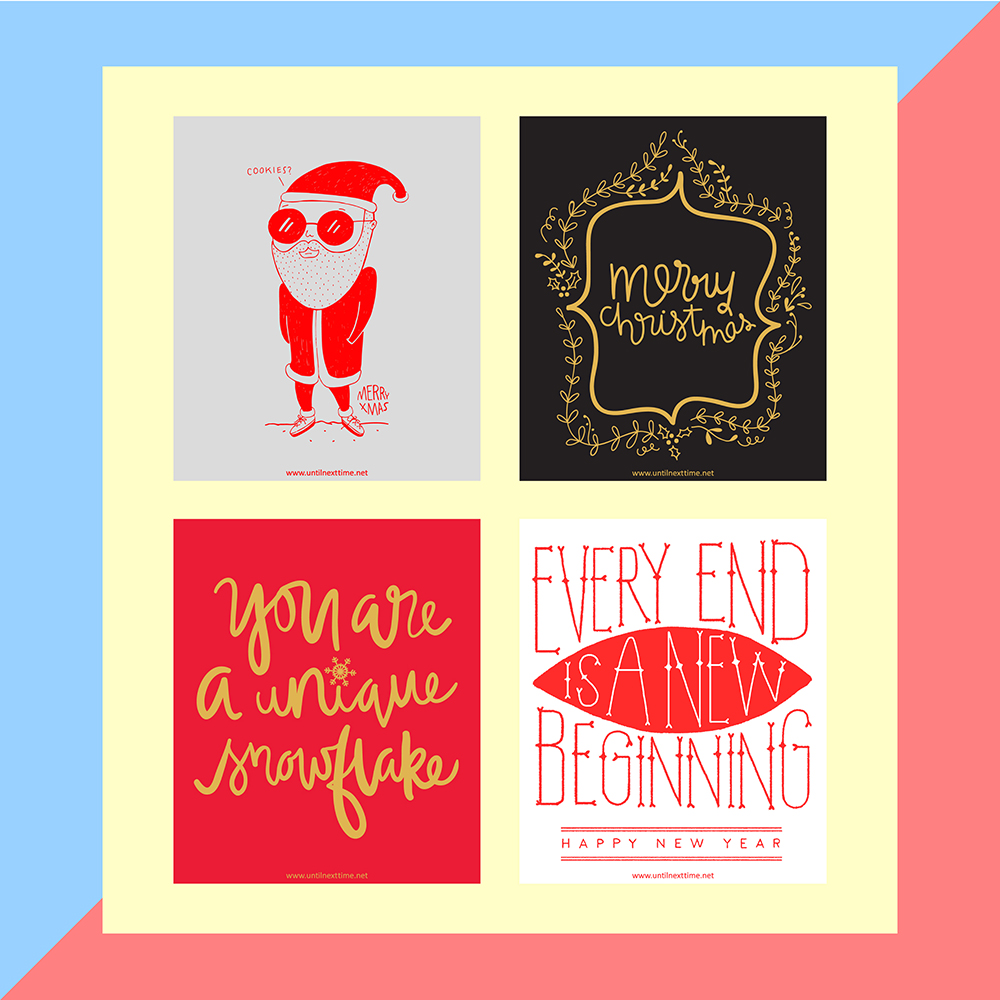
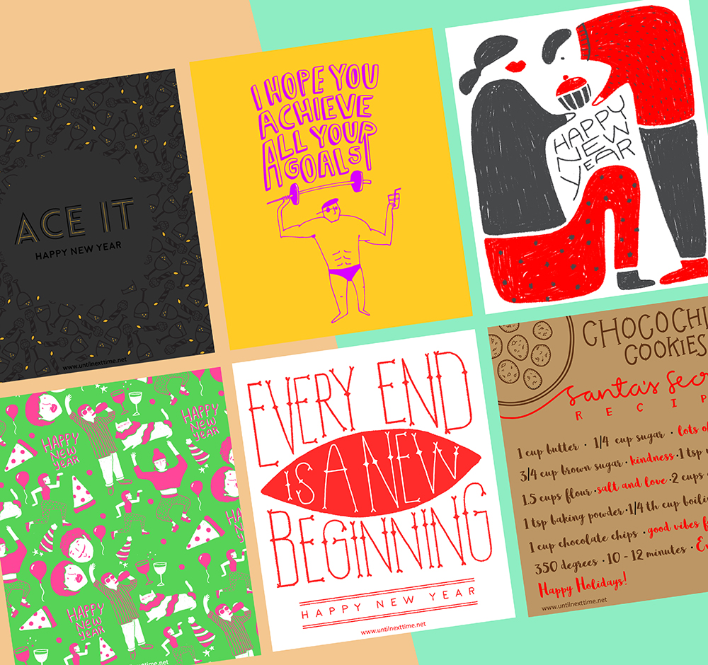
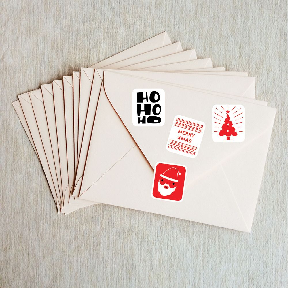
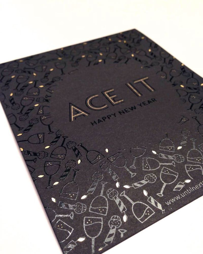
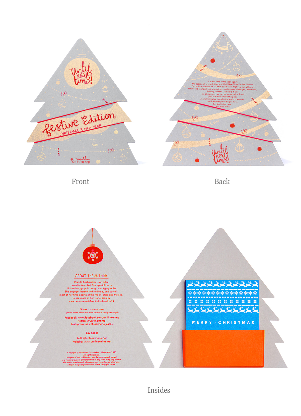
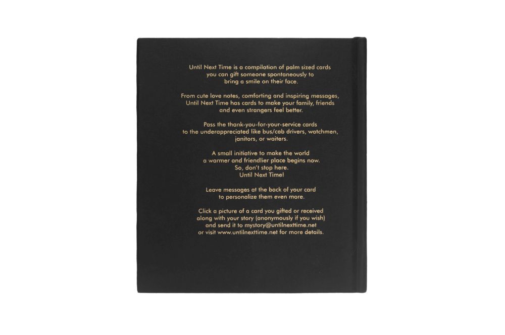
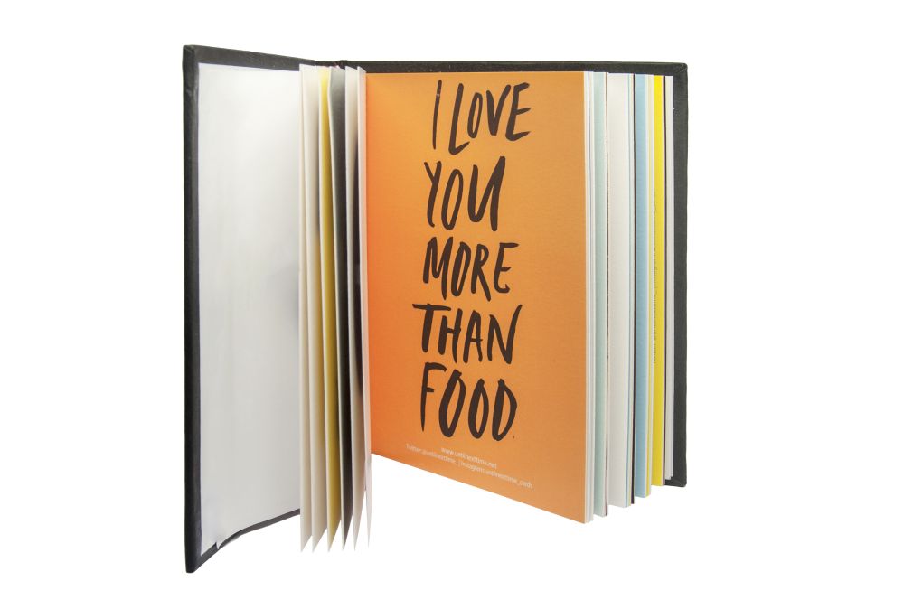
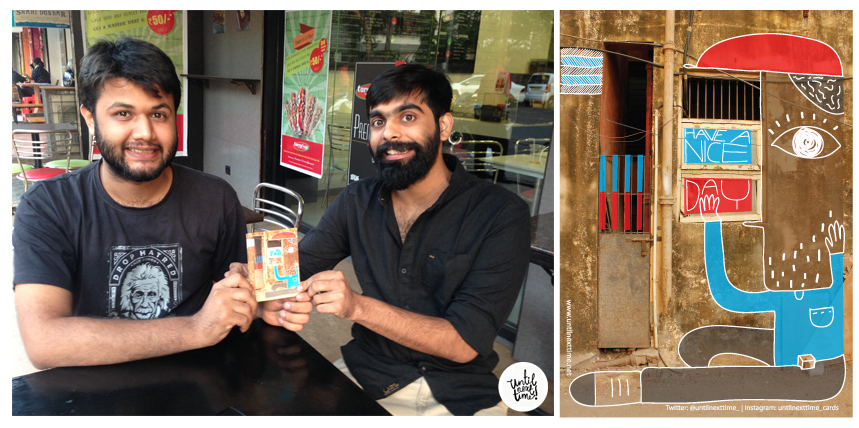
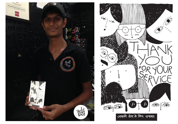
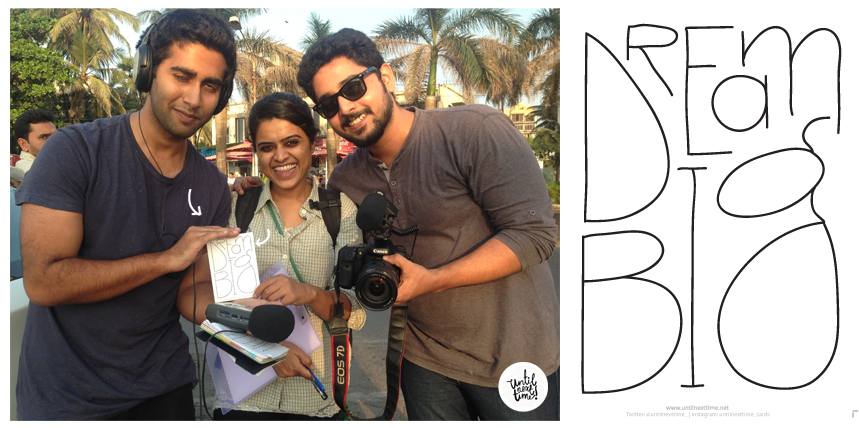
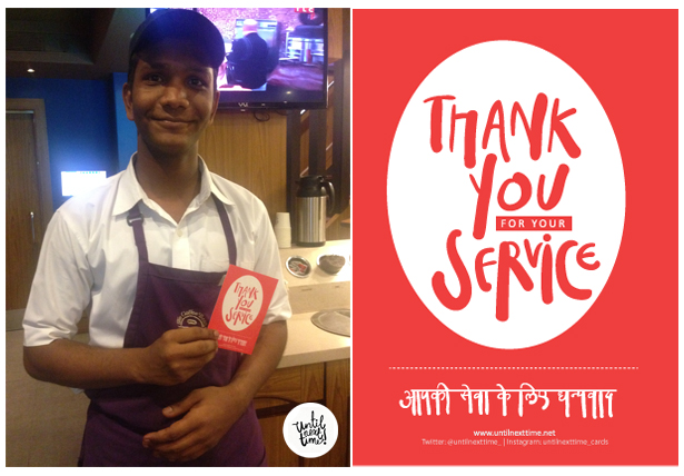
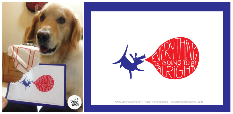
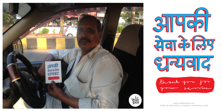
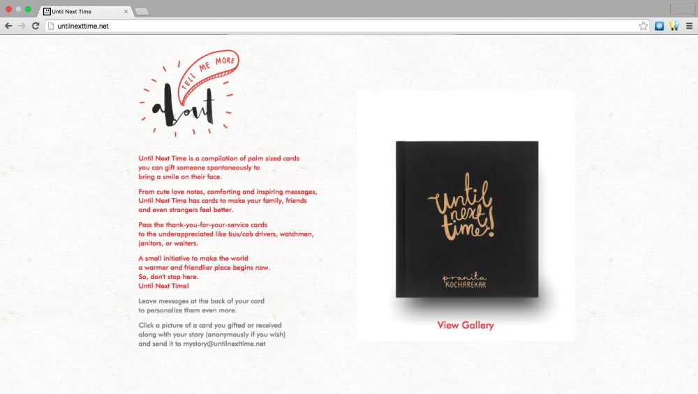
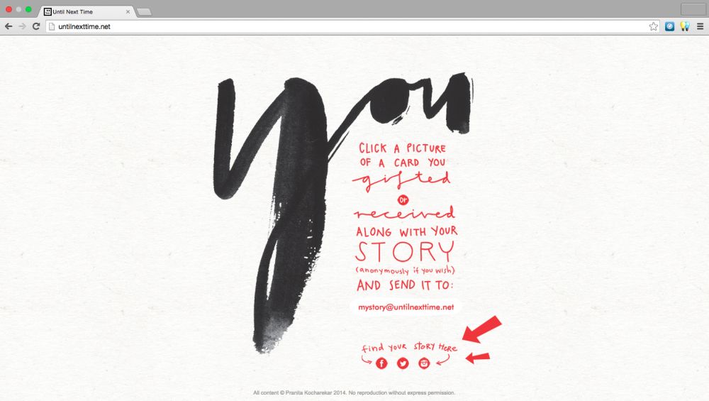
Until Next Time is a compilation of cards designed by me to help spread a smile. This is the second edition – the festive edition. This edition has palm sized Christmas and New Year cards with a unqiue Christmas tree packaging.
Every card was manually screen printed with gold, silver, and fluorescent inks.
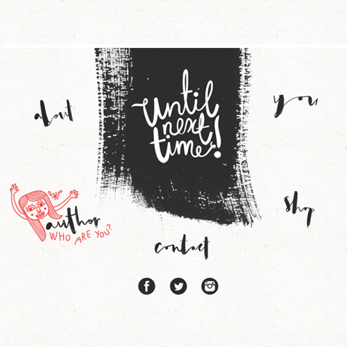
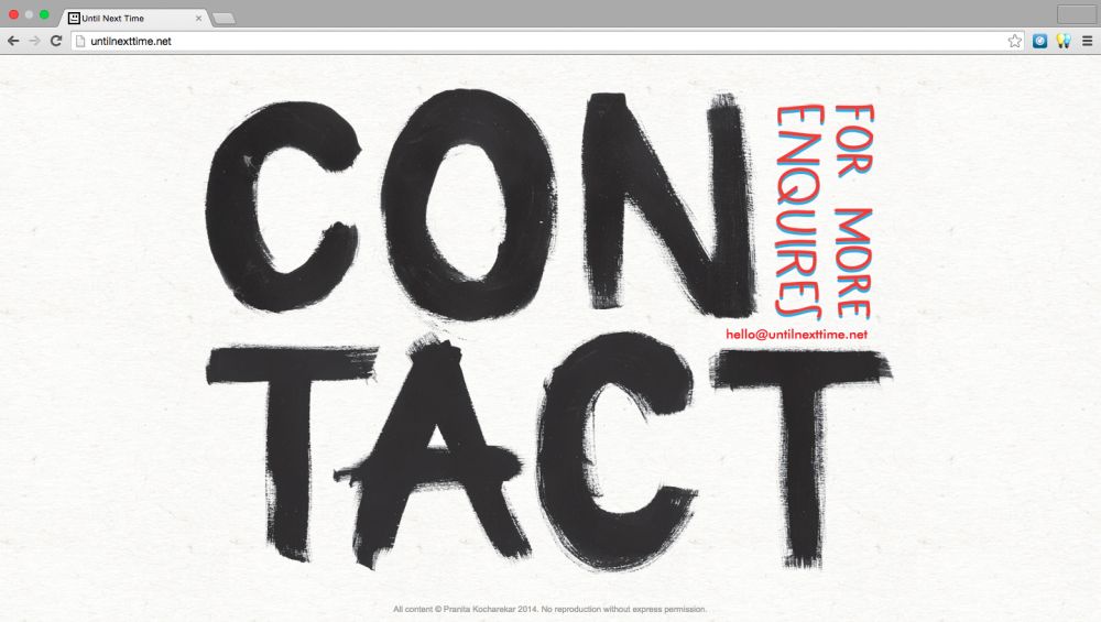
Website: www.untilnexttime.net
Instagram: @untilnexttime_cards
Twitter: @untilnexttime_
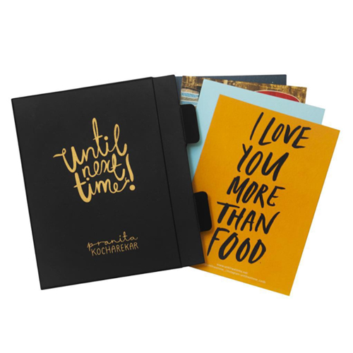
The book is now available on Amazon
Website: www.untilnexttime.net

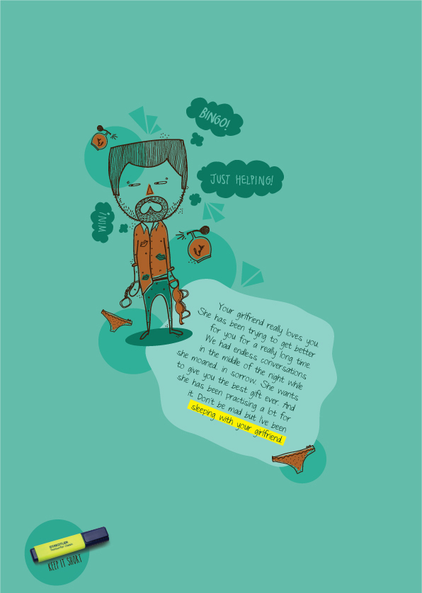
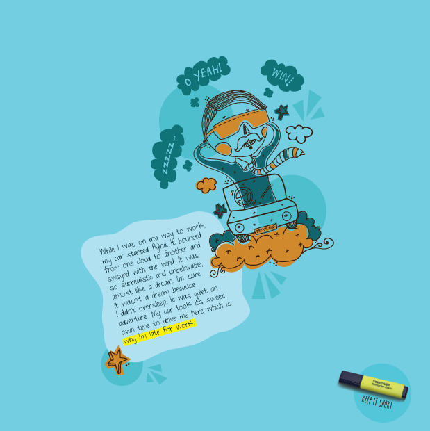
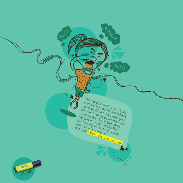
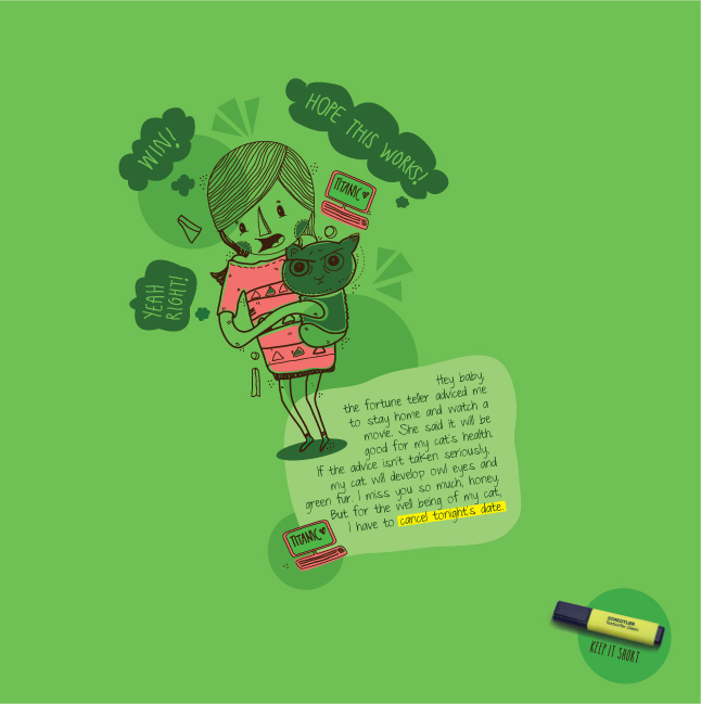
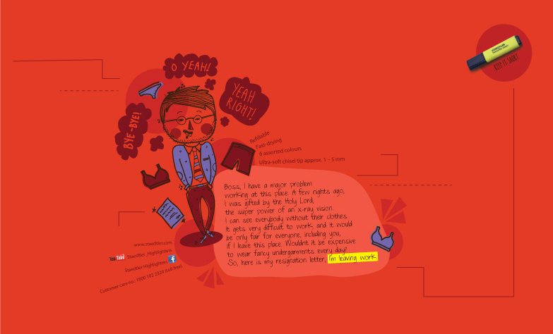
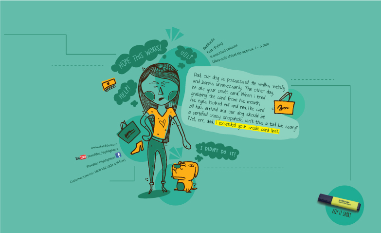
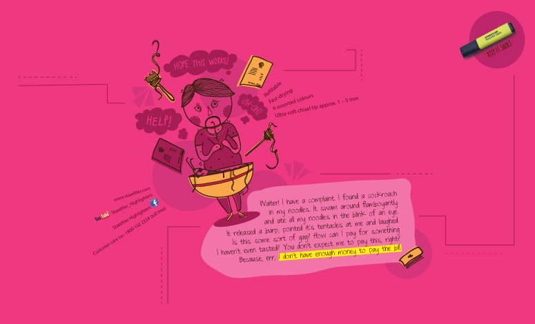
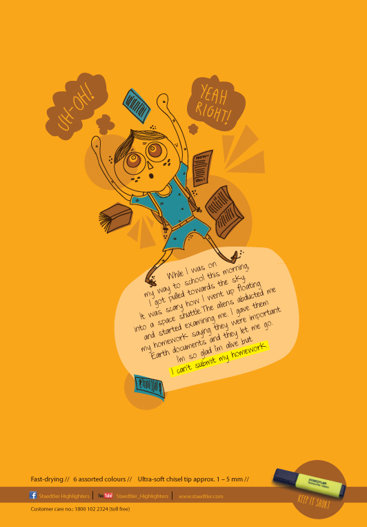
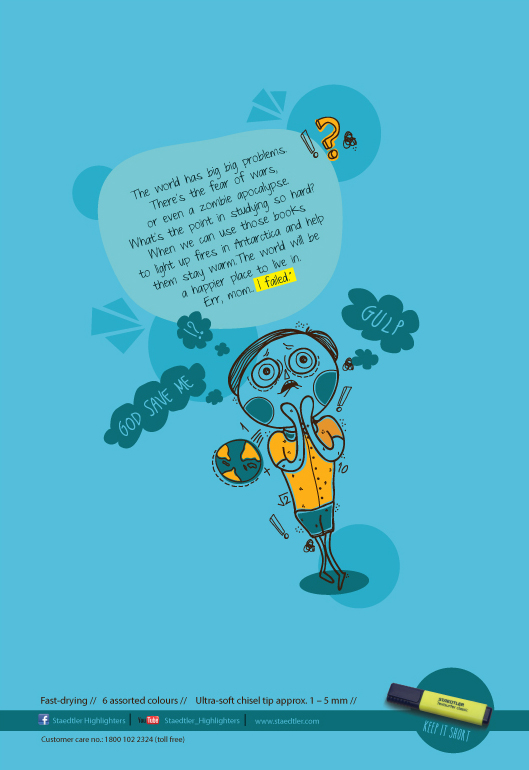
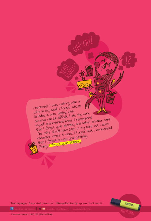
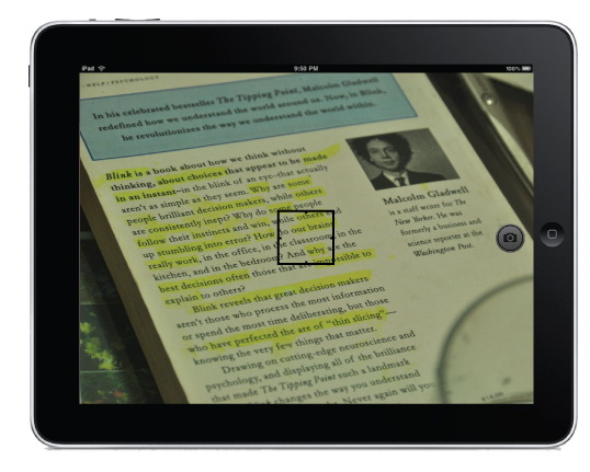
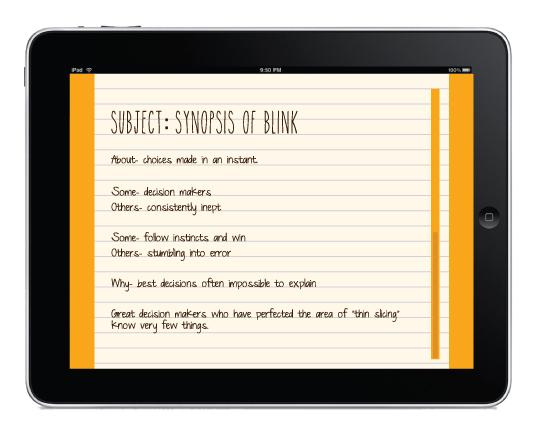
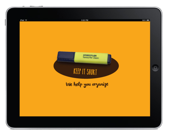
Highlighters are used to highlight information we need to remember/ know. They help us skip the unwanted, leaving the important information highlighted. This is a humourous campaign reminding their consumers and potential target audience of their existence.
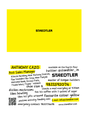
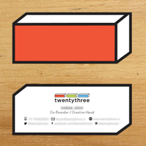
Business Card
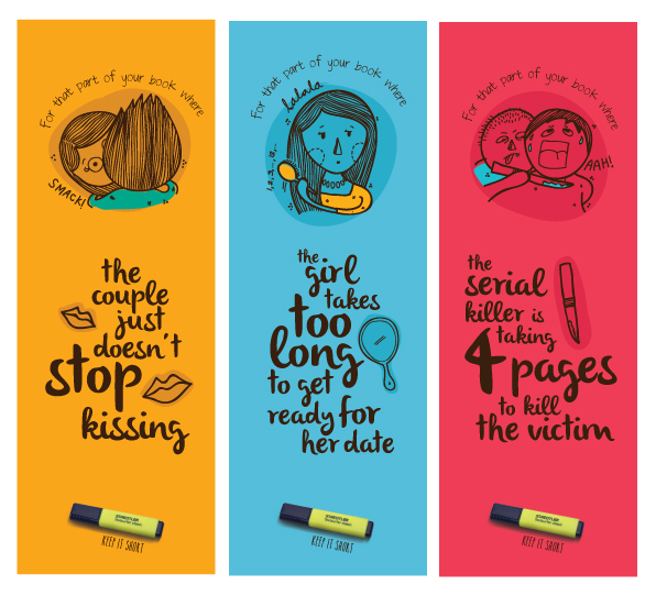 Bookmarks
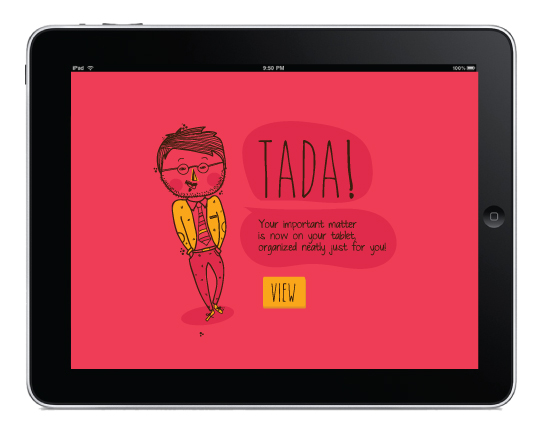
App Design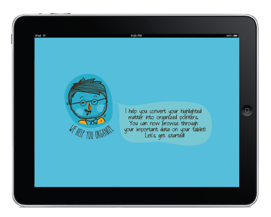

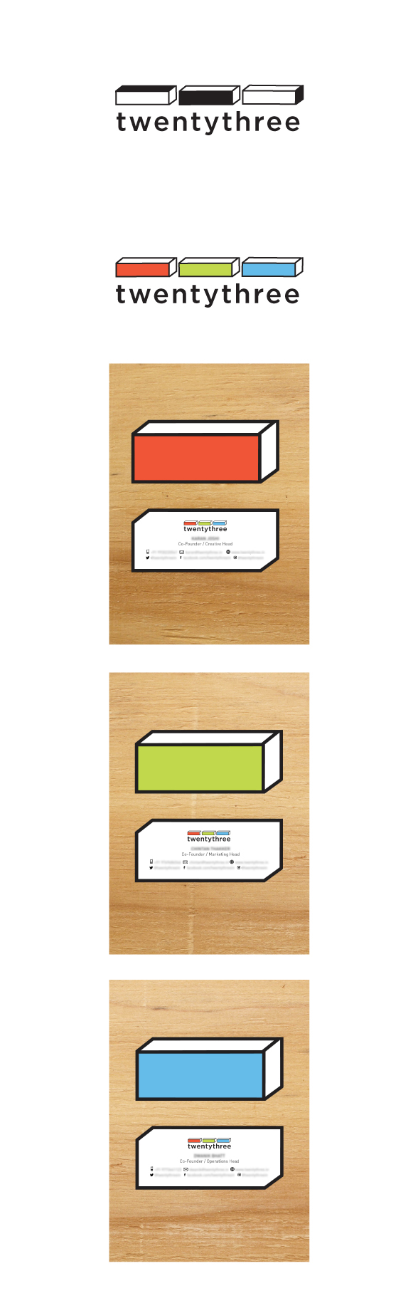
Self Branding
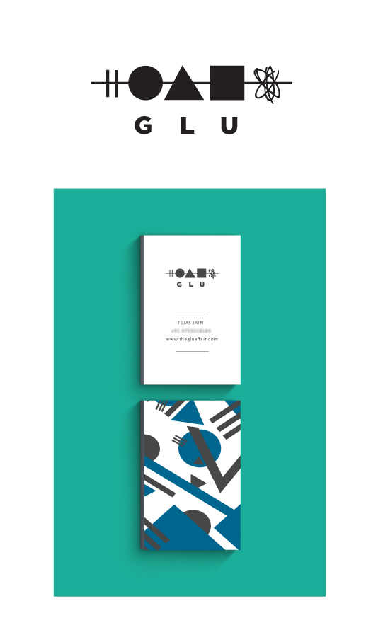
E-commer Luxury Clothing


Band that plays disco music using acoustic instruments
Pop up shops events company
E-commerce luxury clothing

E-commerce clothing
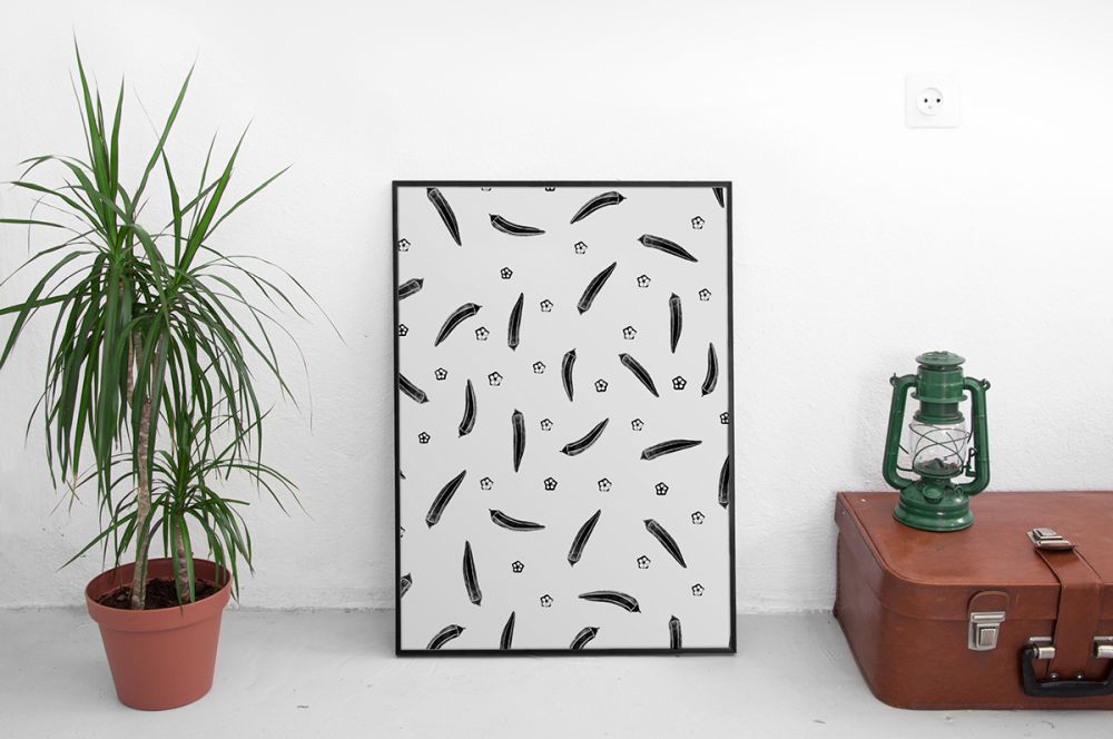
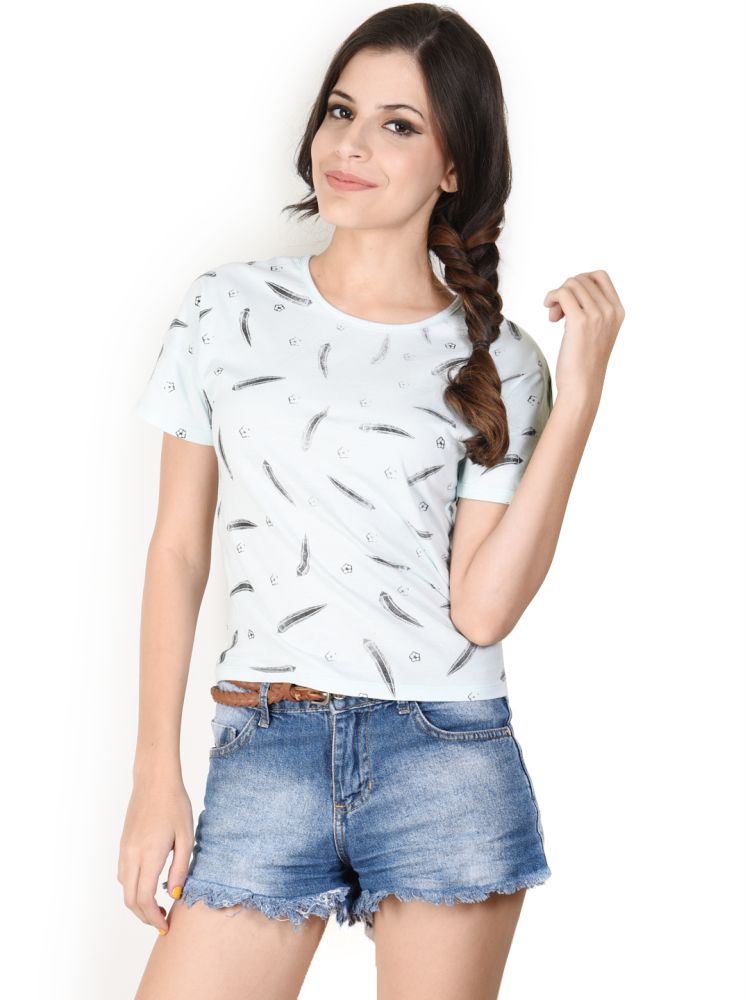
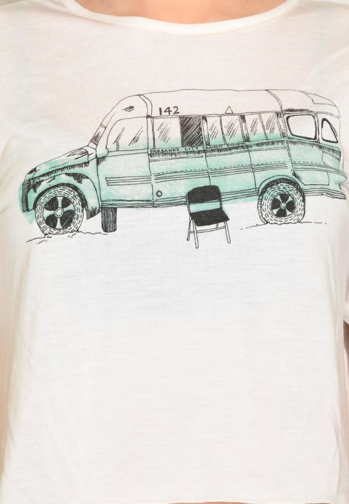
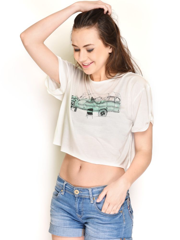
Shoes brand
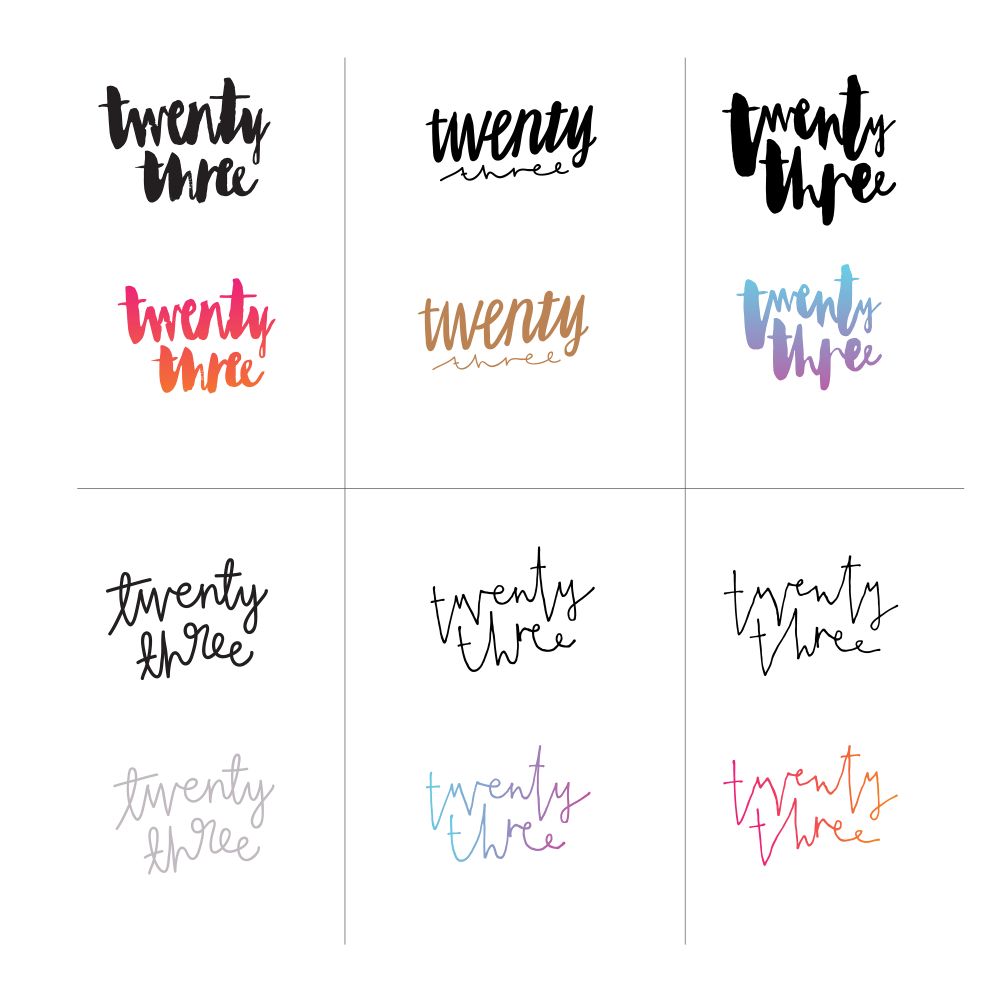
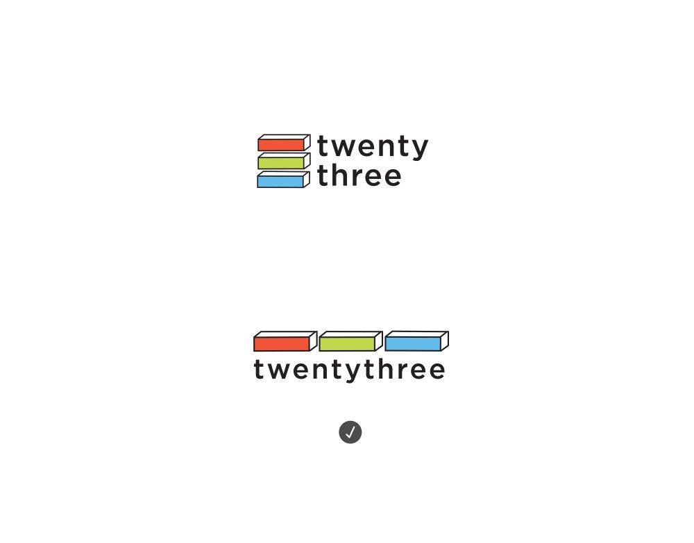
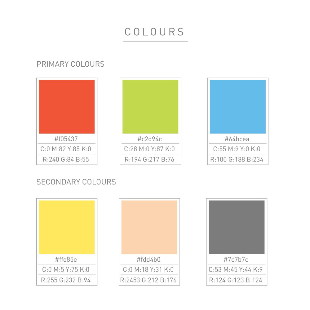
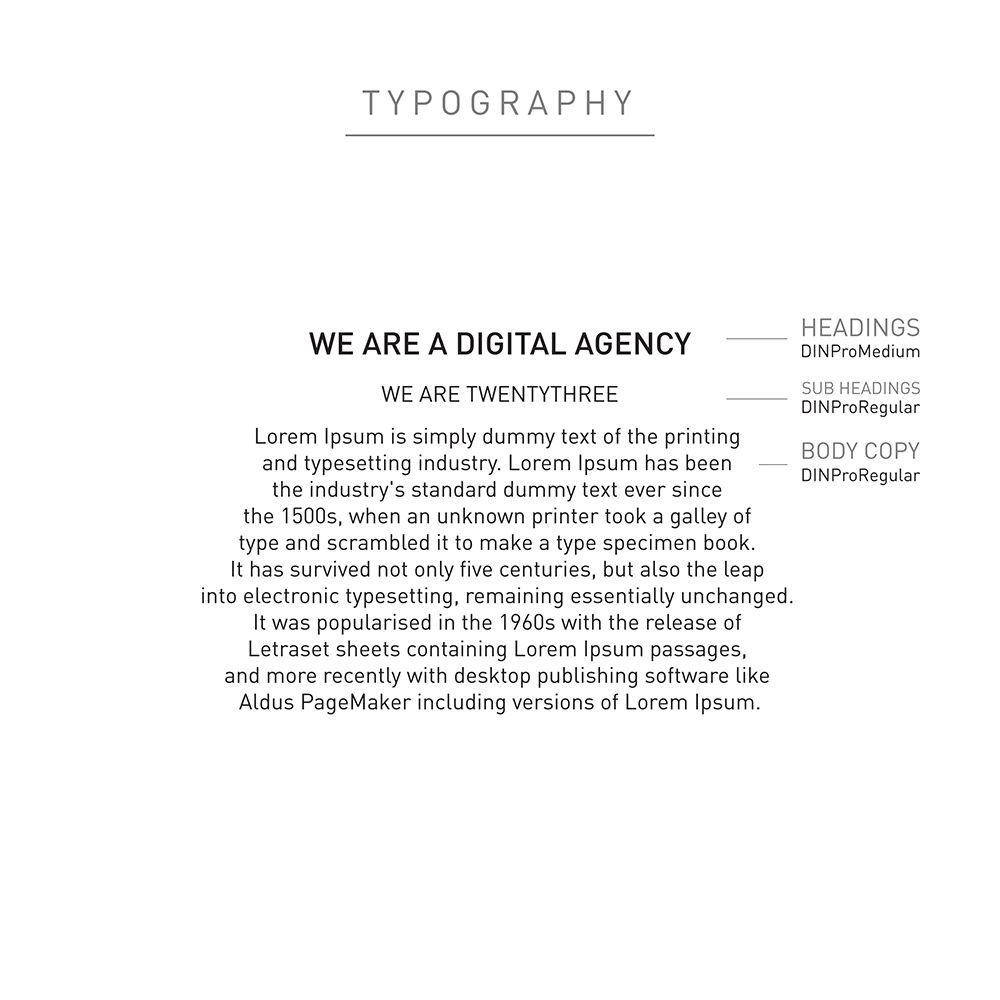
Digital agency
Food – Dessert
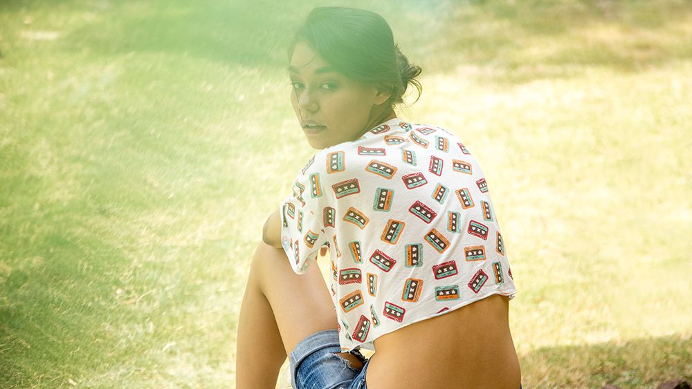
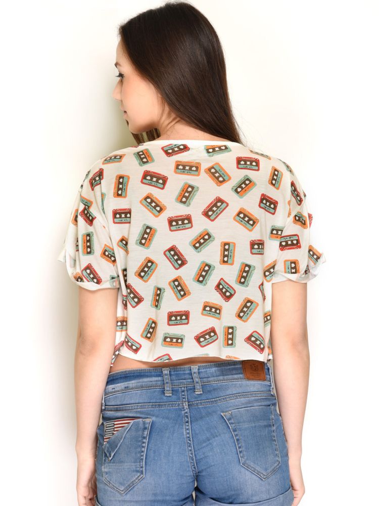
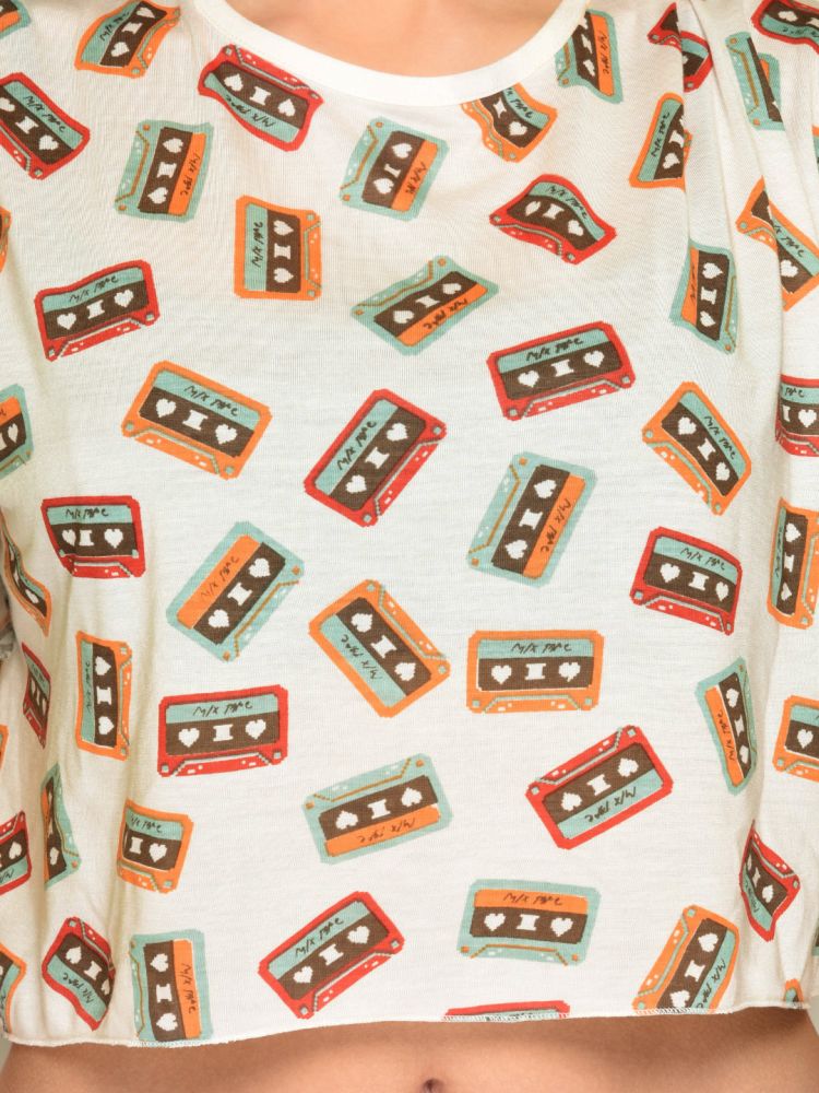
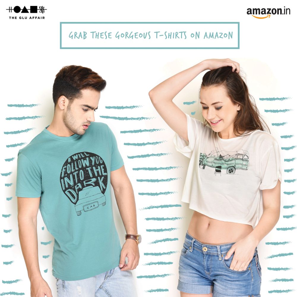
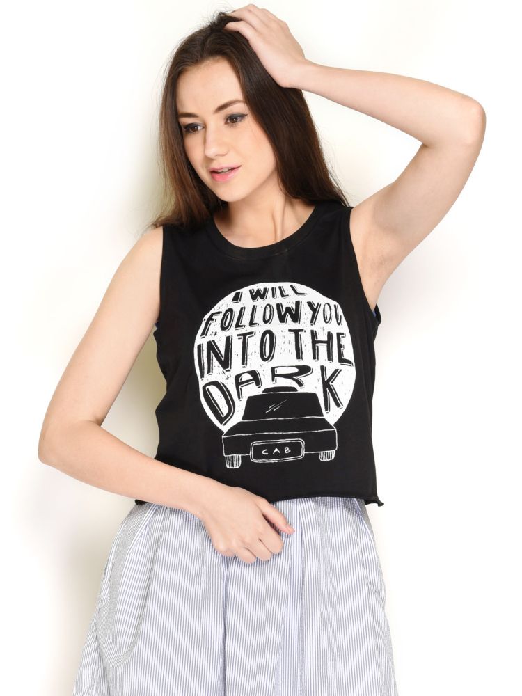
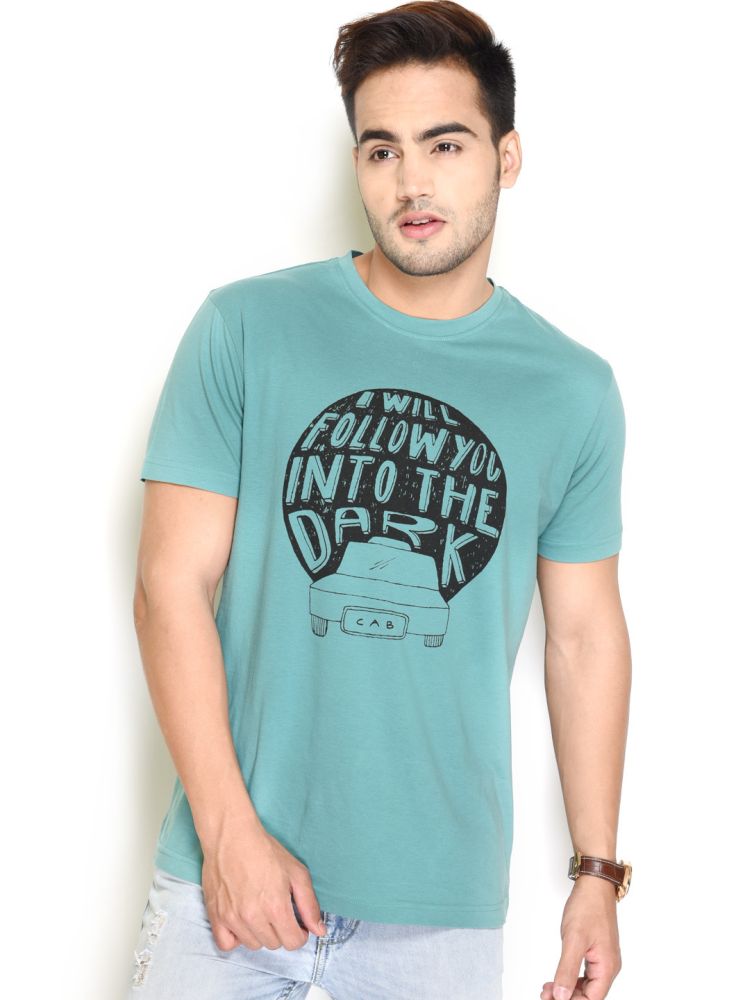
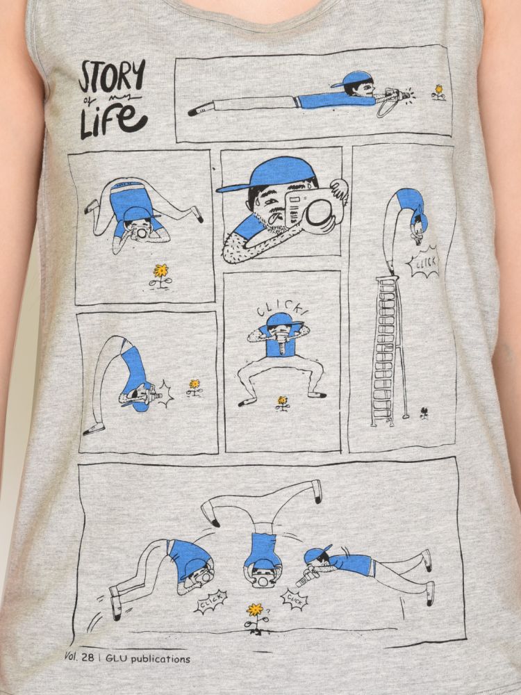
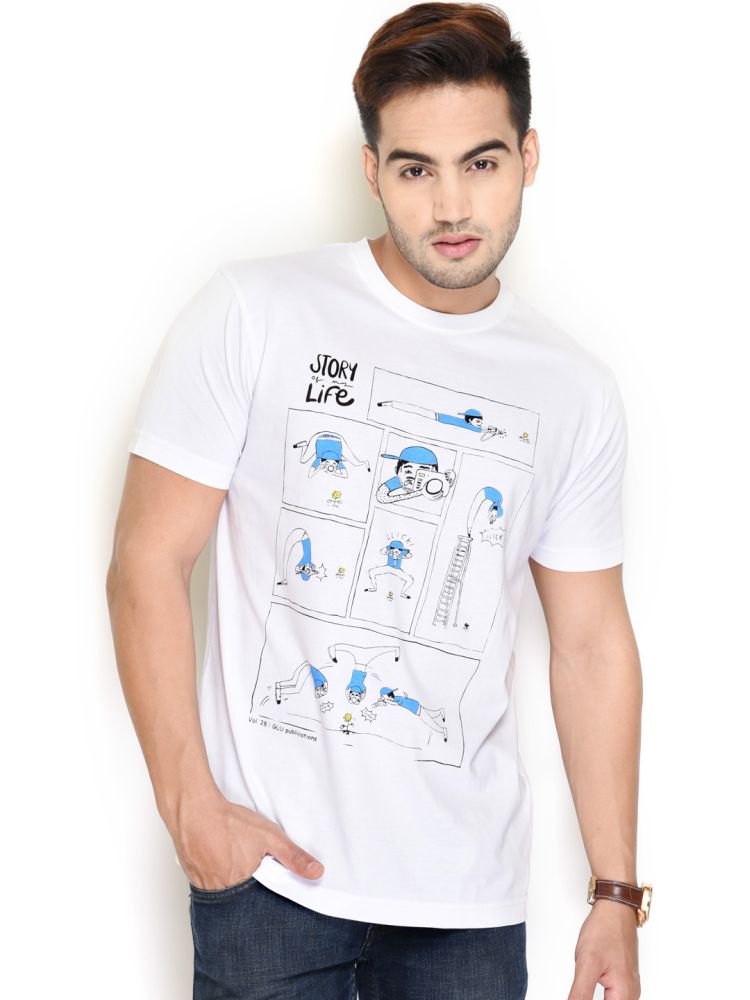
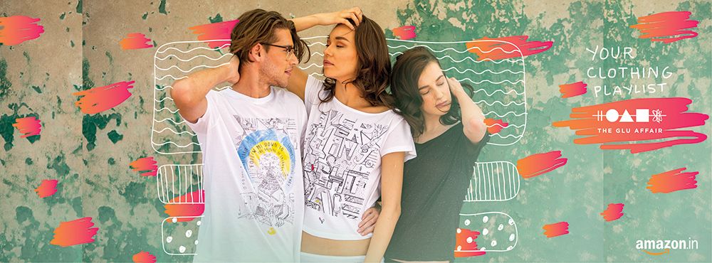
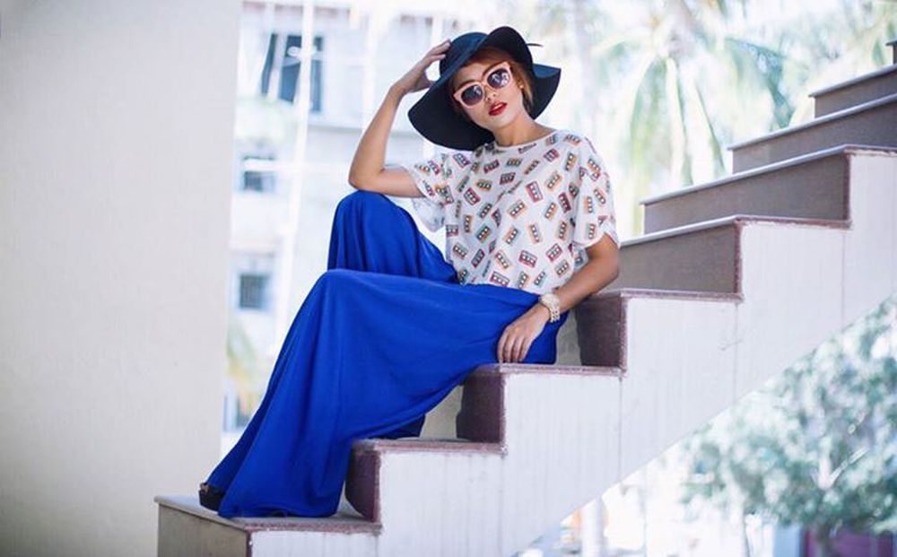
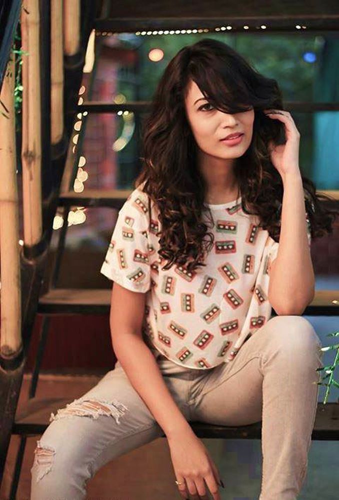
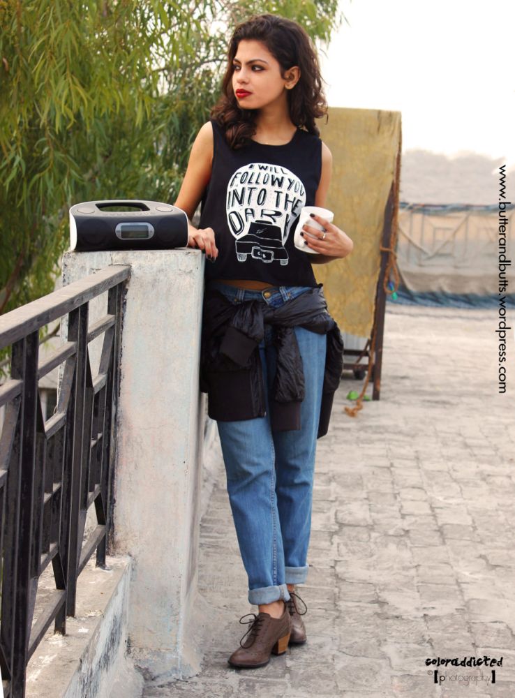
THE GLU AFFAIR is a clothing brand based in India. I’ve been working closely with the brand since a couple years. They’ve released collections inspired by music, art & food. Besides creating their branding, I’ve worked on varaious prints and clothing styles, and also been their artist manager for the first couple collections. We’ve collaborated with artists from all over the globe, like Tyler Spangler, Sophie Bahn, Shamika Kocharekar, Sameer Kulkani, Sanjay Ramachandran, Hikimi& so on.
You can purchase these designs here.
Follow them on Facebook, Twitter & Instagram for more!
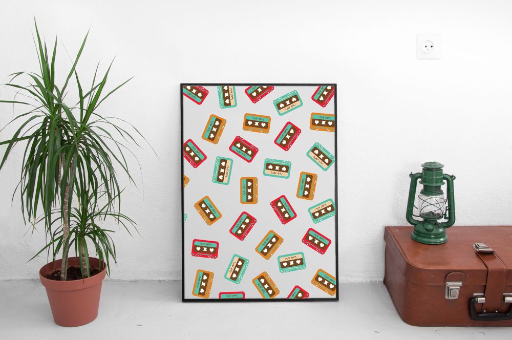

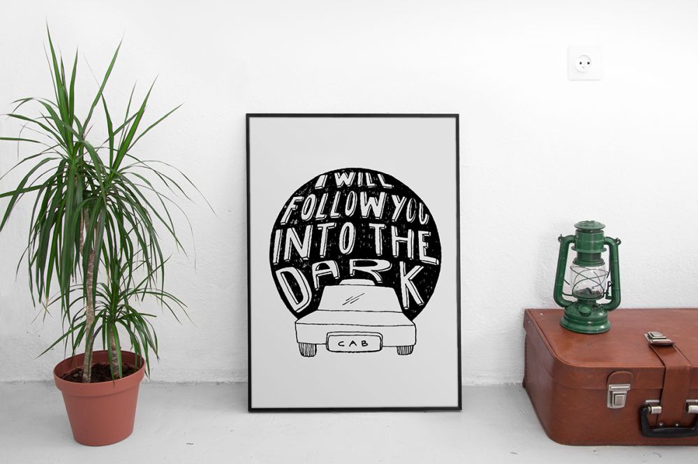
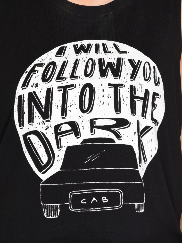
Art for social media
Style & fashion bloggers, DJs and actors donning the print

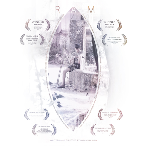
RAM, a Konkani short film about a coming of age drama of a 14 year old boy from a small village in India, desperate to lose his virginity.
Watch the trailer here
Photo editing: Abhiraj Rawale
Layout: Pranita Kocharekar

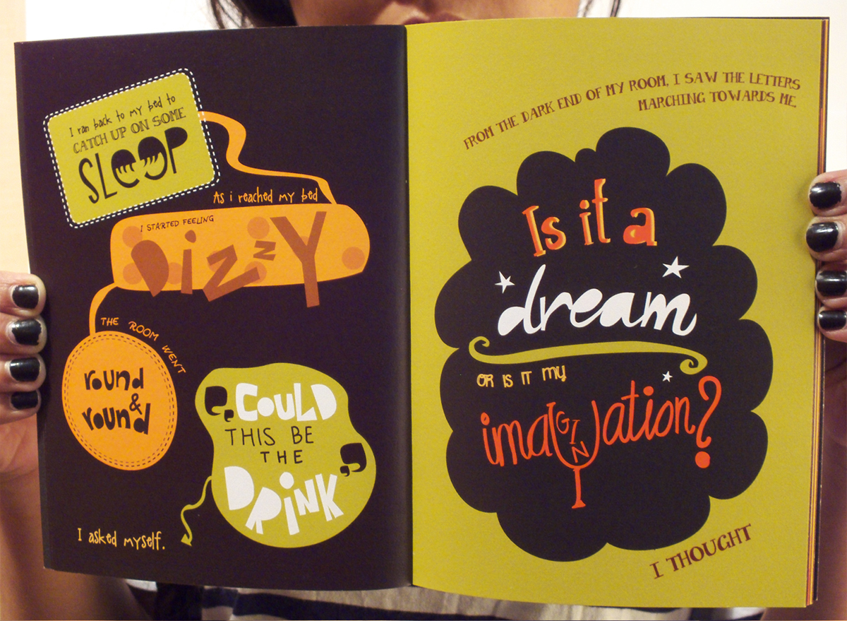
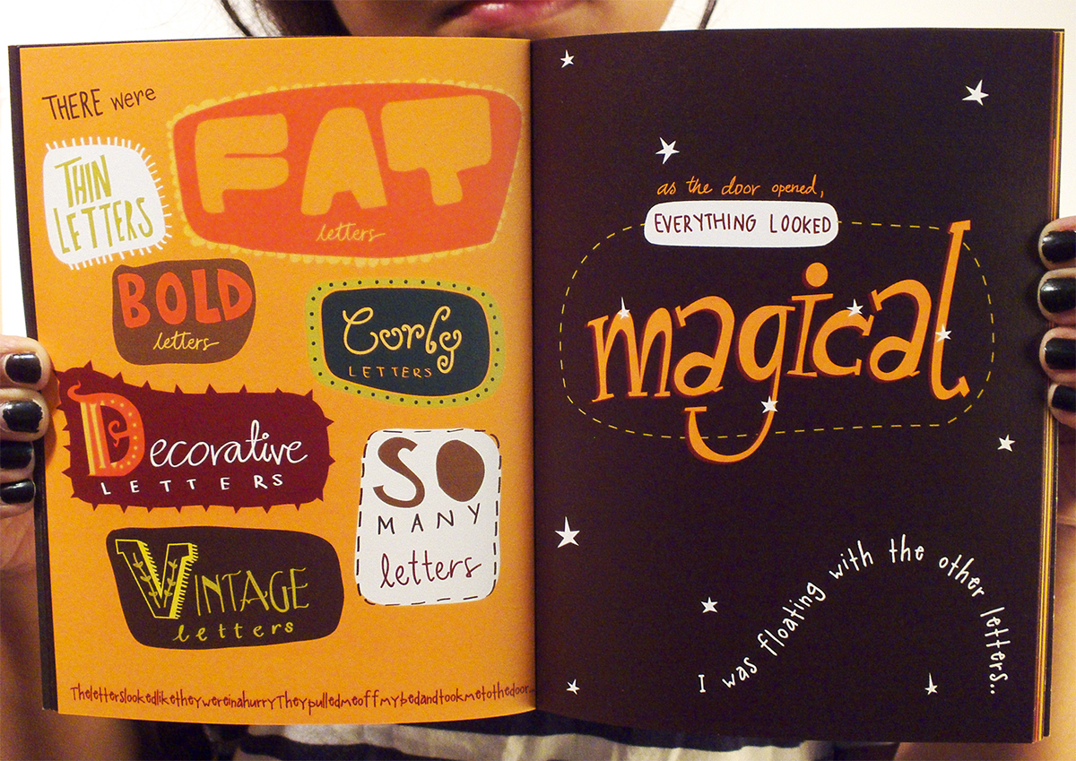
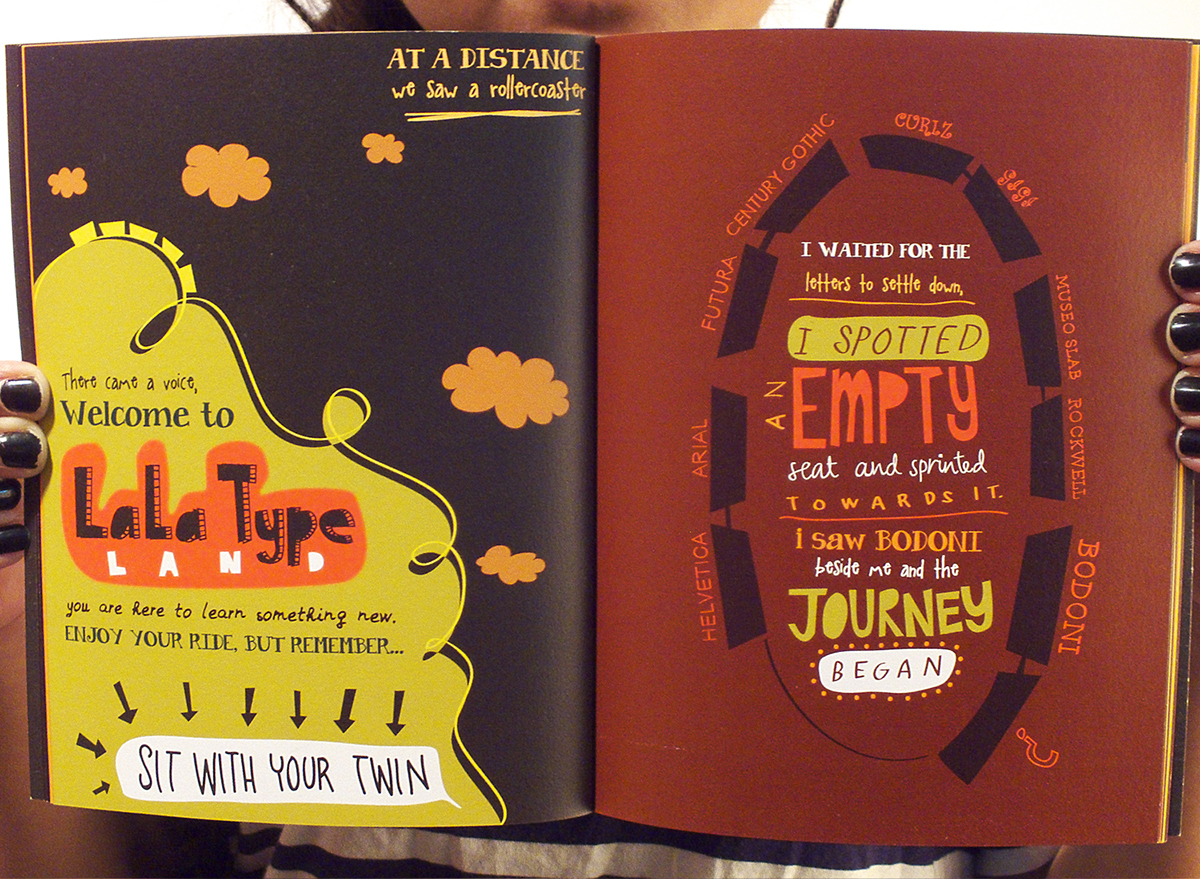
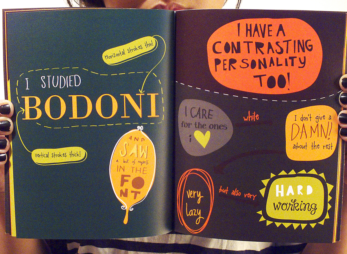
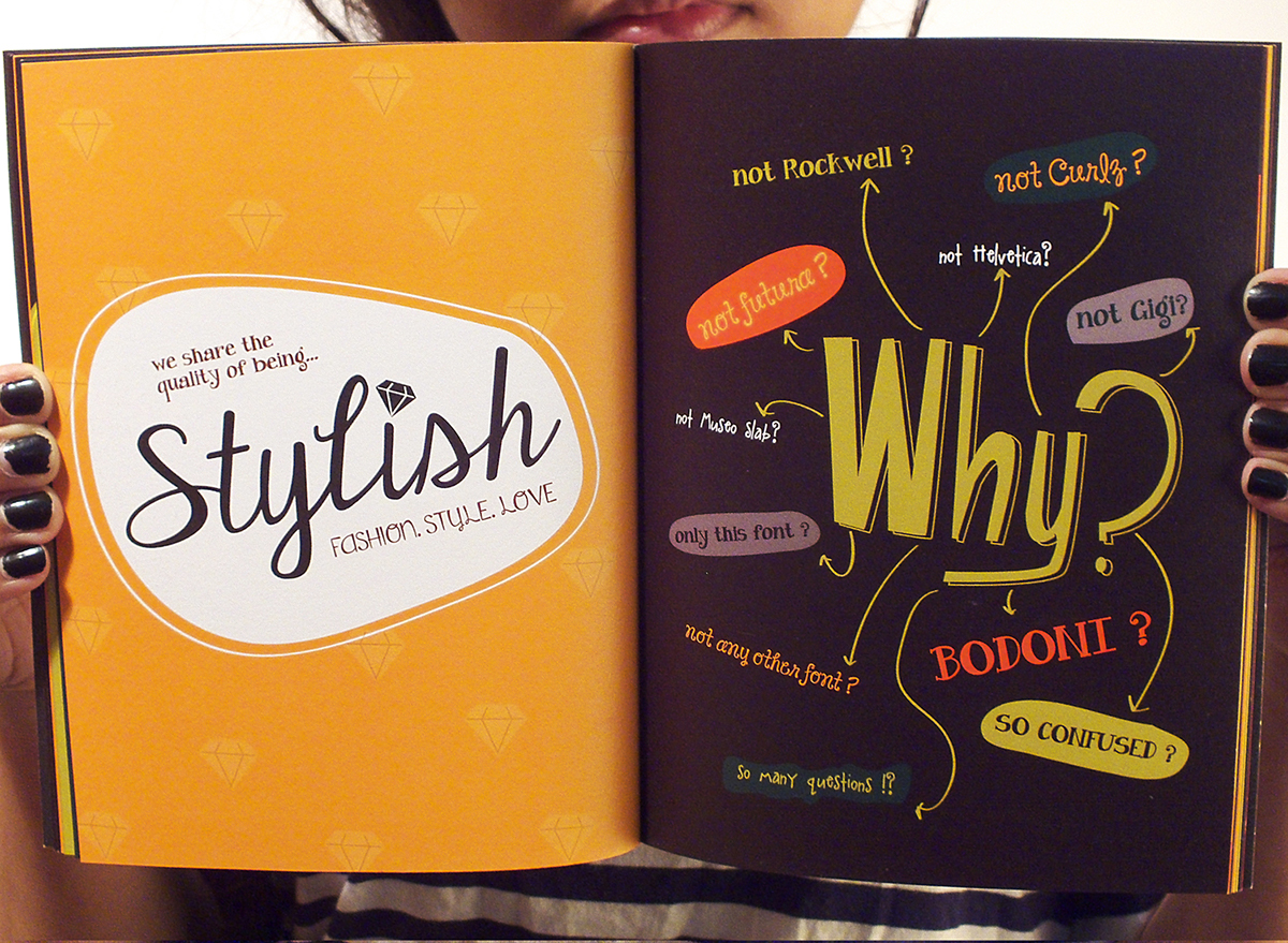

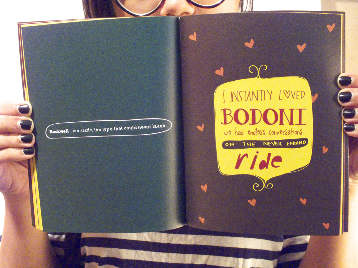
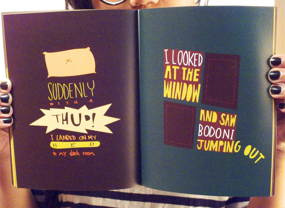
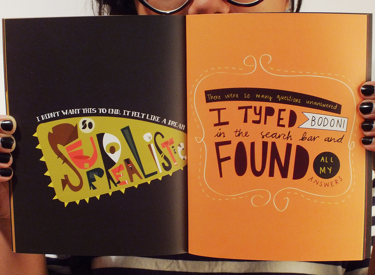
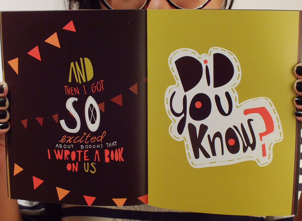
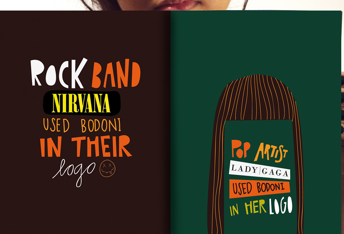
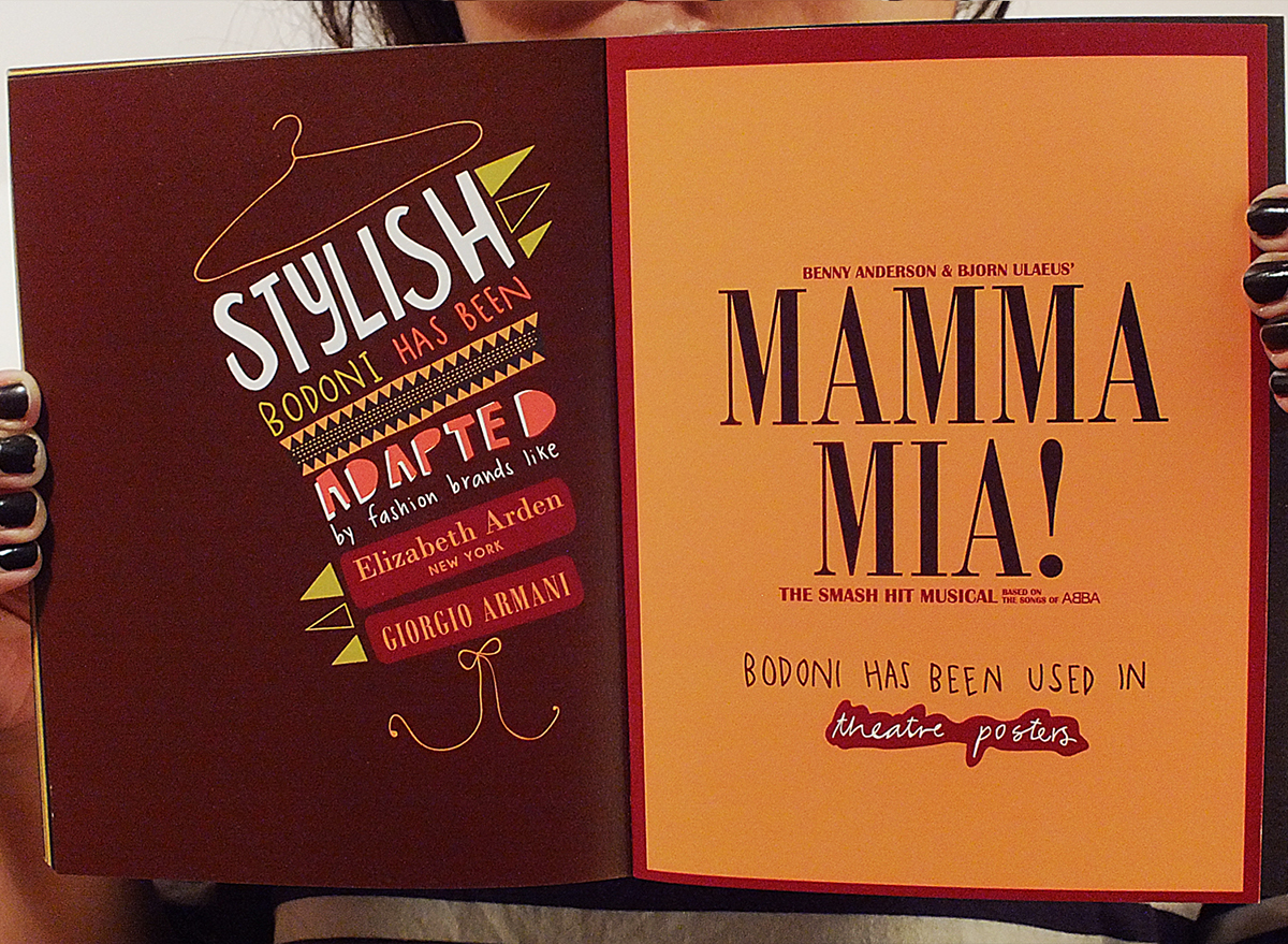
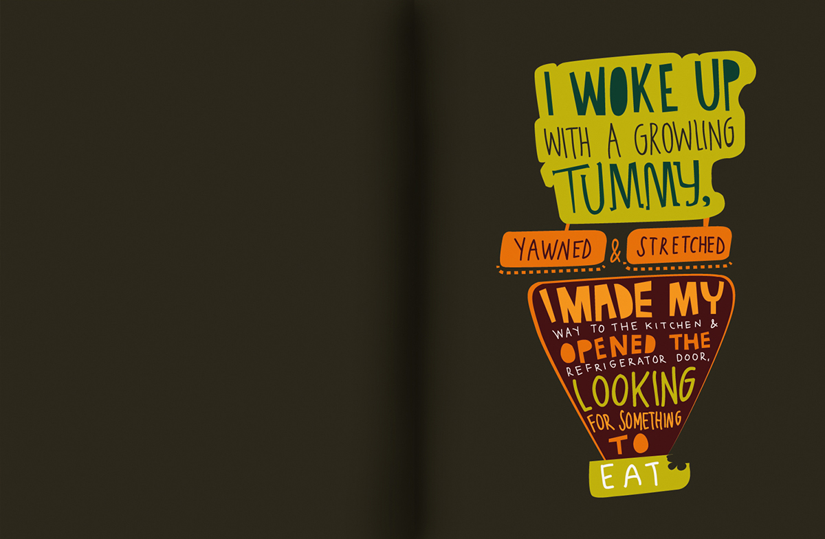
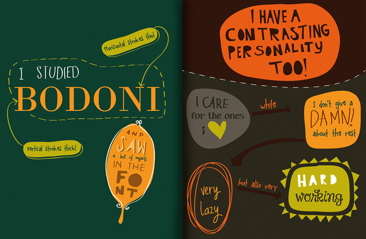
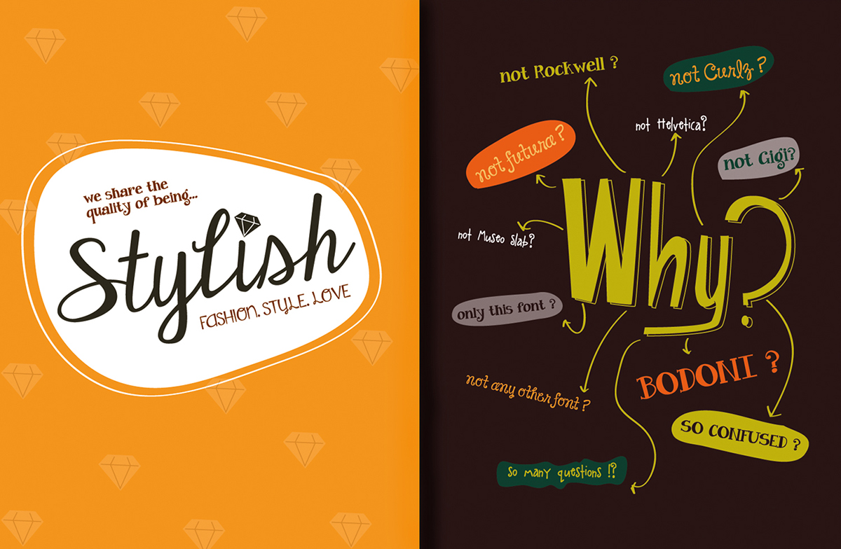
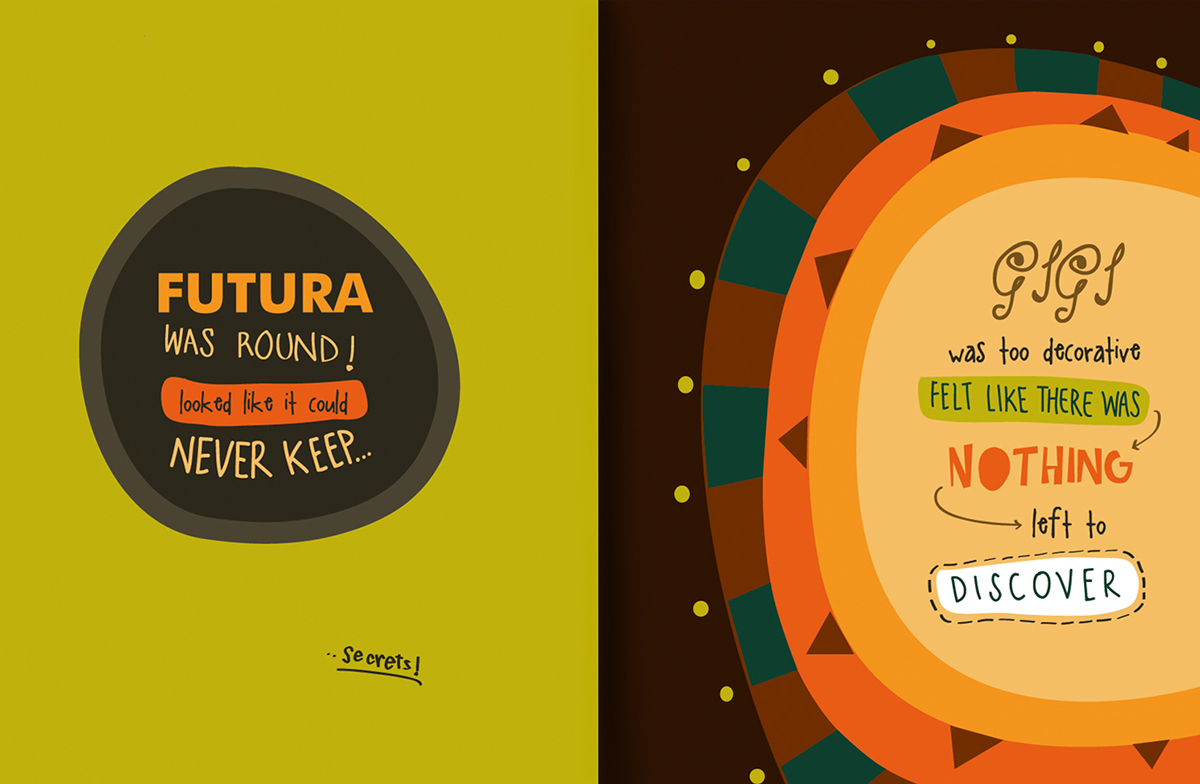
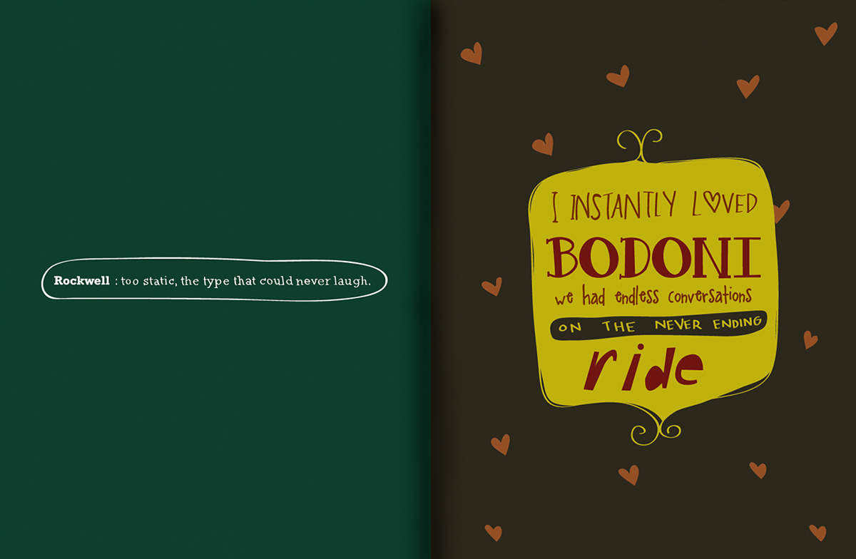
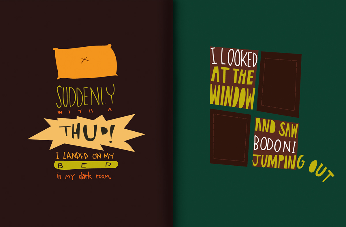
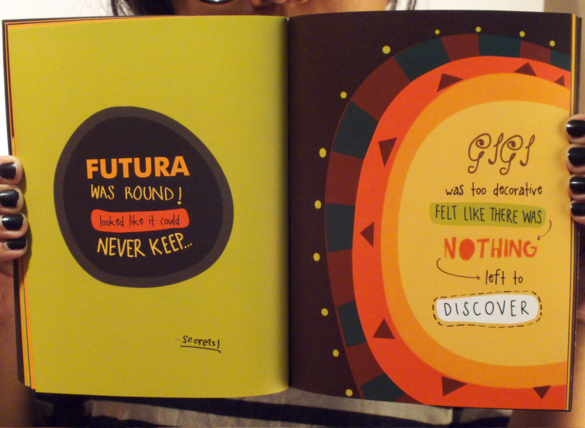
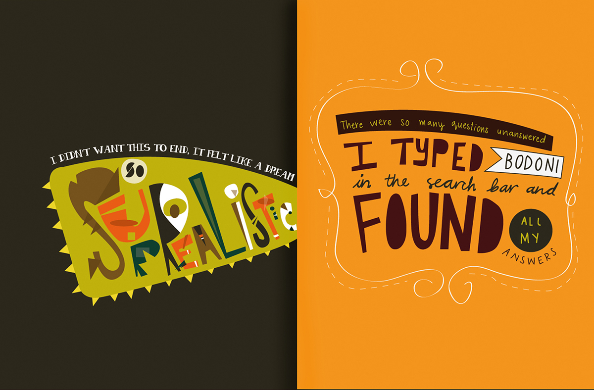
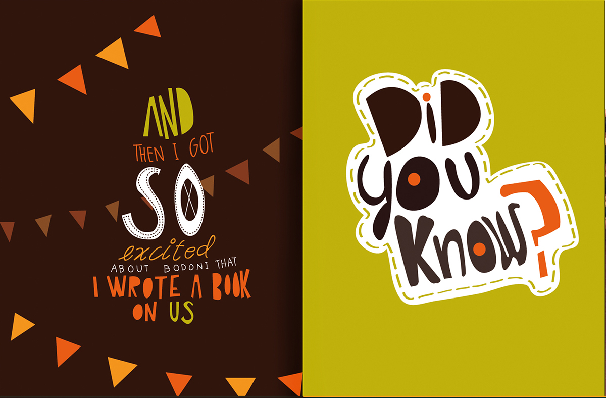
Below are the digital scans of the book for understanding the actual colours used.
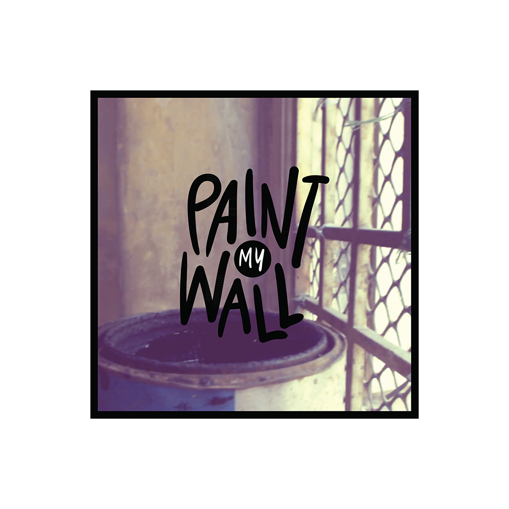
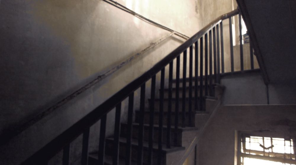
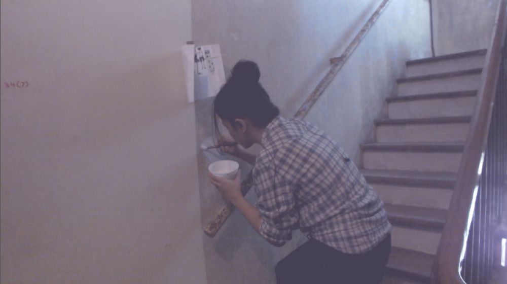
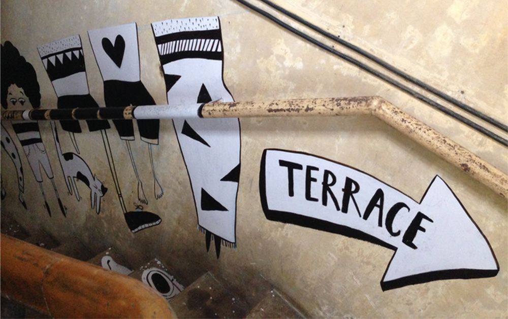
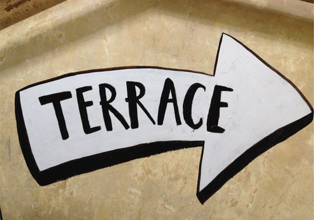
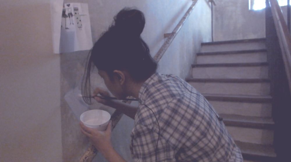
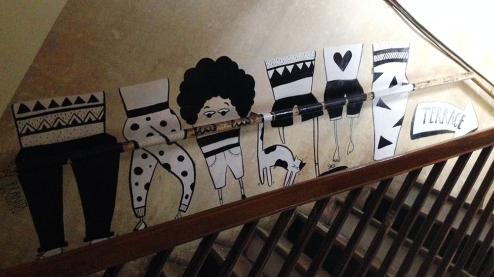
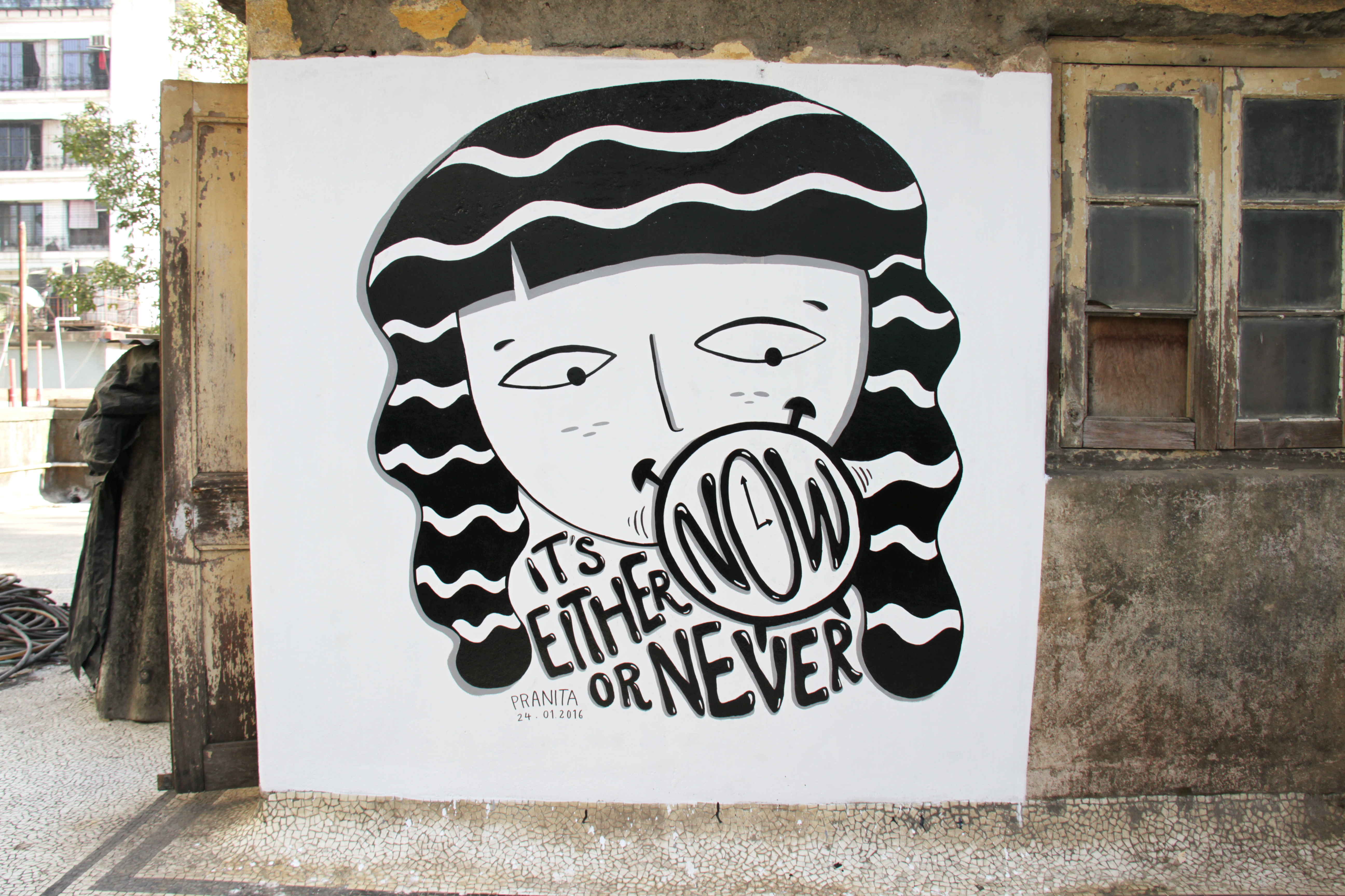
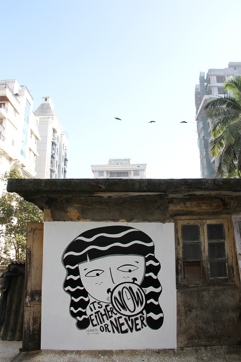
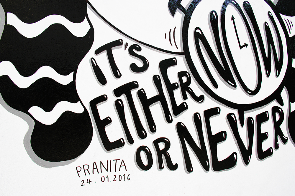
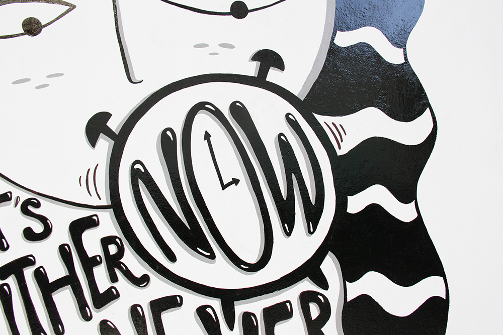
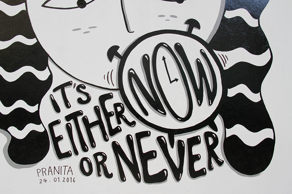
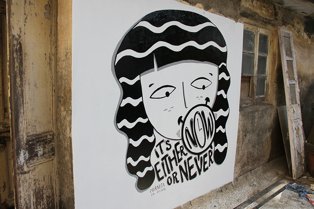
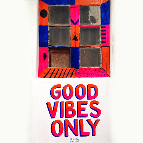
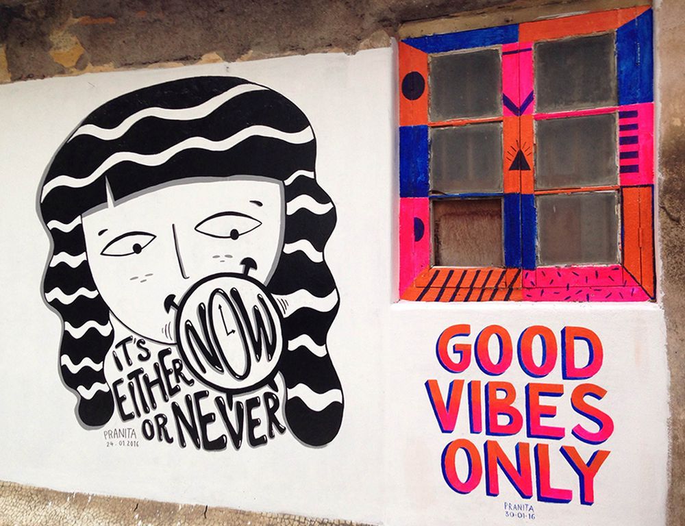
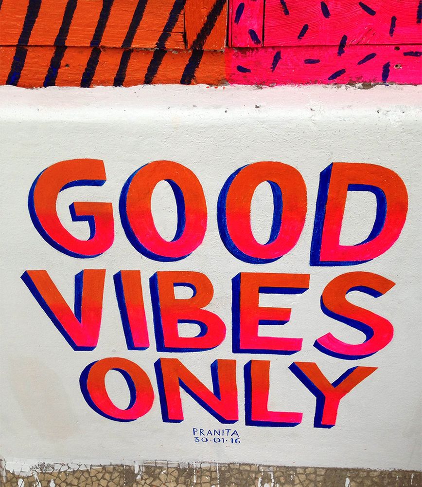
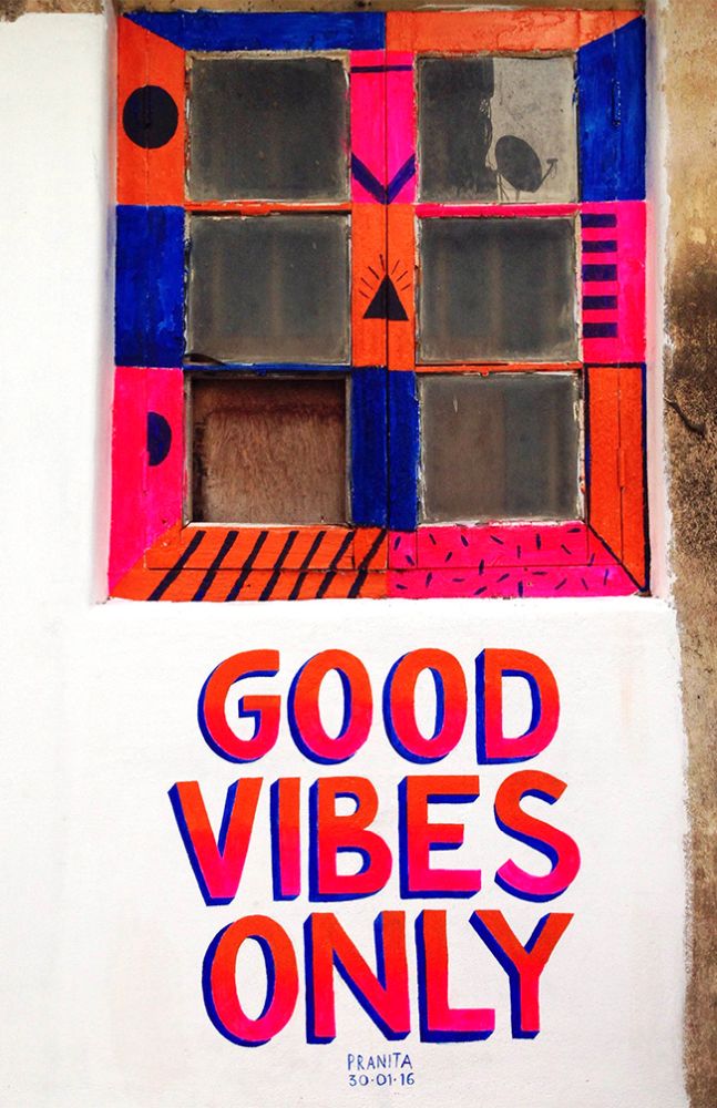
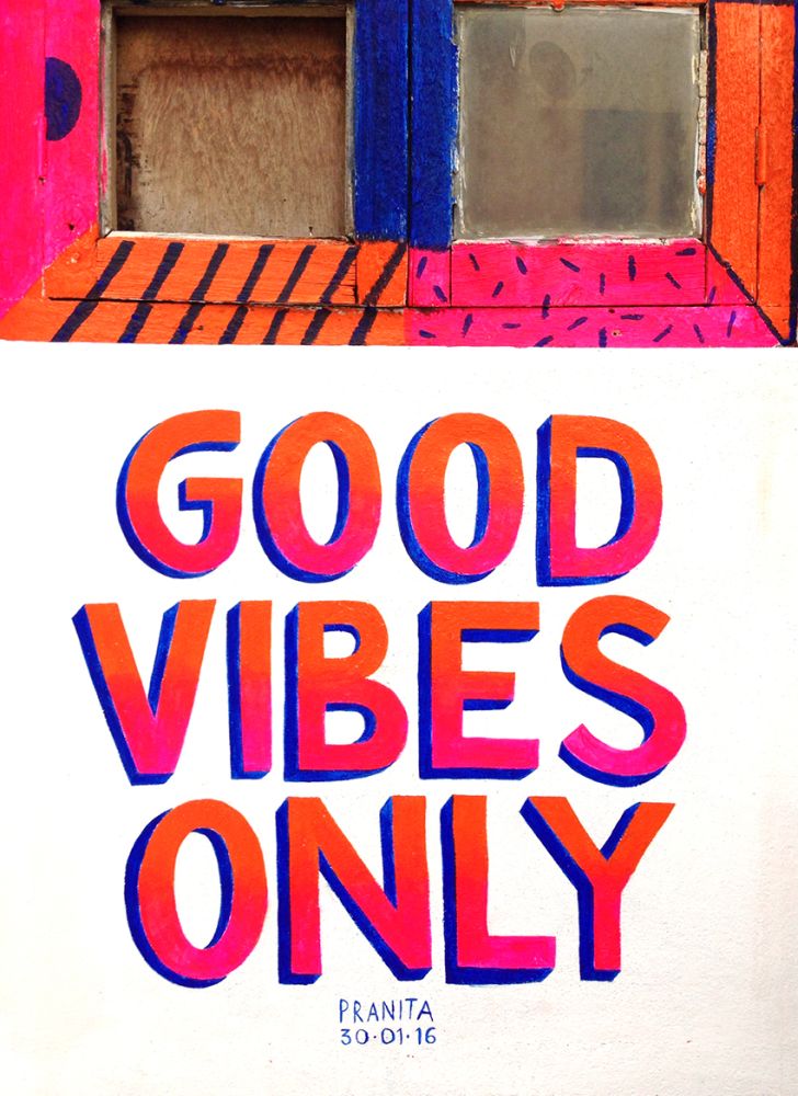
An unplanned, impromptu painting session. Spreading good vibes!
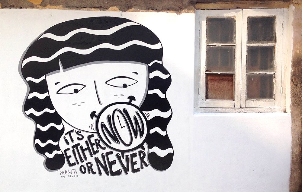
There was empty space next to the mural (before) 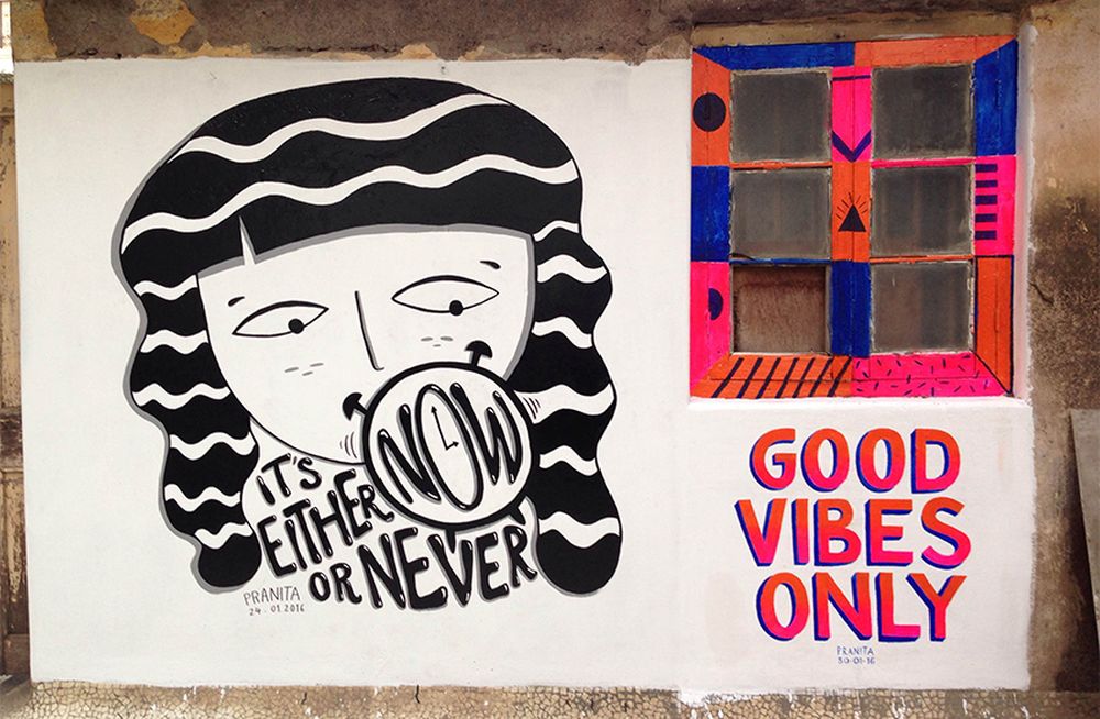
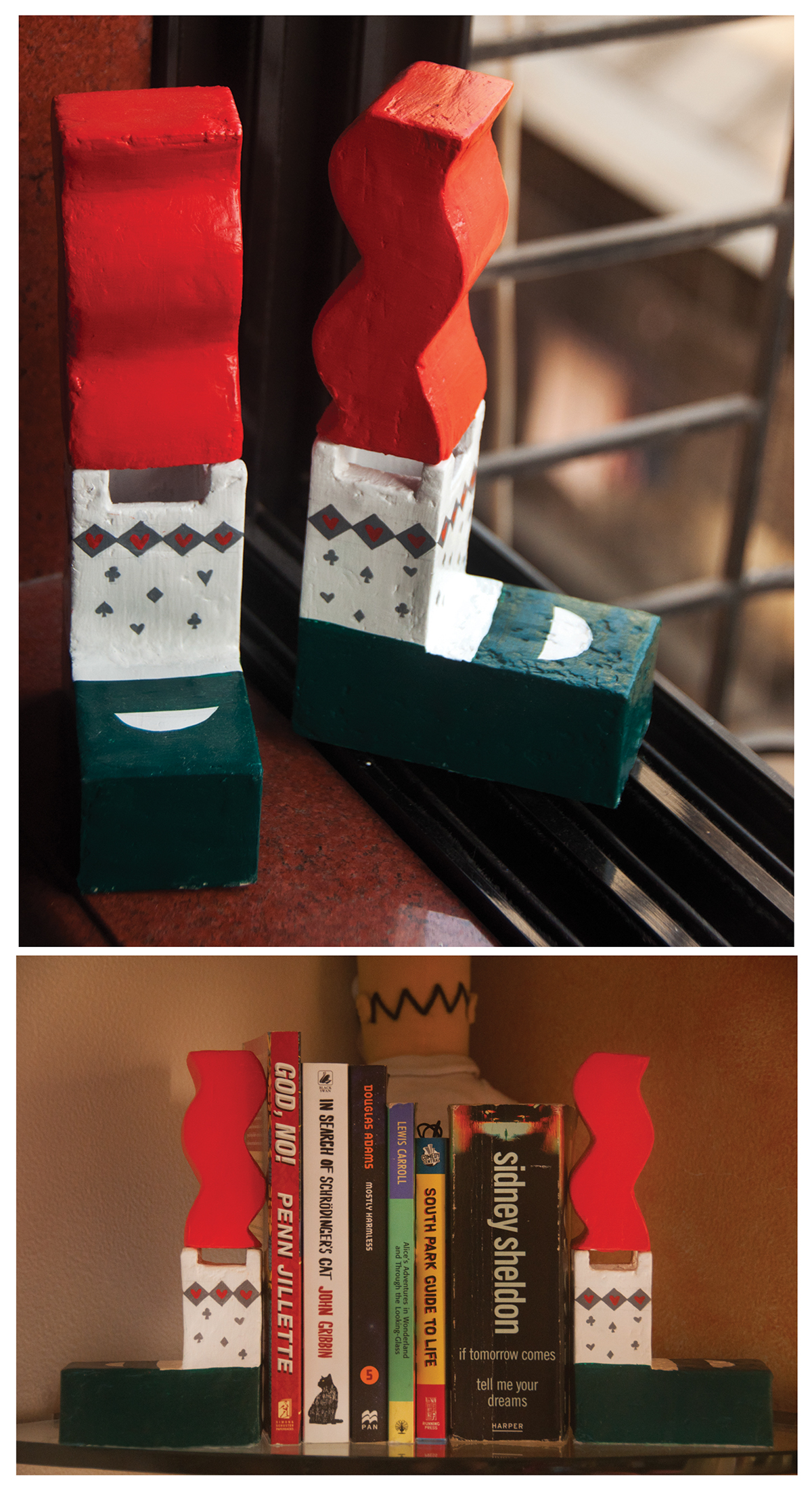
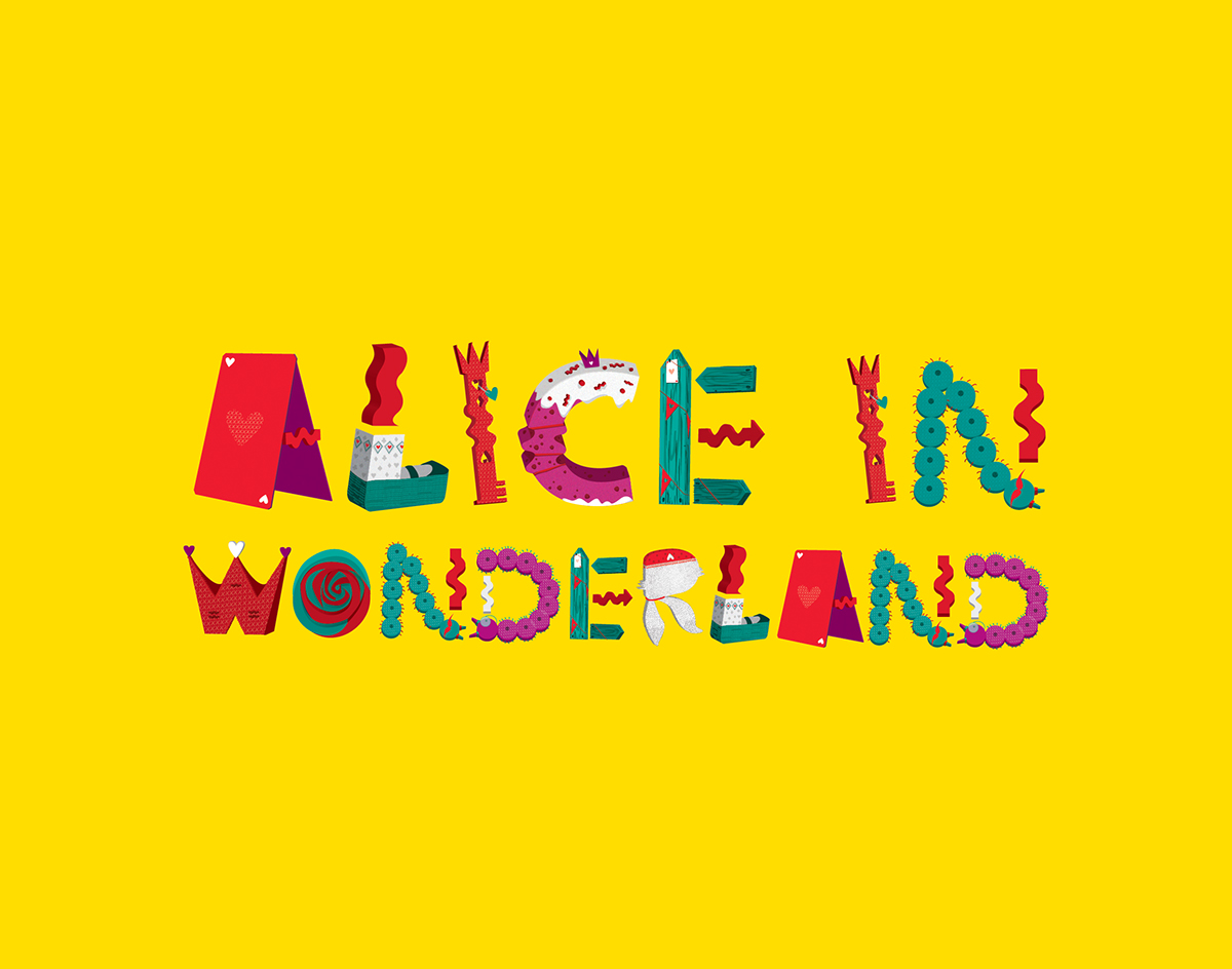
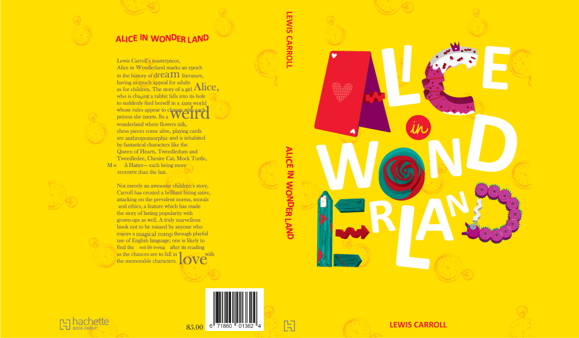
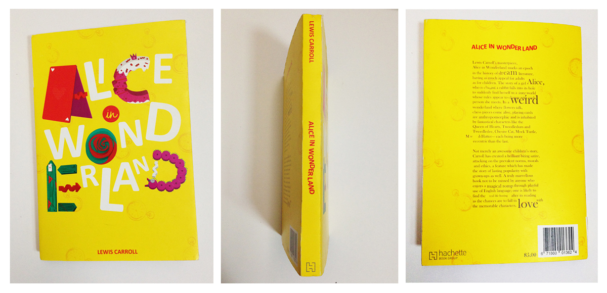
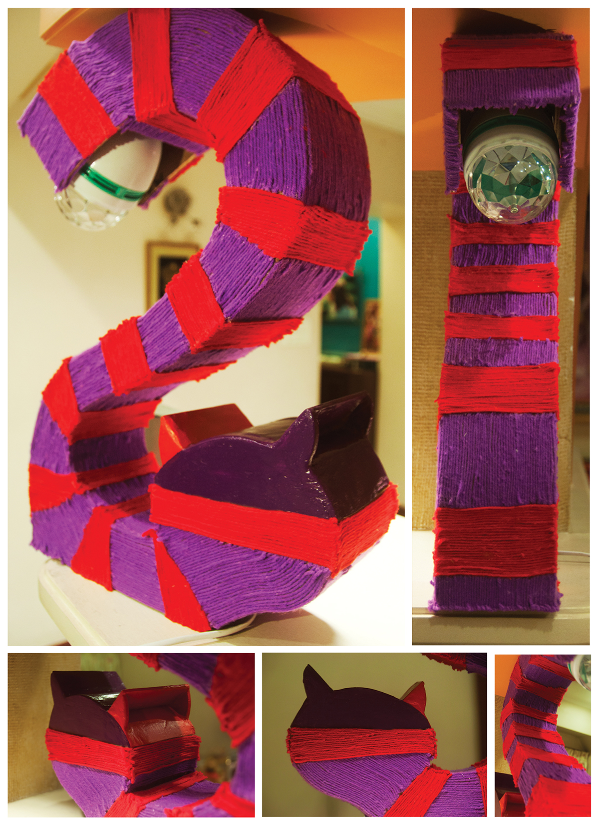
Alice In Wonderland is my favourite book since childhood and I chose to design a typeface to show my gratitude to Sir Lewis Carroll for giving me a whimsical book to get lost in when the world felt too mainstream. Imagination has no bounds. And that is something I wanted to portray through my typeface, targeting not only children but also adults.
The typeface is a 3D experimental display typeface. There are times in the book, where Alice eats the cake or drinks the potion and her size increases and decreases. Here, the objects around Alice are viewed from different perspectives. Thus, I decided to use three perspectives but keep it as simple as possible so the typeface is readable.
Each alphabet is either a character from the book, or a part of the story.
Following is the list of the concepts of the final alphabets:
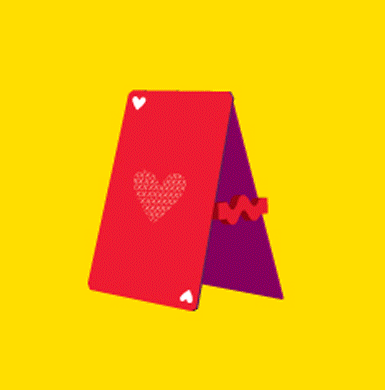
A- Playing cards
B- Alice’s neck twisting (While she ate a piece of mushroom, her neck elongated and twisted in the fields)
C- Cake (the dessert that was stolen from the Queen of Heart’s kingdom)
D- Caterpillar
E- Direction signs (the cheshire cat confuses Alice about directions, after which she reaches the mad hatter’s party)
F- Flamingo (used by the Queen to play a game of croquet)
G- Tea cup (an upside down cup and saucer)
H- Tweedledum & Tweedledee
I- Key (used to open doors when she falls down the rabbit hole)
J- Mad Hatter
K- Key (used to open doors when she falls down the rabbit hole)
L- Alice
M- White Rabbit
N- Caterpillar
O- Rabbit Hole
P- Tear drop (when Alice is twice her size, she begins to cry and a pool of tears is created)
Q- White Rabbit’s watch
R- March Hare
S- Cheshire Cat
T- Mushroom (on which the caterpillar was seen)
U- Cheshire Cat
V- Alice
W- Queen Of Hearts
X- Direction signs (the cheshire cat confuses alice about directions, after which she reaches the mad hatter’s party)
Y- White roses painted red
Z- Alice’s neck twisting (While she ate a bite of the mushroom, her neck elongated and twisted in the field)
I owe this to Manasi Keni, a wonderful mentor, designer and friend.
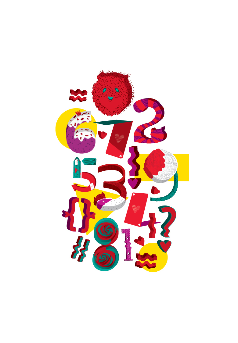
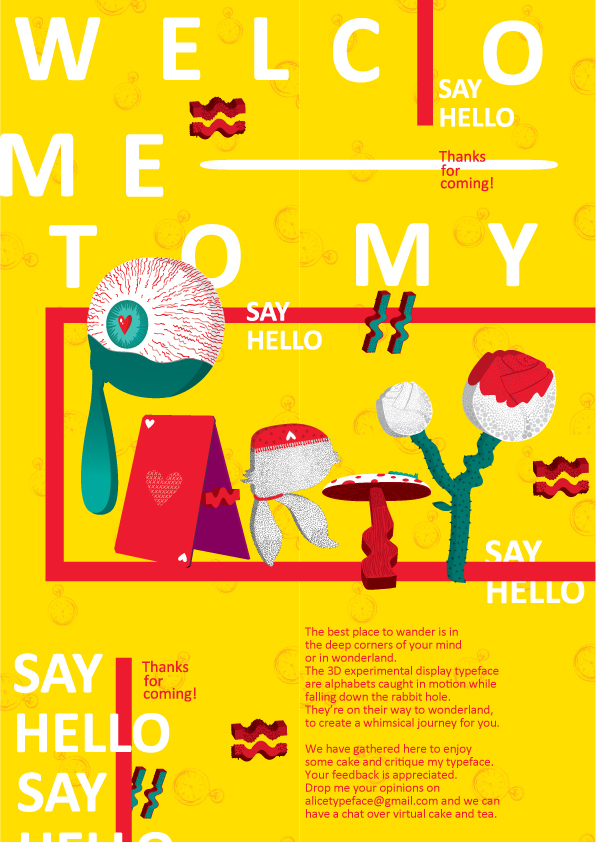
Font Poster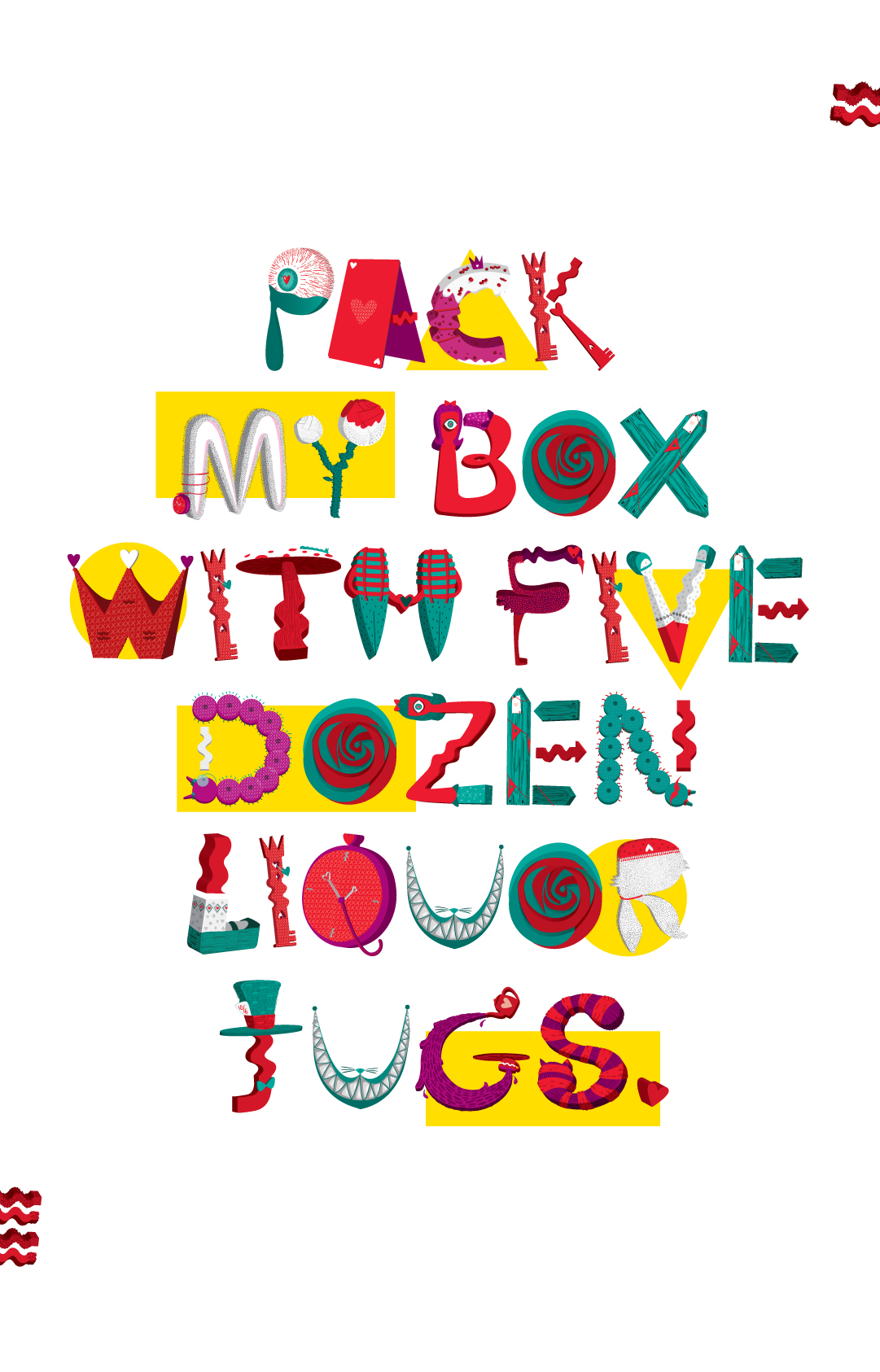
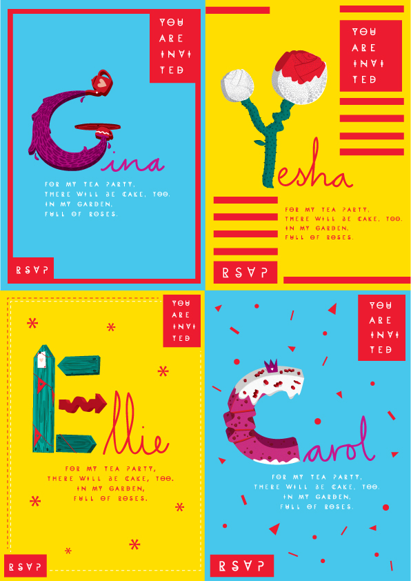
Party Invitation
Book cover Design
Bookmarks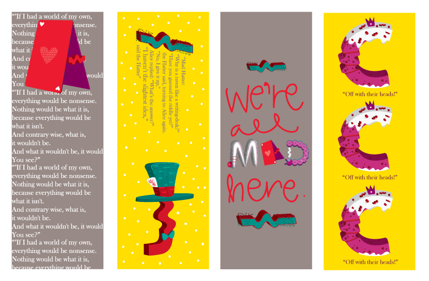
Tshirt Design
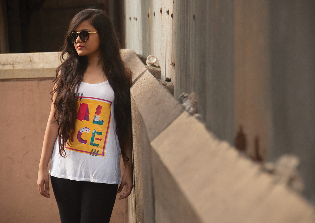
Table lamp as number 2
Book ends as letter L